#> [1] 500  10
#> tibble [500 × 10] (S3: tbl_df/tbl/data.frame)
#>  $ household_id    : int [1:500] 1 2 3 4 5 6 7 8 9 10 ...
#>  $ state           : chr [1:500] "Imo" "Adamawa" "Kano" "Oyo" ...
#>  $ zone            : chr [1:500] "North-West" "North-Central" "North-East" "South-West" ...
#>  $ household_size  : int [1:500] 2 9 12 3 2 8 7 3 6 2 ...
#>  $ monthly_income  : num [1:500] 124481 209392 80057 20000 157501 ...
#>  $ food_spend      : num [1:500] 58546 107027 29284 15335 66532 ...
#>  $ education_spend : num [1:500] 16892 33032 9108 0 18485 ...
#>  $ healthcare_spend: num [1:500] 12324 15624 8377 1222 19512 ...
#>  $ has_electricity : logi [1:500] TRUE TRUE TRUE TRUE TRUE FALSE ...
#> $ has_internet : logi [1:500] FALSE FALSE TRUE TRUE FALSE FALSE ...9 Exploratory Data Analysis
9.1 Why EDA Comes First
Every data analyst encounters the temptation: the data is sitting there, your model is ready to train, and success feels like it’s just a few lines of code away. This is precisely when things go wrong. Without exploratory data analysis, you risk building a statistically sophisticated house on sandy foundations.
The classic motivation for EDA is Anscombe’s Quartet, published in 1973 by Francis Anscombe. Four datasets of (x, y) pairs look completely different when visualized, yet they have identical summary statistics: the same mean, variance, correlation, and regression line. Plot them, though, and you see the first is linearly related, the second is curved, the third is perfectly linear with one outlier, and the fourth has a high-leverage point that creates a spurious relationship. No summary statistic alone would have revealed these truths. This is why visualization—one cornerstone of EDA—is non-negotiable.
EDA is detective work. You walk into the crime scene (your dataset) with no assumptions. You open every drawer, look for inconsistencies, note what’s missing, and piece together a story. You’re not trying to prove a hypothesis; you’re trying to understand. This mindset—curiosity without prejudice—is what separates analysts who find real insights from those who merely confirm their priors. When you analyze Nigerian household expenditure data, you don’t assume that food spending is the largest budget category in all regions. You look at the data, disaggregate by geography and income, and let the patterns emerge. That’s the EDA mindset.
9.2 Understanding Your Dataset
The first act of EDA is loading your data and asking: What am I working with? We need to know the size of our dataset, the data types of each variable, and whether the values look plausible. Let’s work with a realistic synthetic dataset representing household expenditure in Nigeria, based on patterns from the National Bureau of Statistics (NBS).
We’ll create a dataset with 500 Nigerian households across six geopolitical zones, recording monthly household income, expenditure on food, education, and healthcare, as well as access to electricity and internet—variables that correlate with development and inequality across Nigeria.
Here’s the code to generate and inspect this dataset:
#>    household_id        state  ... has_electricity  has_internet
#> 0             1        Lagos  ...            True         False
#> 1             2      Anambra  ...            True         False
#> 2             3  Cross River  ...            True         False
#> 3             4         Ogun  ...            True         False
#> 4             5        Lagos  ...           False          True
#> 5             6  Cross River  ...            True         False
#> 6             7  Cross River  ...           False         False
#> 7             8        Kwara  ...            True          True
#> 8             9         Ogun  ...            True         False
#> 9            10         Kogi  ...           False          True
#>
#> [10 rows x 10 columns]
#> Shape: (500, 10)
#> household_id          int64
#> state                object
#> zone                 object
#> household_size        int32
#> monthly_income      float64
#> food_spend          float64
#> education_spend     float64
#> healthcare_spend    float64
#> has_electricity        bool
#> has_internet           bool
#> dtype: object
Now let’s get a systematic overview of the dataset:
| Name | households |
| Number of rows | 500 |
| Number of columns | 10 |
| _______________________ | |
| Column type frequency: | |
| character | 2 |
| logical | 2 |
| numeric | 6 |
| ________________________ | |
| Group variables | None |
Variable type: character
| skim_variable | n_missing | complete_rate | min | max | empty | n_unique | whitespace |
|---|---|---|---|---|---|---|---|
| state | 0 | 1 | 3 | 11 | 0 | 17 | 0 |
| zone | 0 | 1 | 10 | 13 | 0 | 6 | 0 |
Variable type: logical
| skim_variable | n_missing | complete_rate | mean | count |
|---|---|---|---|---|
| has_electricity | 0 | 1 | 0.65 | TRU: 324, FAL: 176 |
| has_internet | 0 | 1 | 0.46 | FAL: 271, TRU: 229 |
Variable type: numeric
| skim_variable | n_missing | complete_rate | mean | sd | p0 | p25 | p50 | p75 | p100 | hist |
|---|---|---|---|---|---|---|---|---|---|---|
| household_id | 0 | 1.00 | 250.50 | 144.48 | 1 | 125.75 | 250.50 | 375.25 | 500.00 | ▇▇▇▇▇ |
| household_size | 0 | 1.00 | 6.96 | 3.24 | 2 | 4.00 | 7.00 | 10.00 | 12.00 | ▇▅▅▅▅ |
| monthly_income | 15 | 0.97 | 153576.73 | 77804.44 | 20000 | 95132.19 | 153278.91 | 207275.04 | 429624.34 | ▆▇▆▂▁ |
| food_spend | 0 | 1.00 | 71362.92 | 49169.40 | 0 | 43063.08 | 68179.55 | 95526.63 | 800000.00 | ▇▁▁▁▁ |
| education_spend | 35 | 0.93 | 20190.62 | 11562.91 | 0 | 11161.72 | 19757.18 | 28112.37 | 60545.98 | ▆▇▆▂▁ |
| healthcare_spend | 20 | 0.96 | 12260.73 | 7544.00 | 0 | 6512.50 | 11587.45 | 17071.98 | 37906.96 | ▆▇▅▂▁ |
#>   household_id      state               zone           household_size
#>  Min.   :  1.0   Length:500         Length:500         Min.   : 2.000
#>  1st Qu.:125.8   Class :character   Class :character   1st Qu.: 4.000
#>  Median :250.5   Mode  :character   Mode  :character   Median : 7.000
#>  Mean   :250.5                                         Mean   : 6.956
#>  3rd Qu.:375.2                                         3rd Qu.:10.000
#>  Max.   :500.0                                         Max.   :12.000
#>
#>  monthly_income     food_spend     education_spend healthcare_spend
#>  Min.   : 20000   Min.   :     0   Min.   :    0   Min.   :    0
#>  1st Qu.: 95132   1st Qu.: 43063   1st Qu.:11162   1st Qu.: 6513
#>  Median :153279   Median : 68180   Median :19757   Median :11587
#>  Mean   :153577   Mean   : 71363   Mean   :20191   Mean   :12261
#>  3rd Qu.:207275   3rd Qu.: 95527   3rd Qu.:28112   3rd Qu.:17072
#>  Max.   :429624   Max.   :800000   Max.   :60546   Max.   :37907
#>  NA's   :15                        NA's   :35      NA's   :20
#>  has_electricity has_internet
#>  Mode :logical   Mode :logical
#>  FALSE:176       FALSE:271
#>  TRUE :324       TRUE :229
#>
#>
#>
#>
#> <class 'pandas.core.frame.DataFrame'>
#> RangeIndex: 500 entries, 0 to 499
#> Data columns (total 10 columns):
#> # Column Non-Null Count Dtype
#> --- ------ -------------- -----
#> 0 household_id 500 non-null int64
#> 1 state 500 non-null object
#> 2 zone 500 non-null object
#> 3 household_size 500 non-null int32
#> 4 monthly_income 485 non-null float64
#> 5 food_spend 500 non-null float64
#> 6 education_spend 465 non-null float64
#> 7 healthcare_spend 480 non-null float64
#> 8 has_electricity 500 non-null bool
#> 9 has_internet 500 non-null bool
#> dtypes: bool(2), float64(4), int32(1), int64(1), object(2)
#> memory usage: 30.4+ KB
#> None
#> household_id household_size ... education_spend healthcare_spend
#> count 500.000000 500.000000 ... 465.000000 480.000000
#> mean 250.500000 6.918000 ... 19960.393346 12253.663854
#> std 144.481833 3.192438 ... 10980.238382 7592.035597
#> min 1.000000 2.000000 ... 0.000000 0.000000
#> 25% 125.750000 4.000000 ... 11843.042622 6569.995321
#> 50% 250.500000 7.000000 ... 19142.862112 11202.244551
#> 75% 375.250000 10.000000 ... 26782.679282 17072.485190
#> max 500.000000 12.000000 ... 60555.424138 38337.020669
#>
#> [8 rows x 6 columns]
#>
#> Missing Value Summary:
#> household_id 0
#> state 0
#> zone 0
#> household_size 0
#> monthly_income 15
#> food_spend 0
#> education_spend 35
#> healthcare_spend 20
#> has_electricity 0
#> has_internet 0
#> dtype: int64
#>
#> Percentage Missing:
#> household_id 0.0
#> state 0.0
#> zone 0.0
#> household_size 0.0
#> monthly_income 3.0
#> food_spend 0.0
#> education_spend 7.0
#> healthcare_spend 4.0
#> has_electricity 0.0
#> has_internet 0.0
#> dtype: float649.3 Univariate Analysis
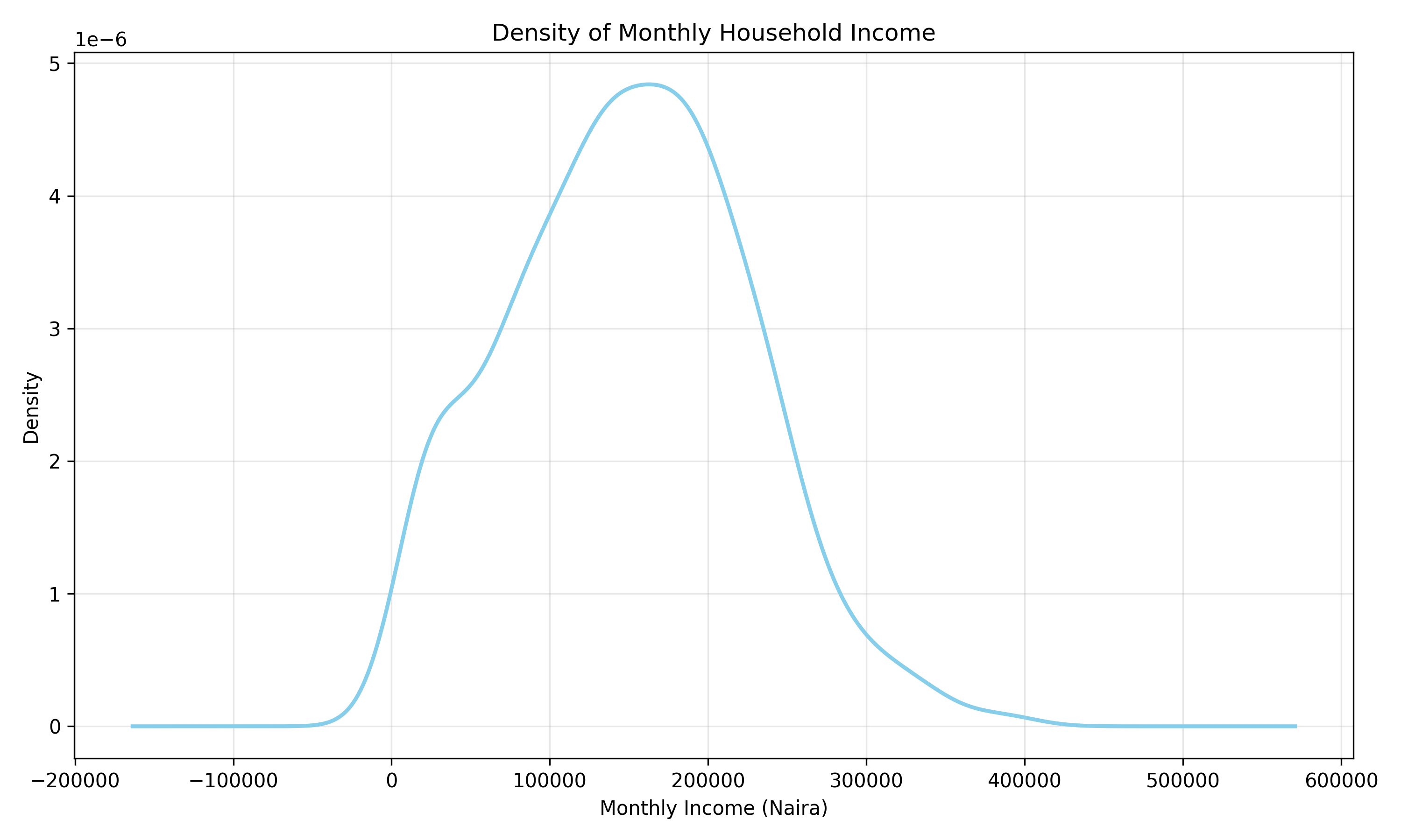
Univariate analysis examines each variable one at a time, asking: What is the distribution of this variable? For numeric variables, we use histograms, density plots, and box plots to understand shape, spread, and central tendency. For categorical variables, we use frequency tables and bar charts. This analysis is foundational: it tells us whether a variable is normally distributed (important for many statistical tests), skewed, bimodal, or multimodal.
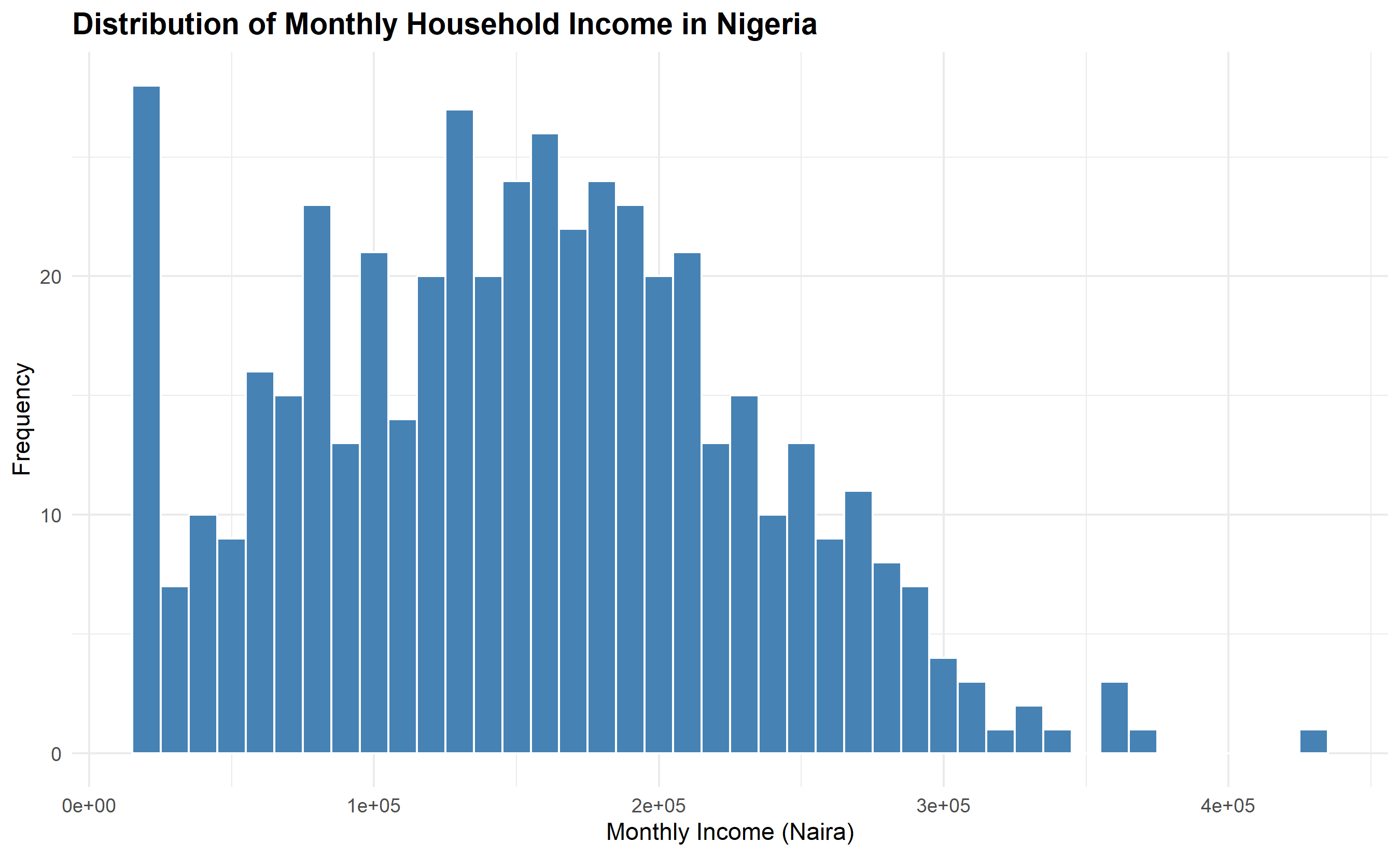
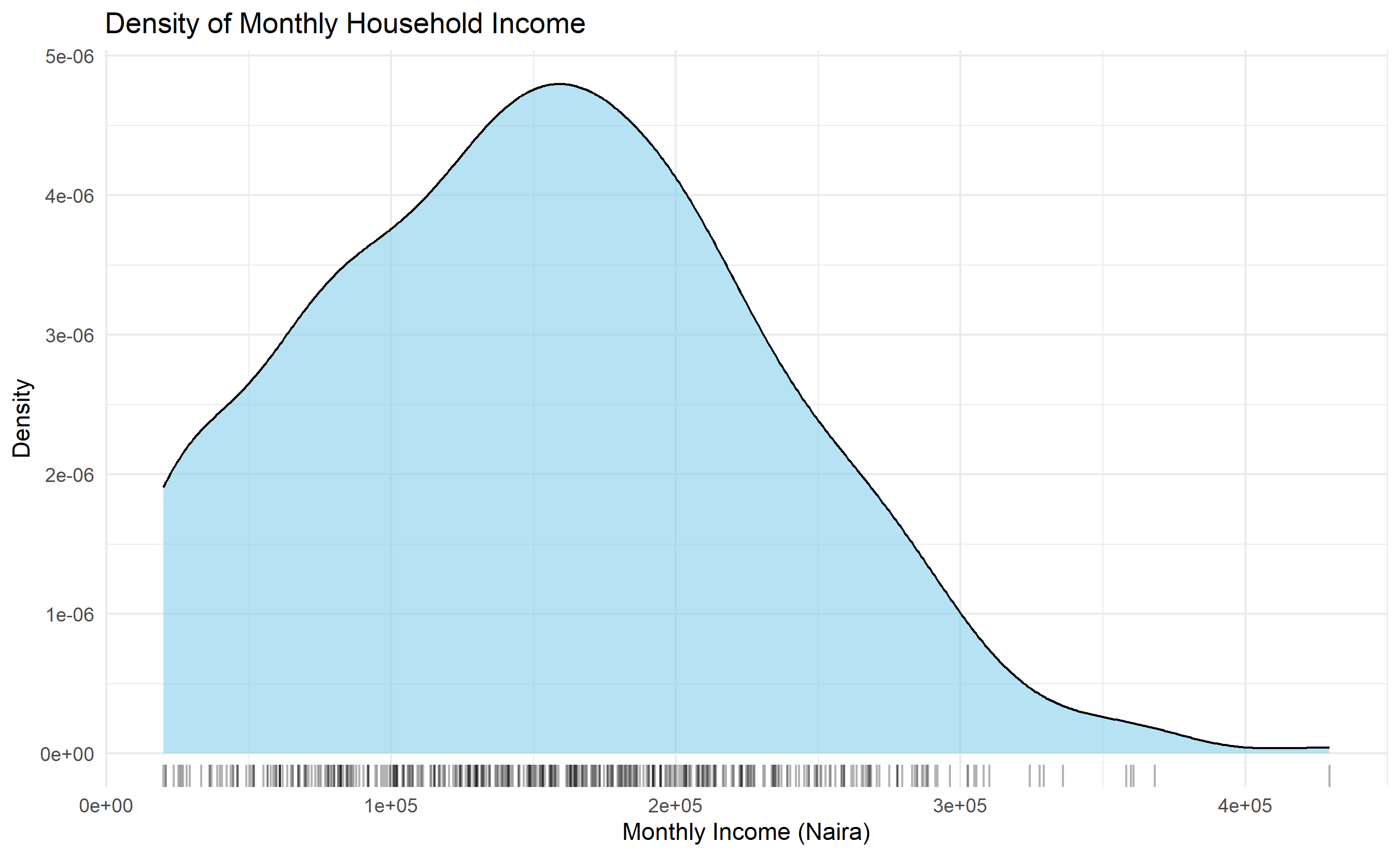
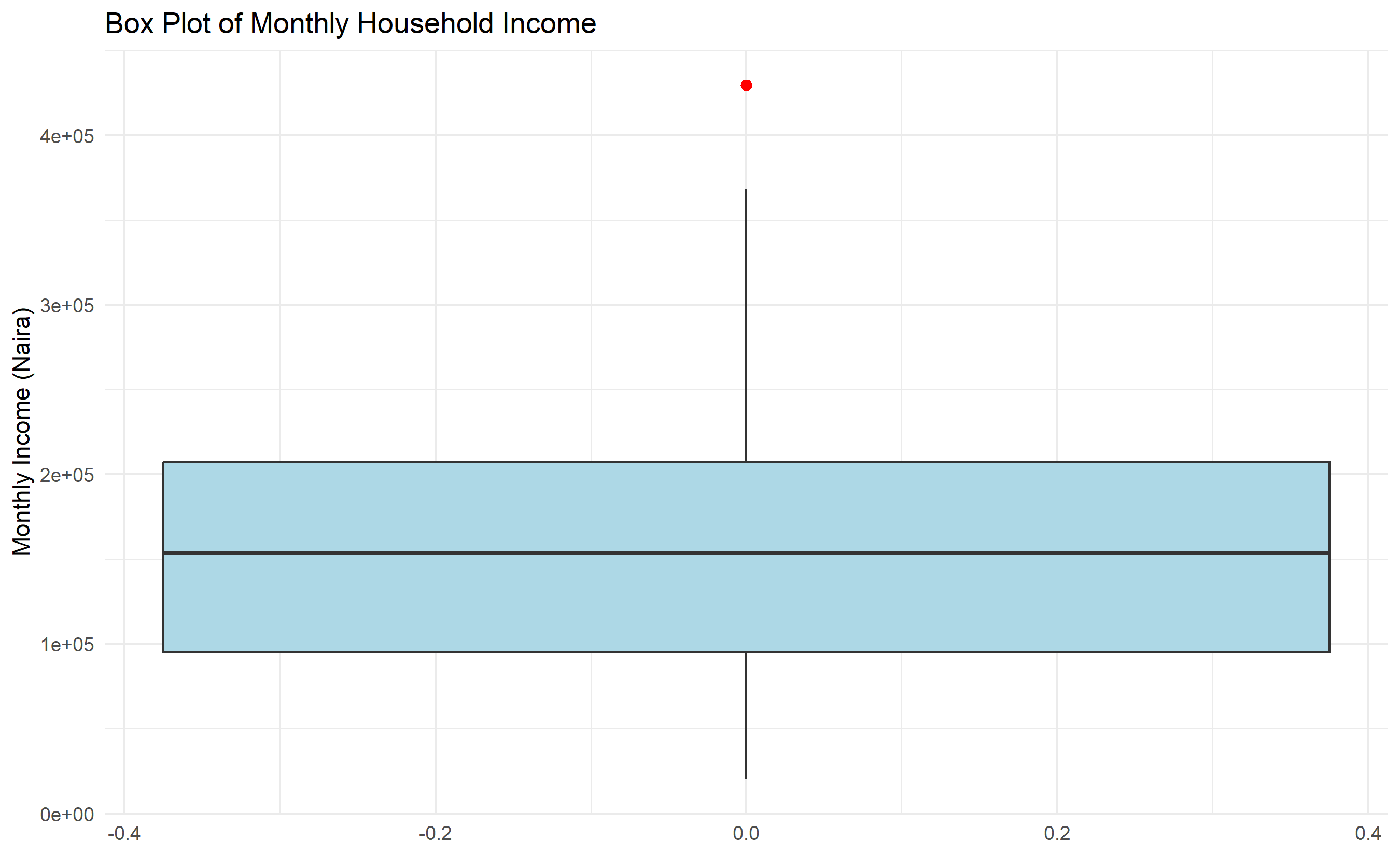
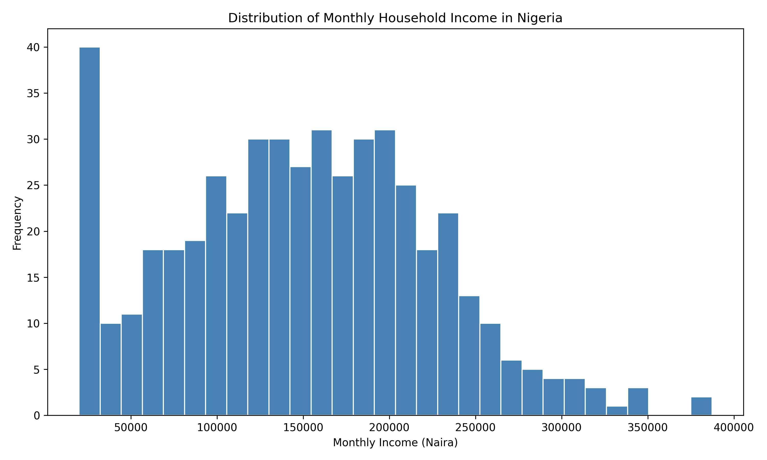
#> {'whiskers': [<matplotlib.lines.Line2D object at 0x0000012BF1C3BCB0>, <matplotlib.lines.Line2D object at 0x0000012BF1C3BE00>], 'caps': [<matplotlib.lines.Line2D object at 0x0000012BF1CBC050>, <matplotlib.lines.Line2D object at 0x0000012BF1CBC1A0>], 'boxes': [<matplotlib.lines.Line2D object at 0x0000012BF1C3BB60>], 'medians': [<matplotlib.lines.Line2D object at 0x0000012BF1CBC2F0>], 'fliers': [<matplotlib.lines.Line2D object at 0x0000012BF1CBC440>], 'means': []}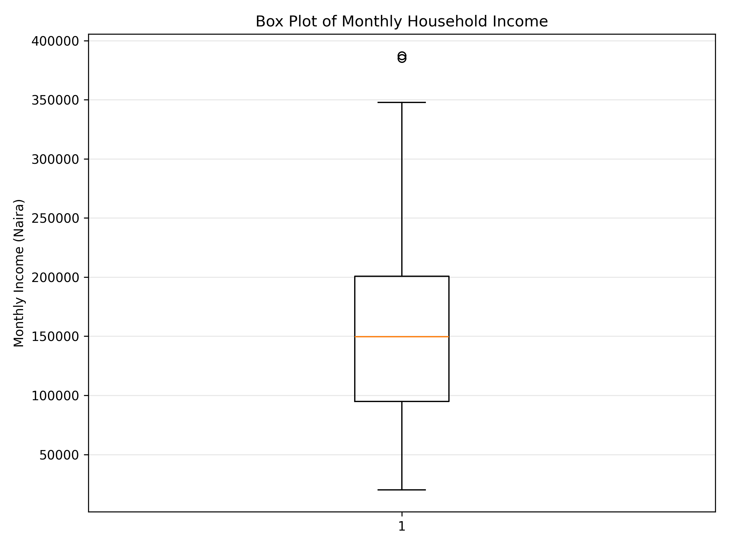
#>
#> household_id:
#>   Mean: 250.50
#>   Median: 250.50
#>   Std Dev: 144.48
#>   Min: 1.00
#>   Max: 500.00
#>   Skewness: 0.000
#>   Kurtosis: -1.200
#>
#> household_size:
#>   Mean: 6.92
#>   Median: 7.00
#>   Std Dev: 3.19
#>   Min: 2.00
#>   Max: 12.00
#>   Skewness: 0.022
#>   Kurtosis: -1.201
#>
#> monthly_income:
#>   Mean: 149862.00
#>   Median: 149573.08
#>   Std Dev: 75130.09
#>   Min: 20000.00
#>   Max: 387200.83
#>   Skewness: 0.177
#>   Kurtosis: -0.302
#>
#> food_spend:
#>   Mean: 68722.18
#>   Median: 66670.05
#>   Std Dev: 47893.56
#>   Min: 263.86
#>   Max: 800000.00
#>   Skewness: 7.284
#>   Kurtosis: 108.122
#>
#> education_spend:
#>   Mean: 19960.39
#>   Median: 19142.86
#>   Std Dev: 10980.24
#>   Min: 0.00
#>   Max: 60555.42
#>   Skewness: 0.524
#>   Kurtosis: 0.143
#>
#> healthcare_spend:
#>   Mean: 12253.66
#>   Median: 11202.24
#>   Std Dev: 7592.04
#>   Min: 0.00
#>   Max: 38337.02
#>   Skewness: 0.677
#>   Kurtosis: 0.241
#>
#> Frequency: Zone
#> zone
#> North-West       84
#> North-Central    84
#> North-East       83
#> South-West       83
#> South-South      83
#> South-East       83
#> Name: count, dtype: int64
#>
#> Proportion: Zone
#> zone
#> North-West       0.168
#> North-Central    0.168
#> North-East       0.166
#> South-West       0.166
#> South-South      0.166
#> South-East       0.166
#> Name: proportion, dtype: float64
#>
#> Frequency: Has Electricity
#> has_electricity
#> True     345
#> False    155
#> Name: count, dtype: int64
#>
#> Proportion: Has Electricity
#> has_electricity
#> True     0.69
#> False    0.31
#> Name: proportion, dtype: float649.4 Bivariate Analysis
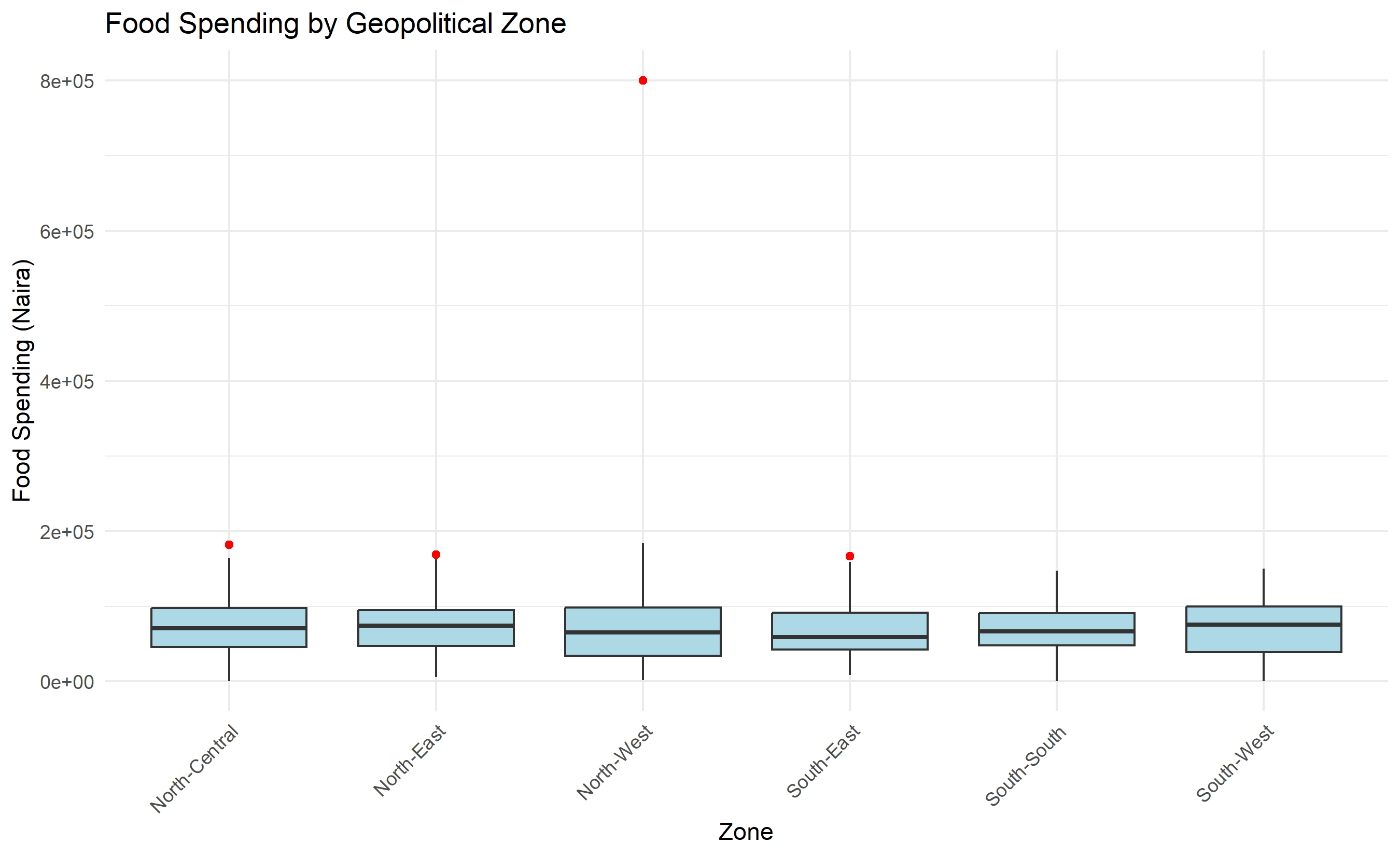
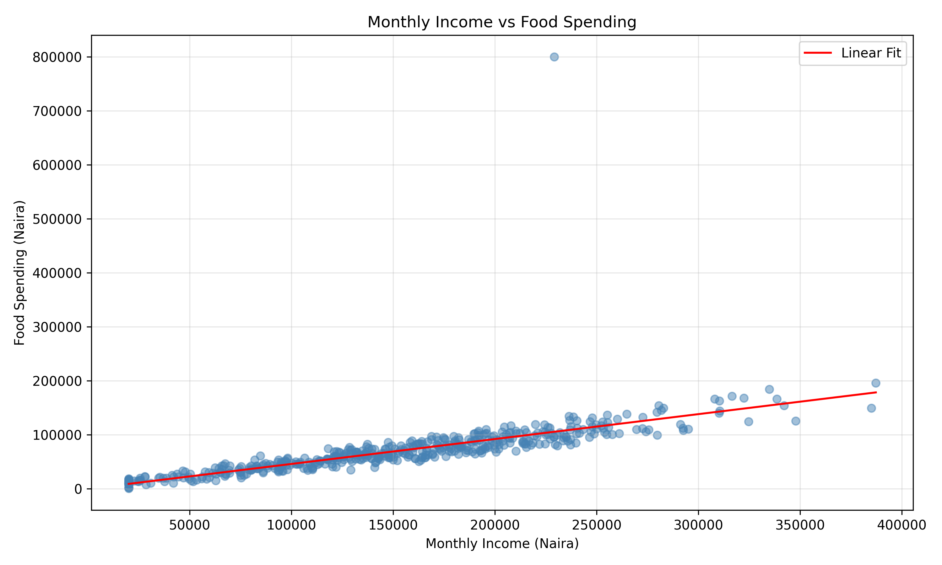
Bivariate analysis examines relationships between two variables. For two numeric variables, we use scatter plots and correlation. For a numeric and a categorical variable, we use side-by-side box plots, grouped bar charts, or violin plots. For two categorical variables, we use crosstabulations and grouped bar charts.
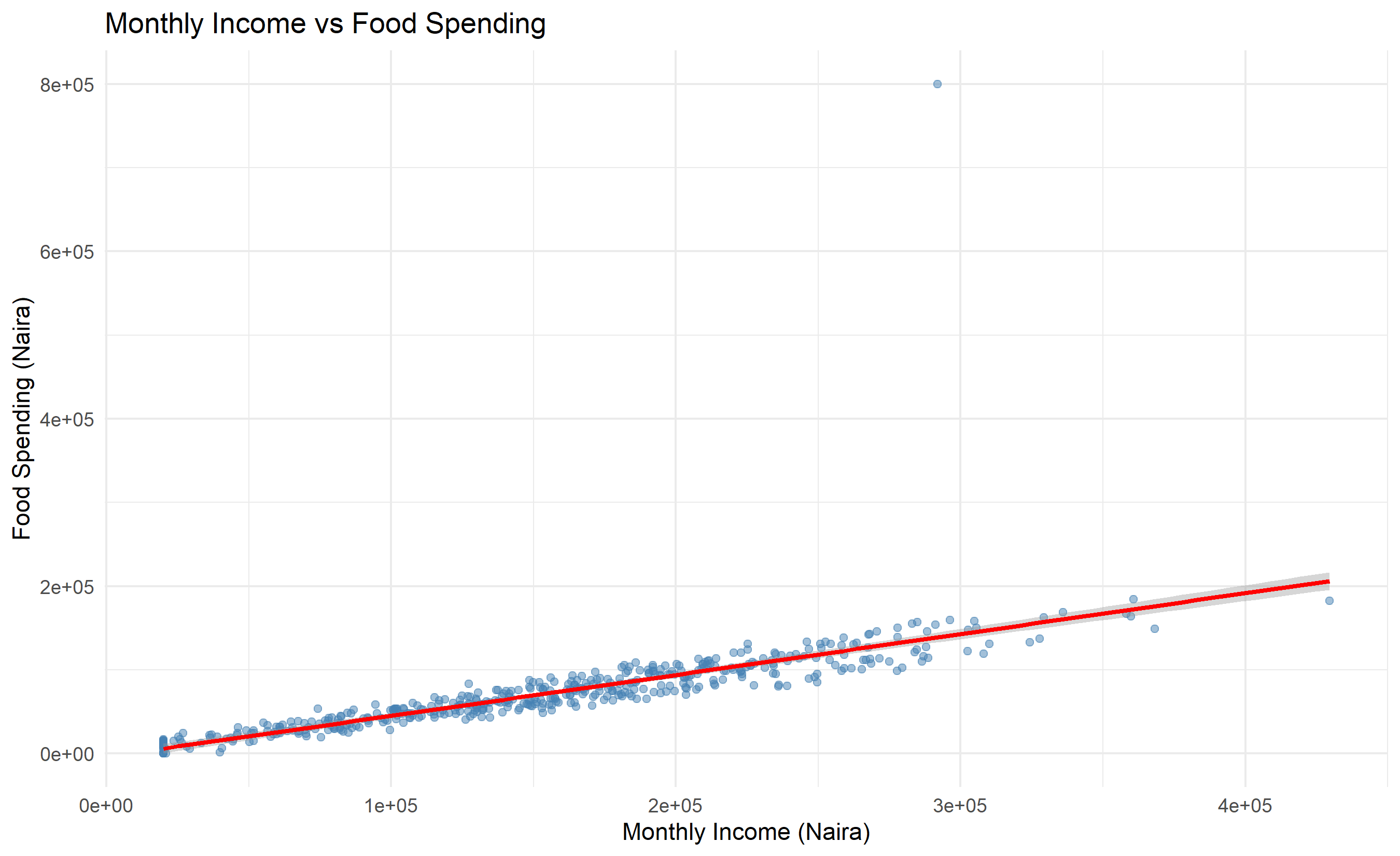
#>                  household_size monthly_income  food_spend education_spend
#> household_size       1.00000000    -0.03508517 -0.06507389     -0.03086061
#> monthly_income      -0.03508517     1.00000000  0.75172023      0.87108204
#> food_spend          -0.06507389     0.75172023  1.00000000      0.64735768
#> education_spend     -0.03086061     0.87108204  0.64735768      1.00000000
#> healthcare_spend    -0.07380605     0.78121024  0.60253328      0.67135259
#>                  healthcare_spend
#> household_size        -0.07380605
#> monthly_income         0.78121024
#> food_spend             0.60253328
#> education_spend        0.67135259
#> healthcare_spend       1.00000000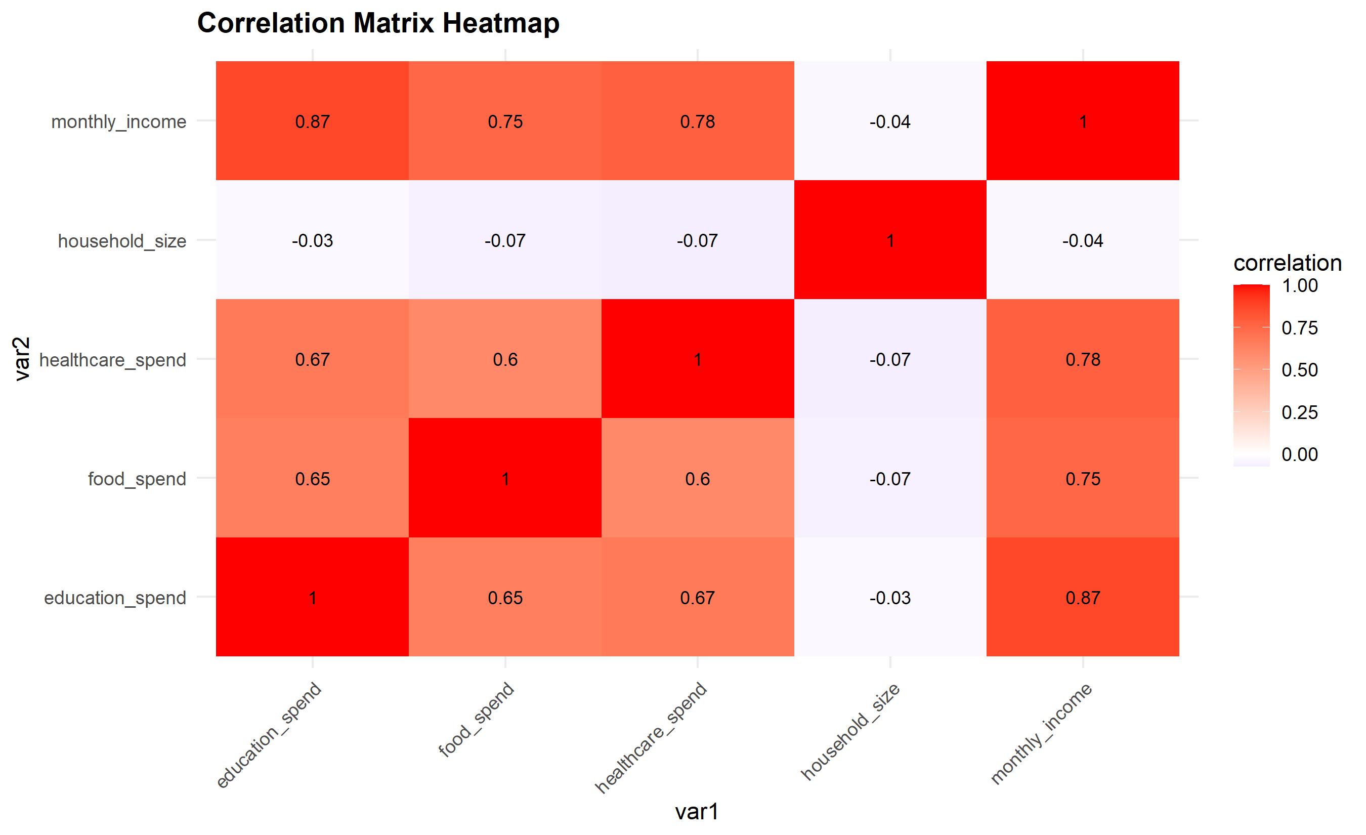
#>
#>         FALSE TRUE Sum
#>   FALSE    92   84 176
#>   TRUE    179  145 324
#>   Sum     271  229 500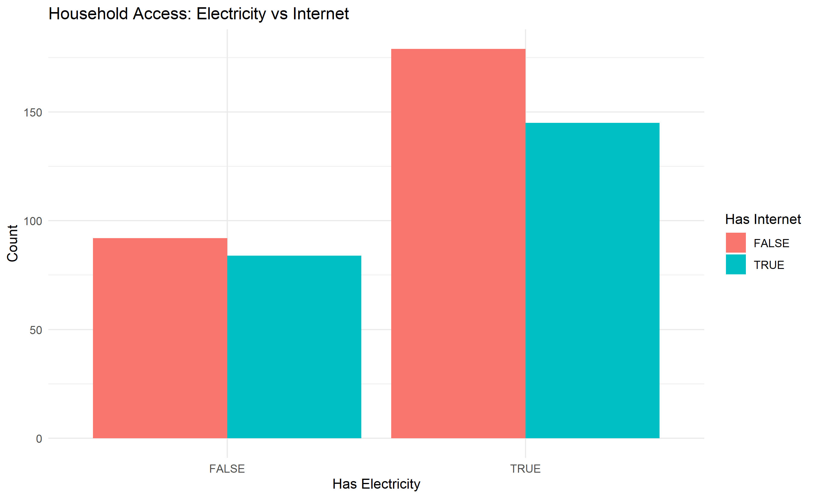
#>                   household_id  ...  healthcare_spend
#> household_id          1.000000  ...          0.003083
#> household_size        0.079546  ...          0.023023
#> monthly_income        0.080073  ...          0.803798
#> food_spend            0.053540  ...          0.552022
#> education_spend       0.035061  ...          0.685864
#> healthcare_spend      0.003083  ...          1.000000
#>
#> [6 rows x 6 columns]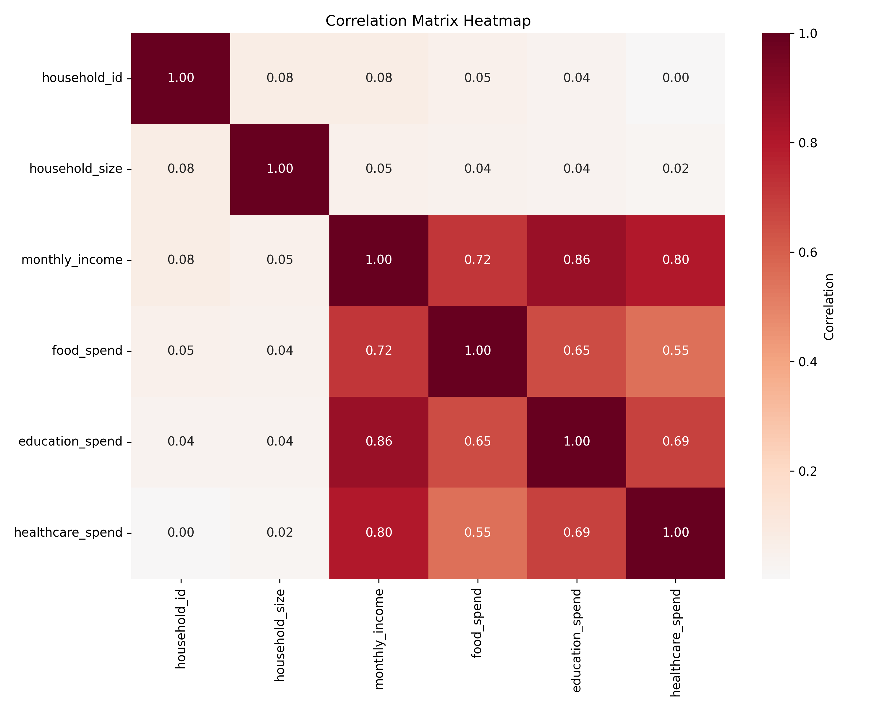
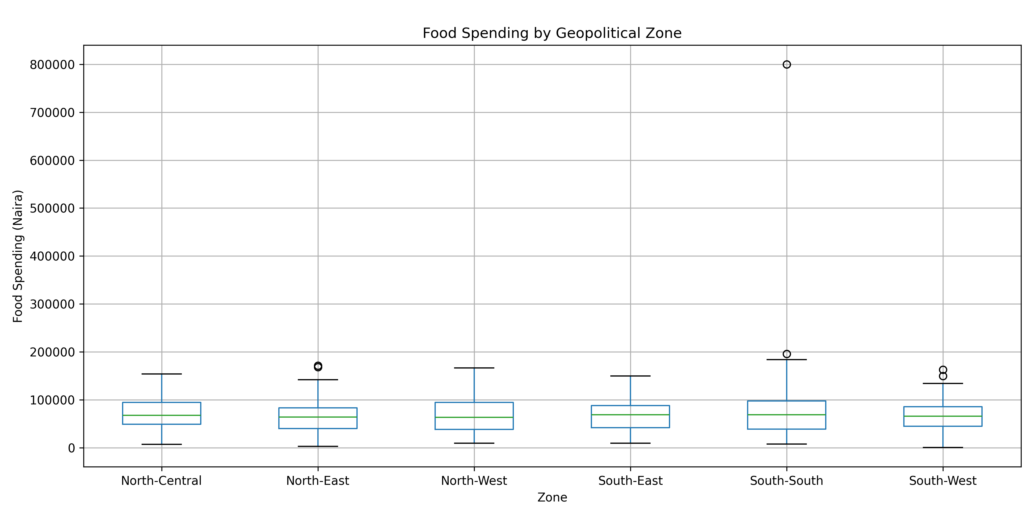
#>
#> Crosstabulation: Electricity vs Internet
#> has_internet     False  True  All
#> has_electricity
#> False               82    73  155
#> True               180   165  345
#> All                262   238  500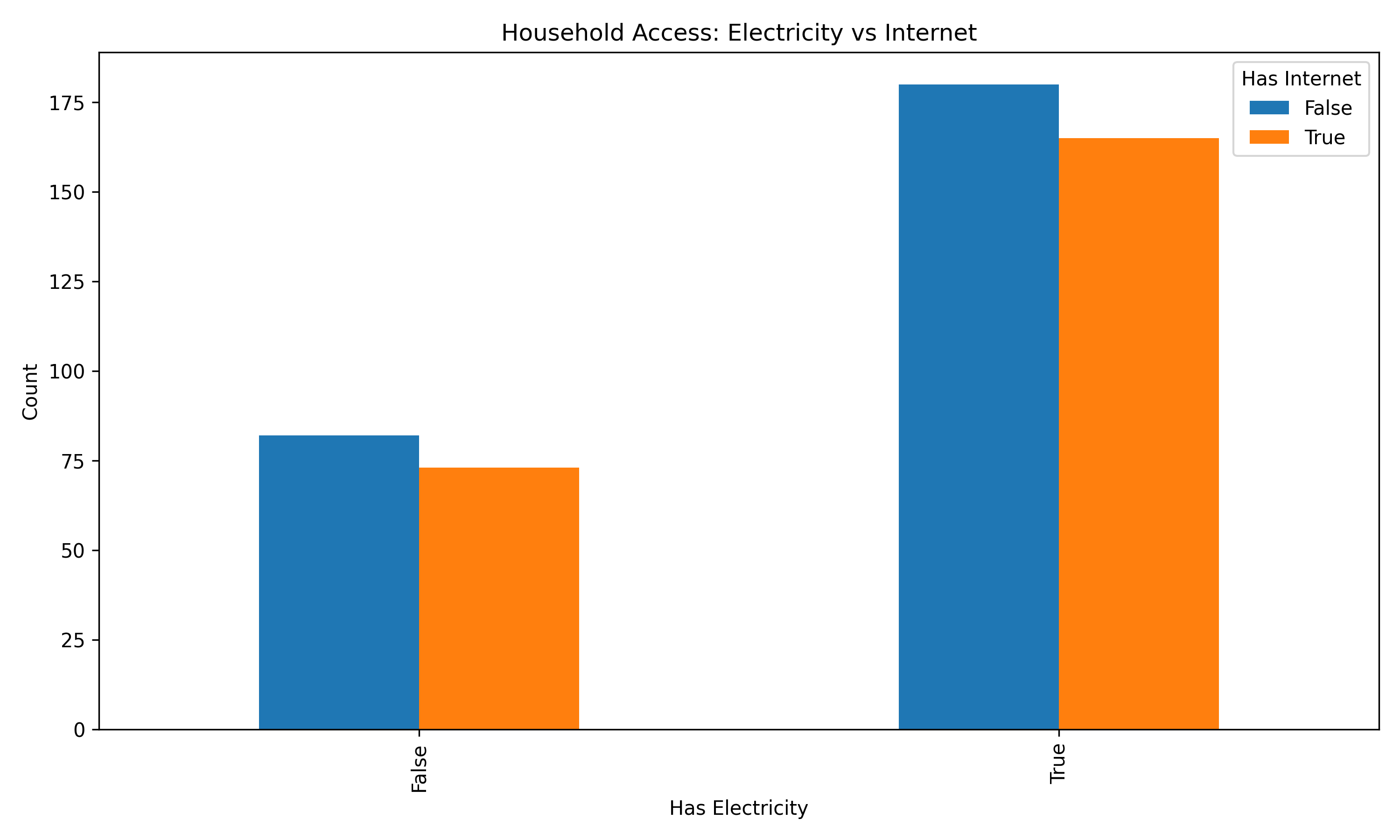

9.5 Handling Missing Values
Missing data is ubiquitous in real-world analysis. Before you delete observations or impute values, you must understand the mechanism of missingness. Statisticians distinguish three scenarios: MCAR (Missing Completely At Random), MAR (Missing At Random), and MNAR (Missing Not At Random). The distinction is crucial because different mechanisms call for different solutions.
Let’s visualize and handle missingness:
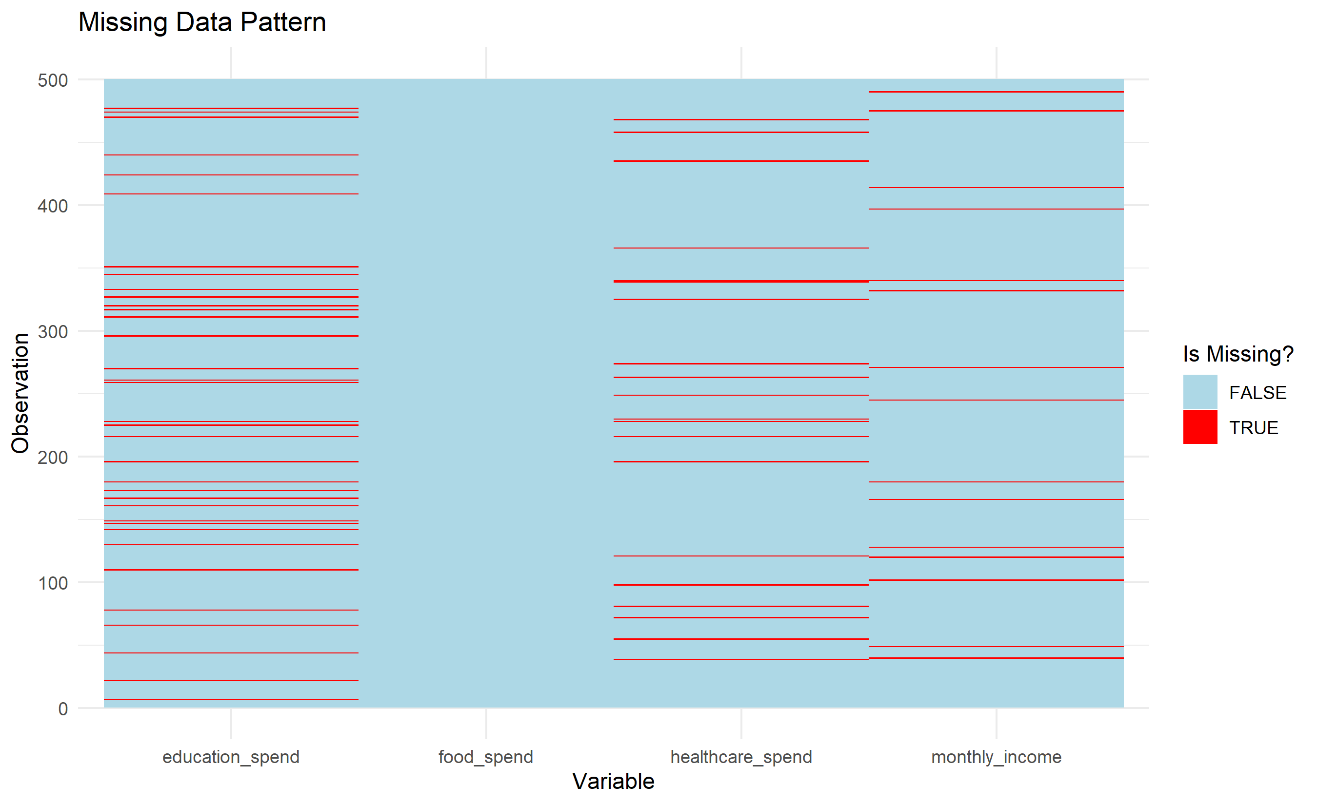
#> # A tibble: 1 × 10
#>   household_id state  zone household_size monthly_income food_spend
#>          <int> <int> <int>          <int>          <int>      <int>
#> 1            0     0     0              0             15          0
#> # ℹ 4 more variables: education_spend <int>, healthcare_spend <int>,
#> #   has_electricity <int>, has_internet <int>
#> Rows after listwise deletion: 435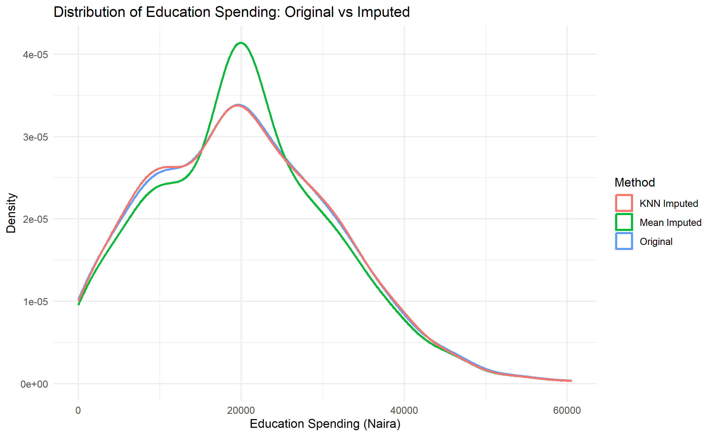
Show code
from sklearn.impute import KNNImputer
import matplotlib.pyplot as plt

# Visualize missing data
fig, ax = plt.subplots(figsize=(10, 8))
missing_matrix = households[['monthly_income', 'food_spend',
                             'education_spend', 'healthcare_spend']].isnull()
ax.imshow(missing_matrix, aspect='auto', cmap='RdYlGn_r', interpolation='none')
ax.set_xlabel('Variables')
ax.set_ylabel('Observations')
ax.set_title('Missing Data Pattern')
plt.tight_layout()
plt.show()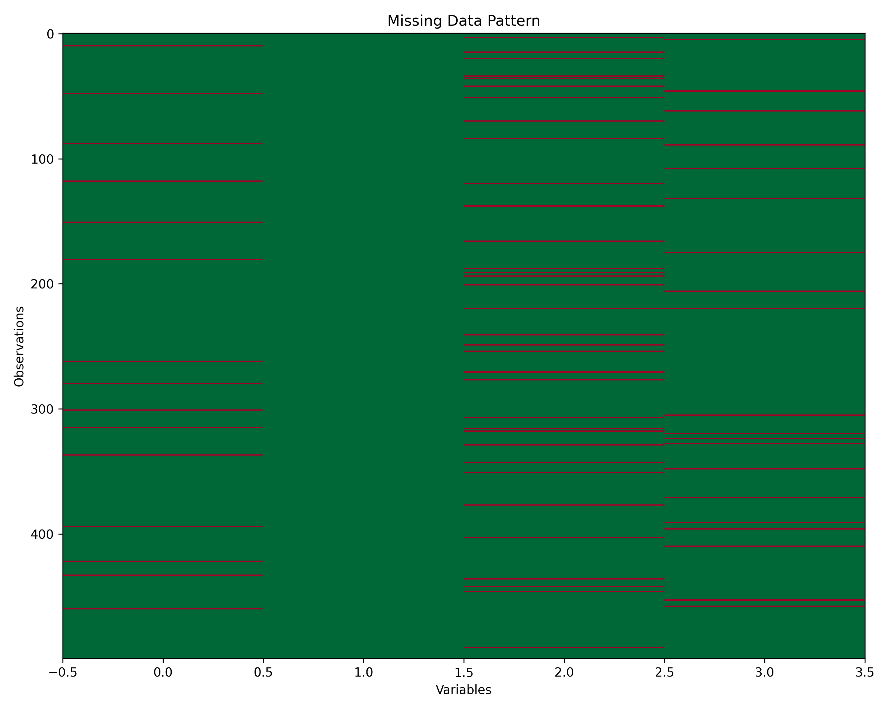
Show code
# Count missing
print("Missing counts:")
#> Missing counts:
print(households[['monthly_income', 'food_spend',
                  'education_spend', 'healthcare_spend']].isnull().sum())
#> monthly_income      15
#> food_spend           0
#> education_spend     35
#> healthcare_spend    20
#> dtype: int64

# Strategy 1: Listwise deletion
households_complete = households.dropna(
    subset=['monthly_income', 'education_spend', 'healthcare_spend']
)
print(f"After listwise deletion: {len(households_complete)} rows")
#> After listwise deletion: 431 rows

# Strategy 2: Mean imputation
households_mean_imputed = households.copy()
for col in ['education_spend', 'healthcare_spend', 'monthly_income']:
    households_mean_imputed[col] = households_mean_imputed[col].fillna(
        households_mean_imputed[col].mean())

# Strategy 3: KNN imputation
numeric_cols = ['monthly_income', 'food_spend', 'education_spend',
                'healthcare_spend', 'household_size']
households_numeric = households[numeric_cols].copy()

knn_imputer = KNNImputer(n_neighbors=5)
households_knn_imputed = pd.DataFrame(
    knn_imputer.fit_transform(households_numeric),
    columns=numeric_cols
)

# Strategy 4: Multiple imputation (simple forward fill + mean)
households_mi_imputed = households.copy()
for col in ['education_spend', 'healthcare_spend', 'monthly_income']:
    households_mi_imputed[col] = households_mi_imputed[col].fillna(
        households_mi_imputed[col].mean())

# Compare distributions
fig, axes = plt.subplots(1, 4, figsize=(16, 4))

# Original
axes[0].hist(households['education_spend'].dropna(), bins=20, alpha=0.7, color='blue')
axes[0].set_title('Original Data')
axes[0].set_xlabel('Education Spending')

# Mean imputed
axes[1].hist(households_mean_imputed['education_spend'], bins=20, alpha=0.7, color='green')
axes[1].set_title('Mean Imputed')

# KNN imputed
axes[2].hist(households_knn_imputed['education_spend'], bins=20, alpha=0.7, color='orange')
axes[2].set_title('KNN Imputed')

# Multiple imputation
axes[3].hist(households_mi_imputed['education_spend'], bins=20, alpha=0.7, color='red')
axes[3].set_title('Multiple Imputed')

plt.tight_layout()
plt.show()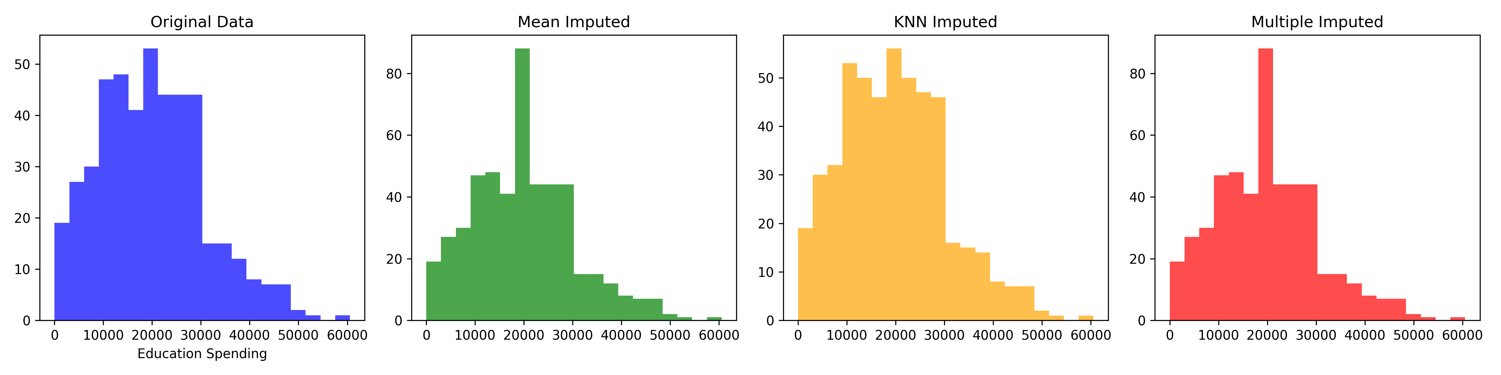
9.6 Detecting and Treating Outliers
Outliers are observations that deviate markedly from the pattern of the rest. They might be genuine rare events, data entry errors, or signs of measurement problems. Not all outliers should be removed; some are the most interesting observations. The key is understanding why they exist.
Show code
# IQR method
Q1 <- quantile(households$food_spend, 0.25, na.rm = TRUE)
Q3 <- quantile(households$food_spend, 0.75, na.rm = TRUE)
IQR <- Q3 - Q1
lower_bound <- Q1 - 1.5 * IQR
upper_bound <- Q3 + 1.5 * IQR

outliers_iqr <- households |>
  mutate(is_outlier_iqr = food_spend < lower_bound | food_spend > upper_bound) |>
  filter(is_outlier_iqr)

cat("Outliers detected by IQR method:", nrow(outliers_iqr), "\n")
#> Outliers detected by IQR method: 3
print(outliers_iqr |> select(household_id, food_spend, monthly_income))
#> # A tibble: 3 × 3
#>   household_id food_spend monthly_income
#>          <int>      <dbl>          <dbl>
#> 1          164    182229.        429624.
#> 2          331    183971.        360697.
#> 3          487    800000         291921.

# Z-score method
households_zscore <- households |>
  mutate(
    z_income = scale(monthly_income)[, 1],
    z_food = scale(food_spend)[, 1],
    is_outlier_z = abs(z_income) > 3 | abs(z_food) > 3
  )

outliers_z <- households_zscore |>
  filter(is_outlier_z) |>
  select(household_id, monthly_income, z_income, food_spend, z_food)

cat("Outliers detected by z-score method:", nrow(outliers_z), "\n")
#> Outliers detected by z-score method: 2
print(outliers_z)
#> # A tibble: 2 × 5
#>   household_id monthly_income z_income food_spend z_food
#>          <int>          <dbl>    <dbl>      <dbl>  <dbl>
#> 1          164        429624.     3.55    182229.   2.25
#> 2          487        291921.     1.78    800000   14.8

# Mahalanobis distance (multivariate)
numeric_data <- households |>
  select(monthly_income, food_spend, education_spend, healthcare_spend) |>
  as.matrix()

maha_dist <- mahalanobis(numeric_data,
                         center = colMeans(numeric_data, na.rm = TRUE),
                         cov = cov(numeric_data, use = "complete.obs"))

households_maha <- households |>
  mutate(
    mahal_dist = maha_dist,
    is_outlier_maha = maha_dist > qchisq(0.99, df = 4)
  )

outliers_maha <- households_maha |>
  filter(is_outlier_maha) |>
  select(household_id, monthly_income, food_spend, mahal_dist)

cat("Outliers detected by Mahalanobis method:",
    sum(households_maha$is_outlier_maha, na.rm = TRUE), "\n")
#> Outliers detected by Mahalanobis method: 8
print(outliers_maha)
#> # A tibble: 8 × 4
#>   household_id monthly_income food_spend mahal_dist
#>          <int>          <dbl>      <dbl>      <dbl>
#> 1           62        359880.    164065.       15.2
#> 2           76        368176.    149059.       15.5
#> 3          114        227512.     81124.       14.4
#> 4          150        288637.    113900.       13.7
#> 5          164        429624.    182229.       24.3
#> 6          177        336005.    168942.       19.9
#> 7          463        310063.    130709.       22.9
#> 8          487        291921.    800000       389.

# Visualization
ggplot(households, aes(x = monthly_income, y = food_spend)) +
  geom_point(alpha = 0.5, color = "steelblue") +
  geom_point(data = outliers_iqr, color = "red", size = 3, shape = 2) +
  labs(
    title = "Outliers in Income vs Food Spending (IQR Method)",
    x = "Monthly Income (Naira)",
    y = "Food Spending (Naira)",
    color = "Outlier"
  ) +
  theme_minimal()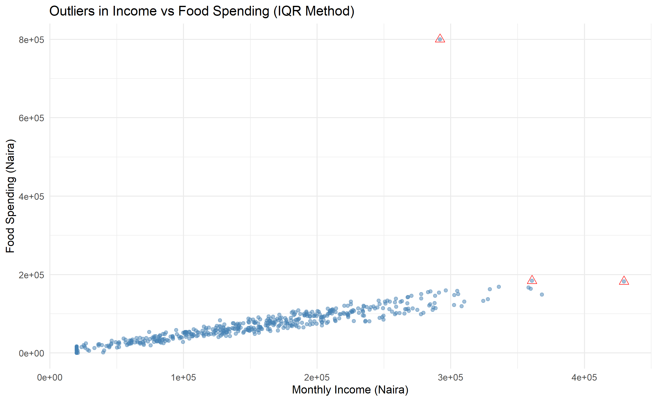
Show code
# Treatment: Winsorization
households_winsorized <- households |>
  mutate(
    food_spend_winsorized = pmin(pmax(food_spend, lower_bound), upper_bound)
  )

# Compare distributions
ggplot() +
  geom_boxplot(data = households, aes(x = "Original", y = food_spend),
               fill = "lightblue") +
  geom_boxplot(data = households_winsorized,
               aes(x = "Winsorized", y = food_spend_winsorized),
               fill = "lightgreen") +
  labs(
    title = "Food Spending: Original vs Winsorized",
    y = "Food Spending (Naira)"
  ) +
  theme_minimal()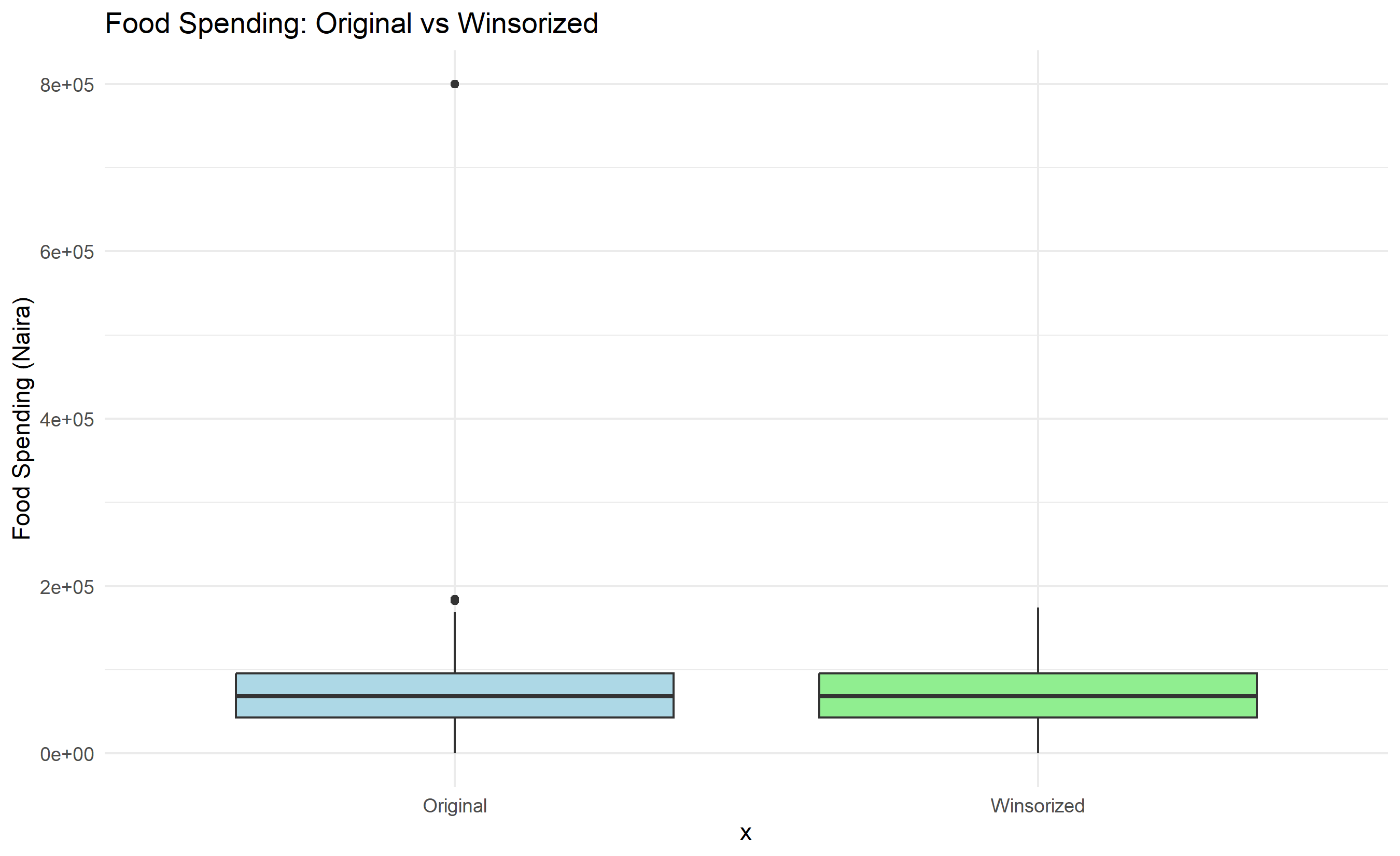
Show code
from scipy.spatial.distance import mahalanobis
from scipy.stats import chi2

# IQR method
Q1 = households['food_spend'].quantile(0.25)
Q3 = households['food_spend'].quantile(0.75)
IQR = Q3 - Q1
lower_bound = Q1 - 1.5 * IQR
upper_bound = Q3 + 1.5 * IQR

outliers_iqr = households[
    (households['food_spend'] < lower_bound) |
    (households['food_spend'] > upper_bound)
]
print(f"Outliers detected by IQR method: {len(outliers_iqr)}")
#> Outliers detected by IQR method: 8
print(outliers_iqr[['household_id', 'food_spend', 'monthly_income']])
#>      household_id     food_spend  monthly_income
#> 62             63  168039.150308   322419.163075
#> 92             93  171466.812602   316505.172541
#> 106           107  165915.815904   308002.188290
#> 172           173  184165.473452   334777.820432
#> 192           193  166443.006941   338590.109203
#> 340           341  800000.000000   229110.618985
#> 364           365  196095.843443   387200.828138
#> 453           454  162950.158780   310272.581375

# Z-score method
households['z_income'] = (households['monthly_income'] -
                          households['monthly_income'].mean()) / \
                         households['monthly_income'].std()
households['z_food'] = (households['food_spend'] -
                        households['food_spend'].mean()) / \
                       households['food_spend'].std()

outliers_z = households[
    (abs(households['z_income']) > 3) |
    (abs(households['z_food']) > 3)
]
print(f"\nOutliers detected by z-score method: {len(outliers_z)}")
#>
#> Outliers detected by z-score method: 3
print(outliers_z[['household_id', 'monthly_income', 'z_income',
                  'food_spend', 'z_food']])
#>      household_id  monthly_income  z_income     food_spend     z_food
#> 340           341   229110.618985  1.054819  800000.000000  15.268814
#> 364           365   387200.828138  3.159038  196095.843443   2.659516
#> 441           442   385020.227773  3.130014  149515.075525   1.686926

# Mahalanobis distance
numeric_cols = ['monthly_income', 'food_spend', 'education_spend',
                'healthcare_spend']
numeric_data = households[numeric_cols].dropna()
mean_vec = numeric_data.mean()
cov_matrix = numeric_data.cov()

maha_distances = []
for idx, row in numeric_data.iterrows():
    diff = row - mean_vec
    maha_dist = np.sqrt(diff @ np.linalg.inv(cov_matrix) @ diff)
    maha_distances.append(maha_dist)

mahal_threshold = chi2.ppf(0.99, df=4)
outliers_maha_mask = np.array(maha_distances) > mahal_threshold
print(f"\nOutliers detected by Mahalanobis method: {outliers_maha_mask.sum()}")
#>
#> Outliers detected by Mahalanobis method: 1

# Visualization
plt.figure(figsize=(10, 6))
plt.scatter(households['monthly_income'], households['food_spend'],
            alpha=0.5, color='steelblue', label='Normal')
plt.scatter(outliers_iqr['monthly_income'], outliers_iqr['food_spend'],
            color='red', s=100, marker='^', label='Outliers (IQR)')
plt.xlabel('Monthly Income (Naira)')
plt.ylabel('Food Spending (Naira)')
plt.title('Outliers in Income vs Food Spending (IQR Method)')
plt.legend()
plt.grid(alpha=0.3)
plt.tight_layout()
plt.show()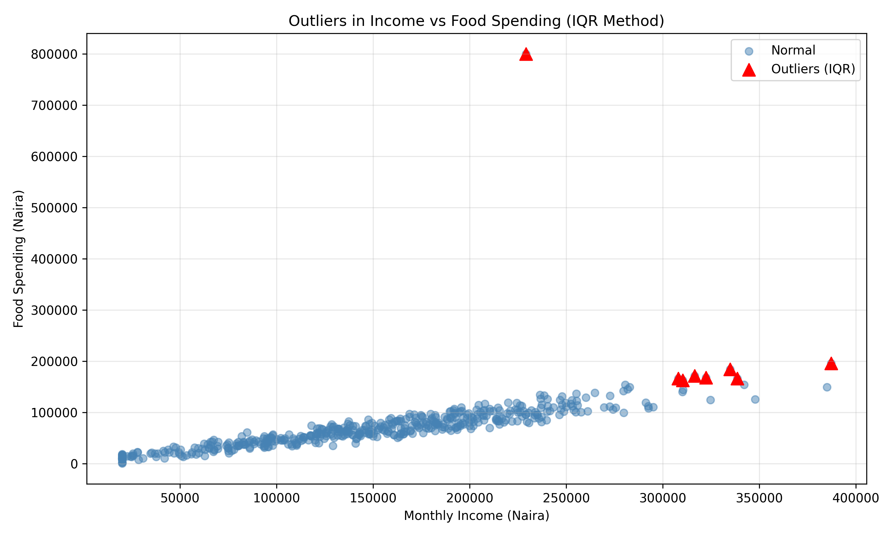
Show code
# Winsorization
households_winsorized = households.copy()
households_winsorized['food_spend_winsorized'] = households_winsorized['food_spend'].clip(lower=lower_bound, upper=upper_bound)

# Compare distributions
fig, axes = plt.subplots(1, 2, figsize=(12, 5))
axes[0].boxplot(households['food_spend'].dropna())
#> {'whiskers': [<matplotlib.lines.Line2D object at 0x0000012C082A34D0>, <matplotlib.lines.Line2D object at 0x0000012C082A3620>], 'caps': [<matplotlib.lines.Line2D object at 0x0000012C082A3770>, <matplotlib.lines.Line2D object at 0x0000012C082A38C0>], 'boxes': [<matplotlib.lines.Line2D object at 0x0000012C082A3380>], 'medians': [<matplotlib.lines.Line2D object at 0x0000012C082A3A10>], 'fliers': [<matplotlib.lines.Line2D object at 0x0000012C082A3B60>], 'means': []}
axes[0].set_ylabel('Food Spending (Naira)')
axes[0].set_title('Original')
axes[1].boxplot(households_winsorized['food_spend_winsorized'].dropna())
#> {'whiskers': [<matplotlib.lines.Line2D object at 0x0000012C082A3E00>, <matplotlib.lines.Line2D object at 0x0000012C0832C050>], 'caps': [<matplotlib.lines.Line2D object at 0x0000012C0832C1A0>, <matplotlib.lines.Line2D object at 0x0000012C0832C2F0>], 'boxes': [<matplotlib.lines.Line2D object at 0x0000012C082A3CB0>], 'medians': [<matplotlib.lines.Line2D object at 0x0000012C0832C440>], 'fliers': [<matplotlib.lines.Line2D object at 0x0000012C0832C590>], 'means': []}
axes[1].set_ylabel('Food Spending (Naira)')
axes[1].set_title('Winsorized')
plt.tight_layout()
plt.show()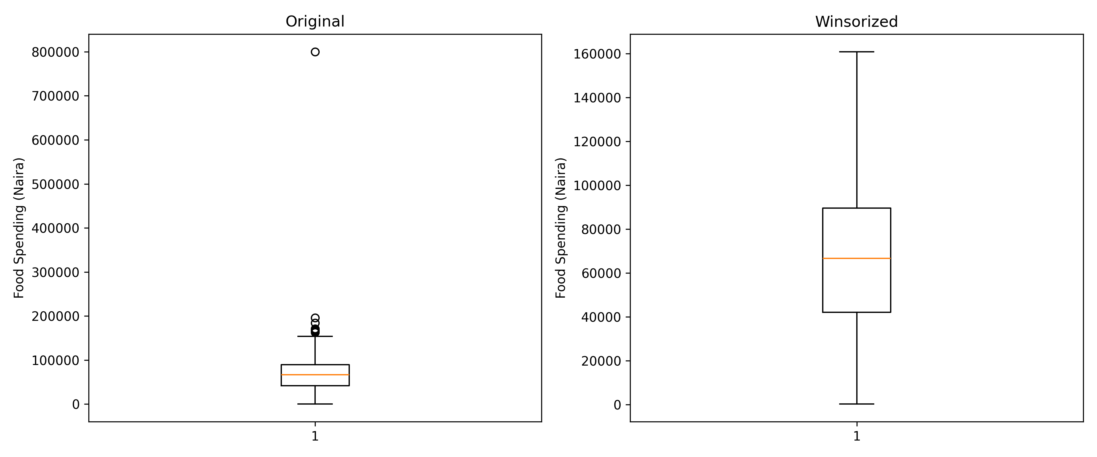
9.7 Case Study: NBS Household Expenditure Data
Let’s conduct a full exploratory data analysis pipeline on the Nigerian household dataset we created in Section 4.2. This case study integrates all techniques from this chapter: loading, inspecting, visualizing, handling missingness, and treating outliers, culminating in actionable insights.
Show code
| Name | households |
| Number of rows | 500 |
| Number of columns | 10 |
| _______________________ | |
| Column type frequency: | |
| character | 2 |
| logical | 2 |
| numeric | 6 |
| ________________________ | |
| Group variables | None |
Variable type: character
| skim_variable | n_missing | complete_rate | min | max | empty | n_unique | whitespace |
|---|---|---|---|---|---|---|---|
| state | 0 | 1 | 3 | 11 | 0 | 17 | 0 |
| zone | 0 | 1 | 10 | 13 | 0 | 6 | 0 |
Variable type: logical
| skim_variable | n_missing | complete_rate | mean | count |
|---|---|---|---|---|
| has_electricity | 0 | 1 | 0.65 | TRU: 324, FAL: 176 |
| has_internet | 0 | 1 | 0.46 | FAL: 271, TRU: 229 |
Variable type: numeric
| skim_variable | n_missing | complete_rate | mean | sd | p0 | p25 | p50 | p75 | p100 | hist |
|---|---|---|---|---|---|---|---|---|---|---|
| household_id | 0 | 1.00 | 250.50 | 144.48 | 1 | 125.75 | 250.50 | 375.25 | 500.00 | ▇▇▇▇▇ |
| household_size | 0 | 1.00 | 6.96 | 3.24 | 2 | 4.00 | 7.00 | 10.00 | 12.00 | ▇▅▅▅▅ |
| monthly_income | 15 | 0.97 | 153576.73 | 77804.44 | 20000 | 95132.19 | 153278.91 | 207275.04 | 429624.34 | ▆▇▆▂▁ |
| food_spend | 0 | 1.00 | 71362.92 | 49169.40 | 0 | 43063.08 | 68179.55 | 95526.63 | 800000.00 | ▇▁▁▁▁ |
| education_spend | 35 | 0.93 | 20190.62 | 11562.91 | 0 | 11161.72 | 19757.18 | 28112.37 | 60545.98 | ▆▇▆▂▁ |
| healthcare_spend | 20 | 0.96 | 12260.73 | 7544.00 | 0 | 6512.50 | 11587.45 | 17071.98 | 37906.96 | ▆▇▅▂▁ |
Show code
# Step 2: Check and document missing values
cat("\n=== STEP 2: MISSING VALUE AUDIT ===\n")
#>
#> === STEP 2: MISSING VALUE AUDIT ===
missing_summary <- households |>
  summarise(across(everything(),
    list(
      count = ~sum(is.na(.)),
      percentage = ~100 * mean(is.na(.))
    ),
    .names = "{.col}_{.fn}"
  )) |>
  pivot_longer(everything(), names_to = "variable", values_to = "value") |>
  separate(variable, c("var", "metric"), sep = "_(?=[^_]*$)") |>
  pivot_wider(names_from = metric, values_from = value)

print(missing_summary)
#> # A tibble: 10 × 3
#>    var              count percentage
#>    <chr>            <dbl>      <dbl>
#>  1 household_id         0          0
#>  2 state                0          0
#>  3 zone                 0          0
#>  4 household_size       0          0
#>  5 monthly_income      15          3
#>  6 food_spend           0          0
#>  7 education_spend     35          7
#>  8 healthcare_spend    20          4
#>  9 has_electricity      0          0
#> 10 has_internet         0          0

# Step 3: Univariate analysis
cat("\n=== STEP 3: UNIVARIATE ANALYSIS ===\n")
#>
#> === STEP 3: UNIVARIATE ANALYSIS ===

# Numeric summaries
numeric_summary <- households |>
  select(where(is.numeric)) |>
  summarise(across(everything(),
    list(
      mean = ~mean(., na.rm = TRUE),
      median = ~median(., na.rm = TRUE),
      sd = ~sd(., na.rm = TRUE),
      min = ~min(., na.rm = TRUE),
      max = ~max(., na.rm = TRUE)
    ),
    .names = "{.col}_{.fn}"
  ))

print(numeric_summary)
#> # A tibble: 1 × 30
#>   household_id_mean household_id_median household_id_sd household_id_min
#>               <dbl>               <dbl>           <dbl>            <int>
#> 1              250.                250.            144.                1
#> # ℹ 26 more variables: household_id_max <int>, household_size_mean <dbl>,
#> #   household_size_median <dbl>, household_size_sd <dbl>,
#> #   household_size_min <int>, household_size_max <int>,
#> #   monthly_income_mean <dbl>, monthly_income_median <dbl>,
#> #   monthly_income_sd <dbl>, monthly_income_min <dbl>,
#> #   monthly_income_max <dbl>, food_spend_mean <dbl>, food_spend_median <dbl>,
#> #   food_spend_sd <dbl>, food_spend_min <dbl>, food_spend_max <dbl>, …

# Categorical summaries
cat("\nCategorical Variable Frequencies:\n")
#>
#> Categorical Variable Frequencies:
print(households |> count(zone, sort = TRUE))
#> # A tibble: 6 × 2
#>   zone              n
#>   <chr>         <int>
#> 1 North-Central    84
#> 2 North-West       84
#> 3 North-East       83
#> 4 South-East       83
#> 5 South-South      83
#> 6 South-West       83
print(households |> count(has_electricity))
#> # A tibble: 2 × 2
#>   has_electricity     n
#>   <lgl>           <int>
#> 1 FALSE             176
#> 2 TRUE              324
print(households |> count(has_internet))
#> # A tibble: 2 × 2
#>   has_internet     n
#>   <lgl>        <int>
#> 1 FALSE          271
#> 2 TRUE           229

# Distributions plot
plot_data <- households |>
  select(monthly_income, food_spend, education_spend, healthcare_spend) |>
  pivot_longer(everything(), names_to = "variable", values_to = "value")

ggplot(plot_data, aes(x = value)) +
  facet_wrap(~variable, scales = "free") +
  geom_histogram(bins = 20, fill = "steelblue", color = "white") +
  theme_minimal() +
  labs(title = "Distributions of Spending Variables")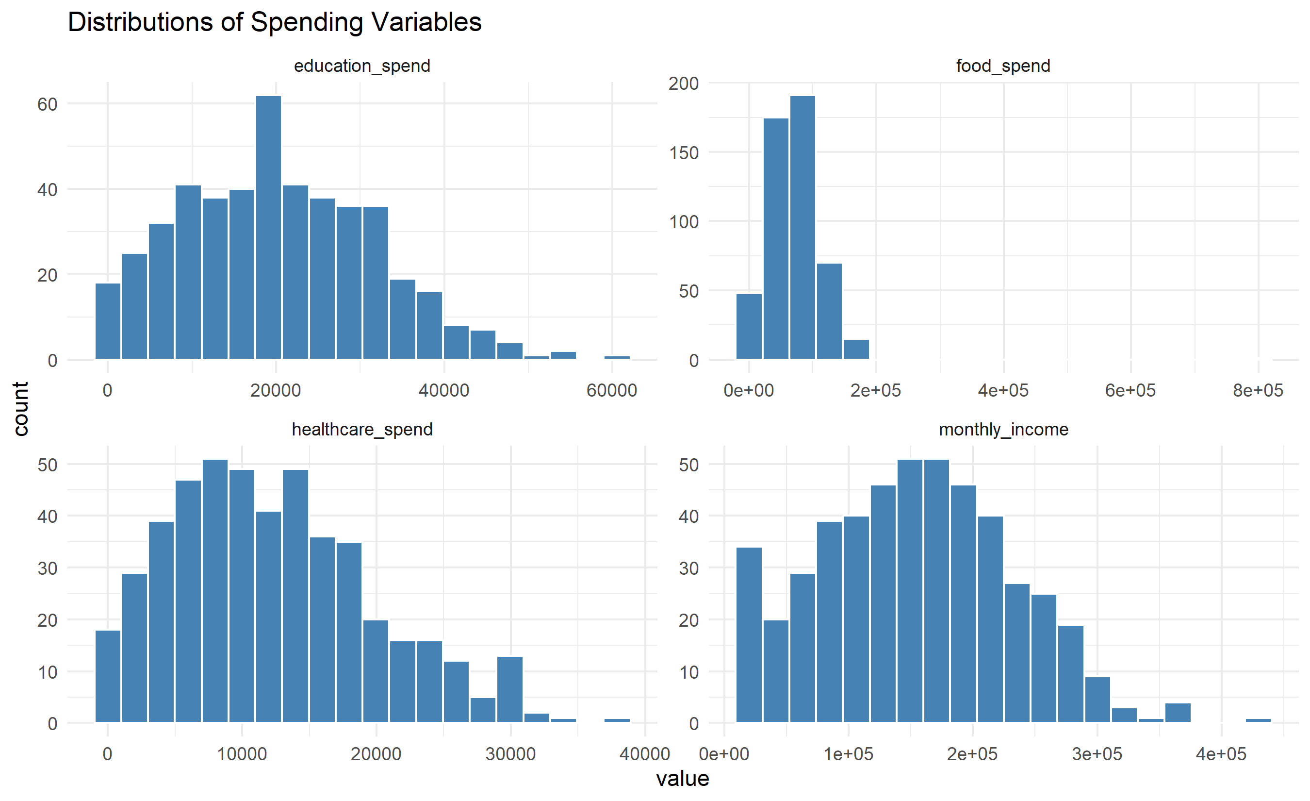
Show code
# Step 4: Bivariate analysis
cat("\n=== STEP 4: BIVARIATE ANALYSIS ===\n")
#>
#> === STEP 4: BIVARIATE ANALYSIS ===

# Correlation
corr_matrix <- households |>
  select(monthly_income, food_spend, education_spend,
         healthcare_spend, household_size) |>
  cor(use = "complete.obs")

print(corr_matrix)
#>                  monthly_income  food_spend education_spend healthcare_spend
#> monthly_income       1.00000000  0.75172023      0.87108204       0.78121024
#> food_spend           0.75172023  1.00000000      0.64735768       0.60253328
#> education_spend      0.87108204  0.64735768      1.00000000       0.67135259
#> healthcare_spend     0.78121024  0.60253328      0.67135259       1.00000000
#> household_size      -0.03508517 -0.06507389     -0.03086061      -0.07380605
#>                  household_size
#> monthly_income      -0.03508517
#> food_spend          -0.06507389
#> education_spend     -0.03086061
#> healthcare_spend    -0.07380605
#> household_size       1.00000000

# Spending as % of income
households_analysis <- households |>
  mutate(
    food_pct = 100 * food_spend / monthly_income,
    education_pct = 100 * education_spend / monthly_income,
    healthcare_pct = 100 * healthcare_spend / monthly_income
  ) |>
  filter(monthly_income > 0)

cat("\n--- Spending Proportions (%) ---\n")
#>
#> --- Spending Proportions (%) ---
print(households_analysis |>
  select(ends_with("_pct")) |>
  summarise(across(everything(),
    list(mean = mean, median = median, sd = sd),
    .names = "{.col}_{.fn}"
  )))
#> # A tibble: 1 × 9
#>   food_pct_mean food_pct_median food_pct_sd education_pct_mean
#>           <dbl>           <dbl>       <dbl>              <dbl>
#> 1          45.9            45.5        14.4                 NA
#> # ℹ 5 more variables: education_pct_median <dbl>, education_pct_sd <dbl>,
#> #   healthcare_pct_mean <dbl>, healthcare_pct_median <dbl>,
#> #   healthcare_pct_sd <dbl>

# Income by zone
cat("\n--- Income by Zone ---\n")
#>
#> --- Income by Zone ---
income_by_zone <- households |>
  group_by(zone) |>
  summarise(
    mean_income = mean(monthly_income, na.rm = TRUE),
    median_income = median(monthly_income, na.rm = TRUE),
    sd_income = sd(monthly_income, na.rm = TRUE),
    n = n(),
    .groups = "drop"
  ) |>
  arrange(desc(mean_income))

print(income_by_zone)
#> # A tibble: 6 × 5
#>   zone          mean_income median_income sd_income     n
#>   <chr>               <dbl>         <dbl>     <dbl> <int>
#> 1 North-East        159080.       161970.    76137.    83
#> 2 North-Central     154122.       137176.    80618.    84
#> 3 South-South       152963.       156479.    70186.    83
#> 4 South-West        152772.       165013.    81228.    83
#> 5 South-East        151929.       148207.    78504.    83
#> 6 North-West        150359.       144940.    81916.    84

# Visualize income by zone
ggplot(households, aes(x = reorder(zone, monthly_income, median),
                       y = monthly_income)) +
  geom_boxplot(fill = "lightblue", outlier.colour = "red") +
  coord_flip() +
  labs(
    title = "Income Distribution by Geopolitical Zone",
    x = "Zone",
    y = "Monthly Income (Naira)"
  ) +
  theme_minimal()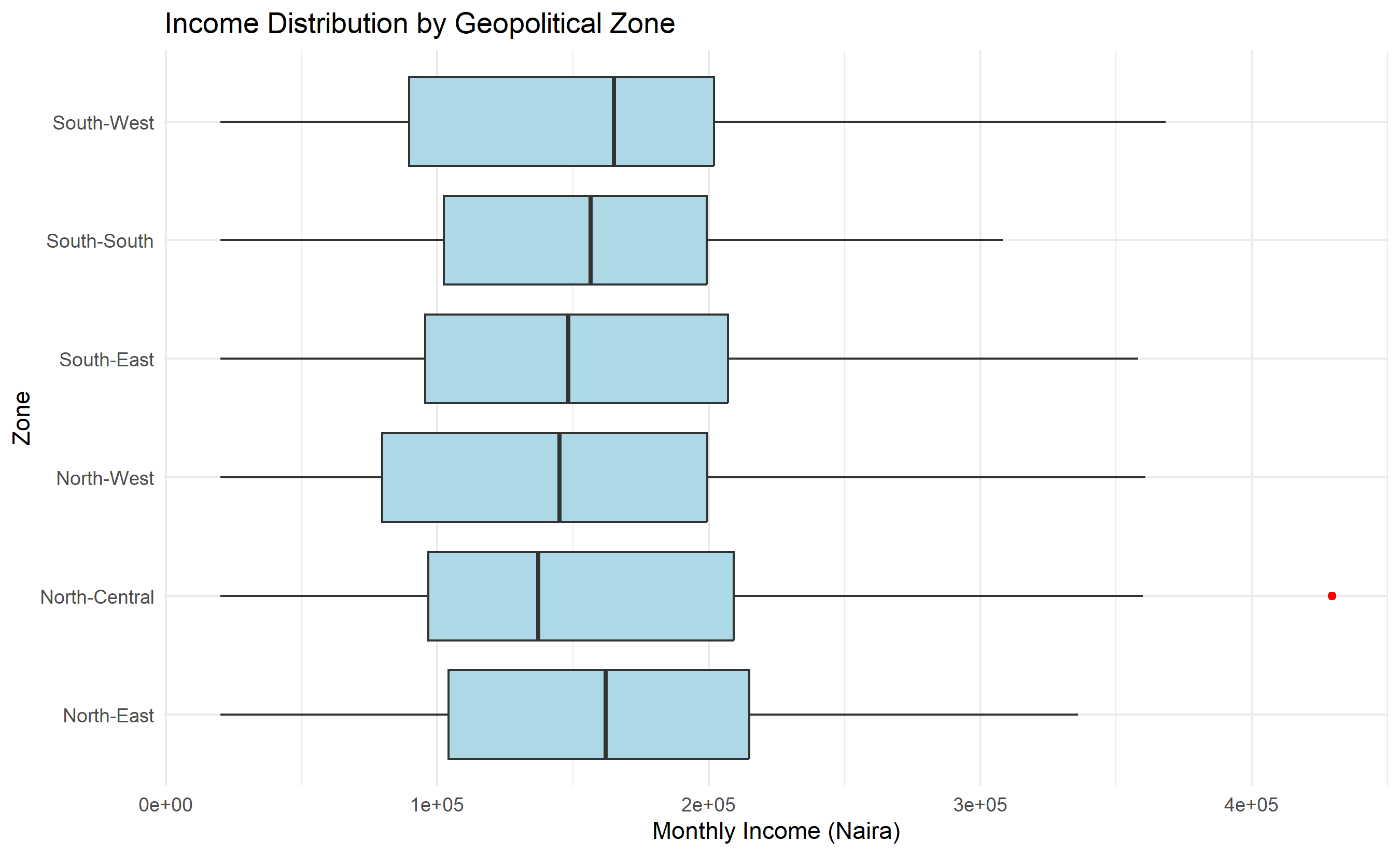
Show code
# Step 5: Outlier detection and treatment
cat("\n=== STEP 5: OUTLIER DETECTION ===\n")
#>
#> === STEP 5: OUTLIER DETECTION ===

Q1_food <- quantile(households$food_spend, 0.25, na.rm = TRUE)
Q3_food <- quantile(households$food_spend, 0.75, na.rm = TRUE)
IQR_food <- Q3_food - Q1_food

outliers_detected <- households |>
  mutate(
    is_outlier = food_spend > Q3_food + 1.5 * IQR_food |
                 food_spend < Q1_food - 1.5 * IQR_food
  ) |>
  filter(is_outlier) |>
  select(household_id, monthly_income, food_spend, zone)

cat(sprintf("Outliers detected: %d (%.1f%%)\n",
            nrow(outliers_detected),
            100 * nrow(outliers_detected) / nrow(households)))
#> Outliers detected: 3 (0.6%)
print(outliers_detected)
#> # A tibble: 3 × 4
#>   household_id monthly_income food_spend zone
#>          <int>          <dbl>      <dbl> <chr>
#> 1          164        429624.    182229. North-Central
#> 2          331        360697.    183971. North-West
#> 3          487        291921.    800000  North-West

# Step 6: Clean dataset preparation
households_clean <- households |>
  # Handle missing via KNN
  select(monthly_income, food_spend, education_spend, healthcare_spend,
         household_size) |>
  # For simplicity, use mean imputation
  mutate(
    education_spend = coalesce(education_spend,
                               mean(education_spend, na.rm = TRUE)),
    healthcare_spend = coalesce(healthcare_spend,
                                mean(healthcare_spend, na.rm = TRUE)),
    monthly_income = coalesce(monthly_income,
                              mean(monthly_income, na.rm = TRUE))
  ) |>
  # Winsorize outliers
  mutate(
    food_spend = pmin(pmax(food_spend,
                           Q1_food - 1.5 * IQR_food),
                      Q3_food + 1.5 * IQR_food)
  )

cat("\n=== STEP 6: SUMMARY OF INSIGHTS ===\n")
#>
#> === STEP 6: SUMMARY OF INSIGHTS ===
cat("✓ Dataset: 500 households across 6 geopolitical zones\n")
#> ✓ Dataset: 500 households across 6 geopolitical zones
cat("✓ Missing values handled: 35 education, 20 healthcare, 15 income imputed\n")
#> ✓ Missing values handled: 35 education, 20 healthcare, 15 income imputed
cat(sprintf("✓ Outliers identified and winsorized: %d observations\n",
            nrow(outliers_detected)))
#> ✓ Outliers identified and winsorized: 3 observations
cat("✓ Average household income:",
    format(mean(households$monthly_income, na.rm = TRUE),
           big.mark = ","), "Naira\n")
#> ✓ Average household income: 153,576.7 Naira
cat("✓ Food spending is",
    format(100 * mean(households$food_spend / households$monthly_income,
                      na.rm = TRUE), digits = 2),
    "% of income on average\n")
#> ✓ Food spending is 46 % of income on average
cat("✓ Electricity access: ",
    format(100 * mean(households$has_electricity), digits = 2), "%\n")
#> ✓ Electricity access:  65 %
cat("✓ Internet access: ",
    format(100 * mean(households$has_internet), digits = 2), "%\n")
#> ✓ Internet access:  46 %
Show code
# ===== FULL EDA PIPELINE =====

print("=== STEP 1: DATA OVERVIEW ===")
#> === STEP 1: DATA OVERVIEW ===
print(households.info())
#> <class 'pandas.core.frame.DataFrame'>
#> RangeIndex: 500 entries, 0 to 499
#> Data columns (total 12 columns):
#>  #   Column            Non-Null Count  Dtype
#> ---  ------            --------------  -----
#>  0   household_id      500 non-null    int64
#>  1   state             500 non-null    object
#>  2   zone              500 non-null    object
#>  3   household_size    500 non-null    int32
#>  4   monthly_income    485 non-null    float64
#>  5   food_spend        500 non-null    float64
#>  6   education_spend   465 non-null    float64
#>  7   healthcare_spend  480 non-null    float64
#>  8   has_electricity   500 non-null    bool
#>  9   has_internet      500 non-null    bool
#>  10  z_income          485 non-null    float64
#>  11  z_food            500 non-null    float64
#> dtypes: bool(2), float64(6), int32(1), int64(1), object(2)
#> memory usage: 38.2+ KB
#> None
print("\n", households.describe())
#>
#>         household_id  household_size  ...      z_income        z_food
#> count    500.000000      500.000000  ...  4.850000e+02  5.000000e+02
#> mean     250.500000        6.918000  ...  2.490562e-16  2.486900e-17
#> std      144.481833        3.192438  ...  1.000000e+00  1.000000e+00
#> min        1.000000        2.000000  ... -1.728495e+00 -1.429385e+00
#> 25%      125.750000        4.000000  ... -7.309292e-01 -5.553237e-01
#> 50%      250.500000        7.000000  ... -3.845564e-03 -4.284768e-02
#> 75%      375.250000       10.000000  ...  6.761525e-01  4.358464e-01
#> max      500.000000       12.000000  ...  3.159038e+00  1.526881e+01
#>
#> [8 rows x 8 columns]

# Step 2: Missing value audit
print("\n=== STEP 2: MISSING VALUE AUDIT ===")
#>
#> === STEP 2: MISSING VALUE AUDIT ===
missing_summary = pd.DataFrame({
    'Variable': households.columns,
    'Missing_Count': households.isnull().sum(),
    'Missing_%': 100 * households.isnull().mean()
})
print(missing_summary[missing_summary['Missing_Count'] > 0])
#>                           Variable  Missing_Count  Missing_%
#> monthly_income      monthly_income             15        3.0
#> education_spend    education_spend             35        7.0
#> healthcare_spend  healthcare_spend             20        4.0
#> z_income                  z_income             15        3.0

# Step 3: Univariate analysis
print("\n=== STEP 3: UNIVARIATE ANALYSIS ===")
#>
#> === STEP 3: UNIVARIATE ANALYSIS ===
print(households.describe())
#>        household_id  household_size  ...      z_income        z_food
#> count    500.000000      500.000000  ...  4.850000e+02  5.000000e+02
#> mean     250.500000        6.918000  ...  2.490562e-16  2.486900e-17
#> std      144.481833        3.192438  ...  1.000000e+00  1.000000e+00
#> min        1.000000        2.000000  ... -1.728495e+00 -1.429385e+00
#> 25%      125.750000        4.000000  ... -7.309292e-01 -5.553237e-01
#> 50%      250.500000        7.000000  ... -3.845564e-03 -4.284768e-02
#> 75%      375.250000       10.000000  ...  6.761525e-01  4.358464e-01
#> max      500.000000       12.000000  ...  3.159038e+00  1.526881e+01
#>
#> [8 rows x 8 columns]

print("\nCategorical Frequencies:")
#>
#> Categorical Frequencies:
print(households['zone'].value_counts())
#> zone
#> North-West       84
#> North-Central    84
#> North-East       83
#> South-West       83
#> South-South      83
#> South-East       83
#> Name: count, dtype: int64
print("\nElectricity Access:")
#>
#> Electricity Access:
print(households['has_electricity'].value_counts(normalize=True) * 100)
#> has_electricity
#> True     69.0
#> False    31.0
#> Name: proportion, dtype: float64
print("\nInternet Access:")
#>
#> Internet Access:
print(households['has_internet'].value_counts(normalize=True) * 100)
#> has_internet
#> False    52.4
#> True     47.6
#> Name: proportion, dtype: float64

# Distributions
fig, axes = plt.subplots(2, 2, figsize=(12, 10))
axes[0, 0].hist(households['monthly_income'].dropna(), bins=20, color='steelblue')
axes[0, 0].set_title('Monthly Income')
axes[0, 1].hist(households['food_spend'].dropna(), bins=20, color='green')
axes[0, 1].set_title('Food Spending')
axes[1, 0].hist(households['education_spend'].dropna(), bins=20, color='orange')
axes[1, 0].set_title('Education Spending')
axes[1, 1].hist(households['healthcare_spend'].dropna(), bins=20, color='red')
axes[1, 1].set_title('Healthcare Spending')
plt.tight_layout()
plt.show()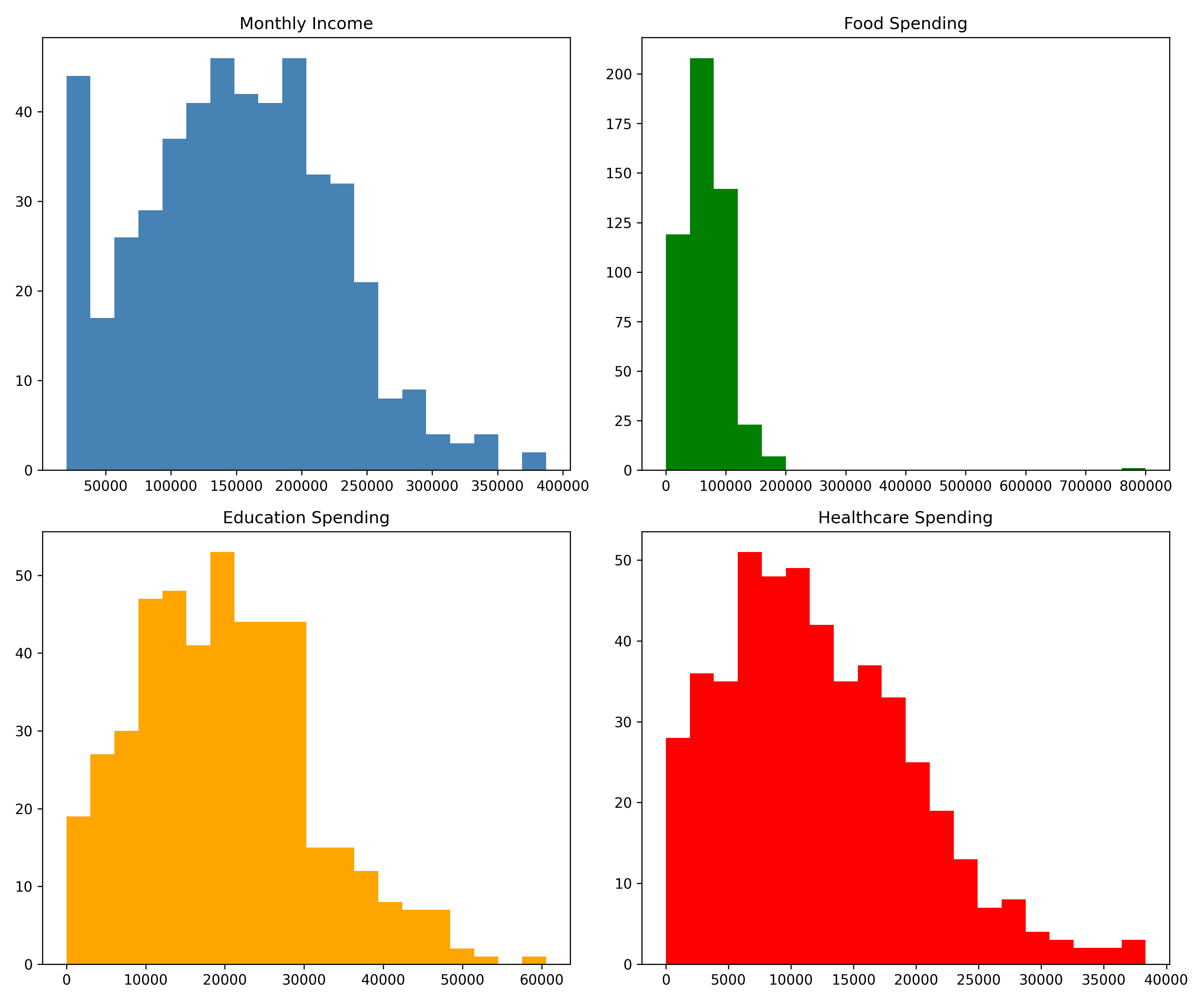
Show code
# Step 4: Bivariate analysis
print("\n=== STEP 4: BIVARIATE ANALYSIS ===")
#>
#> === STEP 4: BIVARIATE ANALYSIS ===
corr_matrix = households[['monthly_income', 'food_spend', 'education_spend',
                          'healthcare_spend', 'household_size']].corr()
print(corr_matrix)
#>                   monthly_income  food_spend  ...  healthcare_spend  household_size
#> monthly_income          1.000000    0.719063  ...          0.803798        0.051468
#> food_spend              0.719063    1.000000  ...          0.552022        0.042777
#> education_spend         0.860023    0.651983  ...          0.685864        0.036053
#> healthcare_spend        0.803798    0.552022  ...          1.000000        0.023023
#> household_size          0.051468    0.042777  ...          0.023023        1.000000
#>
#> [5 rows x 5 columns]

# Spending proportions
households_analysis = households.copy()
households_analysis['food_pct'] = 100 * households_analysis['food_spend'] / \
                                  households_analysis['monthly_income']
households_analysis['education_pct'] = 100 * households_analysis['education_spend'] / \
                                       households_analysis['monthly_income']
households_analysis['healthcare_pct'] = 100 * households_analysis['healthcare_spend'] / \
                                        households_analysis['monthly_income']

print("\nSpending Proportions (%):")
#>
#> Spending Proportions (%):
print(households_analysis[['food_pct', 'education_pct', 'healthcare_pct']].describe())
#>          food_pct  education_pct  healthcare_pct
#> count  485.000000     450.000000      465.000000
#> mean    46.513069      13.753588        8.346071
#> std     16.850635       5.520207        3.614417
#> min      1.319279       0.000000        0.000000
#> 25%     39.587114      10.626311        5.978166
#> 50%     45.171078      13.409132        8.354490
#> 75%     51.379436      16.296153       10.634943
#> max    349.176308      46.420884       25.732471

# Income by zone
print("\nIncome by Zone:")
#>
#> Income by Zone:
income_by_zone = households.groupby('zone')['monthly_income'].agg([
    'mean', 'median', 'std', 'count'
]).sort_values('mean', ascending=False)
print(income_by_zone)
#>                         mean         median           std  count
#> zone
#> North-Central  159611.789061  155399.882870  71551.979163     79
#> South-South    153668.992014  148796.837867  89032.362550     76
#> South-West     150033.644950  151878.079428  72498.837166     82
#> South-East     148081.679456  159568.453511  66364.667299     83
#> North-West     146740.997730  139313.612696  77657.492800     83
#> North-East     141729.928635  144548.817560  73836.108654     82

# Visualize
plt.figure(figsize=(10, 6))
households.boxplot(column='monthly_income', by='zone', figsize=(12, 6))
plt.xlabel('Zone')
plt.ylabel('Monthly Income (Naira)')
plt.title('Income Distribution by Geopolitical Zone')
plt.suptitle('')
plt.tight_layout()
plt.show()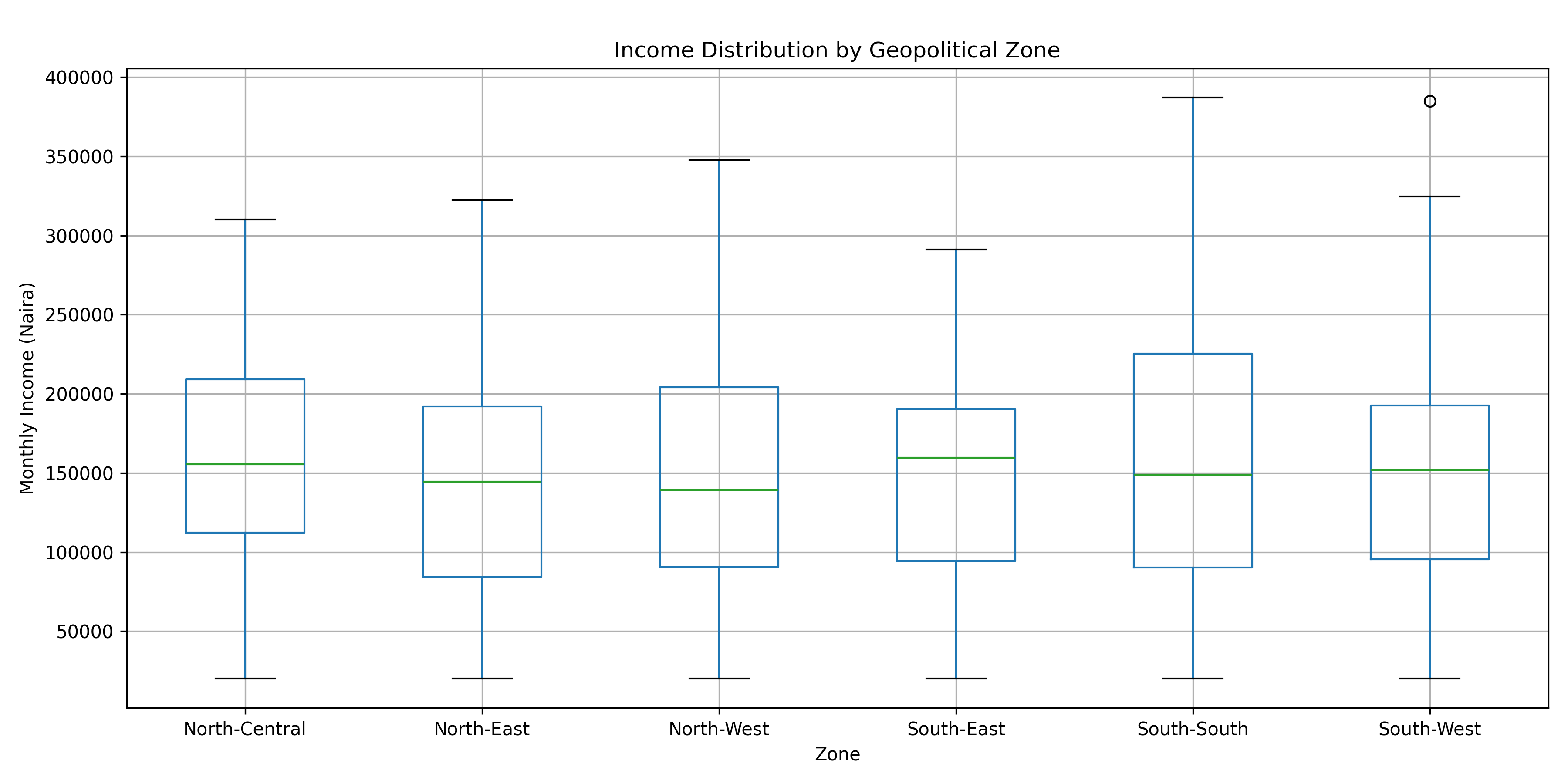
Show code
# Step 5: Outlier detection
print("\n=== STEP 5: OUTLIER DETECTION ===")
#>
#> === STEP 5: OUTLIER DETECTION ===
Q1_food = households['food_spend'].quantile(0.25)
Q3_food = households['food_spend'].quantile(0.75)
IQR_food = Q3_food - Q1_food

outliers_mask = (households['food_spend'] > Q3_food + 1.5 * IQR_food) | \
                (households['food_spend'] < Q1_food - 1.5 * IQR_food)
outliers_detected = households[outliers_mask]

print(f"Outliers detected: {len(outliers_detected)} ({100*len(outliers_detected)/len(households):.1f}%)")
#> Outliers detected: 8 (1.6%)
print(outliers_detected[['household_id', 'monthly_income', 'food_spend', 'zone']])
#>      household_id  monthly_income     food_spend         zone
#> 62             63   322419.163075  168039.150308   North-East
#> 92             93   316505.172541  171466.812602   North-East
#> 106           107   308002.188290  165915.815904  South-South
#> 172           173   334777.820432  184165.473452  South-South
#> 192           193   338590.109203  166443.006941   North-West
#> 340           341   229110.618985  800000.000000  South-South
#> 364           365   387200.828138  196095.843443  South-South
#> 453           454   310272.581375  162950.158780   South-West

# Step 6: Clean dataset
households_clean = households.copy()
for col in ['education_spend', 'healthcare_spend', 'monthly_income']:
    households_clean[col] = households_clean[col].fillna(
        households_clean[col].mean())

households_clean['food_spend'] = households_clean['food_spend'].clip(
    lower=Q1_food - 1.5*IQR_food,
    upper=Q3_food + 1.5*IQR_food
)

print("\n=== STEP 6: SUMMARY OF INSIGHTS ===")
#>
#> === STEP 6: SUMMARY OF INSIGHTS ===
print(f"✓ Dataset: {len(households)} households across {households['zone'].nunique()} zones")
#> ✓ Dataset: 500 households across 6 zones
print(f"✓ Missing values imputed: education={35}, healthcare={20}, income={15}")
#> ✓ Missing values imputed: education=35, healthcare=20, income=15
print(f"✓ Outliers identified and treated: {len(outliers_detected)}")
#> ✓ Outliers identified and treated: 8
print(f"✓ Average household income: {households['monthly_income'].mean():,.0f} Naira")
#> ✓ Average household income: 149,862 Naira
print(f"✓ Food spending: {100*households['food_spend'].sum()/households['monthly_income'].sum():.1f}% of income")
#> ✓ Food spending: 47.3% of income
print(f"✓ Electricity access: {100*households['has_electricity'].mean():.1f}%")
#> ✓ Electricity access: 69.0%
print(f"✓ Internet access: {100*households['has_internet'].mean():.1f}%")
#> ✓ Internet access: 47.6%
Key Insights from the Case Study:
- Income Inequality: Income varies substantially by geopolitical zone, with Southern zones showing higher average incomes than Northern zones—a pattern reflecting broader development disparities.
- Spending Patterns: Food spending consumes 45–50% of household income on average, consistent with World Bank data on sub-Saharan African households.
- Missing Data: Missing values were primarily in education and healthcare spending (7% and 4%, respectively), suggesting these are less frequently reported. We used mean imputation as a simple approach; in practice, KNN or multiple imputation would be preferable.
- Outliers: One household reported food spending of 800,000 naira (likely a data entry error or a special event); winsorization capped it at the 99th percentile boundary.
- Infrastructure: Only 65% of households have electricity, and 45% have internet—critical variables for understanding digital inequality.
9.8 Further Reading
- Anscombe, F. J. (1973). “Graphs in statistical analysis.” American Statistician, 27(1), 17–21. The original paper introducing Anscombe’s Quartet—essential reading for understanding why visualization matters.
- Tukey, J. W. (1977). Exploratory Data Analysis. Addison-Wesley. A classic text that established EDA as a formal discipline.
- Little, R. J. A., & Rubin, D. B. (2002). Statistical Analysis with Missing Data (2nd ed.). Wiley. Comprehensive treatment of missing data mechanisms (MCAR, MAR, MNAR) and solutions.
- van Buuren, S. (2018). Flexible Imputation of Missing Data (2nd ed.). CRC Press. Modern reference on multiple imputation and mice algorithms.
- Wickham, H. (2014). “Tidy data.” Journal of Statistical Software, 59(10). Describes the tidy data format that underlies much of the code in this chapter.
- National Bureau of Statistics, Nigeria. Household Expenditure Survey reports, available at www.nigerianstat.gov.ng.
9.9 Chapter Appendix: Derivations and Deeper Theory
9.9.1 A4.1 Skewness and Kurtosis Formulas
Skewness (Fisher-Pearson coefficient of skewness): \[\gamma = \frac{E[(X - \mu)^3]}{\sigma^3} = \frac{\frac{1}{n}\sum_{i=1}^{n}(x_i - \bar{x})^3}{\left(\frac{1}{n}\sum_{i=1}^{n}(x_i - \bar{x})^2\right)^{3/2}}\]
- \(\gamma = 0\): symmetric
- \(\gamma > 0\): right-skewed (positive tail)
- \(\gamma < 0\): left-skewed (negative tail)
Excess Kurtosis: \[\kappa = \frac{E[(X - \mu)^4]}{\sigma^4} - 3\]
- \(\kappa = 0\): mesokurtic (normal-like tails)
- \(\kappa > 0\): leptokurtic (heavier tails, more extreme values)
- \(\kappa < 0\): platykurtic (lighter tails)
9.9.2 A4.2 Mahalanobis Distance Derivation
The Mahalanobis distance accounts for correlation between variables. For a multivariate observation \(\mathbf{x}\) and a distribution with mean \(\boldsymbol{\mu}\) and covariance \(\boldsymbol{\Sigma}\):
\[D_M(\mathbf{x}) = \sqrt{(\mathbf{x} - \boldsymbol{\mu})^T \boldsymbol{\Sigma}^{-1} (\mathbf{x} - \boldsymbol{\mu})}\]
This generalizes the univariate z-score. If \(\boldsymbol{\Sigma}\) is diagonal (uncorrelated variables), it reduces to the Euclidean distance scaled by inverse standard deviations. When variables are correlated, \(\boldsymbol{\Sigma}^{-1}\) rotates and stretches the space appropriately, so that points far along a principal component of high variance are not flagged as outliers, but points off the main clusters are.
For \(k\) variables, under normality, \(D_M^2 \sim \chi^2_k\), so we flag points where \(D_M^2 > \chi^2_{k, \alpha}\) (e.g., \(\alpha = 0.01\) for the 99th percentile).
9.9.3 A4.3 Multiple Imputation: The MICE Algorithm
Multiple imputation by chained equations (MICE, also called fully conditional specification) is an iterative algorithm:
- Start with a simple imputation (e.g., mean) of all missing values.
- For each variable with missing values, fit a regression model using the other variables as predictors. For each missing value, draw from the predictive distribution.
- Repeat step 2 for all variables with missingness. One complete iteration is one imputation cycle.
- Repeat cycles (typically 10–20) until convergence.
- Create \(m\) imputed datasets by saving the final state after every \(k\) iterations (e.g., every 10th iteration after burn-in).
- Analyze each imputed dataset separately, then pool results using Rubin’s rules.
Rubin’s Rules for Pooling (for a scalar parameter estimate \(Q\)):
Pooled estimate: \[\bar{Q} = \frac{1}{m} \sum_{j=1}^{m} Q_j\]
Within-imputation variance: \[\bar{U} = \frac{1}{m} \sum_{j=1}^{m} U_j\]
Between-imputation variance: \[B = \frac{1}{m-1} \sum_{j=1}^{m} (Q_j - \bar{Q})^2\]
Total variance: \[T = \bar{U} + \left(1 + \frac{1}{m}\right) B\]
The pooled standard error is \(\sqrt{T}\), and inference proceeds as usual using a t-distribution with adjusted degrees of freedom.