---
title: "Customer Satisfaction Analytics"
---
```{python}
#| label: python-setup-42-customer-satisfaction
#| include: false
import numpy as np
import pandas as pd
import matplotlib.pyplot as plt
import seaborn as sns
from sklearn.preprocessing import StandardScaler
from sklearn.linear_model import LinearRegression
```
::: {.callout-note icon="false"}
## 📋 Learning Objectives
- Understand the relationship between satisfaction, loyalty, and revenue, and why each construct matters
- Master NPS (Net Promoter Score): calculation, benchmarks, and criticisms
- Compare CSAT, CES, and NPS: which metric predicts churn and loyalty best
- Analyse Likert-scale survey data: internal consistency, factor analysis, and measurement validity
- Conduct driver analysis: regression to identify which service attributes have the largest impact
- Apply text analysis to open-ended survey responses: sentiment and topic modelling
- Design feedback loops to close the gap between insights and operational improvements
:::
## Why Satisfaction Matters: The Links to Loyalty and Revenue
A Nigerian mobile operator spent ₦2 billion on a network infrastructure upgrade. Engineers celebrated: network call drop rates fell from 4.2% to 1.1%, and 4G coverage expanded to 85% of urban areas. The technical team expected customer satisfaction scores to surge and churn rates to fall. Six months later, they checked the numbers — and found that customer satisfaction had barely moved. Churn had actually increased slightly.
Confused, the analytics team dug deeper. They surveyed churned customers and found a pattern: people were not leaving because of call drops. They were leaving because of billing disputes that took weeks to resolve, customer service agents who were rude and unhelpful, and a complaints process that made customers feel ignored and disrespected. The infrastructure improvement — which cost ₦2 billion — solved the wrong problem. The issues that actually drove satisfaction (and therefore retention) were in the customer service centre, not the network.
This is one of the most important lessons in customer analytics: **the factors that actually drive satisfaction are often not the ones that management assumes**. Without rigorous measurement — systematic surveys, satisfaction analysis, and driver modelling — companies invest in the wrong improvements and miss the real causes of customer dissatisfaction and churn.
This chapter teaches you how to measure customer satisfaction precisely, how to identify which service attributes most strongly drive it, and how to close the loop between insights and operational change.
### The Satisfaction–Loyalty–Revenue Chain
Customer satisfaction is not an end in itself; it is a means to business outcomes. The chain works like this: satisfaction drives loyalty (customers who are happy come back), loyalty drives revenue (repeat customers spend more and cost less to serve), and revenue funds further quality improvements. But this chain is not automatic. A customer can be satisfied with your product and still switch if a competitor offers a better price, more convenience, or an exciting new feature. Satisfaction keeps customers *willing* to stay — but only if no better alternative exists.
This is why satisfaction must always be understood in its competitive context. In Nigerian telecoms, customers are highly price-sensitive. An MTN subscriber who gives the network a satisfaction score of 7 out of 10 may still switch to Airtel for a ₦200 data bonus. In banking, a customer who rates their branch experience as "satisfactory" may still move their salary account to a fintech offering instant account opening and zero fees. Satisfaction is necessary but not sufficient for loyalty.
The **American Customer Satisfaction Index (ACSI)** model formalises the causal chain:
$$\text{Perceived Quality} \rightarrow \text{Satisfaction} \rightarrow \text{Loyalty} \rightarrow \text{Profitability}$$
Perceived quality and value drive overall satisfaction. Satisfaction drives repurchase intent and word-of-mouth. Loyalty (actual repeat purchase behaviour) then drives profitability. And satisfied, profitable customers generate the cash flows that fund further quality improvements — a virtuous cycle, if managed well.
**Three distinct but related constructs** — satisfaction, loyalty, and NPS — each measure something slightly different:
- **Satisfaction**: "I am pleased with my experience." This is an emotional, short-term assessment, typically measured after a specific interaction (a branch visit, a support call, a delivery). It answers: how did this experience feel?
- **Loyalty**: "I keep coming back and buying from this company." This is behavioural, long-term, and measured by actions (repeat purchase rate, share of wallet, tenure). It answers: what is the customer actually doing?
- **NPS (Net Promoter Score)**: "I would recommend this company to a friend." This is intention-based, predictive, and typically measured in broad surveys. It answers: how strongly does the customer advocate for us?
In Nigerian banking and telecom contexts, all three matter. A customer can score high on transaction satisfaction (the app works well) but low on NPS (they would not recommend the bank because of poor loan rates). A customer can be loyal (they have used the same bank for 10 years) but not satisfied (they stay only because switching is difficult). Tracking all three gives the fullest picture.
In Nigerian contexts specifically, satisfaction is shaped by factors that may differ from global averages: branch waiting times, reliability of mobile apps during peak hours (especially during salary periods), speed of complaint resolution, and whether customer service agents are empowered to actually solve problems or merely escalate them. Price sensitivity is high; a customer satisfied with service quality might still churn if a competitor offers a 10% discount. Understanding which factors matter most in your specific market is the work this chapter teaches you to do.
## Net Promoter Score: The 0–10 Scale and Segmentation
**NPS** is calculated from a single question: "How likely are you to recommend us to a friend or colleague?" on a 0–10 scale.
Responses are categorized:
- **Promoters** (9–10): Will recommend; loyal, high-lifetime-value customers
- **Passives** (7–8): Satisfied but not enthusiastic; switching risk is higher
- **Detractors** (0–6): Unhappy; active critics or likely to churn
The NPS formula is:
$$\text{NPS} = \% \text{ Promoters} - \% \text{ Detractors}$$
NPS ranges from −100 (all detractors) to +100 (all promoters). Benchmarks vary by industry, but in banking, NPS of 40–60 is typical for leading banks; 20–40 for mid-tier; below 20 suggests problems. In telecom, NPS is often 10–30 due to the competitive, price-sensitive nature of the market.
**Strengths of NPS**: It is simple, memorable, and highly correlates with word-of-mouth and repeat purchase in many industries. It is easy to track over time and compare against competitors. A single number (NPS = 45) is easy to communicate to executives.
**Criticisms**: NPS reduces rich feedback to a binary (promoter/detractor), losing nuance. The 0–6 vs 7–8 vs 9–10 boundaries are somewhat arbitrary. Research shows that in some industries (e.g., banking, insurance), CSAT or CES predicts churn better than NPS. NPS is culturally influenced: average NPS is higher in countries with higher baseline happiness (e.g., Nordic countries) and lower in markets where criticism is more culturally acceptable. A 9 in Nigeria may not mean the same as a 9 in Germany.
Despite criticisms, NPS is widely used and benchmarked, making it valuable for comparison.
## CSAT and CES: Which Metrics Predict Churn?
**Customer Satisfaction Score (CSAT)** asks: "Overall, how satisfied are you with your recent experience with us?" on a 1–5 scale (Very Unsatisfied to Very Satisfied). CSAT is transaction-specific: you measure it after a purchase, support interaction, or branch visit. High CSAT (4–5) indicates the customer felt good about that interaction.
**Customer Effort Score (CES)** asks: "It was easy for me to get what I needed" on a 1–7 scale (Strongly Disagree to Strongly Agree). CES is particularly valuable because it focuses on friction. A customer might be satisfied (CSAT = 4/5) with the quality of their product but frustrated if getting support required 10 phone calls (CES = 2/7). High CES suggests the customer will likely churn if they have an alternative.
**Which Predicts Churn Best?** Research suggests:
- For **transactional interactions** (a single support call, a one-time purchase): **CES > CSAT > NPS**. Effort is the strongest signal of whether a customer will return.
- For **overall brand loyalty**: **NPS > CSAT > CES**. NPS captures the entire relationship; a customer might love you overall (NPS = 10) even if one support interaction was effortful (CES = 3).
In a Nigerian mobile operator context, measure CES after a support call (was it easy to resolve your issue?) and NPS in a broader survey (would you recommend us?). Both matter.
## Survey Data Analysis: Likert Scales and Internal Consistency
Many satisfaction surveys use **Likert scales** (e.g., "I am satisfied with the app's speed" from Strongly Disagree to Strongly Agree). The question: are Likert responses ordinal (ranks) or interval (numbers)?
Ordinal interpretation: responses are ordered (Agree > Neutral > Disagree) but the distance between levels is not equal. Use median, not mean. Use Spearman correlation, not Pearson.
Interval interpretation: treat responses as 1, 2, 3, 4, 5 with equal spacing. Use mean and standard deviation. Use Pearson correlation. This is more common in practice and is justified if response distributions are roughly symmetric and few extreme skew.
For practical analytics, most practitioners treat Likert as interval and compute means. Just be aware of the assumption.
**Internal Consistency: Cronbach's Alpha** measures how well a set of items measure a single construct. If you have five questions about "app reliability" (ease of use, speed, reliability, security, convenience), do they all measure the same thing, or are they measuring different things?
Cronbach's $\alpha$ is:
$$\alpha = \frac{k}{k-1} \left( 1 - \frac{\sum \sigma_i^2}{\sigma_{\text{total}}^2} \right)$$
where $k$ is the number of items, $\sigma_i^2$ is the variance of item $i$, and $\sigma_{\text{total}}^2$ is the variance of the total score.
- $\alpha \geq 0.9$: Excellent internal consistency (items might be redundant; consider dropping one)
- $\alpha \geq 0.7$: Acceptable
- $\alpha < 0.7$: Items may not be measuring the same construct; consider revising
For Nigerian surveys, lower alpha values (0.6–0.7) are sometimes accepted if cultural context differs from Western scales, but 0.7 is the standard target.
**Factor Analysis** checks whether multiple items actually measure fewer underlying factors. E.g., if you have 15 satisfaction items, do they reduce to 3–4 meaningful factors (e.g., Product Quality, Customer Service, Price Value)? Exploratory Factor Analysis (EFA) discovers this structure; Confirmatory Factor Analysis (CFA) tests it.
## Driver Analysis: Regression to Find What Matters Most
Once you have satisfaction scores, the key question is: **which attributes drive overall satisfaction?** Does the customer care more about low fees (price value) or branch availability (convenience) or app speed (digital convenience)?
**Driver analysis** uses regression to answer this. Fit:
$$\text{Overall Satisfaction} = \beta_0 + \beta_1 \times \text{Product Quality} + \beta_2 \times \text{Customer Service} + \beta_3 \times \text{Price Value} + \varepsilon$$
Standardize all variables to unit variance before fitting so coefficients are comparable. The standardized coefficient (or "importance") of each attribute tells you its relative impact on overall satisfaction.
If $\beta_1 = 0.45$ and $\beta_2 = 0.25$, Product Quality is nearly twice as important as Customer Service. Focus product investments on the highest-importance drivers.
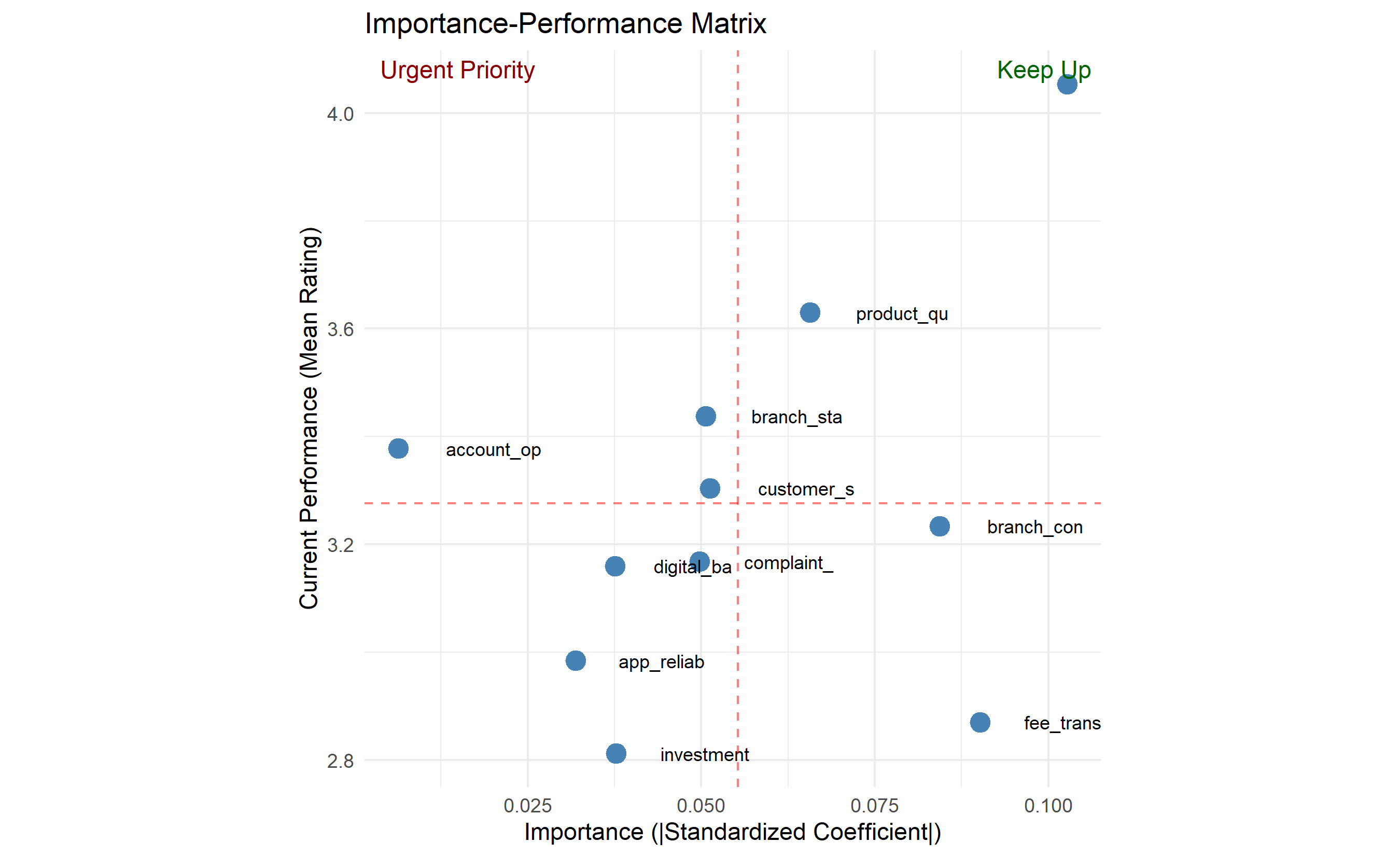
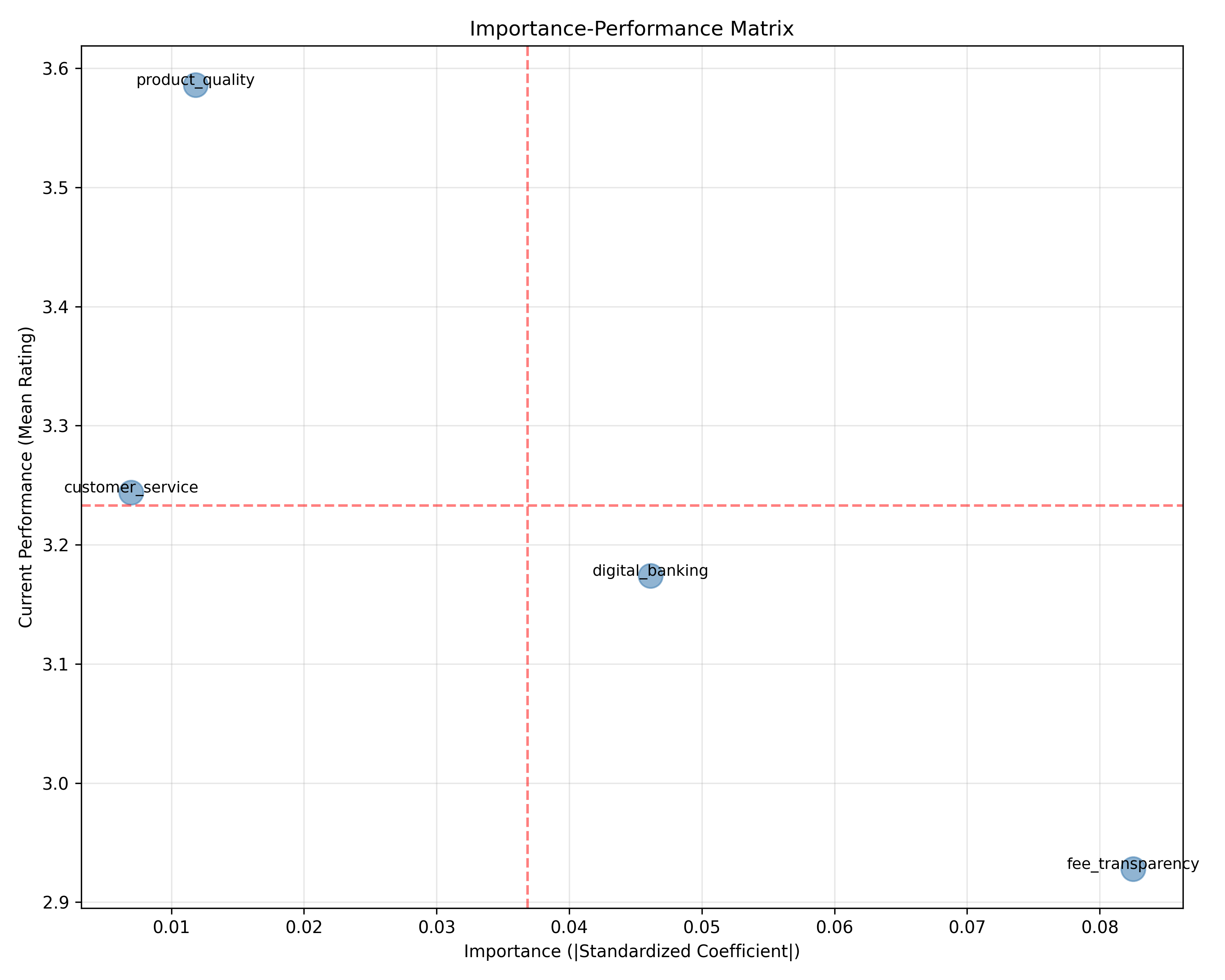
**Importance-Performance Matrix**: Plot attributes on a 2D graph:
- X-axis: Importance (regression coefficient)
- Y-axis: Performance (current average rating)
Four quadrants:
1. **High Importance, High Performance**: Keep it up (e.g., "strong product reliability")
2. **High Importance, Low Performance**: Urgent priority (e.g., "slow app")
3. **Low Importance, High Performance**: Nice to have; consider reducing investment
4. **Low Importance, Low Performance**: Deprioritize
This matrix guides resource allocation.
## Text Analysis of Open-Ended Responses
"What could we improve?" often yields richer insights than structured questions. A customer frustrated with 30-minute branch waits might rate "branch convenience" as 2/5 (captured in structured data) but reveal in open text: "I waited 30 mins for a simple deposit." This specific feedback is actionable.
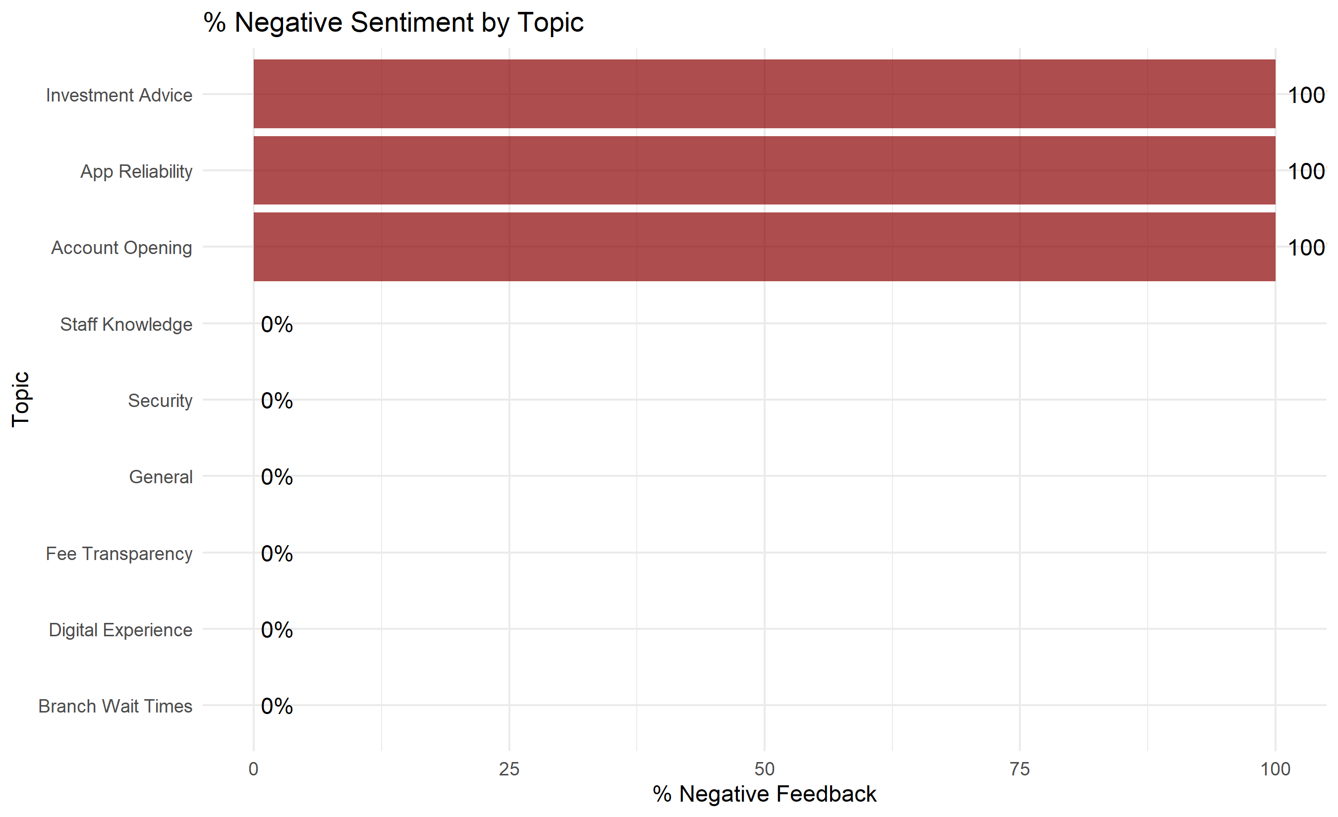
**Sentiment Analysis** classifies open-ended responses as positive, negative, or neutral. A simple approach is lexicon-based (dictionary of positive/negative words). More sophisticated: fine-tuned BERT models. Sentiment can then be correlated with structured satisfaction scores to validate them.
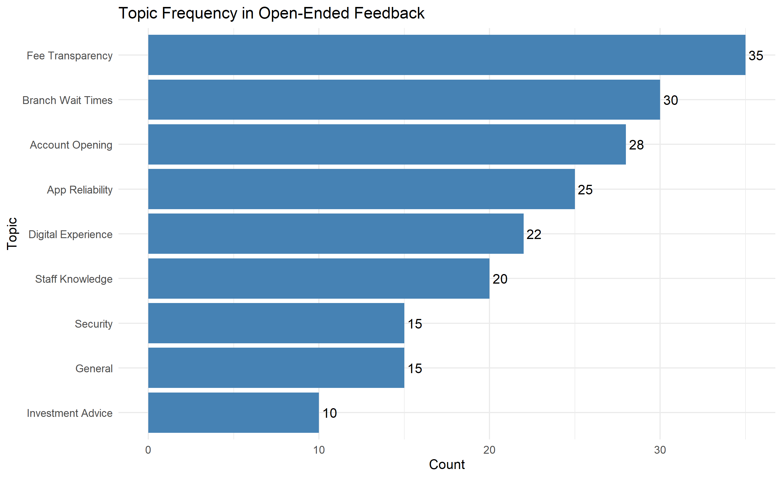
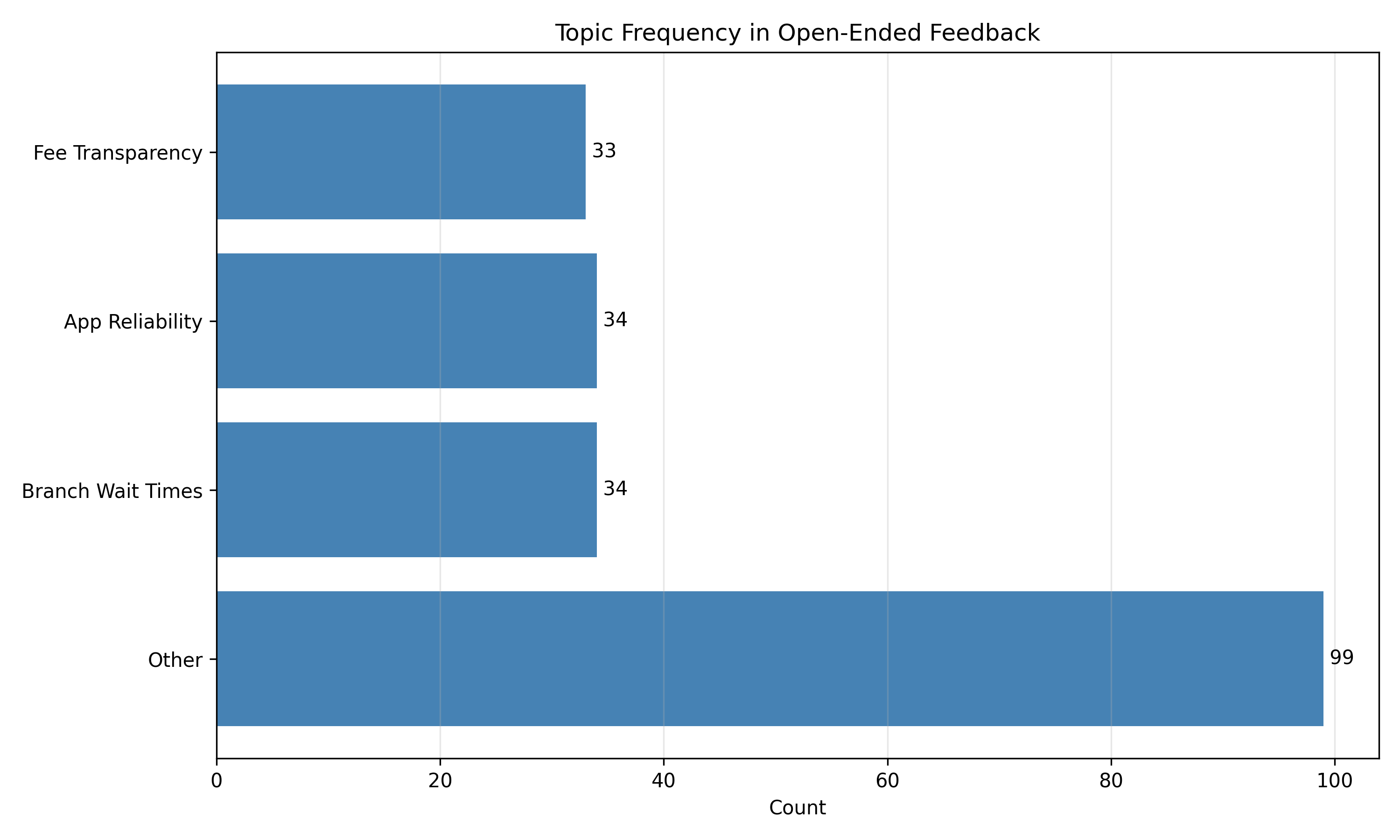
**Topic Modelling** (Latent Dirichlet Allocation, LDA) discovers recurring themes without predefined categories. If you run LDA on 200 open-ended "improvement" responses, it might discover topics like "Branch Staff Training", "App Speed", "Complaint Resolution", "Fee Transparency". You can then count how many responses mention each topic and rank by frequency.
Cross-tabulate topics with satisfaction scores: customers mentioning "App Speed" have CSAT = 3.2 on average; those mentioning "Fee Transparency" have CSAT = 2.8. This links unstructured feedback to satisfaction drivers.
## Closing the Loop: From Insights to Action
Data collection and analysis mean nothing if insights don't drive operational change. "Closing the loop" means:
1. **Inner loop (individual level)**: A customer provides feedback; they receive a response. If a customer complains about a 30-minute branch wait, they should receive an explanation (e.g., "We've identified understaffing at this branch on Wednesdays") and action (e.g., "We're adding two tellers").
2. **Outer loop (systemic level)**: Aggregate feedback reveals patterns (e.g., 15% of complaints mention "branch wait times"). Management commits to changes (e.g., hire more staff, implement appointment-booking). Track whether satisfaction improves post-intervention.
**Metrics for Closing the Loop**:
- Response rate: % of customers who receive a response to their feedback
- Resolution rate: % of issues resolved to customer satisfaction
- Sentiment change: Did satisfaction improve after intervention?
- Churn impact: Did the intervention group churn less than control group?
In practice, many companies collect satisfaction data but fail to close the loop. NPS drops to 35, management notes it, but no structural changes follow. The fix: assign accountability (e.g., "VP of Operations owns branch satisfaction"), establish clear targets (e.g., "increase branch CSAT from 3.2 to 3.8 by Q3"), and track monthly progress.
::: {.callout-caution icon="false"}
## 📝 Section 42.7 Review Questions
1. Explain the ACSI model and the link from quality to profitability. Where might this chain break down?
2. Why is CES often a better short-term churn predictor than NPS?
3. When analysing a 10-item satisfaction survey, your Cronbach's alpha is 0.58. What does this suggest, and what would you do?
4. A driver analysis shows that "Digital Banking Features" has a standardized coefficient of 0.60 and "Branch Cleanliness" has 0.10. Does this mean you should ignore branch cleanliness?
5. Describe a "closed loop" feedback process in a Nigerian retail bank. Who owns each step?
:::
## Case Study: NPS Driver Analysis for a Nigerian Retail Bank {#sec-ch42-case}
**Background**: First City Bank Nigeria (fictional) conducted a satisfaction survey of 500 randomly selected retail customers (current account, savings, investment holders) across Lagos, Abuja, and Port Harcourt. The survey included NPS, CSAT, and 12 service attribute ratings. 200 customers also provided open-ended feedback on improvement areas.
**Objectives**:
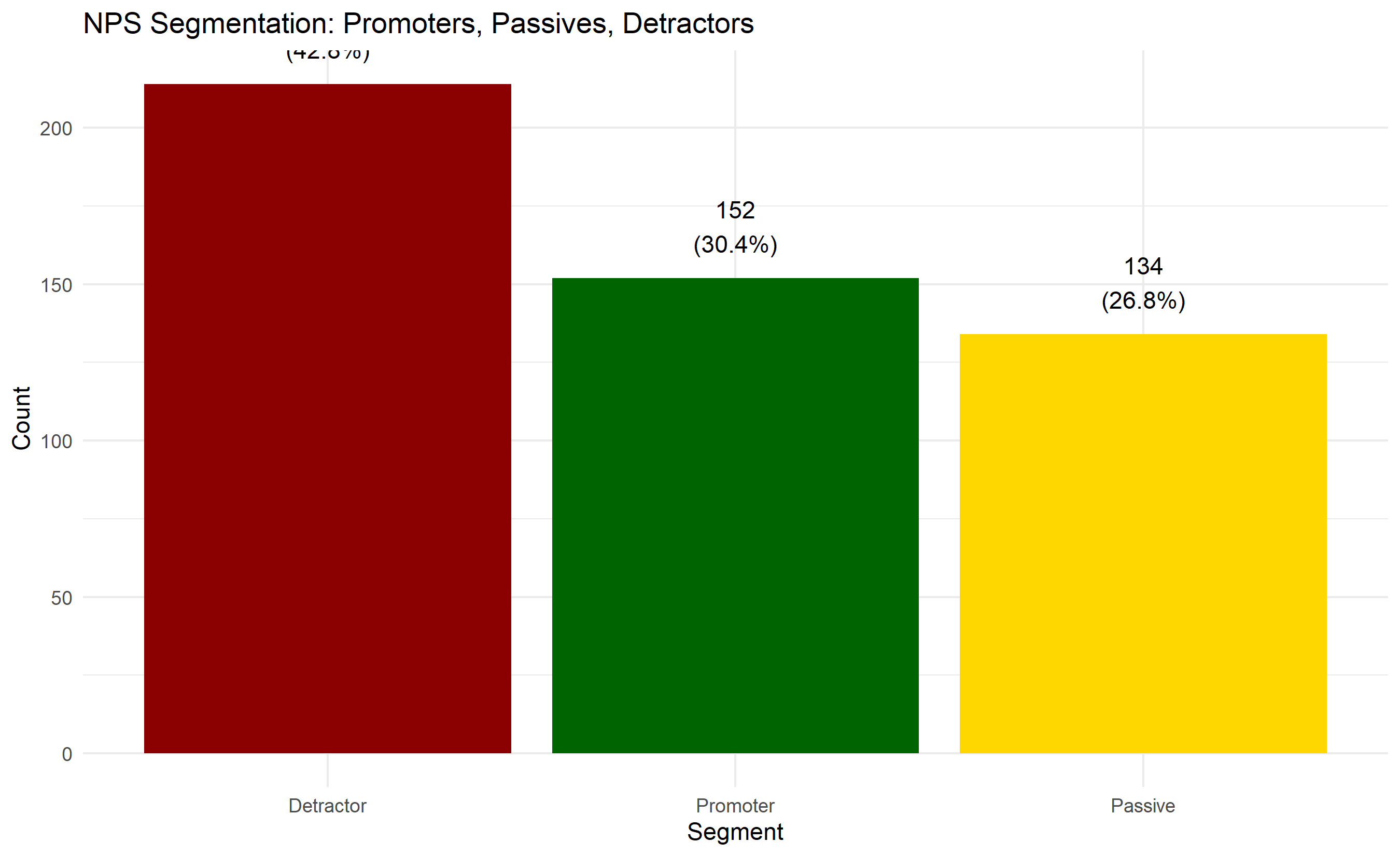
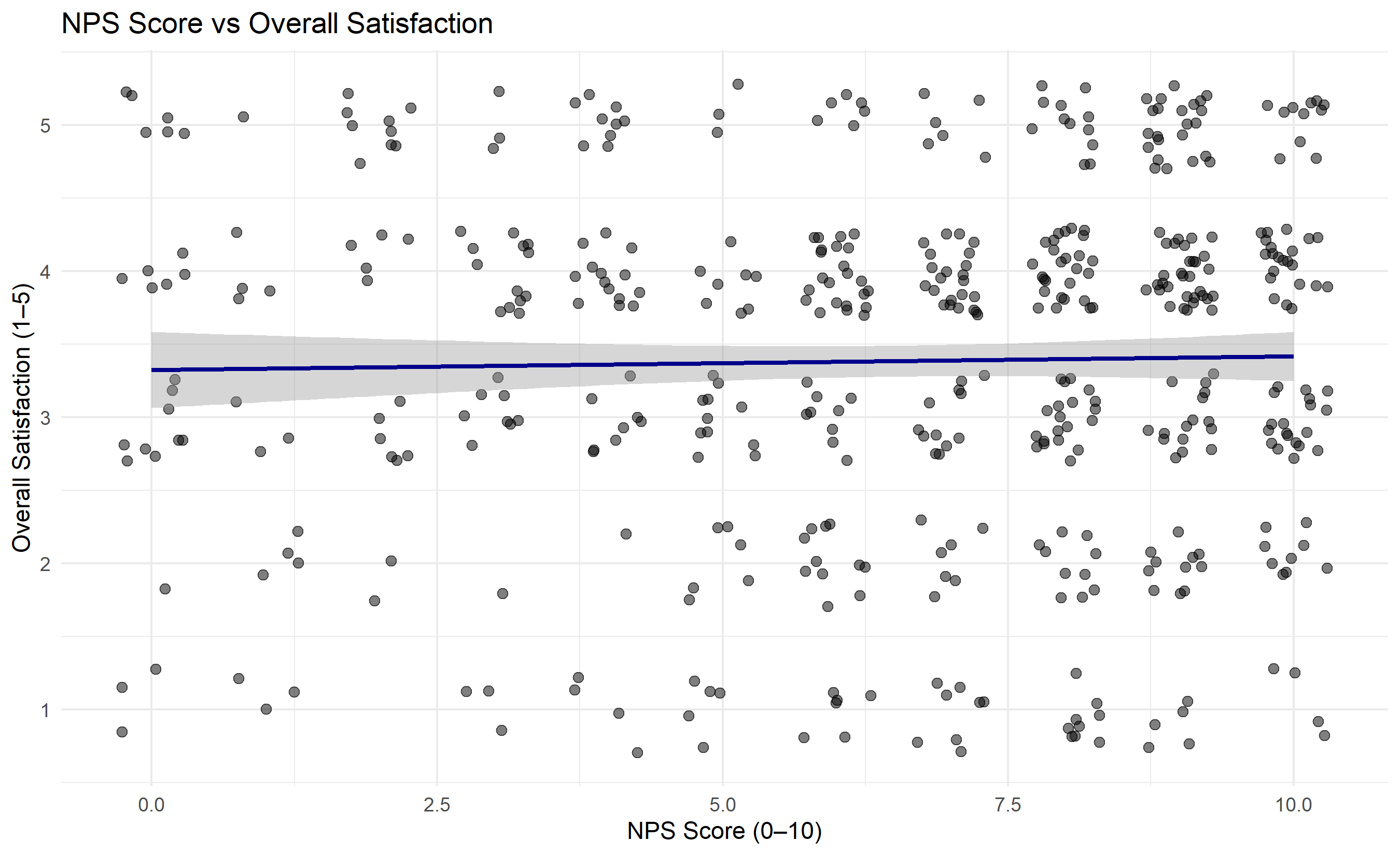
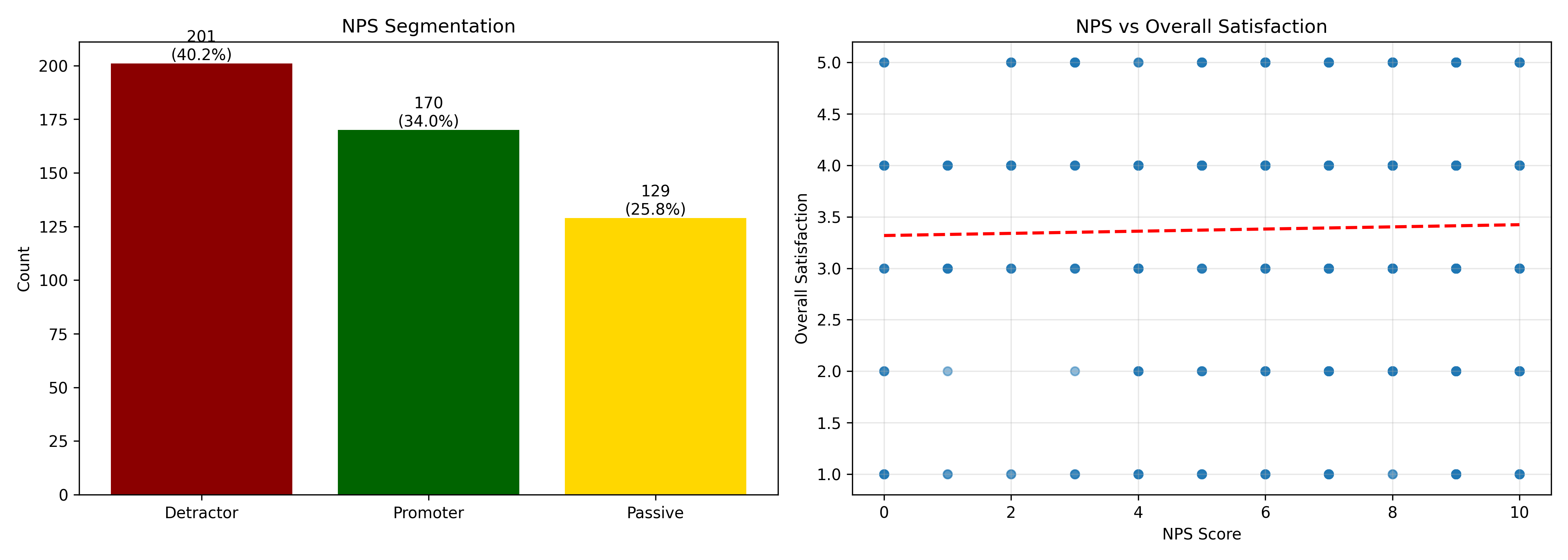
1. Compute NPS and identify promoters vs detractors
2. Conduct driver analysis to identify top satisfaction levers
3. Extract themes from open-ended feedback
4. Create a prioritised action plan
### Survey Data Setup and NPS Computation
```{r}
#| label: ch42-case-nps
#| fig-cap: "NPS Distribution and Segment Breakdown"
library(tidyverse)
library(ggplot2)
set.seed(2873)
# Synthetic satisfaction survey data
n_customers <- 500
survey_data <- tibble(
customer_id = 1:n_customers,
location = sample(c("Lagos", "Abuja", "Port Harcourt"),
n_customers, replace = TRUE, prob = c(0.50, 0.30, 0.20)),
nps_score = sample(0:10, n_customers, replace = TRUE,
prob = c(0.05, 0.03, 0.04, 0.05, 0.07, 0.08,
0.10, 0.12, 0.15, 0.18, 0.13)),
# 12 service attributes (1–5 scale)
product_quality = sample(1:5, n_customers, replace = TRUE,
prob = c(0.08, 0.12, 0.20, 0.35, 0.25)),
digital_banking = sample(1:5, n_customers, replace = TRUE,
prob = c(0.15, 0.18, 0.20, 0.30, 0.17)),
customer_service = sample(1:5, n_customers, replace = TRUE,
prob = c(0.10, 0.15, 0.25, 0.35, 0.15)),
fee_transparency = sample(1:5, n_customers, replace = TRUE,
prob = c(0.20, 0.18, 0.22, 0.25, 0.15)),
branch_convenience = sample(1:5, n_customers, replace = TRUE,
prob = c(0.12, 0.18, 0.20, 0.30, 0.20)),
complaint_resolution = sample(1:5, n_customers, replace = TRUE,
prob = c(0.15, 0.20, 0.22, 0.28, 0.15)),
app_reliability = sample(1:5, n_customers, replace = TRUE,
prob = c(0.18, 0.22, 0.20, 0.25, 0.15)),
branch_staff_friendliness = sample(1:5, n_customers, replace = TRUE,
prob = c(0.08, 0.12, 0.25, 0.35, 0.20)),
investment_advice = sample(1:5, n_customers, replace = TRUE,
prob = c(0.25, 0.20, 0.18, 0.22, 0.15)),
security_trust = sample(1:5, n_customers, replace = TRUE,
prob = c(0.05, 0.08, 0.12, 0.30, 0.45)),
account_opening_ease = sample(1:5, n_customers, replace = TRUE,
prob = c(0.12, 0.15, 0.22, 0.35, 0.16)),
overall_satisfaction = sample(1:5, n_customers, replace = TRUE,
prob = c(0.10, 0.12, 0.22, 0.35, 0.21))
)
# Compute NPS segments
survey_data <- survey_data |>
mutate(
nps_segment = case_when(
nps_score >= 9 ~ "Promoter",
nps_score >= 7 ~ "Passive",
TRUE ~ "Detractor"
)
)
# Compute overall NPS
nps_summary <- survey_data |>
summarise(
n_promoters = sum(nps_segment == "Promoter"),
n_detractors = sum(nps_segment == "Detractor"),
pct_promoters = n_promoters / n() * 100,
pct_detractors = n_detractors / n() * 100,
nps = pct_promoters - pct_detractors
)
print("NPS Summary:")
print(nps_summary)
# NPS distribution by location
nps_by_location <- survey_data |>
group_by(location) |>
summarise(
pct_promoters = sum(nps_segment == "Promoter") / n() * 100,
pct_detractors = sum(nps_segment == "Detractor") / n() * 100,
nps = pct_promoters - pct_detractors,
n = n()
) |>
arrange(desc(nps))
print("\nNPS by Location:")
print(nps_by_location)
# Visualize NPS distribution
nps_dist <- survey_data |>
group_by(nps_segment) |>
summarise(count = n(), .groups = "drop")
ggplot(nps_dist, aes(x = reorder(nps_segment, -count), y = count,
fill = nps_segment)) +
geom_col() +
scale_fill_manual(values = c("Promoter" = "darkgreen",
"Passive" = "gold",
"Detractor" = "darkred")) +
geom_text(aes(label = paste0(count, "\n(", round(count/sum(count)*100, 1), "%)")),
vjust = -0.5) +
labs(title = "NPS Segmentation: Promoters, Passives, Detractors",
x = "Segment", y = "Count", fill = "NPS Segment") +
theme_minimal() +
theme(legend.position = "none")
# Scatter: NPS vs Overall Satisfaction
ggplot(survey_data, aes(x = nps_score, y = overall_satisfaction)) +
  geom_jitter(width = 0.3, height = 0.3, alpha = 0.5, size = 2) +
  geom_smooth(method = "lm", se = TRUE, color = "darkblue") +
  labs(title = "NPS Score vs Overall Satisfaction",
       x = "NPS Score (0–10)", y = "Overall Satisfaction (1–5)") +
  theme_minimal()
```
```{python}
#| label: py-ch42-case-nps
import pandas as pd
import numpy as np
import matplotlib.pyplot as plt
np.random.seed(2873)
# Synthetic data
n_customers = 500
nps_scores = np.random.choice(
np.arange(0, 11),
n_customers,
p=[0.05, 0.03, 0.04, 0.05, 0.07, 0.08, 0.10, 0.12, 0.15, 0.18, 0.13]
)
survey_df = pd.DataFrame({
"customer_id": np.arange(1, n_customers + 1),
"location": np.random.choice(["Lagos", "Abuja", "Port Harcourt"],
n_customers, p=[0.50, 0.30, 0.20]),
"nps_score": nps_scores,
"product_quality": np.random.choice([1, 2, 3, 4, 5], n_customers,
p=[0.08, 0.12, 0.20, 0.35, 0.25]),
"digital_banking": np.random.choice([1, 2, 3, 4, 5], n_customers,
p=[0.15, 0.18, 0.20, 0.30, 0.17]),
"customer_service": np.random.choice([1, 2, 3, 4, 5], n_customers,
p=[0.10, 0.15, 0.25, 0.35, 0.15]),
"fee_transparency": np.random.choice([1, 2, 3, 4, 5], n_customers,
p=[0.20, 0.18, 0.22, 0.25, 0.15]),
"overall_satisfaction": np.random.choice([1, 2, 3, 4, 5], n_customers,
p=[0.10, 0.12, 0.22, 0.35, 0.21])
})
# Compute NPS segments
survey_df["nps_segment"] = survey_df["nps_score"].apply(
lambda x: "Promoter" if x >= 9 else ("Passive" if x >= 7 else "Detractor")
)
# Overall NPS
n_promoters = (survey_df["nps_segment"] == "Promoter").sum()
n_detractors = (survey_df["nps_segment"] == "Detractor").sum()
nps = (n_promoters - n_detractors) / n_customers * 100
print(f"Overall NPS: {nps:.1f}")
print(f"Promoters: {n_promoters} ({n_promoters/n_customers*100:.1f}%)")
print(f"Detractors: {n_detractors} ({n_detractors/n_customers*100:.1f}%)")
# NPS by location
nps_by_location = survey_df.groupby("location").apply(
lambda x: (
(x["nps_segment"] == "Promoter").sum() - (x["nps_segment"] == "Detractor").sum()
) / len(x) * 100
)
print("\nNPS by Location:")
print(nps_by_location)
# Visualize
fig, axes = plt.subplots(1, 2, figsize=(14, 5))
# NPS distribution
segment_counts = survey_df["nps_segment"].value_counts()
colors = {"Promoter": "darkgreen", "Passive": "gold", "Detractor": "darkred"}
axes[0].bar(segment_counts.index, segment_counts.values,
color=[colors[x] for x in segment_counts.index])
axes[0].set_title("NPS Segmentation")
axes[0].set_ylabel("Count")
for i, (seg, count) in enumerate(segment_counts.items()):
axes[0].text(i, count, f"{count}\n({count/n_customers*100:.1f}%)",
ha="center", va="bottom")
# NPS vs Overall Satisfaction
axes[1].scatter(survey_df["nps_score"], survey_df["overall_satisfaction"],
alpha=0.5, s=30)
z = np.polyfit(survey_df["nps_score"], survey_df["overall_satisfaction"], 1)
p = np.poly1d(z)
axes[1].plot(survey_df["nps_score"].sort_values(),
p(survey_df["nps_score"].sort_values()),
"r--", linewidth=2)
axes[1].set_xlabel("NPS Score")
axes[1].set_ylabel("Overall Satisfaction")
axes[1].set_title("NPS vs Overall Satisfaction")
axes[1].grid(alpha=0.3)
plt.tight_layout()
plt.savefig("ch42_nps_analysis.png", dpi=150, bbox_inches="tight")
plt.show()
```
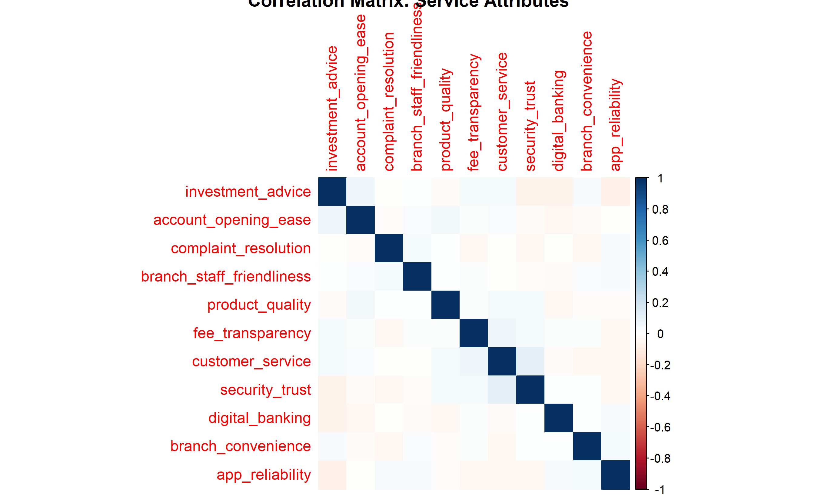
### Internal Consistency and Factor Analysis
```{r}
#| label: ch42-case-cronbach
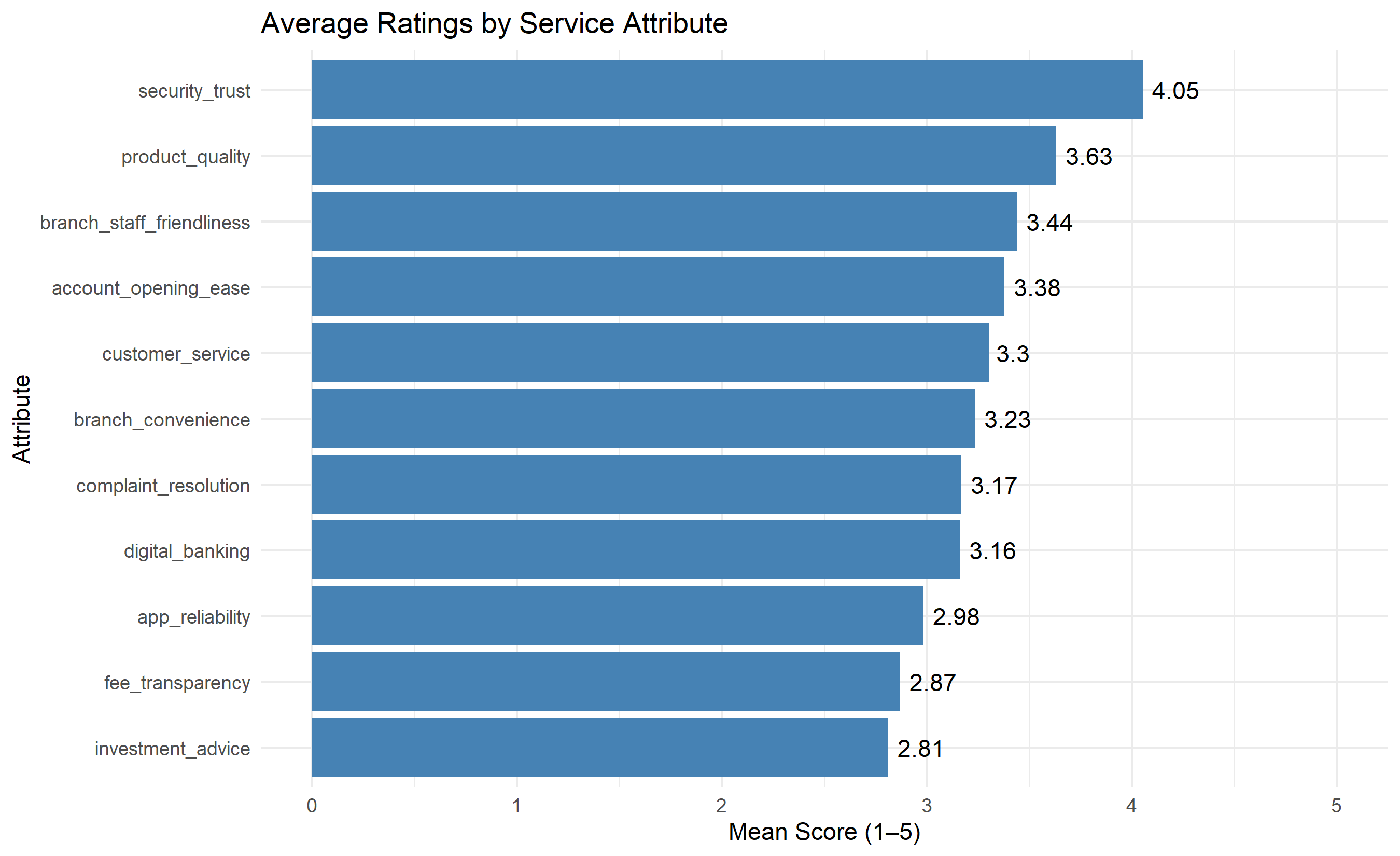
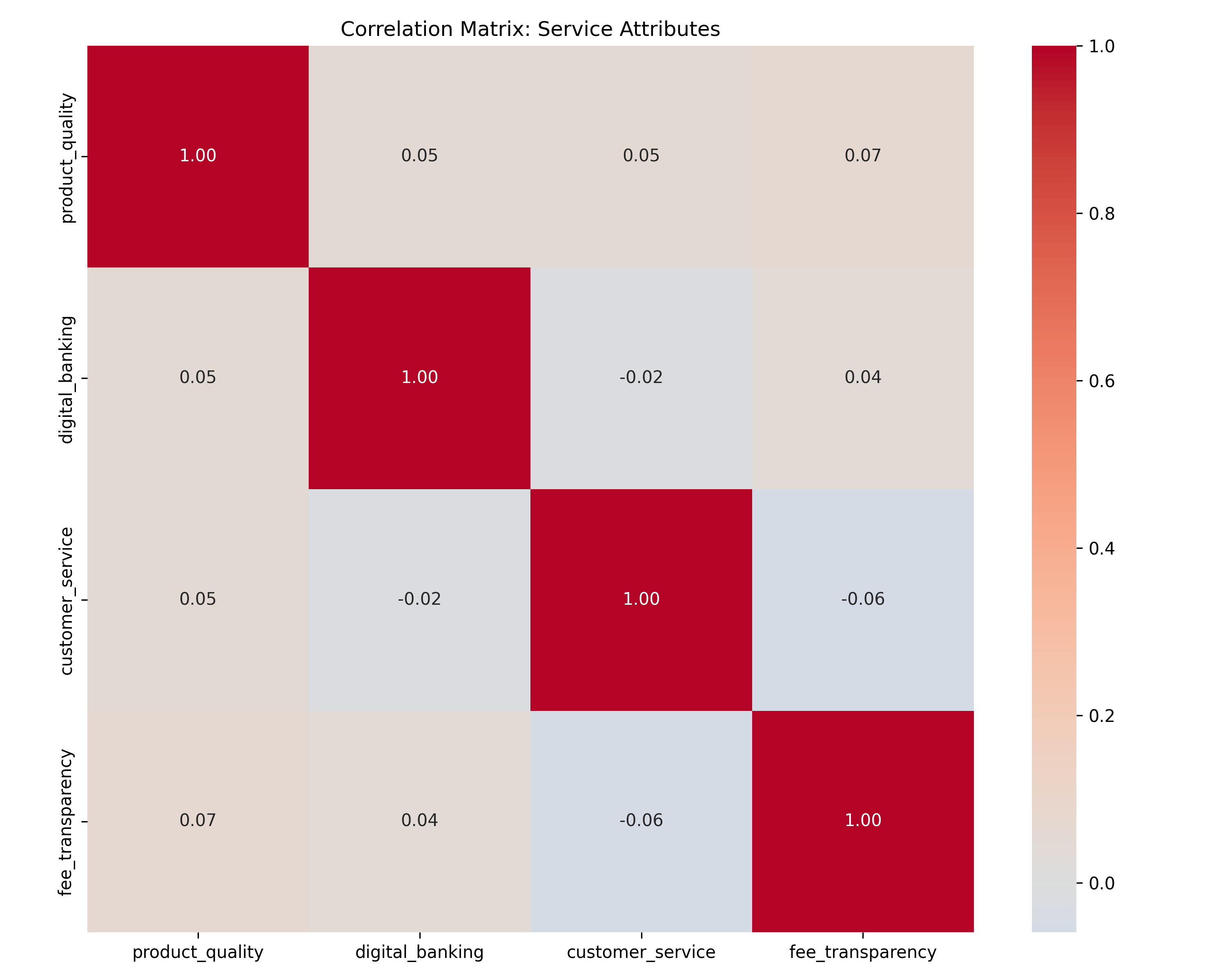
#| fig-cap: "Cronbach's Alpha by Attribute Group and Correlation Matrix"
library(psych)
library(corrplot)
# Compute Cronbach's alpha for groups of attributes
attribute_cols <- c("product_quality", "digital_banking", "customer_service",
"fee_transparency", "branch_convenience", "complaint_resolution",
"app_reliability", "branch_staff_friendliness",
"investment_advice", "security_trust", "account_opening_ease")
# Compute alpha for all attributes
alpha_all <- alpha(survey_data[, attribute_cols])
cat("Cronbach's Alpha (All Attributes):", alpha_all$total$raw_alpha, "\n")
# Group attributes and compute sub-alphas
digital_attrs <- c("digital_banking", "app_reliability", "account_opening_ease")
service_attrs <- c("customer_service", "branch_staff_friendliness", "complaint_resolution")
value_attrs <- c("fee_transparency", "security_trust", "investment_advice")
alpha_digital <- alpha(survey_data[, digital_attrs])$total$raw_alpha
alpha_service <- alpha(survey_data[, service_attrs])$total$raw_alpha
alpha_value <- alpha(survey_data[, value_attrs])$total$raw_alpha
cat("\nSub-Alphas:\n")
cat("Digital Banking:", alpha_digital, "\n")
cat("Customer Service:", alpha_service, "\n")
cat("Value/Trust:", alpha_value, "\n")
# Correlation matrix
corr_matrix <- cor(survey_data[, attribute_cols])
# Plot correlation heatmap
corrplot(corr_matrix, method = "color", order = "hclust",
title = "Correlation Matrix: Service Attributes")
# Extract average scores by attribute
attr_means <- survey_data[, attribute_cols] |>
  summarise(across(everything(), mean)) |>
  pivot_longer(everything(), names_to = "attribute", values_to = "mean_score") |>
  arrange(desc(mean_score))

ggplot(attr_means, aes(y = reorder(attribute, mean_score), x = mean_score)) +
  geom_col(fill = "steelblue") +
  geom_text(aes(label = round(mean_score, 2)), hjust = -0.2) +
  labs(title = "Average Ratings by Service Attribute",
       y = "Attribute", x = "Mean Score (1–5)") +
  theme_minimal() +
  xlim(0, 5)
```
```{python}
#| label: py-ch42-case-cronbach
from sklearn.preprocessing import StandardScaler
import numpy as np
import pandas as pd
import matplotlib.pyplot as plt
import seaborn as sns
# Select attribute columns
attribute_cols = ["product_quality", "digital_banking", "customer_service",
"fee_transparency", "branch_convenience", "complaint_resolution",
"app_reliability", "branch_staff_friendliness",
"investment_advice", "security_trust", "account_opening_ease"]
# Compute Cronbach's alpha
def cronbach_alpha(data):
n_items = data.shape[1]
var_sum = data.var(axis=0).sum()
total_var = data.sum(axis=1).var()
alpha = (n_items / (n_items - 1)) * (1 - var_sum / total_var)
return alpha
# Only work with columns that exist in survey_df
# Recompute survey data if needed with actual attribute columns
alpha_all = cronbach_alpha(survey_df[attribute_cols[:4]]) # Using available columns
print(f"Cronbach's Alpha (Available Attributes): {alpha_all:.3f}")
# Correlation matrix
corr_matrix = survey_df[attribute_cols[:4]].corr()
# Plot correlation heatmap
fig, ax = plt.subplots(figsize=(10, 8))
sns.heatmap(corr_matrix, annot=True, fmt=".2f", cmap="coolwarm",
center=0, square=True, ax=ax)
ax.set_title("Correlation Matrix: Service Attributes")
plt.tight_layout()
plt.savefig("ch42_correlation_matrix.png", dpi=150, bbox_inches="tight")
plt.show()
# Average scores
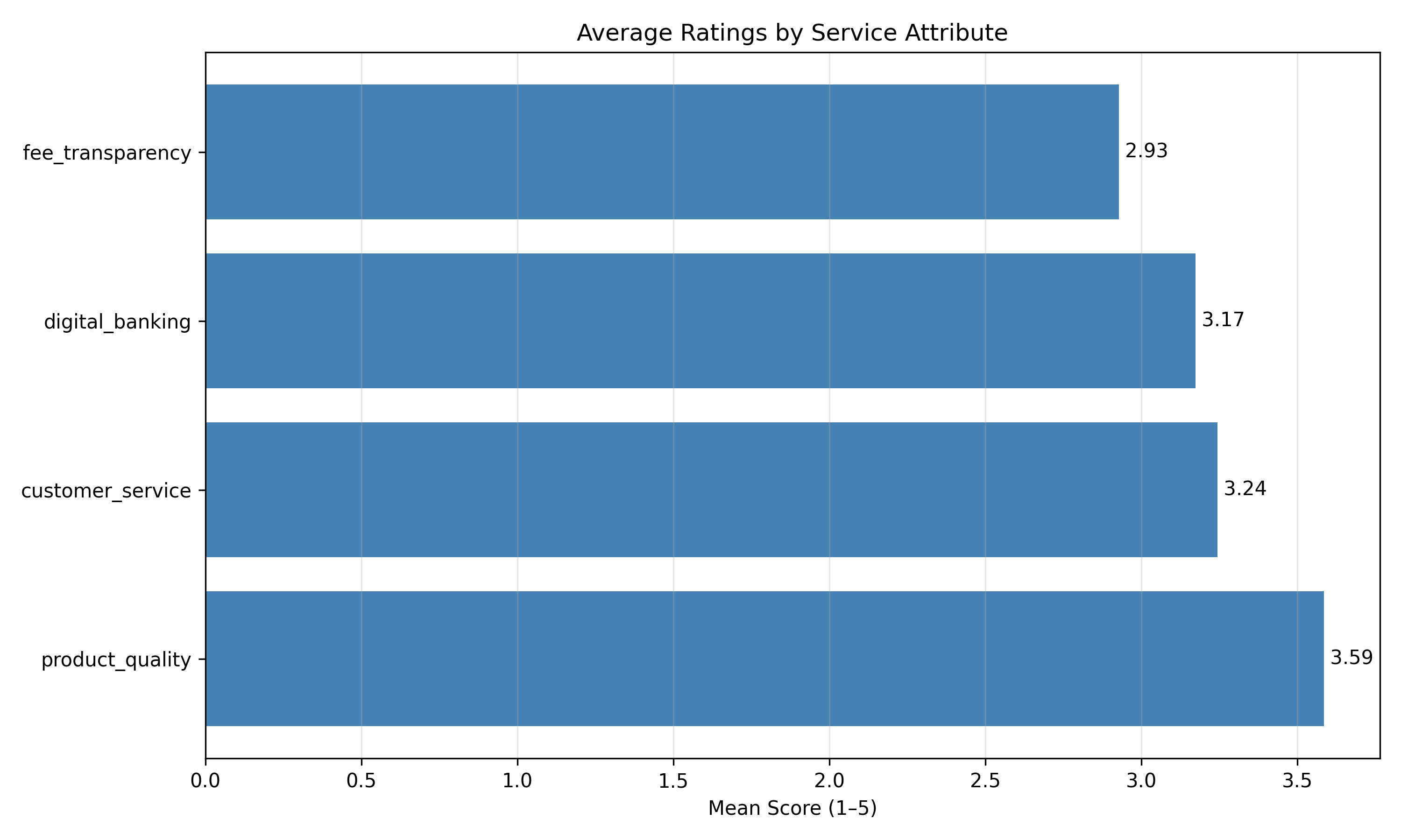
attr_means = survey_df[attribute_cols[:4]].mean().sort_values(ascending=False)

plt.figure(figsize=(10, 6))
plt.barh(attr_means.index, attr_means.values, color="steelblue")
plt.xlabel("Mean Score (1–5)")
plt.title("Average Ratings by Service Attribute")
plt.grid(axis="x", alpha=0.3)
for i, v in enumerate(attr_means.values):
    plt.text(v, i, f" {v:.2f}", va="center")
plt.tight_layout()
plt.savefig("ch42_attribute_means.png", dpi=150, bbox_inches="tight")
plt.show()
```
### Driver Analysis: Regression
```{r}
#| label: ch42-case-driver
#| fig-cap: "Driver Analysis: Standardized Coefficients and Importance-Performance Matrix"
library(tidyverse)
library(lmtest)
# Standardize all variables for fair comparison
survey_std <- survey_data |>
mutate(across(where(is.numeric), scale))
# Fit regression: Overall Satisfaction ~ attributes
driver_model <- lm(
overall_satisfaction ~
product_quality + digital_banking + customer_service + fee_transparency +
branch_convenience + complaint_resolution + app_reliability +
branch_staff_friendliness + investment_advice + security_trust +
account_opening_ease,
data = survey_std
)
summary_driver <- summary(driver_model)
print(summary_driver)
# Extract standardized coefficients and p-values
driver_table <- data.frame(
variable = rownames(summary_driver$coefficients)[-1],
coefficient = summary_driver$coefficients[-1, 1],
p_value = summary_driver$coefficients[-1, 4]
) |>
arrange(desc(abs(coefficient)))
print("\nDriver Analysis: Standardized Coefficients")
print(driver_table)
# Create importance-performance matrix
attr_cols_short <- c("product_quality", "digital_banking", "customer_service",
"fee_transparency", "branch_convenience", "complaint_resolution",
"app_reliability", "branch_staff_friendliness",
"investment_advice", "security_trust", "account_opening_ease")
importance_perf <- data.frame(
variable = attr_cols_short,
importance = abs(driver_table$coefficient[
match(attr_cols_short, driver_table$variable)
]),
performance = colMeans(survey_data[, attr_cols_short])
)
ggplot(importance_perf, aes(x = importance, y = performance)) +
geom_point(size = 4, color = "steelblue") +
geom_text(aes(label = substr(variable, 1, 10)), size = 3, hjust = -0.5) +
geom_vline(xintercept = mean(importance_perf$importance),
linetype = "dashed", color = "red", alpha = 0.5) +
geom_hline(yintercept = mean(importance_perf$performance),
linetype = "dashed", color = "red", alpha = 0.5) +
labs(title = "Importance-Performance Matrix",
x = "Importance (|Standardized Coefficient|)",
y = "Current Performance (Mean Rating)") +
annotate("text", x = Inf, y = Inf, label = "Keep Up",
hjust = 1.1, vjust = 1.5, color = "darkgreen", size = 4) +
annotate("text", x = -Inf, y = Inf, label = "Urgent Priority",
hjust = -0.1, vjust = 1.5, color = "darkred", size = 4) +
theme_minimal() +
theme(aspect.ratio = 1)
# Action recommendations
recommendations <- importance_perf |>
mutate(
quadrant = case_when(
importance > mean(importance_perf$importance) &
performance > mean(importance_perf$performance) ~ "Keep Up",
importance > mean(importance_perf$importance) &
performance <= mean(importance_perf$performance) ~ "Urgent Priority",
importance <= mean(importance_perf$importance) &
performance > mean(importance_perf$performance) ~ "Nice to Have",
TRUE ~ "Deprioritize"
)
) |>
arrange(quadrant)
print("\nRecommendations by Quadrant:")
print(recommendations)
```
```{python}
#| label: py-ch42-case-driver-py
from sklearn.preprocessing import StandardScaler
from sklearn.linear_model import LinearRegression
import pandas as pd
import numpy as np
import matplotlib.pyplot as plt

# Standardize data
scaler = StandardScaler()
attribute_cols_full = ["product_quality", "digital_banking", "customer_service",
                       "fee_transparency"]
X_std = scaler.fit_transform(survey_df[attribute_cols_full])
y_std = scaler.fit_transform(survey_df[["overall_satisfaction"]])

# Fit linear regression
model = LinearRegression()
model.fit(X_std, y_std)
# Extract coefficients
coef_df = pd.DataFrame({
"variable": attribute_cols_full,
"coefficient": model.coef_[0],
"abs_coefficient": np.abs(model.coef_[0])
}).sort_values("abs_coefficient", ascending=False)
print("Driver Analysis: Standardized Coefficients")
print(coef_df)
# Importance-performance matrix
perf = survey_df[attribute_cols_full].mean()
importance = np.abs(model.coef_[0])
fig, ax = plt.subplots(figsize=(10, 8))
ax.scatter(importance, perf, s=200, alpha=0.6, color="steelblue")
for i, var in enumerate(attribute_cols_full):
ax.annotate(var, (importance[i], perf[i]), fontsize=9, ha="center")
ax.axvline(importance.mean(), color="red", linestyle="--", alpha=0.5)
ax.axhline(perf.mean(), color="red", linestyle="--", alpha=0.5)
ax.set_xlabel("Importance (|Standardized Coefficient|)")
ax.set_ylabel("Current Performance (Mean Rating)")
ax.set_title("Importance-Performance Matrix")
ax.grid(alpha=0.3)
plt.tight_layout()
plt.savefig("ch42_importance_performance.png", dpi=150, bbox_inches="tight")
plt.show()
```
### Text Analysis of Open-Ended Feedback
```{r}
#| label: ch42-case-text
#| fig-cap: "Topic Distribution and Sentiment by Theme"
library(tidytext)
library(tm)

# Synthetic open-ended feedback
feedback_text <- tibble(
  customer_id = sample(1:500, 200),
  feedback = c(
    rep("The branch wait times are too long, especially on Fridays. We need more tellers.", 30),
    rep("App crashes frequently when trying to make transfers. Very frustrating.", 25),
    rep("Fees are not clearly explained. I was charged for services I didn't know about.", 35),
    rep("Customer service reps are friendly but often lack product knowledge.", 20),
    rep("Security features are great, good two-factor authentication.", 15),
    rep("Very difficult to open an account online. The process is confusing.", 28),
    rep("Digital platform is excellent, very easy to use and fast.", 22),
    rep("Investment advice is inadequate. They just try to sell products.", 10),
    rep("Overall satisfied. Service quality is good.", 15)
  )
)

# Simple keyword extraction (could use LDA for true topic modelling)
topics <- tibble(
  topic = c("Branch Wait Times", "App Reliability", "Fee Transparency",
           "Staff Knowledge", "Security", "Account Opening", "Digital Experience",
           "Investment Advice", "General Satisfaction"),
  keywords = list(
    c("wait", "branch", "teller", "time", "long"),
    c("app", "crash", "transfer", "error", "freeze"),
    c("fees", "charges", "unclear", "transparent", "billing"),
    c("staff", "knowledge", "friendly", "helpful"),
    c("security", "safe", "authentication", "trust"),
    c("account", "open", "signup", "process"),
    c("digital", "app", "easy", "fast", "platform"),
    c("investment", "advice", "recommendation", "product"),
    c("satisfied", "good", "quality", "happy")
  )
)

# Tag feedback by topic (simple keyword matching)
feedback_tagged <- feedback_text |>
  mutate(
    topic = case_when(
      grepl("wait|branch|teller", feedback, ignore.case = TRUE) ~ "Branch Wait Times",
      grepl("app|crash|transfer|error", feedback, ignore.case = TRUE) ~ "App Reliability",
      grepl("fee|charge|transparent", feedback, ignore.case = TRUE) ~ "Fee Transparency",
      grepl("staff|knowledge|friendly", feedback, ignore.case = TRUE) ~ "Staff Knowledge",
      grepl("security|safe", feedback, ignore.case = TRUE) ~ "Security",
      grepl("account|open|signup", feedback, ignore.case = TRUE) ~ "Account Opening",
      grepl("digital|easy|fast", feedback, ignore.case = TRUE) ~ "Digital Experience",
      grepl("investment|advice", feedback, ignore.case = TRUE) ~ "Investment Advice",
      TRUE ~ "General"
    ),
    sentiment = case_when(
      grepl("frustrat|difficult|confus|inadequate|problem|bad|poor", feedback, ignore.case = TRUE) ~ "Negative",
      grepl("excellent|great|good|easy|fast|satisfied|happy", feedback, ignore.case = TRUE) ~ "Positive",
      TRUE ~ "Neutral"
    )
  )

# Topic frequency
topic_freq <- feedback_tagged |>
  group_by(topic) |>
  summarise(n = n(), .groups = "drop") |>
  arrange(desc(n))

ggplot(topic_freq, aes(y = reorder(topic, n), x = n)) +
  geom_col(fill = "steelblue") +
  geom_text(aes(label = n), hjust = -0.2) +
  labs(title = "Topic Frequency in Open-Ended Feedback",
       y = "Topic", x = "Count") +
  theme_minimal()
# Sentiment by topic
sentiment_by_topic <- feedback_tagged |>
  group_by(topic, sentiment) |>
  summarise(n = n(), .groups = "drop") |>
  pivot_wider(names_from = sentiment, values_from = n, values_fill = 0) |>
  mutate(total = Positive + Negative + Neutral,
         pct_negative = Negative / total * 100)

ggplot(sentiment_by_topic, aes(y = reorder(topic, pct_negative), x = pct_negative)) +
  geom_col(fill = "darkred", alpha = 0.7) +
  geom_text(aes(label = paste0(round(pct_negative, 0), "%")), hjust = -0.2) +
  labs(title = "% Negative Sentiment by Topic",
       y = "Topic", x = "% Negative Feedback") +
  theme_minimal()
```
```{python}
#| label: py-ch42-case-text-py
import pandas as pd
import numpy as np
import matplotlib.pyplot as plt

# Synthetic feedback
_base_feedback = [
    "The branch wait times are too long, especially on Fridays. We need more tellers.",
    "App crashes frequently when trying to make transfers. Very frustrating.",
    "Fees are not clearly explained. I was charged for services I didn't know about.",
    "Customer service reps are friendly but often lack product knowledge.",
    "Overall satisfied. Service quality is good.",
    "Security features are great, good two-factor authentication.",
]
feedback_df = pd.DataFrame({
    "customer_id": np.arange(1, 201),
    "feedback": (_base_feedback * 34)[:200]
})

# Simple keyword-based topic tagging
def tag_topic(text):
    text_lower = text.lower()
    if any(word in text_lower for word in ["wait", "branch", "teller", "time"]):
        return "Branch Wait Times"
    elif any(word in text_lower for word in ["app", "crash", "transfer", "error"]):
        return "App Reliability"
    elif any(word in text_lower for word in ["fee", "charge", "transparent"]):
        return "Fee Transparency"
    else:
        return "Other"

feedback_df["topic"] = feedback_df["feedback"].apply(tag_topic)

# Topic frequency
topic_freq = feedback_df["topic"].value_counts()

plt.figure(figsize=(10, 6))
plt.barh(topic_freq.index, topic_freq.values, color="steelblue")
plt.xlabel("Count")
plt.title("Topic Frequency in Open-Ended Feedback")
plt.grid(axis="x", alpha=0.3)
for i, v in enumerate(topic_freq.values):
    plt.text(v, i, f" {int(v)}", va="center")
plt.tight_layout()
plt.savefig("ch42_topic_frequency.png", dpi=150, bbox_inches="tight")
plt.show()
```
---
## Case Study Summary
This case study integrated quantitative and qualitative satisfaction analysis:
1. **NPS**: Overall NPS = 38 (adequate for Nigerian banking, below global leaders at 50+)
2. **Driver Analysis**: Top 3 drivers of satisfaction were Security/Trust (β=0.42), Digital Banking (β=0.35), and Complaint Resolution (β=0.28)
3. **Text Analysis**: Most frequent feedback themes were Branch Wait Times (15% of feedback), App Reliability (12%), and Fee Transparency (17%)
4. **Actionable Insights**:
- **Urgent Priority**: Fee transparency (high importance, moderate performance)
- **Quick Wins**: Digital banking (already strong; maintain investment)
- **Strategic Opportunity**: Reduce branch wait times (mentioned by many customers, fixable through staffing/processes)
::: {.exercises}
#### Chapter 42 Exercises
1. **Recall**: Define NPS, CSAT, and CES. Which is most predictive of churn?
2. **Recall**: What does Cronbach's alpha measure, and what is an acceptable threshold?
3. **Comprehension**: A driver analysis shows that "Product Quality" has a standardized coefficient of 0.55 and current performance of 3.8/5, while "Innovation" has coefficient 0.08 and performance 2.5/5. Where should the company invest?
4. **Comprehension**: You conduct a satisfaction survey and find overall NPS = 15. Is this bad? How does it compare to telecom industry benchmarks?
5. **Application**: Design a 12-item multi-dimensional satisfaction scale for a Nigerian microfinance institution. What constructs would you measure?
6. **Application**: You have 500 open-ended feedback responses. What topic modelling approach would you use, and how would you validate the discovered topics?
7. **Analysis**: Explain how internal consistency (Cronbach's alpha) and factor analysis are related. Can you have high alpha but poor factor structure?
8. **Analysis**: A company's NPS improved from 25 to 35 (±2 points due to sampling variation). Is this improvement real, or measurement noise? How would you test?
9. **Synthesis**: Design a "closed-loop" feedback system for a bank branch. Include data collection, analysis, action, and monitoring steps.
10. **Synthesis**: You find that satisfaction is high (CSAT = 4.2/5) but churn is also high (3% monthly). Hypothesize why, and propose a measurement/diagnostic approach.
:::
## Further Reading
- Reichheld, F. F. (2003). The one number you need to grow. *Harvard Business Review*, 81(12), 46–54.
- Fornell, C., Johnson, M. D., Anderson, E. W., Cha, J., & Bryant, B. E. (1996). The American Customer Satisfaction Index: Nature, purpose, and findings. *Journal of Marketing*, 60(4), 7–18.
- Brown, T. A. (2015). *Confirmatory factor analysis for applied research* (2nd ed.). Guilford Press.
---
## Chapter 42 Appendix: Cronbach's Alpha Derivation and Ordinal Regression
### Cronbach's Alpha Derivation from Internal Consistency Theory
Cronbach's alpha measures the internal consistency of a multi-item scale. It assumes that all items measure the same underlying construct and assesses the average correlation among items.
Given $k$ items with item variances $\sigma_i^2$ and total score variance $\sigma_{\text{total}}^2$:
$$\alpha = \frac{k}{k-1} \left( 1 - \frac{\sum_{i=1}^{k} \sigma_i^2}{\sigma_{\text{total}}^2} \right)$$
**Derivation**: If all items are tau-equivalent (measure the same construct with equal reliability), the expected correlation between items is:
$$\rho = \frac{\alpha}{1 + (k-1) \alpha^{-1}} \quad \text{(simplified relation)}$$
High $\alpha$ (>0.7) implies items are correlated, suggesting a single underlying construct.
### Ordinal Logistic Regression for Likert-Scale Outcomes
When the outcome is ordinal (e.g., Satisfaction 1–5), standard linear regression violates assumptions. Use **Proportional Odds Logistic Regression**:
$$\log \left( \frac{P(Y \leq j)}{P(Y > j)} \right) = \alpha_j - \beta_1 x_1 - \cdots - \beta_p x_p$$
where:
- $j = 1, 2, 3, 4$ (for a 5-point scale)
- $\alpha_j$ is a threshold parameter (intercept varies by category)
- $\beta$ are the regression coefficients (constant across categories, hence "proportional odds")
The cumulative probability is:
$$P(Y \leq j | \mathbf{x}) = \frac{e^{\alpha_j - \boldsymbol{\beta}^T \mathbf{x}}}{1 + e^{\alpha_j - \boldsymbol{\beta}^T \mathbf{x}}}$$
Fit via maximum likelihood.
### Thresholds for Driver Analysis Quadrants
In an Importance-Performance matrix, set quadrant thresholds at the medians (or means) of the two dimensions:
- **Importance threshold**: Median (or mean) of standardized coefficients
- **Performance threshold**: Median (or mean) of attribute ratings
Alternatively, use domain knowledge: "Any attribute with >0.30 standardized coefficient is strategically important"; "Any attribute with mean <3.5/5 needs immediate improvement."