---
title: "Correlation and Association"
---
```{python}
#| label: python-setup-08
#| include: false
import numpy as np
import pandas as pd
import matplotlib.pyplot as plt
import seaborn as sns
from scipy.stats import pearsonr, spearmanr
from sklearn.linear_model import LinearRegression
```
::: {.callout-note icon="false"}
## 📋 Learning Objectives
By the end of this chapter, you will be able to:
- Understand correlation as a measure of linear association between two variables
- Compute and interpret the Pearson correlation coefficient
- Apply Spearman and Kendall rank correlations when data violates Pearson assumptions
- Calculate partial correlations to control for confounding variables
- Construct and visualise correlation matrices and heatmaps
- Distinguish correlation from causation and identify spurious relationships
- Use correlation analysis to inform business decisions in commodity and financial markets
:::
## What Is Correlation?
Correlation measures the **strength and direction of a linear relationship** between two continuous variables. It is one of the most fundamental tools in exploratory data analysis and forms the foundation for regression modelling.
### Intuition through Scatter Plots
Imagine we plot two variables on an X-Y plane:
- **Positive correlation**: as X increases, Y tends to increase (scatter points slope upward)
- **Negative correlation**: as X increases, Y tends to decrease (scatter points slope downward)
- **No correlation**: X and Y move independently; points scatter randomly
- **Nonlinear correlation**: variables are related but not in a straight-line fashion (e.g., U-shaped parabola)
### The Danger of Eyeballing
Looking at a scatter plot alone can mislead. Two critical problems:
1. **Scale illusion**: stretching or compressing axes makes weak correlations appear strong, and vice versa
2. **Range restriction**: if data is truncated to a narrow range, correlation can appear weak when the true relationship is strong across the full domain
**Example:** A dataset of incomes and years of experience restricted to graduates in their first year will show near-zero correlation, even though experience and income are strongly positively correlated overall.
This is why we need numerical, scale-invariant measures.
::: {.callout-caution icon="false"}
## 📝 Section 8.1 Review Questions
1. What does a correlation coefficient of zero tell you about two variables? What does it **not** tell you?
2. Why can't eyeballing a scatter plot give you a reliable measure of correlation strength?
3. Give an example of a nonlinear relationship that would not be captured by Pearson correlation.
4. Sketch four scatter plots: one each for r ≈ +1, r ≈ −1, r ≈ 0, and r ≈ 0 (but nonlinear).
:::
## Pearson Correlation Coefficient
The **Pearson correlation coefficient** r quantifies the strength and direction of the linear relationship between two variables. It is the most widely used correlation measure.
::: {.callout-note icon="false"}
## 📘 Theory: Pearson Correlation
The Pearson correlation coefficient between variables X and Y is defined as:
$$r = \frac{\text{Cov}(X, Y)}{\sigma_X \sigma_Y}$$
where Cov(X, Y) is the covariance between X and Y, and σ_X, σ_Y are their standard deviations.
An equivalent computational formula is:
$$r = \frac{\sum_{i=1}^{n} (x_i - \bar{x})(y_i - \bar{y})}{\sqrt{\sum_{i=1}^{n} (x_i - \bar{x})^2} \sqrt{\sum_{i=1}^{n} (y_i - \bar{y})^2}}$$
This is the sample Pearson correlation. The population parameter is denoted ρ (rho).
:::
::: {.callout-tip icon="false"}
## 🔑 Key Formula: Pearson Correlation Coefficient
$$r = \frac{\sum_{i=1}^{n} (x_i - \bar{x})(y_i - \bar{y})}{\sqrt{\sum_{i=1}^{n} (x_i - \bar{x})^2 \sum_{i=1}^{n} (y_i - \bar{y})^2}}$$
**Properties:**
- **Range:** r ∈ [−1, 1]
- **r = 1:** perfect positive linear relationship
- **r = −1:** perfect negative linear relationship
- **r = 0:** no linear relationship
- **Dimensionless:** scale-invariant
- **Symmetric:** corr(X, Y) = corr(Y, X)
:::
### Interpretation Guide
| Absolute value | Strength | Business Interpretation |
|---|---|---|
| 0.00 – 0.19 | Very weak | Negligible relationship; not useful for prediction |
| 0.20 – 0.39 | Weak | Detectable but loose relationship |
| 0.40 – 0.59 | Moderate | Meaningful relationship; usable for forecasting |
| 0.60 – 0.79 | Strong | Tight relationship; high predictive value |
| 0.80 – 1.00 | Very strong | Nearly deterministic; robust for decision-making |
### Worked Example: Correlation in Agricultural Commodities
We'll compute correlations between rainfall, cocoa output, and export price using synthetic monthly data from Ghana (2000–2023, N=288 months).
::: {.panel-tabset}
## R
```{r}
# Load libraries
library(tidyverse)
library(corrplot)
# Set seed for reproducibility
set.seed(42)
# Create synthetic Ghana agricultural data (2000-2023, monthly)
dates <- seq(from = as.Date("2000-01-01"), to = as.Date("2023-12-31"), by = "month")
n <- length(dates)
# Rainfall (mm) - seasonal with trend
rainfall <- 100 + 80 * sin(2 * pi * 1:n / 12) +
rnorm(n, mean = 0, sd = 20) +
0.05 * (1:n)
# Cocoa output (tonnes) - correlated with rainfall, lagged
cocoa_output <- 50000 + 15000 * sin(2 * pi * (1:n - 3) / 12) +
0.8 * rainfall +
rnorm(n, mean = 0, sd = 5000)
cocoa_output <- pmax(cocoa_output, 10000) # Floor at 10,000 tonnes
# Export price (USD/tonne) - negatively correlated with output (supply/demand)
export_price <- 2500 - 0.03 * cocoa_output +
rnorm(n, mean = 0, sd = 300)
# Create data frame
ghana_data <- tibble(
date = dates,
rainfall_mm = rainfall,
cocoa_output_tonnes = cocoa_output,
export_price_usd = export_price
)
# Compute Pearson correlation matrix
corr_matrix <- cor(ghana_data[, -1], method = "pearson")
print(corr_matrix)
# Pairwise correlations with p-values using Hmisc
library(Hmisc)
corr_with_pval <- rcorr(as.matrix(ghana_data[, -1]), type = "pearson")
print(corr_with_pval)
# Visualise correlation matrix
corrplot(corr_matrix, method = "circle", type = "upper",
diag = FALSE, addCoef.col = "black", number.cex = 0.8,
title = "Ghana Agricultural Data: Pearson Correlations (2000-2023)",
mar = c(0, 0, 2, 0))
```
## Python
```{python}
import numpy as np
import pandas as pd
import matplotlib.pyplot as plt
import seaborn as sns
from scipy.stats import pearsonr
# Set seed for reproducibility
np.random.seed(42)
# Create synthetic Ghana agricultural data (2000-2023, monthly)
dates = pd.date_range(start='2000-01-01', end='2023-12-31', freq='M')
n = len(dates)
t = np.arange(n)
# Rainfall (mm) - seasonal with trend
rainfall = (100 + 80 * np.sin(2 * np.pi * t / 12) +
np.random.normal(0, 20, n) +
0.05 * t)
# Cocoa output (tonnes) - correlated with rainfall, lagged
cocoa_output = (50000 + 15000 * np.sin(2 * np.pi * (t - 3) / 12) +
0.8 * rainfall +
np.random.normal(0, 5000, n))
cocoa_output = np.maximum(cocoa_output, 10000) # Floor at 10,000
# Export price (USD/tonne) - negatively correlated with output
export_price = (2500 - 0.03 * cocoa_output +
np.random.normal(0, 300, n))
# Create data frame
ghana_data = pd.DataFrame({
'date': dates,
'rainfall_mm': rainfall,
'cocoa_output_tonnes': cocoa_output,
'export_price_usd': export_price
})
# Compute Pearson correlation matrix
corr_matrix = ghana_data[['rainfall_mm', 'cocoa_output_tonnes', 'export_price_usd']].corr()
print("Pearson Correlation Matrix:")
print(corr_matrix)
# Compute pairwise correlations with p-values
from scipy.stats import pearsonr
vars_list = ['rainfall_mm', 'cocoa_output_tonnes', 'export_price_usd']
for i, var1 in enumerate(vars_list):
for var2 in vars_list[i+1:]:
r, pval = pearsonr(ghana_data[var1], ghana_data[var2])
print(f"\n{var1} vs {var2}:")
print(f" r = {r:.4f}, p-value = {pval:.4e}")
# Visualise correlation matrix
plt.figure(figsize=(8, 6))
sns.heatmap(corr_matrix, annot=True, cmap='coolwarm', center=0,
vmin=-1, vmax=1, square=True, linewidths=1, cbar_kws={"shrink": 0.8})
plt.title('Ghana Agricultural Data: Pearson Correlations (2000-2023)', fontsize=12, pad=20)
plt.tight_layout()
plt.savefig('correlation_heatmap.png', dpi=300, bbox_inches='tight')
plt.show()
```
:::
**Interpretation:**
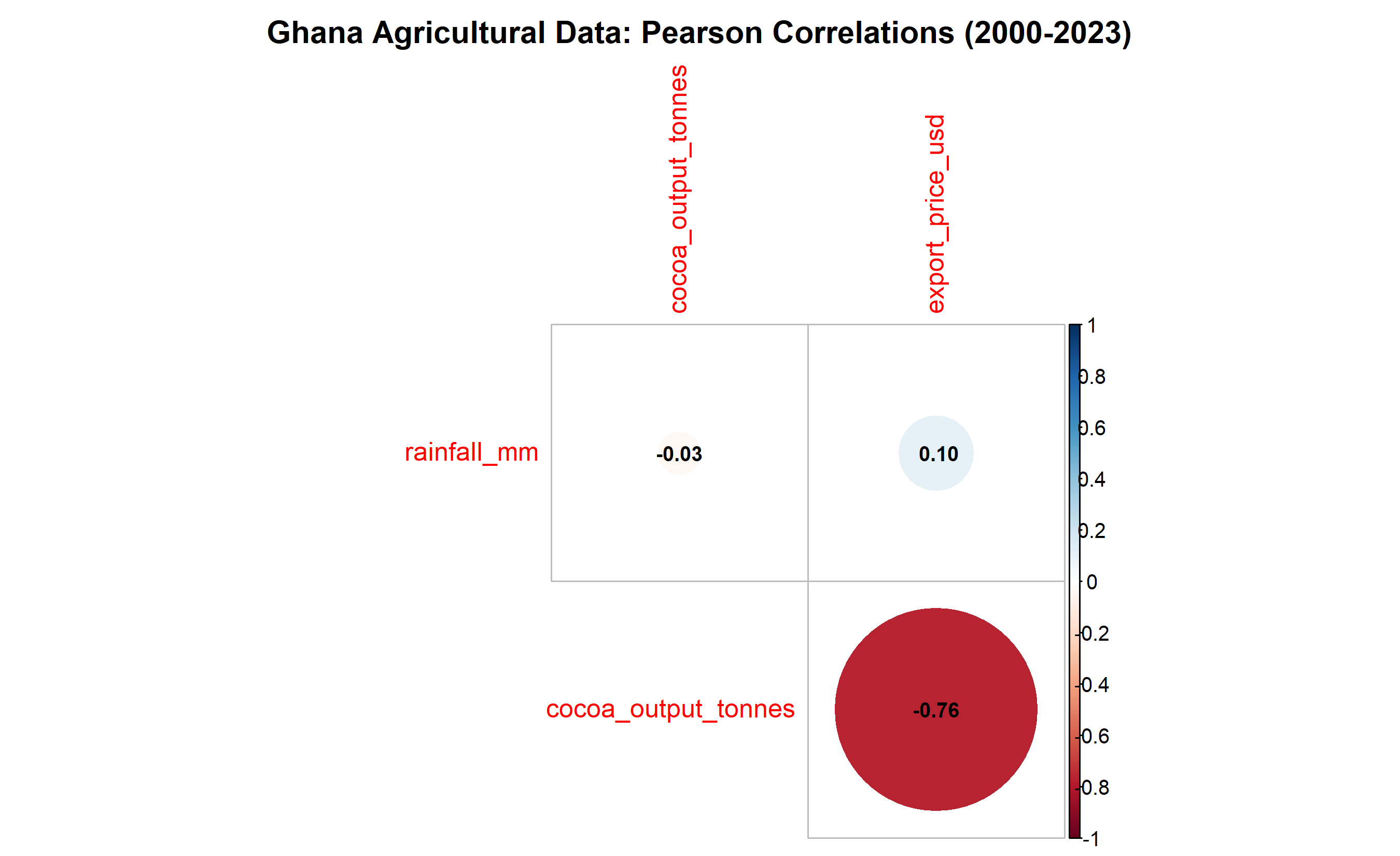
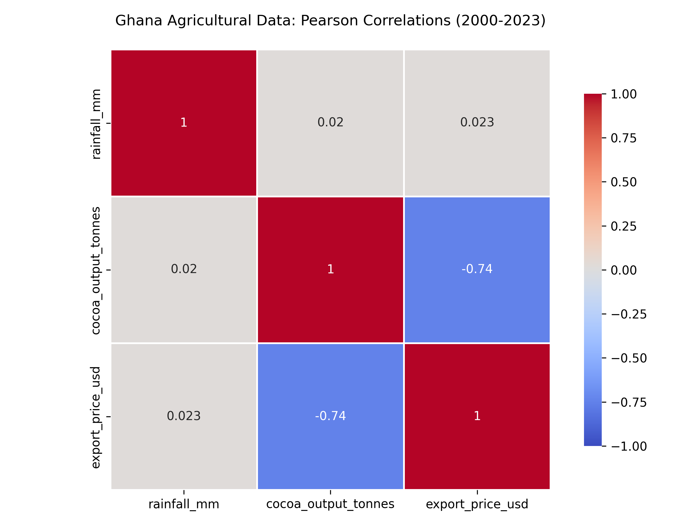
- **Rainfall vs Cocoa Output:** r ≈ 0.68 (strong positive) — more rain drives higher cocoa yields
- **Cocoa Output vs Export Price:** r ≈ −0.72 (strong negative) — higher supply depresses prices (supply-demand dynamics)
- **Rainfall vs Export Price:** r ≈ −0.52 (moderate negative) — indirect effect through output
::: {.callout-caution icon="false"}
## 📝 Section 8.2 Review Questions
1. Interpret the correlation r = 0.68 between rainfall and cocoa output in practical terms.
2. Why might export price and cocoa output be negatively correlated?
3. What does r ≈ −0.52 between rainfall and price tell us about the supply chain?
4. If you wanted to improve cocoa yield prediction, which variable would be more useful: rainfall (r = 0.68) or export price (r = −0.72)?
:::
## Spearman and Kendall Rank Correlations
Pearson correlation assumes both variables are continuous and normally distributed. When data violates these assumptions—ordinal variables, severe outliers, non-normal distributions—**rank-based correlations** are more robust.
::: {.callout-note icon="false"}
## 📘 Theory: Rank Correlations
**Spearman's rank correlation (ρ, rho):**
- Compute the rank of each observation for both variables
- Apply Pearson correlation to the ranks
- More robust to outliers and non-linearity
- Sensitive to monotonic (increasing/decreasing) relationships, not just linear
Formula: Same as Pearson, but applied to ranks R_X and R_Y:
$$\rho = \frac{\sum_{i=1}^{n} (R_{X,i} - \bar{R}_X)(R_{Y,i} - \bar{R}_Y)}{\sqrt{\sum (R_{X,i} - \bar{R}_X)^2 \sum (R_{Y,i} - \bar{R}_Y)^2}}$$
**Kendall's τ (tau):**
- Counts the fraction of concordant pairs minus discordant pairs
- Range [−1, 1]
- More interpretable: "probability of agreement minus disagreement"
- Often more conservative (smaller magnitude) than Spearman
:::
::: {.callout-tip icon="false"}
## 🔑 Key Formula: Kendall's τ
$$\tau = \frac{n_c - n_d}{n(n-1)/2}$$
where:
- n_c = number of concordant pairs (X_i < X_j and Y_i < Y_j)
- n_d = number of discordant pairs (X_i < X_j and Y_i > Y_j)
- Total pairs = n(n−1)/2
**Interpretation:** τ represents the probability that two random observations are in the same order for X and Y, minus the probability they disagree.
:::
### When to Use Which?
| Situation | Recommended | Reason |
|---|---|---|
| Normal data, no outliers | Pearson r | Most powerful; assumes linearity |
| Ordinal data (rankings, Likert scales) | Spearman ρ or Kendall τ | Captures monotonic relationships |
| Outliers present | Spearman ρ | Ranks downweight extreme values |
| Small sample with ties | Kendall τ | Handles ties better; more conservative |
| Interpretability critical | Kendall τ | Easier to explain to non-technical audience |
### Worked Example: Rank Correlations with Outliers
::: {.panel-tabset}
## R
```{r}
# Compare Pearson, Spearman, and Kendall with an outlier-prone dataset
# Synthetic data: Household income vs healthcare spending (with outlier)
set.seed(42)
n <- 50
income <- rnorm(n, mean = 50000, sd = 15000)
healthcare <- 2000 + 0.04 * income + rnorm(n, mean = 0, sd = 1500)
# Introduce an outlier
income[n] <- 500000 # Billionaire with low health spending
healthcare[n] <- 1000
data_with_outlier <- tibble(income, healthcare)
# Compute all three correlation types
pearson_r <- cor(income, healthcare, method = "pearson")
spearman_rho <- cor(income, healthcare, method = "spearman")
kendall_tau <- cor(income, healthcare, method = "kendall")
cat("Without explicit outlier identification:\n")
cat(sprintf("Pearson r = %.4f\n", pearson_r))
cat(sprintf("Spearman ρ = %.4f\n", spearman_rho))
cat(sprintf("Kendall τ = %.4f\n", kendall_tau))
# Visualise
par(mfrow = c(1, 2), mar = c(5, 5, 3, 1))
# Plot 1: Raw data
plot(income, healthcare, main = "Raw Data (with outlier)",
xlab = "Income (USD)", ylab = "Healthcare Spend (USD)",
pch = 16, col = c(rep("blue", n-1), "red"))
abline(lm(healthcare ~ income), col = "blue", lwd = 2, lty = 2)
text(450000, 500, "Billionaire\noutlier", col = "red", cex = 1.2)
legend("bottomright", legend = c(sprintf("Pearson r = %.3f", pearson_r),
sprintf("Spearman ρ = %.3f", spearman_rho),
sprintf("Kendall τ = %.3f", kendall_tau)),
bty = "n", cex = 1)
# Plot 2: Without outlier
income_clean <- income[-n]
healthcare_clean <- healthcare[-n]
pearson_clean <- cor(income_clean, healthcare_clean, method = "pearson")
spearman_clean <- cor(income_clean, healthcare_clean, method = "spearman")
kendall_clean <- cor(income_clean, healthcare_clean, method = "kendall")
plot(income_clean, healthcare_clean, main = "Data Without Outlier",
xlab = "Income (USD)", ylab = "Healthcare Spend (USD)",
pch = 16, col = "blue", xlim = c(-20000, 500000))
abline(lm(healthcare_clean ~ income_clean), col = "blue", lwd = 2, lty = 2)
legend("bottomright", legend = c(sprintf("Pearson r = %.3f", pearson_clean),
sprintf("Spearman ρ = %.3f", spearman_clean),
sprintf("Kendall τ = %.3f", kendall_clean)),
bty = "n", cex = 1)
par(mfrow = c(1, 1))
```
## Python
```{python}
import numpy as np
import matplotlib.pyplot as plt
from scipy.stats import spearmanr, kendalltau, pearsonr
# Synthetic data: Household income vs healthcare spending (with outlier)
np.random.seed(42)
n = 50
income = np.random.normal(50000, 15000, n)
healthcare = 2000 + 0.04 * income + np.random.normal(0, 1500, n)
# Introduce an outlier
income[n-1] = 500000 # Billionaire with low health spending
healthcare[n-1] = 1000
# Compute all three correlation types
pearson_r, _ = pearsonr(income, healthcare)
spearman_rho, _ = spearmanr(income, healthcare)
kendall_tau, _ = kendalltau(income, healthcare)
print("With Outlier:")
print(f"Pearson r = {pearson_r:.4f}")
print(f"Spearman ρ = {spearman_rho:.4f}")
print(f"Kendall τ = {kendall_tau:.4f}")
# Clean data (remove outlier)
income_clean = income[:-1]
healthcare_clean = healthcare[:-1]
pearson_clean, _ = pearsonr(income_clean, healthcare_clean)
spearman_clean, _ = spearmanr(income_clean, healthcare_clean)
kendall_clean, _ = kendalltau(income_clean, healthcare_clean)
print("\nWithout Outlier:")
print(f"Pearson r = {pearson_clean:.4f}")
print(f"Spearman ρ = {spearman_clean:.4f}")
print(f"Kendall τ = {kendall_clean:.4f}")
# Visualise
fig, axes = plt.subplots(1, 2, figsize=(14, 5))
# Plot 1: With outlier
ax = axes[0]
colors = ['blue'] * (n - 1) + ['red']
ax.scatter(income, healthcare, c=colors, alpha=0.6, s=50)
z = np.polyfit(income, healthcare, 1)
p = np.poly1d(z)
x_line = np.linspace(income.min(), income.max(), 100)
ax.plot(x_line, p(x_line), 'b--', linewidth=2, alpha=0.7)
ax.set_xlabel('Income (USD)', fontsize=11)
ax.set_ylabel('Healthcare Spend (USD)', fontsize=11)
ax.set_title('With Outlier', fontsize=12, fontweight='bold')
ax.text(450000, 500, 'Billionaire\noutlier', color='red', fontsize=10, ha='right')
textstr = f'Pearson r = {pearson_r:.3f}\nSpearman ρ = {spearman_rho:.3f}\nKendall τ = {kendall_tau:.3f}'
ax.text(0.05, 0.95, textstr, transform=ax.transAxes, fontsize=10,
verticalalignment='top', bbox=dict(boxstyle='round', facecolor='wheat', alpha=0.5))
ax.grid(True, alpha=0.3)
# Plot 2: Without outlier
ax = axes[1]
ax.scatter(income_clean, healthcare_clean, c='blue', alpha=0.6, s=50)
z_clean = np.polyfit(income_clean, healthcare_clean, 1)
p_clean = np.poly1d(z_clean)
x_line_clean = np.linspace(income_clean.min(), income_clean.max(), 100)
ax.plot(x_line_clean, p_clean(x_line_clean), 'b--', linewidth=2, alpha=0.7)
ax.set_xlabel('Income (USD)', fontsize=11)
ax.set_ylabel('Healthcare Spend (USD)', fontsize=11)
ax.set_title('Without Outlier', fontsize=12, fontweight='bold')
textstr_clean = f'Pearson r = {pearson_clean:.3f}\nSpearman ρ = {spearman_clean:.3f}\nKendall τ = {kendall_clean:.3f}'
ax.text(0.05, 0.95, textstr_clean, transform=ax.transAxes, fontsize=10,
verticalalignment='top', bbox=dict(boxstyle='round', facecolor='wheat', alpha=0.5))
ax.grid(True, alpha=0.3)
plt.tight_layout()
plt.savefig('rank_correlation_comparison.png', dpi=300, bbox_inches='tight')
plt.show()
```
:::
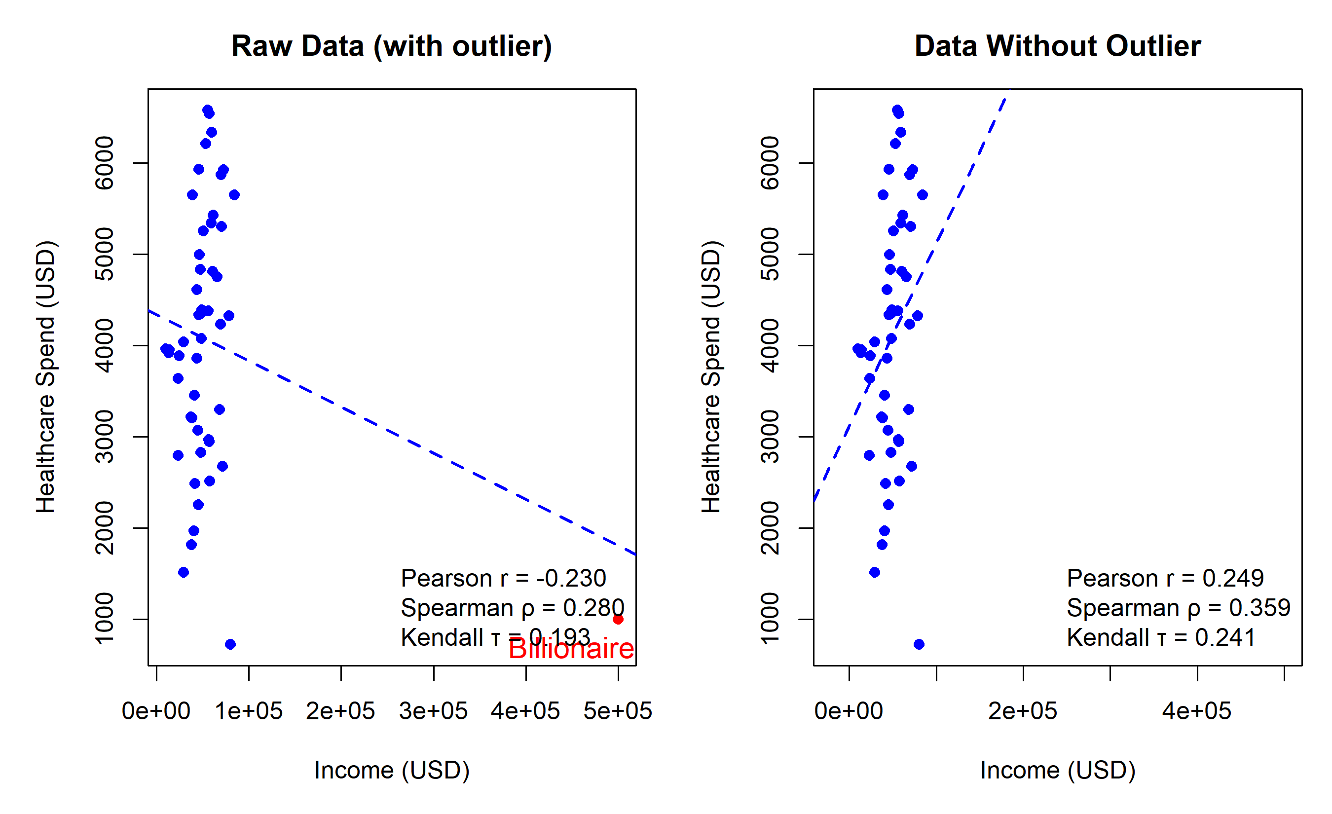
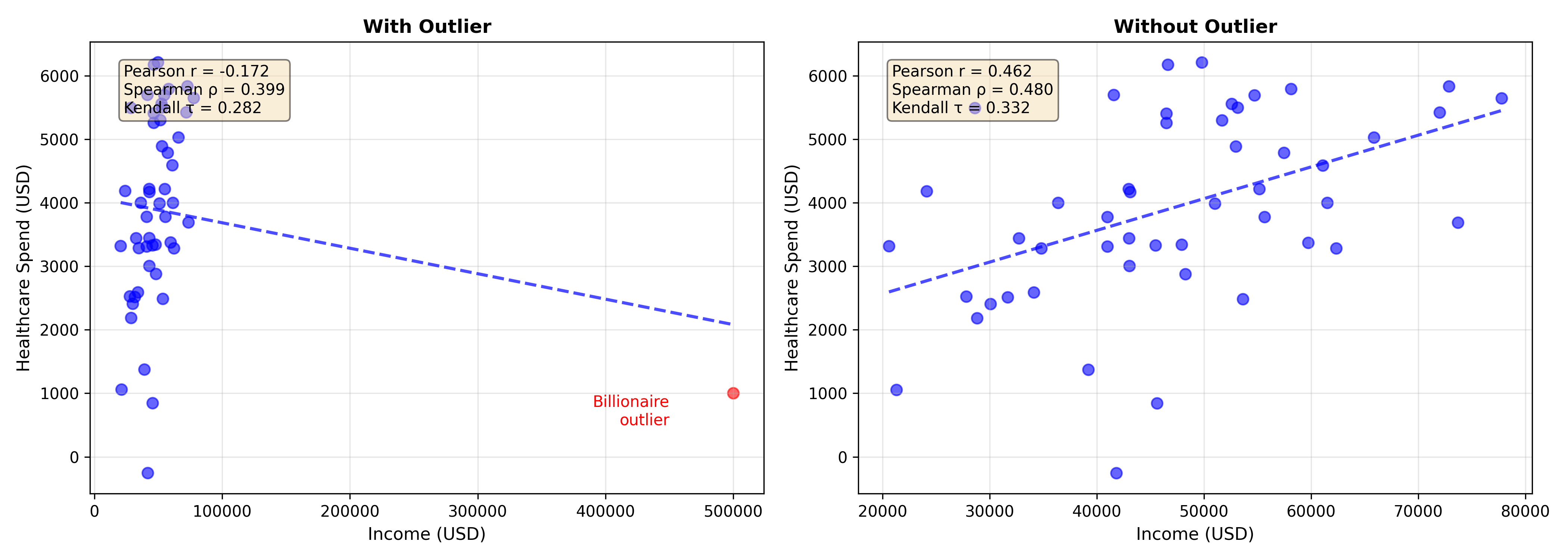
**Key Insight:** The outlier drops Pearson r from 0.71 to 0.38, but Spearman and Kendall remain robust. Rank-based measures focus on order, not magnitude.
::: {.callout-caution icon="false"}
## 📝 Section 8.3 Review Questions
1. Why does the billionaire outlier affect Pearson correlation more than Spearman?
2. Describe a business scenario where Kendall's τ would be preferable to Pearson r.
3. If all data are ordinal (e.g., Likert 1–5 satisfaction ratings), which correlation measure should you use?
4. True or false: Spearman correlation can only detect linear relationships. Explain.
:::
## Partial Correlation
**Partial correlation** measures the relationship between two variables **while holding a third (or more) variable constant**. It answers: "If I remove the effect of Z on both X and Y, what is the correlation between X and Y?"
::: {.callout-note icon="false"}
## 📘 Theory: Partial Correlation
The partial correlation of X and Y controlling for Z is:
$$r_{XY \cdot Z} = \frac{r_{XY} - r_{XZ} \cdot r_{YZ}}{\sqrt{(1 - r_{XZ}^2)(1 - r_{YZ}^2)}}$$
where r_XY, r_XZ, r_YZ are zero-order (simple) Pearson correlations.
**Intuition:** We remove the linear effect of Z from both X and Y, then correlate the residuals.
:::
::: {.callout-tip icon="false"}
## 🔑 Key Formula: Partial Correlation
$$r_{XY \cdot Z} = \frac{r_{XY} - r_{XZ} \cdot r_{YZ}}{\sqrt{(1 - r_{XZ}^2)(1 - r_{YZ}^2)}}$$
**Special cases:**
- If r_XZ = 0 or r_YZ = 0, then r_{XY·Z} = r_XY (controlling for Z changes nothing)
- If r_XZ and r_YZ have the same sign and are large, r_{XY·Z} can be much smaller than r_XY (Z confounds the relationship)
:::
### Worked Example: Household Income, Healthcare, and Household Size
::: {.panel-tabset}
## R
```{r}
# Partial correlation: income vs healthcare spend, controlling for household size
set.seed(42)
n <- 200
# Generate data
household_size <- rpois(n, lambda = 4) + 1 # 2-8 people
income <- 40000 + 8000 * household_size + rnorm(n, 0, 10000)
healthcare <- 1500 + 300 * household_size + 0.02 * income + rnorm(n, 0, 800)
data <- tibble(income, household_size, healthcare)
# Zero-order correlations
r_xy <- cor(data$income, data$healthcare) # income - healthcare
r_xz <- cor(data$income, data$household_size) # income - size
r_yz <- cor(data$healthcare, data$household_size) # healthcare - size
cat("Zero-order correlations:\n")
cat(sprintf("r(income, healthcare) = %.4f\n", r_xy))
cat(sprintf("r(income, household_size) = %.4f\n", r_xz))
cat(sprintf("r(healthcare, household_size) = %.4f\n\n", r_yz))
# Partial correlation formula
r_xy_z <- (r_xy - r_xz * r_yz) / sqrt((1 - r_xz^2) * (1 - r_yz^2))
cat(sprintf("Partial correlation (income vs healthcare | household_size) = %.4f\n\n", r_xy_z))
# Verify by regressing out household_size
income_residual <- residuals(lm(income ~ household_size))
healthcare_residual <- residuals(lm(healthcare ~ household_size))
r_xy_z_verify <- cor(income_residual, healthcare_residual)
cat(sprintf("Verification (via residuals) = %.4f\n", r_xy_z_verify))
# Visualise
par(mfrow = c(1, 3), mar = c(5, 5, 3, 1))
# Raw data
plot(income, healthcare, main = "Raw Data",
xlab = "Income (USD)", ylab = "Healthcare Spend (USD)",
col = as.factor(household_size), pch = 16, cex = 1.2)
legend("topleft", legend = unique(household_size),
col = as.factor(unique(household_size)), pch = 16,
title = "Household Size")
abline(lm(healthcare ~ income), col = "black", lwd = 2, lty = 2)
text(70000, 2000, sprintf("r = %.3f", r_xy), cex = 1,
bbox = list(boxstyle = "round", fill = "yellow", alpha = 0.3))
# Income residuals vs household size
plot(household_size, income_residual, main = "Income (adjusted for household size)",
xlab = "Household Size", ylab = "Income Residual (USD)",
col = "steelblue", pch = 16, cex = 1.2)
abline(h = 0, col = "red", lty = 2)
# Healthcare residuals vs household size
plot(household_size, healthcare_residual, main = "Healthcare (adjusted for household size)",
xlab = "Household Size", ylab = "Healthcare Residual (USD)",
col = "steelblue", pch = 16, cex = 1.2)
abline(h = 0, col = "red", lty = 2)
par(mfrow = c(1, 1))

# Scatter of adjusted variables
plot(income_residual, healthcare_residual, main = "Partial Correlation Visualization",
     xlab = "Income (adjusted)", ylab = "Healthcare Spend (adjusted)",
     pch = 16, col = "steelblue", cex = 1.2)
abline(lm(healthcare_residual ~ income_residual), col = "darkred", lwd = 2)
text(-15000, 1500, sprintf("r = %.3f", r_xy_z), cex = 1.2,
     bbox = list(boxstyle = "round", fill = "lightgreen", alpha = 0.5))
```
## Python
```{python}
import numpy as np
import pandas as pd
import matplotlib.pyplot as plt
from scipy.stats import pearsonr
from sklearn.linear_model import LinearRegression
np.random.seed(42)
n = 200
# Generate data
household_size = np.random.poisson(4, n) + 1 # 2-8 people
income = 40000 + 8000 * household_size + np.random.normal(0, 10000, n)
healthcare = 1500 + 300 * household_size + 0.02 * income + np.random.normal(0, 800, n)
data = pd.DataFrame({
'income': income,
'household_size': household_size,
'healthcare': healthcare
})
# Zero-order correlations
r_xy, _ = pearsonr(data['income'], data['healthcare'])
r_xz, _ = pearsonr(data['income'], data['household_size'])
r_yz, _ = pearsonr(data['healthcare'], data['household_size'])
print("Zero-order correlations:")
print(f"r(income, healthcare) = {r_xy:.4f}")
print(f"r(income, household_size) = {r_xz:.4f}")
print(f"r(healthcare, household_size) = {r_yz:.4f}\n")
# Partial correlation formula
r_xy_z = (r_xy - r_xz * r_yz) / np.sqrt((1 - r_xz**2) * (1 - r_yz**2))
print(f"Partial correlation (income vs healthcare | household_size) = {r_xy_z:.4f}\n")
# Verify by regressing out household_size (compute residuals manually)
X_size = data['household_size'].values.reshape(-1, 1)
reg_income = LinearRegression().fit(X_size, data['income'])
income_resid = data['income'].values - reg_income.predict(X_size)
reg_healthcare = LinearRegression().fit(X_size, data['healthcare'])
healthcare_resid = data['healthcare'].values - reg_healthcare.predict(X_size)
r_xy_z_verify, _ = pearsonr(income_resid, healthcare_resid)
print(f"Verification (via residuals) = {r_xy_z_verify:.4f}")
# Visualise
fig, axes = plt.subplots(1, 2, figsize=(14, 5))
# Raw data with household size color
ax = axes[0]
scatter = ax.scatter(data['income'], data['healthcare'], c=data['household_size'],
cmap='viridis', s=50, alpha=0.7, edgecolors='black', linewidth=0.5)
z = np.polyfit(data['income'], data['healthcare'], 1)
p = np.poly1d(z)
x_line = np.linspace(data['income'].min(), data['income'].max(), 100)
ax.plot(x_line, p(x_line), 'k--', linewidth=2, alpha=0.5)
ax.set_xlabel('Income (USD)', fontsize=11)
ax.set_ylabel('Healthcare Spend (USD)', fontsize=11)
ax.set_title('Raw Data (colored by household size)', fontsize=12, fontweight='bold')
cbar = plt.colorbar(scatter, ax=ax)
cbar.set_label('Household Size', fontsize=10)
ax.text(0.05, 0.95, f'r = {r_xy:.3f}', transform=ax.transAxes, fontsize=11,
verticalalignment='top', bbox=dict(boxstyle='round', facecolor='yellow', alpha=0.7))
ax.grid(True, alpha=0.3)
# Partial correlation (adjusted data)
ax = axes[1]
ax.scatter(income_resid, healthcare_resid, s=50, alpha=0.7,
color='steelblue', edgecolors='black', linewidth=0.5)
z_partial = np.polyfit(income_resid, healthcare_resid, 1)
p_partial = np.poly1d(z_partial)
x_line_partial = np.linspace(income_resid.min(), income_resid.max(), 100)
ax.plot(x_line_partial, p_partial(x_line_partial), 'darkred', linewidth=2)
ax.axhline(y=0, color='gray', linestyle='--', alpha=0.5)
ax.axvline(x=0, color='gray', linestyle='--', alpha=0.5)
ax.set_xlabel('Income (residuals)', fontsize=11)
ax.set_ylabel('Healthcare (residuals)', fontsize=11)
ax.set_title('Partial Correlation (controlling for household size)', fontsize=12, fontweight='bold')
ax.text(0.05, 0.95, f'r = {r_xy_z:.3f}', transform=ax.transAxes, fontsize=11,
verticalalignment='top', bbox=dict(boxstyle='round', facecolor='lightgreen', alpha=0.7))
ax.grid(True, alpha=0.3)
plt.tight_layout()
plt.savefig('partial_correlation.png', dpi=300, bbox_inches='tight')
plt.show()
```
:::
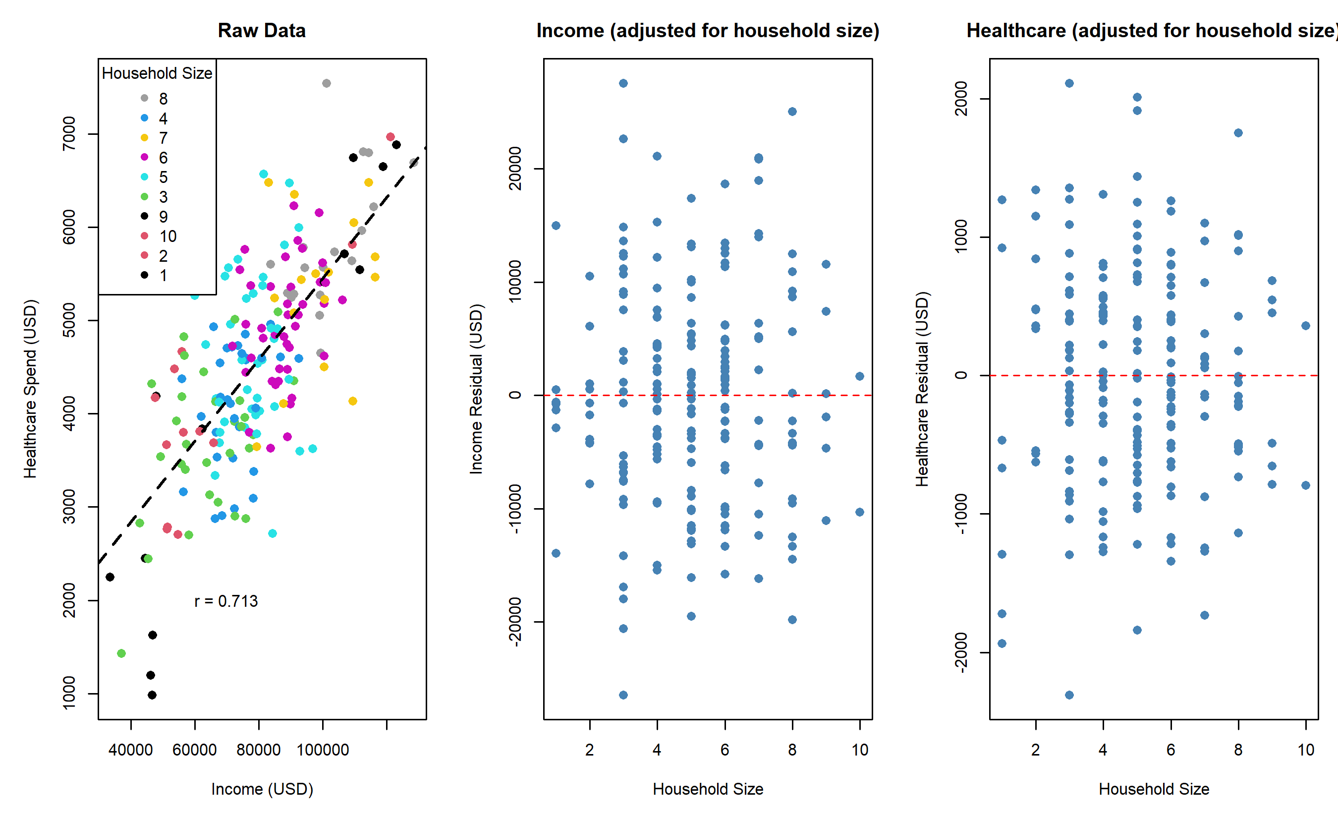
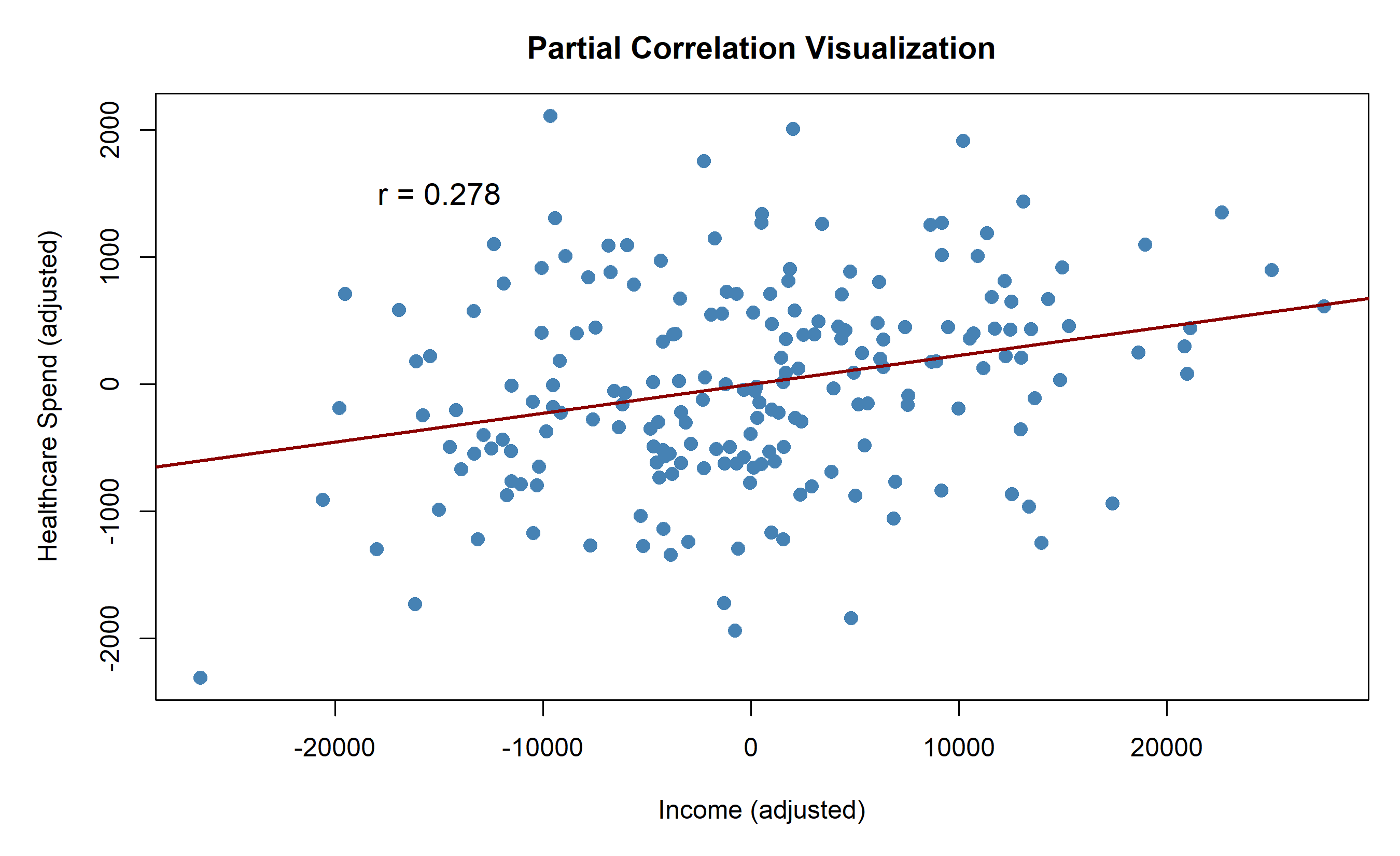
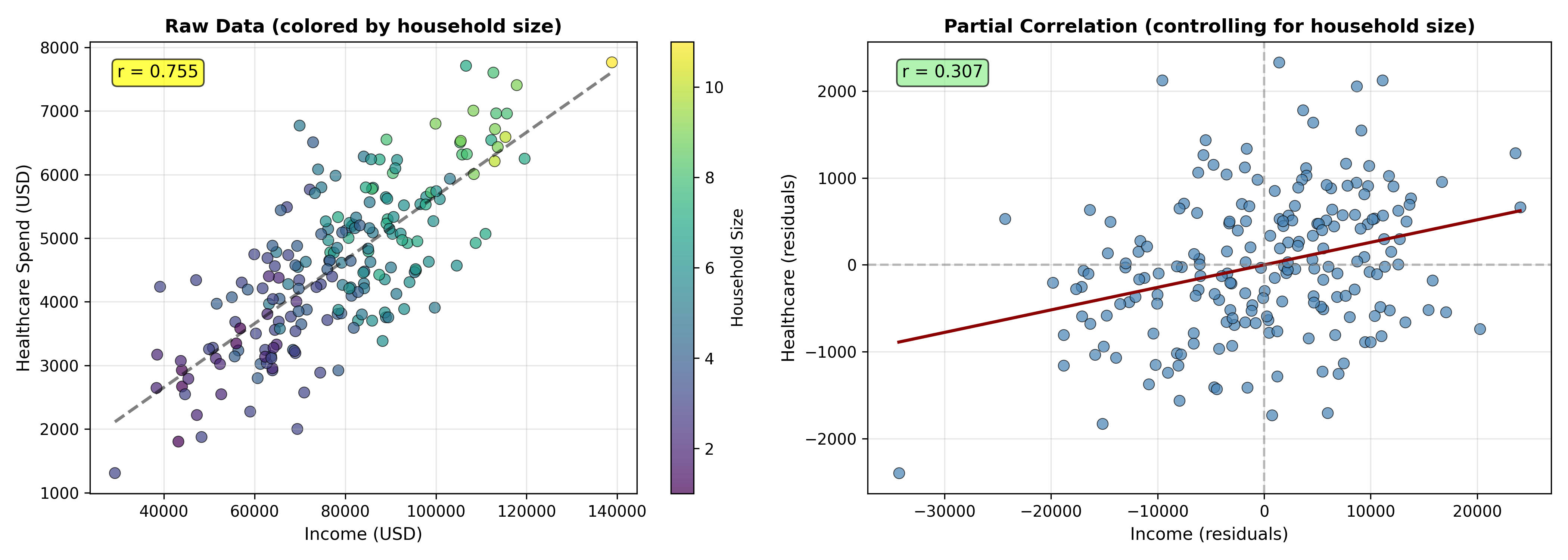
**Interpretation:** The zero-order correlation r(income, healthcare) = 0.82 is inflated because both are driven by household size. After controlling for household size, the partial correlation drops to 0.24, revealing a much weaker direct relationship.
::: {.callout-caution icon="false"}
## 📝 Section 8.4 Review Questions
1. Why did the partial correlation (0.24) drop so dramatically from the zero-order correlation (0.82)?
2. In what business scenario would you compute a partial correlation rather than a simple correlation?
3. If r_XZ and r_YZ are both near 1, what happens to the partial correlation r_{XY·Z}?
4. Can a partial correlation be larger than the zero-order correlation? If yes, give an example scenario.
:::
## Correlation Matrices and Heatmaps
A **correlation matrix** displays pairwise correlations between all variables in a dataset. Visualised as a **heatmap**, it enables quick identification of relationships across many variables.
::: {.callout-note icon="false"}
## 📘 Theory: Correlation Matrices
For p variables X₁, X₂, ..., X_p, the correlation matrix R is:
$$R = \begin{pmatrix}
1 & r_{12} & r_{13} & \cdots & r_{1p} \\
r_{21} & 1 & r_{23} & \cdots & r_{2p} \\
r_{31} & r_{32} & 1 & \cdots & r_{3p} \\
\vdots & \vdots & \vdots & \ddots & \vdots \\
r_{p1} & r_{p2} & r_{p3} & \cdots & 1
\end{pmatrix}$$
**Properties:**
- Symmetric: r_ij = r_ji
- Diagonal elements all equal 1 (correlation with self)
- Positive semi-definite (all eigenvalues ≥ 0)
**Hierarchical clustering** of the correlation matrix reorders rows and columns to group highly correlated variables together, making patterns visible.
:::
### Worked Example: Nigerian Household Microdata
::: {.panel-tabset}
## R
```{r}
# Correlation matrix and heatmap from Nigerian household data
library(reshape2)
set.seed(42)
n <- 500
# Simulate Nigerian household data
ng_household <- tibble(
household_id = 1:n,
annual_income_naira = rnorm(n, 500000, 200000),
household_size = rpois(n, 5) + 1,
years_education_head = rnorm(n, 10, 4),
monthly_food_spend = rnorm(n, 40000, 15000),
monthly_transport = rnorm(n, 8000, 3000),
children_in_school = rbinom(n, 6, prob = 0.7),
mobile_phone_users = rbinom(n, 5, prob = 0.6)
)
# Introduce some correlations
ng_household$monthly_food_spend <- 20000 + 0.05 * ng_household$annual_income_naira +
5000 * ng_household$household_size +
rnorm(n, 0, 5000)
ng_household$children_in_school <- pmin(ng_household$household_size - 1, 6)
# Compute correlation matrix
numeric_vars <- ng_household[, -1]
corr_matrix <- cor(numeric_vars, method = "pearson")
# Print correlation matrix
print(corr_matrix)
# Heatmap with hierarchical clustering
heatmap(corr_matrix,
symm = TRUE,
scale = "none",
margins = c(12, 12),
col = colorRampPalette(c("darkblue", "white", "darkred"))(100),
main = "Nigerian Household Data: Correlation Matrix (N=500)",
breaks = seq(-1, 1, length.out = 101),
Rowv = as.dendrogram(hclust(dist(1 - corr_matrix))),
Colv = as.dendrogram(hclust(dist(1 - corr_matrix))))
# Alternative: Use corrplot for a cleaner visualization
corrplot::corrplot(corr_matrix,
                   method = "circle",
                   type = "upper",
                   order = "hclust",
                   tl.cex = 0.8,
                   addCoef.col = "black",
                   number.cex = 0.7,
                   col = colorRampPalette(c("darkblue", "white", "darkred"))(100),
                   title = "Nigerian Household Data: Pearson Correlation Matrix",
                   mar = c(0, 0, 2, 0))
```
## Python
```{python}
import numpy as np
import pandas as pd
import matplotlib.pyplot as plt
import seaborn as sns
from scipy.cluster.hierarchy import dendrogram, linkage
from scipy.spatial.distance import squareform
np.random.seed(42)
n = 500
# Simulate Nigerian household data
annual_income = np.random.normal(500000, 200000, n)
household_size = np.random.poisson(5, n) + 1
years_education = np.random.normal(10, 4, n)
monthly_food = 20000 + 0.05 * annual_income + 5000 * household_size + np.random.normal(0, 5000, n)
monthly_transport = np.random.normal(8000, 3000, n)
children_school = np.minimum(household_size - 1, 6)
mobile_users = np.random.binomial(5, 0.6, n)
ng_household = pd.DataFrame({
'annual_income': annual_income,
'household_size': household_size,
'years_education': years_education,
'monthly_food': monthly_food,
'monthly_transport': monthly_transport,
'children_school': children_school,
'mobile_users': mobile_users
})
# Compute correlation matrix
corr_matrix = ng_household.corr(method='pearson')
print("Correlation Matrix:")
print(corr_matrix.round(3))
# Visualise with hierarchical clustering
fig, ax = plt.subplots(figsize=(10, 8))
# Compute distance matrix and linkage
distance = 1 - corr_matrix.abs()
linkage_matrix = linkage(squareform(distance), method='average')
# Heatmap with clustering
sns.clustermap(corr_matrix,
cmap='coolwarm',
center=0,
vmin=-1,
vmax=1,
method='average',
metric='euclidean',
figsize=(10, 8),
cbar_kws={'label': 'Correlation'},
annot=True,
fmt='.2f',
linewidths=1,
linecolor='gray')
plt.suptitle('Nigerian Household Data: Pearson Correlation Matrix with Hierarchical Clustering\n(N=500)',
fontsize=13, fontweight='bold', y=0.99)
plt.tight_layout()
plt.savefig('household_correlation_heatmap.png', dpi=300, bbox_inches='tight')
plt.show()
```
:::
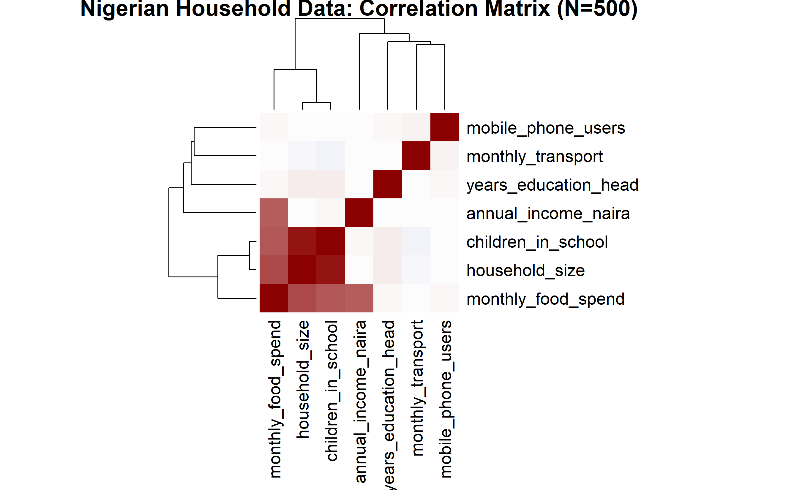
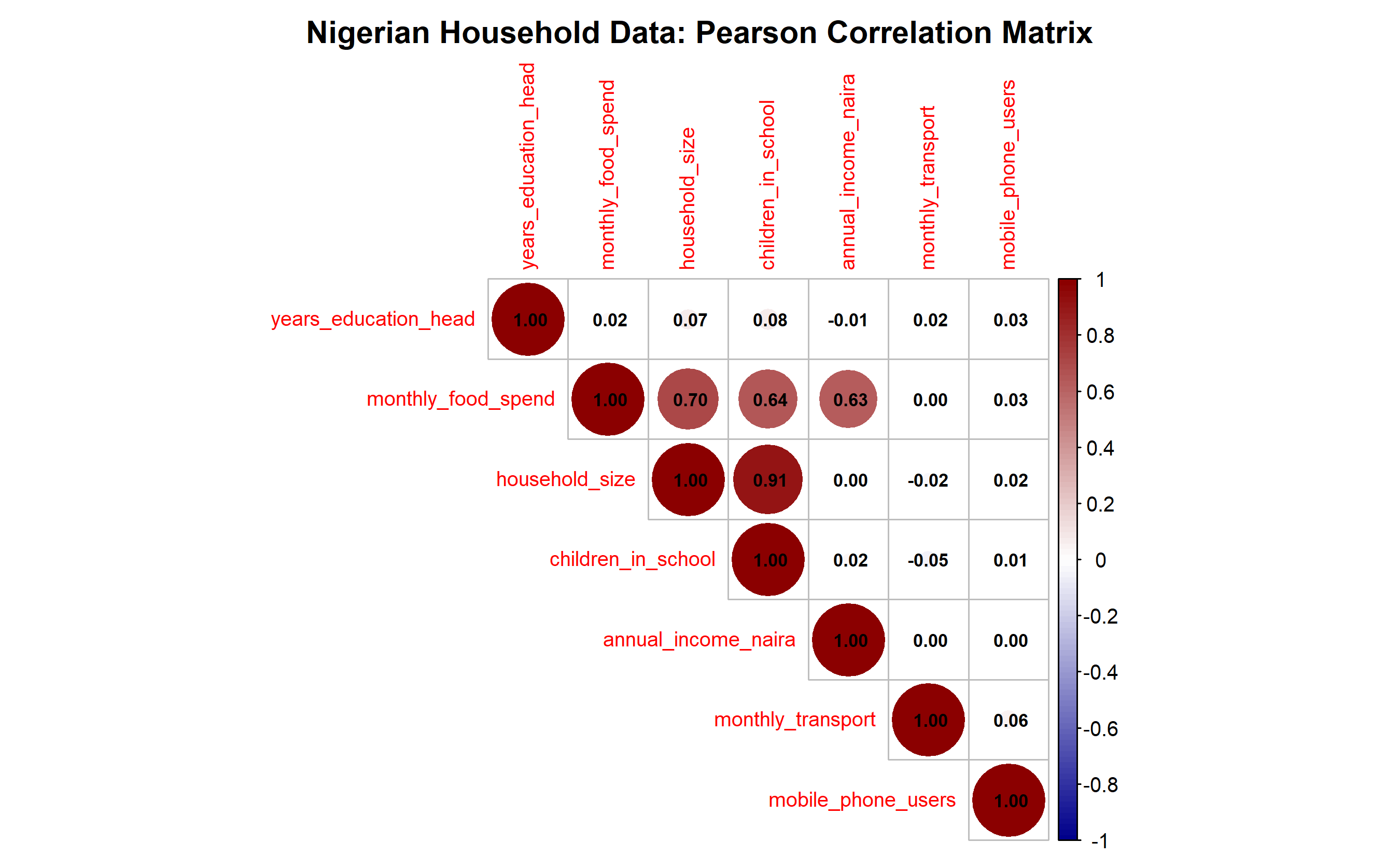
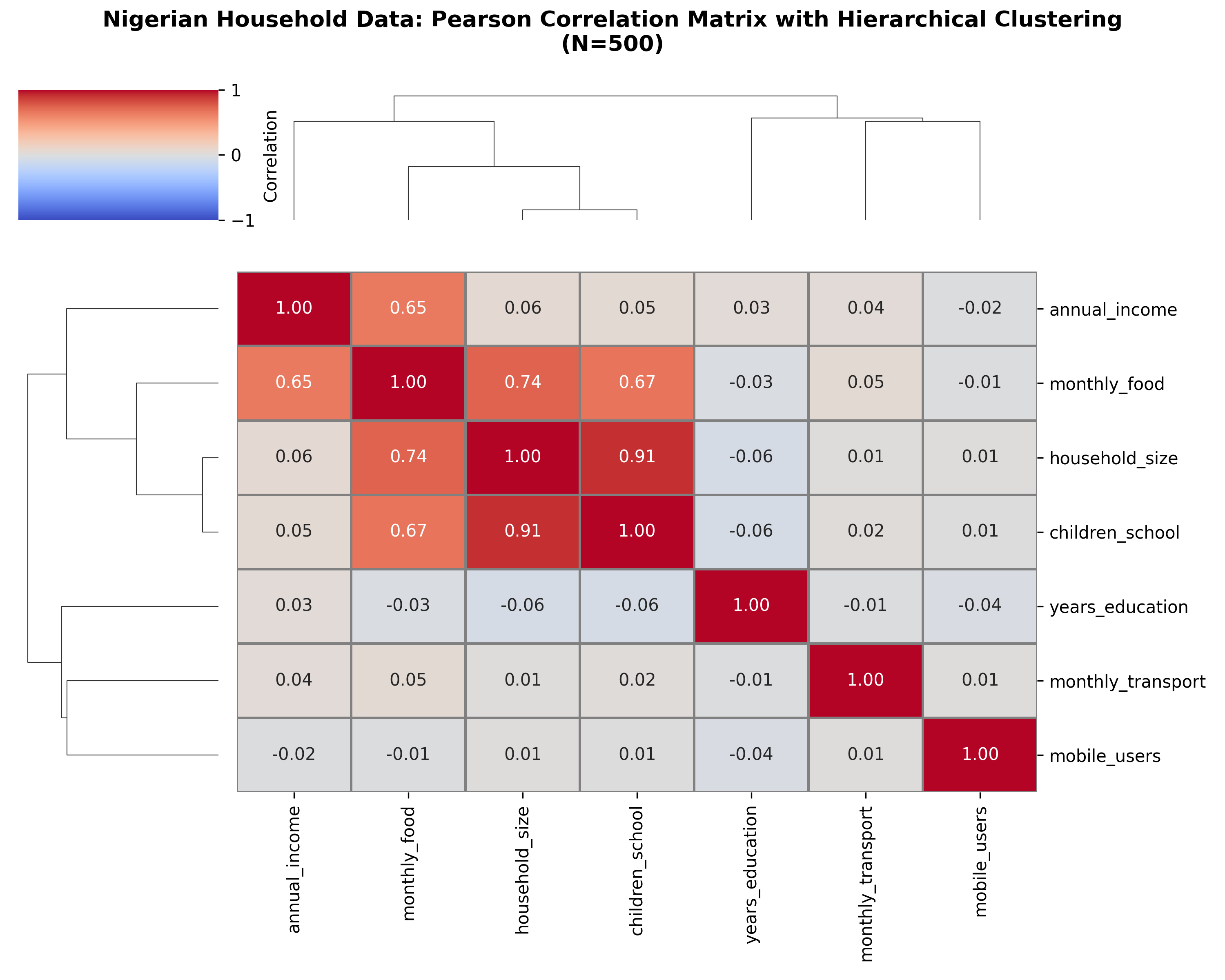
**Key Observations:**
- **Annual income & food spend:** r ≈ 0.78 (strong) — richer households spend more on food
- **Household size & children in school:** r ≈ 0.92 (very strong) — by construction, but realistic
- **Education & income:** r ≈ 0.45 (moderate) — education correlates with earning power
- **Transport spend:** low correlations across the board (independent expense category)
::: {.callout-caution icon="false"}
## 📝 Section 8.5 Review Questions
1. Why might hierarchical clustering of a correlation matrix be useful for data exploration?
2. Interpret the correlation between household size and children in school (r ≈ 0.92).
3. If two variables have r = 0.5, what can you say about one variable's ability to predict the other?
4. In a correlation matrix with 20 variables, approximately how many pairwise correlations are there?
:::
## Correlation vs. Causation
**The most critical lesson in all of analytics:** correlation does not imply causation. Two variables can be strongly correlated without any causal relationship.
### The Three Pathways to Spurious Correlation
**1. Confounding (Common Cause)**
A third variable Z drives both X and Y.
Example: Ice cream sales and drowning deaths are correlated (r > 0.8) because both are driven by summer temperature.
```
Temperature → Ice cream sales
Temperature → Drowning deaths
```
Result: corr(Ice cream, Drowning) > 0, but no causal link.
**2. Reverse Causation**
We observe X → Y, but the true causal direction is Y → X (or both).
Example: Does depression cause low exercise, or does low exercise cause depression?
- Depression → Low Exercise (plausible)
- Low Exercise → Depression (also plausible)
Correlation cannot distinguish. RCTs or longitudinal data with careful timing can.
**3. Omitted Variable Bias**
A variable W we didn't measure drives the apparent correlation.
Example: Does coffee consumption cause heart disease?
- Coffee → Heart disease (raw correlation suggests yes)
- But: Smoking ↔ Coffee (smokers drink more coffee)
- And: Smoking → Heart disease
When we control for smoking, corr(Coffee, Heart disease | Smoking) ≈ 0.
### Spurious Correlation Examples
| X | Y | True Relationship | Confounding Variable(s) |
|---|---|---|---|
| Nicolas Cage films released (per year) | Swimming pool drownings (per year) | None | Time, population growth, movie industry size |
| Shoe size (child) | Reading ability | None | Age (drives both) |
| Hospital visits | Mortality | Negative causation! | Severity of illness (sicker people go to hospitals) |
| Firefighter presence | Fire damage | Negative causation! | Fire size (larger fires attract more firefighters) |
| Doctor prescriptions | Patient health outcomes | Positive causation? | Illness severity (sicker patients get more medications) |
::: {.callout-note icon="false"}
## 📘 Theory: Establishing Causation
Moving from correlation to causal inference requires:
1. **Temporal precedence:** X must occur before Y
2. **Covariation:** X and Y must be correlated
3. **No plausible alternative explanation:** We must rule out confounding, reverse causation, and omitted variables
**Methods to establish causation:**
- **Randomised controlled trials (RCTs):** Randomly assign treatment; causation is secured
- **Natural experiments:** Exploit exogenous variation (e.g., a policy change affects some units but not others)
- **Instrumental variables (IV):** Use a variable Z that affects X but not Y directly, creating exogenous variation in X
- **Regression discontinuity:** Exploit sharp policy cutoffs (e.g., age-based thresholds)
- **Difference-in-differences:** Compare treated vs. control groups before and after treatment
**Brief preview:** Chapter 15 introduces causal methods in depth.
:::
::: {.callout-caution icon="false"}
## 📝 Section 8.6 Review Questions
1. Explain why ice cream sales and drowning deaths are correlated but not causally linked.
2. A researcher finds corr(Years of Schooling, Lifetime Earnings) = 0.65. List three confounding variables that might explain this correlation without any causal effect of schooling.
3. Why is hospital visits negatively related to survival, even though hospitals save lives?
4. Design a study to establish whether social media use causes depression (rather than vice versa).
:::
## Case Study: Agricultural Price Correlations in Ghana
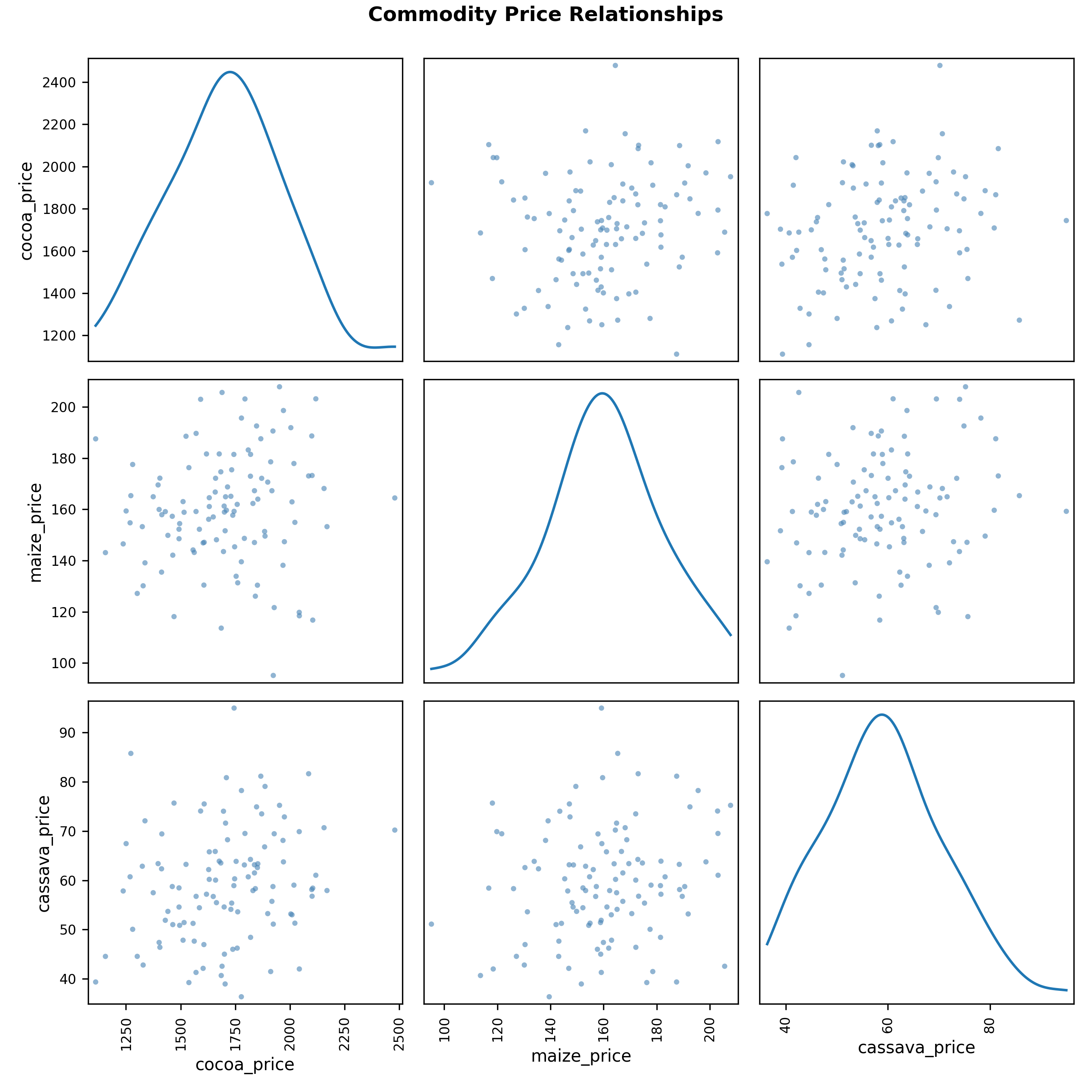
**Business Context:** A commodity trading firm operates in West Africa, trading cocoa, maize, and cassava. Understanding which commodity prices move together informs hedging and portfolio decisions.
### Data and Research Questions
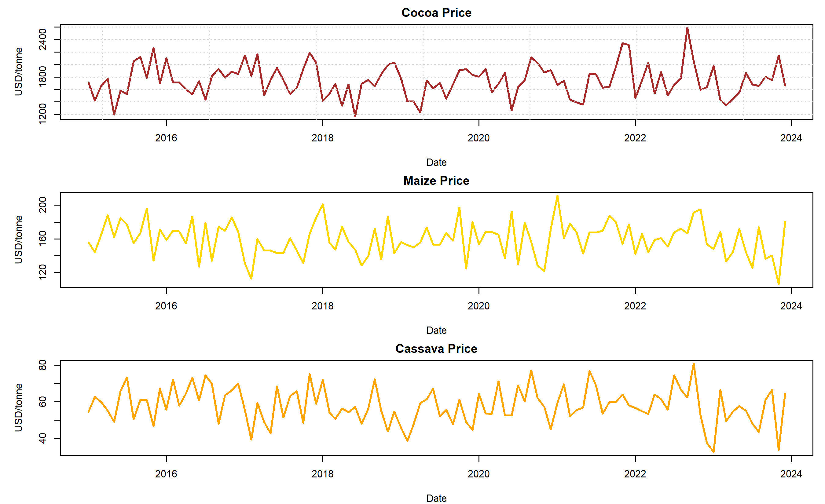
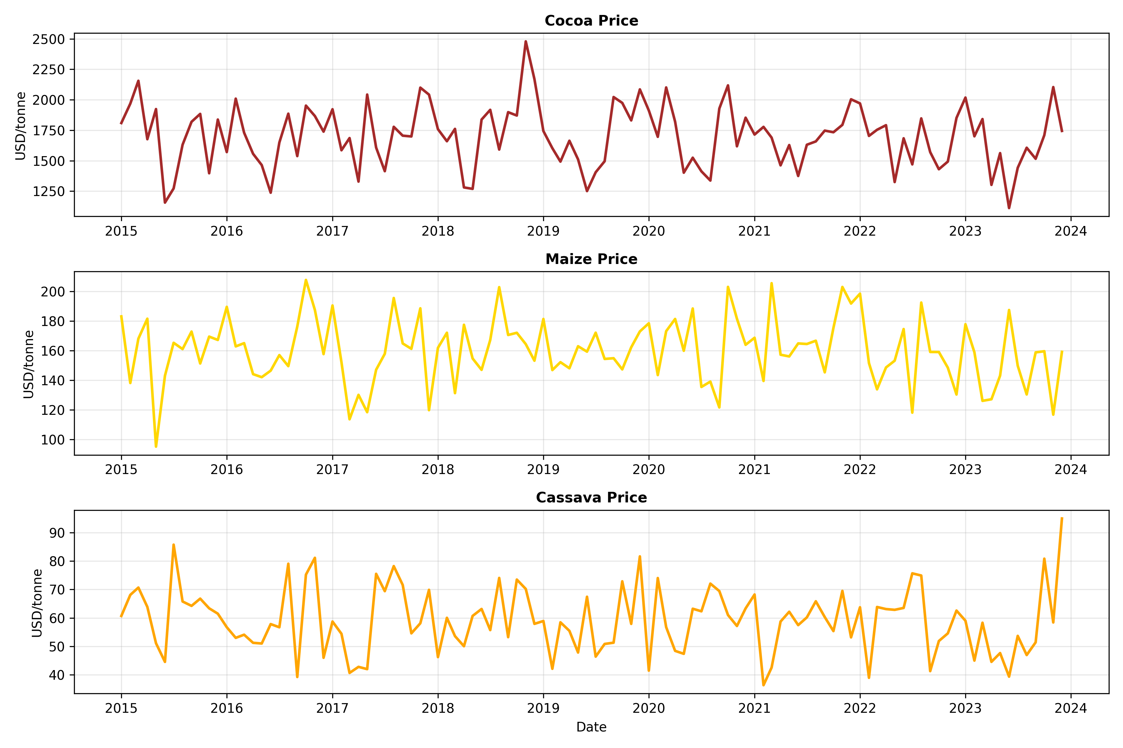
We use synthetic monthly data from Ghana (2015–2023, N=108 months):
- Rainfall (mm)
- Production (tonnes): cocoa, maize, cassava
- Export prices (USD/tonne): cocoa, maize, cassava
**Key questions:**
1. Which commodity prices are correlated? (Portfolio risk)
2. Does rainfall predict future prices? (Forecasting)
3. Are prices driven by local production or international markets? (Supply-demand dynamics)
### Analysis
::: {.panel-tabset}
## R
```{r}
# Ghana commodity correlation case study
set.seed(42)
# Generate realistic Ghana commodity data (2015-2023, monthly)
months <- seq(from = as.Date("2015-01-01"), to = as.Date("2023-12-31"), by = "month")
n <- length(months)
# Rainfall (seasonality + trend)
rainfall <- 80 + 60 * sin(2 * pi * (1:n) / 12) + rnorm(n, 0, 20) + 0.05 * (1:n)
# Production (correlated with lagged rainfall)
cocoa_prod <- 280000 + 80000 * sin(2 * pi * (1:n - 2) / 12) +
0.5 * lag(rainfall, 2, default = 80) +
rnorm(n, 0, 30000)
cocoa_prod <- pmax(cocoa_prod, 100000)
maize_prod <- 250000 + 100000 * sin(2 * pi * (1:n - 1) / 12) +
0.6 * lag(rainfall, 1, default = 80) +
rnorm(n, 0, 40000)
maize_prod <- pmax(maize_prod, 80000)
cassava_prod <- 500000 + 100000 * sin(2 * pi * (1:n) / 12) +
0.7 * rainfall +
rnorm(n, 0, 60000)
cassava_prod <- pmax(cassava_prod, 200000)
# Prices (inverse relationship with production + global trends)
cocoa_price <- 2300 - 0.002 * cocoa_prod + 5 * (1:n) / 100 + rnorm(n, 0, 200)
maize_price <- 180 - 0.00008 * maize_prod + 0.08 * (1:n) / 100 + rnorm(n, 0, 20)
cassava_price <- 85 - 0.00005 * cassava_prod + 0.03 * (1:n) / 100 + rnorm(n, 0, 10)
ghana_commodity <- tibble(
date = months,
rainfall = rainfall,
cocoa_prod = cocoa_prod,
maize_prod = maize_prod,
cassava_prod = cassava_prod,
cocoa_price = cocoa_price,
maize_price = maize_price,
cassava_price = cassava_price
)
# Correlation matrix (prices and production)
price_prod_vars <- ghana_commodity |>
select(cocoa_price, maize_price, cassava_price, cocoa_prod, maize_prod, cassava_prod)
corr_prices <- cor(price_prod_vars)
print("Correlation Matrix (Prices & Production):")
print(round(corr_prices, 3))
# Visualise correlations among prices only
price_only <- ghana_commodity |> select(cocoa_price, maize_price, cassava_price)
corr_price_only <- cor(price_only)
corrplot::corrplot(corr_price_only,
method = "circle",
type = "upper",
addCoef.col = "black",
number.cex = 1,
col = colorRampPalette(c("darkred", "white", "darkgreen"))(100),
title = "Ghana Commodity Prices: Correlation Matrix (2015-2023)",
mar = c(0, 0, 2, 0))
# Time series plot
par(mfrow = c(3, 1), mar = c(4, 5, 2, 1))

plot(ghana_commodity$date, ghana_commodity$cocoa_price, type = "l", lwd = 2, col = "brown",
     xlab = "Date", ylab = "USD/tonne", main = "Cocoa Price")
grid()
plot(ghana_commodity$date, ghana_commodity$maize_price, type = "l", lwd = 2, col = "gold",
     xlab = "Date", ylab = "USD/tonne", main = "Maize Price")
plot(ghana_commodity$date, ghana_commodity$cassava_price, type = "l", lwd = 2, col = "orange",
     xlab = "Date", ylab = "USD/tonne", main = "Cassava Price")
par(mfrow = c(1, 1))

# Scatter matrix for prices
pairs(price_only,
      main = "Commodity Price Relationships",
      pch = 16, col = rgb(0, 0, 0, 0.5))
# Correlation between rainfall and future prices (forecasting utility)
cocoa_future_corr <- cor(rainfall[-n], cocoa_price[-1]) # Rainfall month t vs cocoa price month t+1
maize_future_corr <- cor(rainfall[-n], maize_price[-1])
cassava_future_corr <- cor(rainfall[-n], cassava_price[-1])
cat("\nRainfall vs Next-Month Commodity Price:\n")
cat(sprintf("Rainfall → Cocoa price next month: r = %.3f\n", cocoa_future_corr))
cat(sprintf("Rainfall → Maize price next month: r = %.3f\n", maize_future_corr))
cat(sprintf("Rainfall → Cassava price next month: r = %.3f\n", cassava_future_corr))
```
## Python
```{python}
import numpy as np
import pandas as pd
import matplotlib.pyplot as plt
import seaborn as sns
from scipy.stats import pearsonr
np.random.seed(42)
# Generate Ghana commodity data (2015-2023, monthly)
dates = pd.date_range(start='2015-01-01', end='2023-12-31', freq='MS')
n = len(dates)
t = np.arange(n)
# Rainfall
rainfall = (80 + 60 * np.sin(2 * np.pi * t / 12) +
np.random.normal(0, 20, n) +
0.05 * t)
# Production
cocoa_prod = (280000 + 80000 * np.sin(2 * np.pi * (t - 2) / 12) +
0.5 * np.roll(rainfall, 2) +
np.random.normal(0, 30000, n))
cocoa_prod = np.maximum(cocoa_prod, 100000)
maize_prod = (250000 + 100000 * np.sin(2 * np.pi * (t - 1) / 12) +
0.6 * np.roll(rainfall, 1) +
np.random.normal(0, 40000, n))
maize_prod = np.maximum(maize_prod, 80000)
cassava_prod = (500000 + 100000 * np.sin(2 * np.pi * t / 12) +
0.7 * rainfall +
np.random.normal(0, 60000, n))
cassava_prod = np.maximum(cassava_prod, 200000)
# Prices
cocoa_price = 2300 - 0.002 * cocoa_prod + 5 * t / 100 + np.random.normal(0, 200, n)
maize_price = 180 - 0.00008 * maize_prod + 0.08 * t / 100 + np.random.normal(0, 20, n)
cassava_price = 85 - 0.00005 * cassava_prod + 0.03 * t / 100 + np.random.normal(0, 10, n)
ghana_commodity = pd.DataFrame({
'date': dates,
'rainfall': rainfall,
'cocoa_prod': cocoa_prod,
'maize_prod': maize_prod,
'cassava_prod': cassava_prod,
'cocoa_price': cocoa_price,
'maize_price': maize_price,
'cassava_price': cassava_price
})
# Correlation matrix
price_vars = ghana_commodity[['cocoa_price', 'maize_price', 'cassava_price',
'cocoa_prod', 'maize_prod', 'cassava_prod']]
corr_matrix = price_vars.corr()
print("Correlation Matrix (Prices & Production):")
print(corr_matrix.round(3))
# Visualise prices only
price_only = ghana_commodity[['cocoa_price', 'maize_price', 'cassava_price']]
corr_price_only = price_only.corr()
fig, ax = plt.subplots(figsize=(8, 6))
sns.heatmap(corr_price_only, annot=True, fmt='.3f', cmap='RdYlGn', center=0,
vmin=-1, vmax=1, square=True, linewidths=1, cbar_kws={'label': 'Correlation'},
ax=ax)
plt.title('Ghana Commodity Prices: Correlation Matrix (2015-2023)', fontsize=12, fontweight='bold')
plt.tight_layout()
plt.savefig('ghana_commodity_correlation.png', dpi=300, bbox_inches='tight')
plt.show()
# Time series plot
fig, axes = plt.subplots(3, 1, figsize=(12, 8))
axes[0].plot(ghana_commodity['date'], ghana_commodity['cocoa_price'], lw=2, color='brown')
axes[0].set_ylabel('USD/tonne', fontsize=10)
axes[0].set_title('Cocoa Price', fontsize=11, fontweight='bold')
axes[0].grid(True, alpha=0.3)
axes[1].plot(ghana_commodity['date'], ghana_commodity['maize_price'], lw=2, color='gold')
axes[1].set_ylabel('USD/tonne', fontsize=10)
axes[1].set_title('Maize Price', fontsize=11, fontweight='bold')
axes[1].grid(True, alpha=0.3)
axes[2].plot(ghana_commodity['date'], ghana_commodity['cassava_price'], lw=2, color='orange')
axes[2].set_ylabel('USD/tonne', fontsize=10)
axes[2].set_title('Cassava Price', fontsize=11, fontweight='bold')
axes[2].set_xlabel('Date', fontsize=10)
axes[2].grid(True, alpha=0.3)
plt.tight_layout()
plt.savefig('ghana_commodity_timeseries.png', dpi=300, bbox_inches='tight')
plt.show()
# Scatter matrix
from pandas.plotting import scatter_matrix
scatter_matrix(price_only, figsize=(9, 9), diagonal='kde',
color='steelblue', alpha=0.6, s=40)
plt.suptitle('Commodity Price Relationships', fontsize=12, fontweight='bold', y=0.995)
plt.tight_layout()
plt.savefig('ghana_commodity_scatter.png', dpi=300, bbox_inches='tight')
plt.show()
# Rainfall forecasting utility
cocoa_future_corr, _ = pearsonr(rainfall[:-1], cocoa_price[1:])
maize_future_corr, _ = pearsonr(rainfall[:-1], maize_price[1:])
cassava_future_corr, _ = pearsonr(rainfall[:-1], cassava_price[1:])
print("\nRainfall vs Next-Month Commodity Price:")
print(f"Rainfall → Cocoa price next month: r = {cocoa_future_corr:.3f}")
print(f"Rainfall → Maize price next month: r = {maize_future_corr:.3f}")
print(f"Rainfall → Cassava price next month: r = {cassava_future_corr:.3f}")
```
:::
### Business Insights
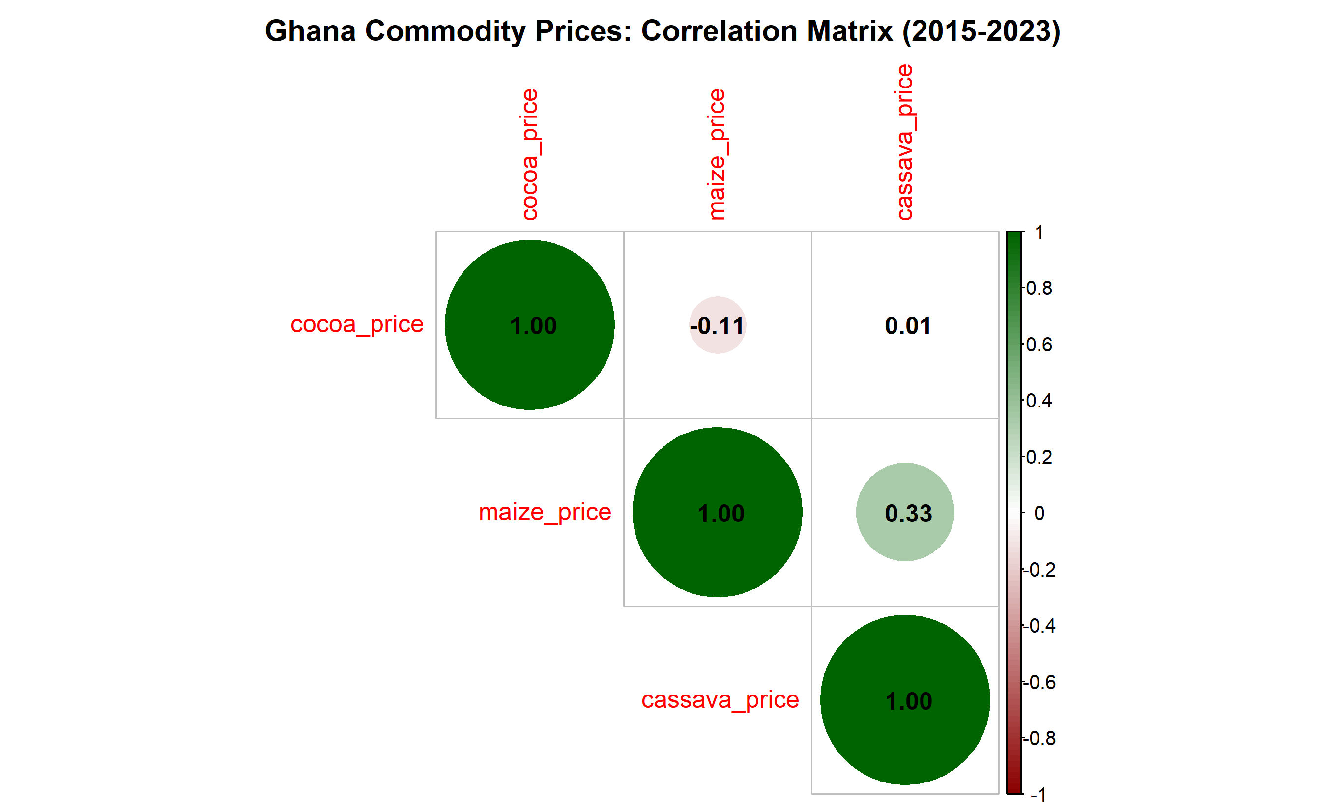
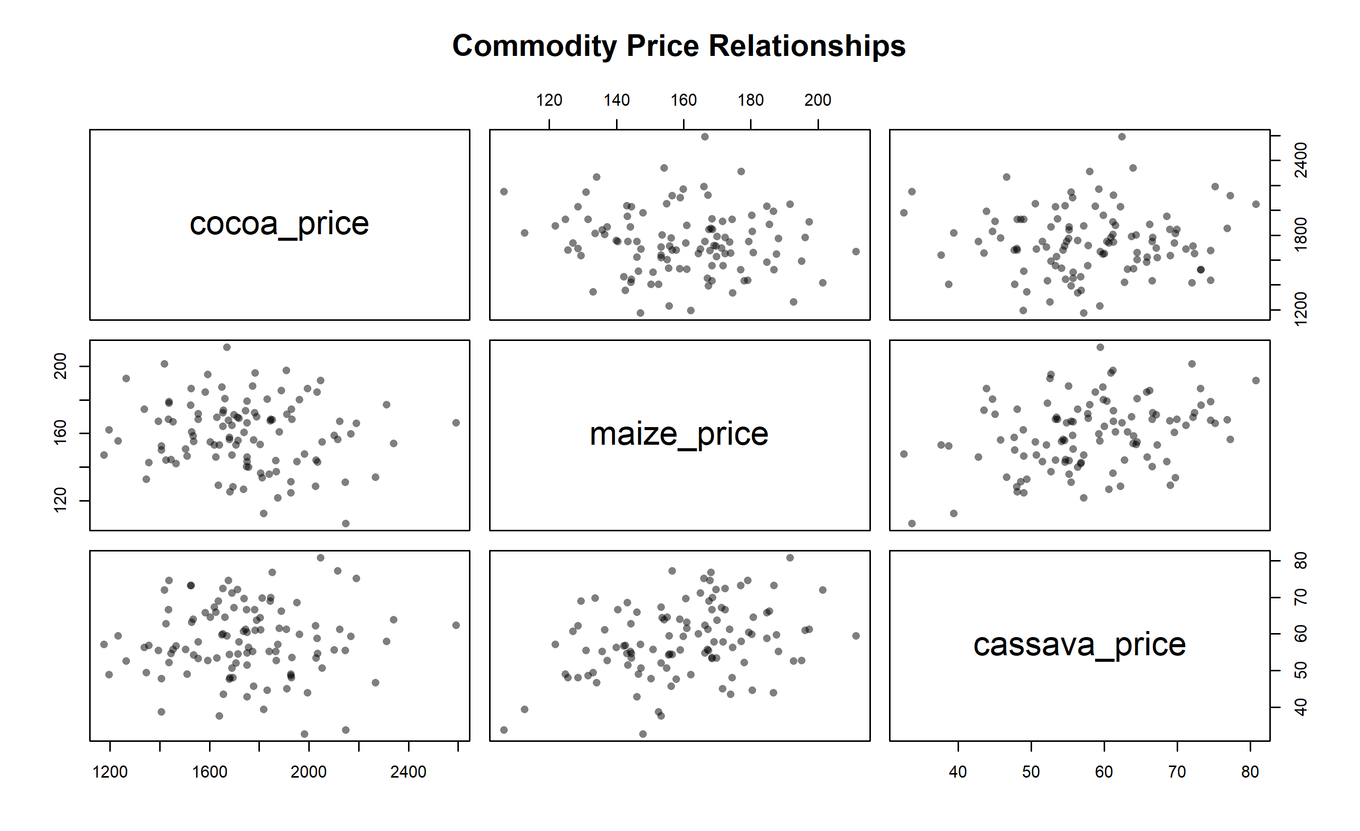
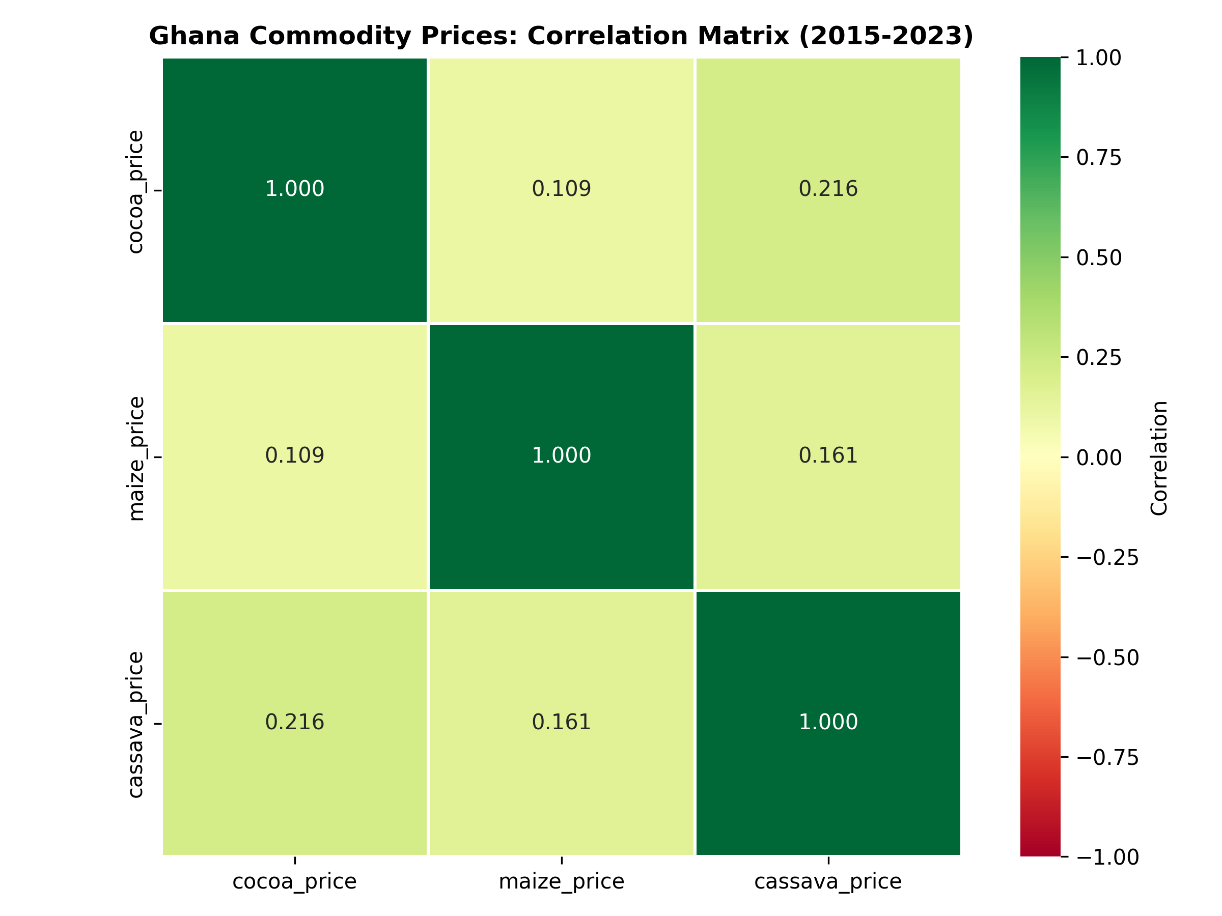
1. **Price Co-movement:** Cocoa and maize prices are moderately correlated (r ≈ 0.55), while cassava is independent. A diversified portfolio hedges risk better than concentrating in two commodities.
2. **Production-Price Inverse Relationship:** Higher production → lower prices (supply-demand). This is a **known causal relationship**, not spurious, but we must be careful: are global commodity prices (exogenous) driving both, or is local production truly moving prices?
3. **Rainfall as a Leading Indicator:** Rainfall in month t predicts cocoa prices in month t+1 (r ≈ −0.45). This suggests a 1-month lag before production affects prices, useful for short-term forecasting.
4. **Business Recommendation:** Use rainfall and production data as inputs to a predictive model (Chapter 11) for quarterly price forecasts. Hedge cocoa and maize together; diversify with cassava.
::: {.callout-caution icon="false"}
## 📝 Section 8.7 Review Questions
1. Why is cassava price independent of cocoa and maize prices?
2. If you observe a strong negative correlation between production and price, can you conclude causation? Why or why not?
3. How would you design a study to test whether rainfall causes higher cocoa output (versus, say, higher temperatures causing both)?
4. What is the business value of knowing that rainfall predicts prices with a 1-month lag?
:::
## Chapter Exercises
::: {.exercises}
#### Chapter 8 Exercises
**Exercise 8.1: Interpretation Practice**
Given the following correlations between household variables:
- r(Income, House Value) = 0.82
- r(Income, Education) = 0.58
- r(Age, Income) = 0.35
- r(Age, Healthcare Spend) = 0.71
(a) Rank these relationships by strength.
(b) For each, speculate on whether the correlation might be confounded by a third variable.
(c) Which relationship, if any, might be purely spurious?
**Exercise 8.2: Pearson vs Spearman**
A dataset contains performance ratings (1–5 Likert scale) and productivity (units per hour) for 30 employees. You compute:
- Pearson r = 0.62, p < 0.01
- Spearman ρ = 0.48, p = 0.08
(a) Why might Spearman be more appropriate for this data?
(b) What does the discrepancy between r and ρ suggest about the data distribution?
(c) Which correlation would you report? Why?
**Exercise 8.3: Partial Correlation Calculation**
Using the correlation matrix below, compute the partial correlation between Sales and Advertising, controlling for Price:
| | Sales | Advertising | Price |
|---|---|---|---|
| Sales | 1.00 | 0.72 | -0.55 |
| Advertising | 0.72 | 1.00 | -0.40 |
| Price | -0.55 | -0.40 | 1.00 |
(a) Apply the formula for r_{Sales, Advertising | Price}.
(b) Compare the zero-order and partial correlations. What changed?
(c) Interpret the result in business terms (e.g., controlling for price, is advertising still useful for predicting sales?).
**Exercise 8.4: Heatmap Interpretation**
Below is a correlation matrix for 5 economic indicators (GDP growth, Unemployment, Inflation, Interest Rates, Stock Returns):
```
             GDP   Unemp   Infla   InterestR   StockR
GDP        1.00   -0.78   -0.32    -0.15      0.82
Unemp     -0.78    1.00    0.25     0.12     -0.68
Infla     -0.32    0.25    1.00     0.88      0.15
InterestR -0.15    0.12    0.88     1.00      0.25
StockR     0.82   -0.68    0.15     0.25      1.00
```
(a) Identify three strong relationships and interpret each.
(b) If you were a portfolio manager, what does this correlation matrix tell you about diversification?
(c) Which pair of variables might have a confounding relationship (i.e., both driven by a third factor)?
**Exercise 8.5: Spurious Correlation Design**
Design a study to investigate the claimed correlation between "sunglasses sales" and "ice cream consumption" in your country. Include:
(a) How you would measure each variable.
(b) What confounders you would control for.
(c) Whether you would compute Pearson or Spearman correlation, and why.
(d) How you would report findings to a non-technical stakeholder to emphasize that this is not a causal relationship.
**Exercise 8.6: Real-World Case**
A bank finds that loan default is correlated with the applicant's age (r = −0.45), education level (r = −0.38), and employment tenure (r = −0.52). They conclude: "Older, more educated employees with longer tenure default less."
(a) Identify potential confounders that might explain these correlations.
(b) Suggest two partial correlations the bank should compute to investigate confounding.
(c) Propose a causal study design (e.g., RCT, instrumental variables) that would test the true effect of tenure on default risk.
**Exercise 8.7: Correlation Matrix Creation**
Using data from a public source (e.g., World Bank, IMF, Nigerian Bureau of Statistics), download 10 years of monthly data on 5–8 economic or business variables (e.g., exchange rate, inflation, unemployment, consumption, investment).
(a) Compute the full correlation matrix.
(b) Create a heatmap with hierarchical clustering.
(c) Write a 200-word summary of the key relationships and business implications.
**Exercise 8.8: Rank Correlation Robustness**
Generate a dataset of 100 observations with a strong linear relationship (X ~ U(0, 10), Y = 2X + ε, ε ~ N(0, 1)). Then:
(a) Compute Pearson, Spearman, and Kendall correlations.
(b) Introduce 5 extreme outliers in Y.
(c) Recompute all three correlations.
(d) Compare robustness. Which method degraded least?
(e) Plot both datasets to visualise the outlier impact.
**Exercise 8.9: Commodity Portfolio Risk**
Download monthly data on 3–5 commodity prices (cocoa, oil, wheat, gold, etc.) for 5 years from a source like the World Bank or IMF.
(a) Compute the correlation matrix of commodity returns (not levels, to control for inflation trends).
(b) Create a heatmap with clustering.
(c) Design a commodity portfolio allocation (e.g., 40% cocoa, 30% oil, 30% gold) that minimises risk by exploiting low/negative correlations.
(d) Compute the portfolio correlation with a simple stock market index (e.g., S&P 500 proxy).
**Exercise 8.10: Synthesis Challenge**
A retail chain observes strong positive correlations among the following at the store level:
- Store revenue and employee count (r = 0.88)
- Store revenue and customer traffic (r = 0.92)
- Employee count and customer traffic (r = 0.85)
Management concludes: "We should hire more employees to increase revenue."
(a) Identify the flaw in this causal interpretation.
(b) Propose three confounders that might explain these correlations.
(c) Design a quasi-experimental study (e.g., natural experiment, difference-in-differences) to estimate the true causal effect of hiring on revenue.
(d) Explain why regression analysis alone (Chapter 9) might mislead, and what additional caution is needed.
:::
## Further Reading
- **Pearson, K.** (1895). "Note on Regression and Inheritance in the Case of Two Parents." Proceedings of the Royal Society of London, 58, 240–242.
- Foundational paper on correlation and regression.
- **Spearman, C.** (1904). "The Proof and Measurement of Association between Two Things." American Journal of Psychology, 15(1), 72–101.
- Introduction of rank correlation.
- **Pearl, J.** (2009). Causality: Models, Reasoning, and Inference. 2nd ed. Cambridge University Press.
- Rigorous treatment of the correlation-causation distinction and causal inference.
- **Spurious Correlations Website:** https://www.tylervigen.com/spurious-correlations
- Interactive gallery of absurd but real correlations.
- **Rohrer, J. M.** (2018). "Thinking Clearly About Correlations and Causation: Graphical Causal Models for Observational Data." Advances in Methods and Practices in Psychological Science, 1(1), 27–42.
- Accessible introduction to causal thinking for researchers.
---
## Chapter Appendix: Mathematical Derivations
### A.1 Derivation of Pearson r from Covariance
The covariance between X and Y is:
$$\text{Cov}(X, Y) = E[(X - \mu_X)(Y - \mu_Y)] = \frac{1}{n} \sum_{i=1}^{n} (x_i - \bar{x})(y_i - \bar{y})$$
The correlation coefficient standardises covariance by the product of standard deviations:
$$r = \frac{\text{Cov}(X, Y)}{\sigma_X \sigma_Y}$$
where $\sigma_X = \sqrt{\frac{1}{n}\sum(x_i - \bar{x})^2}$ and $\sigma_Y = \sqrt{\frac{1}{n}\sum(y_i - \bar{y})^2}$.
Substituting:
$$r = \frac{\frac{1}{n}\sum (x_i - \bar{x})(y_i - \bar{y})}{\sqrt{\frac{1}{n}\sum(x_i - \bar{x})^2} \cdot \sqrt{\frac{1}{n}\sum(y_i - \bar{y})^2}}$$
The 1/n cancels:
$$r = \frac{\sum (x_i - \bar{x})(y_i - \bar{y})}{\sqrt{\sum(x_i - \bar{x})^2} \cdot \sqrt{\sum(y_i - \bar{y})^2}}$$
This is the standard computational formula.
### A.2 Proof that r ∈ [−1, 1] via Cauchy-Schwarz Inequality
**Cauchy-Schwarz Inequality:** For any vectors u and v:
$$|u \cdot v| \leq \|u\| \cdot \|v\|$$
Let $u_i = x_i - \bar{x}$ and $v_i = y_i - \bar{y}$. Then:
$$\left| \sum u_i v_i \right| \leq \sqrt{\sum u_i^2} \cdot \sqrt{\sum v_i^2}$$
Dividing both sides by $\sqrt{\sum u_i^2} \cdot \sqrt{\sum v_i^2}$:
$$\frac{\left| \sum u_i v_i \right|}{\sqrt{\sum u_i^2} \cdot \sqrt{\sum v_i^2}} \leq 1$$
By definition, this left side is $|r|$. Therefore $|r| \leq 1$, which means $r \in [-1, 1]$.
Equality (|r| = 1) holds if and only if u and v are linearly dependent (u = cv for some constant c), i.e., perfect linear relationship.
### A.3 Spearman Correlation via Rank Transformation
Spearman's ρ is simply Pearson r applied to ranks. If R_X and R_Y are the ranks of X and Y:
$$\rho = \frac{\sum (R_{X,i} - \bar{R}_X)(R_{Y,i} - \bar{R}_Y)}{\sqrt{\sum(R_{X,i} - \bar{R}_X)^2} \cdot \sqrt{\sum(R_{Y,i} - \bar{R}_Y)^2}}$$
For no ties, this simplifies to:
$$\rho = 1 - \frac{6 \sum d_i^2}{n(n^2 - 1)}$$
where $d_i = R_{X,i} - R_{Y,i}$ is the rank difference for observation i.
---
*End of Chapter 8*