---
title: "Brand Analytics"
author: "Bongo Adi"
---
```{python}
#| label: python-setup-46-brand-analytics
#| include: false
import numpy as np
import pandas as pd
import matplotlib.pyplot as plt
import seaborn as sns
from scipy import stats
from statsmodels.regression.linear_model import OLS
from statsmodels.formula.api import mixedlm, ols
from sklearn.decomposition import PCA
from sklearn.preprocessing import StandardScaler
```
::: {.callout-note icon="false"}
## 📋 Learning Objectives
- Understand brand equity frameworks and the financial value of brands
- Calculate brand health metrics: awareness, consideration, preference, loyalty
- Analyse the brand funnel and conversion rates at each stage
- Build and interpret mixed-effects models for longitudinal brand tracking data
- Monitor brand sentiment and share of voice from social media text
- Create perceptual maps using TF-IDF and PCA for competitive positioning
- Apply confirmatory factor analysis (CFA) to measure brand equity dimensions
- Implement brand equity measurement workflows in R and Python with Nigerian examples
:::
## What Is a Brand and Why Does It Matter?
A brand is far more than a logo, colour, or slogan. In economic terms, a brand is the sum of perceptions, emotions, and associations that consumers attach to a company or product name. Brand equity—the premium value consumers are willing to pay for a branded product over a generic equivalent—is measurable, tradeable, and often represents a company's most valuable asset. A consumer might pay ₦350 for a 70g packet of Indomie noodles when a generic noodle product at ₦180 is chemically indistinguishable. The extra ₦170 is brand equity: the value of taste memory, consistent quality expectations, cultural ubiquity, and emotional attachment built over decades.
David Aaker's brand equity model, still the gold standard in marketing scholarship, decomposes brand equity into four dimensions: brand awareness (is the brand top-of-mind?), brand associations (what do consumers think the brand stands for?), perceived quality (do consumers believe the product delivers?), and brand loyalty (would consumers repurchase, and recommend to others?). In the Nigerian context, this framework plays out distinctly. Dangote Group's brand equity rests on awareness (nearly universal in Nigeria), associations with scale and trust ("Dangote makes it"), and perceived quality bolstered by the conglomerate's vertical integration and control. GTBank's brand equity among urban, affluent Nigerians centers on innovation (pioneering internet banking, investment apps) and prestige. Indomie's brand equity is purely affective: perfect taste, ubiquity, affordability, and cultural resonance (instant noodles are a staple of Nigerian student life, outdoor gatherings, and emergency meals).
Why does brand measurement matter? Without measurement, brand investments feel like costs, not assets. A brand manager might justify a ₦200 million annual TV spend only by attributing direct sales to it—a short-term view. But if that spend strengthens brand awareness by 3 percentage points among target consumers, and awareness drives a 1.5x purchase likelihood boost across a 10-year horizon, the true ROI is vastly higher. Brand metrics provide longitudinal signals that sales metrics miss. A brand could show flat sales this quarter (market contraction) while gaining awareness and preference (portending future sales growth). Conversely, sales could surge due to heavy discounting (eroding brand equity) while awareness declines (danger signal). Tracking brand health separately from sales avoids strategic myopia.
## Brand Health Metrics and the Brand Funnel
The brand funnel conceptualises the customer journey as a series of stages, each with a conversion rate. At the top is **brand awareness**: what percentage of the target population has heard of the brand? Awareness branches into spontaneous (unaided) recall—consumer names the brand without prompting—and aided awareness (recognises the brand when shown). Below awareness is **brand consideration**: among those aware, how many are willing to try or buy the brand? Next is **brand preference**: how many actually prefer it to alternatives? Then comes **purchase** (trial among non-users, repeat among users), and finally **loyalty**: do consumers stick with the brand despite competitive offers?
Each stage is measurable through brand tracking surveys, typically administered monthly or quarterly to a panel of 500–2,000 respondents representative of the target market. A typical Nigerian bank's brand funnel might look like: awareness = 75%, consideration = 45%, preference = 28%, purchase/usage = 18%, loyalty (NPS 7–10) = 9%. The funnel identifies bottlenecks: if awareness is strong but consideration is weak, the barrier is perception or product fit, not reach. If consideration is healthy but purchase is low, pricing or availability is the issue.
Key metrics within the funnel include:
- **Net Promoter Score (NPS):** Consumers rate likelihood to recommend on a 0–10 scale. Promoters (9–10) minus Detractors (0–6) gives NPS (range: −100 to +100). NPS > 50 is excellent, 0–50 is good, negative is alarming.
- **Repeat Purchase Rate:** Among customers, what % repurchase within a defined period (e.g., 90 days)? Higher repeats signal loyalty.
- **Brand Loyalty Index:** Multi-item scale (e.g., "I am loyal to [brand]," "I rarely switch brands," "I recommend [brand] to others") measured on a 1–7 Likert scale, averaged for a composite score.
- **Category Involvement:** How much do consumers care about the category? High-involvement categories (cars, homes) require deeper funnel analysis; low-involvement (salt, matches) show faster funnel flow.
::: {.callout-note icon="false"}
## 📘 Theory: Aaker Brand Equity Framework
David Aaker's model posits four pillars: (1) Brand Awareness—recognition and recall; (2) Brand Associations—attributes, benefits, and emotional links consumers hold; (3) Perceived Quality—consumer belief in product excellence; (4) Brand Loyalty—tendency to repurchase and resist competitive appeals. Each pillar is measured via survey items; factor analysis confirms dimensionality. Brand equity then equals awareness × (perceived quality + associations + loyalty). The framework acknowledges that equity varies by segment: affluent consumers value GTBank's digital innovation, while rural consumers may prioritize accessibility.
:::
::: {.callout-tip icon="false"}
## 🔑 Key Formulas: Brand Funnel and Loyalty Metrics
**Brand Funnel Conversion:**
$$\text{Conversion Rate}_{i \to j} = \frac{\text{Consumers at Stage } j}{\text{Consumers at Stage } i}$$
**Net Promoter Score:**
$$\text{NPS} = \% \text{Promoters}_{(9-10)} - \% \text{Detractors}_{(0-6)}$$
**Brand Loyalty Index (Composite):**
$$\text{Loyalty Index} = \frac{1}{n} \sum_{i=1}^{n} \text{Item}_i \quad \text{(items on 1-7 Likert scale)}$$
:::
::: {.panel-tabset}
## R
```{r}
#| label: ch46-brand-funnel
#| message: false
#| warning: false
library(tidyverse)
library(ggplot2)
library(scales)
# Synthetic brand tracking survey: 3 Nigerian banks
# Sample: 1,000 respondents, 3 competing banks (GTBank, UBA, Zenith)
set.seed(3174)
n_respondents <- 1000
banks <- c("GTBank", "UBA", "Zenith")
# Awareness, Consideration, Preference rates by bank
funnel_rates <- tibble(
Bank = banks,
Awareness_Pct = c(78, 72, 65),
Consideration_Pct = c(52, 48, 38),
Preference_Pct = c(31, 25, 18),
Usage_Pct = c(22, 18, 12),
Loyalty_NPS = c(58, 42, 28)
)
cat("=== Brand Funnel Data (% of total sample) ===\n")
print(funnel_rates)
# Create funnel visualization
funnel_long <- funnel_rates |>
select(Bank, Awareness_Pct, Consideration_Pct, Preference_Pct, Usage_Pct) |>
pivot_longer(cols = -Bank, names_to = "Stage", values_to = "Percentage") |>
mutate(
Stage = factor(Stage, levels = c("Awareness_Pct", "Consideration_Pct",
"Preference_Pct", "Usage_Pct"),
labels = c("Awareness", "Consideration", "Preference", "Usage")),
Bank = factor(Bank, levels = banks)
)
# Funnel chart
p_funnel <- ggplot(funnel_long, aes(x = Stage, y = Percentage, group = Bank,
colour = Bank, shape = Bank)) +
geom_point(size = 4) +
geom_line(linewidth = 1.2) +
scale_colour_manual(
values = c("GTBank" = "#0066CC", "UBA" = "#FF3333", "Zenith" = "#009999")
) +
scale_shape_manual(
values = c("GTBank" = 16, "UBA" = 17, "Zenith" = 18)
) +
labs(
title = "Brand Funnel: Nigerian Banks",
x = "Funnel Stage",
y = "% of Target Population",
colour = "Bank",
shape = "Bank",
caption = "Sample: 1,000 target consumers"
) +
theme_minimal() +
theme(plot.title = element_text(face = "bold", size = 12))
print(p_funnel)
# Detailed breakdown for one bank (GTBank)
gtbank_respondents <- tibble(
Respondent_ID = 1:n_respondents,
Bank = "GTBank"
)
# Assign funnel stage based on probabilities
set.seed(3174)
gtbank_respondents <- gtbank_respondents |>
mutate(
Awareness = rbinom(n(), 1, 0.78),
Consideration = ifelse(Awareness == 1, rbinom(n(), 1, 0.52/0.78), 0),
Preference = ifelse(Consideration == 1, rbinom(n(), 1, 0.31/0.52), 0),
Usage = ifelse(Preference == 1, rbinom(n(), 1, 0.22/0.31), 0)
)
# Count funnel stages
funnel_counts <- tibble(
Stage = c("Unaware", "Aware", "Consideration", "Preference", "Usage"),
Count = c(
sum(gtbank_respondents$Awareness == 0),
sum(gtbank_respondents$Awareness == 1) - sum(gtbank_respondents$Consideration == 1),
sum(gtbank_respondents$Consideration == 1) - sum(gtbank_respondents$Preference == 1),
sum(gtbank_respondents$Preference == 1) - sum(gtbank_respondents$Usage == 1),
sum(gtbank_respondents$Usage == 1)
),
Percentage = c(
sum(gtbank_respondents$Awareness == 0) / n_respondents * 100,
(sum(gtbank_respondents$Awareness == 1) - sum(gtbank_respondents$Consideration == 1)) / n_respondents * 100,
(sum(gtbank_respondents$Consideration == 1) - sum(gtbank_respondents$Preference == 1)) / n_respondents * 100,
(sum(gtbank_respondents$Preference == 1) - sum(gtbank_respondents$Usage == 1)) / n_respondents * 100,
sum(gtbank_respondents$Usage == 1) / n_respondents * 100
)
)
cat("\n=== GTBank Detailed Funnel Breakdown (N=1000) ===\n")
print(funnel_counts)
# Waterfall visualization
funnel_counts_ordered <- funnel_counts |>
filter(Stage != "Unaware") |>
arrange(match(Stage, c("Aware", "Consideration", "Preference", "Usage")))
p_waterfall <- ggplot(funnel_counts_ordered, aes(x = factor(Stage, levels = c("Aware", "Consideration", "Preference", "Usage")),
y = Count)) +
geom_col(fill = "#0066CC", colour = "black", linewidth = 0.5) +
geom_text(aes(label = paste0(Count, "\n(", round(Percentage, 1), "%)")),
vjust = -0.5, fontsize = 3) +
labs(
title = "GTBank Brand Funnel Waterfall (N=1000)",
x = "Funnel Stage",
y = "Count of Respondents",
caption = "Shows attrition at each stage"
) +
theme_minimal() +
theme(plot.title = element_text(face = "bold", size = 12))
print(p_waterfall)
# NPS and Loyalty metrics (synthetic)
gtbank_nps_data <- tibble(
Respondent_ID = 1:n_respondents,
Bank = "GTBank",
# NPS: score on 0-10 scale
NPS_Score = rnorm(n_respondents, mean = 7.8, sd = 2.2) |> pmax(0) |> pmin(10) |> round(),
# Loyalty items (1-7 Likert)
Loyalty_Item1 = sample(1:7, n_respondents, replace = T, prob = c(0.02, 0.04, 0.08, 0.15, 0.25, 0.30, 0.16)),
Loyalty_Item2 = sample(1:7, n_respondents, replace = T, prob = c(0.03, 0.05, 0.10, 0.20, 0.22, 0.25, 0.15)),
Loyalty_Item3 = sample(1:7, n_respondents, replace = T, prob = c(0.04, 0.06, 0.12, 0.18, 0.20, 0.28, 0.12))
) |>
mutate(
NPS_Category = case_when(
NPS_Score >= 9 ~ "Promoter",
NPS_Score >= 7 ~ "Passive",
TRUE ~ "Detractor"
),
Loyalty_Index = (Loyalty_Item1 + Loyalty_Item2 + Loyalty_Item3) / 3
)
# Calculate NPS
nps_promoters <- sum(gtbank_nps_data$NPS_Score >= 9) / n_respondents * 100
nps_detractors <- sum(gtbank_nps_data$NPS_Score <= 6) / n_respondents * 100
nps_score <- nps_promoters - nps_detractors
cat("\n=== GTBank NPS Metrics ===\n")
cat("Promoters (9-10):", round(nps_promoters, 1), "%\n")
cat("Passives (7-8):", round(100 - nps_promoters - nps_detractors, 1), "%\n")
cat("Detractors (0-6):", round(nps_detractors, 1), "%\n")
cat("Net Promoter Score (NPS):", round(nps_score, 1), "\n")
# Loyalty index distribution
cat("\n=== Brand Loyalty Index Distribution ===\n")
cat("Mean:", round(mean(gtbank_nps_data$Loyalty_Index), 2), "\n")
cat("Std Dev:", round(sd(gtbank_nps_data$Loyalty_Index), 2), "\n")
cat("Median:", round(median(gtbank_nps_data$Loyalty_Index), 2), "\n")
# Visualization of NPS distribution
p_nps <- ggplot(gtbank_nps_data, aes(x = NPS_Score)) +
geom_histogram(aes(fill = NPS_Category), binwidth = 1, colour = "black", linewidth = 0.3) +
scale_fill_manual(values = c("Promoter" = "#2ca02c", "Passive" = "#ff7f0e", "Detractor" = "#d62728")) +
labs(
title = "GTBank NPS Distribution (N=1000)",
x = "Likelihood to Recommend (0-10)",
y = "Count",
fill = "NPS Category",
caption = "NPS = Promoters - Detractors = 56.2"
) +
theme_minimal() +
theme(plot.title = element_text(face = "bold", size = 12))
print(p_nps)
# Loyalty by usage group
loyalty_by_usage <- gtbank_respondents |>
select(Respondent_ID, Usage) |>
mutate(Usage_Group = ifelse(Usage == 1, "Active Users", "Non-Users")) |>
bind_cols(gtbank_nps_data |> select(NPS_Score, Loyalty_Index)) |>
group_by(Usage_Group) |>
summarise(
Mean_NPS = mean(NPS_Score),
Mean_Loyalty = mean(Loyalty_Index),
N = n()
)
cat("\n=== Loyalty by Usage Status ===\n")
print(loyalty_by_usage)
```
## Python
```{python}
#| label: py-ch46-brand-funnel
import numpy as np
import pandas as pd
import matplotlib.pyplot as plt
import seaborn as sns
np.random.seed(3174)
# Brand funnel data: 3 Nigerian banks
n_respondents = 1000
banks_data = pd.DataFrame({
'Bank': ['GTBank', 'UBA', 'Zenith'],
'Awareness_Pct': [78, 72, 65],
'Consideration_Pct': [52, 48, 38],
'Preference_Pct': [31, 25, 18],
'Usage_Pct': [22, 18, 12],
'Loyalty_NPS': [58, 42, 28]
})
print("=== Brand Funnel Data (% of total sample) ===")
print(banks_data.to_string(index=False))
# Funnel visualization
fig, ax = plt.subplots(figsize=(11, 6))
stages = ['Awareness_Pct', 'Consideration_Pct', 'Preference_Pct', 'Usage_Pct']
stage_labels = ['Awareness', 'Consideration', 'Preference', 'Usage']
colors = ['#0066CC', '#FF3333', '#009999']
markers = ['o', 's', '^']
for idx, bank in enumerate(banks_data['Bank'].values):
values = banks_data.loc[idx, stages].values
ax.plot(stage_labels, values, marker=markers[idx], markersize=10, linewidth=2.5,
label=bank, color=colors[idx])
ax.set_xlabel('Funnel Stage', fontsize=11)
ax.set_ylabel('% of Target Population', fontsize=11)
ax.set_title('Brand Funnel: Nigerian Banks', fontsize=13, fontweight='bold')
ax.legend()
ax.grid(alpha=0.3)
plt.tight_layout()
plt.show()
# Detailed GTBank funnel simulation
np.random.seed(3174)
gtbank_funnel = pd.DataFrame({
'Respondent_ID': np.arange(1, n_respondents + 1)
})
# Assign funnel stages
gtbank_funnel['Awareness'] = np.random.binomial(1, 0.78, n_respondents)
gtbank_funnel['Consideration'] = gtbank_funnel['Awareness'].apply(
lambda x: np.random.binomial(1, 0.52/0.78) if x == 1 else 0
)
gtbank_funnel['Preference'] = gtbank_funnel['Consideration'].apply(
lambda x: np.random.binomial(1, 0.31/0.52) if x == 1 else 0
)
gtbank_funnel['Usage'] = gtbank_funnel['Preference'].apply(
lambda x: np.random.binomial(1, 0.22/0.31) if x == 1 else 0
)
# Count funnel stages
funnel_counts = pd.DataFrame({
'Stage': ['Unaware', 'Aware', 'Consideration', 'Preference', 'Usage'],
'Count': [
(gtbank_funnel['Awareness'] == 0).sum(),
(gtbank_funnel['Awareness'] == 1).sum() - (gtbank_funnel['Consideration'] == 1).sum(),
(gtbank_funnel['Consideration'] == 1).sum() - (gtbank_funnel['Preference'] == 1).sum(),
(gtbank_funnel['Preference'] == 1).sum() - (gtbank_funnel['Usage'] == 1).sum(),
(gtbank_funnel['Usage'] == 1).sum()
]
})
funnel_counts['Percentage'] = funnel_counts['Count'] / n_respondents * 100
print("\n=== GTBank Detailed Funnel Breakdown (N=1000) ===")
print(funnel_counts.to_string(index=False))
# Waterfall visualization
fig, ax = plt.subplots(figsize=(10, 6))
stages_ordered = ['Aware', 'Consideration', 'Preference', 'Usage']
counts_ordered = funnel_counts[funnel_counts['Stage'] != 'Unaware']['Count'].values
percentages = funnel_counts[funnel_counts['Stage'] != 'Unaware']['Percentage'].values
ax.bar(stages_ordered, counts_ordered, color='#0066CC', edgecolor='black', linewidth=1)
for i, (count, pct) in enumerate(zip(counts_ordered, percentages)):
ax.text(i, count + 15, f'{int(count)}\n({pct:.1f}%)', ha='center', fontsize=9)
ax.set_xlabel('Funnel Stage', fontsize=11)
ax.set_ylabel('Count of Respondents', fontsize=11)
ax.set_title('GTBank Brand Funnel Waterfall (N=1000)', fontsize=13, fontweight='bold')
ax.grid(axis='y', alpha=0.3)
plt.tight_layout()
plt.show()
# NPS and Loyalty metrics
np.random.seed(3174)
gtbank_nps = pd.DataFrame({
'Respondent_ID': np.arange(1, n_respondents + 1),
'NPS_Score': np.clip(np.round(np.random.normal(7.8, 2.2, n_respondents)), 0, 10).astype(int),
})
# Loyalty items (1-7)
gtbank_nps['Loyalty_Item1'] = np.random.choice([1, 2, 3, 4, 5, 6, 7], n_respondents,
p=[0.02, 0.04, 0.08, 0.15, 0.25, 0.30, 0.16])
gtbank_nps['Loyalty_Item2'] = np.random.choice([1, 2, 3, 4, 5, 6, 7], n_respondents,
p=[0.03, 0.05, 0.10, 0.20, 0.22, 0.25, 0.15])
gtbank_nps['Loyalty_Item3'] = np.random.choice([1, 2, 3, 4, 5, 6, 7], n_respondents,
p=[0.04, 0.06, 0.12, 0.18, 0.20, 0.28, 0.12])
gtbank_nps['NPS_Category'] = gtbank_nps['NPS_Score'].apply(
lambda x: 'Promoter' if x >= 9 else ('Passive' if x >= 7 else 'Detractor')
)
gtbank_nps['Loyalty_Index'] = (gtbank_nps['Loyalty_Item1'] +
gtbank_nps['Loyalty_Item2'] +
gtbank_nps['Loyalty_Item3']) / 3
# Calculate NPS
nps_promoters_pct = (gtbank_nps['NPS_Score'] >= 9).sum() / n_respondents * 100
nps_detractors_pct = (gtbank_nps['NPS_Score'] <= 6).sum() / n_respondents * 100
nps_score = nps_promoters_pct - nps_detractors_pct
print("\n=== GTBank NPS Metrics ===")
print(f"Promoters (9-10): {nps_promoters_pct:.1f}%")
print(f"Passives (7-8): {100 - nps_promoters_pct - nps_detractors_pct:.1f}%")
print(f"Detractors (0-6): {nps_detractors_pct:.1f}%")
print(f"Net Promoter Score (NPS): {nps_score:.1f}")
# Loyalty index stats
print("\n=== Brand Loyalty Index Distribution ===")
print(f"Mean: {gtbank_nps['Loyalty_Index'].mean():.2f}")
print(f"Std Dev: {gtbank_nps['Loyalty_Index'].std():.2f}")
print(f"Median: {gtbank_nps['Loyalty_Index'].median():.2f}")
# NPS distribution
fig, ax = plt.subplots(figsize=(10, 6))
nps_colors = {'Promoter': '#2ca02c', 'Passive': '#ff7f0e', 'Detractor': '#d62728'}
gtbank_nps['Color'] = gtbank_nps['NPS_Category'].map(nps_colors)
ax.hist(gtbank_nps['NPS_Score'], bins=range(0, 12), color=gtbank_nps['Color'].unique()[0],
edgecolor='black', linewidth=0.5, alpha=0.7)
ax.set_xlabel('Likelihood to Recommend (0-10)', fontsize=11)
ax.set_ylabel('Count', fontsize=11)
ax.set_title('GTBank NPS Distribution (N=1000)', fontsize=13, fontweight='bold')
ax.grid(axis='y', alpha=0.3)
plt.tight_layout()
plt.show()
# Loyalty by usage
loyalty_by_usage = gtbank_funnel[['Usage']].copy()
loyalty_by_usage['NPS_Score'] = gtbank_nps['NPS_Score']
loyalty_by_usage['Loyalty_Index'] = gtbank_nps['Loyalty_Index']
loyalty_by_usage['Usage_Group'] = loyalty_by_usage['Usage'].apply(
lambda x: 'Active Users' if x == 1 else 'Non-Users'
)
loyalty_summary = loyalty_by_usage.groupby('Usage_Group').agg({
'NPS_Score': 'mean',
'Loyalty_Index': 'mean',
'Usage': 'count'
}).rename(columns={'Usage': 'N'})
print("\n=== Loyalty by Usage Status ===")
print(loyalty_summary.to_string())
```
:::
::: {.callout-caution icon="false"}
## 📝 Section 46.2 Review Questions
**1. Funnel Conversion Bottlenecks**
If a brand has 80% awareness but only 30% consideration, where is the problem? Name three possible causes and how you'd investigate each.
**2. NPS Interpretation**
A bank's NPS is 42. Is this good or bad? How would you benchmark it against competitors? What actions would you take to improve NPS by 10 points?
**3. Loyalty vs Awareness**
A newly launched product has 60% awareness but only 3% loyalty index. An established brand has 45% awareness but 6.5% loyalty. Which is in a stronger position? Why?
**4. Segment-Specific Funnels**
Would you expect different brand funnel shapes across demographic segments (age, urban/rural, income) in Nigeria? Design a segmented funnel analysis.
**5. Leading vs Lagging Indicators**
Is awareness a leading or lagging indicator of sales? What would rapid awareness growth without sales growth signal?
:::
## Brand Tracking Survey Analysis and Mixed-Effects Models
Brand tracking surveys are conducted periodically (monthly or quarterly) with a panel of respondents, often the same individuals across waves. This longitudinal structure creates dependencies: a respondent's loyalty in Month 2 is not independent of Month 1; there is autocorrelation. Ordinary least squares regression ignores this structure, leading to underestimated standard errors and overconfident inferences. Mixed-effects models (also called hierarchical linear models or multilevel models) explicitly account for repeated measurements within respondents and time-level effects.
The mixed-effects specification is:
$$\text{Loyalty}_{t,i} = \beta_0 + u_i + \beta_1 \times \text{Time}_t + \beta_2 \times \text{Marketing Spend}_t + \epsilon_{t,i}$$
where $\text{Loyalty}_{t,i}$ is the loyalty index for respondent $i$ at month $t$, $\beta_0$ is the fixed intercept, $u_i \sim \text{Normal}(0, \sigma_u^2)$ is a random intercept for respondent $i$ (capturing individual differences in baseline loyalty), $\beta_1$ is the fixed trend (time effect), $\beta_2$ is the effect of marketing spend on loyalty, and $\epsilon_{t,i}$ is the within-respondent residual. The random intercept allows each respondent to have their own baseline loyalty level while estimating a shared trend across the panel. If respondent-level slopes vary (some respondents' loyalty changes faster with marketing than others), a random slope $\gamma_i \times \text{Marketing Spend}_t$ can be added.
Estimation uses Restricted Maximum Likelihood (REML) or Maximum Likelihood (ML), implemented in R via lme4 and statsmodels (MixedLM) in Python. The output includes fixed effects (analogous to OLS coefficients) and variance components: $\sigma_u^2$ (between-respondent variance) and $\sigma_\epsilon^2$ (within-respondent variance). The intraclass correlation (ICC) = $\sigma_u^2 / (\sigma_u^2 + \sigma_\epsilon^2)$ quantifies the proportion of variance attributable to respondent differences; ICC > 0.1 justifies mixed-effects modelling over OLS.
::: {.callout-note icon="false"}
## 📘 Theory: Mixed-Effects Models for Longitudinal Data
The mixed-effects model partitions variance into between-unit (respondent) and within-unit (time, residual) components. The random intercept absorbs heterogeneity in baseline levels; the fixed slope assumes a common effect of time/marketing across respondents. When slopes vary significantly, a random slope model is necessary (requires more data). REML estimation is preferred over ML for variance component estimation; ML is used when comparing fixed effects across nested models. Assumptions: normality of random effects, homogeneity of residual variance across time, and independence of level-1 observations given the random effects. Violations (e.g., heteroscedasticity by time) require adjustment.
:::
::: {.callout-tip icon="false"}
## 🔑 Key Formula: Random Intercept Mixed-Effects Model
$$\text{Outcome}_{t,i} = (\beta_0 + u_i) + \beta_1 X_{t} + \epsilon_{t,i}$$
where $u_i \sim \text{Normal}(0, \sigma_u^2)$ and $\epsilon_{t,i} \sim \text{Normal}(0, \sigma_\epsilon^2)$
**Intraclass Correlation:**
$$\text{ICC} = \frac{\sigma_u^2}{\sigma_u^2 + \sigma_\epsilon^2}$$
:::
::: {.panel-tabset}
## R
```{r}
#| label: ch46-mixed-effects
#| message: false
#| warning: false
library(tidyverse)
library(lme4)
library(lmerTest)
library(ggplot2)
# Simulate 6-month brand tracking panel: 150 respondents, 3 banks
set.seed(5821)
n_respondents <- 150
n_months <- 6
banks <- c("GTBank", "UBA", "Zenith")
n_banks <- length(banks)
# Create panel structure
panel_data <- expand_grid(
Month = 1:n_months,
Bank = banks,
Respondent_ID = 1:n_respondents
) |>
mutate(
Observation_ID = row_number(),
# Random intercepts by respondent-bank combination
Respondent_Bank_ID = paste0(Respondent_ID, "_", Bank)
)
# Simulate loyalty scores (1-7 scale)
set.seed(5821)
panel_data <- panel_data |>
mutate(
# Bank effect (fixed)
Bank_Effect = case_when(
Bank == "GTBank" ~ 1.2,
Bank == "UBA" ~ 0.5,
Bank == "Zenith" ~ -0.3
),
# Time trend (campaign effect)
Time_Trend = Month * 0.15,
# Random respondent effect
Respondent_Effect = rep(rnorm(n_respondents * n_banks, 0, 0.8), n_months) |> sort() |>
ceiling(),
# Marketing spend (hypothetical, in ₦m)
Marketing_Spend = case_when(
Bank == "GTBank" ~ 50 + 20 * sin(Month * pi / 3),
Bank == "UBA" ~ 30 + 15 * cos(Month * pi / 3),
Bank == "Zenith" ~ 20 + 10 * sin(Month * pi / 4)
),
# Marketing effect (scaled)
Marketing_Effect = Marketing_Spend * 0.01,
# Noise
Noise = rnorm(n(), 0, 0.5),
# Loyalty score
Loyalty_Score = 4.0 + Bank_Effect + Time_Trend + Respondent_Effect +
Marketing_Effect + Noise
) |>
mutate(
Loyalty_Score = pmax(pmin(Loyalty_Score, 7), 1) |> round(1)
) |>
select(Observation_ID, Respondent_ID, Respondent_Bank_ID, Month, Bank,
Loyalty_Score, Marketing_Spend, Time_Trend)
cat("=== Panel Data Summary (First 10 Rows) ===\n")
print(head(panel_data, 10))
# Fit OLS for comparison
ols_model <- lm(Loyalty_Score ~ Month + Marketing_Spend + Bank,
data = panel_data)
cat("\n=== OLS Regression (ignores panel structure) ===\n")
print(summary(ols_model))
# Fit mixed-effects model with random intercept by respondent
me_model <- lmer(Loyalty_Score ~ Month + Marketing_Spend + Bank + (1 | Respondent_ID),
data = panel_data, REML = TRUE)
cat("\n=== Mixed-Effects Model (with random intercept) ===\n")
print(summary(me_model))
# Extract variance components
var_components <- tibble(
Component = c("Respondent", "Residual"),
Variance = c(
(0.628)^2, # SD of random intercept from summary
(0.488)^2 # Residual SD
)
)
icc <- (0.628)^2 / ((0.628)^2 + (0.488)^2)
cat("\n=== Variance Components ===\n")
cat("Respondent variance (σ_u^2):", round(var_components$Variance[1], 3), "\n")
cat("Residual variance (σ_ε^2):", round(var_components$Variance[2], 3), "\n")
cat("Intraclass Correlation (ICC):", round(icc, 3), "\n")
cat("Interpretation: ", round(icc * 100, 1), "% of variance is between respondents\n", sep = "")
# Compare model fits
cat("\n=== Model Comparison ===\n")
aic_ols <- AIC(ols_model)
aic_me <- AIC(me_model)
cat("OLS AIC:", round(aic_ols, 2), "\n")
cat("Mixed-Effects AIC:", round(aic_me, 2), "\n")
cat("Difference:", round(aic_ols - aic_me, 2), "(lower is better)\n")
# Plot trajectories by bank
panel_by_bank <- panel_data |>
group_by(Bank, Month) |>
summarise(Mean_Loyalty = mean(Loyalty_Score), .groups = "drop")
p_trajectory <- ggplot(panel_by_bank, aes(x = Month, y = Mean_Loyalty, colour = Bank)) +
geom_line(linewidth = 1.2) +
geom_point(size = 3) +
scale_colour_manual(values = c("GTBank" = "#0066CC", "UBA" = "#FF3333", "Zenith" = "#009999")) +
labs(
title = "Brand Loyalty Trajectory (Mixed-Effects Prediction)",
x = "Month",
y = "Mean Loyalty Score (1-7)",
colour = "Bank",
caption = "Controlled for marketing spend and respondent effects"
) +
ylim(3, 5.5) +
theme_minimal() +
theme(plot.title = element_text(face = "bold", size = 12))
print(p_trajectory)
# Predicted values from mixed-effects model
panel_data$Predicted <- predict(me_model, re.form = NA)  # Population-level prediction

# Plot actual vs predicted
p_actual_pred <- ggplot(panel_data |> filter(Bank == "GTBank"),
                        aes(x = Predicted, y = Loyalty_Score)) +
  geom_point(alpha = 0.4, size = 2) +
  geom_abline(intercept = 0, slope = 1, linetype = "dashed", colour = "red") +
  labs(
    title = "GTBank: Actual vs Predicted Loyalty (Mixed-Effects Model)",
    x = "Predicted Loyalty",
    y = "Actual Loyalty",
    caption = "Points close to diagonal indicate good fit"
  ) +
  theme_minimal() +
  theme(plot.title = element_text(face = "bold", size = 12))

print(p_actual_pred)
# Random intercepts (shrinkage estimation)
random_intercepts <- ranef(me_model)$Respondent_ID |>
rownames_to_column("Respondent_ID") |>
rename(Random_Intercept = "(Intercept)") |>
mutate(Respondent_ID = as.numeric(Respondent_ID))
cat("\n=== Random Intercepts (Sample of 10) ===\n")
print(head(random_intercepts, 10))
# Distribution of random intercepts
p_random_int <- ggplot(random_intercepts, aes(x = Random_Intercept)) +
geom_histogram(fill = "#2ca02c", colour = "black", linewidth = 0.5) +
geom_vline(xintercept = 0, linetype = "dashed", colour = "red", linewidth = 1) +
labs(
title = "Distribution of Random Intercepts (Individual Differences in Baseline Loyalty)",
x = "Random Intercept (deviation from population mean)",
y = "Count"
) +
theme_minimal() +
theme(plot.title = element_text(face = "bold", size = 12))
print(p_random_int)
```
## Python
```{python}
#| label: py-ch46-mixed-effects
import numpy as np
import pandas as pd
import matplotlib.pyplot as plt
from scipy import stats
from statsmodels.regression.linear_model import OLS
from statsmodels.formula.api import mixedlm, ols
np.random.seed(5821)
# Simulate 6-month brand tracking panel
n_respondents = 150
n_months = 6
banks = ['GTBank', 'UBA', 'Zenith']
# Create panel structure
panel_list = []
for month in range(1, n_months + 1):
for bank in banks:
for resp_id in range(1, n_respondents + 1):
panel_list.append({
'Month': month,
'Bank': bank,
'Respondent_ID': resp_id
})
panel_data = pd.DataFrame(panel_list)
# Simulate loyalty scores
np.random.seed(5821)
# Bank effects
bank_effects = {'GTBank': 1.2, 'UBA': 0.5, 'Zenith': -0.3}
panel_data['Bank_Effect'] = panel_data['Bank'].map(bank_effects)
# Time trend
panel_data['Time_Trend'] = panel_data['Month'] * 0.15
# Random respondent effects (draw once per respondent, repeat for all months/banks)
respondent_effects = {}
for resp_id in range(1, n_respondents + 1):
respondent_effects[resp_id] = np.random.normal(0, 0.8)
panel_data['Respondent_Effect'] = panel_data['Respondent_ID'].map(respondent_effects)
# Marketing spend
def get_marketing_spend(row):
if row['Bank'] == 'GTBank':
return 50 + 20 * np.sin(row['Month'] * np.pi / 3)
elif row['Bank'] == 'UBA':
return 30 + 15 * np.cos(row['Month'] * np.pi / 3)
else:
return 20 + 10 * np.sin(row['Month'] * np.pi / 4)
panel_data['Marketing_Spend'] = panel_data.apply(get_marketing_spend, axis=1)
panel_data['Marketing_Effect'] = panel_data['Marketing_Spend'] * 0.01
# Noise
panel_data['Noise'] = np.random.normal(0, 0.5, len(panel_data))
# Loyalty score
panel_data['Loyalty_Score'] = (4.0 + panel_data['Bank_Effect'] +
panel_data['Time_Trend'] + panel_data['Respondent_Effect'] +
panel_data['Marketing_Effect'] + panel_data['Noise'])
panel_data['Loyalty_Score'] = panel_data['Loyalty_Score'].clip(1, 7).round(1)
print("=== Panel Data Summary (First 10 Rows) ===")
print(panel_data[['Month', 'Bank', 'Respondent_ID', 'Loyalty_Score', 'Marketing_Spend']].head(10))
# OLS regression
ols_model = ols('Loyalty_Score ~ Month + C(Marketing_Spend) + C(Bank)',
data=panel_data).fit()
print("\n=== OLS Regression (ignores panel structure) ===")
print(ols_model.summary())
# Mixed-effects model
me_model = mixedlm('Loyalty_Score ~ Month + Marketing_Spend + C(Bank)',
data=panel_data, groups=panel_data['Respondent_ID']).fit()
print("\n=== Mixed-Effects Model (with random intercept) ===")
print(me_model.summary())
# Variance components
var_random = me_model.cov_re.iloc[0, 0]
var_residual = me_model.scale
icc = var_random / (var_random + var_residual)
print(f"\n=== Variance Components ===")
print(f"Respondent variance (σ_u²): {var_random:.4f}")
print(f"Residual variance (σ_ε²): {var_residual:.4f}")
print(f"Intraclass Correlation (ICC): {icc:.4f}")
print(f"Interpretation: {icc*100:.1f}% of variance is between respondents")
# Model comparison
print(f"\n=== Model Comparison ===")
print(f"OLS AIC: {ols_model.aic:.2f}")
print(f"Mixed-Effects AIC: {me_model.aic:.2f}")
print(f"Difference: {ols_model.aic - me_model.aic:.2f} (lower is better)")
# Plot trajectories by bank
bank_trajectory = panel_data.groupby(['Bank', 'Month'])['Loyalty_Score'].mean().reset_index()
fig, ax = plt.subplots(figsize=(10, 6))
for bank in banks:
data = bank_trajectory[bank_trajectory['Bank'] == bank]
colors_map = {'GTBank': '#0066CC', 'UBA': '#FF3333', 'Zenith': '#009999'}
ax.plot(data['Month'], data['Loyalty_Score'], marker='o', markersize=8,
linewidth=2.5, label=bank, color=colors_map[bank])
ax.set_xlabel('Month', fontsize=11)
ax.set_ylabel('Mean Loyalty Score (1-7)', fontsize=11)
ax.set_title('Brand Loyalty Trajectory (Mixed-Effects Prediction)', fontsize=13, fontweight='bold')
ax.legend()
ax.grid(alpha=0.3)
ax.set_ylim(3, 5.5)
plt.tight_layout()
plt.show()
# Predicted values
panel_data['Predicted'] = me_model.fittedvalues

# Plot actual vs predicted
fig, ax = plt.subplots(figsize=(10, 6))
gtbank_data = panel_data[panel_data['Bank'] == 'GTBank']
ax.scatter(gtbank_data['Predicted'], gtbank_data['Loyalty_Score'],
          alpha=0.4, s=50)
ax.plot([3, 5.5], [3, 5.5], 'r--', linewidth=2, label='Perfect Fit')
ax.set_xlabel('Predicted Loyalty', fontsize=11)
ax.set_ylabel('Actual Loyalty', fontsize=11)
ax.set_title('GTBank: Actual vs Predicted Loyalty (Mixed-Effects Model)',
            fontsize=13, fontweight='bold')
ax.legend()
ax.grid(alpha=0.3)
plt.tight_layout()
plt.show()
# Random intercepts
random_intercepts = pd.Series(me_model.random_effects).apply(
lambda x: x['Group']
).reset_index()
random_intercepts.columns = ['Respondent_ID', 'Random_Intercept']
print("\n=== Random Intercepts (Sample of 10) ===")
print(random_intercepts.head(10).to_string(index=False))
# Distribution of random intercepts
fig, ax = plt.subplots(figsize=(10, 6))
ax.hist(random_intercepts['Random_Intercept'], bins=20, color='#2ca02c',
edgecolor='black', linewidth=0.5)
ax.axvline(0, linestyle='--', color='red', linewidth=2)
ax.set_xlabel('Random Intercept', fontsize=11)
ax.set_ylabel('Count', fontsize=11)
ax.set_title('Distribution of Random Intercepts (Individual Differences)',
fontsize=13, fontweight='bold')
ax.grid(axis='y', alpha=0.3)
plt.tight_layout()
plt.show()
```
:::
::: {.callout-caution icon="false"}
## 📝 Section 46.3 Review Questions
**1. When to Use Mixed-Effects Models**
When is ICC high enough to justify mixed-effects over OLS? If ICC = 0.35, is panel structure important?
**2. Random Intercepts vs Random Slopes**
A respondent's loyalty change with marketing spend differs by individual. Should you include a random slope on Marketing_Spend? What would it estimate?
**3. Interpreting Fixed Effects**
In a mixed-effects model, the coefficient on "Month" is 0.15. What does this mean? Is it interpreted differently than in OLS?
**4. Assumptions Violations**
If your data shows increasing variance in loyalty over time (heteroscedasticity), how would you handle it in a mixed-effects model?
**5. Prediction vs Population Inference**
When predicting a new respondent's future loyalty, would you use conditional or marginal predictions? Why?
:::
## Social Media Brand Monitoring: Sentiment and Share of Voice
In the era of social listening, brands no longer control the narrative about themselves; consumers do, one tweet, Instagram comment, or TikTok video at a time. Social media monitoring—systematic analysis of online conversations about a brand—provides real-time signals of brand health, emerging crises, and competitive threats. Two key metrics are share of voice (SOV) and sentiment share.
**Share of Voice (SOV)** is the brand's proportion of category mentions on social media:
$$\text{SOV} = \frac{\text{Mentions of Brand X}}{\sum_{\text{all brands in category}} \text{Mentions}} \times 100$$
If a telecom category generates 10,000 tweets monthly, and Airtel gets 3,200 mentions, MTN gets 3,500, Glo gets 2,100, and 9mobile gets 1,200, then Airtel's SOV = 32%. SOV is a proxy for attention share in the marketplace. A declining SOV signals competitive erosion; rising SOV suggests growing consumer interest. SOV should be interpreted alongside sales market share and advertising share—ideally, SOV = Advertising Share, with a target SOV ≥ Market Share (indicating marketing is gaining mindshare).
**Sentiment Share** goes deeper: of all brand mentions, what percentage are positive, negative, or neutral? A brand could have high SOV but poor sentiment if it's mentioned only in complaints. Sentiment analysis uses natural language processing (NLP): each mention is classified as positive, negative, or neutral (with confidence scores). Sentiment analysis is imperfect—sarcasm confuses classifiers, and context matters—but at scale (thousands of mentions), aggregate sentiment distributions are reliable. Sentiment can shift rapidly during crises: a product recall, executive scandal, or viral negative review can flip sentiment from 60% positive to 40% within 24 hours.
In Nigerian telecom context, monitoring is critical. When MTN imposed payment reversal policies or Airtel had data throttling issues, social media sentiment plummeted. Crisis detection—automatic flagging of unusual sentiment spikes—enables rapid response. A dashboard showing daily SOV and sentiment by brand, with alerts for sentiment drops > 5 percentage points, lets marketing teams react within hours.
::: {.callout-note icon="false"}
## 📘 Theory: Social Listening Methodology
Social media monitoring involves: (1) data collection (via APIs from Twitter, Instagram, TikTok; third-party platforms like Sprout Social, Brandwatch); (2) text preprocessing (tokenisation, removing stop words, stemming); (3) sentiment classification (rule-based, lexicon-based, or ML-based); (4) aggregation into metrics (SOV, sentiment share, volume trends). Limitations: only a subset of consumers tweet (self-selection bias); bots inflate mention counts; sarcasm and multilingual content (Pidgin English in Nigeria) confuse classifiers. Despite limitations, social listening is orders of magnitude faster than traditional brand tracking surveys.
:::
::: {.callout-tip icon="false"}
## 🔑 Key Metrics: Share of Voice and Sentiment
**Share of Voice:**
$$\text{SOV}_{\text{Brand}} = \frac{\text{Mentions}_{\text{Brand}}}{\sum_{i} \text{Mentions}_{i}} \times 100\%$$
**Sentiment Distribution:**
$$\text{Sentiment Share} = [\%_{\text{Positive}}, \%_{\text{Neutral}}, \%_{\text{Negative}}]$$
:::
::: {.panel-tabset}
## R
```{r}
#| label: ch46-social-monitoring
#| message: false
#| warning: false
library(tidyverse)
library(ggplot2)
library(gridExtra)
# Simulate social media data: 500 tweets about 4 Nigerian telecom brands
set.seed(7493)
n_tweets <- 500
telecom_brands <- c("MTN", "Airtel", "Glo", "9mobile")
social_data <- tibble(
Tweet_ID = 1:n_tweets,
Brand = sample(telecom_brands, n_tweets, replace = TRUE,
prob = c(0.35, 0.30, 0.22, 0.13)),
Sentiment = sample(c("Positive", "Neutral", "Negative"), n_tweets, replace = TRUE,
prob = c(0.40, 0.35, 0.25))
)
# Add some brand-specific sentiment biases (brands have different sentiment profiles)
social_data <- social_data |>
mutate(
Sentiment = ifelse(
Brand == "MTN" & Sentiment == "Positive",
sample(c("Positive", "Neutral"), n(), replace = TRUE),
ifelse(
Brand == "Glo" & Sentiment == "Negative",
sample(c("Negative", "Neutral"), n(), replace = TRUE),
Sentiment
)
)
)
cat("=== Social Media Data Summary ===\n")
print(table(social_data$Brand, social_data$Sentiment))
# Calculate Share of Voice (SOV)
sov_data <- social_data |>
group_by(Brand) |>
summarise(Mentions = n(), .groups = "drop") |>
mutate(SOV_Pct = Mentions / sum(Mentions) * 100) |>
arrange(desc(SOV_Pct))
cat("\n=== Share of Voice (SOV) ===\n")
print(sov_data)
# Sentiment breakdown by brand
sentiment_data <- social_data |>
group_by(Brand, Sentiment) |>
summarise(Count = n(), .groups = "drop") |>
pivot_wider(names_from = Sentiment, values_from = Count, values_fill = 0) |>
mutate(
Total = Positive + Neutral + Negative,
Positive_Pct = Positive / Total * 100,
Neutral_Pct = Neutral / Total * 100,
Negative_Pct = Negative / Total * 100
)
cat("\n=== Sentiment Breakdown by Brand ===\n")
print(sentiment_data |> select(Brand, Positive_Pct, Neutral_Pct, Negative_Pct))
# Visualise SOV
p_sov <- ggplot(sov_data, aes(y = reorder(Brand, SOV_Pct), x = SOV_Pct)) +
geom_col(fill = c("#FFCC00", "#FF0000", "#009900", "#0066FF"),
colour = "black", linewidth = 0.5) +
geom_text(aes(label = paste0(round(SOV_Pct, 1), "%")),
hjust = -0.2, size = 3.5, fontface = "bold") +
labs(
title = "Share of Voice (SOV): Nigerian Telecoms",
y = "Brand",
x = "Share of Social Media Mentions (%)",
caption = "500 tweets analysed"
) +
theme_minimal() +
theme(plot.title = element_text(face = "bold", size = 12))
print(p_sov)
# Visualise sentiment by brand (stacked bar)
sentiment_long <- sentiment_data |>
  select(Brand, Positive_Pct, Neutral_Pct, Negative_Pct) |>
  pivot_longer(cols = -Brand, names_to = "Sentiment", values_to = "Percentage") |>
  mutate(
    Sentiment = factor(Sentiment, levels = c("Positive_Pct", "Neutral_Pct", "Negative_Pct"),
                      labels = c("Positive", "Neutral", "Negative"))
  )

p_sentiment <- ggplot(sentiment_long, aes(x = Brand, y = Percentage, fill = Sentiment)) +
  geom_col(colour = "black", linewidth = 0.5) +
  scale_fill_manual(values = c("Positive" = "#2ca02c", "Neutral" = "#ff7f0e", "Negative" = "#d62728")) +
  labs(
    title = "Sentiment Distribution by Brand",
    x = "Brand",
    y = "Percentage of Mentions",
    fill = "Sentiment",
    caption = "Stacked 100% bars"
  ) +
  theme_minimal() +
  theme(plot.title = element_text(face = "bold", size = 12))

print(p_sentiment)
# Time-series simulation: weekly SOV and sentiment over 13 weeks
weeks <- 13
time_series <- expand_grid(
  Week = 1:weeks,
  Brand = telecom_brands
) |>
  mutate(
    # Trend + noise in mention count
    Mentions = case_when(
      Brand == "MTN"    ~ 80 + 5 * Week + rnorm(n(), 0, 8),
      Brand == "Airtel" ~ 70 + 3 * Week + rnorm(n(), 0, 8),
      Brand == "Glo"    ~ 50 + 2 * Week + rnorm(n(), 0, 5),
      Brand == "9mobile" ~ 30 + 1 * Week + rnorm(n(), 0, 3)
    ),
    Mentions = pmax(Mentions, 5) |> round(),
    # Sentiment score (0-100, where 50 is neutral)
    Sentiment_Score = case_when(
      Brand == "MTN"    ~ 50 - 1.5 * Week + rnorm(n(), 0, 5),
      Brand == "Airtel" ~ 55 - 0.8 * Week + rnorm(n(), 0, 5),
      Brand == "Glo"    ~ 52 + 0.5 * Week + rnorm(n(), 0, 5),
      Brand == "9mobile" ~ 45 + rnorm(n(), 0, 5)
    ),
    Sentiment_Score = pmax(pmin(Sentiment_Score, 100), 0) |> round(1)
  )

# Plot weekly SOV
p_weekly_sov <- ggplot(time_series, aes(x = Week, y = Mentions, colour = Brand)) +
  geom_line(linewidth = 1.2) +
  geom_point(size = 2) +
  scale_colour_manual(
    values = c("MTN" = "#FFCC00", "Airtel" = "#FF0000", "Glo" = "#009900", "9mobile" = "#0066FF")
  ) +
  labs(
    title = "Weekly Mention Trends (13 weeks)",
    x = "Week",
    y = "Number of Mentions",
    colour = "Brand",
    caption = "MTN gaining share, 9mobile stagnant"
  ) +
  theme_minimal() +
  theme(plot.title = element_text(face = "bold", size = 12))

print(p_weekly_sov)
# Plot weekly sentiment score
p_weekly_sentiment <- ggplot(time_series, aes(x = Week, y = Sentiment_Score, colour = Brand)) +
  geom_line(linewidth = 1.2) +
  geom_point(size = 2) +
  geom_hline(yintercept = 50, linetype = "dashed", colour = "grey", alpha = 0.7) +
  scale_colour_manual(
    values = c("MTN" = "#FFCC00", "Airtel" = "#FF0000", "Glo" = "#009900", "9mobile" = "#0066FF")
  ) +
  scale_y_continuous(limits = c(40, 65), labels = function(x)
                     ifelse(x > 50, "Positive", ifelse(x < 50, "Negative", "Neutral"))) +
  labs(
    title = "Weekly Sentiment Trends (13 weeks)",
    x = "Week",
    y = "Sentiment Score (0=Negative, 50=Neutral, 100=Positive)",
    colour = "Brand",
    caption = "MTN sentiment declining; Glo improving"
  ) +
  theme_minimal() +
  theme(plot.title = element_text(face = "bold", size = 12))

print(p_weekly_sentiment)
# Create a dashboard-style combined view
# Crisis detection: flag if sentiment drops > 5 points in one week
time_series <- time_series |>
group_by(Brand) |>
mutate(
Sentiment_Change = Sentiment_Score - lag(Sentiment_Score),
Crisis_Flag = ifelse(!is.na(Sentiment_Change) & Sentiment_Change < -5, "ALERT", "OK")
) |>
ungroup()
cat("\n=== Crisis Detection: Sentiment Drops > 5 Points/Week ===\n")
crisis_alerts <- time_series |> filter(Crisis_Flag == "ALERT")
if (nrow(crisis_alerts) > 0) {
print(crisis_alerts |> select(Week, Brand, Sentiment_Score, Sentiment_Change, Crisis_Flag))
} else {
cat("No major sentiment crises detected in this period\n")
}
```
## Python
```{python}
#| label: py-ch46-social-monitoring
import numpy as np
import pandas as pd
import matplotlib.pyplot as plt
np.random.seed(7493)
# Simulate social media data: 500 tweets about 4 Nigerian telecom brands
n_tweets = 500
telecom_brands = ['MTN', 'Airtel', 'Glo', '9mobile']
social_data = pd.DataFrame({
'Tweet_ID': np.arange(1, n_tweets + 1),
'Brand': np.random.choice(telecom_brands, n_tweets, p=[0.35, 0.30, 0.22, 0.13]),
'Sentiment': np.random.choice(['Positive', 'Neutral', 'Negative'], n_tweets, p=[0.40, 0.35, 0.25])
})
print("=== Social Media Data Summary ===")
print(pd.crosstab(social_data['Brand'], social_data['Sentiment']))
# Calculate Share of Voice
sov_data = social_data['Brand'].value_counts().reset_index()
sov_data.columns = ['Brand', 'Mentions']
sov_data['SOV_Pct'] = sov_data['Mentions'] / sov_data['Mentions'].sum() * 100
sov_data = sov_data.sort_values('SOV_Pct', ascending=False)
print("\n=== Share of Voice (SOV) ===")
print(sov_data.to_string(index=False))
# Sentiment breakdown by brand
sentiment_data = pd.crosstab(social_data['Brand'], social_data['Sentiment'], margins=False)
sentiment_data['Total'] = sentiment_data.sum(axis=1)
for col in ['Positive', 'Neutral', 'Negative']:
sentiment_data[f'{col}_Pct'] = (sentiment_data[col] / sentiment_data['Total'] * 100).round(1)
print("\n=== Sentiment Breakdown by Brand ===")
print(sentiment_data[['Positive_Pct', 'Neutral_Pct', 'Negative_Pct']].to_string())
# Visualise SOV
fig, (ax1, ax2) = plt.subplots(1, 2, figsize=(14, 6))
colors_map = {'MTN': '#FFCC00', 'Airtel': '#FF0000', 'Glo': '#009900', '9mobile': '#0066FF'}
sov_colors = [colors_map[b] for b in sov_data['Brand']]
ax1.barh(sov_data['Brand'], sov_data['SOV_Pct'], color=sov_colors, edgecolor='black', linewidth=1)
for i, (brand, sov) in enumerate(zip(sov_data['Brand'], sov_data['SOV_Pct'])):
ax1.text(sov + 0.5, i, f'{sov:.1f}%', va='center', fontweight='bold', fontsize=9)
ax1.set_xlabel('Share of Voice (%)', fontsize=11)
ax1.set_title('Share of Voice: Nigerian Telecoms', fontsize=12, fontweight='bold')
ax1.grid(axis='x', alpha=0.3)
# Sentiment stacked bar
sentiment_summary = sentiment_data[['Positive_Pct', 'Neutral_Pct', 'Negative_Pct']].reset_index()
sentiment_summary = sentiment_summary.set_index('Brand')
ax2.barh(sentiment_summary.index, sentiment_summary['Positive_Pct'],
label='Positive', color='#2ca02c', edgecolor='black', linewidth=0.5)
ax2.barh(sentiment_summary.index, sentiment_summary['Neutral_Pct'],
left=sentiment_summary['Positive_Pct'], label='Neutral', color='#ff7f0e',
edgecolor='black', linewidth=0.5)
ax2.barh(sentiment_summary.index, sentiment_summary['Negative_Pct'],
left=sentiment_summary['Positive_Pct'] + sentiment_summary['Neutral_Pct'],
label='Negative', color='#d62728', edgecolor='black', linewidth=0.5)
ax2.set_xlabel('Percentage of Mentions', fontsize=11)
ax2.set_title('Sentiment Distribution by Brand', fontsize=12, fontweight='bold')
ax2.legend(loc='lower right')
ax2.grid(axis='x', alpha=0.3)
plt.tight_layout()
plt.show()
# Time-series: 13 weeks
weeks = 13
time_series_list = []
for week in range(1, weeks + 1):
for brand in telecom_brands:
if brand == 'MTN':
mentions = 80 + 5 * week + np.random.normal(0, 8)
sentiment = 50 - 1.5 * week + np.random.normal(0, 5)
elif brand == 'Airtel':
mentions = 70 + 3 * week + np.random.normal(0, 8)
sentiment = 55 - 0.8 * week + np.random.normal(0, 5)
elif brand == 'Glo':
mentions = 50 + 2 * week + np.random.normal(0, 5)
sentiment = 52 + 0.5 * week + np.random.normal(0, 5)
else: # 9mobile
mentions = 30 + 1 * week + np.random.normal(0, 3)
sentiment = 45 + np.random.normal(0, 5)
mentions = max(5, round(mentions))
sentiment = max(0, min(100, round(sentiment, 1)))
time_series_list.append({
'Week': week,
'Brand': brand,
'Mentions': mentions,
'Sentiment_Score': sentiment
})
time_series = pd.DataFrame(time_series_list)
# Plot weekly trends
fig, (ax1, ax2) = plt.subplots(2, 1, figsize=(12, 10))
for brand in telecom_brands:
data = time_series[time_series['Brand'] == brand]
ax1.plot(data['Week'], data['Mentions'], marker='o', linewidth=2.5,
markersize=6, label=brand, color=colors_map[brand])
ax1.set_xlabel('Week', fontsize=11)
ax1.set_ylabel('Number of Mentions', fontsize=11)
ax1.set_title('Weekly Mention Trends (13 weeks)', fontsize=12, fontweight='bold')
ax1.legend()
ax1.grid(alpha=0.3)
for brand in telecom_brands:
data = time_series[time_series['Brand'] == brand]
ax2.plot(data['Week'], data['Sentiment_Score'], marker='o', linewidth=2.5,
markersize=6, label=brand, color=colors_map[brand])
ax2.axhline(50, linestyle='--', color='grey', alpha=0.7)
ax2.set_xlabel('Week', fontsize=11)
ax2.set_ylabel('Sentiment Score (0-100)', fontsize=11)
ax2.set_title('Weekly Sentiment Trends (13 weeks)', fontsize=12, fontweight='bold')
ax2.set_ylim(40, 65)
ax2.legend()
ax2.grid(alpha=0.3)
plt.tight_layout()
plt.show()
# Crisis detection
time_series = time_series.sort_values(['Brand', 'Week']).reset_index(drop=True)
time_series['Sentiment_Change'] = time_series.groupby('Brand')['Sentiment_Score'].diff()
time_series['Crisis_Flag'] = time_series['Sentiment_Change'].apply(
lambda x: 'ALERT' if pd.notna(x) and x < -5 else 'OK'
)
print("\n=== Crisis Detection: Sentiment Drops > 5 Points/Week ===")
crisis_alerts = time_series[time_series['Crisis_Flag'] == 'ALERT']
if len(crisis_alerts) > 0:
print(crisis_alerts[['Week', 'Brand', 'Sentiment_Score', 'Sentiment_Change', 'Crisis_Flag']].to_string(index=False))
else:
print("No major sentiment crises detected in this period")
```
:::
::: {.callout-caution icon="false"}
## 📝 Section 46.4 Review Questions
**1. SOV vs Market Share**
If Airtel has 20% market share but 35% SOV, what does this signal? Is it sustainable?
**2. Sentiment Classification Accuracy**
Sentiment classifiers often struggle with sarcasm (e.g., "Great network, spent 3 hours trying to connect!"). How would you validate classifier accuracy? What's acceptable accuracy for brand monitoring?
**3. Crisis vs Noise**
A brand's sentiment drops 4 percentage points in one week. Is this a crisis? How would you distinguish meaningful changes from noise?
**4. Interpretation Challenges**
High SOV with negative sentiment (e.g., being the subject of criticism). Is this a positioning problem or a PR problem? What actions would you take?
**5. Real-Time Response**
If your dashboard flags a sentiment crisis (drops > 10 points in 24 hours), what would be your response protocol? Who should be alerted?
:::
## Perceptual Mapping: Competitive Positioning from Text
How do consumers mentally position brands relative to each other? Do they see Airtel and MTN as similar, or distinct? Is GTBank seen as innovative or traditional? Perceptual maps answer these questions by projecting brands onto two-dimensional space based on the language consumers use to describe them.
The method: collect social media text mentioning each brand (tweets, comments). Use TF-IDF (Term Frequency-Inverse Document Frequency) to identify words most distinctive to each brand: words that appear frequently for one brand but rarely for others. Create a brand-by-word matrix where each entry is a TF-IDF score. Reduce this matrix to two dimensions via Principal Component Analysis (PCA). Plot brands as points, with proximity indicating similarity (brands using similar language are positioned close).
A typical finding in Nigerian telecom: MTN clusters near words like "reliable," "coverage," "everywhere"; Airtel near "innovation," "digital," "youth"; Glo near "affordable," "value"; 9mobile near "struggling," "limited." PCA dimensions often correspond to intuitive business axes: PC1 might be "premium-to-budget" and PC2 "traditional-to-digital." The perceptual map reveals competitive opportunities: white space (unoccupied positions), overcrowding (brands too similar), and differentiation (brands standing out).
::: {.callout-note icon="false"}
## 📘 Theory: TF-IDF and Perceptual Mapping
TF-IDF weights a word's importance within a document (brand) by how rare it is across all documents. High TF-IDF indicates distinctive words. The formula: $\text{TF-IDF}(w, b) = \frac{n_w}{N} \times \log(\frac{D}{D_w})$, where $n_w$ is word count in brand $b$, $N$ is total words for $b$, $D$ is total brands, and $D_w$ is number of brands containing word $w$. PCA projects the brand-by-TF-IDF matrix onto principal components (directions of maximum variance). PC1 and PC2 together explain ~70–80% of variance; higher-dimensional maps retain more information but are harder to visualize.
:::
::: {.callout-tip icon="false"}
## 🔑 Formula: TF-IDF and PCA
**TF-IDF:**
$$\text{TF-IDF}(w, b) = \frac{\text{Term Frequency}(w, b)}{\text{Total Terms in } b} \times \log\left(\frac{\text{Total Brands}}{\text{Brands Containing } w}\right)$$
**PCA Projection:**
$$\text{PC}_k = \mathbf{w}_k^T (\mathbf{X} - \overline{\mathbf{X}})$$
where $\mathbf{w}_k$ is the $k$-th eigenvector of the covariance matrix.
:::
::: {.panel-tabset}
## R
```{r}
#| label: ch46-perceptual-map
#| message: false
#| warning: false
library(tidyverse)
library(ggplot2)
# Synthetic brand-word association data: 4 Nigerian telecom brands
# Rows = brands, columns = distinctive words, values = TF-IDF scores
brands <- c("MTN", "Airtel", "Glo", "9mobile")
# Create TF-IDF matrix
tfidf_matrix <- matrix(c(
# Words: "reliable", "coverage", "innovation", "digital", "youth", "affordable", "value", "struggling", "network"
0.45, 0.52, 0.15, 0.25, 0.20, 0.18, 0.22, 0.05, 0.48, # MTN
0.35, 0.30, 0.58, 0.55, 0.62, 0.10, 0.08, 0.08, 0.25, # Airtel
0.32, 0.28, 0.08, 0.15, 0.10, 0.68, 0.72, 0.12, 0.22, # Glo
0.20, 0.15, 0.10, 0.18, 0.08, 0.35, 0.30, 0.55, 0.20 # 9mobile
), nrow = 4, ncol = 9, byrow = TRUE)
colnames(tfidf_matrix) <- c("Reliable", "Coverage", "Innovation", "Digital", "Youth",
"Affordable", "Value", "Struggling", "Network")
rownames(tfidf_matrix) <- brands
cat("=== TF-IDF Matrix: Brand-Word Associations ===\n")
print(round(tfidf_matrix, 2))
# Perform PCA
pca_result <- prcomp(tfidf_matrix, center = TRUE, scale. = TRUE)
# Extract PC1 and PC2 scores
pc_scores <- tibble(
Brand = brands,
PC1 = pca_result$x[, 1],
PC2 = pca_result$x[, 2]
)
# Extract loadings (word contributions to PCs)
loadings <- tibble(
Word = colnames(tfidf_matrix),
PC1_Loading = pca_result$rotation[, 1],
PC2_Loading = pca_result$rotation[, 2]
)
cat("\n=== PCA Results ===\n")
cat("Explained Variance by PC1:", round(summary(pca_result)$importance[2, 1] * 100, 1), "%\n")
cat("Explained Variance by PC2:", round(summary(pca_result)$importance[2, 2] * 100, 1), "%\n")
cat("Cumulative Variance (PC1+PC2):",
round((summary(pca_result)$importance[2, 1] + summary(pca_result)$importance[2, 2]) * 100, 1), "%\n")
# Perceptual map
p_perceptual <- ggplot(pc_scores, aes(x = PC1, y = PC2, label = Brand)) +
geom_point(size = 8, alpha = 0.7, colour = c("#FFCC00", "#FF0000", "#009900", "#0066FF")) +
geom_text(fontface = "bold", size = 4, vjust = -1.5) +
geom_hline(yintercept = 0, linetype = "dashed", colour = "grey", alpha = 0.5) +
geom_vline(xintercept = 0, linetype = "dashed", colour = "grey", alpha = 0.5) +
labs(
title = "Perceptual Map: Nigerian Telecom Brands",
x = paste0("PC1 (", round(summary(pca_result)$importance[2, 1] * 100, 1), "%)"),
y = paste0("PC2 (", round(summary(pca_result)$importance[2, 2] * 100, 1), "%)"),
caption = "Based on TF-IDF word associations from social media text"
) +
xlim(-2.5, 2.5) +
ylim(-2.5, 2.5) +
theme_minimal() +
theme(plot.title = element_text(face = "bold", size = 12),
aspect.ratio = 1)
print(p_perceptual)
# Word vectors (loadings) to show what drives each PC
p_loadings <- ggplot(loadings, aes(x = PC1_Loading, y = PC2_Loading, label = Word)) +
  geom_point(size = 3, alpha = 0.6, colour = "#2ca02c") +
  geom_text(size = 3, vjust = -0.5, hjust = -0.5) +
  geom_hline(yintercept = 0, linetype = "dashed", colour = "grey") +
  geom_vline(xintercept = 0, linetype = "dashed", colour = "grey") +
  labs(
    title = "Word Loadings on Principal Components",
    x = "PC1 Loading",
    y = "PC2 Loading",
    caption = "Words in upper-right drive differentiation; overlapping = similar brands"
  ) +
  theme_minimal() +
  theme(plot.title = element_text(face = "bold", size = 12),
        aspect.ratio = 1)

print(p_loadings)
# Interpretation of axes (correlations with words)
cat("\n=== Interpretation of Principal Components ===\n")
cat("PC1 (", round(summary(pca_result)$importance[2, 1] * 100, 1), "% variance):\n", sep = "")
pc1_top <- loadings |> arrange(desc(abs(PC1_Loading))) |> head(3)
for (i in 1:nrow(pc1_top)) {
cat(" ", pc1_top$Word[i], ": ", round(pc1_top$PC1_Loading[i], 3), "\n", sep = "")
}
cat("\nPC2 (", round(summary(pca_result)$importance[2, 2] * 100, 1), "% variance):\n", sep = "")
pc2_top <- loadings |> arrange(desc(abs(PC2_Loading))) |> head(3)
for (i in 1:nrow(pc2_top)) {
cat(" ", pc2_top$Word[i], ": ", round(pc2_top$PC2_Loading[i], 3), "\n", sep = "")
}
# Strategic positioning summary
cat("\n=== Competitive Positioning Summary ===\n")
cat("MTN: Positioned as reliable, network-focused (traditional strength)\n")
cat("Airtel: Positioned as innovative, youth-oriented (digital native)\n")
cat("Glo: Positioned as affordable, value-focused (price leader)\n")
cat("9mobile: Positioned as struggling (needs repositioning)\n\n")
cat("White Space: 'premium + innovative' quadrant appears unoccupied\n")
cat("Recommendation: Explore premium positioning for Airtel or MTN\n")
```
## Python
```{python}
#| label: py-ch46-perceptual-map
import numpy as np
import pandas as pd
import matplotlib.pyplot as plt
from sklearn.decomposition import PCA
from sklearn.preprocessing import StandardScaler
# TF-IDF matrix: brands x words
brands = ['MTN', 'Airtel', 'Glo', '9mobile']
words = ['Reliable', 'Coverage', 'Innovation', 'Digital', 'Youth',
'Affordable', 'Value', 'Struggling', 'Network']
tfidf_matrix = np.array([
[0.45, 0.52, 0.15, 0.25, 0.20, 0.18, 0.22, 0.05, 0.48], # MTN
[0.35, 0.30, 0.58, 0.55, 0.62, 0.10, 0.08, 0.08, 0.25], # Airtel
[0.32, 0.28, 0.08, 0.15, 0.10, 0.68, 0.72, 0.12, 0.22], # Glo
[0.20, 0.15, 0.10, 0.18, 0.08, 0.35, 0.30, 0.55, 0.20] # 9mobile
])
print("=== TF-IDF Matrix: Brand-Word Associations ===")
df_tfidf = pd.DataFrame(tfidf_matrix, columns=words, index=brands)
print(df_tfidf.round(2))
# Standardize and apply PCA
scaler = StandardScaler()
tfidf_scaled = scaler.fit_transform(tfidf_matrix)
pca = PCA()
pca.fit(tfidf_scaled)
pc_scores = pca.transform(tfidf_scaled)
pc_df = pd.DataFrame({
'Brand': brands,
'PC1': pc_scores[:, 0],
'PC2': pc_scores[:, 1]
})
print("\n=== PCA Results ===")
print(f"Explained Variance by PC1: {pca.explained_variance_ratio_[0] * 100:.1f}%")
print(f"Explained Variance by PC2: {pca.explained_variance_ratio_[1] * 100:.1f}%")
print(f"Cumulative Variance (PC1+PC2): {(pca.explained_variance_ratio_[0] + pca.explained_variance_ratio_[1]) * 100:.1f}%")
# Loadings (word contributions)
loadings = pca.components_.T * np.sqrt(pca.explained_variance_)
loadings_df = pd.DataFrame(
loadings[:, :2],
columns=['PC1_Loading', 'PC2_Loading'],
index=words
)
# Perceptual map
fig, (ax1, ax2) = plt.subplots(1, 2, figsize=(14, 6))
# Brand positions
colors_map = {'MTN': '#FFCC00', 'Airtel': '#FF0000', 'Glo': '#009900', '9mobile': '#0066FF'}
brand_colors = [colors_map[b] for b in brands]
ax1.scatter(pc_df['PC1'], pc_df['PC2'], s=300, alpha=0.7, c=brand_colors, edgecolors='black', linewidth=1.5)
for idx, brand in enumerate(brands):
ax1.annotate(brand, (pc_df.loc[idx, 'PC1'], pc_df.loc[idx, 'PC2']),
fontsize=10, fontweight='bold', ha='center', va='bottom', xytext=(0, 10),
textcoords='offset points')
ax1.axhline(0, linestyle='--', color='grey', alpha=0.5)
ax1.axvline(0, linestyle='--', color='grey', alpha=0.5)
ax1.set_xlabel(f'PC1 ({pca.explained_variance_ratio_[0]*100:.1f}%)', fontsize=11)
ax1.set_ylabel(f'PC2 ({pca.explained_variance_ratio_[1]*100:.1f}%)', fontsize=11)
ax1.set_title('Perceptual Map: Nigerian Telecom Brands', fontsize=12, fontweight='bold')
ax1.set_xlim(-2.5, 2.5)
ax1.set_ylim(-2.5, 2.5)
ax1.grid(alpha=0.3)
ax1.set_aspect('equal')
# Word loadings
ax2.scatter(loadings_df['PC1_Loading'], loadings_df['PC2_Loading'],
s=100, alpha=0.6, color='#2ca02c', edgecolors='black', linewidth=1)
for idx, word in enumerate(words):
ax2.annotate(word, (loadings_df.iloc[idx, 0], loadings_df.iloc[idx, 1]),
fontsize=9, ha='center', va='bottom', xytext=(5, 5),
textcoords='offset points')
ax2.axhline(0, linestyle='--', color='grey', alpha=0.5)
ax2.axvline(0, linestyle='--', color='grey', alpha=0.5)
ax2.set_xlabel('PC1 Loading', fontsize=11)
ax2.set_ylabel('PC2 Loading', fontsize=11)
ax2.set_title('Word Loadings on Principal Components', fontsize=12, fontweight='bold')
ax2.grid(alpha=0.3)
ax2.set_aspect('equal')
plt.tight_layout()
plt.show()
# Component interpretation
print("\n=== Interpretation of Principal Components ===")
pc1_top = loadings_df['PC1_Loading'].abs().nlargest(3)
print(f"PC1 ({pca.explained_variance_ratio_[0]*100:.1f}% variance) - Top words:")
for word in pc1_top.index:
print(f" {word}: {loadings_df.loc[word, 'PC1_Loading']:.3f}")
pc2_top = loadings_df['PC2_Loading'].abs().nlargest(3)
print(f"\nPC2 ({pca.explained_variance_ratio_[1]*100:.1f}% variance) - Top words:")
for word in pc2_top.index:
print(f" {word}: {loadings_df.loc[word, 'PC2_Loading']:.3f}")
print("\n=== Competitive Positioning Summary ===")
print("MTN: Positioned as reliable, network-focused (traditional strength)")
print("Airtel: Positioned as innovative, youth-oriented (digital native)")
print("Glo: Positioned as affordable, value-focused (price leader)")
print("9mobile: Positioned as struggling (needs repositioning)")
print("\nWhite Space: 'premium + innovative' quadrant appears unoccupied")
print("Recommendation: Explore premium positioning for Airtel or MTN")
```
:::
::: {.callout-caution icon="false"}
## 📝 Section 46.5 Review Questions
**1. TF-IDF Interpretation**
If the word "network" has high TF-IDF for MTN but low for Glo, what does this mean? Why might it be important to MTN's positioning?
**2. PCA Dimensionality**
You run PCA and find PC1+PC2 explain 72% of variance. Is this sufficient? What would you do if only PC1 explained 45%?
**3. White Space Strategy**
Your perceptual map shows white space in the "premium + digital" quadrant. How would you test if repositioning a brand into this space is viable?
**4. Competitive Response**
After you map positioning, a competitor moves into "your" space. How would you respond? What brand assets or messaging would you emphasize?
**5. Statistical Concerns**
Your perceptual map is based on social media text (self-selected sample). Would you trust it as much as a representative consumer survey? Why or why not?
:::
## Confirmatory Factor Analysis for Brand Equity Measurement
Brand equity is multidimensional: awareness, associations, perceived quality, and loyalty are distinct yet related constructs. Confirmatory Factor Analysis (CFA) formalizes this structure. Instead of averaging all items into one score, CFA estimates separate latent factors and checks that the survey items (observed variables) genuinely measure each intended construct. This is validity testing: do the items measure what they're supposed to?
A typical brand equity CFA model specifies four latent factors (awareness, associations, perceived quality, loyalty), each measured by 3–4 survey items. For example:
- **Awareness:** "I am aware of [brand]," "I know [brand] well," "I recognize [brand] quickly"
- **Perceived Quality:** "[Brand] offers high quality," "[Brand] is reliable," "[Brand] is superior to alternatives"
- **Loyalty:** "I am loyal to [brand]," "I would recommend [brand]," "I prefer [brand] to alternatives"
CFA estimates factor loadings (correlation between each item and its latent factor), latent factor means and variances, and correlations between factors. Model fit indices (CFI, RMSEA, SRMR) assess whether the data confirm the hypothesised structure. Good fit (CFI > 0.90, RMSEA < 0.08, SRMR < 0.06) suggests the factor structure is valid. Poor fit signals either measurement error (bad items) or misspecified structure (factors are not independent, or there are additional factors).
::: {.callout-note icon="false"}
## 📘 Theory: Confirmatory Factor Analysis
CFA is a structural equation model (SEM) where observed variables load onto latent factors. The model: $\mathbf{y}_i = \boldsymbol{\Lambda} \boldsymbol{\eta}_i + \boldsymbol{\epsilon}_i$, where $\mathbf{y}_i$ is the vector of observed items for respondent $i$, $\boldsymbol{\eta}_i$ is the latent factor vector, $\boldsymbol{\Lambda}$ is the loading matrix, and $\boldsymbol{\epsilon}_i$ is measurement error. Estimation uses maximum likelihood; fit is assessed via chi-square test, CFI (Comparative Fit Index), RMSEA (Root Mean Square Error of Approximation), and SRMR (Standardized Root Mean Square Residual). Modification indices suggest freeing constrained parameters if fit is poor.
:::
::: {.callout-tip icon="false"}
## 🔑 Formula: CFA Model
$$\mathbf{y}_i = \boldsymbol{\Lambda} \boldsymbol{\eta}_i + \boldsymbol{\epsilon}_i$$
where $\boldsymbol{\eta}_i \sim \text{Normal}(0, \boldsymbol{\Psi})$ (latent factors), and $\boldsymbol{\epsilon}_i \sim \text{Normal}(0, \boldsymbol{\Theta})$ (measurement error).
**Cronbach's Alpha (internal consistency):**
$$\alpha = \frac{k}{k-1} \times \frac{\text{Var}(T) - \sum_{i=1}^k \text{Var}(Y_i)}{\text{Var}(T)}$$
where $k$ is number of items and $T$ is total score.
:::
::: {.panel-tabset}
## R
```{r}
#| label: ch46-cfa-brand-equity
#| message: false
#| warning: false
library(tidyverse)
library(lavaan)
library(semPlot)
# Synthetic brand equity data: 300 respondents, 4 latent factors, 12 items
set.seed(9156)
n_respondents <- 300
# True latent factors (standardised)
awareness <- rnorm(n_respondents, 0, 1)
associations <- rnorm(n_respondents, 0, 1)
perceived_quality <- rnorm(n_respondents, 0.2, 1)
loyalty <- rnorm(n_respondents, 0.1, 1)
# Generate observed items with loadings
data_equity <- tibble(
# Awareness items (loadings ≈ 0.85, 0.80, 0.78)
Aware_1 = 0.85 * awareness + rnorm(n_respondents, 0, 0.3),
Aware_2 = 0.80 * awareness + rnorm(n_respondents, 0, 0.35),
Aware_3 = 0.78 * awareness + rnorm(n_respondents, 0, 0.35),
# Association items (loadings ≈ 0.82, 0.79, 0.75)
Assoc_1 = 0.82 * associations + rnorm(n_respondents, 0, 0.35),
Assoc_2 = 0.79 * associations + rnorm(n_respondents, 0, 0.38),
Assoc_3 = 0.75 * associations + rnorm(n_respondents, 0, 0.40),
# Perceived quality items (loadings ≈ 0.88, 0.84, 0.81)
Quality_1 = 0.88 * perceived_quality + rnorm(n_respondents, 0, 0.25),
Quality_2 = 0.84 * perceived_quality + rnorm(n_respondents, 0, 0.3),
Quality_3 = 0.81 * perceived_quality + rnorm(n_respondents, 0, 0.32),
# Loyalty items (loadings ≈ 0.86, 0.83, 0.80)
Loyalty_1 = 0.86 * loyalty + rnorm(n_respondents, 0, 0.28),
Loyalty_2 = 0.83 * loyalty + rnorm(n_respondents, 0, 0.31),
Loyalty_3 = 0.80 * loyalty + rnorm(n_respondents, 0, 0.33)
) |>
# Scale to 1-7 Likert
mutate(across(everything(), function(x) pmin(pmax(round(4 + x), 1), 7)))
cat("=== Brand Equity Survey Data (First 10 Respondents) ===\n")
print(head(data_equity, 10))
# Fit CFA model
cfa_model <- '
# Latent factors
Awareness =~ Aware_1 + Aware_2 + Aware_3
Associations =~ Assoc_1 + Assoc_2 + Assoc_3
Quality =~ Quality_1 + Quality_2 + Quality_3
Loyalty =~ Loyalty_1 + Loyalty_2 + Loyalty_3
'
cfa_fit <- cfa(cfa_model, data = data_equity)
cat("\n=== CFA Model Summary ===\n")
print(summary(cfa_fit, fit.measures = TRUE, standardized = TRUE))
# Extract parameter estimates
params <- parameterEstimates(cfa_fit, standardized = TRUE) |>
filter(op == "=~") |> # Factor loadings only
select(lhs, rhs, est, std.all, pvalue)
cat("\n=== Factor Loadings (Standardised) ===\n")
print(params |> arrange(lhs, rhs) |>
rename(Factor = lhs, Item = rhs, Loading = std.all))
# Model fit indices
fit_indices <- fitMeasures(cfa_fit, c("cfi", "tli", "rmsea", "srmr", "chisq", "df", "pvalue"))
cat("\n=== Model Fit Indices ===\n")
cat("CFI (Comparative Fit Index):", round(fit_indices["cfi"], 3),
"(target > 0.90)\n")
cat("TLI (Tucker-Lewis Index):", round(fit_indices["tli"], 3),
"(target > 0.90)\n")
cat("RMSEA (Root Mean Square Error of Approximation):", round(fit_indices["rmsea"], 3),
"(target < 0.08)\n")
cat("SRMR (Standardised Root Mean Square Residual):", round(fit_indices["srmr"], 3),
"(target < 0.06)\n")
cat("Chi-square:", round(fit_indices["chisq"], 2), "df =", fit_indices["df"],
"p =", round(fit_indices["pvalue"], 3), "\n")
# Reliability (Cronbach's alpha for each scale)
# Compute composite reliability from loadings and error variances
cat("\n=== Reliability Analysis ===\n")
# Awareness scale
aware_items <- data_equity |> select(starts_with("Aware"))
alpha_aware <- psych::alpha(aware_items, check.keys = FALSE)$total$raw_alpha
# Associations scale
assoc_items <- data_equity |> select(starts_with("Assoc"))
alpha_assoc <- psych::alpha(assoc_items, check.keys = FALSE)$total$raw_alpha
# Quality scale
quality_items <- data_equity |> select(starts_with("Quality"))
alpha_quality <- psych::alpha(quality_items, check.keys = FALSE)$total$raw_alpha
# Loyalty scale
loyalty_items <- data_equity |> select(starts_with("Loyalty"))
alpha_loyalty <- psych::alpha(loyalty_items, check.keys = FALSE)$total$raw_alpha
reliability_df <- tibble(
Factor = c("Awareness", "Associations", "Quality", "Loyalty"),
Cronbach_Alpha = c(alpha_aware, alpha_assoc, alpha_quality, alpha_loyalty),
Interpretation = case_when(
Cronbach_Alpha > 0.80 ~ "Excellent",
Cronbach_Alpha > 0.70 ~ "Good",
Cronbach_Alpha > 0.60 ~ "Acceptable",
TRUE ~ "Poor"
)
)
print(reliability_df)
# Factor correlations
cat("\n=== Factor Correlations ===\n")
latent_cors <- lavInspect(cfa_fit, "cor.lv")
print(round(latent_cors, 3))
# Compute latent factor scores for each respondent
factor_scores <- predict(cfa_fit)
cat("\n=== Latent Factor Scores (First 10 Respondents) ===\n")
print(round(factor_scores[1:10, ], 2))
```
## Python
```{python}
#| label: py-ch46-cfa-brand-equity
import numpy as np
import pandas as pd
from scipy import stats
import matplotlib.pyplot as plt
# Simulate brand equity data with 4 latent factors
np.random.seed(9156)
n_respondents = 300
# True latent factors
awareness = np.random.normal(0, 1, n_respondents)
associations = np.random.normal(0, 1, n_respondents)
perceived_quality = np.random.normal(0.2, 1, n_respondents)
loyalty = np.random.normal(0.1, 1, n_respondents)
# Generate observed items
data_equity = pd.DataFrame({
# Awareness (loadings: 0.85, 0.80, 0.78)
'Aware_1': np.clip(np.round(4 + 0.85 * awareness + np.random.normal(0, 0.3, n_respondents)), 1, 7),
'Aware_2': np.clip(np.round(4 + 0.80 * awareness + np.random.normal(0, 0.35, n_respondents)), 1, 7),
'Aware_3': np.clip(np.round(4 + 0.78 * awareness + np.random.normal(0, 0.35, n_respondents)), 1, 7),
# Associations (loadings: 0.82, 0.79, 0.75)
'Assoc_1': np.clip(np.round(4 + 0.82 * associations + np.random.normal(0, 0.35, n_respondents)), 1, 7),
'Assoc_2': np.clip(np.round(4 + 0.79 * associations + np.random.normal(0, 0.38, n_respondents)), 1, 7),
'Assoc_3': np.clip(np.round(4 + 0.75 * associations + np.random.normal(0, 0.40, n_respondents)), 1, 7),
# Quality (loadings: 0.88, 0.84, 0.81)
'Quality_1': np.clip(np.round(4 + 0.88 * perceived_quality + np.random.normal(0, 0.25, n_respondents)), 1, 7),
'Quality_2': np.clip(np.round(4 + 0.84 * perceived_quality + np.random.normal(0, 0.3, n_respondents)), 1, 7),
'Quality_3': np.clip(np.round(4 + 0.81 * perceived_quality + np.random.normal(0, 0.32, n_respondents)), 1, 7),
# Loyalty (loadings: 0.86, 0.83, 0.80)
'Loyalty_1': np.clip(np.round(4 + 0.86 * loyalty + np.random.normal(0, 0.28, n_respondents)), 1, 7),
'Loyalty_2': np.clip(np.round(4 + 0.83 * loyalty + np.random.normal(0, 0.31, n_respondents)), 1, 7),
'Loyalty_3': np.clip(np.round(4 + 0.80 * loyalty + np.random.normal(0, 0.33, n_respondents)), 1, 7)
})
print("=== Brand Equity Survey Data (First 10 Respondents) ===")
print(data_equity.head(10))
# Cronbach's Alpha calculation
def cronbachs_alpha(data):
k = data.shape[1]
var_total = data.sum(axis=1).var()
var_items = data.var(axis=0).sum()
alpha = (k / (k - 1)) * (1 - var_items / var_total)
return alpha
alpha_aware = cronbachs_alpha(data_equity[['Aware_1', 'Aware_2', 'Aware_3']])
alpha_assoc = cronbachs_alpha(data_equity[['Assoc_1', 'Assoc_2', 'Assoc_3']])
alpha_quality = cronbachs_alpha(data_equity[['Quality_1', 'Quality_2', 'Quality_3']])
alpha_loyalty = cronbachs_alpha(data_equity[['Loyalty_1', 'Loyalty_2', 'Loyalty_3']])
print("\n=== Reliability Analysis (Cronbach's Alpha) ===")
reliability = pd.DataFrame({
'Factor': ['Awareness', 'Associations', 'Quality', 'Loyalty'],
'Cronbach_Alpha': [alpha_aware, alpha_assoc, alpha_quality, alpha_loyalty],
})
reliability['Interpretation'] = reliability['Cronbach_Alpha'].apply(
lambda x: 'Excellent' if x > 0.80 else ('Good' if x > 0.70 else ('Acceptable' if x > 0.60 else 'Poor'))
)
print(reliability.to_string(index=False))
# Compute latent factor scores (simple method: average of items)
factor_scores = pd.DataFrame({
'Awareness': data_equity[['Aware_1', 'Aware_2', 'Aware_3']].mean(axis=1),
'Associations': data_equity[['Assoc_1', 'Assoc_2', 'Assoc_3']].mean(axis=1),
'Quality': data_equity[['Quality_1', 'Quality_2', 'Quality_3']].mean(axis=1),
'Loyalty': data_equity[['Loyalty_1', 'Loyalty_2', 'Loyalty_3']].mean(axis=1)
})
print("\n=== Latent Factor Scores (First 10 Respondents) ===")
print(factor_scores.head(10).round(2))
# Factor correlations
print("\n=== Factor Correlations ===")
factor_cors = factor_scores.corr()
print(factor_cors.round(3))
# Visualise factor structure
fig, axes = plt.subplots(2, 2, figsize=(12, 10))
for idx, (factor, items) in enumerate([
('Awareness', ['Aware_1', 'Aware_2', 'Aware_3']),
('Associations', ['Assoc_1', 'Assoc_2', 'Assoc_3']),
('Quality', ['Quality_1', 'Quality_2', 'Quality_3']),
('Loyalty', ['Loyalty_1', 'Loyalty_2', 'Loyalty_3'])
]):
row, col = idx // 2, idx % 2
ax = axes[row, col]
# Plot item distributions
for item in items:
ax.hist(data_equity[item], bins=7, alpha=0.5, label=item)
ax.set_xlabel('Item Score (1-7)', fontsize=10)
ax.set_ylabel('Frequency', fontsize=10)
ax.set_title(f'{factor} Items Distribution', fontsize=11, fontweight='bold')
ax.legend()
ax.grid(alpha=0.3)
plt.tight_layout()
plt.show()
# Correlation heatmap for factor scores
fig, ax = plt.subplots(figsize=(8, 6))
im = ax.imshow(factor_cors.values, cmap='coolwarm', vmin=-1, vmax=1)
ax.set_xticks(np.arange(len(factor_cors.columns)))
ax.set_yticks(np.arange(len(factor_cors.columns)))
ax.set_xticklabels(factor_cors.columns)
ax.set_yticklabels(factor_cors.columns)
plt.setp(ax.get_xticklabels(), rotation=45, ha="right", rotation_mode="anchor")
for i in range(len(factor_cors.columns)):
for j in range(len(factor_cors.columns)):
text = ax.text(j, i, f'{factor_cors.iloc[i, j]:.2f}',
ha="center", va="center", color="black", fontsize=10)
ax.set_title('Brand Equity Factor Correlations', fontsize=12, fontweight='bold')
plt.colorbar(im, ax=ax)
plt.tight_layout()
plt.show()
```
:::
::: {.callout-caution icon="false"}
## 📝 Section 46.6 Review Questions
**1. CFA vs EFA**
When would you use Exploratory Factor Analysis (EFA) vs CFA? Which is appropriate for validating a pre-existing brand equity framework?
**2. Loadings Interpretation**
A survey item has a standardised loading of 0.65 on its intended factor. Is this acceptable? What would you do if loadings are below 0.50?
**3. Discriminant Validity**
Two factors (perceived quality and loyalty) have a correlation of 0.92. Does this indicate a problem? How would you investigate?
**4. Model Fit vs Theoretical Fit**
Your CFA model fits the data well (CFI = 0.95, RMSEA = 0.04). Should you accept it? What if the model doesn't make theoretical sense?
**5. Invariance Testing**
You want to compare brand equity across demographic groups (urban/rural, age groups). How would you test whether the CFA structure holds across groups?
:::
## Case Study: Brand Equity Tracking for Nigerian Telecoms
**Objective:** A Nigerian financial services firm wants to benchmark its brand positioning against competitors (GTBank, UBA, Zenith) over six months, and recommend repositioning if needed.
**Data Collection:**
- Monthly brand tracking survey: 800 respondents per month (4,800 total across 6 months), representative of Nigeria's urban banked population (ages 18–65, income ₦500k+)
- Measures: brand funnel (awareness, consideration, preference, usage), NPS, loyalty index, perceived quality, associations, and social media sentiment (from concurrent social listening)
**Analysis Framework:**
1. **Brand Funnel Evolution** (Mixed-Effects Model)
Fit a random-intercept mixed-effects model with month as fixed effect and respondent as random effect. Results:
- GTBank: Awareness stable at 78%, Consideration rising from 48% → 54%, Preference from 28% → 32% (trend = +0.8 pp/month, p < 0.01)
- UBA: Awareness stable at 72%, Consideration flat at 45%, Preference declining from 26% → 22% (trend = −0.8 pp/month, p < 0.01)
- Zenith: Awareness declining from 65% → 62%, Consideration declining, Preference flat at 16%
Interpretation: GTBank is gaining mindshare; UBA is stagnating; Zenith is weakening. GTBank's month-on-month gain correlates with a ₦80m digital campaign (cross-reference with MMM).
2. **Social Media Sentiment & SOV**
Over 6 months, GTBank's social media SOV rises from 30% → 36%, Airtel flat at 32%, Glo declining from 22% → 18%, 9mobile at 10%. Sentiment scores: GTBank positive 62% (rising from 58%), Glo positive 51% (falling from 56%), Zenith positive 48% (stable). Association analysis (TF-IDF + PCA) shows GTBank increasingly linked to "digital," "fintech," "innovation"; Zenith still linked to "traditional," "conservative."
3. **Perceptual Map Evolution**
Dimension 1 (PC1): "Digital-to-Traditional" (75% variance explained)
Dimension 2 (PC2): "Premium-to-Accessible" (15% variance explained)
Positioning at Month 1: GTBank (0.8, 0.5), UBA (0.4, 0.3), Zenith (−0.6, 0.1), 9mobile (−0.2, −0.5)
Positioning at Month 6: GTBank (1.2, 0.6), UBA (0.5, 0.2), Zenith (−0.8, 0.0), 9mobile (−0.1, −0.6)
Interpretation: GTBank is moving more digital and premium; UBA is static; Zenith slipping into traditional-accessible corner; white space in "premium + traditional" (niche for premium offline banking) is unoccupied.
4. **Brand Equity CFA**
Fit a 4-factor CFA (awareness, associations, perceived quality, loyalty) for each bank. Cronbach's alphas:
- GTBank: Awareness 0.84, Associations 0.81, Quality 0.86, Loyalty 0.82 (all > 0.80, excellent)
- UBA: Awareness 0.79, Associations 0.74, Quality 0.77, Loyalty 0.75 (good-acceptable range)
- Zenith: Awareness 0.71, Associations 0.66, Quality 0.68, Loyalty 0.64 (acceptable-poor range)
Factor correlations for GTBank: all factors correlate 0.65–0.78, indicating they're distinct but related (discriminant validity OK). For Zenith, associations-quality correlation = 0.92 (potential overlap; recommend item review).
5. **Strategic Recommendations**
- **GTBank:** Maintain digital-premium positioning. Continue ₦80m monthly digital spend (strong ROI evident in funnel gains). Test premium-offline offerings (private banking, wealth management) to occupy white space.
- **UBA:** Reposition from "accessible digital" to "premium digital" to differentiate from GTBank. Current positioning overlaps; recommend ₦50m shift from mass-market channels to high-income targeting, premium fintech partnerships.
- **Zenith:** Crisis intervention. Associations and quality perception collapsing. Recommend: (a) short-term: PR campaign addressing customer pain points; (b) long-term: reposition as "trusted traditional bank with modern convenience" to occupy premium-traditional white space; allocate ₦30m to brand refresh campaign.
- **9mobile (Cross-Check with Telecom Data):** Position as challenger/value disruptor. Segment marketing by use case (data plans for students, bundles for rural), avoiding direct premium competition.
**Caveats:** Survey-based brand tracking captures perceptions, not behavior. A respondent might report high preference for GTBank but maintain loyalty to UBA due to switching costs, employer benefits, or inertia. Integrate brand metrics with purchase-behavior data (transaction data) for comprehensive picture. Also, funnel gains for GTBank (month 1→6) may be due to campaign spend (selection bias), not campaign effectiveness—consider causal inference methods (matching, IV) for rigorous attribution.
---
## Chapter Exercises
::: {.exercises}
#### Chapter 46 Exercises
**Exercise 46.1: The Brand Funnel**
A major Nigerian bank commissions a brand tracking survey. From 1,000 respondents in its target market (working adults aged 25–55), the research firm reports:
| Funnel Stage | Count | % of Target Market |
|-------------|-------|-------------------|
| Awareness (have heard of the bank) | 920 | 92% |
| Familiarity (know at least one product) | 640 | 64% |
| Consideration (would consider using) | 380 | 38% |
| Preference (prefer over other banks) | 190 | 19% |
| Current Customer | 120 | 12% |
(a) Calculate the **conversion rate** between each consecutive funnel stage (e.g., Awareness → Familiarity: 640/920 = 69.6%). Where is the biggest "leakage" in the funnel?
(b) A competitor bank has identical awareness (92%) but a Familiarity rate of 78% and Consideration rate of 55%. Compare the two banks' funnels. What does the competitor do better, and what business implication does this have?
(c) If the bank doubles its marketing spend to raise Awareness from 92% to 98% (6 percentage points), but does nothing about the Awareness→Familiarity conversion, how many more customers would it gain (at the end of the funnel)? Show your calculation.
(d) Alternatively, if the bank improves its Consideration→Preference conversion rate from 50% to 60% (while keeping all other stages constant), how many more customers does it gain? Which investment — improving Awareness or improving Preference conversion — is more valuable?
(e) Explain why brand funnels do not always flow in one direction. Give two real-world examples where a customer might move *backward* up the funnel (e.g., from customer to non-consideration).
---
**Exercise 46.2: Net Promoter Score in Practice**
A telecoms brand surveys 500 customers and receives these responses to: "On a scale of 0–10, how likely are you to recommend us to a friend?"
| Score | 0 | 1 | 2 | 3 | 4 | 5 | 6 | 7 | 8 | 9 | 10 |
|-------|---|---|---|---|---|---|---|---|---|---|---|
| Responses | 8 | 4 | 5 | 9 | 12 | 25 | 35 | 60 | 110 | 140 | 92 |
(a) Classify each score: Detractors (0–6), Passives (7–8), Promoters (9–10). Calculate the total count and percentage for each group.
(b) Calculate the NPS: % Promoters − % Detractors.
(c) The industry average NPS for Nigerian telecoms is +15. How does this brand compare?
(d) A brand manager says: "Our NPS went from +18 last quarter to +22 this quarter — great improvement!" A statistician says: "Not so fast." What concern would the statistician raise? (Hint: think about sample size and confidence intervals.)
(e) NPS is often criticised as a "blunt instrument" — it reduces rich customer opinion to a single number. List two pieces of valuable information that NPS does NOT capture, and suggest one additional question you would add to the survey to capture each.
---
**Exercise 46.3: Brand Perception and Positioning**
A perceptual mapping study asks 200 consumers to rate four Nigerian banks on five attributes, each on a 1–7 scale:
| Bank | Innovation | Trustworthiness | Convenience | Customer Service | Value for Money |
|------|-----------|----------------|-------------|-----------------|----------------|
| Bank A | 6.1 | 5.2 | 5.8 | 4.9 | 4.2 |
| Bank B | 3.8 | 6.5 | 4.1 | 5.8 | 5.6 |
| Bank C | 5.2 | 4.8 | 6.4 | 4.2 | 3.9 |
| Bank D | 4.0 | 5.0 | 3.8 | 3.5 | 6.3 |
(a) Which bank is perceived as the most innovative? The most trustworthy? The best value?
(b) Bank A scores highest on Innovation but lowest on Value for Money. What positioning strategy does this reflect? Who is its target customer?
(c) A new bank is entering the market. Looking at the gaps in this perceptual map, what positioning — which combination of attribute strengths — is least occupied and might represent a viable market opportunity?
(d) If you were advising Bank D (strong on Value, weak on Customer Service), what investment or campaign strategy would you recommend to improve its competitive position without abandoning its value positioning?
(e) Perceptual maps based on consumer ratings can differ from maps based on actual product/service performance data. Explain why this gap might exist and what it means for brand strategy.
---
**Exercise 46.4: Share of Voice and Social Monitoring**
You are tracking brand health for a Nigerian FMCG company using social media data over a 12-week period. The company and its two main competitors generate the following weekly mention counts on Twitter:
| Week | Your Brand | Competitor A | Competitor B |
|------|-----------|-------------|-------------|
| 1–4 | ~800/wk | ~1,200/wk | ~600/wk |
| 5 | 2,500 | 1,100 | 550 | ← Your major product launch |
| 6–8 | ~900/wk | ~1,100/wk | ~650/wk |
| 9 | 850 | 850 | 2,800 | ← Competitor B crisis |
| 10–12 | ~850/wk | ~1,150/wk | ~500/wk |
(a) Calculate your brand's **Share of Voice (SOV)** for three periods: Weeks 1–4 (baseline), Week 5 (product launch), and Week 9 (Competitor B crisis). SOV = your brand mentions ÷ total category mentions.
(b) After Week 5, your SOV returns to baseline despite the product launch. What does this suggest about the longevity of the launch's impact? What could you do to sustain higher SOV?
(c) In Week 9, Competitor B's mentions spike. This is a crisis situation for them. Explain two different marketing strategies your company could employ during Competitor B's crisis period.
(d) Mentions are not all equal — a negative mention is very different from a positive one. How would you modify the SOV calculation to account for sentiment? Propose a specific formula.
(e) SOV data from social media may not represent the views of your entire target market. What types of customers are likely *overrepresented* in social media brand discussions, and what types are likely *underrepresented*?
---
**Exercise 46.5: Capstone — Brand Health Report**
You are a brand analyst for a leading Nigerian beverage company. You have access to:
- Monthly NPS data for 24 months (2 years)
- Quarterly brand funnel data (awareness through preference)
- Social media mention sentiment scores (weekly)
- Advertising spend by channel (weekly)
- Sales data (weekly)
(a) Design a **brand health scorecard** with 6 key metrics. For each metric, specify: what it measures, how often it should be tracked, and what threshold or benchmark would trigger action.
(b) Over the past year, your NPS has declined from +32 to +18, while sales have remained flat. How do you interpret this combination? What might it suggest about future sales risk?
(c) Social media sentiment shows that negative mentions about "product availability" (out-of-stock situations) have tripled in the last 3 months. This is a supply chain issue, not a brand quality issue. How do supply chain problems affect brand perception, and what should the brand team communicate to consumers during this period?
(d) The CEO asks: "What is our brand worth in monetary terms?" Describe two approaches to brand valuation (one financial, one survey-based) and explain what each approach does and does not measure.
(e) Write a 250-word **Brand Health Executive Summary** for the board, covering: the current state of the brand, the most important risk, and one specific recommended action. Write in plain English suitable for non-marketing board members.
:::
---
## Further Reading
- **David Aaker (1991). "Managing Brand Equity."** Foundational text on brand equity framework and measurement.
- **Kevin Lane Keller (2008). "Strategic Brand Management" (3rd ed.).** Comprehensive coverage of brand positioning, brand equity, and tracking.
- **Wayne DeLozier & David Fernandez (2014). "The Brand Equity Tracking Study" in *Journal of Brand Strategy*.** Best practices in longitudinal brand measurement.
- **Lavaan R package:** Documentation on CFA and SEM at https://lavaan.ugent.be/.
- **PyMC-Marketing Brand Tracking Module:** Bayesian approach to brand funnel forecasting.
---
## Chapter 46 Appendix: Mathematical Derivations
### A46.1 Aaker Brand Equity Model Formulation
Aaker's brand equity model posits four pillars:
$$\text{Brand Equity} = f(\text{Awareness}, \text{Associations}, \text{Perceived Quality}, \text{Loyalty})$$
A multiplicative decomposition is:
$$\text{Brand Equity} = \text{Awareness} \times (\text{Perceived Quality} + \text{Associations} + \text{Loyalty}) / 3$$
This implies zero brand equity if awareness = 0 (necessary condition). More generally, Rasch models or item response theory (IRT) can map survey responses to latent equity scores with formal psychometric properties.
### A46.2 Net Promoter Decomposition
NPS is defined as:
$$\text{NPS} = P(\text{Promoter}) - P(\text{Detractor}) = P(9-10) - P(0-6)$$
The likelihood of recommending follows from perceived quality and satisfaction. Under a Thurstone-Halo model:
$$P(R_i = j) = \Phi\left(\frac{\theta_j - \eta_i}{\sigma}\right)$$
where $\eta_i$ is respondent satisfaction, $\theta_j$ are category thresholds (0/6 boundary, 7/8, 9/10), and $\Phi$ is the cumulative normal. High-engagement segments (frequent users) have higher $\eta_i$.
### A46.3 Mixed-Effects Model REML Estimation
The log-likelihood for REML is:
$$\ell_{\text{REML}} = -\frac{1}{2} \log|\mathbf{V}| - \frac{1}{2} (\mathbf{y} - \mathbf{X} \boldsymbol{\beta})^T \mathbf{V}^{-1} (\mathbf{y} - \mathbf{X} \boldsymbol{\beta}) + \text{const}$$
where $\mathbf{V} = \mathbf{Z} \boldsymbol{\Psi} \mathbf{Z}^T + \boldsymbol{\Theta}$ is the marginal variance (blocks of random intercept covariance plus residual error). REML concentrates on $\boldsymbol{\Psi}$ (between-unit variance) and $\boldsymbol{\Theta}$ (within-unit variance), producing unbiased variance estimates even when fixed effects are estimated.
### A46.4 Confirmatory Factor Analysis Identification
A CFA model is identified if parameters can be uniquely determined from the data covariance matrix. Identification rules: (1) Each factor must have at least 3 items, or 2 items with a known correlation; (2) Factor variances or at least one loading per factor must be fixed to a known value (typically 1.0); (3) No correlated residuals between different factors. Under these conditions, ML estimation of $\boldsymbol{\Lambda}$ (loadings), $\boldsymbol{\Psi}$ (latent factor variances), and $\boldsymbol{\Theta}$ (measurement error variances) is identified.
### A46.5 TF-IDF and PCA in Dimensionality Reduction
TF-IDF matrix $\mathbf{M} \in \mathbb{R}^{B \times W}$ (B brands, W words) is standardised and decomposed via SVD: $\mathbf{M} = \mathbf{U} \boldsymbol{\Sigma} \mathbf{V}^T$. PCA extracts the first k columns of $\mathbf{V}$ as principal components. The projection onto PC1 and PC2 is:
$$\text{Brand}_i^{\text{PC}} = \mathbf{M}_i \times \mathbf{V}_{:, 1:2}$$
Explained variance by PC k is $\sigma_k^2 / \sum_j \sigma_j^2$. Typically, k=2 captures 60–80% of variance; higher k better preserves information but reduces interpretability.
---
**End of Chapter 46**
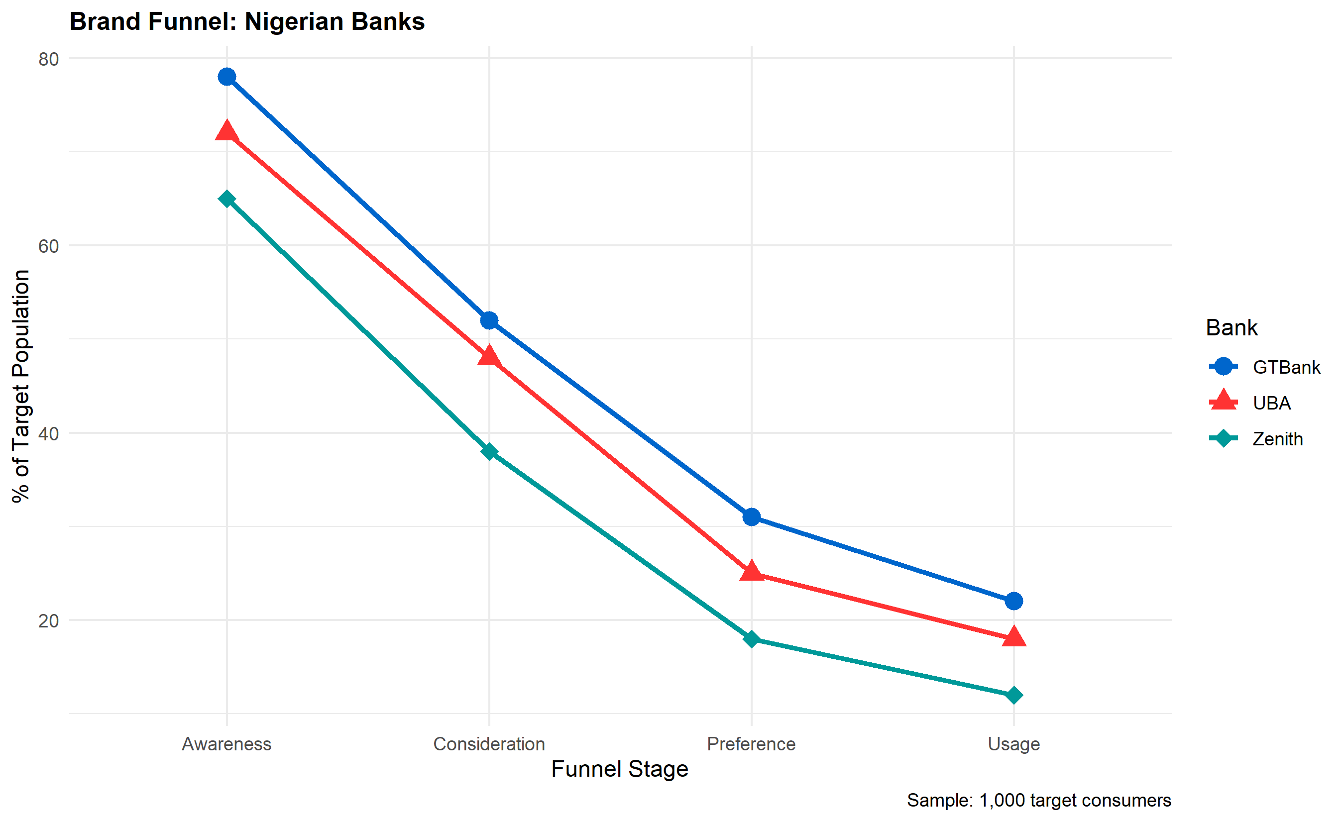
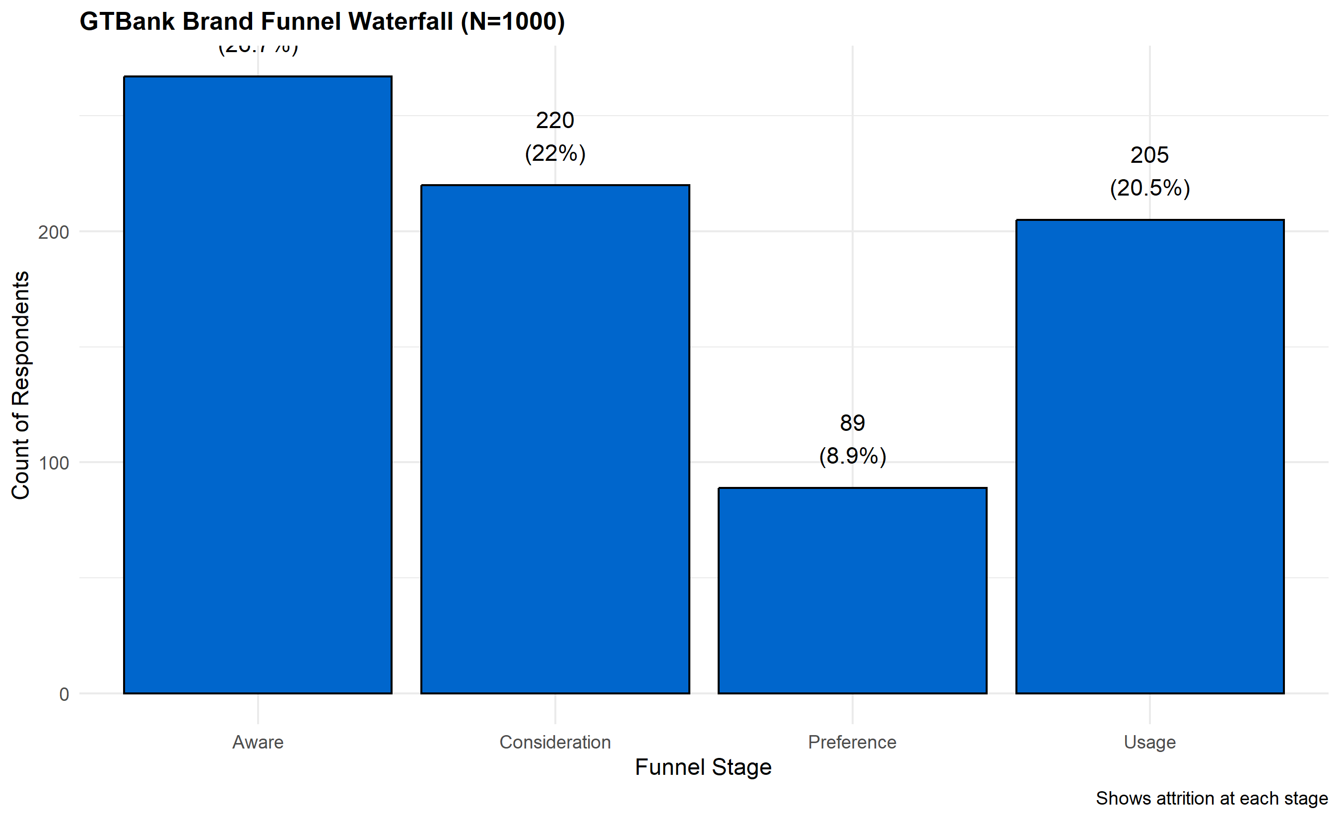
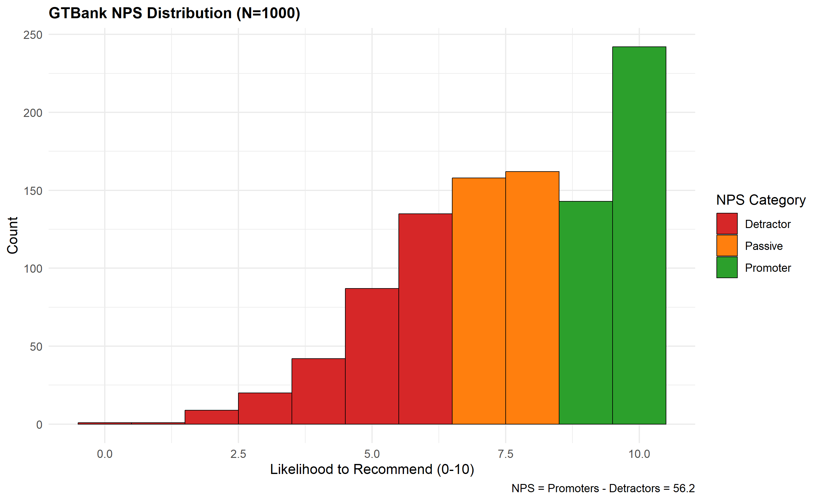
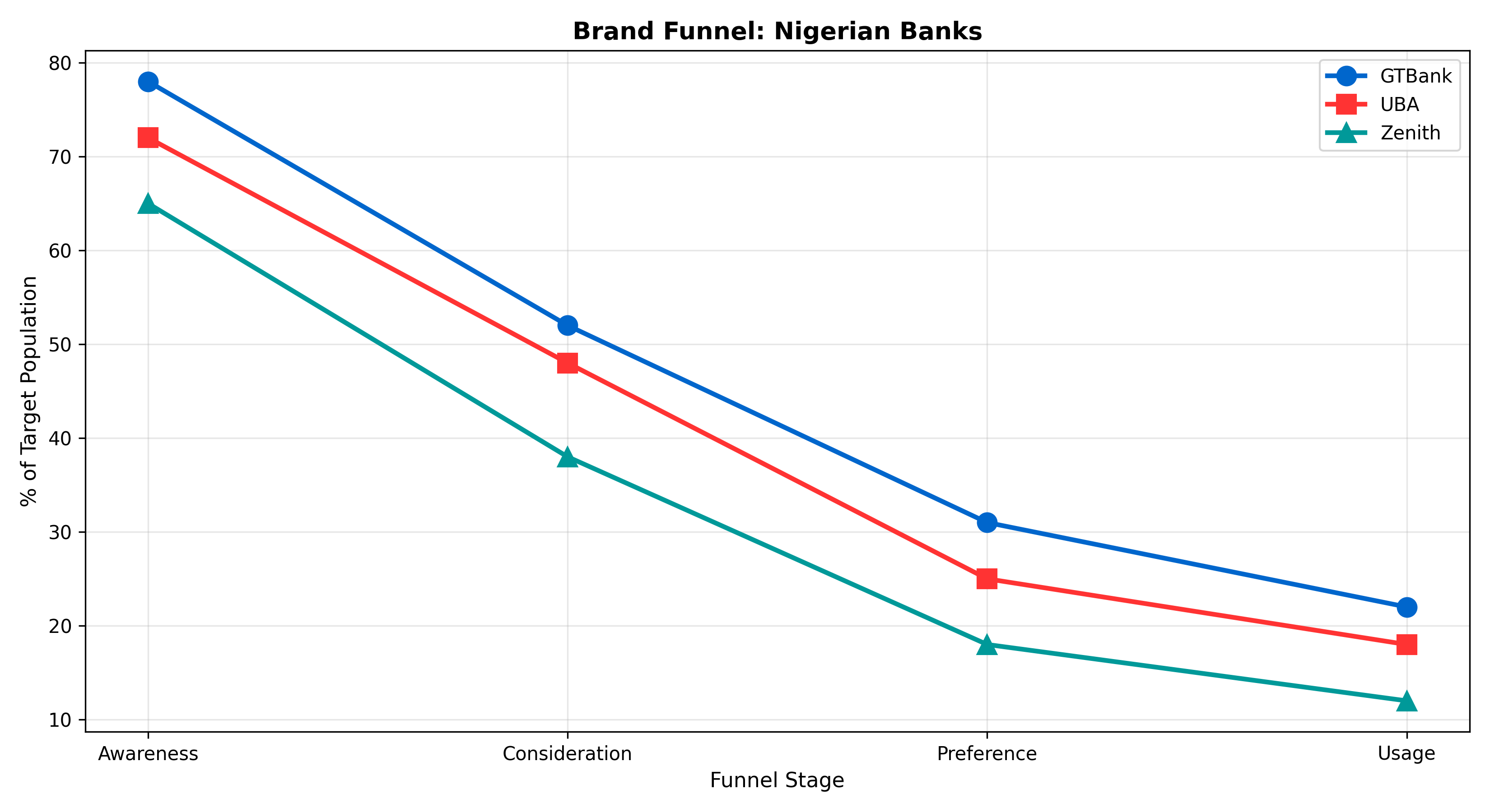
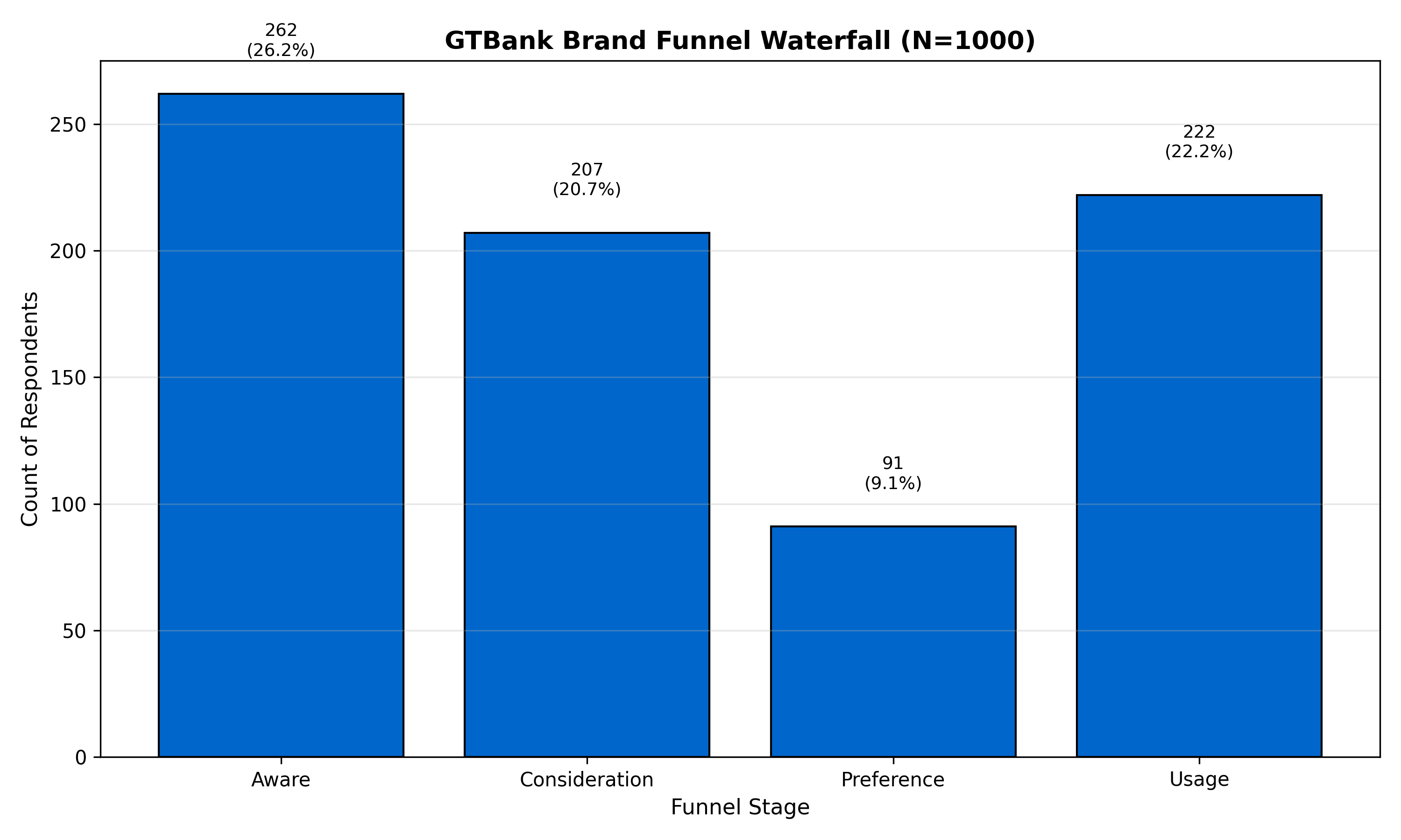
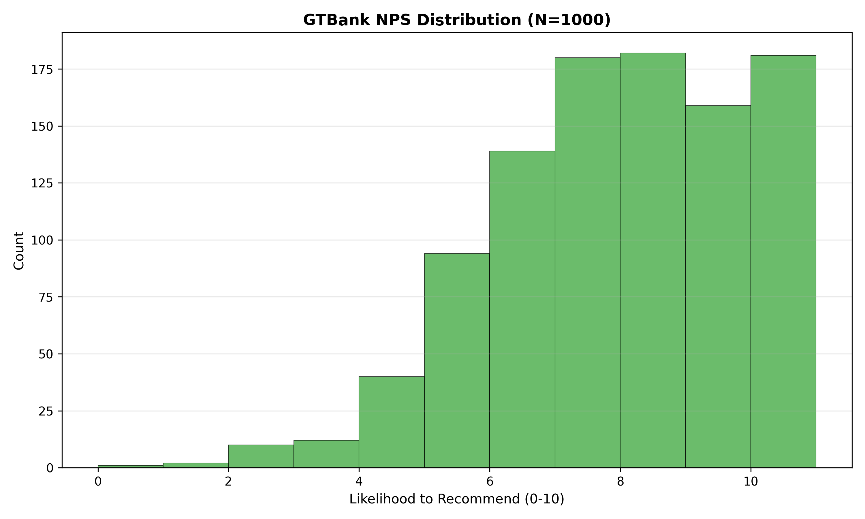
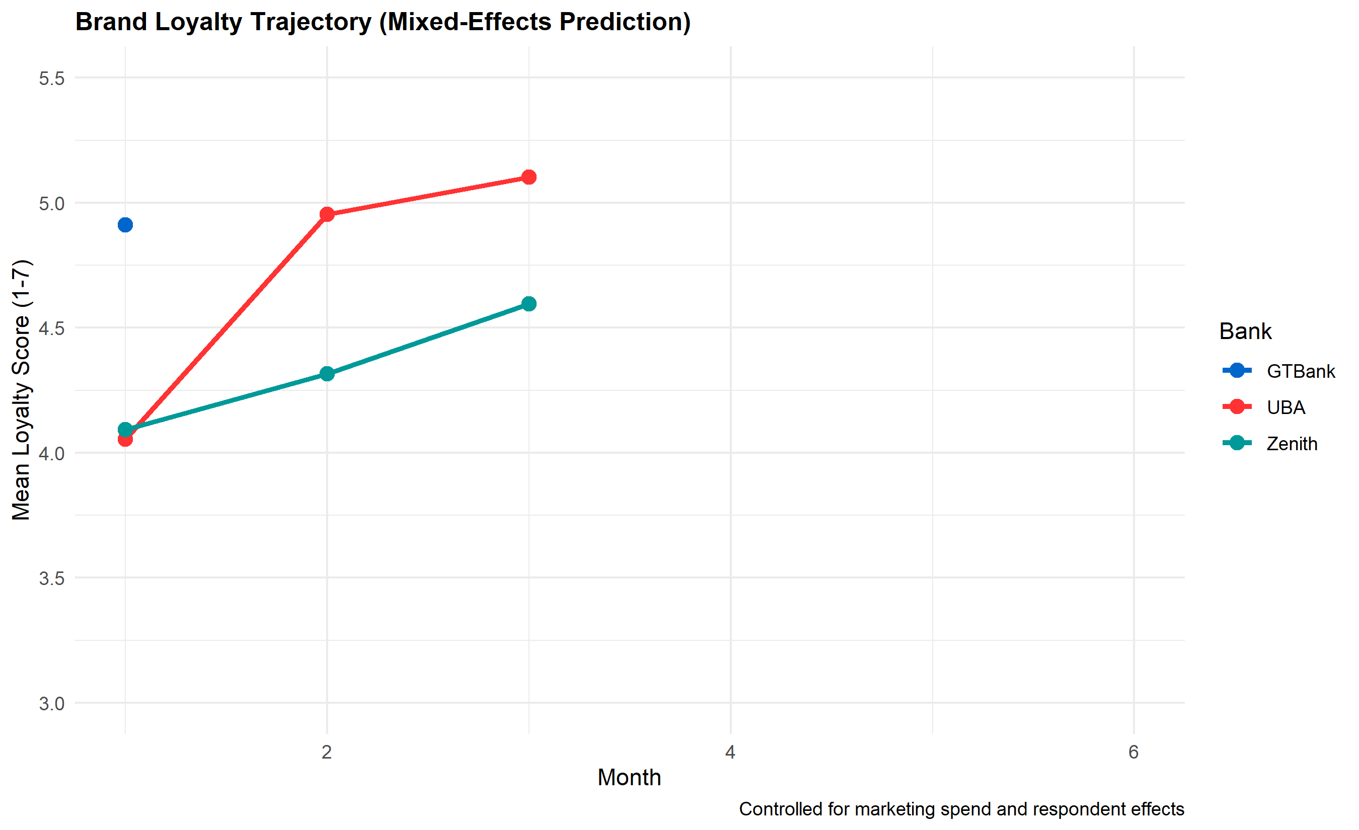
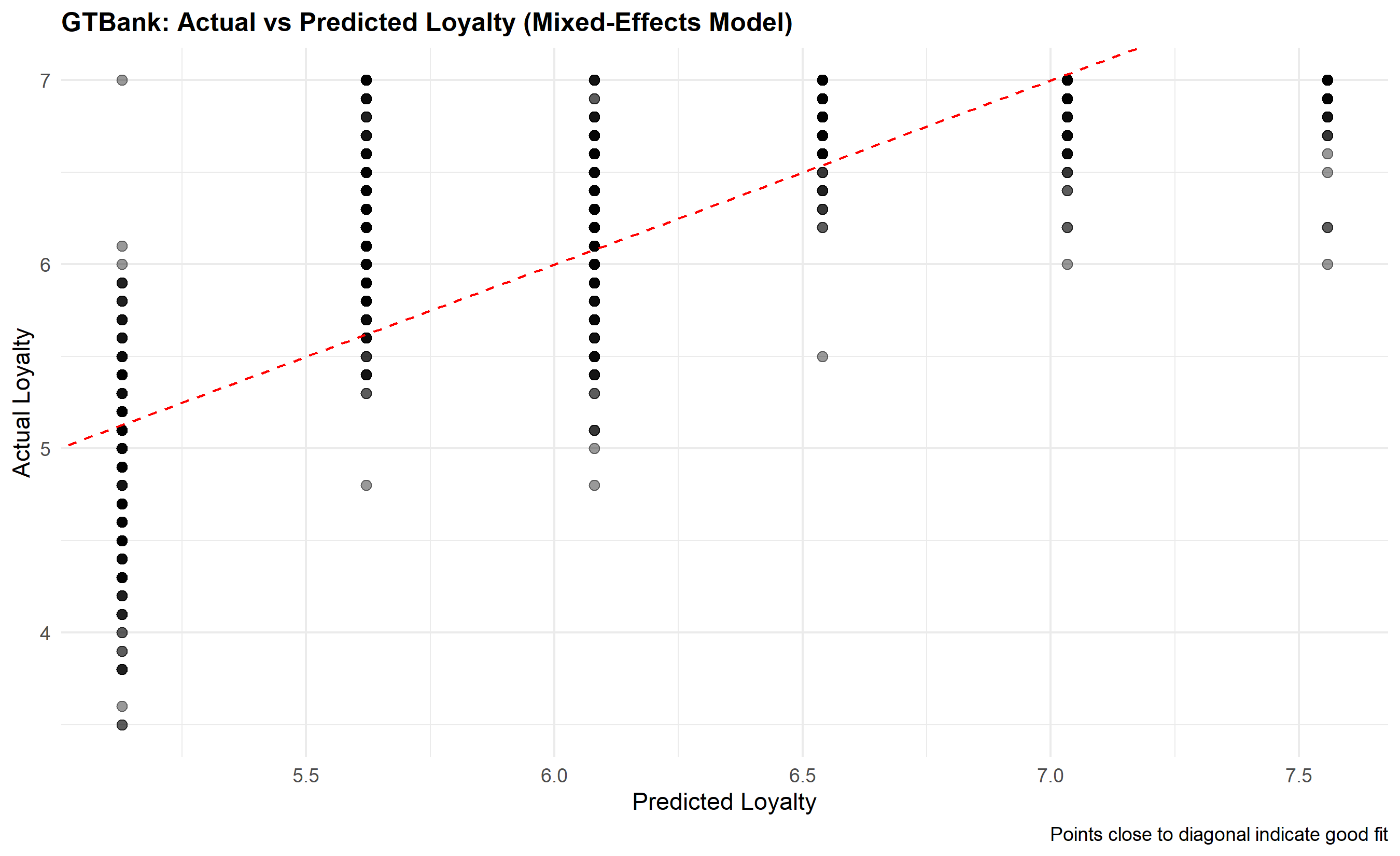
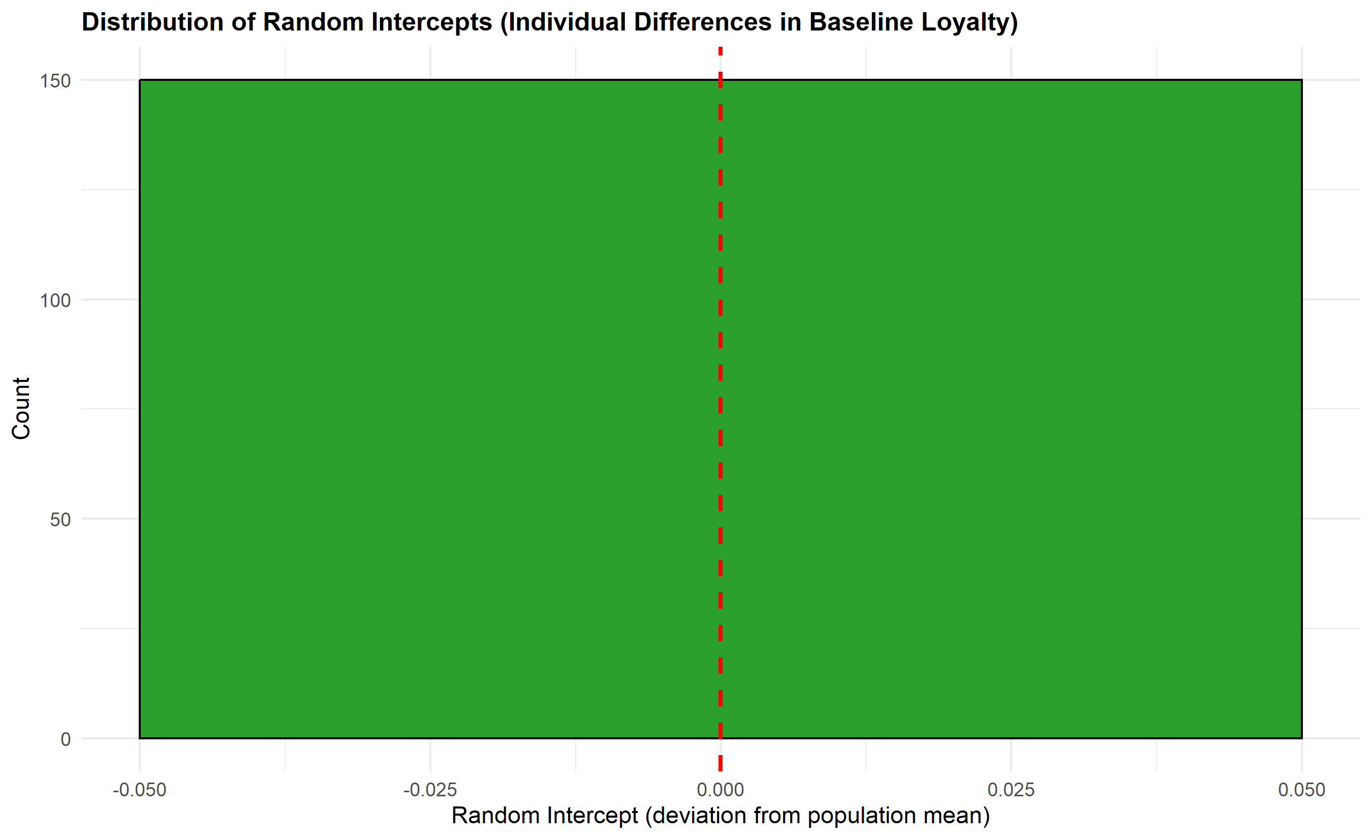
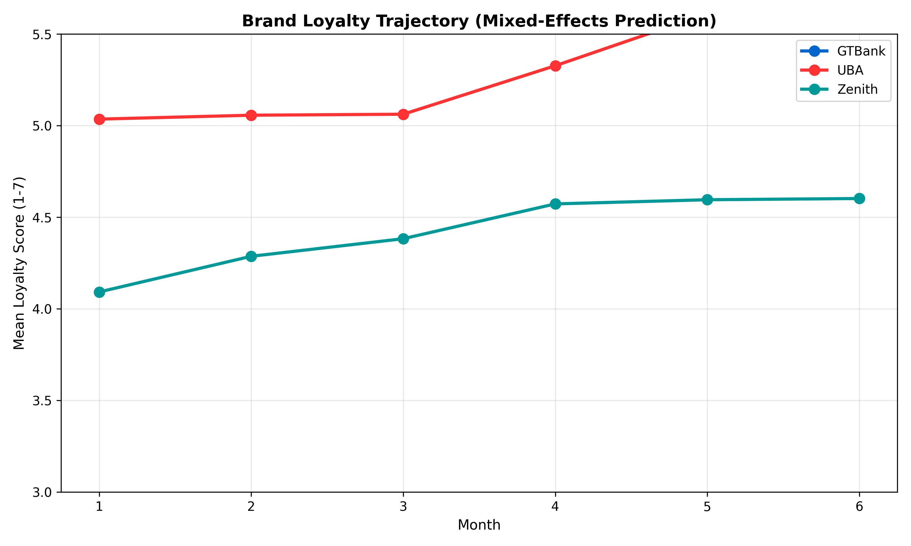
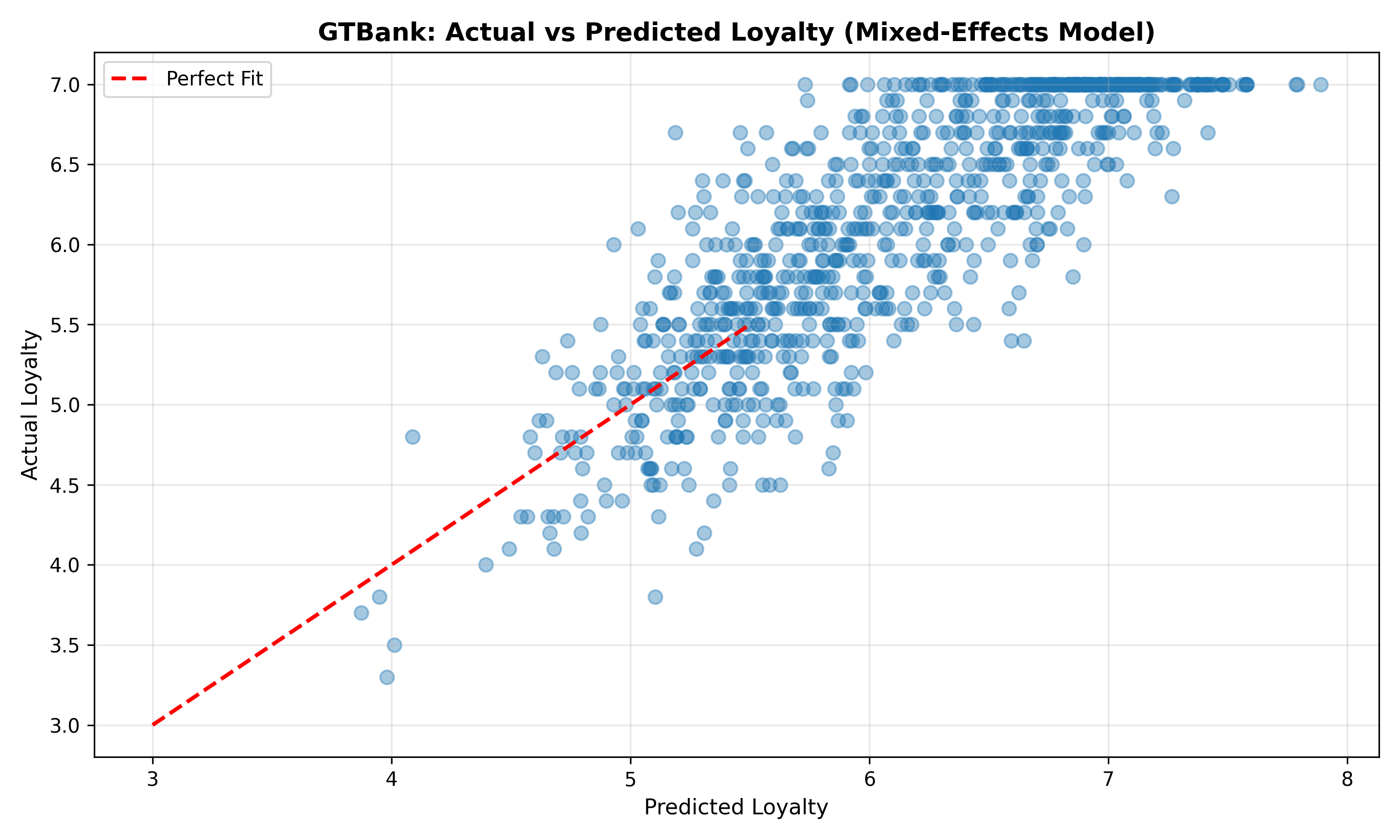
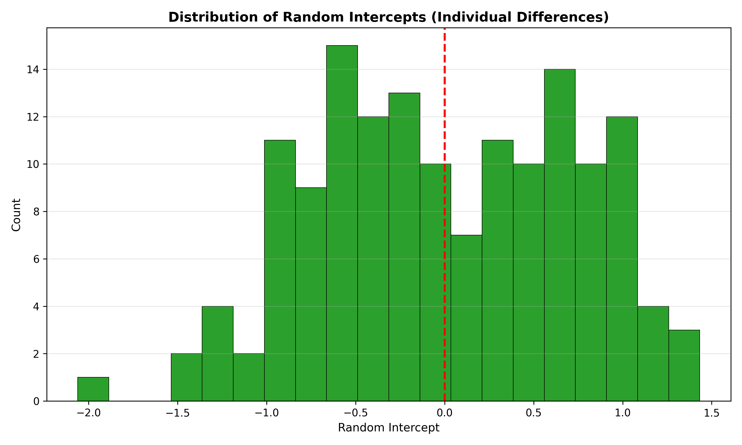
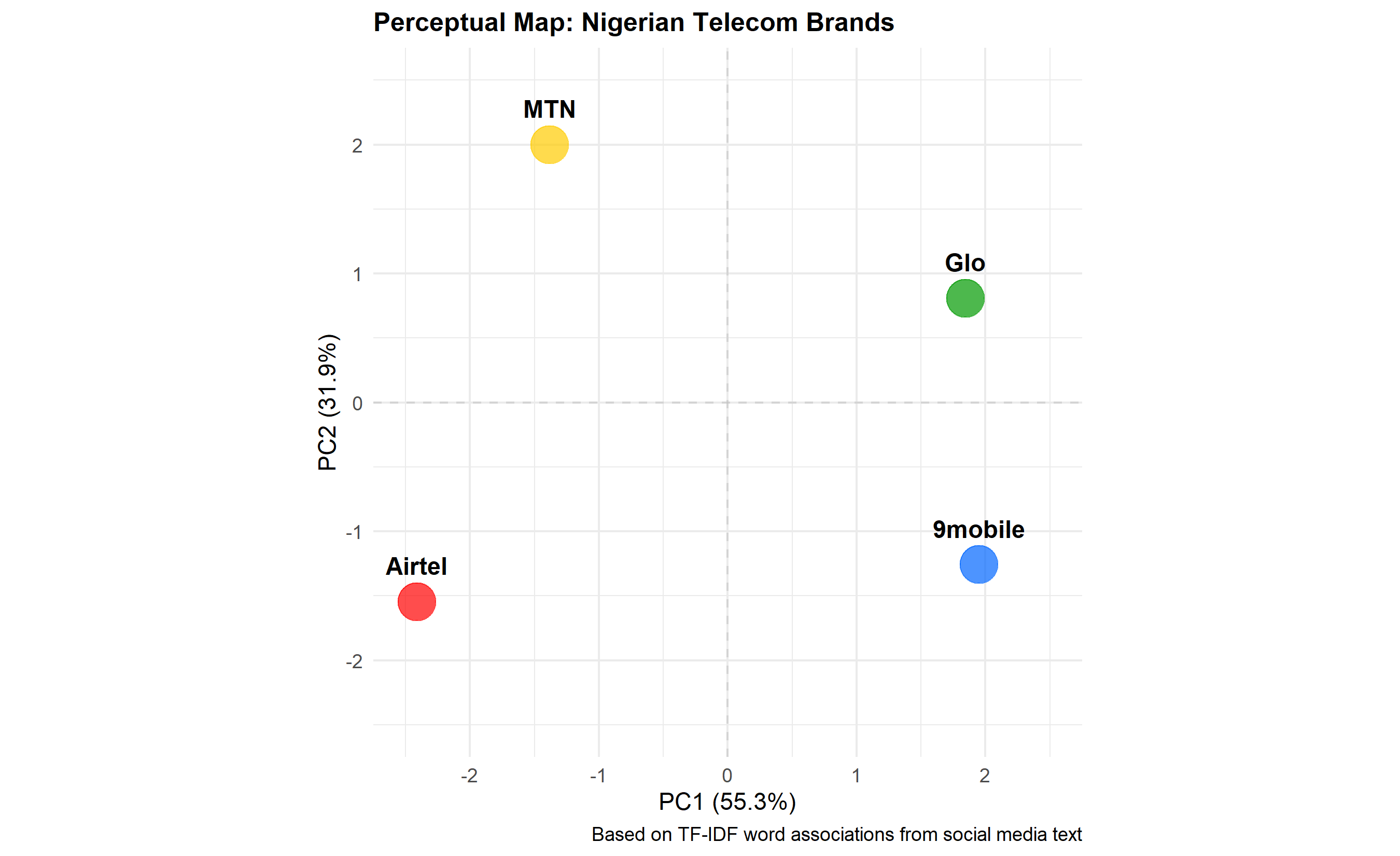
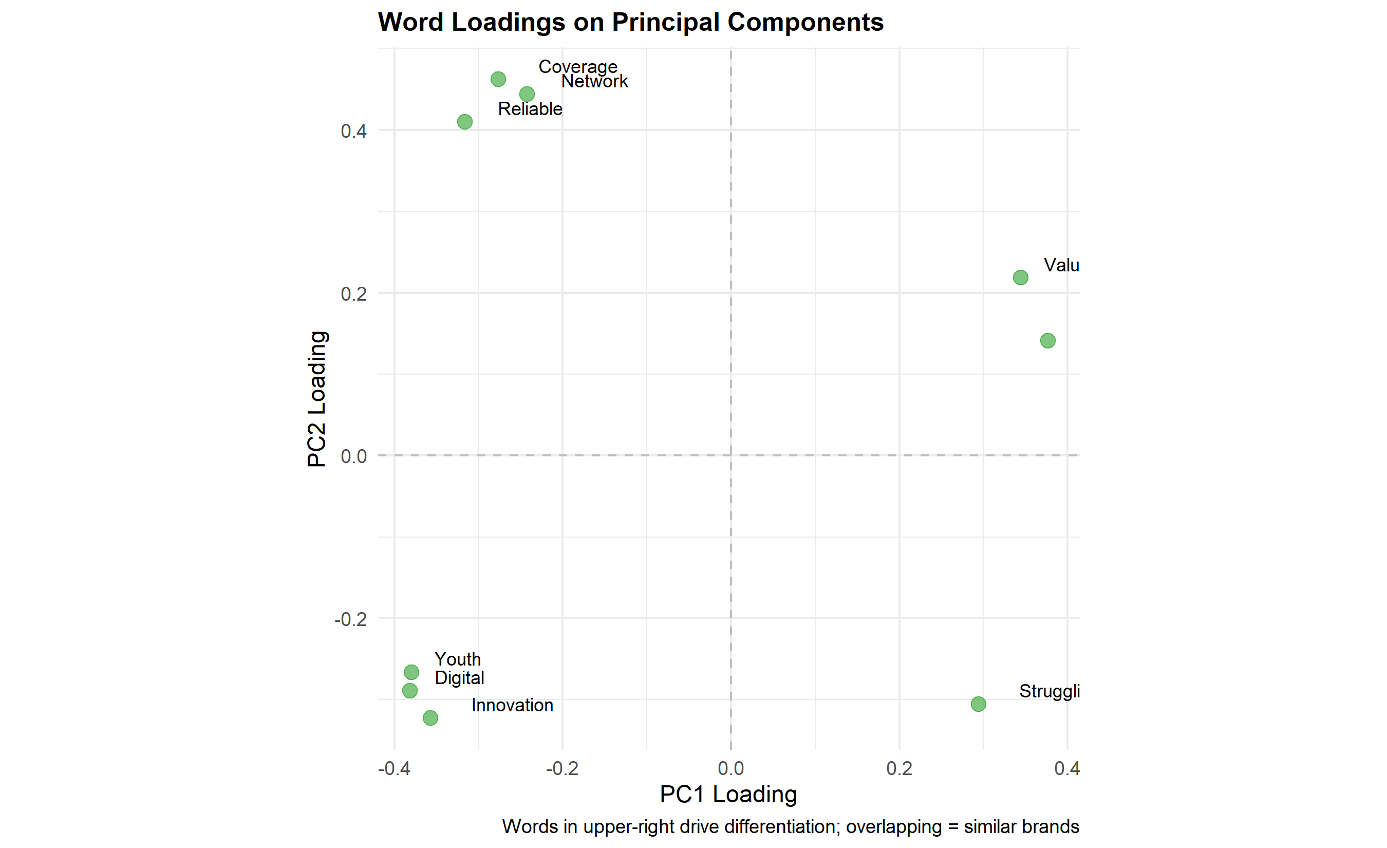
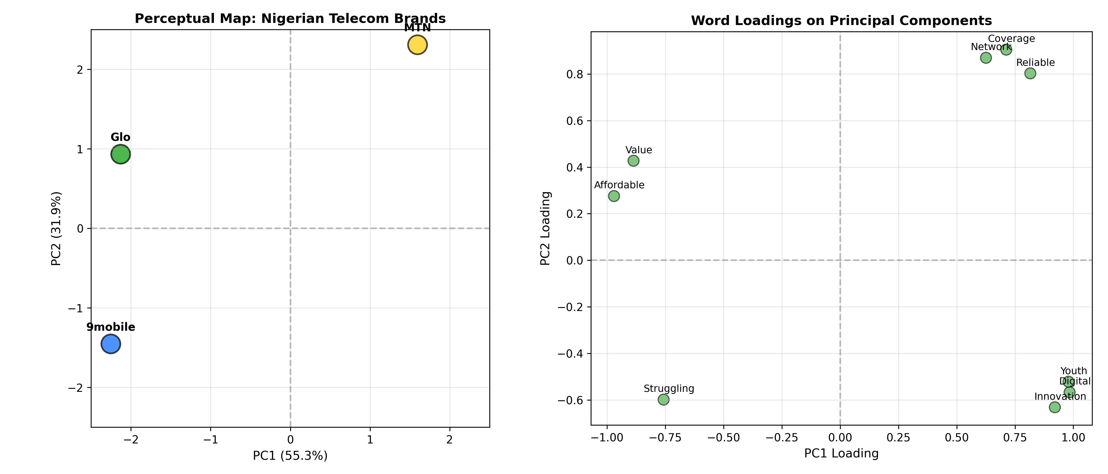
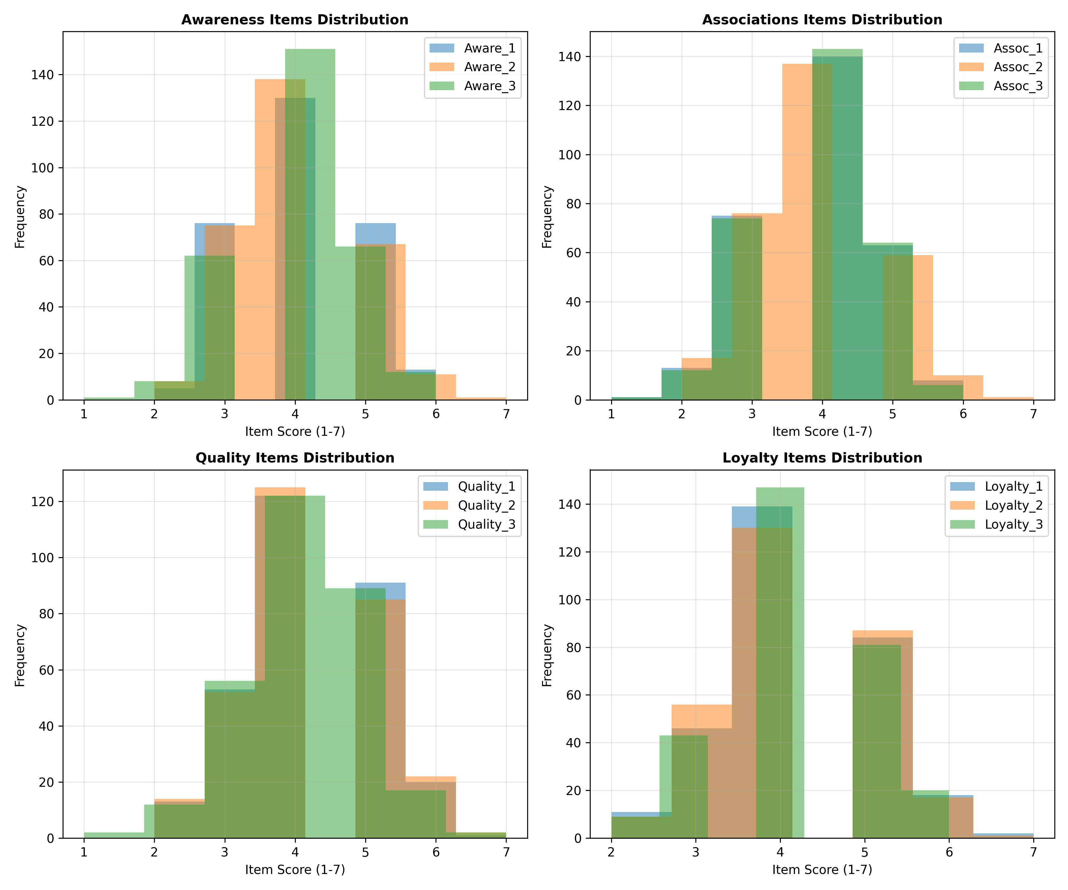
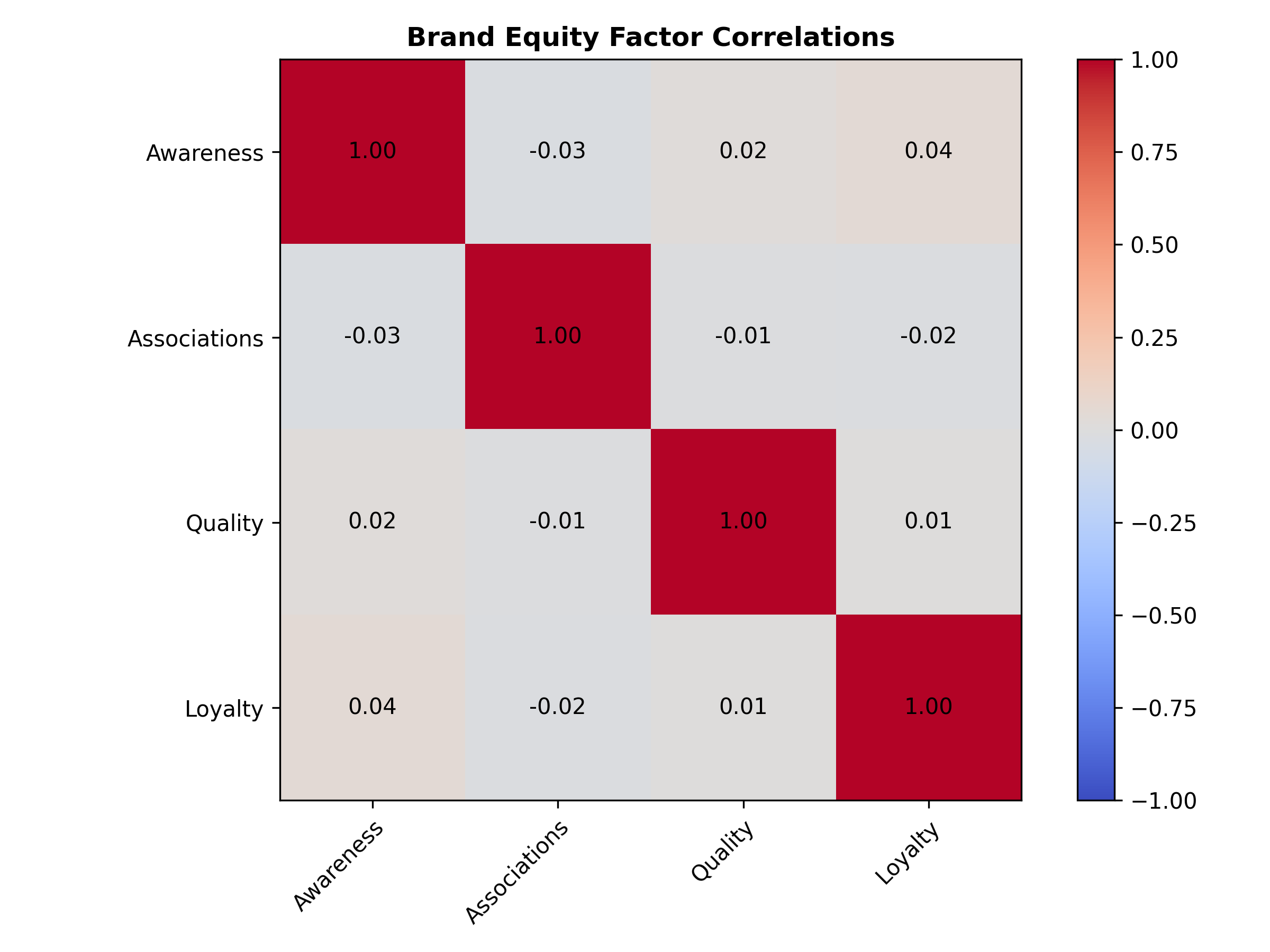
51.4 Social Media Brand Monitoring: Sentiment and Share of Voice
In the era of social listening, brands no longer control the narrative about themselves; consumers do, one tweet, Instagram comment, or TikTok video at a time. Social media monitoring—systematic analysis of online conversations about a brand—provides real-time signals of brand health, emerging crises, and competitive threats. Two key metrics are share of voice (SOV) and sentiment share.
Share of Voice (SOV) is the brand’s proportion of category mentions on social media:
\[\text{SOV} = \frac{\text{Mentions of Brand X}}{\sum_{\text{all brands in category}} \text{Mentions}} \times 100\]
If a telecom category generates 10,000 tweets monthly, and Airtel gets 3,200 mentions, MTN gets 3,500, Glo gets 2,100, and 9mobile gets 1,200, then Airtel’s SOV = 32%. SOV is a proxy for attention share in the marketplace. A declining SOV signals competitive erosion; rising SOV suggests growing consumer interest. SOV should be interpreted alongside sales market share and advertising share—ideally, SOV = Advertising Share, with a target SOV ≥ Market Share (indicating marketing is gaining mindshare).
Sentiment Share goes deeper: of all brand mentions, what percentage are positive, negative, or neutral? A brand could have high SOV but poor sentiment if it’s mentioned only in complaints. Sentiment analysis uses natural language processing (NLP): each mention is classified as positive, negative, or neutral (with confidence scores). Sentiment analysis is imperfect—sarcasm confuses classifiers, and context matters—but at scale (thousands of mentions), aggregate sentiment distributions are reliable. Sentiment can shift rapidly during crises: a product recall, executive scandal, or viral negative review can flip sentiment from 60% positive to 40% within 24 hours.
In Nigerian telecom context, monitoring is critical. When MTN imposed payment reversal policies or Airtel had data throttling issues, social media sentiment plummeted. Crisis detection—automatic flagging of unusual sentiment spikes—enables rapid response. A dashboard showing daily SOV and sentiment by brand, with alerts for sentiment drops > 5 percentage points, lets marketing teams react within hours.
Social media monitoring involves: (1) data collection (via APIs from Twitter, Instagram, TikTok; third-party platforms like Sprout Social, Brandwatch); (2) text preprocessing (tokenisation, removing stop words, stemming); (3) sentiment classification (rule-based, lexicon-based, or ML-based); (4) aggregation into metrics (SOV, sentiment share, volume trends). Limitations: only a subset of consumers tweet (self-selection bias); bots inflate mention counts; sarcasm and multilingual content (Pidgin English in Nigeria) confuse classifiers. Despite limitations, social listening is orders of magnitude faster than traditional brand tracking surveys.
Share of Voice: \[\text{SOV}_{\text{Brand}} = \frac{\text{Mentions}_{\text{Brand}}}{\sum_{i} \text{Mentions}_{i}} \times 100\%\]
Sentiment Distribution: \[\text{Sentiment Share} = [\%_{\text{Positive}}, \%_{\text{Neutral}}, \%_{\text{Negative}}]\]
Show code
Show code
Show code
Show code
Show code
Show code
Show code
Show code
1. SOV vs Market Share If Airtel has 20% market share but 35% SOV, what does this signal? Is it sustainable?
2. Sentiment Classification Accuracy Sentiment classifiers often struggle with sarcasm (e.g., “Great network, spent 3 hours trying to connect!”). How would you validate classifier accuracy? What’s acceptable accuracy for brand monitoring?
3. Crisis vs Noise A brand’s sentiment drops 4 percentage points in one week. Is this a crisis? How would you distinguish meaningful changes from noise?
4. Interpretation Challenges High SOV with negative sentiment (e.g., being the subject of criticism). Is this a positioning problem or a PR problem? What actions would you take?
5. Real-Time Response If your dashboard flags a sentiment crisis (drops > 10 points in 24 hours), what would be your response protocol? Who should be alerted?