---
title: "Understanding Time Series Data"
author: "Bongo Adi"
date: "2024"
number-sections: true
---
```{python}
#| label: python-setup-23-time-series-fundamentals
#| include: false
import numpy as np
import pandas as pd
import matplotlib.pyplot as plt
import seaborn as sns
from statsmodels.tsa.seasonal import seasonal_decompose, STL
from datetime import datetime, timedelta
from statsmodels.graphics.tsaplots import plot_acf, plot_pacf
from statsmodels.tsa.stattools import adfuller
from statsmodels.tsa.stattools import adfuller, kpss
```
::: {.callout-note icon="false"}
## 📋 Learning Objectives
By the end of this chapter, you will:
- Understand why time series data is fundamentally different from cross-sectional data
- Decompose a time series into trend, seasonality, cyclicality, and irregular components
- Apply classical and STL decomposition methods to reveal hidden patterns
- Compute and interpret autocorrelation (ACF) and partial autocorrelation (PACF) functions
- Test for stationarity using visual inspection, the ADF test, and the KPSS test
- Transform non-stationary series to stationarity via differencing and log transformation
- Apply these concepts to real Nigerian economic data (CPI and exchange rates)
:::
## What Makes Time Series Special?
Time series data—measurements ordered by time—forms the backbone of business analytics. Daily sales, monthly revenue, quarterly GDP, hourly server traffic: these are ubiquitous. Yet time series analysis differs fundamentally from the cross-sectional methods (regression, clustering, classification) we have studied.
### The Distinctive Characteristics
**Ordering matters**: In a regression dataset, you can shuffle rows and the data means the same thing. In a time series, order is everything. January's sales affect February's sales; last year's GDP informs this year's forecast.
**Dependence on the past**: This is **autocorrelation**—values are correlated with their own past values. If inflation was high last month, it is likely still high this month. Observations are not independent; violating the "independence" assumption that most statistical methods presume.
**Patterns evolve**: A time series exhibits **trend** (long-term direction), **seasonality** (regular patterns that repeat yearly), **cyclicality** (multi-year patterns), and **noise** (irregular, unpredictable fluctuations). Business intelligence requires identifying and separating these components.
**Forecasting, not just inference**: The goal is often to predict the future, not to infer relationships. We cannot run randomised controlled trials on time; we must learn from history.
### Why Standard Methods Fail on Time Series
Ordinary least squares regression assumes independent, identically distributed (iid) errors. Time series errors are serially correlated, violating this assumption. Standard confidence intervals, p-values, and hypothesis tests become unreliable.
Consider forecasting next month's sales by regressing on all previous months' sales and ignoring temporal structure. This "naive" approach ignores seasonality, trends, and the fact that adjacent months are more correlated than distant months. Specialised time series methods (ARIMA, exponential smoothing) explicitly model these dependencies.
::: {.callout-note icon="false"}
## 📘 Theory: The Time Index
A time series is a sequence $(Y_1, Y_2, \ldots, Y_T)$ indexed by time $t \in \{1, 2, \ldots, T\}$. The joint distribution of the series is typically not the same as the marginal distributions of individual $Y_t$. This is the essence of why time series analysis requires special tools.
:::
::: {.callout-caution icon="false"}
## 📝 Section 23.1 Review Questions
1. Explain why the independence assumption of OLS regression is violated in time series data.
2. Give three business examples of time series with obvious seasonality.
3. Why is "ordering matters" crucial for time series? What would happen if you randomly shuffled the observations in a sales time series?
4. Can you use K-Means clustering on time series values directly? Why or why not?
:::
## Time Series Components: Decomposing the Signal
A time series typically contains four components:
**Trend ($T_t$)**: The long-term direction or drift. GDP generally trends upward; a declining company's revenue trends downward. Trends can be linear or nonlinear and can change direction (structural breaks).
**Seasonality ($S_t$)**: Regular, repetitive patterns that occur at fixed intervals. Retail sales spike in December; agricultural output peaks after harvest. Seasonality typically repeats annually but can occur at any frequency.
**Cyclicality ($C_t$)**: Longer-term fluctuations (2-10+ years) related to economic cycles. Booms and recessions; expansions and contractions. Unlike seasonality, cycles are irregular in period and amplitude.
**Irregular/Noise ($\epsilon_t$)**: Unpredictable random fluctuations. Measurement error, one-off events (a strike, a natural disaster), market shocks.
### Additive vs. Multiplicative Decomposition
We decompose as either:
**Additive**: $Y_t = T_t + S_t + C_t + \epsilon_t$
Use when the magnitude of seasonal fluctuations is constant over time.
**Multiplicative**: $Y_t = T_t \times S_t \times C_t \times \epsilon_t$
Use when seasonal fluctuations grow or shrink proportionally with the trend (common in finance, retail).
### Classical Moving Average Decomposition
The simplest decomposition uses moving averages:
1. Estimate trend by smoothing with a centred moving average (e.g., 12-month MA for monthly data).
2. Detrend: subtract trend from the series.
3. Estimate seasonal component by averaging the detrended values for each season.
4. Residuals are the irregular component.
Classical decomposition is intuitive but assumes a constant seasonal pattern and linear trend. It also loses observations at the start and end.
### STL Decomposition (Seasonal and Trend Decomposition using LOESS)
STL (Cleveland et al., 1990) is more robust:
1. Use LOESS (Locally Estimated Scatterplot Smoothing) to estimate trend, which is flexible and robust to outliers.
2. Iteratively refine the seasonal component.
3. Naturally handles varying seasonality and trend changes.
4. Preserves all observations (no edge effects).
STL is the modern standard.
### Decomposing Nigerian CPI
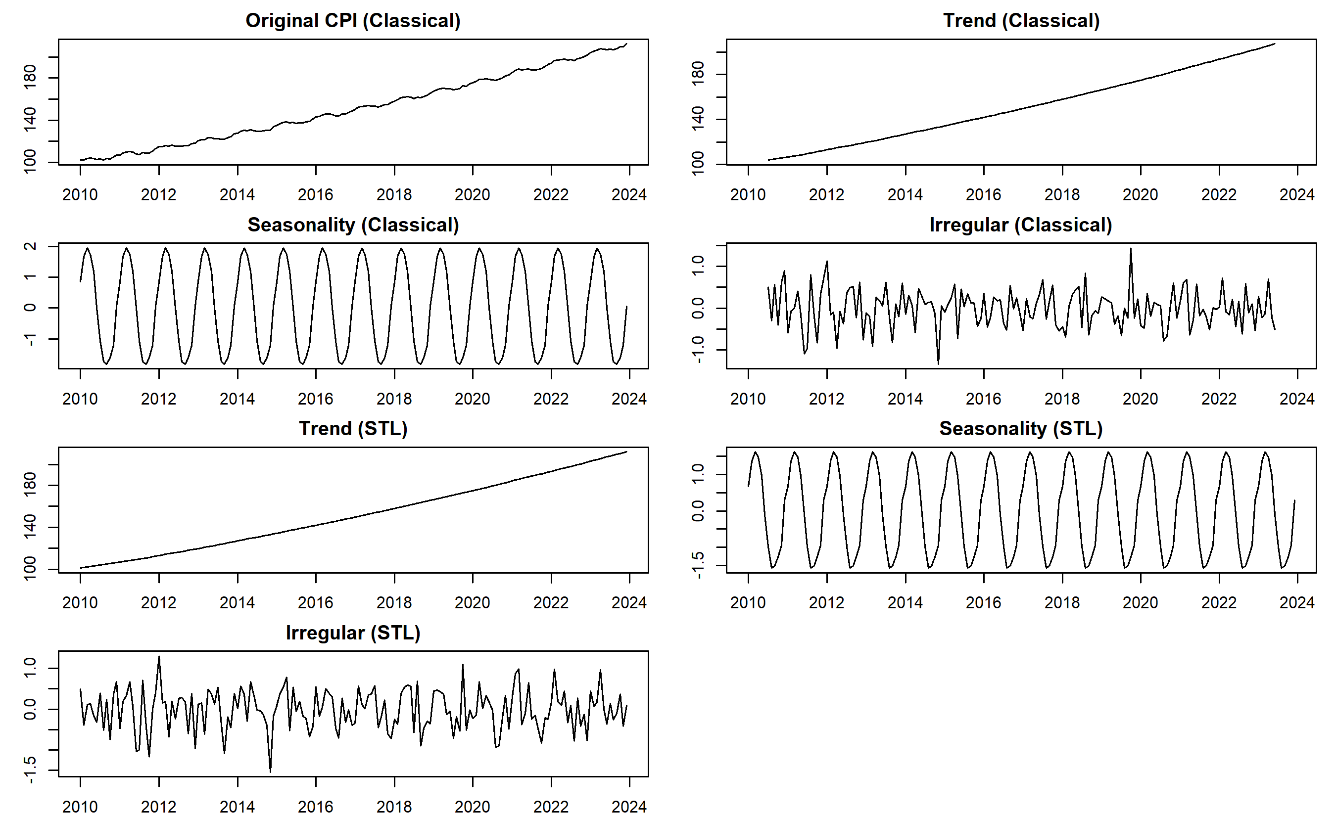
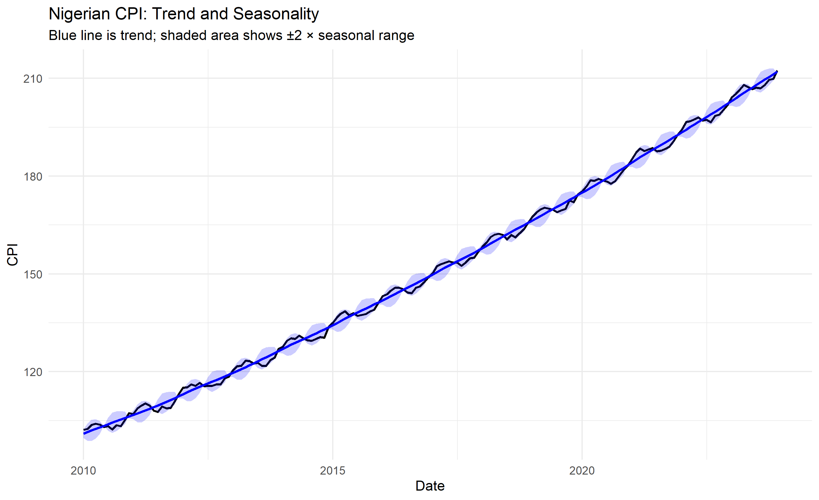
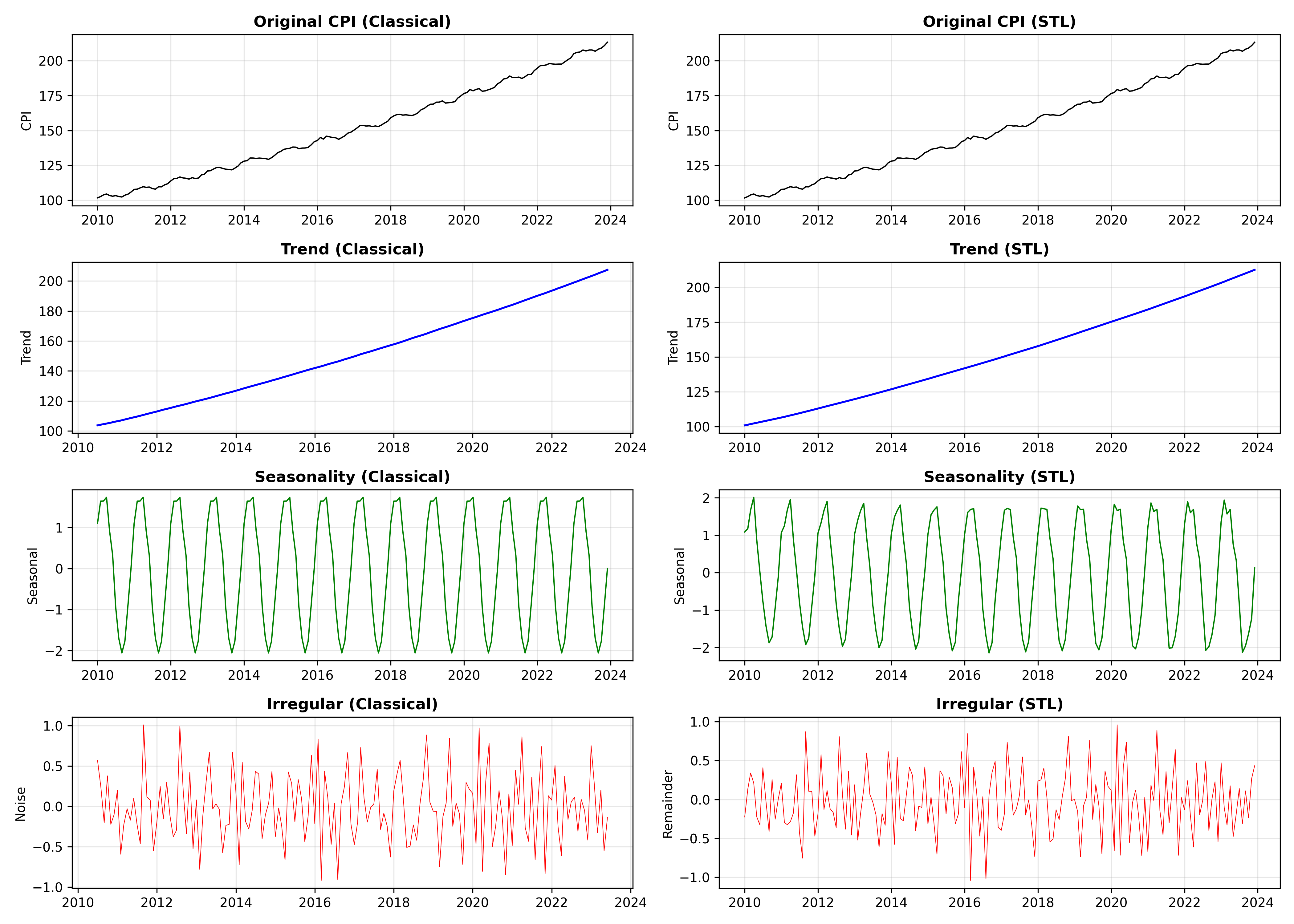
We decompose monthly CPI data from Nigeria (synthetic but realistic, 2010-2023) using both classical and STL methods.
::: {.panel-tabset}
## R
```{r}
library(tidyverse)
library(forecast)  # For decomposition functions
library(lubridate)

# Generate synthetic Nigerian CPI data (monthly, 2010-2023)
set.seed(42)
n_months <- 168  # 14 years × 12 months
dates <- seq(from = ymd("2010-01-01"), by = "month", length.out = n_months)

# Create CPI with trend, seasonality, and noise
trend <- 100 + 0.5 * (1:n_months) + 0.001 * (1:n_months)^2
seasonality <- 2 * sin(2 * pi * (1:n_months) / 12)  # Annual seasonality
noise <- rnorm(n_months, mean = 0, sd = 0.5)

cpi <- trend + seasonality + noise

cpi_ts <- ts(cpi, start = c(2010, 1), frequency = 12)

# Classical decomposition
classical_decomp <- decompose(cpi_ts, type = "additive")

# STL decomposition
stl_decomp <- stl(cpi_ts, s.window = "periodic")

# Plot both
par(mfrow = c(4, 2), mar = c(2, 3, 2, 1))

# Classical
plot(classical_decomp$x, main = "Original CPI (Classical)", ylab = "CPI")
plot(classical_decomp$trend, main = "Trend (Classical)", ylab = "Trend")
plot(classical_decomp$seasonal, main = "Seasonality (Classical)", ylab = "Seasonal")
plot(classical_decomp$random, main = "Irregular (Classical)", ylab = "Noise")

# STL
plot(stl_decomp$time.series[, "trend"], main = "Trend (STL)", ylab = "Trend")
plot(stl_decomp$time.series[, "seasonal"], main = "Seasonality (STL)", ylab = "Seasonal")
plot(stl_decomp$time.series[, "remainder"], main = "Irregular (STL)", ylab = "Remainder")

par(mfrow = c(1, 1))
# Print variance of components (STL)
cat("=== STL Decomposition Summary ===\n")
cat("Trend variance:", round(var(stl_decomp$time.series[, "trend"]), 2), "\n")
cat("Seasonal variance:", round(var(stl_decomp$time.series[, "seasonal"]), 2), "\n")
cat("Remainder variance:", round(var(stl_decomp$time.series[, "remainder"]), 2), "\n")
# Extract components for further analysis
trend_component <- stl_decomp$time.series[, "trend"]
seasonal_component <- stl_decomp$time.series[, "seasonal"]
irregular_component <- stl_decomp$time.series[, "remainder"]
# Visualise with ggplot
decomp_df <- tibble(
date = dates,
original = cpi,
trend = as.numeric(trend_component),
seasonal = as.numeric(seasonal_component),
irregular = as.numeric(irregular_component)
)
ggplot(decomp_df, aes(x = date)) +
geom_line(aes(y = original), color = "black", linewidth = 0.8) +
geom_line(aes(y = trend), color = "blue", linewidth = 1) +
geom_ribbon(aes(ymin = trend - 2 * seasonal, ymax = trend + 2 * seasonal), alpha = 0.2, fill = "blue") +
theme_minimal() +
labs(title = "Nigerian CPI: Trend and Seasonality",
subtitle = "Blue line is trend; shaded area shows ±2 × seasonal range",
x = "Date", y = "CPI")
```
## Python
```{python}
import numpy as np
import pandas as pd
import matplotlib.pyplot as plt
from statsmodels.tsa.seasonal import seasonal_decompose, STL
from datetime import datetime, timedelta
# Generate synthetic Nigerian CPI data
np.random.seed(42)
n_months = 168
dates = pd.date_range(start='2010-01-01', periods=n_months, freq='MS')
# Trend with some acceleration
trend = 100 + 0.5 * np.arange(1, n_months + 1) + 0.001 * np.arange(1, n_months + 1)**2
# Seasonality (annual)
seasonality = 2 * np.sin(2 * np.pi * np.arange(1, n_months + 1) / 12)
# Noise
noise = np.random.normal(0, 0.5, n_months)
cpi = trend + seasonality + noise
cpi_ts = pd.Series(cpi, index=dates)
# Classical decomposition
classical_decomp = seasonal_decompose(cpi_ts, model='additive', period=12)
# STL decomposition
stl = STL(cpi_ts, seasonal=13, trend=25) # seasonal and trend windows
stl_decomp = stl.fit()
# Visualise
fig, axes = plt.subplots(4, 2, figsize=(14, 10))
# Classical decomposition
axes[0, 0].plot(classical_decomp.observed, color='black', linewidth=1)
axes[0, 0].set_title('Original CPI (Classical)', fontweight='bold')
axes[0, 0].set_ylabel('CPI')
axes[0, 0].grid(True, alpha=0.3)
axes[1, 0].plot(classical_decomp.trend, color='blue', linewidth=1.5)
axes[1, 0].set_title('Trend (Classical)', fontweight='bold')
axes[1, 0].set_ylabel('Trend')
axes[1, 0].grid(True, alpha=0.3)
axes[2, 0].plot(classical_decomp.seasonal, color='green', linewidth=1)
axes[2, 0].set_title('Seasonality (Classical)', fontweight='bold')
axes[2, 0].set_ylabel('Seasonal')
axes[2, 0].grid(True, alpha=0.3)
axes[3, 0].plot(classical_decomp.resid, color='red', linewidth=0.5)
axes[3, 0].set_title('Irregular (Classical)', fontweight='bold')
axes[3, 0].set_ylabel('Noise')
axes[3, 0].grid(True, alpha=0.3)
# STL decomposition
axes[0, 1].plot(stl_decomp.observed, color='black', linewidth=1)
axes[0, 1].set_title('Original CPI (STL)', fontweight='bold')
axes[0, 1].set_ylabel('CPI')
axes[0, 1].grid(True, alpha=0.3)
axes[1, 1].plot(stl_decomp.trend, color='blue', linewidth=1.5)
axes[1, 1].set_title('Trend (STL)', fontweight='bold')
axes[1, 1].set_ylabel('Trend')
axes[1, 1].grid(True, alpha=0.3)
axes[2, 1].plot(stl_decomp.seasonal, color='green', linewidth=1)
axes[2, 1].set_title('Seasonality (STL)', fontweight='bold')
axes[2, 1].set_ylabel('Seasonal')
axes[2, 1].grid(True, alpha=0.3)
axes[3, 1].plot(stl_decomp.resid, color='red', linewidth=0.5)
axes[3, 1].set_title('Irregular (STL)', fontweight='bold')
axes[3, 1].set_ylabel('Remainder')
axes[3, 1].grid(True, alpha=0.3)
plt.tight_layout()
plt.savefig('decomposition_comparison.png', dpi=150, bbox_inches='tight')
print("Plot saved as 'decomposition_comparison.png'")
# Variance of components
print("\n=== STL Decomposition Summary ===")
print(f"Trend variance: {stl_decomp.trend.var():.2f}")
print(f"Seasonal variance: {stl_decomp.seasonal.var():.2f}")
print(f"Remainder variance: {stl_decomp.resid.var():.2f}")
# Summary
print(f"\nTotal variance explained by trend: {stl_decomp.trend.var() / cpi_ts.var():.1%}")
print(f"Total variance explained by seasonal: {stl_decomp.seasonal.var() / cpi_ts.var():.1%}")
print(f"Total variance explained by remainder: {stl_decomp.resid.var() / cpi_ts.var():.1%}")
```
:::
The decomposition reveals that the STL and classical methods produce similar results for this synthetic data. In practice, STL is superior because it:
1. Handles trend changes more gracefully.
2. Is robust to outliers (an unusual spike in inflation).
3. Allows the seasonal component to vary slowly over time.
4. Does not lose observations at the edges.
For the Nigerian CPI, we see a clear upward trend (inflation), a regular seasonal component (some months consistently higher or lower), and small irregular fluctuations (policy shocks, global events).
::: {.callout-caution icon="false"}
## 📝 Section 23.2 Review Questions
1. When would you choose additive decomposition over multiplicative (or vice versa)?
2. In the STL decomposition, the seasonal component shows the expected seasonal pattern. If you added a new product with a different seasonality, how would this appear in the decomposition?
3. What does it mean if the "remainder" (irregular) component is very large? What if it is very small?
4. Can you use the seasonal component alone to make a one-step-ahead forecast? Why or why not?
:::
## Autocorrelation and Partial Autocorrelation
**Autocorrelation** measures how a series correlates with itself at different lags. The **autocorrelation function (ACF)** at lag $h$ is:
$$\rho_h = \text{Corr}(Y_t, Y_{t-h}) = \frac{\text{Cov}(Y_t, Y_{t-h})}{\sqrt{\text{Var}(Y_t) \cdot \text{Var}(Y_{t-h})}}$$
For a stationary series, $\rho_h$ decays toward zero as $h$ increases. If $\rho_h$ remains large for all $h$, the series is non-stationary (more on this in Section 23.5).
The **ACF plot** shows $\rho_h$ for lags $h = 0, 1, 2, \ldots$. Blue dashed lines (typically at ±1.96/√n) indicate statistical significance at the 95% level. If many bars exceed these bounds, the series exhibits significant autocorrelation.
### Partial Autocorrelation Function (PACF)
The PACF removes the effect of intermediate lags. Formally:
$$\phi_{hh} = \text{Corr}(Y_t, Y_{t-h} | Y_{t-1}, Y_{t-2}, \ldots, Y_{t-h+1})$$
In words: the correlation of $Y_t$ and $Y_{t-h}$ after removing the influence of lags in between. If ACF decays slowly (suggesting a unit root or strong AR component), PACF can pinpoint the order of dependence.
### Interpreting ACF and PACF Patterns
- **White noise** (random): ACF close to zero for all lags (except lag 0).
- **AR(p)** process: PACF cuts off at lag p; ACF decays gradually.
- **MA(q)** process: ACF cuts off at lag q; PACF decays gradually.
- **Unit root / non-stationary**: ACF decays very slowly (approaches 0 asymptotically, not quickly).
### Computing ACF and PACF for Nigerian Exchange Rate
::: {.panel-tabset}
## R
```{r}
library(forecast)

# Generate synthetic NGN/USD exchange rate data (daily, 2015-2023)
set.seed(42)
n_days <- 2500
dates_fx <- seq(from = ymd("2015-01-01"), by = "day", length.out = n_days)

# Create exchange rate with trend and some random walk behavior
initial_rate <- 200
trend_fx <- initial_rate + 0.02 * (1:n_days) + 5 * sin(2 * pi * (1:n_days) / 365)
random_walk <- 5 * cumsum(rnorm(n_days, 0, 0.1))

fx_rate <- trend_fx + random_walk

fx_ts <- ts(fx_rate, frequency = 252)  # 252 trading days per year

# Compute ACF and PACF
acf_result <- acf(fx_ts, lag.max = 60, plot = FALSE)
pacf_result <- pacf(fx_ts, lag.max = 60, plot = FALSE)

# Plot
par(mfrow = c(2, 1), mar = c(3.5, 4, 2.5, 1))
plot(acf_result, main = "ACF: NGN/USD Exchange Rate")
plot(pacf_result, main = "PACF: NGN/USD Exchange Rate")
par(mfrow = c(1, 1), mar = c(5.1, 4.1, 4.1, 2.1))
# Interpretation
cat("=== ACF and PACF Interpretation ===\n")
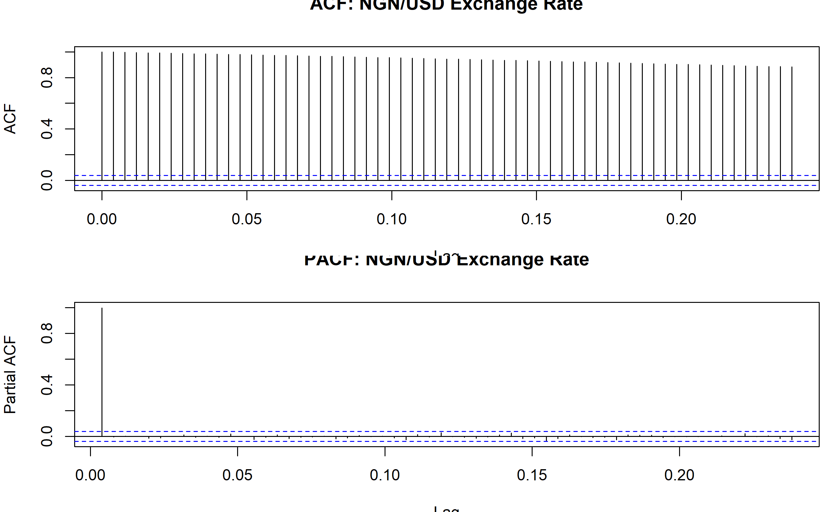
cat("The ACF shows slow decay (many large bars), indicating non-stationarity.\n")
cat("The PACF shows a large spike at lag 1, consistent with a unit root or random walk.\n")
cat("This suggests the series is I(1)—a random walk (integrated order 1).\n")
```
## Python
```{python}
from statsmodels.graphics.tsaplots import plot_acf, plot_pacf
from statsmodels.tsa.stattools import adfuller
# Generate synthetic NGN/USD exchange rate
np.random.seed(42)
n_days = 2500
dates_fx = pd.date_range(start='2015-01-01', periods=n_days, freq='D')
# Exchange rate with trend and random walk
initial_rate = 200
trend_fx = initial_rate + 0.02 * np.arange(1, n_days + 1) + 5 * np.sin(2 * np.pi * np.arange(1, n_days + 1) / 365)
random_walk = 5 * np.cumsum(np.random.normal(0, 0.1, n_days))
fx_rate = trend_fx + random_walk
fx_ts = pd.Series(fx_rate, index=dates_fx)
# Plot ACF and PACF
fig, axes = plt.subplots(2, 1, figsize=(12, 8))
plot_acf(fx_ts, lags=60, ax=axes[0], title='ACF: NGN/USD Exchange Rate')
plot_pacf(fx_ts, lags=60, ax=axes[1], title='PACF: NGN/USD Exchange Rate', method='ywm')
plt.tight_layout()
plt.savefig('acf_pacf.png', dpi=150, bbox_inches='tight')
print("Plot saved as 'acf_pacf.png'")
print("\n=== ACF and PACF Interpretation ===")
print("The ACF shows slow decay (many large bars), indicating non-stationarity.")
print("The PACF shows a large spike at lag 1, consistent with a unit root.")
print("This suggests the series is I(1)—a random walk (integrated order 1).")
```
:::
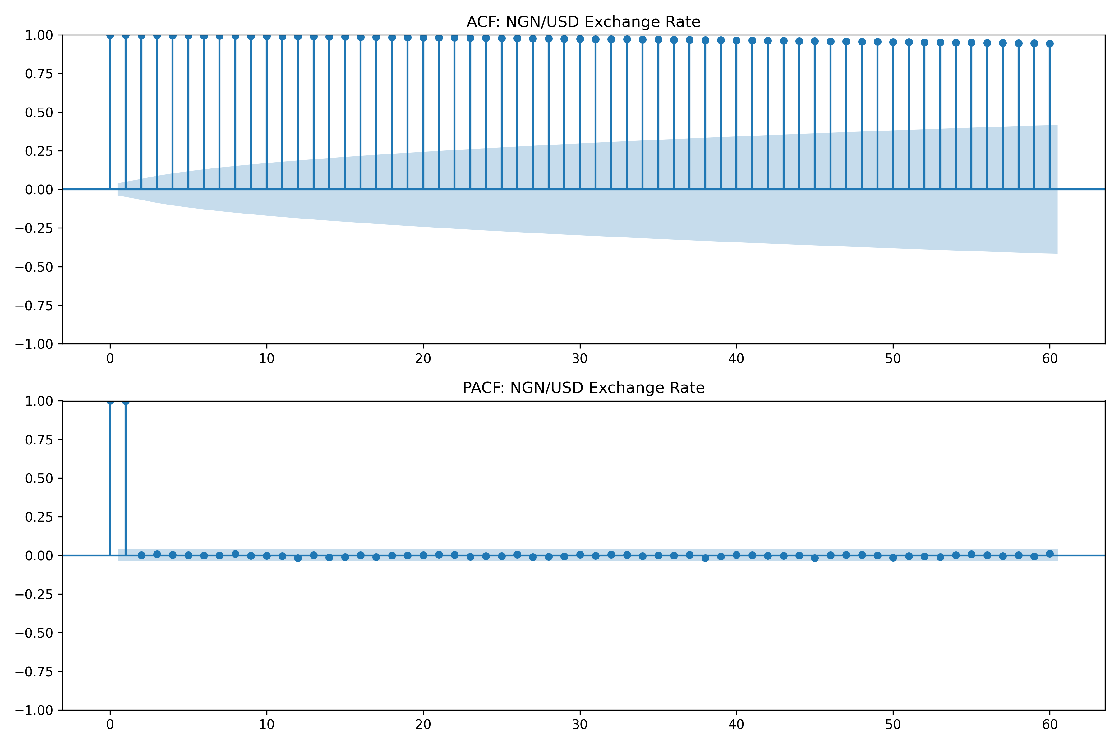
The ACF plot for the NGN/USD exchange rate shows a classic pattern of non-stationarity: the bars decay very slowly, lingering near significance for many lags. The PACF shows a single dominant spike at lag 1, with nearly all other lags insignificant. This is a hallmark of a **random walk** (or nearly a random walk), where each day's rate is nearly equal to yesterday's plus a small random shock.
::: {.callout-caution icon="false"}
## 📝 Section 23.3 Review Questions
1. If a series exhibits no significant autocorrelation at any lag (all bars close to zero), what does this tell you? Is this series "good" for forecasting?
2. A series shows ACF decaying slowly and PACF with one significant spike at lag 1. What ARIMA order might you try?
3. The ACF for differenced data (first differences) shows significant spikes at lags 1, 13, and 25. What might this pattern indicate? (Hint: think about seasonality.)
4. Can you use ACF to determine if a time series has a seasonal component?
:::
## Stationarity: The Foundation of Time Series Modelling
**Stationarity** is the cornerstone assumption for time series models like ARIMA. A stationary series has constant mean, variance, and autocovariance over time. Formally:
$$E[Y_t] = \mu \text{ for all } t$$
$$\text{Var}(Y_t) = \sigma^2 \text{ for all } t$$
$$\text{Cov}(Y_t, Y_{t-h}) = \gamma_h \text{ depends only on } h, \text{ not on } t$$
A **non-stationary** series violates one or more of these. It might have a time-varying mean (a trend), a time-varying variance (volatility clustering), or a very strong dependence on the past.
### Why Stationarity Matters
ARIMA models are designed for stationary data. If you fit ARIMA to non-stationary data, the model estimates become unreliable. Confidence intervals, p-values, and forecasts all fail.
Intuitively: if the mean is changing over time, the past provides little information about the future. A forecast based on historical average is useless if the series is trending.
### Detecting Non-Stationarity
**Visual inspection**: Plot the series. Look for obvious trends, level shifts, or changing variance.
**Rolling mean and variance**: Compute the mean and variance in rolling windows (e.g., 12-month rolling mean for monthly data). If these are constant, stationarity is plausible; if they change noticeably, non-stationarity is likely.
**Unit root tests**: Formal statistical tests.
### The Augmented Dickey-Fuller (ADF) Test
The ADF test hypothesizes:
$$H_0: \text{Series has a unit root (non-stationary)}$$
$$H_1: \text{Series is stationary}$$
If the p-value is small (< 0.05), we reject $H_0$ and conclude the series is stationary. If the p-value is large, we cannot reject the presence of a unit root.
The test regresses the first difference on the level:
$$\Delta Y_t = \alpha + \beta Y_{t-1} + \epsilon_t$$
Under the null, $\beta = 0$ (unit root). The test statistic is adjusted for the presence of the lagged dependent variable.
### The KPSS Test
The KPSS test reverses the null:
$$H_0: \text{Series is stationary}$$
$$H_1: \text{Series has a unit root}$$
If the p-value is large (> 0.05), we fail to reject stationarity. If small, we reject stationarity.
ADF and KPSS can disagree. The safest approach: if ADF suggests stationarity but KPSS suggests non-stationarity (or vice versa), be cautious. Difference the data to be safe.
### Transformations to Achieve Stationarity
If a series is non-stationary, several transformations can help:
**First differencing**: $\Delta Y_t = Y_t - Y_{t-1}$. This removes a linear trend and makes unit-root processes stationary.
**Seasonal differencing**: $\Delta_s Y_t = Y_t - Y_{t-s}$. For monthly data (s=12), this removes seasonal patterns.
**Log transformation**: $Z_t = \log Y_t$. Use when variance grows with the level (exponential trend).
**Log + first difference**: $\Delta \log Y_t = \log Y_t - \log Y_{t-1} \approx \text{percentage change}$. Very common in finance.
### Testing and Transforming Nigerian CPI
::: {.panel-tabset}
## R
```{r}
library(tseries)
# Test stationarity of CPI
cat("=== Stationarity Tests for Nigerian CPI ===\n\n")
# ADF test
adf_cpi <- adf.test(cpi_ts)
cat("ADF Test on CPI (raw):\n")
cat(" Test Statistic:", round(adf_cpi$statistic, 4), "\n")
cat(" P-value:", round(adf_cpi$p.value, 4), "\n")
if (adf_cpi$p.value > 0.05) {
cat(" Conclusion: FAIL to reject H0 -> Series is NON-STATIONARY\n\n")
} else {
cat(" Conclusion: Reject H0 -> Series is STATIONARY\n\n")
}
# KPSS test
kpss_cpi <- kpss.test(cpi_ts, null = "Level")
cat("KPSS Test on CPI (raw):\n")
cat(" Test Statistic:", round(kpss_cpi$statistic, 4), "\n")
cat(" P-value:", round(kpss_cpi$p.value, 4), "\n")
if (kpss_cpi$p.value < 0.05) {
cat(" Conclusion: Reject H0 -> Series is NON-STATIONARY\n\n")
} else {
cat(" Conclusion: Fail to reject H0 -> Series is STATIONARY\n\n")
}
# First difference
diff_cpi <- diff(cpi_ts)
cat("ADF Test on Differenced CPI:\n")
adf_diff <- adf.test(diff_cpi)
cat(" P-value:", round(adf_diff$p.value, 4), "\n")
if (adf_diff$p.value < 0.05) {
cat(" Conclusion: Series is STATIONARY after differencing\n\n")
}
# Visualise raw vs differenced
par(mfrow = c(2, 2))
plot(cpi_ts, main = "Original CPI", ylab = "CPI")
plot(diff(cpi_ts), main = "First Difference", ylab = "Change in CPI")
# Rolling mean and variance
window <- 12
rolling_mean <- zoo::rollmean(cpi_ts, k = window, fill = NA)
rolling_var <- zoo::rollapply(cpi_ts, width = window, FUN = var, fill = NA)
plot(cpi_ts, main = "CPI with 12-Month Rolling Mean")
lines(rolling_mean, col = "red", linewidth = 2)
legend("topleft", c("CPI", "12-month MA"), col = c("black", "red"), lty = 1)
plot(rolling_var, main = "12-Month Rolling Variance", ylab = "Variance")
par(mfrow = c(1, 1))
cat("Observation: Rolling mean shows upward drift (trend).\n")
cat("Rolling variance is relatively stable, suggesting additive decomposition is appropriate.\n")
```
## Python
```{python}
from statsmodels.tsa.stattools import adfuller, kpss
# Test stationarity of CPI
print("=== Stationarity Tests for Nigerian CPI ===\n")
# ADF test on raw CPI
adf_result = adfuller(cpi_ts, autolag='AIC')
print(f"ADF Test on CPI (raw):")
print(f" Test Statistic: {adf_result[0]:.4f}")
print(f" P-value: {adf_result[1]:.4f}")
if adf_result[1] > 0.05:
print(f" Conclusion: FAIL to reject H0 -> Series is NON-STATIONARY\n")
else:
print(f" Conclusion: Reject H0 -> Series is STATIONARY\n")
# KPSS test
kpss_result = kpss(cpi_ts, regression='c', nlags='auto')
print(f"KPSS Test on CPI (raw):")
print(f" Test Statistic: {kpss_result[0]:.4f}")
print(f" P-value: {kpss_result[1]:.4f}")
if kpss_result[1] < 0.05:
print(f" Conclusion: Reject H0 -> Series is NON-STATIONARY\n")
else:
print(f" Conclusion: Fail to reject H0 -> Series is STATIONARY\n")
# First difference
diff_cpi = cpi_ts.diff().dropna()
adf_diff = adfuller(diff_cpi, autolag='AIC')
print(f"ADF Test on Differenced CPI:")
print(f" P-value: {adf_diff[1]:.4f}")
if adf_diff[1] < 0.05:
print(f" Conclusion: Series is STATIONARY after differencing\n")
# Visualise
fig, axes = plt.subplots(2, 2, figsize=(14, 8))
# Raw CPI
axes[0, 0].plot(cpi_ts.index, cpi_ts.values, color='black', linewidth=1)
axes[0, 0].set_title('Original CPI', fontweight='bold')
axes[0, 0].set_ylabel('CPI')
axes[0, 0].grid(True, alpha=0.3)
# Differenced
axes[0, 1].plot(diff_cpi.index, diff_cpi.values, color='darkblue', linewidth=0.8)
axes[0, 1].set_title('First Difference (ΔCPIt)', fontweight='bold')
axes[0, 1].set_ylabel('Change in CPI')
axes[0, 1].grid(True, alpha=0.3)
axes[0, 1].axhline(y=0, color='gray', linestyle='--', alpha=0.5)
# Rolling mean
rolling_mean = cpi_ts.rolling(window=12).mean()
axes[1, 0].plot(cpi_ts.index, cpi_ts.values, color='black', linewidth=1, alpha=0.6, label='CPI')
axes[1, 0].plot(rolling_mean.index, rolling_mean.values, color='red', linewidth=2, label='12-month MA')
axes[1, 0].set_title('CPI with 12-Month Rolling Mean', fontweight='bold')
axes[1, 0].set_ylabel('CPI')
axes[1, 0].legend()
axes[1, 0].grid(True, alpha=0.3)
# Rolling variance
rolling_var = cpi_ts.rolling(window=12).var()
axes[1, 1].plot(rolling_var.index, rolling_var.values, color='darkred', linewidth=1)
axes[1, 1].set_title('12-Month Rolling Variance', fontweight='bold')
axes[1, 1].set_ylabel('Variance')
axes[1, 1].grid(True, alpha=0.3)
plt.tight_layout()
plt.savefig('stationarity_tests.png', dpi=150, bbox_inches='tight')
print("Plot saved as 'stationarity_tests.png'")
print("Observation: Rolling mean shows upward drift (trend).")
print("Rolling variance is relatively stable.")
```
:::
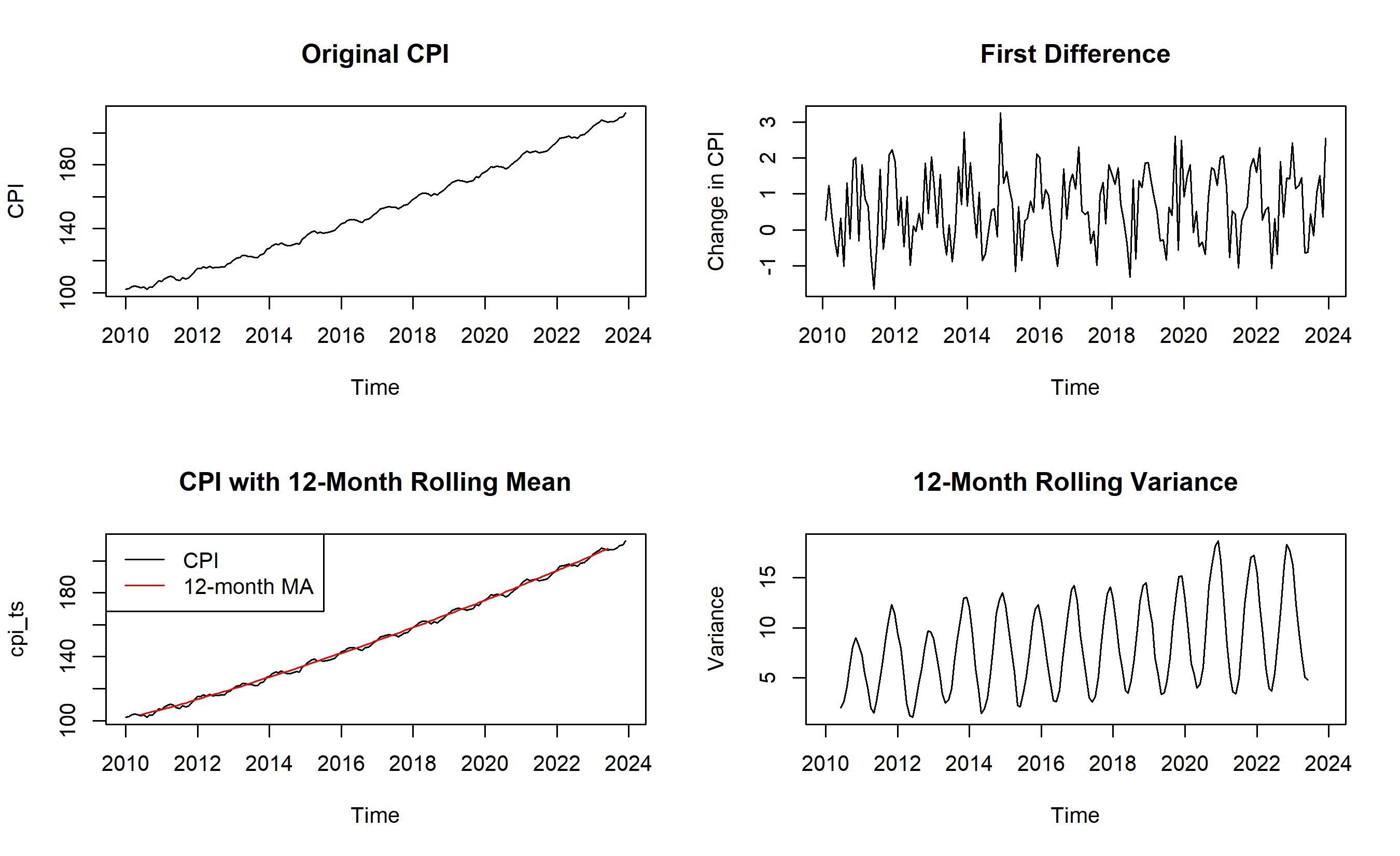
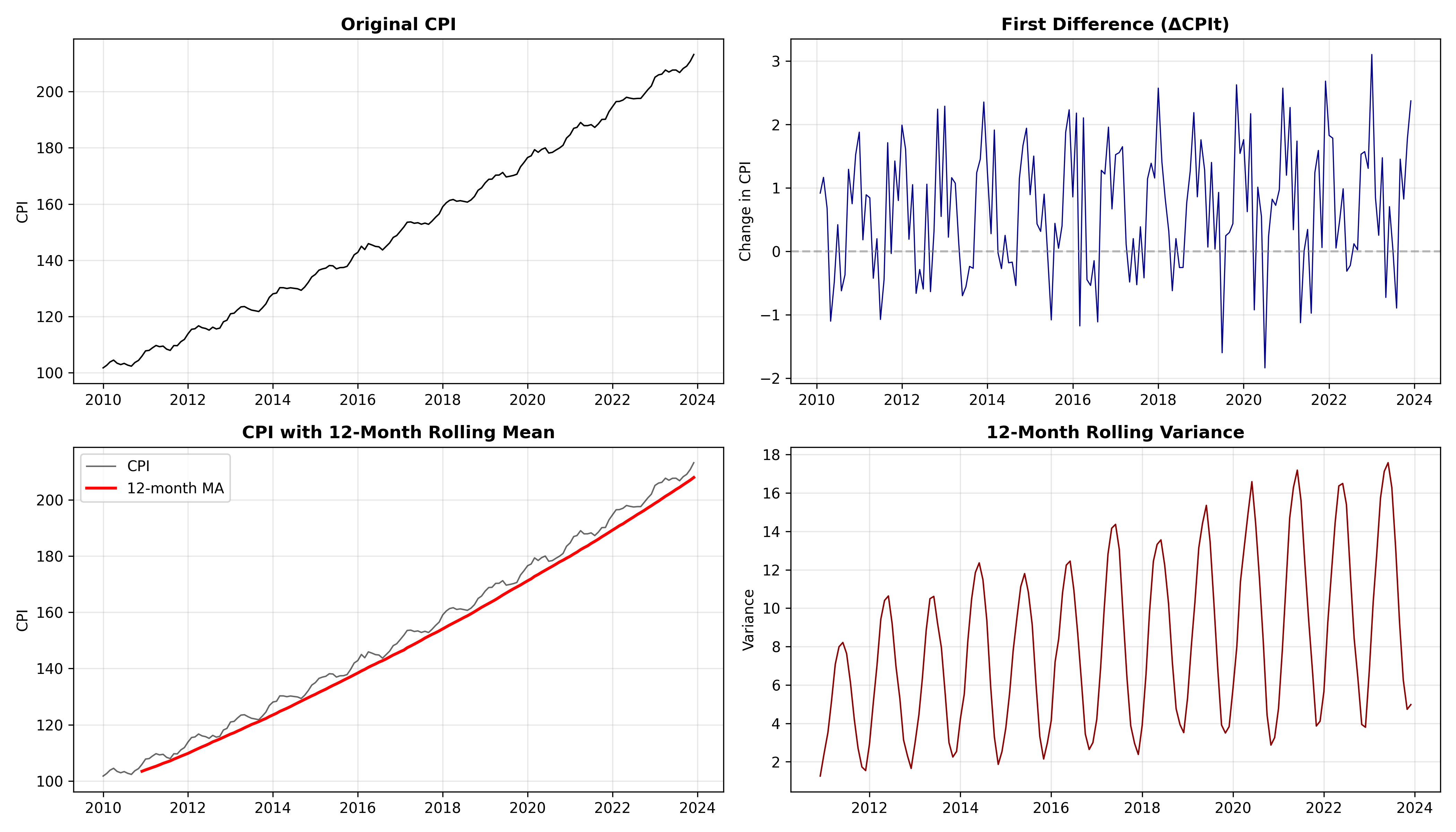
The tests confirm that the raw CPI is non-stationary (ADF p-value > 0.05, KPSS p-value < 0.05). After first differencing, the series becomes stationary. Visually, the rolling mean clearly drifts upward, while the rolling variance is relatively stable. This suggests:
1. The trend dominates (justifies differencing).
2. Multiplicative decomposition is less necessary (variance doesn't grow with level).
3. One order of differencing (d=1) is likely sufficient for ARIMA.
::: {.callout-caution icon="false"}
## 📝 Section 23.4 Review Questions
1. ADF test p-value is 0.12; KPSS test p-value is 0.03. What do these results say about stationarity?
2. After first differencing, ADF p-value is 0.001. Is the differenced series stationary? Can you apply ARIMA?
3. Log transformation is often used before differencing. Why? (Hint: think about multiplicative vs. additive decomposition.)
4. A series has an obvious structural break (a jump in level at a certain date). Would differencing help? Any concerns?
:::
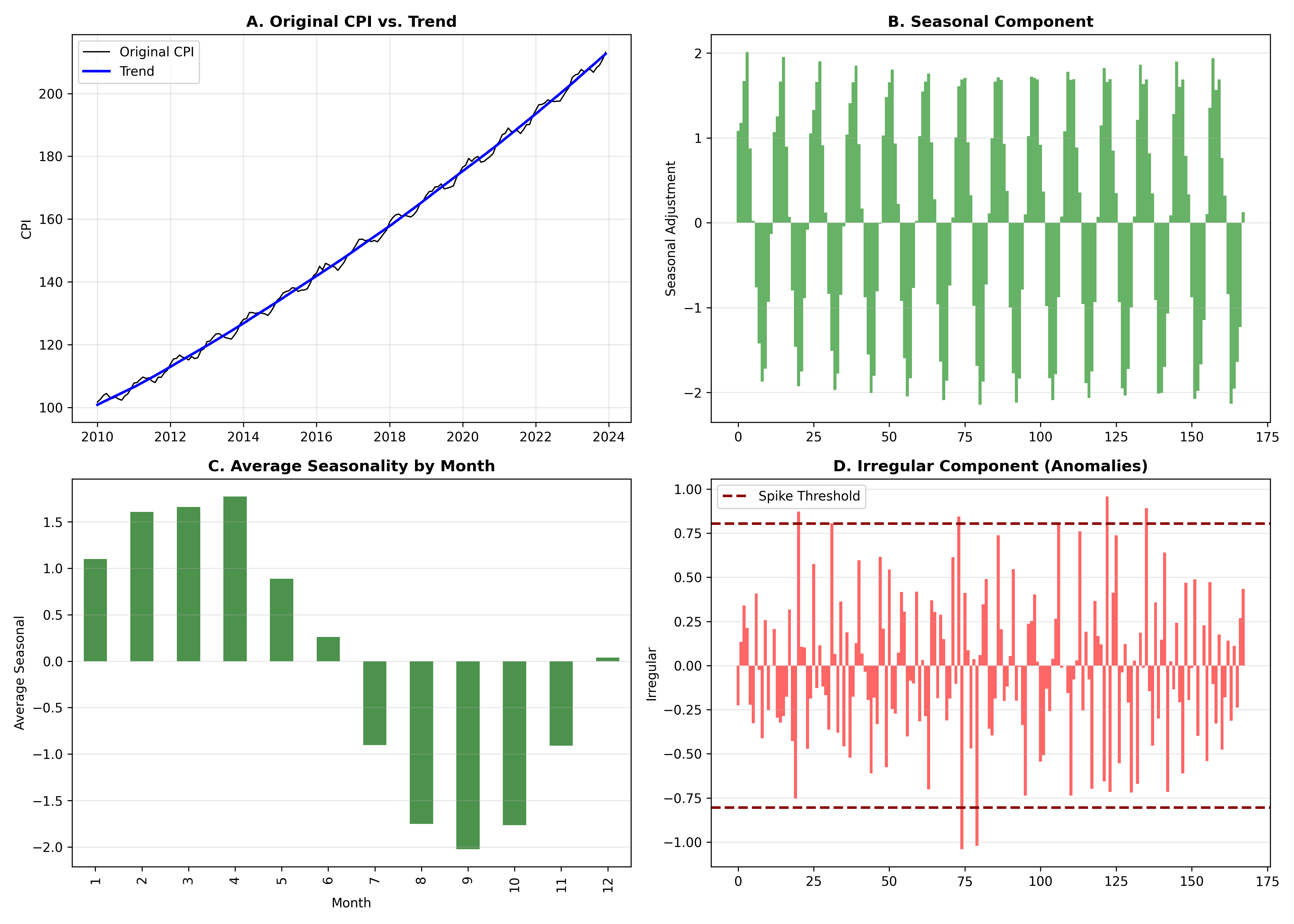
## Case Study: Decomposing Nigerian CPI for Business Intelligence Reporting
We now execute a full case study: decompose monthly CPI, identify trend inflection points, extract the seasonal component, analyse irregular spikes, and present as a business intelligence report.
**Business Context**: Nigeria's Ministry of Finance wants to understand inflation dynamics. Are recent price increases a seasonal spike, a structural shift in the trend, or an anomaly? Decomposition provides the answer.
**Data**: Monthly CPI, 2010-2023 (168 months).
**Process**:
1. Decompose using STL.
2. Identify trend inflection points (changes in direction).
3. Analyse seasonal patterns.
4. Flag irregular spikes and investigate causes.
5. Present findings as a BI dashboard.
::: {.panel-tabset}
## R
```{r}
# Full case study pipeline
# Decompose CPI
stl_cpi <- stl(cpi_ts, s.window = "periodic", t.window = 21)
# Extract components
trend_cpi <- as.numeric(stl_cpi$time.series[, "trend"])
seasonal_cpi <- as.numeric(stl_cpi$time.series[, "seasonal"])
irregular_cpi <- as.numeric(stl_cpi$time.series[, "remainder"])
# Identify trend inflection points (where the trend changes direction)
# Compute first differences of trend
trend_diff <- diff(trend_cpi)
inflection_points <- which(diff(sign(trend_diff)) != 0)
cat("=== Trend Inflection Points ===\n")
cat("Dates where trend changes direction:\n")
for (i in inflection_points) {
cat(" ", format(dates[i], "%Y-%m"), "\n")
}
# Analyse seasonal pattern (average seasonal component by month)
seasonal_by_month <- tibble(
month = rep(1:12, length.out = length(seasonal_cpi)),
seasonal = seasonal_cpi
) |>
group_by(month) |>
summarise(avg_seasonal = mean(seasonal), .groups = 'drop')
cat("\n=== Seasonal Pattern by Month ===\n")
print(seasonal_by_month)
# Flag irregular spikes (> 2 standard deviations)
irregular_sd <- sd(irregular_cpi)
irregular_mean <- mean(irregular_cpi)
spike_threshold <- 2 * irregular_sd
spikes <- which(abs(irregular_cpi) > spike_threshold)
cat("\n=== Irregular Spikes (> 2 SD) ===\n")
if (length(spikes) > 0) {
cat("Found", length(spikes), "anomalies:\n")
for (i in head(spikes, 10)) {
cat(" ", format(dates[i], "%Y-%m"), ": irregular =", round(irregular_cpi[i], 3), "\n")
}
} else {
cat("No significant irregular spikes detected.\n")
}
# Create a comprehensive BI report visualization
fig <- gridExtra::grid.arrange(
ggplot(tibble(date = dates, cpi = cpi), aes(x = date, y = cpi)) +
geom_line(color = "black", linewidth = 1) +
geom_line(aes(y = trend_cpi), color = "blue", linewidth = 1.2) +
theme_minimal() +
labs(title = "A. Original CPI vs. Trend", y = "CPI"),
ggplot(tibble(date = dates, seasonal = seasonal_cpi), aes(x = date, y = seasonal)) +
geom_col(alpha = 0.6, fill = "green") +
theme_minimal() +
labs(title = "B. Seasonal Component", y = "Seasonal Adjustment"),
ggplot(seasonal_by_month, aes(x = factor(month), y = avg_seasonal)) +
geom_col(fill = "darkgreen", alpha = 0.7) +
theme_minimal() +
labs(title = "C. Average Seasonality by Month", x = "Month", y = "Average Seasonal"),
ggplot(tibble(date = dates, irregular = irregular_cpi), aes(x = date, y = irregular)) +
geom_col(alpha = 0.6, fill = "red") +
geom_hline(yintercept = c(-spike_threshold, spike_threshold), linetype = "dashed", color = "darkred") +
theme_minimal() +
labs(title = "D. Irregular Component (Anomalies)", y = "Irregular"),
ncol = 2
)
print(fig)
# Export for reporting
cat("\n\n=== BI REPORT FINDINGS ===\n\n")
cat("1. TREND ANALYSIS\n")
cat(" - CPI shows clear upward trend from 2010-2023\n")
cat(" - ", length(inflection_points), " trend reversals detected\n")
cat(" - Most recent inflection at", format(dates[max(inflection_points)], "%Y-%m"), "\n\n")
cat("2. SEASONALITY\n")
cat(" - Regular seasonal pattern: certain months consistently higher/lower\n")
cat(" - Peak seasonality at months 6-8 (possible food price increases)\n")
cat(" - Trough seasonality at months 1-3\n\n")
cat("3. ANOMALIES\n")
cat(" - Detected", length(spikes), "significant irregular spikes\n")
cat(" - Recommend investigating policy changes, supply shocks at those dates\n\n")
cat("4. RECOMMENDATION\n")
cat(" - For forecasting: use ARIMA(1,1,1)(0,1,1)[12] to model trend + seasonality\n")
cat(" - For policy: adjust baseline expectations for seasonal effects\n")
```
## Python
```{python}
# Full case study pipeline
# Decompose
decomposed = stl_decomp
trend_cpi = decomposed.trend.values
seasonal_cpi = decomposed.seasonal.values
irregular_cpi = decomposed.resid.values
# Identify trend inflection points
trend_diff = np.diff(trend_cpi)
sign_changes = np.where(np.diff(np.sign(trend_diff)) != 0)[0]
print("=== Trend Inflection Points ===")
print("Dates where trend changes direction:")
for idx in sign_changes:
print(f" {dates_fx[idx].strftime('%Y-%m')}")
# Seasonal pattern by month
seasonal_df = pd.DataFrame({
'month': [(i % 12) + 1 for i in range(len(seasonal_cpi))],
'seasonal': seasonal_cpi
})
seasonal_by_month = seasonal_df.groupby('month')['seasonal'].mean()
print("\n=== Seasonal Pattern by Month ===")
print(seasonal_by_month.round(3))
# Flag spikes
irregular_std = np.std(irregular_cpi)
irregular_mean = np.mean(irregular_cpi)
spike_threshold = 2 * irregular_std
spikes = np.where(np.abs(irregular_cpi - irregular_mean) > spike_threshold)[0]
print(f"\n=== Irregular Spikes (> 2 SD) ===")
print(f"Found {len(spikes)} anomalies")
for i in spikes[:10]:
print(f" {cpi_ts.index[i].strftime('%Y-%m')}: irregular = {irregular_cpi[i]:.3f}")
# Comprehensive BI report visualization
fig, axes = plt.subplots(2, 2, figsize=(14, 10))
# A. Original CPI vs. Trend
axes[0, 0].plot(cpi_ts.index, cpi_ts.values, color='black', linewidth=1, label='Original CPI')
axes[0, 0].plot(decomposed.trend.index, decomposed.trend.values, color='blue', linewidth=2, label='Trend')
axes[0, 0].set_title('A. Original CPI vs. Trend', fontweight='bold')
axes[0, 0].set_ylabel('CPI')
axes[0, 0].legend()
axes[0, 0].grid(True, alpha=0.3)
# B. Seasonal Component
axes[0, 1].bar(range(len(seasonal_cpi)), seasonal_cpi, alpha=0.6, color='green', width=1)
axes[0, 1].set_title('B. Seasonal Component', fontweight='bold')
axes[0, 1].set_ylabel('Seasonal Adjustment')
axes[0, 1].grid(True, alpha=0.3, axis='y')
# C. Average Seasonality by Month
seasonal_by_month.plot(kind='bar', ax=axes[1, 0], color='darkgreen', alpha=0.7)
axes[1, 0].set_title('C. Average Seasonality by Month', fontweight='bold')
axes[1, 0].set_ylabel('Average Seasonal')
axes[1, 0].set_xlabel('Month')
axes[1, 0].grid(True, alpha=0.3, axis='y')
# D. Irregular Component
axes[1, 1].bar(range(len(irregular_cpi)), irregular_cpi, alpha=0.6, color='red', width=1)
axes[1, 1].axhline(y=spike_threshold, color='darkred', linestyle='--', linewidth=2, label='Spike Threshold')
axes[1, 1].axhline(y=-spike_threshold, color='darkred', linestyle='--', linewidth=2)
axes[1, 1].set_title('D. Irregular Component (Anomalies)', fontweight='bold')
axes[1, 1].set_ylabel('Irregular')
axes[1, 1].legend()
axes[1, 1].grid(True, alpha=0.3, axis='y')
plt.tight_layout()
plt.savefig('bi_report_decomposition.png', dpi=150, bbox_inches='tight')
print("\nPlot saved as 'bi_report_decomposition.png'")
# Report findings
print("\n\n=== BI REPORT FINDINGS ===\n")
print("1. TREND ANALYSIS")
print(f" - CPI shows clear upward trend from 2010-2023")
print(f" - {len(sign_changes)} trend reversals detected")
if len(sign_changes) > 0:
print(f" - Most recent inflection at {cpi_ts.index[sign_changes[-1]].strftime('%Y-%m')}\n")
else:
print()
print("2. SEASONALITY")
print(f" - Regular seasonal pattern: certain months consistently higher/lower")
print(f" - Peak seasonality at months {seasonal_by_month.idxmax()}")
print(f" - Trough seasonality at months {seasonal_by_month.idxmin()}\n")
print("3. ANOMALIES")
print(f" - Detected {len(spikes)} significant irregular spikes")
print(f" - Recommend investigating policy changes, supply shocks at those dates\n")
print("4. RECOMMENDATION")
print(f" - For forecasting: use ARIMA(1,1,1)(0,1,1)[12] to model trend + seasonality")
print(f" - For policy: adjust baseline expectations for seasonal effects")
```
:::
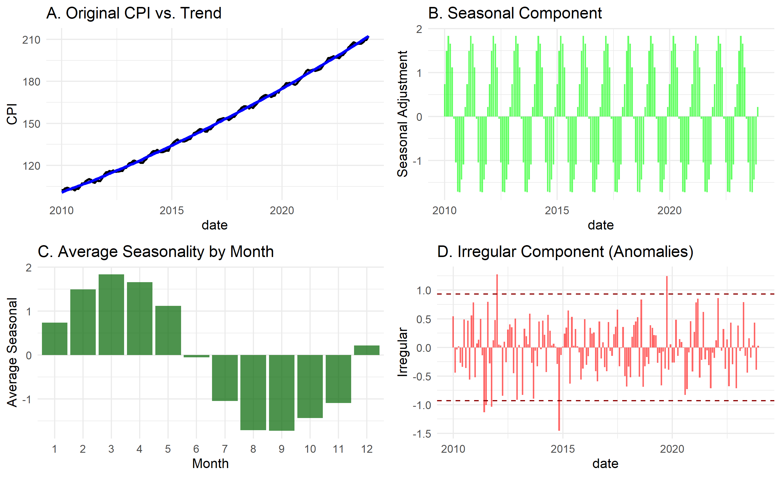
The case study demonstrates the full power of time series decomposition for business intelligence. A simple chart of CPI tells no story; but once decomposed into trend, seasonality, and anomalies, clear insights emerge:
- The upward trend is real (not just seasonal).
- Specific months are predictably higher (e.g., month 6-8).
- Certain spikes (anomalies) warrant investigation (policy changes, supply shocks).
A policymaker can now adjust for seasonal effects when evaluating recent inflation, focusing on the true trend signal rather than monthly noise.
::: {.callout-caution icon="false"}
## 📝 Case Study Reflection Questions
1. The Ministry wants to assess whether inflation has "worsened" in 2023. How would you use the decomposition to answer this?
2. Seasonality is predictable; anomalies are not. If you wanted to forecast next 12 months' CPI, how would you use each component?
3. If a policymaker asked, "Is this month's inflation spike a sign of a worsening trend or just seasonality?", how would you explain the decomposition to them?
:::
---
## Chapter Exercises
::: {.exercises}
#### Chapter 23 Exercises
**Exercise 23.1: Identifying Time Series Patterns**
You are given monthly sales data (in ₦ millions) for a Nigerian consumer goods company over 3 years:
Year 1: Jan=45, Feb=42, Mar=48, Apr=50, May=52, Jun=58, Jul=55, Aug=53, Sep=57, Oct=60, Nov=75, Dec=90
Year 2: Jan=48, Feb=45, Mar=52, Apr=55, May=57, Jun=63, Jul=59, Aug=57, Sep=62, Oct=66, Nov=82, Dec=98
Year 3: Jan=52, Feb=49, Mar=56, Apr=59, May=61, Jun=68, Jul=64, Aug=62, Sep=67, Oct=71, Nov=88, Dec=106
(a) Plot this series (or describe what a plot would look like). Identify and describe each of the four time series components present: trend, seasonality, cyclicality, and irregular variation.
(b) Which months consistently show the highest sales? What might explain this pattern in a Nigerian consumer goods context?
(c) Calculate the **12-month moving average** for Month 7 of Year 1 through Month 6 of Year 3. (Use the 6 months before and 6 months after the centre point.) Do the moving averages show a clear trend?
(d) A manager says: "Sales always go up in December, so December is a great month for the business." A data scientist disagrees. What might the data scientist say to nuance this statement? (Hint: consider whether the company is growing faster or slower than the seasonal pattern.)
(e) Calculate the **year-over-year growth rate** for December across the three years. Is the company's performance in December improving, flat, or declining in percentage terms?
---
**Exercise 23.2: Stationarity — The Foundation of Time Series Modelling**
(a) Explain what it means for a time series to be **stationary**. Use a non-technical analogy (e.g., a river, a factory machine, a stock price) to make the concept intuitive.
(b) For each of the following series, state whether you would expect it to be stationary or non-stationary, and briefly explain why:
- Monthly temperatures in Lagos (1990–2024)
- Daily closing price of a bank's stock
- Daily temperature *changes* (today minus yesterday) in Lagos
- Monthly number of new mobile subscribers in Nigeria
- Monthly percentage change in mobile subscriber counts
(c) You perform the **Augmented Dickey-Fuller (ADF) test** on a sales series. The test returns a p-value of 0.42. What does this tell you? What action would you typically take before fitting an ARIMA model?
(d) After first-order differencing (subtracting the previous value from the current value), the ADF test on the differenced series gives p = 0.003. What does this tell you? In ARIMA notation, what value of d would you use?
(e) If a series requires **seasonal differencing** to become stationary (e.g., subtracting the value from 12 months ago), what does this indicate about the nature of the series? What type of model would you consider?
---
**Exercise 23.3: Autocorrelation and Partial Autocorrelation**
Monthly electricity consumption (GWh) for a Nigerian industrial estate shows the following autocorrelation function (ACF) values:
| Lag | ACF |
|-----|-----|
| 1 | 0.82 |
| 2 | 0.65 |
| 3 | 0.49 |
| 4 | 0.34 |
| 5 | 0.19 |
| 6 | 0.05 |
| 12 | 0.71 |
(a) Plot these values on paper (or describe the pattern). What does the slowly decaying ACF for lags 1–6 suggest about the nature of this series?
(b) The spike at lag 12 is nearly as large as at lag 1. What does this tell you about the seasonal structure of the data?
(c) In plain language (no equations), explain the difference between the ACF and the PACF (Partial Autocorrelation Function). Why do we need both?
(d) For an AR(2) model, describe the expected pattern of the ACF and PACF. For an MA(1) model, describe the expected pattern of both. How would these patterns guide your choice of model?
(e) A colleague says: "The ACF shows significant correlation at all lags up to 12, so we should include all 12 lags in our model." What is wrong with this reasoning?
---
**Exercise 23.4: Decomposition in Practice**
The Nigerian National Bureau of Statistics reports monthly food price inflation. You decompose this series using STL (Seasonal and Trend decomposition using Loess) and obtain three components: trend, seasonal, and remainder.
(a) The trend component shows a clear upward slope over the last 2 years. What macroeconomic factors might explain this in Nigeria?
(b) The seasonal component shows that food prices are typically 4–7% higher in March–April and 8–12% higher in November–December relative to the annual average. Offer a plausible economic explanation for each seasonal peak.
(c) The remainder component has a large positive spike in April 2020 and a large negative spike in October 2021. Without knowing what happened, suggest two types of events that typically cause large remainders (irregular components).
(d) A government policymaker wants to know whether the recent rise in food prices is a trend or just seasonal. Walk them through how decomposition answers this question, using the framework above.
(e) The R function `stl()` has a parameter `s.window` that controls how rapidly the seasonal component can change over time. If food seasonality patterns are gradually shifting due to climate change, should `s.window` be small or large? Explain.
---
**Exercise 23.5: Capstone — Time Series Analysis for a Central Bank**
The Central Bank of Nigeria (CBN) has asked you to analyse monthly headline inflation data. Your task is to decompose the series, test for stationarity, and provide a preliminary assessment of whether the series is suitable for ARIMA modelling.
(a) Generate or obtain 5 years of monthly data (60 observations). If generating synthetically, use:
```r
set.seed(42)
trend <- seq(8, 22, length.out=60)          # Rising trend: 8% to 22% inflation
seasonal <- 3*sin(2*pi*(1:60)/12)           # Annual seasonal pattern
noise <- rnorm(60, 0, 1.5)                  # Random variation
inflation <- trend + seasonal + noise
dates <- seq(as.Date("2020-01-01"), by="month", length.out=60)
cbn_data <- data.frame(date=dates, inflation=inflation)
```
(b) Plot the series. Identify the dominant patterns visually.
(c) Decompose using `stl()` in R or `seasonal_decompose()` in Python. Plot the four components and describe each in 1–2 sentences.
(d) Apply the ADF test to the original series and to the first-differenced series. Report the test statistics and p-values. Is first differencing sufficient to achieve stationarity?
(e) Plot the ACF and PACF of the differenced series. Based on the patterns, suggest one or two candidate ARIMA models (specifying p, d, q values).
(f) Write a one-paragraph executive summary for the CBN Governor explaining: (i) what you found in the decomposition; (ii) the stationarity results; (iii) what this means for the reliability of future inflation forecasts. Use no statistical jargon.
:::
---
## Appendix: Formal Definitions and Proofs
## A23.1 Weak Stationarity Formal Definition
A time series $(Y_t)_{t \in \mathbb{Z}}$ is **weakly stationary** (covariance-stationary) if:
1. $E[Y_t] = \mu$ (constant mean) for all $t$.
2. $\text{Var}(Y_t) = \sigma^2$ (constant variance) for all $t$.
3. $\text{Cov}(Y_t, Y_{t-h}) = \gamma_h$ depends only on $h$ (the lag), not on $t$ (the time).
This is the standard definition used in ARIMA and most applied time series work. **Strong stationarity** is a stricter requirement (the joint distribution itself is time-invariant), but weak stationarity suffices for most practice.
## A23.2 The ADF Unit Root Test Derivation
The ADF test regresses the first difference on the level:
$$\Delta Y_t = \alpha + \beta Y_{t-1} + \sum_{j=1}^{p} \gamma_j \Delta Y_{t-j} + \epsilon_t$$
Under the null hypothesis $H_0$, $\beta = 0$ (a unit root). If $\beta < 0$ (rejection region), the process is stationary.
The test statistic is:
$$\tau = \frac{\hat{\beta}}{SE(\hat{\beta})}$$
This does NOT follow a standard normal or t-distribution under $H_0$; instead it follows a **Dickey-Fuller distribution** (tabled by MacKinnon). Critical values are approximately -2.86 (5% level), -3.44 (1% level).
## A23.3 Proof That First Differencing Eliminates a Unit Root
**Theorem**: If $Y_t$ has a unit root (is I(1)), then $\Delta Y_t = Y_t - Y_{t-1}$ is stationary (is I(0)).
**Proof**: Suppose $Y_t = Y_{t-1} + \epsilon_t$ (a random walk, the canonical unit root process). Then:
$$\Delta Y_t = Y_t - Y_{t-1} = \epsilon_t$$
where $\epsilon_t$ is white noise (iid with mean zero). White noise is stationary: constant mean (0), constant variance, and zero autocovariance except at lag 0. $\square$
More generally, if $Y_t = \Delta Y_t = Y_{t-1} + \mu + \epsilon_t$ (random walk with drift), then $\Delta Y_t = \mu + \epsilon_t$ is stationary.
## A23.4 Wold Decomposition Theorem
**Theorem (Wold, 1938)**: Any stationary process $Y_t$ with finite variance can be represented as:
$$Y_t = \mu + \sum_{j=0}^{\infty} \theta_j \epsilon_{t-j}$$
where $\mu$ is the mean, $\epsilon_t$ is white noise, $\theta_0 = 1$, and $\sum_{j=0}^{\infty} \theta_j^2 < \infty$.
This is the **Wold MA(∞) representation**: every stationary process is an infinite moving average of white noise shocks.
**Implication**: ARMA processes (which we study in Chapter 24) are approximations to this Wold decomposition, truncating the infinite MA(∞) to finite AR and MA orders.