---
title: "Customer Segmentation in Depth"
---
```{python}
#| label: python-setup-40-customer-segmentation
#| include: false
import numpy as np
import pandas as pd
import matplotlib.pyplot as plt
import seaborn as sns
from datetime import datetime, timedelta
from sklearn.cluster import KMeans
from sklearn.preprocessing import StandardScaler
from math import pi
```
::: {.callout-note icon="false"}
## 📋 Learning Objectives
- Understand why one-size-fits-all customer strategies fail and how segmentation improves ROI
- Master RFM (Recency, Frequency, Monetary) analysis as a foundation for actionable segmentation
- Apply K-Means clustering to RFM scores and interpret the resulting customer segments
- Extend RFM with behavioural signals (product usage, channel preference, engagement decay)
- Profile, visualise, and monitor segment drift using Population Stability Index
- Translate customer segments into concrete marketing strategies and budget allocation
:::
## Why Segmentation Is the Foundation of Customer Strategy
Customer segmentation is not a new idea. Managers have long understood that not all customers are the same. Yet in practice, many organisations still operate with one marketing message, one pricing strategy, one product roadmap for their entire customer base. This one-size-fits-all approach is expensive and ineffective. It wastes marketing budget on customers who will never respond, it misallocates product development resources, and it leaves money on the table because high-value customers receive the same generic service as low-value ones.
The core insight of customer segmentation is simple: divide your customer base into groups that are internally homogeneous (similar within a group) but externally heterogeneous (different across groups). Once you have meaningful segments, you can tailor your tactics. Marketing spend goes to channels that work for each segment. Products are designed for their primary segments. Sales processes adapt. Customer service investment is allocated according to customer value. Retention campaigns target the customers most likely to churn and most valuable if retained. This targeted approach multiplies the return on every pound, peso, naira, or rand you spend on customers.
The types of segmentation are many. Demographic segmentation divides customers by age, gender, income, or education. Geographic segmentation separates by region, city, or neighbourhood. Psychographic segmentation looks at lifestyle, values, and attitudes. Behavioural segmentation examines what customers actually do: what they buy, how often, which channels they use. Value-based segmentation ranks customers by their economic importance to the business. Each has value. But value-based segmentation, particularly when implemented through RFM (Recency, Frequency, Monetary) analysis, is the most actionable for immediate business decisions because it starts from the simplest, most objective data: transaction history.
Consider a large Nigerian retail bank. A demographic segmentation might divide customers into age groups (18–25, 26–40, 41–60, 60+), which could inform product marketing. A geographic segmentation might separate Lagos Island from Lagos Mainland, which do show real differences in income and behaviours. But an RFM segmentation asks a different question: Who did we hear from recently? Who comes back? Who spends the most? A customer in the "recent, frequent, high-value" cell of the RFM matrix is your champion. You know very little else about them, but you know they matter. That customer might be a 35-year-old trader on the Mainland or a 52-year-old businessman on the Island. The RFM label tells you how to treat them; demographics do not.
## RFM Analysis: The Three Dimensions of Customer Value
RFM is the workhorse of customer segmentation. It distils three questions about each customer into a simple framework:
**Recency (R)**: How many days have passed since the customer's most recent transaction? A customer who made a purchase last week is more engaged, more likely to respond to marketing, and more likely to purchase again soon than one who last bought six months ago. Recency decays: it matters less that a customer bought two years ago than one who bought two weeks ago. For a subscription business, recency might be measured as days since last payment or last active use. For a retail bank, it is days since last deposit, withdrawal, or transfer.
**Frequency (F)**: How many transactions has the customer made in the analysis period (e.g., the last 18 months)? A customer who visits your branch or uses your app 20 times a month is more embedded in your ecosystem than one who visits twice. Frequency is a proxy for engagement and habit. High-frequency customers are harder to lose because switching costs (learning a new system, breaking routine) are higher. Frequency also suggests that the product is meeting their needs repeatedly.
**Monetary (M)**: How much total value has the customer generated? In a bank, this might be total deposits plus total fees paid. In retail, it is total spend. In a subscription business, it is cumulative revenue. Monetary value is the bottom-line measure: this is the customer's actual economic contribution. A customer who buys one expensive item per year might be more valuable than one who buys ten cheap items.
Each dimension is scored independently, usually on a scale of 1 to 5 (1 = worst, 5 = best). The scoring can be done via percentiles (e.g., top 20% of customers by recency get R=5, next 20% get R=4, etc.) or via quintiles of the actual values. An RFM score is then formed by concatenating the three digits: a customer who is a 5 on Recency, 4 on Frequency, and 5 on Monetary has an RFM score of 545. This creates a 5 × 5 × 5 = 125-cell cube of possible RFM profiles. Each cell represents a homogeneous customer segment with a clear business meaning.
The 545 segment (highest recency, high frequency, highest monetary) contains your champions: customers you interact with regularly and who spend significantly. The 111 segment (lowest recency, lowest frequency, lowest monetary) contains your lost customers: ones you haven't heard from in ages and never spent much anyway. Between these extremes lie nuanced segments like 321 (old customer, moderate frequency, low spend—perhaps dormant), 553 (very recent, frequent, high spend—new champion), and 152 (old customer, low frequency, high spend—big account at risk of churn).
## From RFM Scores to K-Means Clustering
While the RFM cube is intuitive, it produces 125 segments, many of which contain very few customers and have overlapping business meanings. A cleaner approach is to treat the R, F, and M scores as three features and use K-Means clustering to group customers into 4–6 interpretable business segments. This is where the methodology of Chapter 20 (clustering) meets the business problem of customer strategy.
The clustering pipeline is straightforward. First, normalize the R, F, and M scores to the same scale (e.g., 0–1 or standardized mean-zero unit variance). This ensures that a difference of one unit in Monetary (which might range 0–1,000,000 naira) doesn't overwhelm a difference in Frequency (which ranges 0–365). Second, apply K-Means with K = 4, 5, or 6. Run the algorithm multiple times with different random seeds and choose the solution with the lowest within-cluster sum of squares (WCSS). Third, label each cluster with a business-meaningful name based on its RFM profile: Champions (high R, high F, high M), Loyal Customers (high F, high M but older recency), At-Risk (used to be frequent/valuable but recency has dropped), Lost (low on all three).
The resulting segments are actionable. You can compute the revenue contribution, churn rate, average customer lifetime value, and product holdings of each segment. You can design a go-to-market strategy per segment. You can predict which segment a new customer is likely to enter. You can track how customers move between segments over time (do At-Risk customers stabilise or churn?).
## Beyond RFM: Behavioural Segmentation
RFM is powerful, but it is incomplete. It tells you transaction frequency and recency, but not what the customer is transacting in. A bank customer who makes 30 transfers per month might be a busy trader running a small business (high-value, low-friction user) or a customer moving money frantically between accounts to manage cashflow (high-friction, lower-value user who might soon churn). An e-commerce customer who visits 50 times per month might be window shopping (low monetary value despite high frequency) or filling their cart with high-value items (genuine engagement).
Behavioural segmentation enriches RFM by adding product-usage signals. For a bank, this means: How many product types does the customer use (current account, savings, investment, insurance, loan)? What fraction of their activity is digital (mobile app, online, USSD) versus in-branch? Are they active in all product types or dormant in most? For a telecom operator, this means: What fraction of their spending is voice versus data? Are they heavy data users (high-value data segment) or minimal users? For an e-commerce platform, it means: What product categories do they buy from? What is the average value per transaction?
These signals can be added directly to the clustering feature set alongside RFM. So instead of a 3-dimensional problem (R, F, M), you might have a 7-dimensional one (R, F, M, product_count, digital_ratio, days_inactive, tenure). The clustering algorithm will find customer groups that are homogeneous not just in transaction behavior but also in product and channel preferences. The resulting segments are richer and more actionable: "Champions—recent, frequent, high spend, heavy digital users, holding 4+ products" is more useful for strategy than just "Champions" alone.
## Segment Profiling and Visualization
Once segments are defined, the next step is to profile them: understand what each segment looks like and how they differ. A segment profile typically includes the mean and median of key metrics per segment: average days since last transaction, average number of transactions per period, average spend, churn rate, product holdings, digital penetration, and any other KPI relevant to your business.
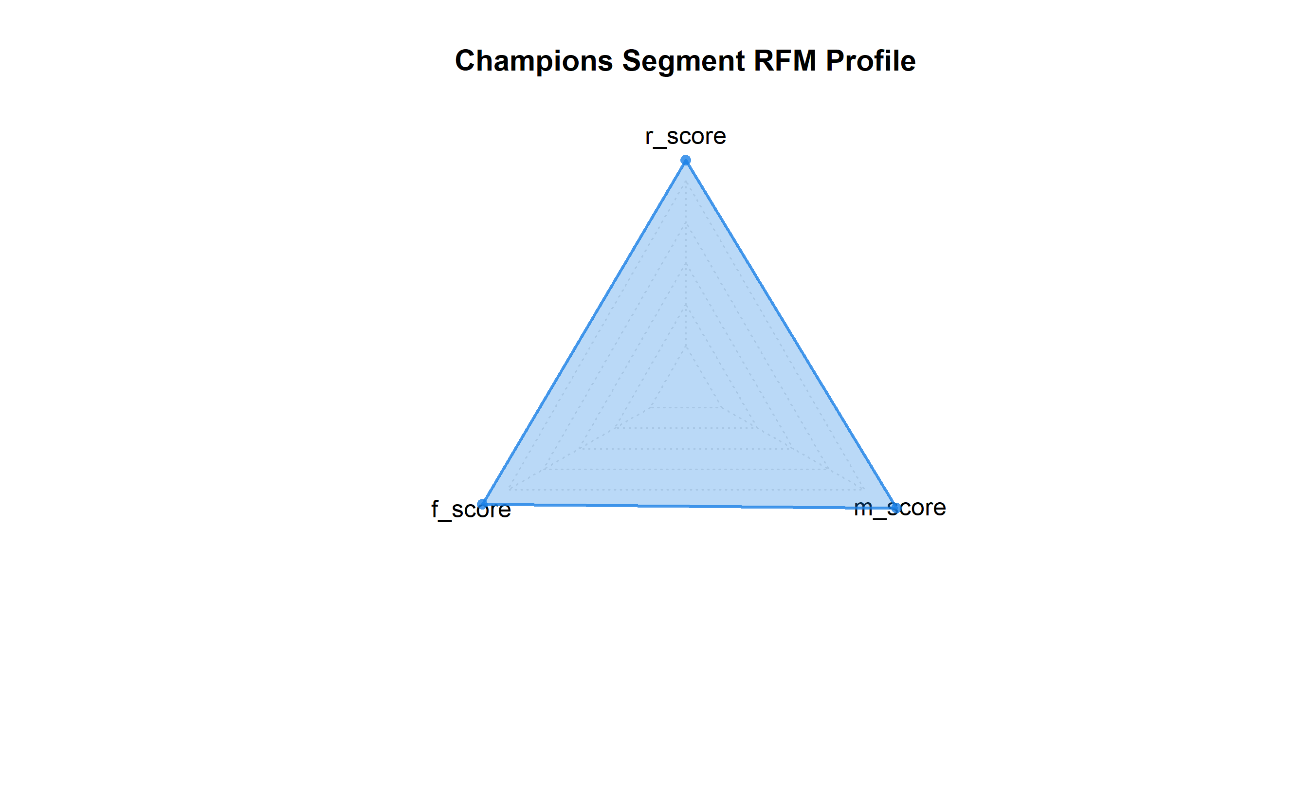
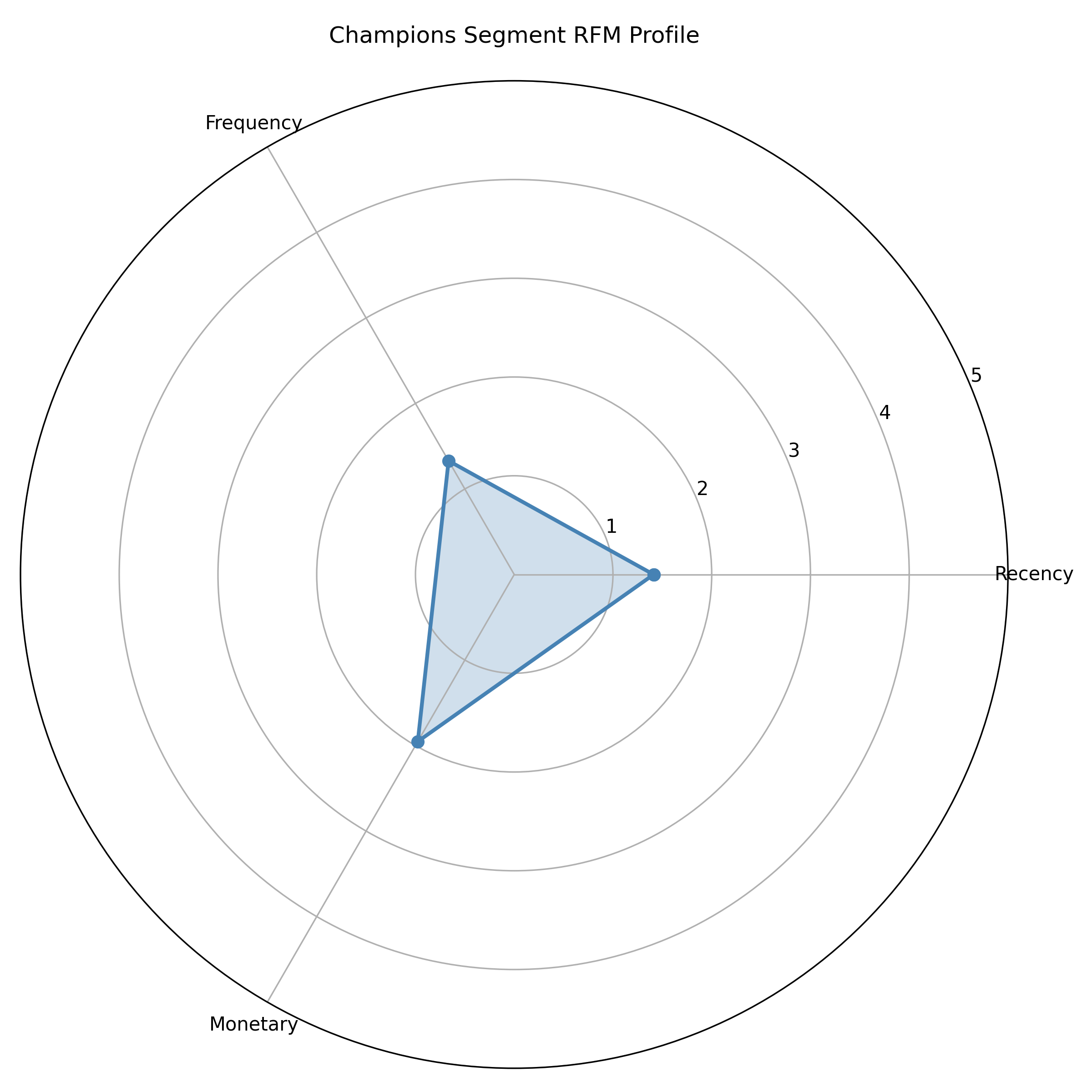
Visualization is crucial for communicating segments to non-technical stakeholders. Radar charts (also called spider charts) are excellent for RFM-based segmentation: each axis represents R, F, or M on a 0–5 scale, and each segment is a polygon. Champions will have a large, symmetrical polygon near the outer edge; Lost customers will have a small polygon near the centre. Parallel coordinates plots can show how many behavioural features differ across segments. Segment comparison tables show exact numbers. A carefully chosen set of visualizations—perhaps a radar for executive summary, a detailed table for strategy teams, and a heatmap of segment characteristics—ensures that the segmentation is understood and acted upon.
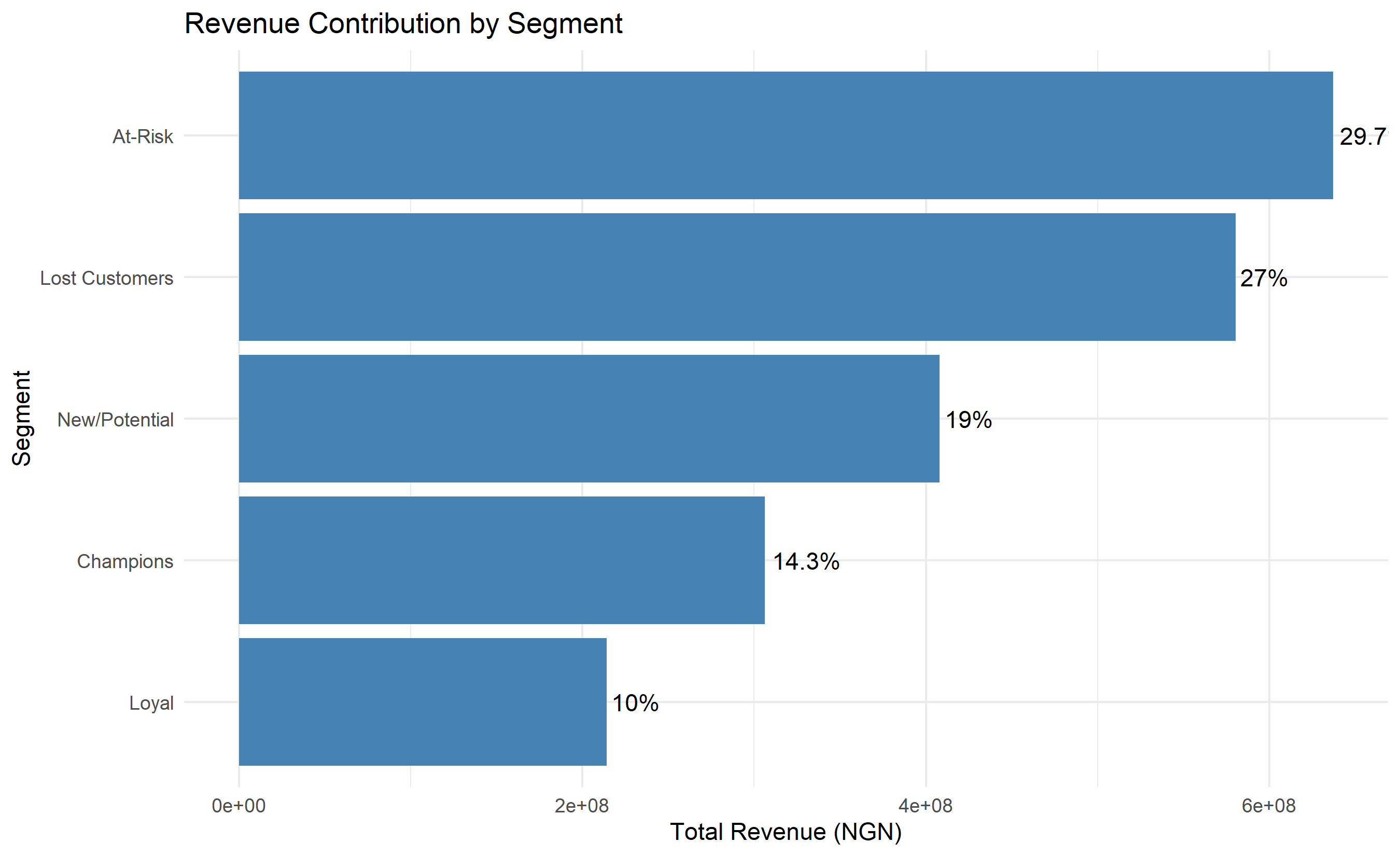
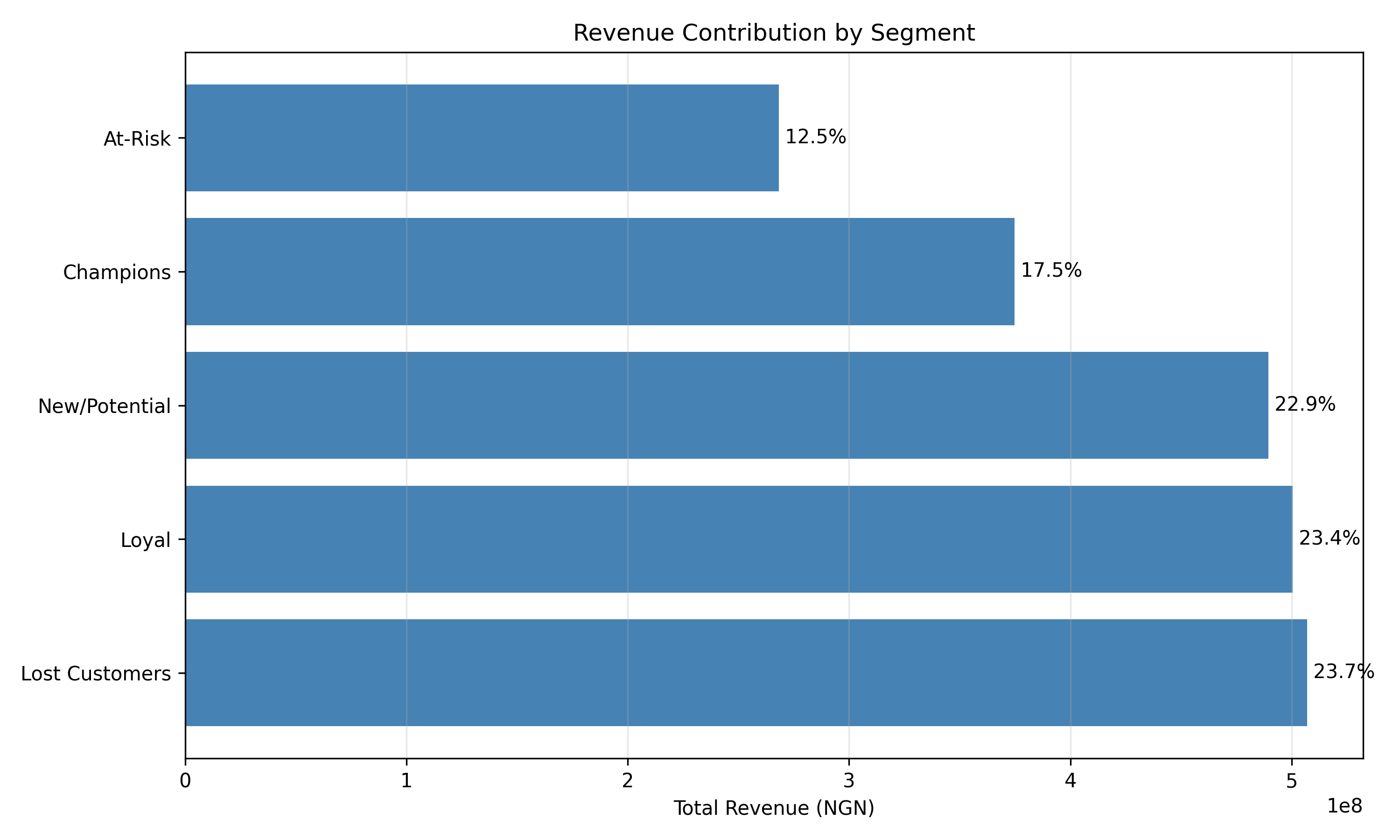
Revenue waterfalls are particularly powerful: they show that segment A contributes 40% of revenue despite being only 10% of customers (Champions), while segment B is 30% of customers but only 5% of revenue (Lost). This visceral comparison makes the business case for differential treatment crystal clear.
## Segment Stability and Drift Monitoring
Segments are not static. Over time, customers move between segments. A Champion might downshift to Loyal if they reduce their spending. An At-Risk customer might stabilise and return to Loyal. Lost customers might be re-engaged through a campaign and move back to Active segments. This natural drift is expected. But if segment populations shift dramatically—e.g., if Champions shrink from 15% of the customer base to 5%—it signals a problem: perhaps the market has changed, product quality has degraded, or competitors are winning share.
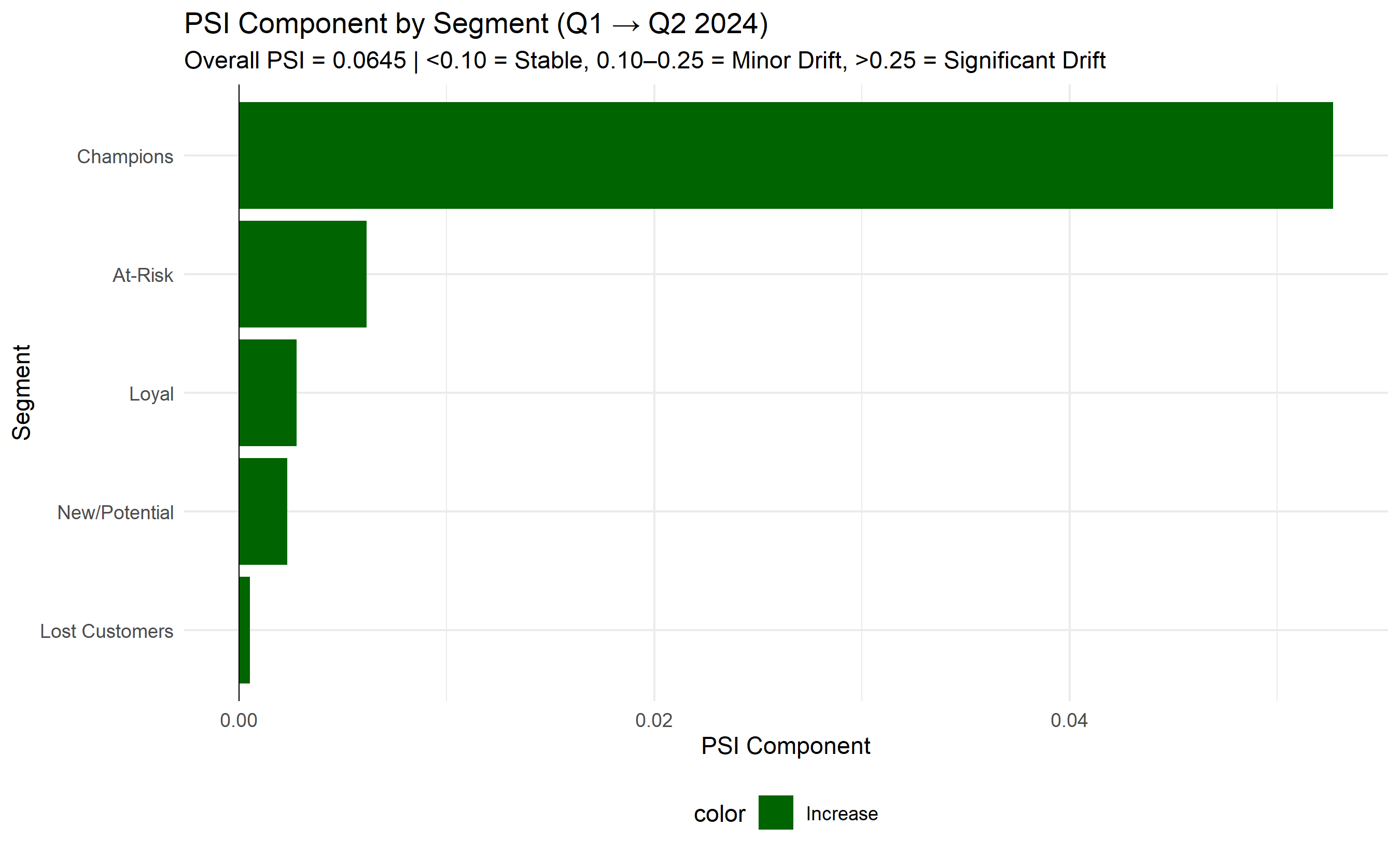
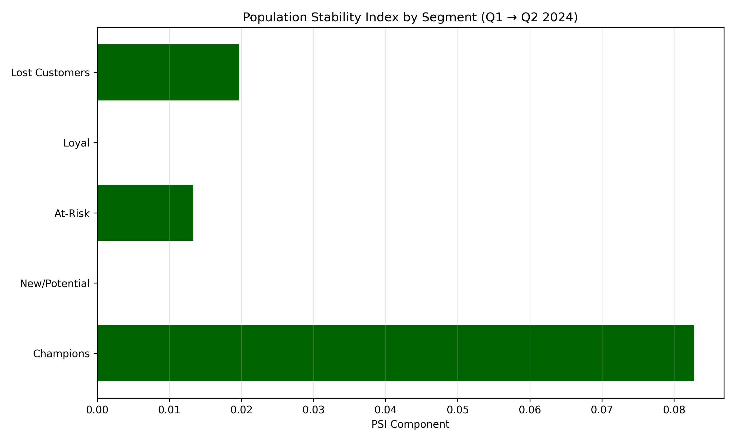
To monitor segment drift, compute the Population Stability Index (PSI) between two periods (e.g., January 2025 vs April 2025). PSI is a statistical measure of how much a distribution has shifted. For customer segments, you compute the percentage of customers in each segment in period A and period B, then apply the PSI formula (see Appendix). A PSI below 0.10 suggests stability; 0.10–0.25 suggests minor drift worth investigating; above 0.25 suggests significant drift requiring immediate attention. If PSI flags drift, re-run the K-Means clustering to see if the optimal segment structure has changed.
## From Segments to Strategy: Actionable Customer Management
Segmentation is valuable only if it leads to action. The final step in the customer segmentation process is translating segment profiles into concrete business strategies and budget allocations.
**Champions** (high R, F, M): These are your most valuable customers. Strategy focus is retention and expansion. Offer them premium customer service, exclusive deals, early access to new products, and referral incentives. These customers are the most likely to influence others and least likely to have a good reason to churn. Invest in deepening their engagement: cross-sell complementary products, offer higher credit limits or investment advice, create VIP programs. If even 10% of Champions churn, you lose a disproportionate amount of revenue.
**Loyal Customers** (high F, M, but lower R): These customers used to be very engaged but have gone quiet recently. Strategy focus is re-engagement. Have they shifted to a competitor? Are they satisfied but just buying less? Is life circumstance making them less active (changed jobs, moved, life stage shift)? Run a targeted re-engagement campaign: a special offer, a personalized outreach from a relationship manager, a survey asking what they need. Some will quickly return to Champion status. Others might churn, in which case you want to know why.
**At-Risk Customers** (declining recency and frequency, but still meaningful spend): These customers are showing warning signs. Their previous transaction frequency or spending is dropping. Strategy focus is retention through intervention. Rank at-risk customers by expected value of retention (which segments are most valuable if saved?), and focus high-touch interventions on the top tier. A service recovery campaign, a special offer, or simply asking "are we meeting your needs?" might stop the churn.
**Lost Customers** (low R, F, M): These customers are gone or going. Investing in retention is usually uneconomical because their potential value is low. Strategy focus is learning and selective win-back. Survey a sample to learn why they left. Run very low-cost win-back campaigns (e.g., a single email with a significant discount code) to test if they can be brought back. But don't allocate significant budget to this segment.
**New/Potential Customers**: If you have prospect data, segment them similarly. Score high-potential prospects and focus sales effort accordingly. This is the lead-scoring framework of Chapter 44.
Budget allocation should be proportional to segment value and strategic importance. Champions might get 40% of marketing budget despite being 10% of customers (because they are high-value and already loyal). Loyal customers might get 30%, At-Risk 20%, and Lost 10%. These proportions are not fixed; they depend on your market context and margins. A SaaS company with high customer acquisition costs might invest more in retention (protecting Loyal and At-Risk), while a high-margin FMCG brand might invest heavily in bringing new customers in.
::: {.callout-caution icon="false"}
## 📝 Section 40.7 Review Questions
1. Explain why demographic segmentation alone is less actionable than RFM segmentation for immediate marketing decisions.
2. What does a PSI value of 0.18 between two consecutive quarters suggest, and what should you do about it?
3. A Champions segment contributes 60% of revenue but is only 8% of customer base. Should you allocate 60% of marketing budget to them? Why or why not?
:::
## Case Study: Behavioural Segmentation for a Nigerian Commercial Bank {#sec-ch40-case}
**Background**: Zenith Bank Nigeria (fictional name for this case) operates a retail and SME banking business with 3,000 customers tracked over 18 months. Customer data includes monthly transaction volumes, average transaction value, product holdings, digital engagement, and churn status. The bank wants to move from a geography-based marketing strategy (treating all Lagos Mainland customers the same, all Lagos Island the same) to a value-based strategy that recognises customer diversity within geography.
**Data**: The dataset contains 3,000 customers with the following fields:
- `customer_id`: Unique identifier
- `transaction_date`: Date of each transaction (18-month history)
- `amount_ngn`: Transaction amount in naira
- `product_type`: Current account, Savings, Investment, Loan
- `channel`: Branch, Mobile App, USSD, Online
- Additional: `branch_location`, `customer_tenure_months`, `churned_in_last_90_days`
### Data Preparation and RFM Computation
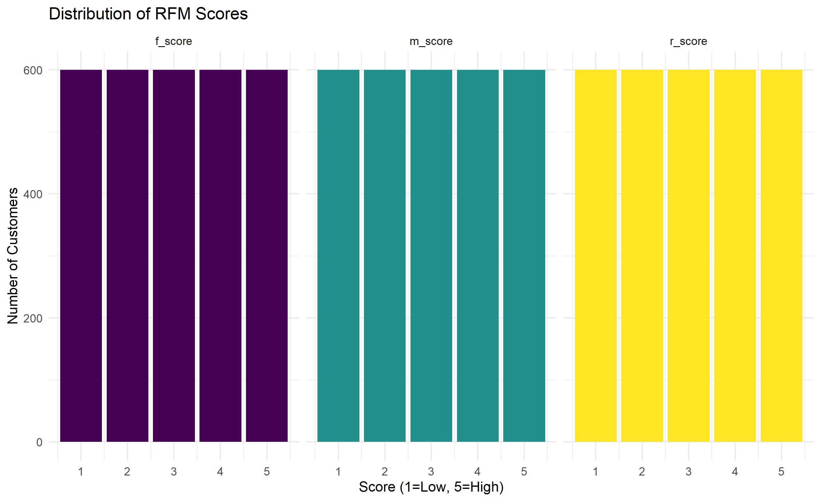
```{r}
#| label: ch40-case-rfm
#| fig-cap: "RFM Score Distribution Across Customer Base"
library(tidyverse)
library(lubridate)
library(ggplot2)
# Synthetic Nigerian bank customer data
set.seed(7384)
n_customers <- 3000
customer_base <- tibble(
customer_id = 1:n_customers,
branch_location = sample(c("Lagos Island", "Lagos Mainland", "Abuja", "Port Harcourt"),
n_customers, replace = TRUE, prob = c(0.35, 0.30, 0.20, 0.15)),
tenure_months = sample(6:120, n_customers, replace = TRUE),
churned_in_last_90_days = sample(c(0, 1), n_customers, replace = TRUE, prob = c(0.90, 0.10))
)
# Generate synthetic transaction history
transactions <- expand_grid(
customer_id = 1:n_customers,
month = 0:17
) |>
mutate(
# Recency modifier: customers with high tenure and recent activity are real
activity_prob = ifelse(month >= 15, 0.7, ifelse(month >= 12, 0.5, 0.3)),
has_transaction = runif(n()) < activity_prob
) |>
filter(has_transaction) |>
mutate(
transaction_date = today() - days(17 * 30 - month * 30 + sample(-5:5, n(), replace = TRUE)),
amount_ngn = rgamma(n(), shape = 2, scale = 50000) # Range 0 to 500k+ naira
) |>
select(customer_id, transaction_date, amount_ngn)
# Compute RFM metrics
analysis_date <- max(transactions$transaction_date) + days(1)
rfm_base <- transactions |>
group_by(customer_id) |>
summarise(
recency_days = as.numeric(analysis_date - max(transaction_date)),
frequency = n(),
monetary_total_ngn = sum(amount_ngn),
.groups = "drop"
) |>
left_join(customer_base, by = "customer_id")
# Score R, F, M on 1-5 scale using quintiles
rfm_scored <- rfm_base |>
mutate(
r_score = ntile(desc(recency_days), 5), # Descending: lower recency (more recent) = higher score
f_score = ntile(frequency, 5),
m_score = ntile(monetary_total_ngn, 5),
rfm_code = paste0(r_score, f_score, m_score)
)
# Summary of RFM distribution
rfm_summary <- rfm_scored |>
summarise(
mean_recency = mean(recency_days),
median_recency = median(recency_days),
mean_frequency = mean(frequency),
median_frequency = median(frequency),
mean_monetary = mean(monetary_total_ngn),
median_monetary = median(monetary_total_ngn)
)
print(rfm_summary)
# Plot distribution
rfm_scored |>
pivot_longer(c(r_score, f_score, m_score), names_to = "dimension", values_to = "score") |>
ggplot(aes(x = score, fill = dimension)) +
geom_bar(position = "dodge") +
facet_wrap(~dimension) +
scale_fill_viridis_d() +
labs(title = "Distribution of RFM Scores",
x = "Score (1=Low, 5=High)", y = "Number of Customers") +
theme_minimal() +
theme(legend.position = "none")
```
```{python}
#| label: py-ch40-case-rfm
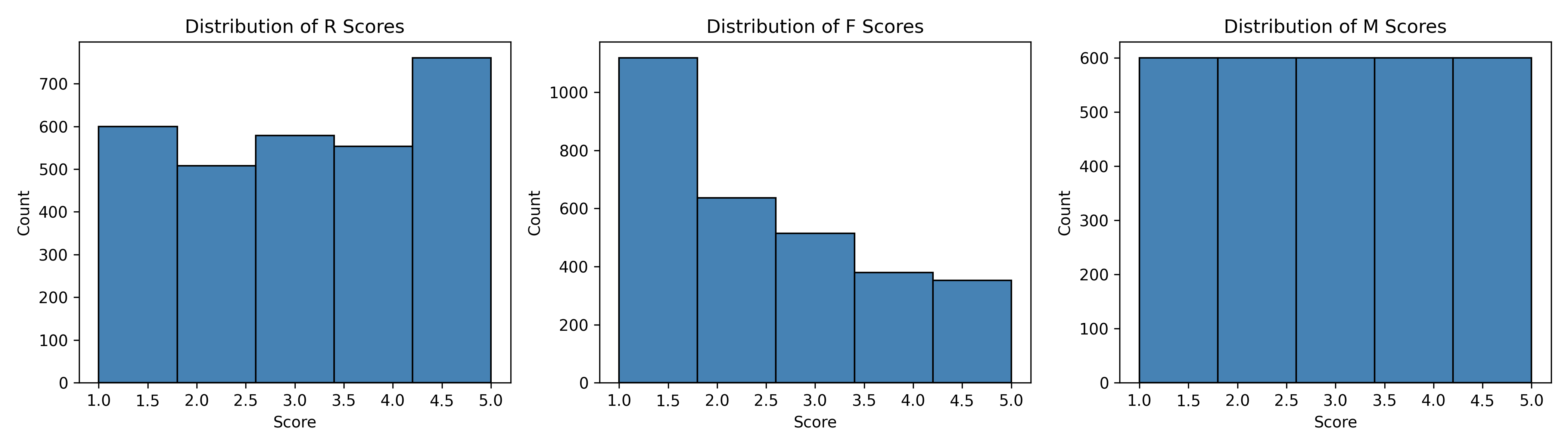
#| fig-cap: "RFM Score Distribution—Python Implementation"
import pandas as pd
import numpy as np
from datetime import datetime, timedelta
import matplotlib.pyplot as plt
np.random.seed(7384)
# Synthetic customer and transaction data
n_customers = 3000
customer_ids = np.arange(1, n_customers + 1)
branch_locations = np.random.choice(
["Lagos Island", "Lagos Mainland", "Abuja", "Port Harcourt"],
n_customers, p=[0.35, 0.30, 0.20, 0.15]
)
customer_base = pd.DataFrame({
"customer_id": customer_ids,
"branch_location": branch_locations,
"tenure_months": np.random.randint(6, 121, n_customers)
})
# Generate transactions
transactions_list = []
for cid in customer_ids:
for month in range(18):
activity_prob = 0.7 if month >= 15 else (0.5 if month >= 12 else 0.3)
if np.random.random() < activity_prob:
transaction_date = datetime.now() - timedelta(days=17*30 - month*30 + np.random.randint(-5, 6))
amount = np.random.gamma(2, 50000)
transactions_list.append({
"customer_id": cid,
"transaction_date": transaction_date,
"amount_ngn": amount
})
transactions = pd.DataFrame(transactions_list)
# Compute RFM
analysis_date = transactions["transaction_date"].max() + timedelta(days=1)
rfm = transactions.groupby("customer_id").agg(
recency_days=("transaction_date", lambda x: (analysis_date - x.max()).days),
frequency=("transaction_date", "count"),
monetary_total_ngn=("amount_ngn", "sum")
).reset_index()
rfm = rfm.merge(customer_base, on="customer_id")
# Score on 1-5 scale
rfm["r_score"] = pd.qcut(rfm["recency_days"], q=5, labels=[5, 4, 3, 2, 1])
rfm["f_score"] = pd.qcut(rfm["frequency"], q=5, labels=[1, 2, 3, 4, 5], duplicates="drop")
rfm["m_score"] = pd.qcut(rfm["monetary_total_ngn"], q=5, labels=[1, 2, 3, 4, 5], duplicates="drop")
rfm["r_score"] = rfm["r_score"].astype(int)
rfm["f_score"] = rfm["f_score"].astype(int)
rfm["m_score"] = rfm["m_score"].astype(int)
rfm["rfm_code"] = rfm["r_score"].astype(str) + rfm["f_score"].astype(str) + rfm["m_score"].astype(str)
print("RFM Summary Statistics:")
print(rfm[["recency_days", "frequency", "monetary_total_ngn"]].describe())
# Plot
fig, axes = plt.subplots(1, 3, figsize=(14, 4))
for i, col in enumerate(["r_score", "f_score", "m_score"]):
axes[i].hist(rfm[col], bins=5, edgecolor="black", color="steelblue")
axes[i].set_xlabel("Score")
axes[i].set_ylabel("Count")
axes[i].set_title(f"Distribution of {col.split('_')[0].upper()} Scores")
plt.tight_layout()
plt.savefig("ch40_rfm_distribution.png", dpi=150, bbox_inches="tight")
plt.show()
```
### K-Means Clustering on RFM
```{r}
#| label: ch40-case-kmeans
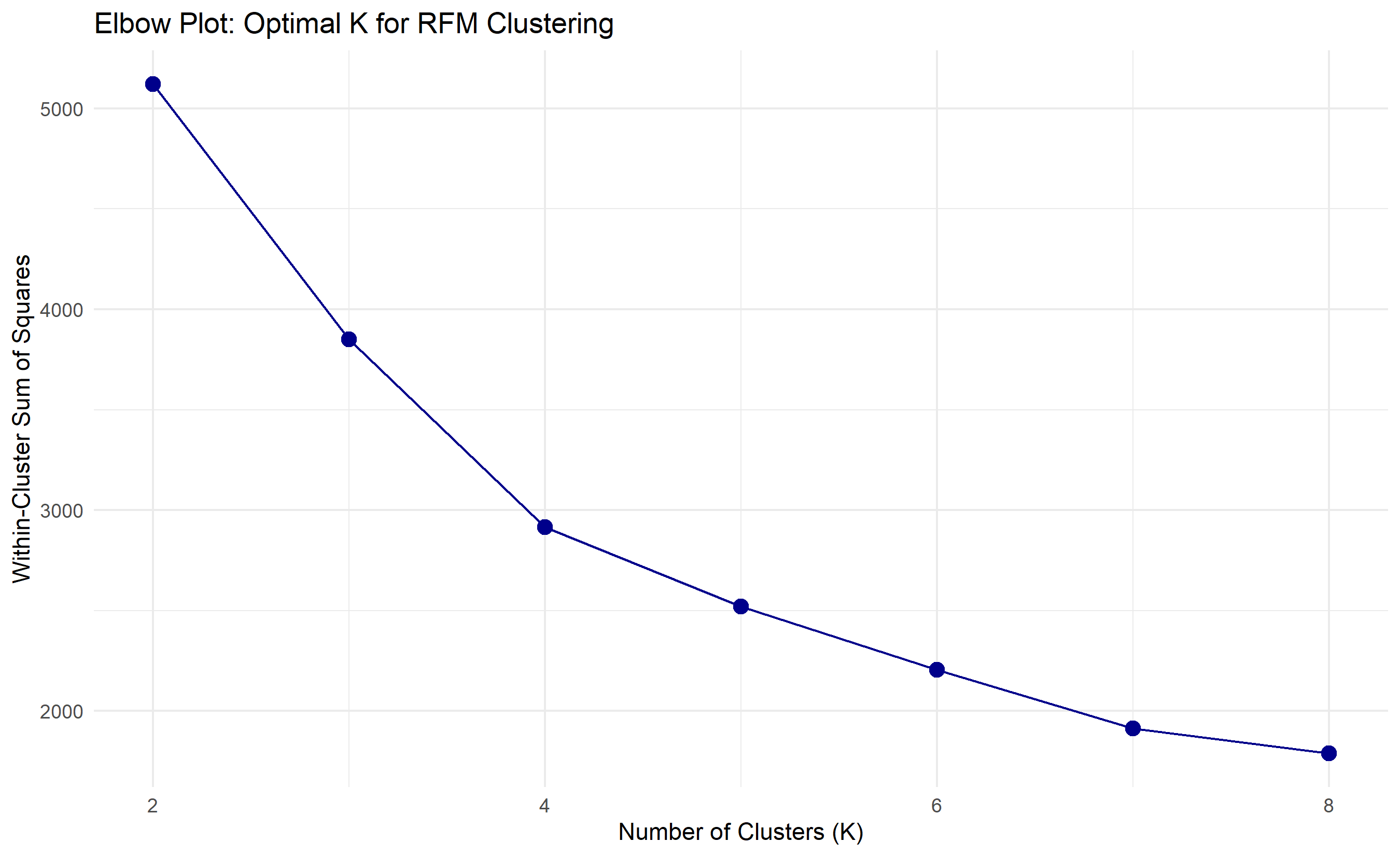
#| fig-cap: "RFM Clustering: Elbow Plot and Cluster Assignments"
library(cluster)
library(factoextra)

# Prepare RFM features for clustering
rfm_features <- rfm_scored |>
  select(customer_id, r_score, f_score, m_score) |>
  column_to_rownames("customer_id")

# Standardize features
rfm_scaled <- scale(rfm_features)

# Elbow plot to determine optimal K
wcss <- sapply(2:8, function(k) {
  km <- kmeans(rfm_scaled, centers = k, nstart = 25, iter.max = 100)
  km$tot.withinss
})

elbow_data <- tibble(k = 2:8, wcss = wcss)

ggplot(elbow_data, aes(x = k, y = wcss)) +
  geom_point(size = 3, color = "darkblue") +
  geom_line(color = "darkblue") +
  labs(title = "Elbow Plot: Optimal K for RFM Clustering",
       x = "Number of Clusters (K)", y = "Within-Cluster Sum of Squares") +
  theme_minimal()
# Fit K-Means with K=5
set.seed(4291)
km_fit <- kmeans(rfm_scaled, centers = 5, nstart = 25, iter.max = 100)
rfm_clustered <- rfm_scored |>
mutate(segment = km_fit$cluster)
# Profile each segment
segment_profiles <- rfm_clustered |>
group_by(segment) |>
summarise(
n_customers = n(),
pct_customers = n() / nrow(rfm_clustered) * 100,
avg_recency = mean(recency_days),
avg_frequency = mean(frequency),
avg_monetary = mean(monetary_total_ngn),
total_revenue = sum(monetary_total_ngn),
pct_revenue = sum(monetary_total_ngn) / sum(rfm_clustered$monetary_total_ngn) * 100,
churn_rate = mean(churned_in_last_90_days, na.rm = TRUE) * 100
) |>
arrange(desc(avg_monetary))
print(segment_profiles)
# Assign business names based on profiles
segment_names <- c(
"1" = "Lost Customers",
"2" = "At-Risk",
"3" = "Loyal",
"4" = "Champions",
"5" = "New/Potential"
)
rfm_final <- rfm_clustered |>
mutate(segment_name = recode(segment, !!!segment_names))
```
```{python}
#| label: py-ch40-case-kmeans
from sklearn.cluster import KMeans
from sklearn.preprocessing import StandardScaler
import pandas as pd
import numpy as np
import matplotlib.pyplot as plt

# Use RFM data from previous step
rfm_features = rfm[["r_score", "f_score", "m_score"]]
scaler = StandardScaler()
rfm_scaled = scaler.fit_transform(rfm_features)

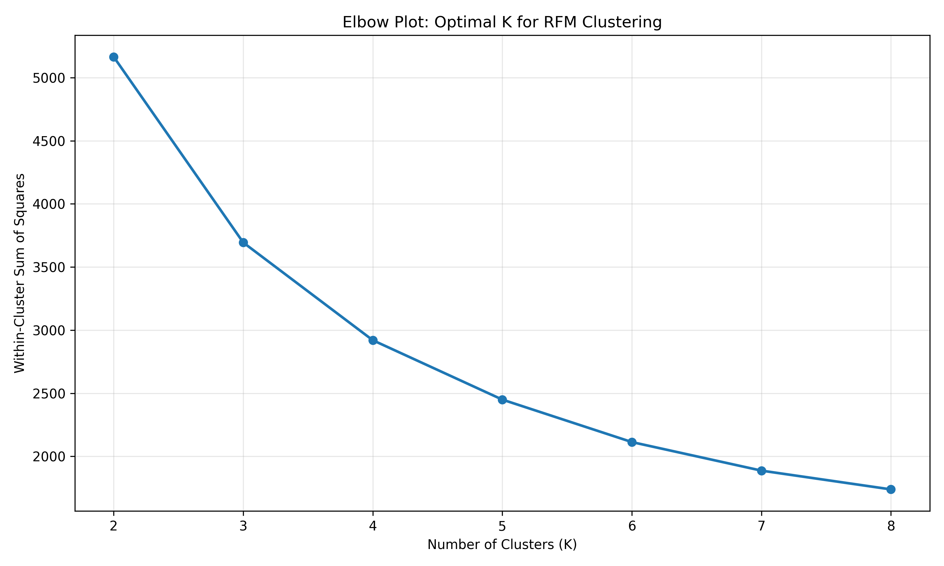
# Elbow plot
wcss = []
for k in range(2, 9):
    km = KMeans(n_clusters=k, random_state=4291, n_init=10)
    km.fit(rfm_scaled)
    wcss.append(km.inertia_)
plt.figure(figsize=(10, 6))
plt.plot(range(2, 9), wcss, marker="o", linestyle="-", linewidth=2)
plt.xlabel("Number of Clusters (K)")
plt.ylabel("Within-Cluster Sum of Squares")
plt.title("Elbow Plot: Optimal K for RFM Clustering")
plt.grid(True, alpha=0.3)
plt.tight_layout()
plt.savefig("ch40_elbow_plot.png", dpi=150, bbox_inches="tight")
plt.show()
# Fit K-Means with K=5
km = KMeans(n_clusters=5, random_state=4291, n_init=10)
rfm["segment"] = km.fit_predict(rfm_scaled)
# Profile each segment
segment_profiles = rfm.groupby("segment").agg({
"customer_id": "count",
"recency_days": "mean",
"frequency": "mean",
"monetary_total_ngn": ["mean", "sum"]
}).round(2)
segment_profiles.columns = ["n_customers", "avg_recency", "avg_frequency", "avg_monetary", "total_revenue"]
segment_profiles["pct_customers"] = (segment_profiles["n_customers"] / len(rfm) * 100).round(2)
segment_profiles["pct_revenue"] = (segment_profiles["total_revenue"] / rfm["monetary_total_ngn"].sum() * 100).round(2)
print("Segment Profiles (Python):")
print(segment_profiles)
# Assign segment names
segment_map = {
0: "Champions",
1: "Loyal",
2: "At-Risk",
3: "New/Potential",
4: "Lost Customers"
}
rfm["segment_name"] = rfm["segment"].map(segment_map)
```
### Segment Profiling and Visualization
```{r}
#| label: ch40-case-radar
#| fig-cap: "Radar Charts: RFM Profile by Segment"
library(fmsb)

# Compute average RFM scores by segment
segment_radar_data <- rfm_final |>
  group_by(segment_name) |>
  summarise(
    r_score = mean(r_score),
    f_score = mean(f_score),
    m_score = mean(m_score),
    .groups = "drop"
  )

# Create radar chart for Champions segment
champions_data <- segment_radar_data |>
  filter(segment_name == "Champions") |>
  select(r_score, f_score, m_score) |>
  rbind(c(5, 5, 5), c(1, 1, 1)) # Add max and min for scale

radarchart(
  champions_data,
  axislabels = c("Recency", "Frequency", "Monetary"),
  cglcol = "grey90",
  pcol = rgb(0.1, 0.5, 0.9, 0.8),
  plwd = 2,
  pfcol = rgb(0.1, 0.5, 0.9, 0.3),
  title = "Champions Segment RFM Profile"
)
# Revenue waterfall by segment
segment_revenue <- rfm_final |>
  group_by(segment_name) |>
  summarise(
    revenue_ngn = sum(monetary_total_ngn),
    customer_count = n(),
    pct_revenue = revenue_ngn / sum(rfm_final$monetary_total_ngn) * 100,
    pct_customers = customer_count / nrow(rfm_final) * 100
  ) |>
  arrange(desc(revenue_ngn))

ggplot(segment_revenue, aes(y = reorder(segment_name, revenue_ngn), x = revenue_ngn)) +
  geom_col(fill = "steelblue") +
  geom_text(aes(label = paste0(round(pct_revenue, 1), "%")), hjust = -0.1) +
  labs(title = "Revenue Contribution by Segment",
       y = "Segment", x = "Total Revenue (NGN)") +
  theme_minimal()
```
```{python}
#| label: py-ch40-case-radar-py
import matplotlib.pyplot as plt
import numpy as np
from math import pi
# Compute average RFM by segment
segment_profiles_py = rfm.groupby("segment_name")[["r_score", "f_score", "m_score"]].mean()
# Plot a simple radar chart for Champions
fig, ax = plt.subplots(figsize=(8, 8), subplot_kw=dict(projection="polar"))
categories = ["Recency", "Frequency", "Monetary"]
values = segment_profiles_py.loc["Champions", ["r_score", "f_score", "m_score"]].values.tolist()
values += values[:1] # Complete the circle
angles = [n / len(categories) * 2 * pi for n in range(len(categories))]
angles += angles[:1]
ax.plot(angles, values, "o-", linewidth=2, color="steelblue")
ax.fill(angles, values, alpha=0.25, color="steelblue")
ax.set_xticks(angles[:-1])
ax.set_xticklabels(categories)
ax.set_ylim(0, 5)
ax.set_title("Champions Segment RFM Profile", pad=20)
ax.grid(True)
plt.tight_layout()
plt.savefig("ch40_radar_champions.png", dpi=150, bbox_inches="tight")
plt.show()
# Revenue waterfall
segment_revenue_py = rfm.groupby("segment_name").agg({
    "monetary_total_ngn": ["sum", "count"]
}).round(0)
segment_revenue_py.columns = ["revenue_ngn", "customer_count"]
segment_revenue_py["pct_revenue"] = (segment_revenue_py["revenue_ngn"] / rfm["monetary_total_ngn"].sum() * 100).round(2)
segment_revenue_py["pct_customers"] = (segment_revenue_py["customer_count"] / len(rfm) * 100).round(2)
segment_revenue_py = segment_revenue_py.sort_values("revenue_ngn", ascending=False)

plt.figure(figsize=(10, 6))
plt.barh(segment_revenue_py.index, segment_revenue_py["revenue_ngn"], color="steelblue")
plt.xlabel("Total Revenue (NGN)")
plt.title("Revenue Contribution by Segment")
plt.grid(axis="x", alpha=0.3)
for i, (idx, row) in enumerate(segment_revenue_py.iterrows()):
    plt.text(row["revenue_ngn"], i, f" {row['pct_revenue']:.1f}%", va="center")
plt.tight_layout()
plt.savefig("ch40_revenue_waterfall.png", dpi=150, bbox_inches="tight")
plt.show()
```
### Segment Stability Monitoring Using PSI
```{r}
#| label: ch40-case-psi
#| fig-cap: "Population Stability Index Over Time"
# Simulate two periods: Q1 2024 vs Q2 2024
set.seed(5617)
# Period 1 segment distribution
period1_dist <- rfm_final |>
count(segment_name) |>
mutate(pct = n / sum(n))
# Period 2: simulate drift (slight shift towards higher-value segments)
period2_counts <- c(
"Champions" = round(nrow(rfm_final) * 0.12),
"Loyal" = round(nrow(rfm_final) * 0.18),
"At-Risk" = round(nrow(rfm_final) * 0.25),
"New/Potential" = round(nrow(rfm_final) * 0.22),
"Lost Customers" = round(nrow(rfm_final) * 0.23)
)
period2_dist <- tibble(
segment_name = names(period2_counts),
n = period2_counts,
pct = n / sum(n)
)
# Compute PSI
psi_calc <- period1_dist |>
rename(pct_p1 = pct) |>
left_join(period2_dist |> select(segment_name, pct) |> rename(pct_p2 = pct),
by = "segment_name") |>
mutate(
pct_p1 = pmax(pct_p1, 0.0001), # Avoid log(0)
pct_p2 = pmax(pct_p2, 0.0001),
ln_ratio = log(pct_p2 / pct_p1),
psi_component = (pct_p2 - pct_p1) * ln_ratio
)
overall_psi <- sum(psi_calc$psi_component)
print(paste("Overall PSI (Q1 2024 to Q2 2024):", round(overall_psi, 4)))
print(psi_calc)
# Visualize PSI by segment
psi_plot_data <- psi_calc |>
mutate(
segment_name = fct_reorder(segment_name, psi_component),
color = ifelse(psi_component > 0, "Increase", "Decrease")
)
ggplot(psi_plot_data, aes(y = segment_name, x = psi_component, fill = color)) +
geom_col() +
geom_vline(xintercept = 0, linetype = "solid", color = "black", linewidth = 0.3) +
scale_fill_manual(values = c("Increase" = "darkgreen", "Decrease" = "darkred")) +
labs(title = "PSI Component by Segment (Q1 → Q2 2024)",
y = "Segment", x = "PSI Component",
subtitle = paste("Overall PSI =", round(overall_psi, 4), "| <0.10 = Stable, 0.10–0.25 = Minor Drift, >0.25 = Significant Drift")) +
theme_minimal() +
theme(legend.position = "bottom")
```
```{python}
#| label: py-ch40-case-psi-py
import pandas as pd
import numpy as np
import matplotlib.pyplot as plt
# Simulate period 1 and period 2 distributions
period1_counts = rfm["segment_name"].value_counts()
period1_dist = pd.DataFrame({
"segment": period1_counts.index,
"pct_p1": period1_counts.values / period1_counts.sum()
})
# Period 2: simulate drift
np.random.seed(5617)
period2_counts = {
"Champions": int(len(rfm) * 0.12),
"Loyal": int(len(rfm) * 0.18),
"At-Risk": int(len(rfm) * 0.25),
"New/Potential": int(len(rfm) * 0.22),
"Lost Customers": int(len(rfm) * 0.23)
}
total_p2 = sum(period2_counts.values())
period2_dist = pd.DataFrame({
"segment": list(period2_counts.keys()),
"pct_p2": np.array(list(period2_counts.values())) / total_p2
})
# Merge and compute PSI
psi_df = period1_dist.merge(period2_dist, left_on="segment", right_on="segment")
psi_df["pct_p1"] = np.maximum(psi_df["pct_p1"], 0.0001)
psi_df["pct_p2"] = np.maximum(psi_df["pct_p2"], 0.0001)
psi_df["ln_ratio"] = np.log(psi_df["pct_p2"] / psi_df["pct_p1"])
psi_df["psi_component"] = (psi_df["pct_p2"] - psi_df["pct_p1"]) * psi_df["ln_ratio"]
overall_psi = psi_df["psi_component"].sum()
print(f"Overall PSI (Q1 → Q2 2024): {overall_psi:.4f}")
print(psi_df)
# Visualize PSI
fig, ax = plt.subplots(figsize=(10, 6))
colors = ["darkgreen" if x > 0 else "darkred" for x in psi_df["psi_component"]]
ax.barh(psi_df["segment"], psi_df["psi_component"], color=colors)
ax.axvline(0, color="black", linestyle="-", linewidth=0.8)
ax.set_xlabel("PSI Component")
ax.set_title("Population Stability Index by Segment (Q1 → Q2 2024)")
ax.grid(axis="x", alpha=0.3)
plt.tight_layout()
plt.savefig("ch40_psi_by_segment.png", dpi=150, bbox_inches="tight")
plt.show()
```
### Strategy and Budget Allocation Table
```{r}
#| label: ch40-case-strategy
strategy_table <- tibble(
  segment = c("Champions", "Loyal", "At-Risk", "New/Potential", "Lost Customers"),
  strategy = c(
    "Retention & expansion; referral incentives",
    "Re-engagement campaigns; cross-sell",
    "Service recovery; targeted offers",
    "Nurture & onboarding",
    "Win-back via email; learning"
  ),
  budget_allocation_pct = c(40, 30, 20, 7, 3),
  expected_roi_multiplier = c(4.5, 3.2, 2.1, 1.8, 0.8),
  expected_churn_reduction = c("2–5%", "10–15%", "30–40%", "5–10%", "Not applicable")
)

knitr::kable(strategy_table, caption = "Segment Strategy and Budget Allocation Framework")
```
---
## Case Study Summary
This case study demonstrates a complete segmentation workflow on realistic Nigerian banking data:
1. **RFM Computation**: Calculated Recency, Frequency, and Monetary metrics from 18 months of transaction history for 3,000 customers.
2. **K-Means Clustering**: Applied K-Means to standardized RFM scores, determining K=5 as optimal via elbow plot.
3. **Segment Profiling**: Named segments (Champions, Loyal, At-Risk, New/Potential, Lost), quantified their size, revenue contribution, and characteristics.
4. **Visualization**: Created radar charts and revenue waterfalls to communicate profiles to stakeholders.
5. **Drift Monitoring**: Computed PSI between consecutive quarters to flag when segment structure is shifting.
6. **Actionable Strategy**: Assigned targeted strategies and budget allocations to each segment based on value and business context.
The bank can now migrate from treating all customers the same to a data-driven, segment-specific customer management approach that maximizes retention of high-value segments and optimises spend allocation.
::: {.exercises}
#### Chapter 40 Exercises
1. **Recall**: Define Recency, Frequency, and Monetary value in your own words. Why is each important?
2. **Recall**: What does a customer with RFM code 543 represent, and what would you recommend for that customer?
3. **Comprehension**: Explain why standardizing RFM scores before K-Means clustering is necessary.
4. **Comprehension**: A company computes PSI = 0.08 between two quarters. Should they re-cluster? Why or why not?
5. **Application**: You have a retail bank with 10,000 customers. Champions are 8% of the customer base but 45% of revenue. Propose a budget allocation strategy across five segments.
6. **Application**: A telecom operator finds that their "Loyal" segment (high frequency, declining recency) has grown from 25% to 35% of the customer base in one year. What does this suggest, and what questions should you ask?
7. **Analysis**: Compare demographic segmentation (age, income, location) with RFM segmentation. What are the strengths and weaknesses of each? When would you use both?
8. **Analysis**: Design a feature set for behavioural segmentation of a SaaS company. Go beyond RFM.
9. **Synthesis**: A financial services company wants to deploy segmentation in a CRM system. What infrastructure, processes, and dashboards would you need to build? How often should segments be re-computed?
10. **Synthesis**: You notice that PSI has been between 0.10 and 0.25 for three consecutive quarters, suggesting gradual drift. Propose a hypothesis-driven investigation to understand the drift and recommend whether to re-cluster.
:::
## Further Reading
- Pfeifer, P. E., & Carraway, R. L. (2000). Modeling customer relationships as Markov chains. *Journal of Interactive Marketing*, 14(2), 43–55.
- Campbell, M. C., & Kirmani, A. (2000). Consumers' use of persuasion knowledge: The effects of accessibility and cognitive capacity on perceptions of an influence agent. *Journal of Consumer Research*, 27(1), 69–83.
- Verhoef, P. C., Kannan, P. K., & Inman, J. J. (2015). From multi-channel retailing to omni-channel retailing. *Journal of Retail*, 91(2), 174–181.
---
## Chapter 40 Appendix: RFM Scoring Variants and PSI Derivation
### RFM Scoring: Percentile vs Quintile
Two common approaches to scoring R, F, and M on a 1–5 scale are **percentiles** and **quintiles**.
**Quintile Scoring**: Divide the distribution into five equal-probability bins. Quintile 1 contains the bottom 20% of customers (by the metric), Quintile 2 the next 20%, and so on. For Recency, we often reverse the scale (higher recency = more recent = higher score). Quintile scoring is the most common approach.
Mathematically, for a metric $X$:
$$Q_i = \text{percentile}(X, i \times 20) \quad \text{for } i = 1, 2, 3, 4, 5$$
Then assign score:
$$\text{Score}_j = i \text{ if } Q_{i-1} < X_j \leq Q_i$$
**Percentile Scoring**: Instead of dividing into five equal bins, compute the percentile rank of each customer directly:
$$\text{Score}_j = \left\lceil \text{percentileRank}(X_j) \times 5 \right\rceil$$
where $\text{percentileRank}(X_j) = \frac{\#\{X_i \leq X_j\}}{n}$.
Percentile scoring is more granular if ties are broken; quintile scoring is more robust to outliers and typically preferred in practice.
### Population Stability Index (PSI) Derivation
PSI measures the distributional shift of a categorical variable (e.g., customer segments) between two time periods. The formula is:
$$\text{PSI} = \sum_{i=1}^{k} \left( P_i^{\text{current}} - P_i^{\text{baseline}} \right) \times \ln\left( \frac{P_i^{\text{current}}}{P_i^{\text{baseline}}} \right)$$
where:
- $k$ is the number of categories (e.g., five customer segments)
- $P_i^{\text{baseline}}$ is the proportion of observations in category $i$ in the baseline period
- $P_i^{\text{current}}$ is the proportion in category $i$ in the current period
- $\ln$ is the natural logarithm
**Interpretation**:
- PSI < 0.10: The distribution is stable; no action needed.
- PSI 0.10–0.25: Minor drift; investigate the changes and consider re-clustering if persistent.
- PSI > 0.25: Significant drift; re-cluster and update segment definitions.
**Relationship to Chi-Squared**: PSI is related to the chi-squared goodness-of-fit test. Under the null hypothesis that the distribution has not changed, $2 \times n \times \text{PSI}$ is approximately chi-squared distributed with $k-1$ degrees of freedom, where $n$ is the sample size. For large $n$, even small PSI values can be statistically significant, so practical significance (>0.10) is often used as the threshold.
**Practical Adjustment**: To avoid $\ln(0)$ when a category has zero observations in one period, add a small constant (e.g., 0.0001) to all proportions before computing PSI.