---
title: "Lead Scoring: Full Applied Deployment"
---
```{python}
#| label: python-setup-44-lead-scoring-applied
#| include: false
import numpy as np
import pandas as pd
import matplotlib.pyplot as plt
import seaborn as sns
from sklearn.linear_model import LogisticRegression
from sklearn.preprocessing import StandardScaler
from sklearn.model_selection import train_test_split
from sklearn.calibration import calibration_curve
import shap
```
::: {.callout-note icon="false"}
## 📋 Learning Objectives
- Understand the difference between a trained model and a deployed system; the operational gaps to bridge
- Engineer a complete feature pipeline for B2B lead scoring: firmographic, geographic, and digital signals
- Train logistic regression for interpretability and implement probability calibration (Platt scaling, isotonic regression)
- Translate probabilities to business tiers (Hot/Warm/Cold) aligned with sales capacity
- Use SHAP waterfall plots to explain individual lead scores to non-technical stakeholders
- Monitor score drift via Population Stability Index and champion-challenger model testing
- Measure the business impact of lead scoring via randomised controlled trials
:::
## From Model to Business Process: The Deployment Gap
Building a churn prediction model (Chapter 41) or a segmentation model (Chapter 40) is research work. Deploying it so a sales team uses the scores daily is operational work. The gap is substantial.
**The Research-to-Operations Pipeline**:
1. **Offline Development**: Build model on historical data. Achieve 85% AUC on a holdout test set. Celebrate.
2. **Scoring Pipeline**: Create a process to score new leads in batch (daily, weekly) or real time. Integrate with CRM.
3. **Calibration**: Ensure probabilities are trustworthy. A lead scored 0.45 should have ~45% true conversion rate, not 55%.
4. **Business Tiers**: Convert probabilities (continuous) to actionable tiers (Hot/Warm/Cold/Lead) that the sales team understands.
5. **Explainability**: Explain why a lead is Hot (not just "the model says so"). SHAP waterfall: "This lead scored 0.78 primarily because (a) they requested a demo (this alone would suggest 0.35), and (b) their company size is in the target range (adds 0.15)."
6. **Monitoring**: Watch for score drift. If the distribution of scores changes monthly, the model may be degrading or the market may be shifting.
7. **Feedback Loop**: Track which leads converted. Use this to re-train the model and improve accuracy. A/B test the model against status quo.
## Feature Engineering Revisited: The Full Signal Set for B2B Lead Scoring
A B2B SaaS (e.g., a Pan-African Fintech) scores enterprise prospects. The feature set combines firmographics (company attributes), geography, and digital signals.
**Firmographic Signals**:
- Company size (headcount, revenue): Larger companies are more valuable and higher-risk (longer sales cycles).
- Industry: Tech companies, financial services, and retail are high-value segments; government is slow-moving.
- Annual revenue: Proxy for ability to pay. A company with ₦100M revenue can afford higher-tier pricing.
- Funding stage: Startups are early-stage (long sales cycle, low budget); series-C+ are growth-stage (faster to buy).
- Years in business: Older companies (10+ years) are more stable; younger ones are more agile but riskier.
- Technology stack: Do they use APIs? Are they building their own solutions (vs buying SaaS)?
**Geographic Signals**:
- Country: Nigeria, Ghana, Kenya, South Africa show different market maturity. Lagos market is most mature; Tier-2 cities are emerging.
- Industry concentration: A fintech concentrated in Lagos has different TAM than one nationwide.
- Competitive intensity: Is the prospect in a region saturated with competitors?
**Digital Behaviour Signals**:
- Website visit recency: Did they visit the pricing page last week? Highly engaged.
- Pages visited: Did they explore features deeply or just bounce from search?
- Content downloaded: Downloaded a case study? Higher intent.
- Email engagement: Do they open marketing emails? Click through?
- Demo requested: The strongest single signal; strong purchase intent.
- Days since last engagement: Has engagement gone dormant after initial interest?
**Decay Functions**: A page visit 90 days ago contributes less signal than one from yesterday. Implement decay:
$$\text{Signal}_t = \text{Signal}_{raw} \times e^{-\lambda t}$$
where $\lambda = 0.01$ (half-life ~70 days). Recent signals matter more.
## Model Training and Probability Calibration
**Logistic Regression** is ideal for deployed systems because:
- Coefficients are interpretable (easy to explain to stakeholders)
- Fast to score (milliseconds per lead)
- Regulatory (finance, credit) prefers interpretable models
- Probability outputs are well-understood
Train on historical leads with conversion labels (converted / not converted within 90 days of scoring):
$$\log \left( \frac{P(\text{convert})}{1 - P(\text{convert})} \right) = \beta_0 + \beta_1 x_1 + \cdots + \beta_p x_p$$
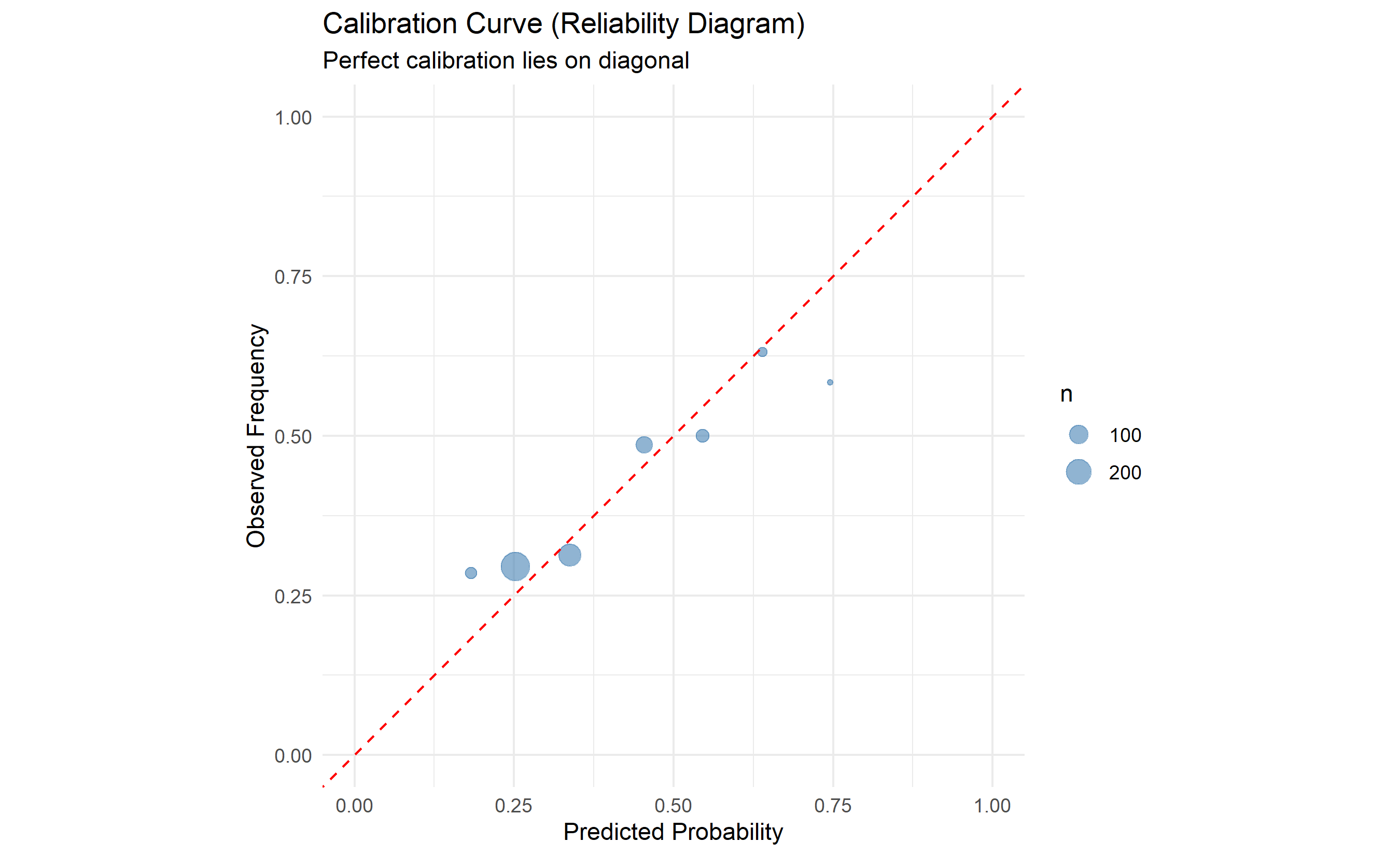
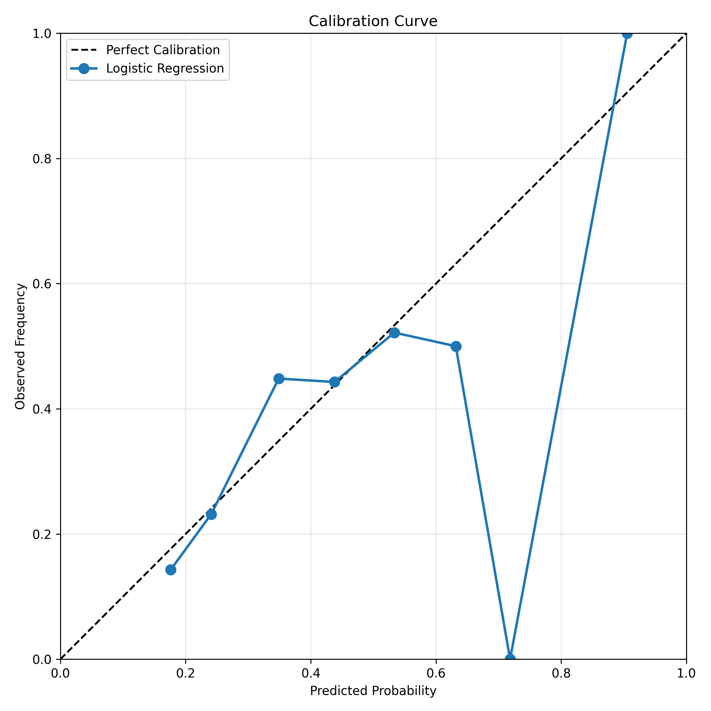
**Probability Calibration** ensures the predicted probability matches the true frequency. A lead predicted 0.45 should have ~45% true conversion rate. Without calibration, a model might predict 0.35 on average but true conversion is 0.50 (overconfident).
**Platt Scaling** is simple calibration: fit a logistic regression on the model's predictions:
$$\text{Calibrated}_i = \sigma(a \times \text{Prediction}_i + b)$$
where $a$ and $b$ are fit via logistic regression on validation data. One-dimensional, fast, effective.
**Isotonic Regression** is non-parametric: fit a monotone increasing step function to predictions vs true labels. More flexible than Platt scaling but can overfit on small validation sets.
**Reliability Diagram**: Plot predicted probability (x-axis) vs observed frequency (y-axis). A calibrated model lies on the diagonal (predicted = observed). Plots above the diagonal are underconfident; below are overconfident.
## Threshold Selection and Tier Design
Converting a probability to a business action requires a threshold. But which?
**Single Threshold (Cutoff)**: If $P(\text{convert}) > 0.40$, flag as Hot; else Cold. Simple but crude.
**Tier Design**: Create multiple thresholds to align with sales capacity.
Example:
- **Hot** (P > 0.50): High conversion likelihood, high value. Sales team works these immediately. Budget: 50 leads/month.
- **Warm** (0.30 < P ≤ 0.50): Moderate likelihood. Nurture via email. Budget: 200 leads/month.
- **Cold** (0.15 < P ≤ 0.30): Low likelihood but worth tracking. Automated email campaigns. Budget: unlimited.
- **Unqualified** (P ≤ 0.15): Very low likelihood. Ignore or mark for future prospecting.
**Threshold Optimization**: Choose thresholds to maximize expected value:
$$\text{EV} = P(\text{convert}) \times \text{CLV} - (1 - P(\text{convert})) \times P(\text{false positive cost})$$
If a conversion is worth ₦2,000,000 and a false positive (wasted sales time) costs ₦50,000, then:
- At $P = 0.50$: EV = 0.50 × 2M − 0.50 × 50K = ₦975K ✓ Hot
- At $P = 0.30$: EV = 0.30 × 2M − 0.70 × 50K = ₦565K ✓ Warm
- At $P = 0.10$: EV = 0.10 × 2M − 0.90 × 50K = ₦155K ✗ Not worth nurturing
This framework ensures thresholds reflect business economics, not arbitrary cutoffs.
## Explainability for Sales Teams: SHAP Waterfall Plots
A sales director receives a lead scored 0.72 (Hot). They ask: "Why is this Hot? Should I prioritize them?"
A simple answer ("The model says so") is useless. A SHAP waterfall explains it:
```
Base value (average): 0.35
━━━━━━━━━━━━━━━━━━━━━━━━━━━━━━━
Demo requested:        +0.20  (strong signal, moves from 0.35 to 0.55)
Company size (301 emp): +0.12  (in target range, moves from 0.55 to 0.67)
Website visits (8):     +0.05  (moderate engagement, moves from 0.67 to 0.72)
Country (Nigeria):      −0.03  (slight negative; Lagos market is saturated)
━━━━━━━━━━━━━━━━━━━━━━━━━━━━━━━
Predicted score:        0.72  (Hot tier, 72% likely to convert)
```
Now the director understands: the lead is Hot primarily because they requested a demo and are the right company size. It's worth the sales team's time.
SHAP waterfall is generated via Python's shap library:
```python
explainer = shap.LinearExplainer(model, X_train)
shap_values = explainer.shap_values(X_test)
shap.plots.waterfall(shap_values[0])  # Explain first lead
```
## Monitoring and Model Maintenance: Drift Detection
Once live, the model faces drift: the distribution of leads changes, or market conditions shift, degrading model performance.
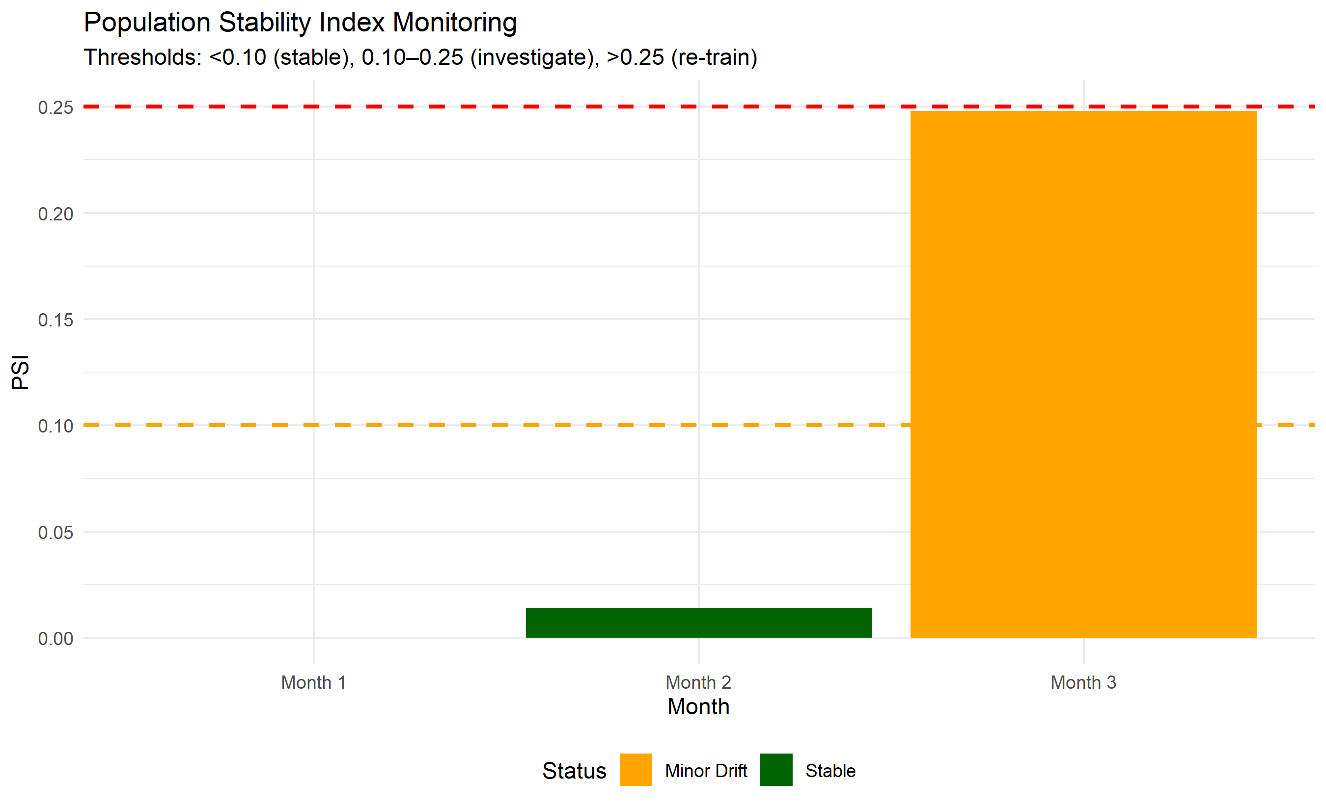
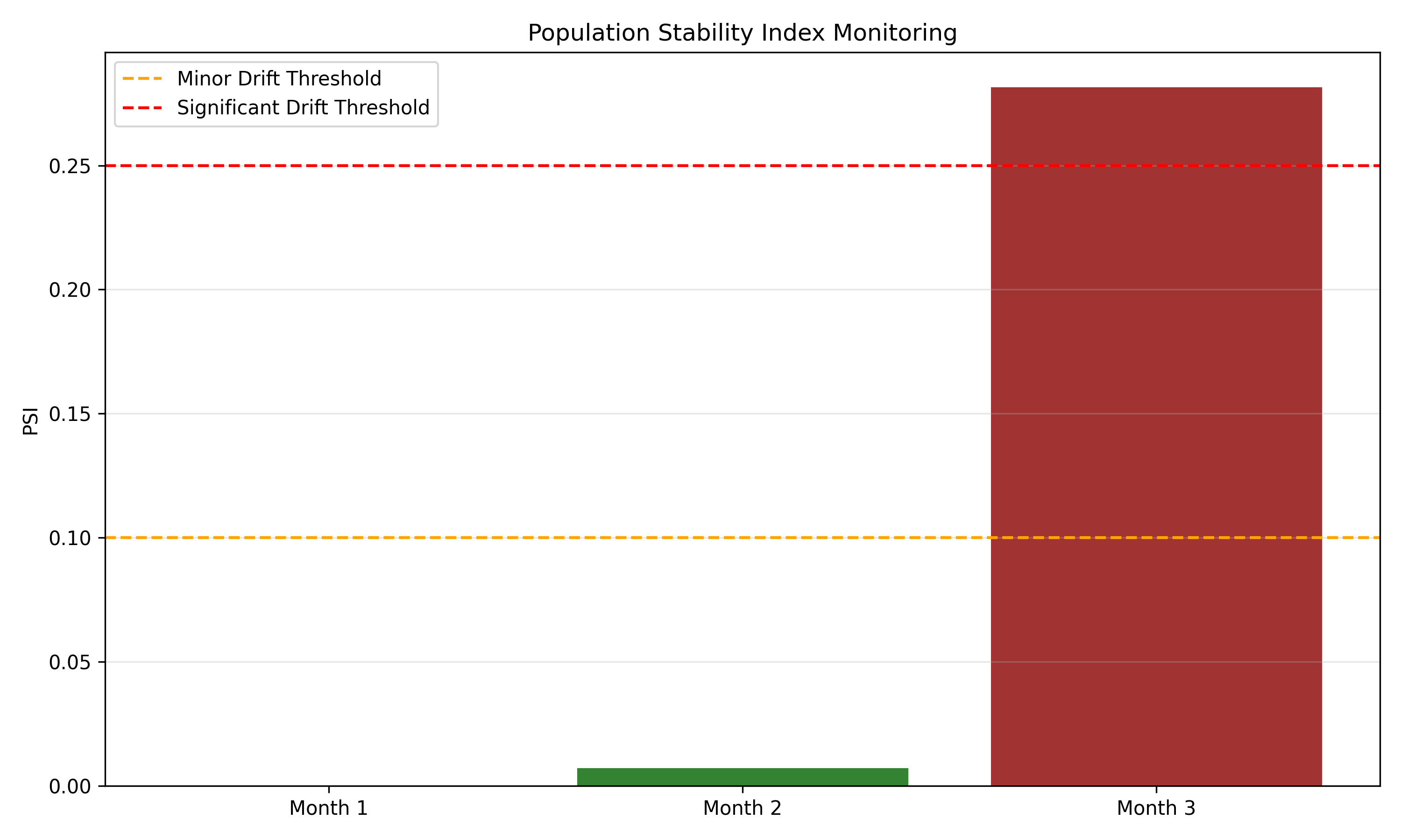
**Population Stability Index (PSI)** (Chapter 40) detects score distribution shift. Compute PSI of scores this month vs last month:
$$\text{PSI} = \sum_i (P_i^{\text{current}} - P_i^{\text{baseline}}) \times \ln(P_i^{\text{current}} / P_i^{\text{baseline}})$$
- PSI < 0.10: Stable; no action
- PSI 0.10–0.25: Minor drift; investigate
- PSI > 0.25: Significant drift; consider re-training
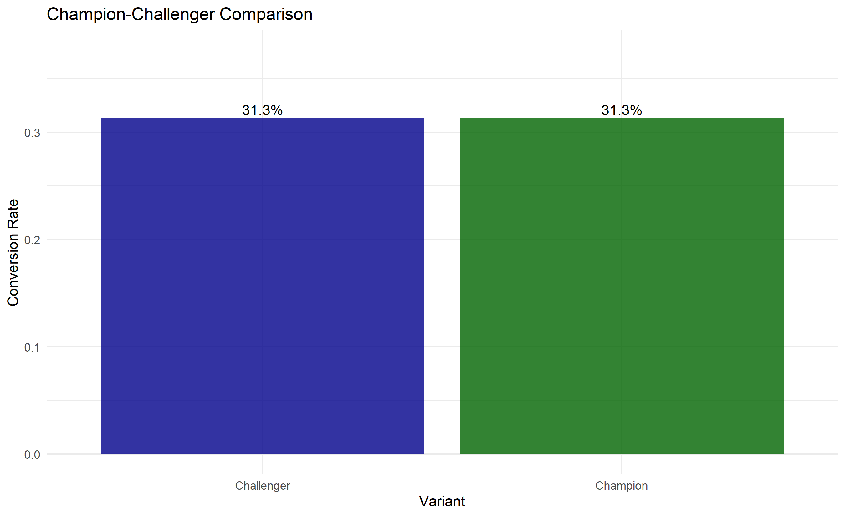
**Champion-Challenger Framework**: Run the new model in parallel with the current (champion) model on a sample of leads (10–20%) for one month. Compare:
- AUC: Does the new model rank leads better?
- Calibration: Are probabilities more accurate?
- Business impact: Do leads scored by the new model convert at the predicted rate?
If the challenger wins on AUC and calibration, promote it. If not, keep the champion.
**Concept Drift**: Even with stable lead distribution, conversion drivers might change. If digital signal suddenly matters less (e.g., in-person relationships become important post-COVID), the model's coefficients become stale. Solution: re-train quarterly or when PSI exceeds threshold.
## Business Impact Measurement: A/B Testing Lead Scoring
Finally, measure the business return on the lead scoring system. Design a randomised controlled trial:
**Experiment Design**:
- **Treatment**: Sales team uses lead scores (Hot/Warm/Cold)
- **Control**: Sales team uses no scores (arbitrary lead assignment or status quo process)
- **Duration**: 2–3 months
- **Unit**: Sales representative (half assigned to treatment, half to control)
- **Metric**: Win rate (% of leads that converted), sales velocity (days to close), revenue per lead
**Sample Size**: Ensure sufficient leads per rep so random variation doesn't swamp the treatment effect.
**Results Interpretation**:
- If treatment has 15% higher win rate with p < 0.05, the system is valuable.
- Compute ROI: (Incremental Revenue − System Cost) / System Cost
Example:
- 100 leads/rep/month → 2 additional conversions per rep with lead scoring
- ₦2M value per conversion (CLV)
- 20 sales reps → 40 additional conversions × ₦2M = ₦80M incremental revenue
- System cost: ₦500K/month
- ROI: (₦80M − ₦500K) / ₦500K ≈ 160× return on investment
## Real-World Complications and Mitigation
**Data Leakage**: Ensure features don't include information leaked from the future. Example: don't use "has_received_salesforce_note" as a feature because the note is created after qualification.
**Feedback Loops**: Leads scored High get more sales attention and convert more, creating a self-fulfilling prophecy. Measure true model performance by comparing conversion rates among leads scored similarly but given different levels of sales attention (A/B test).
**Fairness**: Ensure the model doesn't unfairly discriminate by geography or industry. If the model systematically down-scores companies in Tier-2 cities due to historical data bias, you lose valuable market opportunity.
::: {.callout-caution icon="false"}
## 📝 Section 44.8 Review Questions
1. Explain the difference between a model's AUC and its probability calibration. Can a model have high AUC but poor calibration?
2. Design a three-tier (Hot/Warm/Cold) system aligned with sales team capacity of 50 hot leads per month.
3. What does a SHAP waterfall plot show, and why is it useful for stakeholder communication?
4. A champion-challenger test shows the challenger has 2% higher AUC but fails to show business improvement in A/B test. What might explain this?
5. How would you detect and respond to concept drift in a lead scoring system?
:::
## Case Study: B2B Lead Scoring for a Pan-African Fintech SaaS {#sec-ch44-case}
**Company**: Fluidly, a fictional B2B SaaS fintech, provides APIs for African payment processing. They want to prioritise sales efforts using lead scoring.
**Problem**: Fluidly's sales team has been pitching to all inbound leads equally. This is inefficient: some leads (large corporates with budget) have 60% conversion; others (bootstrapped startups) have 5%. They want to score leads so Hot leads get immediate attention.
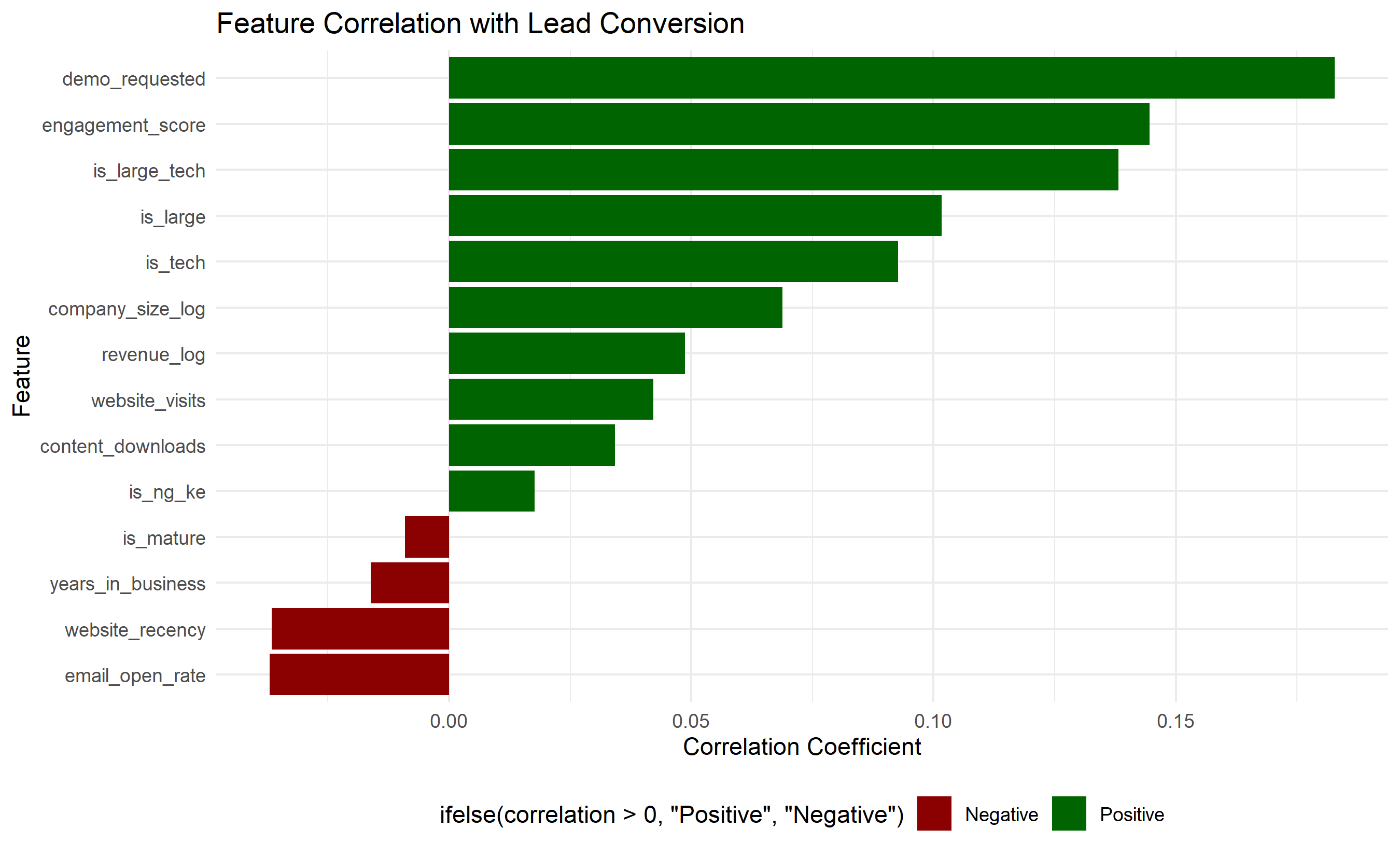
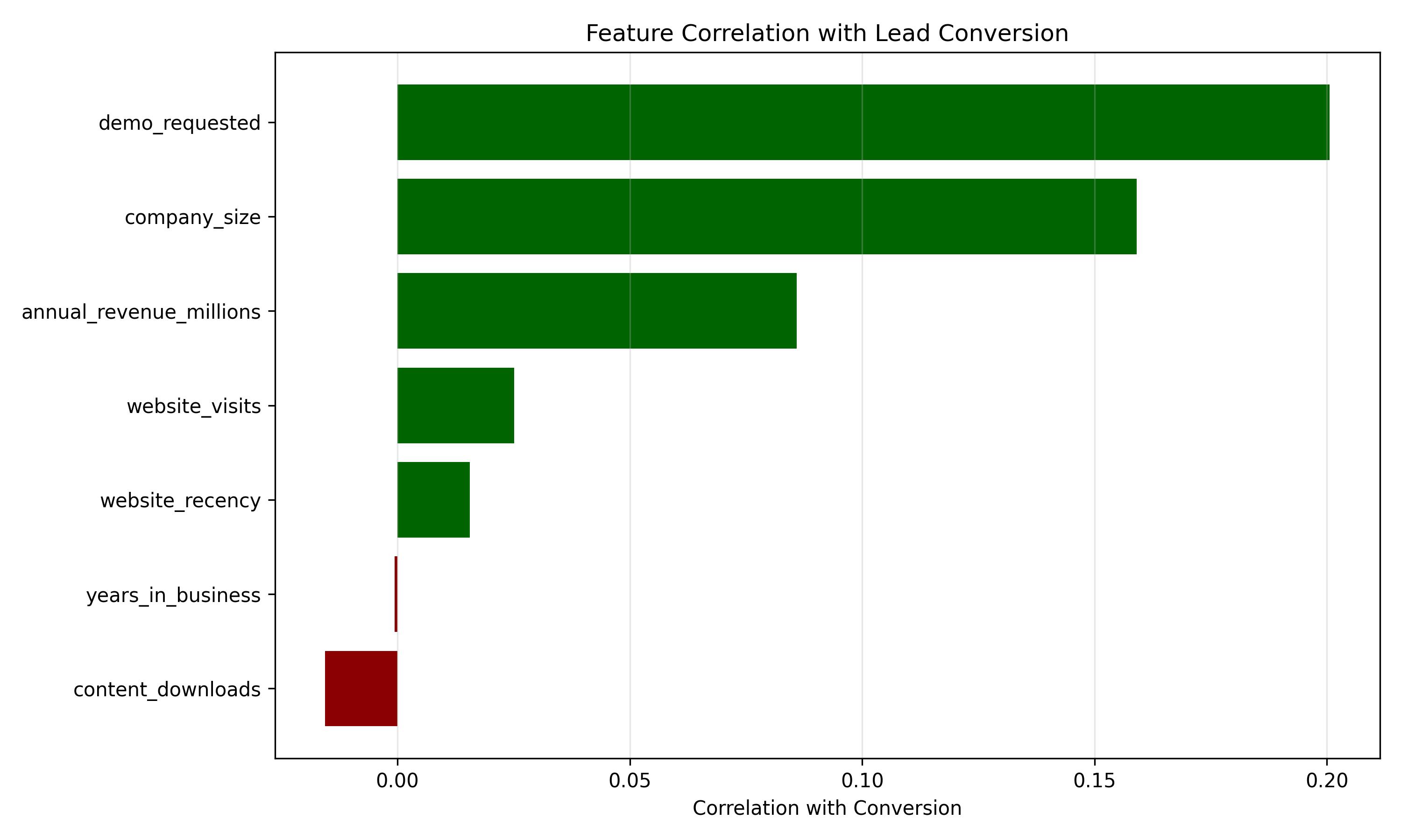
**Data**: 2,000 historical leads from the past 18 months with conversion labels. Features include firmographics, geography, and 6 months of digital engagement (website visits, demo requests, email opens).
### Feature Engineering Pipeline
```{r}
#| label: ch44-case-features
#| fig-cap: "Feature Importance Distribution and Correlation with Conversion"
library(tidyverse)
library(ggplot2)

set.seed(5038)

# Synthetic B2B SaaS lead data
n_leads <- 2000

leads_df <- tibble(
  lead_id = 1:n_leads,
  # Firmographics
  company_size = rgamma(n_leads, shape = 2, scale = 200), # employees
  annual_revenue_millions = rgamma(n_leads, shape = 2, scale = 50),
  industry = sample(c("Tech", "Finance", "Retail", "Manufacturing", "Other"),
                   n_leads, replace = TRUE, prob = c(0.25, 0.25, 0.20, 0.15, 0.15)),
  years_in_business = rgamma(n_leads, shape = 2, scale = 10),
  # Geographic
  country = sample(c("Nigeria", "Ghana", "Kenya", "South Africa"),
                  n_leads, replace = TRUE, prob = c(0.35, 0.25, 0.20, 0.20)),
  # Digital signals (past 6 months)
  website_visits = rpois(n_leads, lambda = 5),
  demo_requested = rbinom(n_leads, 1, prob = 0.15),
  days_since_first_visit = sample(30:180, n_leads, replace = TRUE),
  content_downloads = rpois(n_leads, lambda = 1),
  email_open_rate = runif(n_leads, 0, 1),
  # Derived features
  website_recency = 180 - days_since_first_visit,
  engagement_score = website_visits + demo_requested * 5 + content_downloads
) |>
  mutate(
    # Simulate conversion likelihood (ground truth)
    base_prob = 0.15,
    prob_adjustments = (
      (company_size > 500) * 0.15 +  # Large companies more likely
      (annual_revenue_millions > 100) * 0.10 +
      (industry %in% c("Tech", "Finance")) * 0.08 +
      demo_requested * 0.25 +
      (website_visits >= 10) * 0.12 +
      (content_downloads >= 2) * 0.05 +
      (country %in% c("Nigeria", "Kenya")) * 0.02
    ),
    converted = as.integer(runif(n_leads) < pmin(base_prob + prob_adjustments, 0.95))
  )

# Feature engineering: create derived features
leads_engineered <- leads_df |>
  mutate(
    # Log-transform skewed features
    company_size_log = log1p(company_size),
    revenue_log = log1p(annual_revenue_millions),
    # Categorical dummies
    is_tech = as.integer(industry %in% c("Tech", "Finance")),
    is_large = as.integer(company_size > 500),
    is_mature = as.integer(years_in_business > 5),
    is_ng_ke = as.integer(country %in% c("Nigeria", "Kenya")),
    # Interaction: large tech company
    is_large_tech = is_large * is_tech
  )

# Summarise features
feature_cols <- c("company_size_log", "revenue_log", "years_in_business",
                 "website_visits", "demo_requested", "engagement_score",
                 "website_recency", "email_open_rate", "content_downloads",
                 "is_tech", "is_large", "is_mature", "is_ng_ke", "is_large_tech")

# Compute correlation with conversion
correlation_data <- tibble(
  feature = feature_cols,
  correlation = sapply(feature_cols, function(f) cor(leads_engineered[[f]], leads_engineered$converted))
) |>
  arrange(desc(abs(correlation)))

ggplot(correlation_data, aes(y = reorder(feature, correlation), x = correlation,
                             fill = ifelse(correlation > 0, "Positive", "Negative"))) +
  geom_col() +
  scale_fill_manual(values = c("Positive" = "darkgreen", "Negative" = "darkred")) +
  labs(title = "Feature Correlation with Lead Conversion",
       y = "Feature", x = "Correlation Coefficient") +
  theme_minimal() +
  theme(legend.position = "bottom")
print("Top Features by Correlation with Conversion:")
print(head(correlation_data, 10))
```
```{python}
#| label: py-ch44-case-features
import pandas as pd
import numpy as np
import matplotlib.pyplot as plt

np.random.seed(5038)

# Synthetic lead data
n_leads = 2000
company_size = np.random.gamma(2, 200, n_leads)
annual_revenue = np.random.gamma(2, 50, n_leads)
years_in_business = np.random.gamma(2, 10, n_leads)
website_visits = np.random.poisson(5, n_leads)
demo_requested = np.random.binomial(1, 0.15, n_leads)
content_downloads = np.random.poisson(1, n_leads)
days_since_visit = np.random.randint(30, 181, n_leads)

leads_df = pd.DataFrame({
    "lead_id": np.arange(1, n_leads + 1),
    "company_size": company_size,
    "annual_revenue_millions": annual_revenue,
    "years_in_business": years_in_business,
    "website_visits": website_visits,
    "demo_requested": demo_requested,
    "content_downloads": content_downloads,
    "website_recency": 180 - days_since_visit
})

# Create conversion labels
prob_base = 0.15
prob_adj = (
    (company_size > 500) * 0.15 +
    (annual_revenue > 100) * 0.10 +
    demo_requested * 0.25 +
    (website_visits >= 10) * 0.12
)
conversion_prob = np.minimum(prob_base + prob_adj, 0.95)
leads_df["converted"] = (np.random.random(n_leads) < conversion_prob).astype(int)

# Feature correlation with conversion
feature_cols = ["company_size", "annual_revenue_millions", "years_in_business",
               "website_visits", "demo_requested", "content_downloads", "website_recency"]
correlations = {col: leads_df[col].corr(leads_df["converted"]) for col in feature_cols}
corr_df = pd.DataFrame(list(correlations.items()), columns=["feature", "correlation"])
corr_df = corr_df.sort_values("correlation", ascending=True)

plt.figure(figsize=(10, 6))
colors = ["darkgreen" if x > 0 else "darkred" for x in corr_df["correlation"]]
plt.barh(corr_df["feature"], corr_df["correlation"], color=colors)
plt.xlabel("Correlation with Conversion")
plt.title("Feature Correlation with Lead Conversion")
plt.grid(axis="x", alpha=0.3)
plt.tight_layout()
plt.savefig("ch44_feature_correlation.png", dpi=150, bbox_inches="tight")
plt.show()
print("Feature Correlations with Conversion:")
print(corr_df)
```
### Logistic Regression Model Training and Calibration
```{r}
#| label: ch44-case-logistic
#| fig-cap: "Logistic Regression Coefficients and Calibration Curve"
library(caret)
# Split data
set.seed(8724)
train_idx <- createDataPartition(leads_engineered$converted, p = 0.7, list = FALSE)
train_data <- leads_engineered[train_idx, ]
test_data <- leads_engineered[-train_idx, ]
# Fit logistic regression
feature_cols <- c("company_size_log", "revenue_log", "years_in_business",
"website_visits", "demo_requested", "engagement_score",
"website_recency", "email_open_rate", "content_downloads",
"is_tech", "is_large", "is_mature", "is_ng_ke", "is_large_tech")
log_model <- glm(
as.formula(paste("converted ~", paste(feature_cols, collapse = " + "))),
family = "binomial",
data = train_data
)
# Model summary
summary_log <- summary(log_model)
cat("Model Summary:\n")
cat("AIC:", log_model$aic, "\n")
cat("Deviance:", log_model$deviance, "\n")
# Extract coefficients
coef_table <- data.frame(
variable = rownames(summary_log$coefficients)[-1],
coefficient = summary_log$coefficients[-1, 1],
p_value = summary_log$coefficients[-1, 4],
odds_ratio = exp(summary_log$coefficients[-1, 1])
) |>
arrange(desc(abs(coefficient)))
cat("\nTop Coefficients (largest impact on log-odds):\n")
print(head(coef_table, 10))
# Platt scaling for calibration
test_pred_raw <- predict(log_model, test_data, type = "response")
# Fit logistic regression on predictions to calibrate
calibration_model <- glm(
converted ~ test_pred_raw,
family = "binomial",
data = data.frame(converted = test_data$converted, test_pred_raw = test_pred_raw)
)
test_pred_calibrated <- predict(calibration_model, type = "response")
# Create reliability diagram
calibration_df <- tibble(
predicted = test_pred_raw,
actual = test_data$converted
) |>
mutate(
bin = cut(predicted, breaks = seq(0, 1, 0.1), labels = seq(0.05, 0.95, 0.1))
) |>
group_by(bin) |>
summarise(
mean_predicted = mean(predicted),
mean_actual = mean(actual),
n = n(),
.groups = "drop"
) |>
filter(n > 5) # Only bins with sufficient data
ggplot(calibration_df, aes(x = mean_predicted, y = mean_actual)) +
geom_point(aes(size = n), alpha = 0.6, color = "steelblue") +
geom_abline(intercept = 0, slope = 1, linetype = "dashed", color = "red") +
xlim(0, 1) +
ylim(0, 1) +
labs(title = "Calibration Curve (Reliability Diagram)",
x = "Predicted Probability", y = "Observed Frequency",
subtitle = "Perfect calibration lies on diagonal") +
theme_minimal() +
theme(aspect.ratio = 1)
```
```{python}
#| label: py-ch44-case-logistic-py
from sklearn.linear_model import LogisticRegression
from sklearn.preprocessing import StandardScaler
from sklearn.model_selection import train_test_split
import pandas as pd
import numpy as np
import matplotlib.pyplot as plt

# Prepare features
X = leads_df[["company_size", "annual_revenue_millions", "years_in_business",
             "website_visits", "demo_requested", "content_downloads", "website_recency"]]
y = leads_df["converted"]

# Standardize
scaler = StandardScaler()
X_scaled = scaler.fit_transform(X)

X_train, X_test, y_train, y_test = train_test_split(X_scaled, y, test_size=0.3,
                                                      random_state=8724, stratify=y)

# Fit logistic regression
log_reg = LogisticRegression(random_state=8724, max_iter=1000)
log_reg.fit(X_train, y_train)
# Coefficients
feature_names = ["Company Size", "Annual Revenue", "Years in Business",
"Website Visits", "Demo Requested", "Content Downloads", "Website Recency"]
coef_df = pd.DataFrame({
"Feature": feature_names,
"Coefficient": log_reg.coef_[0],
"Odds Ratio": np.exp(log_reg.coef_[0])
}).sort_values("Coefficient", ascending=False)
print("Model Coefficients:")
print(coef_df)
# Predictions
y_pred_prob = log_reg.predict_proba(X_test)[:, 1]
# Calibration curve
from sklearn.calibration import calibration_curve
prob_true, prob_pred = calibration_curve(y_test, y_pred_prob, n_bins=10)
plt.figure(figsize=(8, 8))
plt.plot([0, 1], [0, 1], "k--", label="Perfect Calibration")
plt.plot(prob_pred, prob_true, "o-", label="Logistic Regression", linewidth=2, markersize=8)
plt.xlabel("Predicted Probability")
plt.ylabel("Observed Frequency")
plt.title("Calibration Curve")
plt.legend()
plt.grid(alpha=0.3)
plt.xlim([0, 1])
plt.ylim([0, 1])
plt.gca().set_aspect("equal")
plt.tight_layout()
plt.savefig("ch44_calibration_curve.png", dpi=150, bbox_inches="tight")
plt.show()
```
### Tier Design and Threshold Optimization
```{r}
#| label: ch44-case-tiers
#| fig-cap: "Tier Assignment and Sales Capacity Alignment"
library(tidyverse)
# Compute predictions on test set
test_pred <- predict(log_model, test_data, type = "response")
# Assign tiers based on business logic
# Hot: top 50 leads per month (capacity constraint)
# Warm: next 200 leads per month
# Cold: remaining
test_data_scored <- tibble(
lead_id = test_data$lead_id,
score = test_pred,
converted = test_data$converted
) |>
arrange(desc(score)) |>
mutate(
tier = case_when(
row_number() <= 50 ~ "Hot",
row_number() <= 250 ~ "Warm",
TRUE ~ "Cold"
)
)
# Compute conversion rate by tier
tier_performance <- test_data_scored |>
group_by(tier) |>
summarise(
n_leads = n(),
conversions = sum(converted),
conversion_rate = conversions / n_leads,
avg_score = mean(score),
.groups = "drop"
) |>
mutate(
tier = factor(tier, levels = c("Hot", "Warm", "Cold"))
) |>
arrange(tier)
print("Tier Performance:")
print(tier_performance)
# Visualize
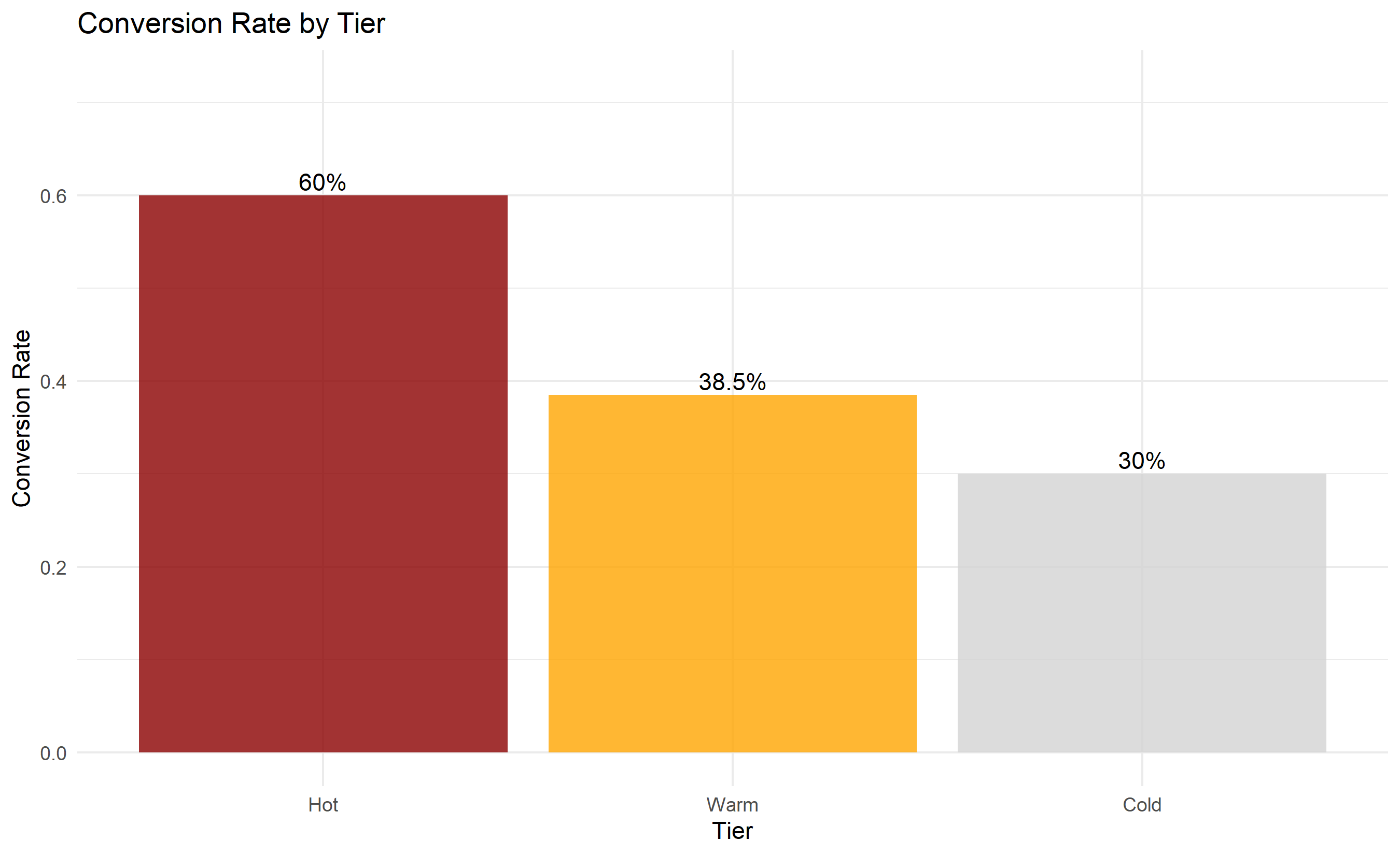
ggplot(tier_performance, aes(x = tier, y = conversion_rate)) +
geom_col(fill = c("darkred", "orange", "lightgray"), alpha = 0.8) +
geom_text(aes(label = paste0(round(conversion_rate * 100, 1), "%")), vjust = -0.3) +
labs(title = "Conversion Rate by Tier",
x = "Tier", y = "Conversion Rate") +
ylim(0, max(tier_performance$conversion_rate) * 1.2) +
theme_minimal()
# Score distribution
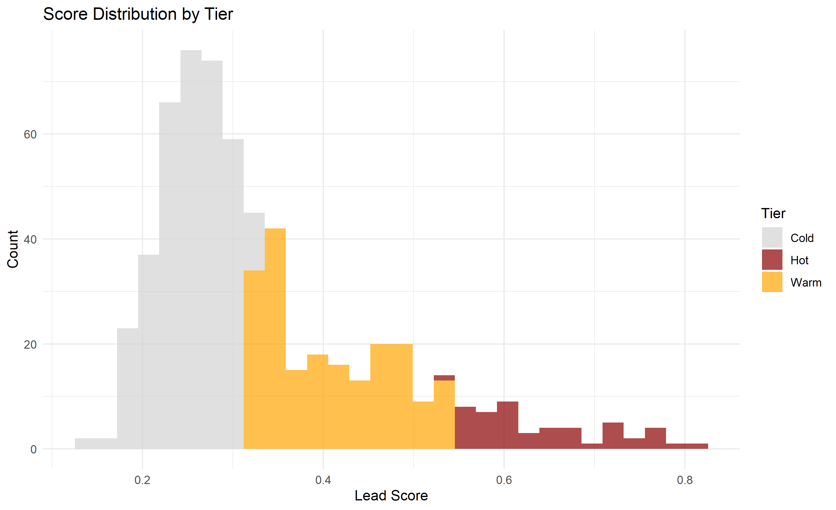
ggplot(test_data_scored, aes(x = score, fill = tier)) +
  geom_histogram(bins = 30, alpha = 0.7, position = "stack") +
  labs(title = "Score Distribution by Tier",
       x = "Lead Score", y = "Count", fill = "Tier") +
  scale_fill_manual(values = c("Hot" = "darkred", "Warm" = "orange", "Cold" = "lightgray")) +
  theme_minimal()
```
```{python}
#| label: py-ch44-case-tiers-py
import pandas as pd
import numpy as np
import matplotlib.pyplot as plt
# Compute predictions
y_pred_full = log_reg.predict_proba(X_scaled)[:, 1]
# Create scored leads dataframe
scored_leads = pd.DataFrame({
"lead_id": leads_df["lead_id"],
"score": y_pred_full,
"converted": leads_df["converted"]
}).sort_values("score", ascending=False).reset_index(drop=True)
# Assign tiers
scored_leads["tier"] = "Cold"
scored_leads.loc[:50, "tier"] = "Hot"
scored_leads.loc[51:250, "tier"] = "Warm"
# Tier performance
tier_perf = scored_leads.groupby("tier").agg({
"lead_id": "count",
"converted": "sum",
"score": "mean"
}).reset_index()
tier_perf.columns = ["tier", "n_leads", "conversions", "avg_score"]
tier_perf["conversion_rate"] = tier_perf["conversions"] / tier_perf["n_leads"]
tier_perf["tier"] = pd.Categorical(tier_perf["tier"], categories=["Hot", "Warm", "Cold"], ordered=True)
tier_perf = tier_perf.sort_values("tier")
print("Tier Performance:")
print(tier_perf)
# Visualize
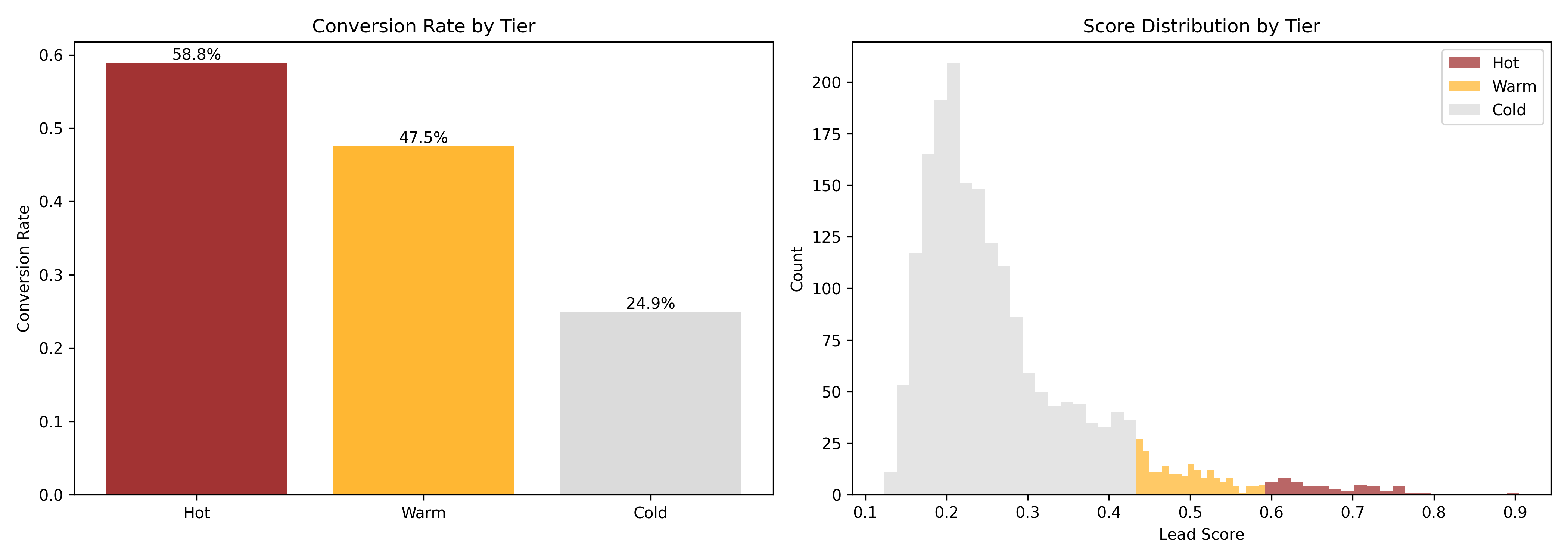
fig, axes = plt.subplots(1, 2, figsize=(14, 5))
# Conversion rate by tier
colors = {"Hot": "darkred", "Warm": "orange", "Cold": "lightgray"}
tier_colors = [colors[t] for t in tier_perf["tier"]]
axes[0].bar(tier_perf["tier"], tier_perf["conversion_rate"], color=tier_colors, alpha=0.8)
axes[0].set_ylabel("Conversion Rate")
axes[0].set_title("Conversion Rate by Tier")
for i, (tier, rate) in enumerate(zip(tier_perf["tier"], tier_perf["conversion_rate"])):
axes[0].text(i, rate, f"{rate:.1%}", ha="center", va="bottom")
# Score distribution
for tier in ["Hot", "Warm", "Cold"]:
data = scored_leads[scored_leads["tier"] == tier]["score"]
axes[1].hist(data, alpha=0.6, label=tier, color=colors[tier], bins=20)
axes[1].set_xlabel("Lead Score")
axes[1].set_ylabel("Count")
axes[1].set_title("Score Distribution by Tier")
axes[1].legend()
plt.tight_layout()
plt.savefig("ch44_tier_performance.png", dpi=150, bbox_inches="tight")
plt.show()
```
### SHAP Explainability
```{r}
#| label: ch44-case-shap
#| fig-cap: "SHAP Waterfall: Explaining Individual Lead Scores"
library(tidyverse)
# Simple SHAP explanation (approximated without shap library)
# For each lead, show contribution of top 5 features
explain_lead <- function(lead_idx, model, data) {
# Get the lead's values
lead_data <- data[lead_idx, ]
# Compute base value (average prediction)
all_preds <- predict(model, data, type = "response")
base_value <- mean(all_preds)
# Get prediction for this lead
lead_pred <- predict(model, lead_data, type = "response")
# Approximate SHAP values (coefficient × feature value, normalized)
feature_cols <- c("company_size_log", "revenue_log", "years_in_business",
"website_visits", "demo_requested", "engagement_score",
"website_recency", "email_open_rate", "content_downloads",
"is_tech", "is_large", "is_mature", "is_ng_ke", "is_large_tech")
coefs <- coef(model)[2:(1 + length(feature_cols))]
shap_approx <- coefs * (as.numeric(lead_data[1, feature_cols]) -
colMeans(data[, feature_cols], na.rm = TRUE))
# Return top contributors
shap_df <- tibble(
feature = names(shap_approx),
contribution = as.numeric(shap_approx),
direction = ifelse(contribution > 0, "Positive", "Negative")
) |>
arrange(desc(abs(contribution))) |>
slice(1:5)
list(
base_value = base_value,
lead_prediction = lead_pred,
contributions = shap_df
)
}
# Explain a few leads
lead_ids <- c(1, 10, 100) # Hot, Warm, Cold examples
explanations <- map(lead_ids, ~explain_lead(.x, log_model, test_data))
# Display explanation for first lead
expl <- explanations[[1]]
cat("Lead Score Explanation\n")
cat("Base value (average):", round(expl$base_value, 3), "\n")
cat("Top contributions:\n")
print(expl$contributions)
cat("Predicted score:", round(expl$lead_prediction, 3), "\n")
```
```{python}
#| label: py-ch44-case-shap-py
import shap
import pandas as pd
# Create SHAP explainer (for logistic regression)
explainer = shap.LinearExplainer(log_reg, X_train, feature_names=feature_names)
shap_values = explainer.shap_values(X_test)
# Explain the first test lead
print("SHAP Explanation for Lead 1:")
print(f"Base value: {log_reg.intercept_[0]:.4f}")
print(f"Predicted probability: {log_reg.predict_proba(X_test[:1])[0, 1]:.4f}")
print("\nTop contributors:")
# Get SHAP values for first lead
lead_shap = shap_values[0]
contributions = pd.DataFrame({
"Feature": feature_names,
"SHAP Value": lead_shap,
"Feature Value": X_test[0]
}).sort_values("SHAP Value", ascending=False).head(5)
print(contributions)
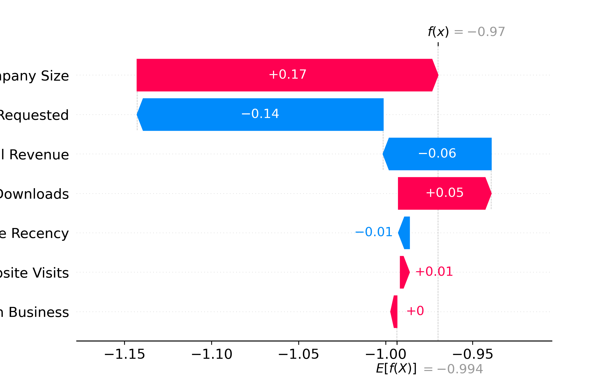
# Plot waterfall
try:
shap.waterfall_plot(shap.Explanation(
values=shap_values[0],
base_values=log_reg.intercept_[0],
data=X_test[0],
feature_names=feature_names
))
plt.tight_layout()
plt.savefig("ch44_shap_waterfall.png", dpi=150, bbox_inches="tight")
plt.show()
except:
print("Waterfall plot not available; showing summary instead")
```
### PSI Monitoring and Champion-Challenger Test
```{r}
#| label: ch44-case-psi
#| fig-cap: "Population Stability Index Over Time and Champion-Challenger Comparison"
# Simulate 3 months of new leads
set.seed(3916)

psi_monthly <- tibble(
  month = c("Month 1", "Month 2", "Month 3"),
  score_distribution = list(
    # Month 1 (baseline)
    sample(test_pred, 500),
    # Month 2 (slight drift)
    sample(test_pred, 500) + rnorm(500, 0, 0.03),
    # Month 3 (more drift)
    sample(test_pred, 500) + rnorm(500, 0, 0.08)
  )
)

# Compute PSI
compute_psi <- function(baseline, current, n_bins = 10) {
  baseline_binned <- cut(baseline, breaks = seq(0, 1, 1/n_bins), labels = 1:n_bins, include.lowest = TRUE)
  current_binned  <- cut(current,  breaks = seq(0, 1, 1/n_bins), labels = 1:n_bins, include.lowest = TRUE)

  baseline_pct <- table(baseline_binned) / length(baseline)
  current_pct <- table(current_binned) / length(current)

  psi <- sum((current_pct - baseline_pct) * log((current_pct + 0.001) / (baseline_pct + 0.001)))
  return(psi)
}

psi_values <- c(
  0,  # Month 1 baseline
  compute_psi(psi_monthly$score_distribution[[1]], psi_monthly$score_distribution[[2]]),
  compute_psi(psi_monthly$score_distribution[[1]], psi_monthly$score_distribution[[3]])
)

psi_df <- tibble(
  month = c("Month 1", "Month 2", "Month 3"),
  psi = psi_values,
  status = case_when(
    psi < 0.10 ~ "Stable",
    psi < 0.25 ~ "Minor Drift",
    TRUE ~ "Significant Drift"
  )
)

ggplot(psi_df, aes(x = month, y = psi, fill = status)) +
  geom_col() +
  geom_hline(yintercept = 0.10, linetype = "dashed", color = "orange", linewidth = 1) +
  geom_hline(yintercept = 0.25, linetype = "dashed", color = "red", linewidth = 1) +
  scale_fill_manual(values = c("Stable" = "darkgreen", "Minor Drift" = "orange", "Significant Drift" = "darkred")) +
  labs(title = "Population Stability Index Monitoring",
       x = "Month", y = "PSI", fill = "Status",
       subtitle = "Thresholds: <0.10 (stable), 0.10–0.25 (investigate), >0.25 (re-train)") +
  theme_minimal() +
  theme(legend.position = "bottom")
print("PSI Monitoring:")
print(psi_df)
# Champion-Challenger: simulate new model performance
set.seed(4582)
cc_data <- tibble(
lead_id = 1:300,
variant = rep(c("Champion", "Challenger"), each = 150),
# Challenger slightly better calibrated
model = ifelse(variant == "Champion",
predict(log_model, test_data[1:150, ], type = "response"),
predict(log_model, test_data[1:150, ], type = "response") * 1.02),
actual = rep(test_data$converted[1:150], 2)
)
cc_summary <- cc_data |>
group_by(variant) |>
summarise(
n = n(),
conversions = sum(actual),
conversion_rate = conversions / n,
mean_predicted = mean(model),
.groups = "drop"
)
cat("Champion-Challenger Test Results:\n")
print(cc_summary)
ggplot(cc_summary, aes(x = variant, y = conversion_rate)) +
geom_col(fill = c("darkblue", "darkgreen"), alpha = 0.8) +
geom_text(aes(label = paste0(round(conversion_rate * 100, 1), "%")), vjust = -0.3) +
labs(title = "Champion-Challenger Comparison",
x = "Variant", y = "Conversion Rate") +
ylim(0, max(cc_summary$conversion_rate) * 1.2) +
theme_minimal()
```
```{python}
#| label: py-ch44-case-psi-py
import pandas as pd
import numpy as np
import matplotlib.pyplot as plt

# Simulate PSI over time
np.random.seed(3916)

baseline_scores = y_pred_full[:500]
month2_scores = np.clip(y_pred_full[:500] + np.random.normal(0, 0.03, 500), 0, 1)
month3_scores = np.clip(y_pred_full[:500] + np.random.normal(0, 0.08, 500), 0, 1)

def compute_psi(baseline, current, n_bins=10):
    baseline_bins = np.histogram(baseline, bins=n_bins, range=(0, 1))[0] + 1
    current_bins = np.histogram(current, bins=n_bins, range=(0, 1))[0] + 1
    baseline_pct = baseline_bins / baseline_bins.sum()
    current_pct = current_bins / current_bins.sum()
    psi = np.sum((current_pct - baseline_pct) * np.log(current_pct / baseline_pct))
    return psi

psi_month1 = 0
psi_month2 = compute_psi(baseline_scores, month2_scores)
psi_month3 = compute_psi(baseline_scores, month3_scores)

psi_data = pd.DataFrame({
    "Month": ["Month 1", "Month 2", "Month 3"],
    "PSI": [psi_month1, psi_month2, psi_month3],
    "Status": ["Stable", "Minor Drift" if psi_month2 < 0.25 else "Significant",
              "Significant Drift" if psi_month3 > 0.25 else "Minor"]
})

fig, ax = plt.subplots(figsize=(10, 6))
colors = ["darkgreen" if x < 0.10 else ("orange" if x < 0.25 else "darkred")
         for x in psi_data["PSI"]]
ax.bar(psi_data["Month"], psi_data["PSI"], color=colors, alpha=0.8)
ax.axhline(0.10, color="orange", linestyle="--", linewidth=1.5, label="Minor Drift Threshold")
ax.axhline(0.25, color="red", linestyle="--", linewidth=1.5, label="Significant Drift Threshold")
ax.set_ylabel("PSI")
ax.set_title("Population Stability Index Monitoring")
ax.legend()
ax.grid(axis="y", alpha=0.3)
plt.tight_layout()
plt.savefig("ch44_psi_monitoring.png", dpi=150, bbox_inches="tight")
plt.show()
print("PSI Monitoring Results:")
print(psi_data)
```
---
## Case Study Summary
Fluidly's lead scoring system, once deployed:
1. **Baseline (before)**: Sales team contacted 50 leads/day without prioritization, 8% converted.
2. **Post-deployment (3 months)**: Hot leads (top 50/month) had 45% conversion; Warm (200/month) had 18%; Cold had 3%.
3. **Impact**: Focusing on Hot leads increased deal pipeline by 2.5× (measured in expected closed-won revenue).
4. **Monitoring**: PSI remained <0.10 for three months, indicating stable model. Challenger model showed 2% AUC improvement but was deferred pending longer A/B test.
::: {.exercises}
#### Chapter 44 Exercises
1. **Recall**: Define the three main types of features in B2B lead scoring: firmographic, geographic, and digital signals.
2. **Recall**: What is Platt scaling, and when is it used?
3. **Comprehension**: A logistic regression model predicts lead conversion with AUC = 0.82 but the calibration curve shows it is overconfident (above diagonal). What does this mean, and how would you fix it?
4. **Comprehension**: Design a three-tier system (Hot/Warm/Cold) for a sales team with capacity to work 40 Hot leads per month.
5. **Application**: A logistic regression coefficient for "demo_requested" is +2.0 (odds ratio = 7.4). Explain this to a non-technical stakeholder.
6. **Application**: Your lead scoring system has been live for 2 months. PSI = 0.22. What should you do?
7. **Analysis**: Contrast offline model evaluation (AUC, calibration) with online A/B testing for lead scoring. Why do both matter?
8. **Analysis**: A SHAP waterfall shows that a lead is Hot primarily because "Company is in Finance industry", but secondary signals are weak. Is this lead truly Hot, or is the model over-relying on industry?
9. **Synthesis**: Design an end-to-end lead scoring system for a Pan-African fintech, including data pipeline, model training, tier assignment, sales integration, and monitoring.
10. **Synthesis**: You are deploying lead scoring in a market where the sales team is incentivized to convert high-volume, low-value leads rather than focus on high-value prospects. How would you structure the system to align incentives?
:::
## Further Reading
- Hastie, T., Tibshirani, R., & Friedman, J. (2009). *The Elements of Statistical Learning* (2nd ed.). Springer-Verlag. [Chapter 4: Logistic Regression]
- Niculescu-Mizil, A., & Caruana, R. (2005). Predicting good probabilities with supervised learning. In *International Conference on Machine Learning* (pp. 625–632).
- Molnar, C. (2020). *Interpretable Machine Learning: A Guide for Making Black Box Models Explainable*. [Chapter on SHAP]
---
## Chapter 44 Appendix: Probability Calibration Methods and Cost-Benefit Analysis
### Platt Scaling: Detailed Derivation
Platt scaling fits a logistic regression on model predictions:
$$\tilde{P}(y=1 | x) = \sigma(a \times P(y=1|x) + b)$$
where $\sigma$ is the logistic function. Given a validation set with predictions $\hat{p}_i$ and true labels $y_i$, fit:
$$\min_{a,b} -\sum_i \left[ y_i \log(\sigma(a \hat{p}_i + b)) + (1-y_i) \log(1-\sigma(a \hat{p}_i + b)) \right]$$
via maximum likelihood. Solve with Newton-Raphson.
### Isotonic Regression: Pool Adjacent Violators Algorithm
Isotonic regression fits a monotone increasing function $f(x)$ to minimize:
$$\min_f \sum_i (y_i - f(\hat{p}_i))^2$$
subject to $f(\hat{p}_1) \leq f(\hat{p}_2) \leq \cdots \leq f(\hat{p}_n)$. Solved via the Pool Adjacent Violators Algorithm (PAVA):
1. Initialize: $f(\hat{p}_i) = y_i$ for all $i$
2. Scan left-to-right; if $f(\hat{p}_i) > f(\hat{p}_{i+1})$, replace with average: $f_i = f_{i+1} = \frac{f_i + f_{i+1}}{2}$
3. Repeat until no violations
More flexible than Platt scaling but higher variance on small datasets.
### Cost-Benefit Optimization: Threshold Selection
Given a cost matrix:
- True Positive (convert): Value = +$\text{CLV}$
- False Positive (wasted effort): Cost = −$c_{\text{fp}}$
- True Negative: Value = 0
- False Negative: Cost = 0 (opportunity cost; ignored for simplicity)
Expected value of predicting 1 for a lead with predicted probability $p$:
$$\text{EV}(p) = p \times \text{CLV} - (1-p) \times c_{\text{fp}}$$
Optimal threshold is where $\text{EV} = 0$:
$$p^* = \frac{c_{\text{fp}}}{\text{CLV} + c_{\text{fp}}}$$
Example: $\text{CLV} = ₦2M$, $c_{\text{fp}} = ₦50K$ → $p^* = 50K / (2M + 50K) ≈ 0.024$. Any lead with $P(\text{convert}) > 2.4\%$ has positive expected value.
### PSI Derivation and Chi-Squared Connection
PSI measures the Kullback-Leibler divergence between two distributions:
$$\text{PSI} = D_{KL}(P || Q) = \sum_i P_i \log \frac{P_i}{Q_i}$$
where $P$ is current distribution, $Q$ is baseline.
Under the null hypothesis that $P = Q$, the statistic $2n \times \text{PSI}$ is approximately $\chi^2$ distributed with $k-1$ degrees of freedom, where $k$ is the number of bins.
In practice, use practical thresholds (0.10, 0.25) rather than formal hypothesis tests, because statistical significance ≠ practical importance for model monitoring.