---
title: "Customer Experience and Web/Social Analytics"
---
```{python}
#| label: python-setup-43-customer-experience-web
#| include: false
import numpy as np
import pandas as pd
import matplotlib.pyplot as plt
import seaborn as sns
from scipy.stats import beta
```
::: {.callout-note icon="false"}
## 📋 Learning Objectives
- Map the omnichannel customer journey: awareness, consideration, purchase, use, retention, advocacy
- Master web analytics fundamentals: sessions, users, funnels, bounce rates, conversion
- Understand and implement attribution models: first-touch, last-touch, linear, time-decay, data-driven
- Analyse social media metrics: reach, engagement, follower growth, sentiment, share of voice
- Build cohort retention analysis to track customer groups over time
- Design and analyse A/B tests for UX improvements using Bayesian methods
- Create dashboards that integrate CX metrics across channels
:::
## The Customer Journey: Touchpoints and Omnichannel Experience
Every customer travels a journey. For a Nigerian e-commerce customer buying a phone:
- **Awareness**: Sees an Instagram ad for the phone
- **Consideration**: Visits the website, reads product reviews, compares prices
- **Purchase**: Adds to cart, checks out, pays
- **Use**: Receives the phone, unboxes it, uses it daily
- **Retention**: Leaves a review, signs up for the loyalty program, buys a case
- **Advocacy**: Recommends to a friend, posts unboxing video on TikTok
At each stage, data is generated. Instagram records the impression (was the ad shown?), the click (did they click?). The website captures pageviews, time spent, scroll depth. Checkout captures cart abandonment. Post-purchase email tracking captures opens and clicks. Social mentions capture advocacy.
**Omnichannel** means the customer moves fluidly between channels: they might research on the app, complete the purchase via web, call customer service by phone, post on social media. The experience should be seamless. From an analytics perspective, omnichannel means integrating data across all channels into a unified view of the customer.
**The Role of Data**: At each stage, analytics answers different questions:
- Awareness: How many people saw the ad? What was the reach?
- Consideration: How many visited the website? What content did they engage with?
- Purchase: How many converted? What was the funnel drop-off?
- Retention: How many are still active after 30 days? 90 days?
- Advocacy: How many referred friends? What is the NPS?
By connecting these metrics, you can compute the customer lifetime value and optimize the journey.
## Web Analytics Fundamentals: Funnels and Conversion
**Sessions and Users**:
- A **user** is a unique individual (identified by a user ID, cookie, or device ID)
- A **session** is a single visit by a user within a time window (e.g., 30 minutes of inactivity ends the session)
- One user can have many sessions (Monday and Friday are two sessions)
**Key Web Metrics**:
- **Pageviews**: Total pages viewed (counted multiple times if user re-visits)
- **Unique Pageviews**: Number of sessions in which that page was viewed (one per session max)
- **Bounce Rate**: % of sessions that viewed only one page and left; high bounce rate suggests the page didn't engage the user
- **Pages per Session**: Average number of pages viewed per session
- **Time on Page**: Average time spent on a page (lower = bad, unless it's a thank-you page)
- **Time on Site**: Average session duration
**The Conversion Funnel**: A funnel shows drop-off at each stage:
- Landing Page → Product Pages → Cart → Checkout → Confirmation
Example funnel for a Nigerian e-commerce site:
- Step 1 (Landing Page): 10,000 sessions
- Step 2 (Category Page): 7,000 (30% drop-off)
- Step 3 (Product Page): 5,000 (29% drop-off)
- Step 4 (Add to Cart): 3,000 (40% drop-off)
- Step 5 (Checkout): 2,200 (27% drop-off)
- Step 6 (Confirmation): 1,800 (18% drop-off)
**Conversion Rate** = (Confirmations / Landing Sessions) × 100% = 1,800 / 10,000 = 18%
Each drop represents an opportunity for optimization. Reducing drop-off at Step 3 (Product Page → Cart) from 40% to 30% would add 500 conversions, a 28% improvement.
## Attribution Modelling: The Credit Assignment Problem
When a customer converts, which marketing channel deserves credit? A customer might:
1. See a Google search ad (Day 1)
2. Visit the website (Day 1)
3. Leave without converting
4. Receive a retargeting display ad (Day 3)
5. Click and return (Day 3)
6. Browse but don't convert
7. Receive an email reminder (Day 5)
8. Click and purchase (Day 5)
Should credit go to Google (first touch), Email (last touch), or all three?
**Five Common Attribution Models**:
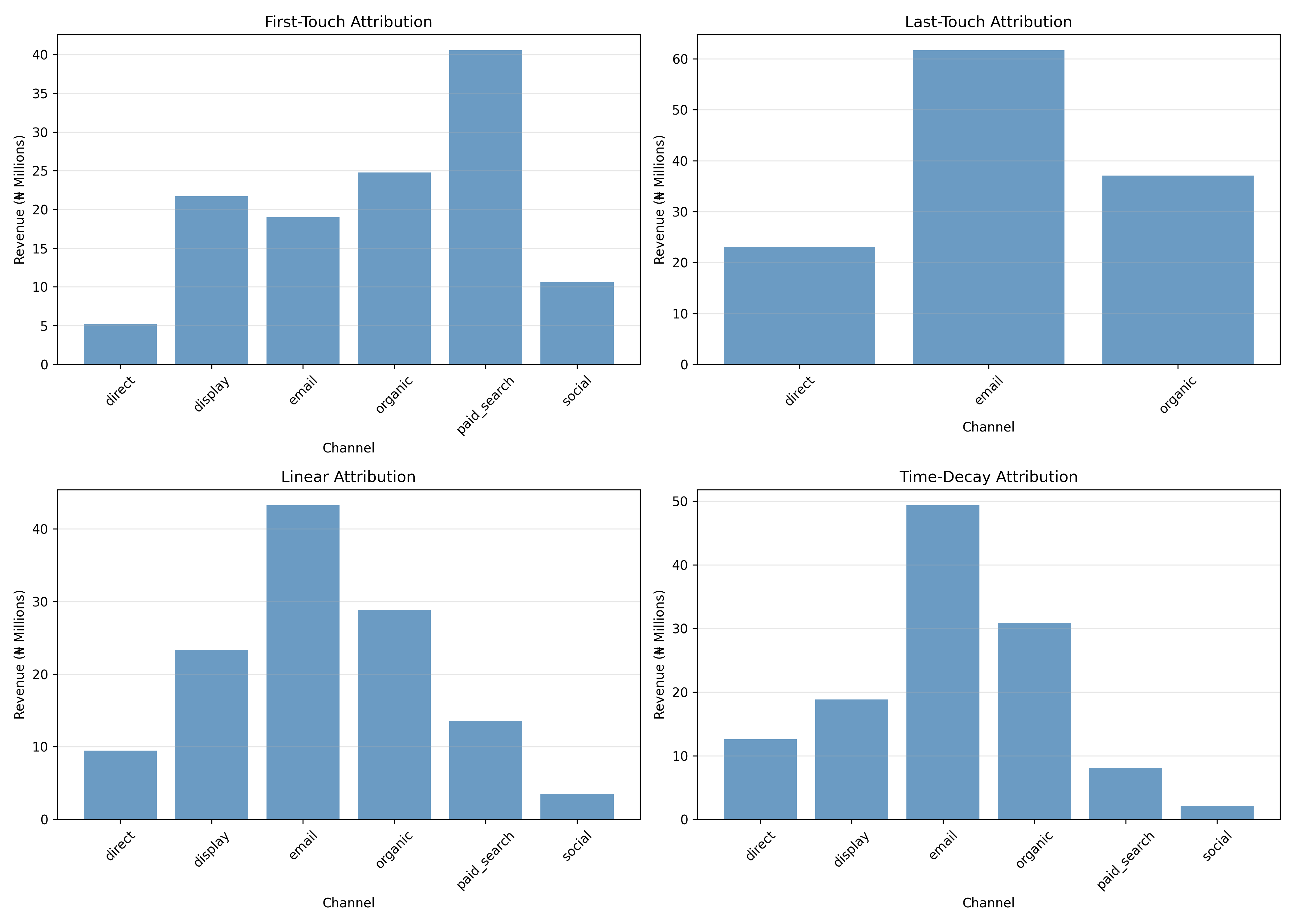
1. **First-Touch**: All credit to Google. Good for measuring brand awareness campaigns.
2. **Last-Touch**: All credit to Email. Good for measuring direct response, but ignores earlier touchpoints.
3. **Linear**: 1/3 credit to each channel. Fair but ignores timing.
4. **Time-Decay**: 50% to Email, 30% to Display, 20% to Google (reverse order of occurrence). Recent touchpoints matter more.
5. **Data-Driven (Shapley Value)**: Uses machine learning to estimate each channel's causal contribution (see Chapter 16 for Shapley details). Most sophisticated but requires sufficient data.
**Practical Use**:
- Brand campaigns: Use first-touch to measure awareness
- Performance campaigns: Use last-touch to measure direct response
- Budget allocation: Use data-driven or time-decay to understand true channel contribution
## Social Media Analytics: Engagement and Sentiment
**Core Social Media Metrics**:
- **Reach**: Unique users who saw your content
- **Impressions**: Total times your content was displayed (one user can generate multiple)
- **Engagement**: Likes, comments, shares, retweets
- **Engagement Rate**: (Engagement / Impressions) × 100%
- **Follower Growth**: Net change in followers (sign-up minus churn)
- **Share of Voice**: Your brand mentions / (Your mentions + Competitor mentions)
**Nigerian Social Media Context**: The platform landscape differs from global norms:
- **Twitter/X**: Used heavily for real-time discussion, news, customer service complaints
- **Instagram**: FMCG brands and e-commerce thrive; visual products
- **TikTok**: Growing rapidly; short-form entertainment and product reviews
- **Facebook**: Still large but aging demographic; good for community building
- **WhatsApp**: Not publicly postable but critical for customer communication
**Sentiment Analysis**: Classify social mentions as positive, negative, or neutral. Tools like TextBlob (Python) or VADER (R) provide sentiment scores; more sophisticated fine-tuned BERT models improve accuracy.
**Example Dashboard**:
- Twitter Mentions: 1,500 last month, 62% positive, trending topics: #BankAppDown (80 mentions, 10% positive)
- Instagram Posts: 8,000 impressions per post, 4.2% engagement rate (good for FMCG)
- TikTok Videos: 250K views, 15K likes, 500 comments (viral for that brand)
## Cohort Analysis: Tracking Customer Groups Over Time
A cohort is a group of customers acquired in the same period. Cohort analysis tracks their behavior over time. Example: customers acquired in January 2025, February 2025, March 2025 are three cohorts.
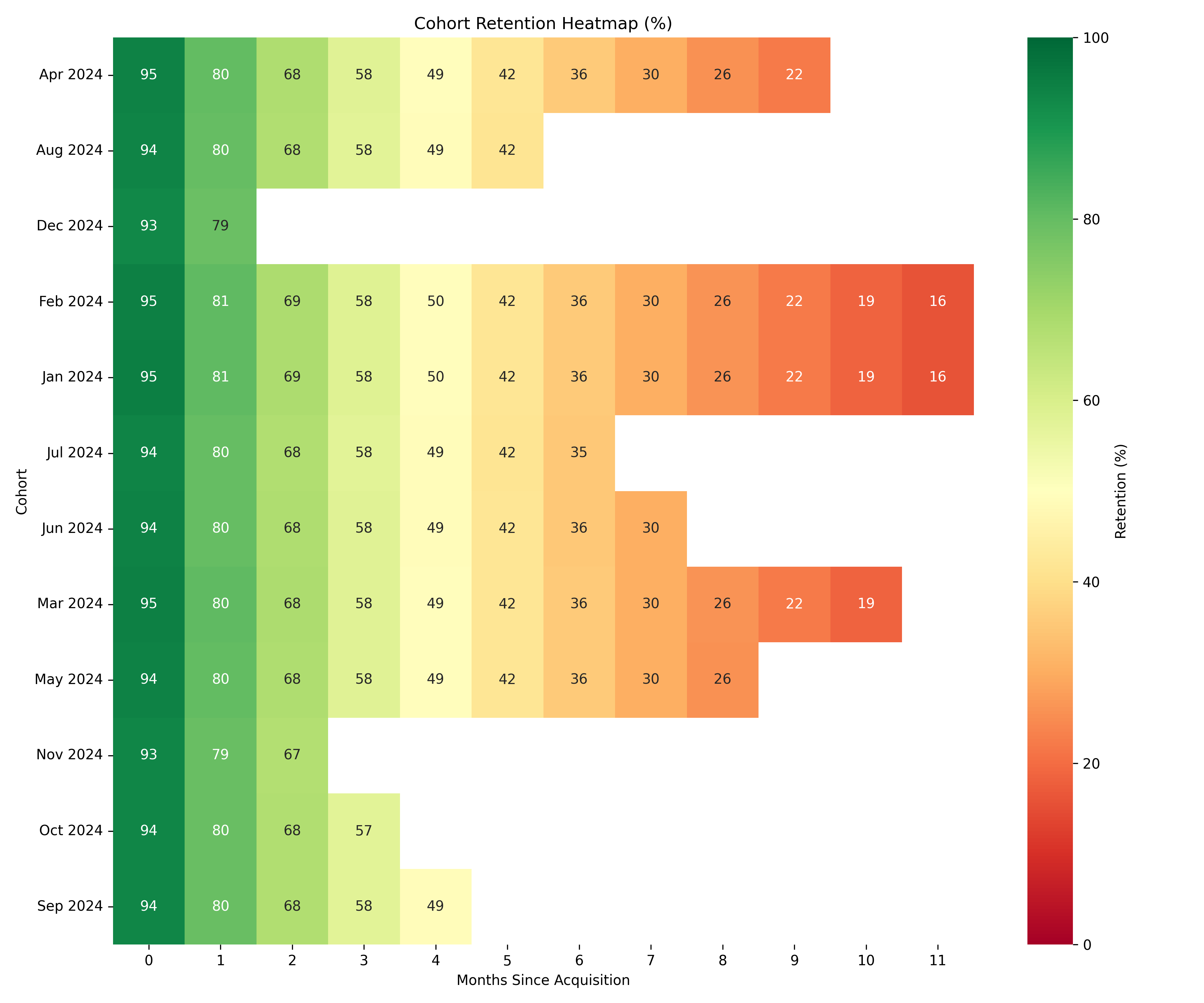
**Cohort Retention Matrix**: Rows are cohorts (acquisition month), columns are months since acquisition (0, 1, 2, 3...). Each cell is the % of customers from that cohort still active at that point.
Example:
|Cohort|Month 0|Month 1|Month 2|Month 3|
|---|---|---|---|---|
|Jan 2025|100%|75%|60%|50%|
|Feb 2025|100%|72%|58%|48%|
|Mar 2025|100%|70%|55%|-|
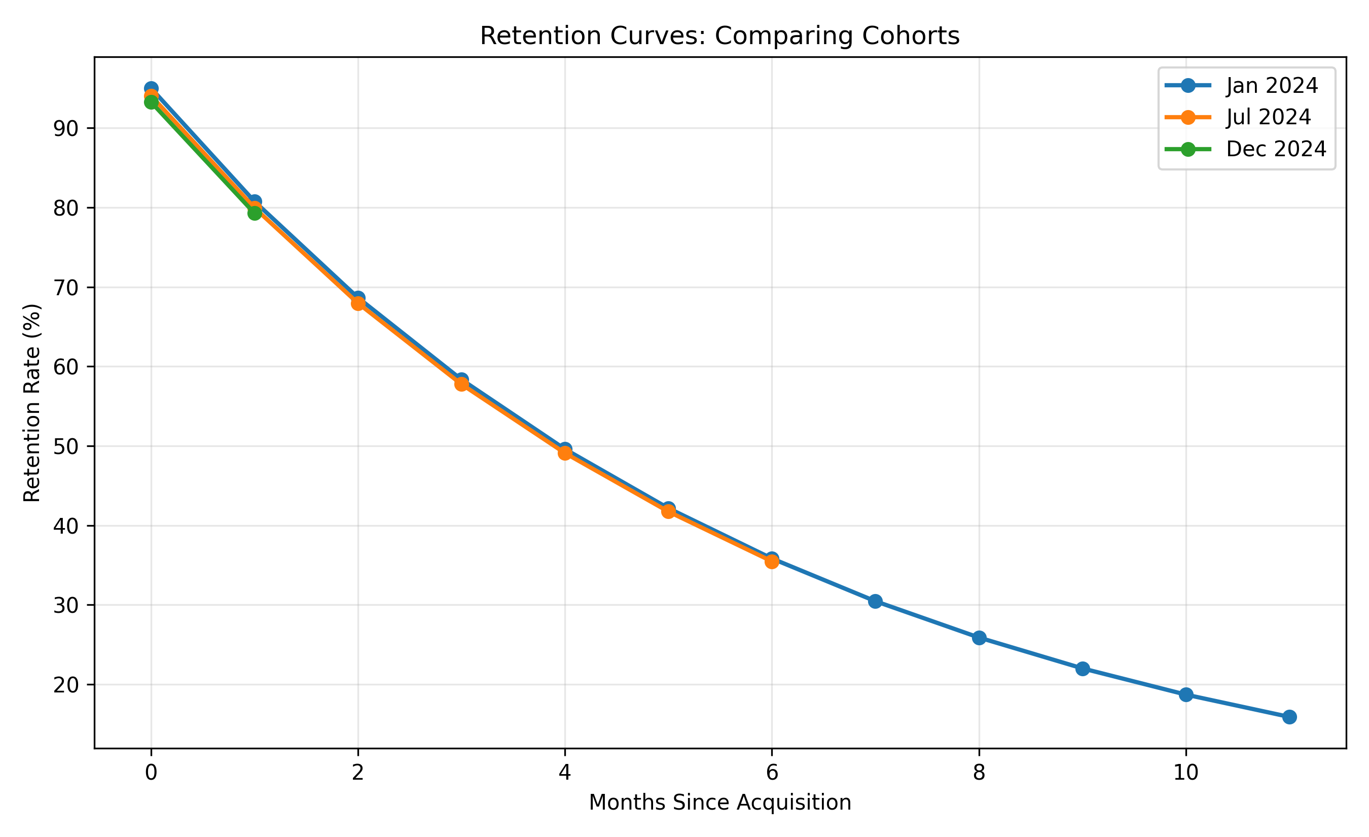
All cohorts start at 100% (by definition, the cohort includes everyone acquired that month). By month 1, Jan cohort drops to 75% (25% churn). By month 3, it's 50% (50% churn over 3 months).
**Interpretation**:
- If all cohorts follow the same retention curve, product quality is stable.
- If recent cohorts have lower retention (March < February < January), product has degraded or market conditions changed.
- If retention improves for recent cohorts (March > February > January), you're improving the product or targeting better customers.
**Revenue Cohort Analysis**: Instead of just retention %, track revenue from each cohort over time. This captures both churn and spending changes.
## A/B Testing for Customer Experience Improvements
When deciding whether to redesign a checkout flow, change an email subject line, or modify a landing page, run an A/B test (or multivariate test for multiple changes). The gold standard is randomization: split users into A (control, old version) and B (treatment, new version), show each group their version, and measure the outcome (conversion rate, average order value, engagement, etc.).
**Bayesian A/B Test** (from Chapter 7) is ideal for CX because:
- You can stop early when there's sufficient evidence
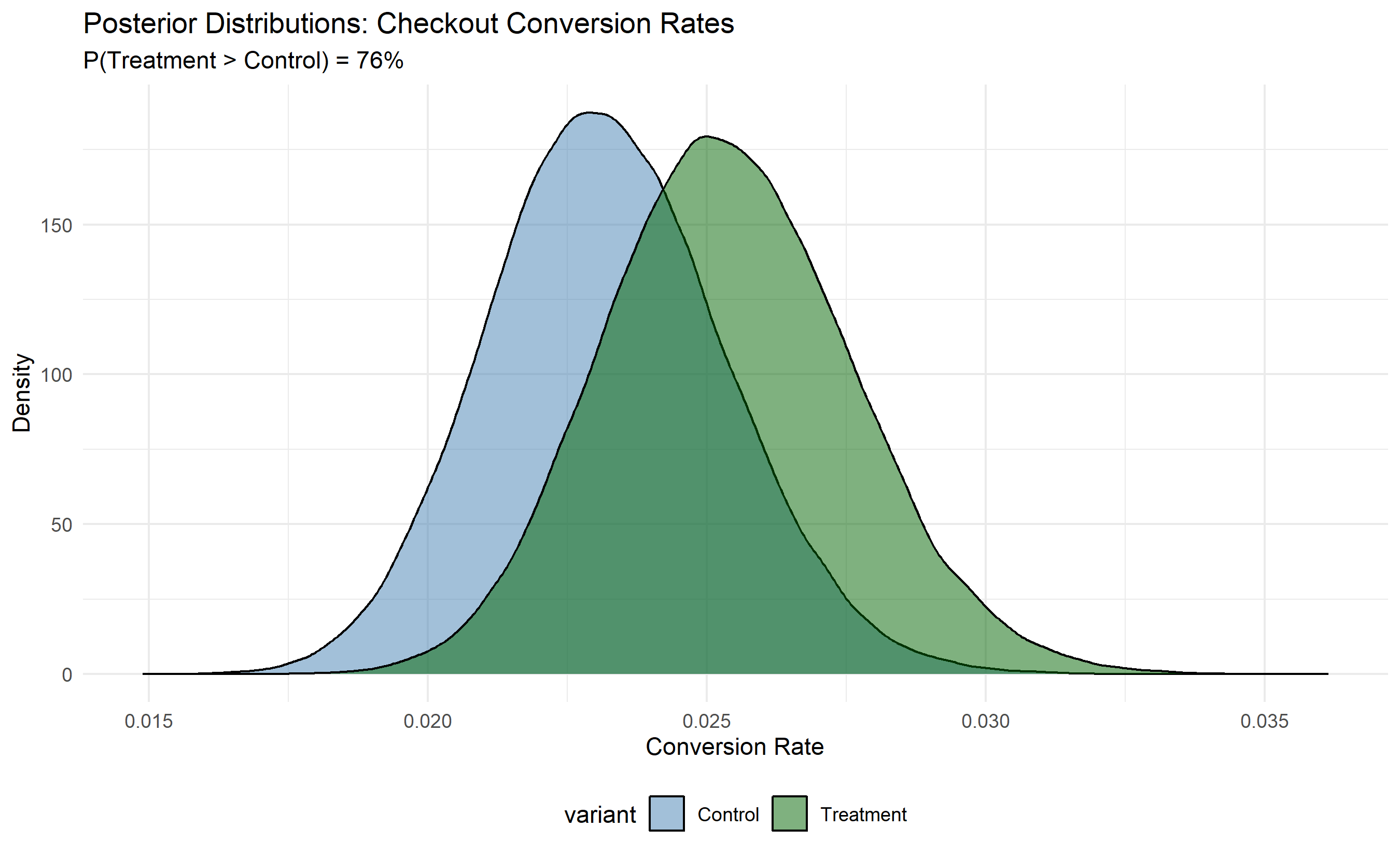
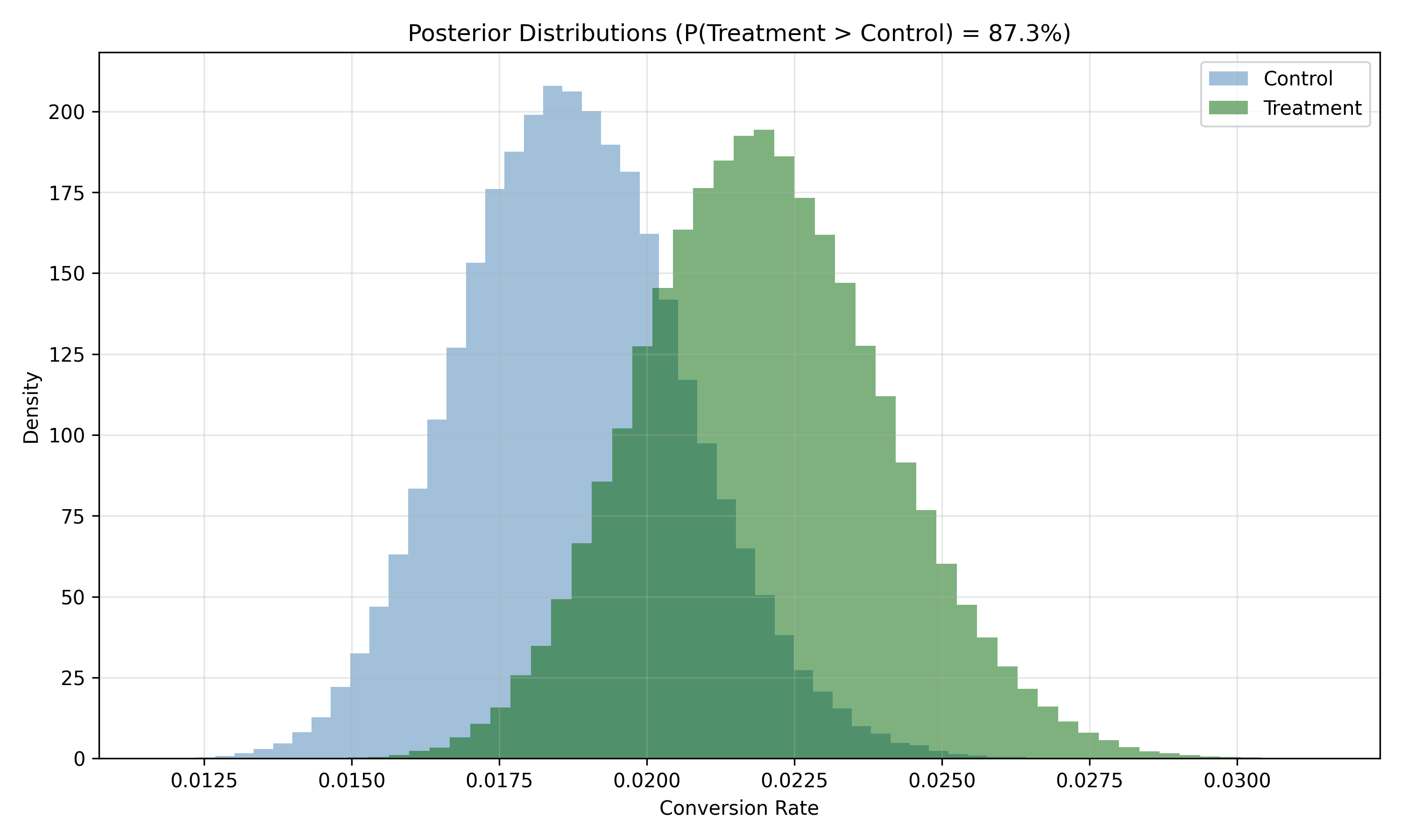
- You get a probabilistic answer ("Treatment B has 94% probability of being better")
- You account for practical significance, not just statistical significance
Example: A/B test two checkout designs on 10,000 users:
- Version A (control): 1,800 conversions out of 5,000 users = 36% conversion rate
- Version B (treatment): 1,950 conversions out of 5,000 users = 39% conversion rate
Fit Beta-Binomial models to each group. Posterior probability that B > A is 92%. Conclusion: B is likely better; adopt it.
## Dashboarding Customer Experience Metrics
A comprehensive CX dashboard integrates:
- **Web Funnel**: Landing → Product → Cart → Checkout → Confirmation (weekly)
- **Cohort Retention**: Monthly cohort retention matrix heatmap (updated monthly)
- **NPS Trend**: NPS over time by segment (monthly)
- **Attribution**: Revenue by channel (weekly)
- **Social Sentiment**: % positive mentions by brand/competitor (weekly)
- **A/B Tests**: Active experiments, current winner, sample size, days remaining
The dashboard has three audiences:
- **Executive**: Single-page KPI view (NPS, conversion rate, churn)
- **Operational**: Detailed funnel and cohort views for daily decision-making
- **Analytics**: Deep dives with drill-downs and filtering
::: {.callout-caution icon="false"}
## 📝 Section 43.7 Review Questions
1. Define "omnichannel" and explain how it differs from multichannel. What data integration challenges arise?
2. A funnel shows: Landing (1,000) → Product (800) → Cart (400) → Checkout (300). What is the conversion rate and where is the largest drop-off?
3. Explain why last-touch attribution often overestimates the value of display and email channels.
4. A cohort acquired in January has 50% retention at month 3. Is this good or bad? How would you benchmark it?
5. Design an A/B test for a Nigerian bank's mobile app onboarding flow. What is your success metric?
:::
## Case Study: E-Commerce Funnel Analysis and Attribution for a Nigerian Online Retailer {#sec-ch43-case}
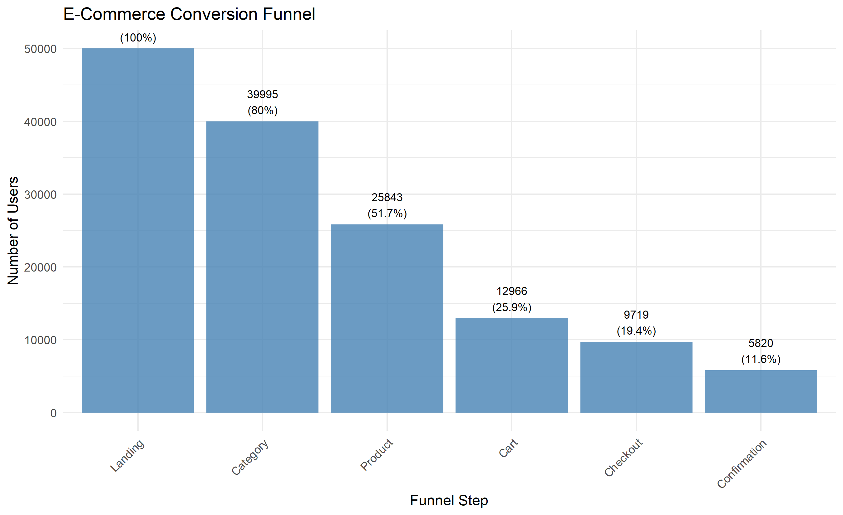
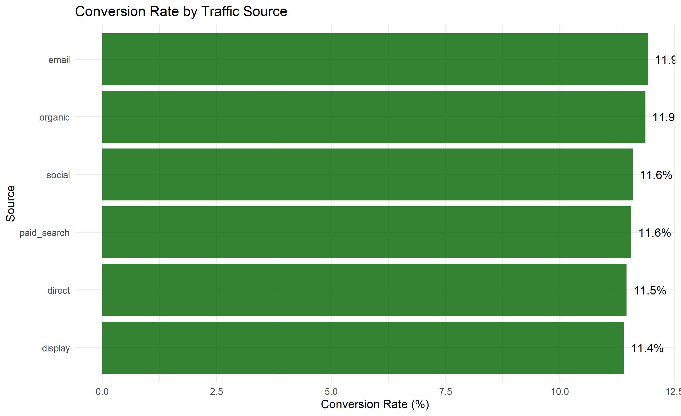
**Background**: ShopNigeria is a fictional e-commerce platform (fashion, electronics, FMCG). With operations across Lagos, Abuja, and other cities, they attract 50,000 monthly sessions. The team wants to understand conversion funnel drop-off and improve the checkout experience.
**Data**:
- Sessions with source (organic, paid_search, display, email, social, direct)
- Funnel steps: landing_page, category, product, cart, checkout, confirmation
- Socio-demographic: device (mobile, desktop), location, user_id (for return visitor tracking)
### Funnel Analysis and Drop-Off Identification
```{r}
#| label: ch43-case-funnel
#| fig-cap: "Conversion Funnel and Step-by-Step Drop-Off"
library(tidyverse)
library(ggplot2)
set.seed(6129)
# Synthetic e-commerce funnel data
n_sessions <- 50000
sessions_df <- tibble(
session_id = 1:n_sessions,
source = sample(c("organic", "paid_search", "display", "email", "social", "direct"),
n_sessions, replace = TRUE,
prob = c(0.25, 0.30, 0.15, 0.10, 0.10, 0.10)),
device = sample(c("mobile", "desktop"), n_sessions, replace = TRUE, prob = c(0.60, 0.40)),
location = sample(c("Lagos", "Abuja", "Kano", "Other"), n_sessions, replace = TRUE,
prob = c(0.45, 0.25, 0.15, 0.15))
) |>
mutate(
# Funnel progression: each step has a conditional probability of moving to the next
viewed_category = runif(n_sessions) < 0.80,
viewed_product = ifelse(viewed_category,
runif(n_sessions) < 0.65,
FALSE),
added_to_cart = ifelse(viewed_product,
runif(n_sessions) < 0.50,
FALSE),
started_checkout = ifelse(added_to_cart,
runif(n_sessions) < 0.75,
FALSE),
completed = ifelse(started_checkout,
runif(n_sessions) < 0.60,
FALSE)
)
# Compute funnel metrics
funnel_summary <- tibble(
step = c("Landing", "Category", "Product", "Cart", "Checkout", "Confirmation"),
users = c(
nrow(sessions_df),
sum(sessions_df$viewed_category),
sum(sessions_df$viewed_product),
sum(sessions_df$added_to_cart),
sum(sessions_df$started_checkout),
sum(sessions_df$completed)
)
) |>
mutate(
dropoff = users - lead(users, default = 0),
dropoff_pct = dropoff / users * 100,
retention_pct = users / first(users) * 100
)
print("Funnel Summary:")
print(funnel_summary)
# Visualize funnel
ggplot(funnel_summary, aes(x = reorder(step, -users), y = users)) +
geom_col(fill = "steelblue", alpha = 0.8) +
geom_text(aes(label = paste0(users, "\n(", round(retention_pct, 1), "%)")),
vjust = -0.3, size = 3) +
labs(title = "E-Commerce Conversion Funnel",
x = "Funnel Step", y = "Number of Users") +
theme_minimal() +
theme(axis.text.x = element_text(angle = 45, hjust = 1))
# Overall conversion rate
conversion_rate <- sum(sessions_df$completed) / nrow(sessions_df) * 100
cat("Overall Conversion Rate:", conversion_rate, "%\n")
# Conversion by device
conv_by_device <- sessions_df |>
group_by(device) |>
summarise(
sessions = n(),
conversions = sum(completed),
conversion_rate = conversions / sessions * 100
)
print("\nConversion by Device:")
print(conv_by_device)
# Conversion by source
conv_by_source <- sessions_df |>
group_by(source) |>
summarise(
sessions = n(),
conversions = sum(completed),
conversion_rate = conversions / sessions * 100
) |>
arrange(desc(conversion_rate))
print("\nConversion by Source:")
print(conv_by_source)
ggplot(conv_by_source, aes(y = reorder(source, conversion_rate), x = conversion_rate)) +
geom_col(fill = "darkgreen", alpha = 0.8) +
geom_text(aes(label = paste0(round(conversion_rate, 1), "%")), hjust = -0.2) +
labs(title = "Conversion Rate by Traffic Source",
y = "Source", x = "Conversion Rate (%)") +
theme_minimal()
```
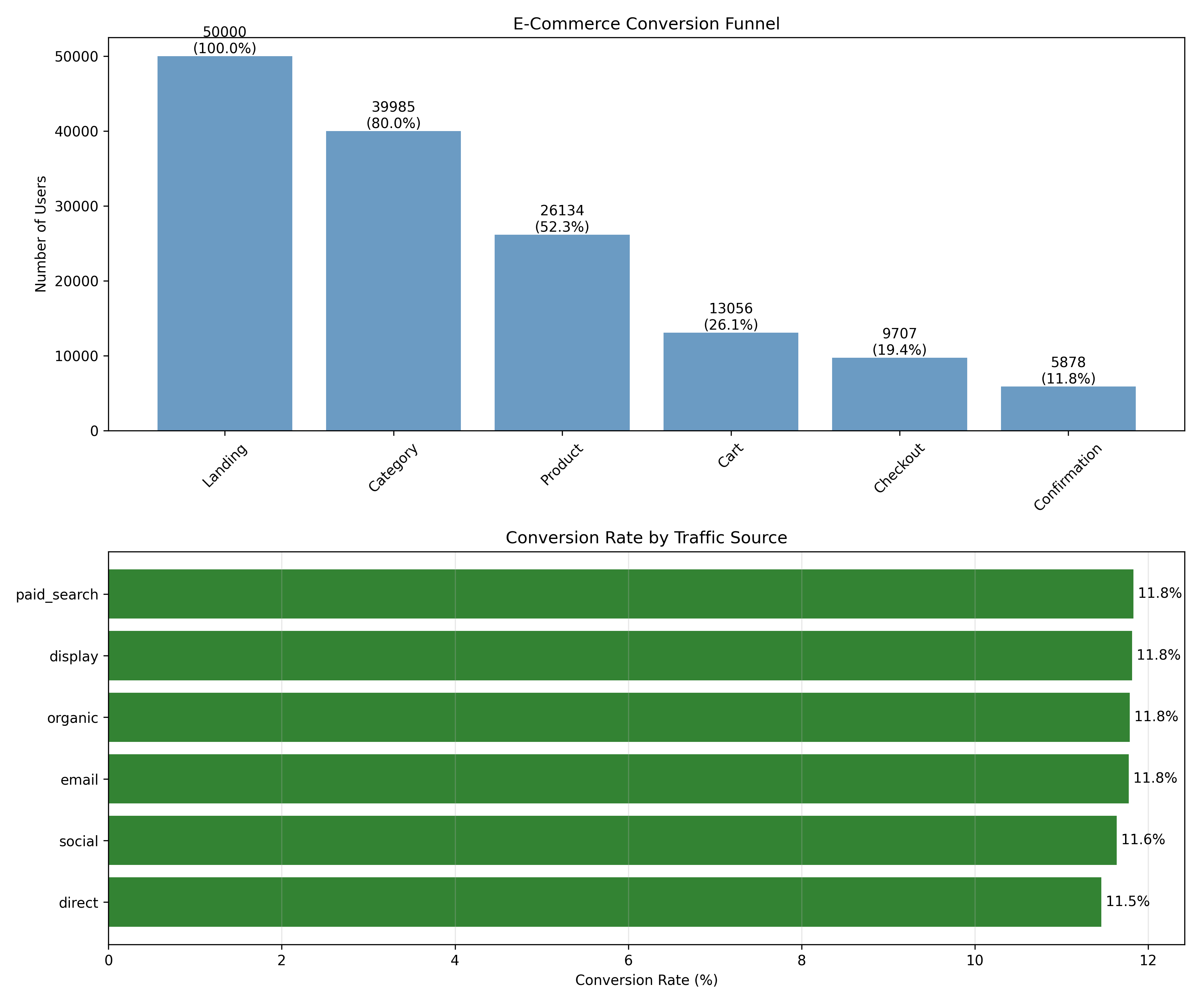
```{python}
#| label: py-ch43-case-funnel
import pandas as pd
import numpy as np
import matplotlib.pyplot as plt
np.random.seed(6129)
# Synthetic funnel data
n_sessions = 50000
sources = np.random.choice(["organic", "paid_search", "display", "email", "social", "direct"],
n_sessions, p=[0.25, 0.30, 0.15, 0.10, 0.10, 0.10])
devices = np.random.choice(["mobile", "desktop"], n_sessions, p=[0.60, 0.40])
# Funnel progression
viewed_category = np.random.random(n_sessions) < 0.80
viewed_product = viewed_category & (np.random.random(n_sessions) < 0.65)
added_to_cart = viewed_product & (np.random.random(n_sessions) < 0.50)
started_checkout = added_to_cart & (np.random.random(n_sessions) < 0.75)
completed = started_checkout & (np.random.random(n_sessions) < 0.60)
sessions_df = pd.DataFrame({
"session_id": np.arange(1, n_sessions + 1),
"source": sources,
"device": devices,
"viewed_category": viewed_category,
"viewed_product": viewed_product,
"added_to_cart": added_to_cart,
"started_checkout": started_checkout,
"completed": completed
})
# Funnel summary
funnel_steps = ["Landing", "Category", "Product", "Cart", "Checkout", "Confirmation"]
funnel_users = [
n_sessions,
viewed_category.sum(),
viewed_product.sum(),
added_to_cart.sum(),
started_checkout.sum(),
completed.sum()
]
funnel_df = pd.DataFrame({
"step": funnel_steps,
"users": funnel_users
})
funnel_df["dropoff"] = funnel_df["users"].diff().abs().fillna(0)
funnel_df["retention_pct"] = funnel_df["users"] / funnel_df["users"].iloc[0] * 100
print("Funnel Summary:")
print(funnel_df)
# Visualize
fig, axes = plt.subplots(2, 1, figsize=(12, 10))
# Funnel bar chart
axes[0].bar(funnel_df["step"], funnel_df["users"], color="steelblue", alpha=0.8)
for i, (step, users, ret) in enumerate(zip(funnel_df["step"], funnel_df["users"], funnel_df["retention_pct"])):
axes[0].text(i, users, f"{int(users)}\n({ret:.1f}%)", ha="center", va="bottom")
axes[0].set_ylabel("Number of Users")
axes[0].set_title("E-Commerce Conversion Funnel")
axes[0].tick_params(axis="x", rotation=45)
# Conversion by source
conv_by_source = sessions_df.groupby("source").agg({
"session_id": "count",
"completed": "sum"
}).reset_index()
conv_by_source.columns = ["source", "sessions", "conversions"]
conv_by_source["conversion_rate"] = conv_by_source["conversions"] / conv_by_source["sessions"] * 100
conv_by_source = conv_by_source.sort_values("conversion_rate", ascending=True)
axes[1].barh(conv_by_source["source"], conv_by_source["conversion_rate"], color="darkgreen", alpha=0.8)
for i, (source, rate) in enumerate(zip(conv_by_source["source"], conv_by_source["conversion_rate"])):
axes[1].text(rate, i, f" {rate:.1f}%", va="center")
axes[1].set_xlabel("Conversion Rate (%)")
axes[1].set_title("Conversion Rate by Traffic Source")
axes[1].grid(axis="x", alpha=0.3)
plt.tight_layout()
plt.savefig("ch43_funnel_analysis.png", dpi=150, bbox_inches="tight")
plt.show()
print(f"\nOverall Conversion Rate: {completed.sum() / n_sessions * 100:.2f}%")
```
### Attribution Modelling
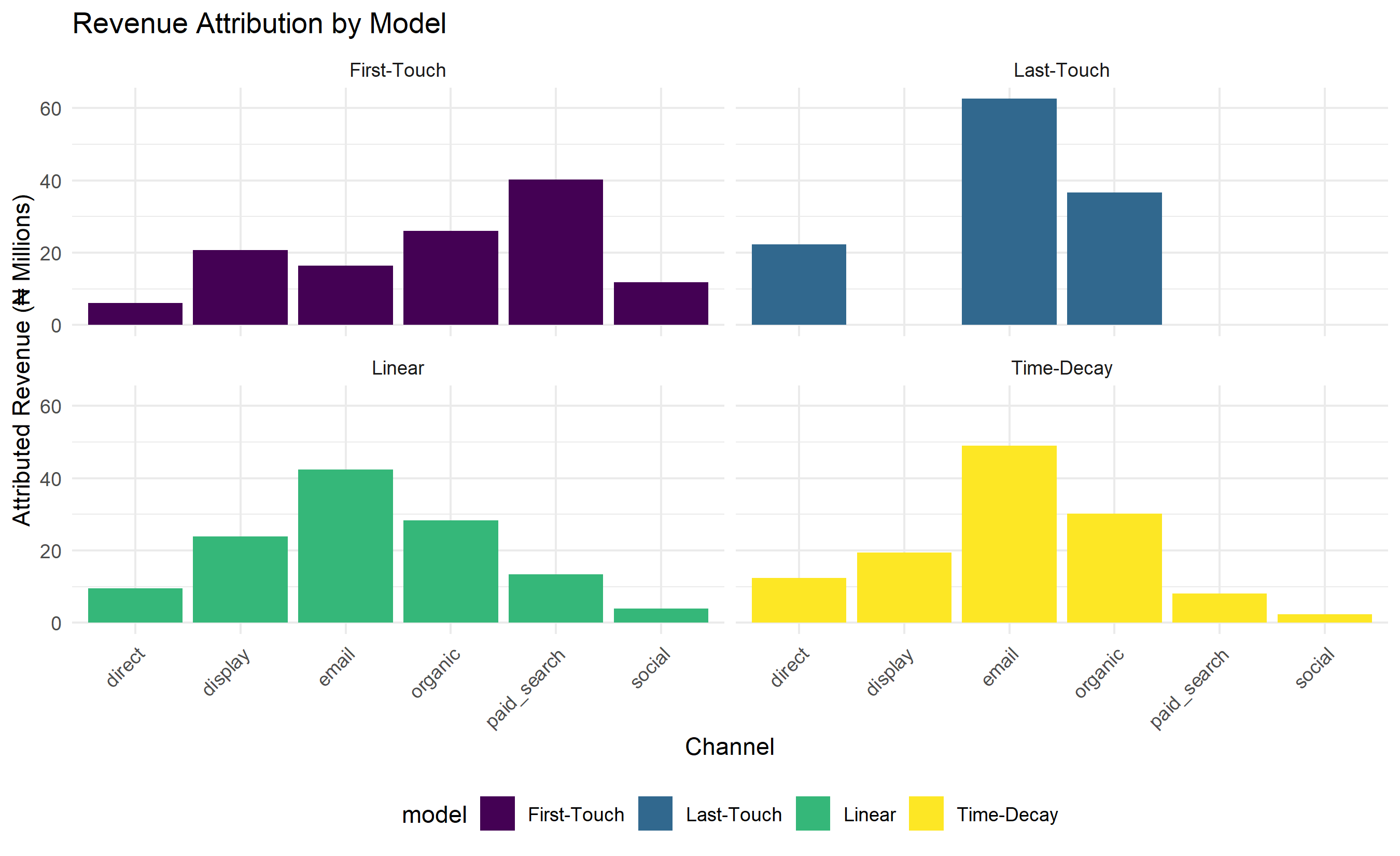
```{r}
#| label: ch43-case-attribution
#| fig-cap: "Revenue Attribution by Channel Under Different Models"
# Simulate multi-touch conversion paths
set.seed(9453)
n_conversions <- 2000

conversions_df <- tibble(
  conversion_id = 1:n_conversions,
  # Simulate typical path: Google Ads → Display Retargeting → Email → Conversion
  first_touch = sample(c("organic", "paid_search", "display", "email", "social", "direct"),
                      n_conversions, replace = TRUE,
                      prob = c(0.2, 0.35, 0.15, 0.15, 0.10, 0.05)),
  middle_touch = sample(c("display", "email", "organic"),
                       n_conversions, replace = TRUE,
                       prob = c(0.4, 0.4, 0.2)),
  last_touch = sample(c("email", "organic", "direct"),
                     n_conversions, replace = TRUE,
                     prob = c(0.50, 0.30, 0.20)),
  revenue_ngn = rgamma(n_conversions, shape = 2, scale = 30000)
)

# Compute attribution under different models
attribution_results <- tibble()

# 1. First-Touch
first_touch_attr <- conversions_df |>
  group_by(first_touch) |>
  summarise(revenue = sum(revenue_ngn), .groups = "drop") |>
  mutate(model = "First-Touch", channel = first_touch) |>
  select(model, channel, revenue)

# 2. Last-Touch
last_touch_attr <- conversions_df |>
  group_by(last_touch) |>
  summarise(revenue = sum(revenue_ngn), .groups = "drop") |>
  mutate(model = "Last-Touch", channel = last_touch) |>
  select(model, channel, revenue)

# 3. Linear (equal credit to first, middle, last)
linear_attr <- bind_rows(
  conversions_df |> group_by(first_touch) |>
    summarise(revenue = sum(revenue_ngn) / 3, .groups = "drop") |>
    mutate(channel = first_touch),
  conversions_df |> group_by(middle_touch) |>
    summarise(revenue = sum(revenue_ngn) / 3, .groups = "drop") |>
    mutate(channel = middle_touch),
  conversions_df |> group_by(last_touch) |>
    summarise(revenue = sum(revenue_ngn) / 3, .groups = "drop") |>
    mutate(channel = last_touch)
) |>
  group_by(channel) |>
  summarise(revenue = sum(revenue), .groups = "drop") |>
  mutate(model = "Linear")

# 4. Time-Decay (exponential): last gets 50%, middle gets 30%, first gets 20%
time_decay_attr <- bind_rows(
  conversions_df |> group_by(first_touch) |>
    summarise(revenue = sum(revenue_ngn) * 0.2, .groups = "drop") |>
    mutate(channel = first_touch),
  conversions_df |> group_by(middle_touch) |>
    summarise(revenue = sum(revenue_ngn) * 0.3, .groups = "drop") |>
    mutate(channel = middle_touch),
  conversions_df |> group_by(last_touch) |>
    summarise(revenue = sum(revenue_ngn) * 0.5, .groups = "drop") |>
    mutate(channel = last_touch)
) |>
  group_by(channel) |>
  summarise(revenue = sum(revenue), .groups = "drop") |>
  mutate(model = "Time-Decay")

# Combine all models
attribution_comparison <- bind_rows(first_touch_attr, last_touch_attr, linear_attr, time_decay_attr)

# Visualize
ggplot(attribution_comparison, aes(x = channel, y = revenue / 1000000, fill = model)) +
  geom_col(position = "dodge") +
  facet_wrap(~model) +
  labs(title = "Revenue Attribution by Model",
       x = "Channel", y = "Attributed Revenue (₦ Millions)") +
  scale_fill_viridis_d() +
  theme_minimal() +
  theme(axis.text.x = element_text(angle = 45, hjust = 1),
        legend.position = "bottom")
# Summary table
attr_summary <- attribution_comparison |>
group_by(channel) |>
pivot_wider(names_from = model, values_from = revenue) |>
mutate(across(where(is.numeric), ~round(. / 1000000, 2)))
print("Attribution Revenue by Model (NGN Millions):")
print(attr_summary)
```
```{python}
#| label: py-ch43-case-attribution-py
import pandas as pd
import numpy as np
import matplotlib.pyplot as plt
np.random.seed(9453)
# Simulate conversion paths
n_conversions = 2000
conversions_df = pd.DataFrame({
"conversion_id": np.arange(1, n_conversions + 1),
"first_touch": np.random.choice(["organic", "paid_search", "display", "email", "social", "direct"],
n_conversions, p=[0.2, 0.35, 0.15, 0.15, 0.10, 0.05]),
"middle_touch": np.random.choice(["display", "email", "organic"],
n_conversions, p=[0.4, 0.4, 0.2]),
"last_touch": np.random.choice(["email", "organic", "direct"],
n_conversions, p=[0.50, 0.30, 0.20]),
"revenue_ngn": np.random.gamma(2, 30000, n_conversions)
})
# Attribution models
models = {}
# First-touch
models["First-Touch"] = conversions_df.groupby("first_touch")["revenue_ngn"].sum()
# Last-touch
models["Last-Touch"] = conversions_df.groupby("last_touch")["revenue_ngn"].sum()
# Linear
linear_revenue = pd.concat([
conversions_df.groupby("first_touch")["revenue_ngn"].sum() / 3,
conversions_df.groupby("middle_touch")["revenue_ngn"].sum() / 3,
conversions_df.groupby("last_touch")["revenue_ngn"].sum() / 3
])
models["Linear"] = linear_revenue.groupby(level=0).sum()
# Time-decay
time_decay = pd.concat([
conversions_df.groupby("first_touch")["revenue_ngn"].sum() * 0.2,
conversions_df.groupby("middle_touch")["revenue_ngn"].sum() * 0.3,
conversions_df.groupby("last_touch")["revenue_ngn"].sum() * 0.5
])
models["Time-Decay"] = time_decay.groupby(level=0).sum()
# Comparison table
comparison_df = pd.DataFrame(models).round(0)
print("Revenue Attribution by Model (NGN):")
print(comparison_df)
# Visualize
fig, axes = plt.subplots(2, 2, figsize=(14, 10))
axes = axes.flatten()
for i, (model_name, revenue) in enumerate(models.items()):
ax = axes[i]
ax.bar(revenue.index, revenue.values / 1e6, color="steelblue", alpha=0.8)
ax.set_title(f"{model_name} Attribution")
ax.set_ylabel("Revenue (₦ Millions)")
ax.set_xlabel("Channel")
ax.tick_params(axis="x", rotation=45)
ax.grid(axis="y", alpha=0.3)
plt.tight_layout()
plt.savefig("ch43_attribution_models.png", dpi=150, bbox_inches="tight")
plt.show()
```
### Cohort Retention Analysis
```{r}
#| label: ch43-case-cohort
#| fig-cap: "Cohort Retention Heatmap and Retention Curve Comparison"
# Simulate 12 cohorts (Jan 2024 – Dec 2024) tracked for 12 months
set.seed(1827)

cohorts <- expand_grid(
  cohort_month = seq(as.Date("2024-01-01"), as.Date("2024-12-01"), by = "month"),
  month_index = 0:11
) |>
  mutate(
    cohort_label = format(cohort_month, "%b %Y"),
    # Simulate retention: declines with each month, earlier cohorts have lower overall retention
    cohort_effect = as.numeric(cohort_month - min(cohort_month)) / 30, # Slight improvement in later cohorts
    base_retention = 0.95,
    decay_rate = 0.85, # 15% churn each month
    retention = base_retention * (decay_rate ^ month_index) * (1 - cohort_effect * 0.05)
  ) |>
  select(cohort_label, month_index, retention)

# Create heatmap matrix
cohort_matrix <- cohorts |>
  pivot_wider(names_from = month_index, values_from = retention, values_fill = NA) |>
  as.data.frame() |>
  column_to_rownames("cohort_label")

# Plot heatmap
heatmap(as.matrix(cohort_matrix) * 100,
        Rowv = NA, Colv = NA,
        main = "Cohort Retention Heatmap (%)",
        xlab = "Months Since Acquisition",
        ylab = "Cohort",
        col = colorRampPalette(c("darkred", "yellow", "darkgreen"))(100))
# Extract and plot retention curves for selected cohorts
selected_cohorts <- c("Jan 2024", "Jul 2024", "Dec 2024")
retention_curves <- cohorts |>
  filter(cohort_label %in% selected_cohorts) |>
  mutate(retention_pct = retention * 100)

ggplot(retention_curves, aes(x = month_index, y = retention_pct, color = cohort_label, group = cohort_label)) +
  geom_line(linewidth = 1.2) +
  geom_point(size = 2) +
  labs(title = "Retention Curves: Comparing Cohorts",
       x = "Months Since Acquisition", y = "Retention Rate (%)",
       color = "Cohort") +
  theme_minimal() +
  theme(legend.position = "right")
```
```{python}
#| label: py-ch43-case-cohort-py
import pandas as pd
import numpy as np
import matplotlib.pyplot as plt
import seaborn as sns

np.random.seed(1827)

# Create cohort data
months = pd.date_range(start="2024-01-01", end="2024-12-01", freq="MS")
cohort_data = []

for i, month in enumerate(months):
    for j in range(12):
        if j <= 12 - i:  # Can't have future data
            base_retention = 0.95
            decay = 0.85 ** j
            cohort_effect = i / 30 * 0.05
            retention = base_retention * decay * (1 - cohort_effect)
            cohort_data.append({
                "cohort": month.strftime("%b %Y"),
                "month_index": j,
                "retention": retention
            })

cohort_df = pd.DataFrame(cohort_data)

# Pivot to heatmap
cohort_pivot = cohort_df.pivot(index="cohort", columns="month_index", values="retention") * 100

# Plot heatmap
fig, ax = plt.subplots(figsize=(12, 10))
sns.heatmap(cohort_pivot, annot=True, fmt=".0f", cmap="RdYlGn", cbar_kws={"label": "Retention (%)"},
           ax=ax, vmin=0, vmax=100)
ax.set_title("Cohort Retention Heatmap (%)")
ax.set_xlabel("Months Since Acquisition")
ax.set_ylabel("Cohort")
plt.tight_layout()
plt.savefig("ch43_cohort_heatmap.png", dpi=150, bbox_inches="tight")
plt.show()
# Retention curves for selected cohorts
selected = ["Jan 2024", "Jul 2024", "Dec 2024"]
for cohort in selected:
    if cohort in cohort_df["cohort"].unique():
        data = cohort_df[cohort_df["cohort"] == cohort].sort_values("month_index")
        plt.plot(data["month_index"], data["retention"] * 100, marker="o", label=cohort, linewidth=2)

plt.xlabel("Months Since Acquisition")
plt.ylabel("Retention Rate (%)")
plt.title("Retention Curves: Comparing Cohorts")
plt.legend()
plt.grid(alpha=0.3)
plt.tight_layout()
plt.savefig("ch43_retention_curves.png", dpi=150, bbox_inches="tight")
plt.show()
```
### A/B Test: Checkout Flow Redesign
```{r}
#| label: ch43-case-ab-test
#| fig-cap: "Bayesian A/B Test Results: Posterior Probabilities"
library(tidyverse)
set.seed(7361)
# A/B test: old checkout vs new checkout
ab_test_data <- tibble(
variant = c(rep("Control (Old Checkout)", 5000), rep("Treatment (New Checkout)", 5000)),
converted = c(
rbinom(5000, 1, prob = 0.018), # 1.8% conversion for control
rbinom(5000, 1, prob = 0.022) # 2.2% conversion for treatment
)
)
# Compute summary
ab_summary <- ab_test_data |>
group_by(variant) |>
summarise(
n = n(),
conversions = sum(converted),
conversion_rate = conversions / n,
.groups = "drop"
)
print("A/B Test Summary:")
print(ab_summary)
# Bayesian inference (Beta-Binomial conjugacy)
# Prior: Beta(1, 1) = Uniform
# Posterior: Beta(a + successes, b + failures)
control_successes <- ab_summary$conversions[1]
control_failures <- ab_summary$n[1] - control_successes
treatment_successes <- ab_summary$conversions[2]
treatment_failures <- ab_summary$n[2] - treatment_successes
# Posterior parameters
control_posterior_a <- 1 + control_successes
control_posterior_b <- 1 + control_failures
treatment_posterior_a <- 1 + treatment_successes
treatment_posterior_b <- 1 + treatment_failures
# Sample from posteriors and compute probability that treatment > control
n_samples <- 100000
control_samples <- rbeta(n_samples, control_posterior_a, control_posterior_b)
treatment_samples <- rbeta(n_samples, treatment_posterior_a, treatment_posterior_b)
prob_treatment_better <- mean(treatment_samples > control_samples)
prob_control_better <- mean(control_samples > treatment_samples)
cat("Probability Treatment > Control:", prob_treatment_better, "\n")
cat("Probability Control > Treatment:", prob_control_better, "\n")
# Plot posterior distributions
posterior_df <- tibble(
variant = c(rep("Control", n_samples), rep("Treatment", n_samples)),
conversion_rate = c(control_samples, treatment_samples)
)
ggplot(posterior_df, aes(x = conversion_rate, fill = variant)) +
geom_density(alpha = 0.5) +
labs(title = "Posterior Distributions: Checkout Conversion Rates",
x = "Conversion Rate", y = "Density",
subtitle = paste0("P(Treatment > Control) = ", round(prob_treatment_better * 100, 1), "%")) +
scale_fill_manual(values = c("Control" = "steelblue", "Treatment" = "darkgreen")) +
theme_minimal() +
theme(legend.position = "bottom")
# Expected improvement
expected_improvement <- mean(treatment_samples - control_samples)
cat("\nExpected Improvement in Conversion Rate:", round(expected_improvement * 100, 3), "%\n")
```
```{python}
#| label: py-ch43-case-ab-test-py
import numpy as np
import pandas as pd
from scipy.stats import beta
import matplotlib.pyplot as plt
np.random.seed(7361)
# A/B test data
n_per_variant = 5000
control_conversions = np.sum(np.random.random(n_per_variant) < 0.018)
treatment_conversions = np.sum(np.random.random(n_per_variant) < 0.022)
print(f"Control: {control_conversions}/{n_per_variant} = {control_conversions/n_per_variant:.3%}")
print(f"Treatment: {treatment_conversions}/{n_per_variant} = {treatment_conversions/n_per_variant:.3%}")
# Bayesian inference
control_a = 1 + control_conversions
control_b = 1 + (n_per_variant - control_conversions)
treatment_a = 1 + treatment_conversions
treatment_b = 1 + (n_per_variant - treatment_conversions)
# Sample from posteriors
n_samples = 100000
control_samples = np.random.beta(control_a, control_b, n_samples)
treatment_samples = np.random.beta(treatment_a, treatment_b, n_samples)
prob_treatment_better = np.mean(treatment_samples > control_samples)
print(f"\nP(Treatment > Control) = {prob_treatment_better:.3%}")
print(f"Expected Improvement = {(treatment_samples - control_samples).mean():.4%}")
# Plot
fig, ax = plt.subplots(figsize=(10, 6))
ax.hist(control_samples, bins=50, alpha=0.5, label="Control", color="steelblue", density=True)
ax.hist(treatment_samples, bins=50, alpha=0.5, label="Treatment", color="darkgreen", density=True)
ax.set_xlabel("Conversion Rate")
ax.set_ylabel("Density")
ax.set_title(f"Posterior Distributions (P(Treatment > Control) = {prob_treatment_better:.1%})")
ax.legend()
ax.grid(alpha=0.3)
plt.tight_layout()
plt.savefig("ch43_ab_test_posteriors.png", dpi=150, bbox_inches="tight")
plt.show()
```
---
## Case Study Summary
ShopNigeria's analysis revealed:
1. **Funnel Bottleneck**: Largest drop-off is Product → Cart (50% drop). Focus on improving product page to reduce friction.
2. **Attribution Insight**: Last-touch overstates email value (15% of revenue) vs linear (12%). True value likely 11–13% after accounting for awareness role of paid search.
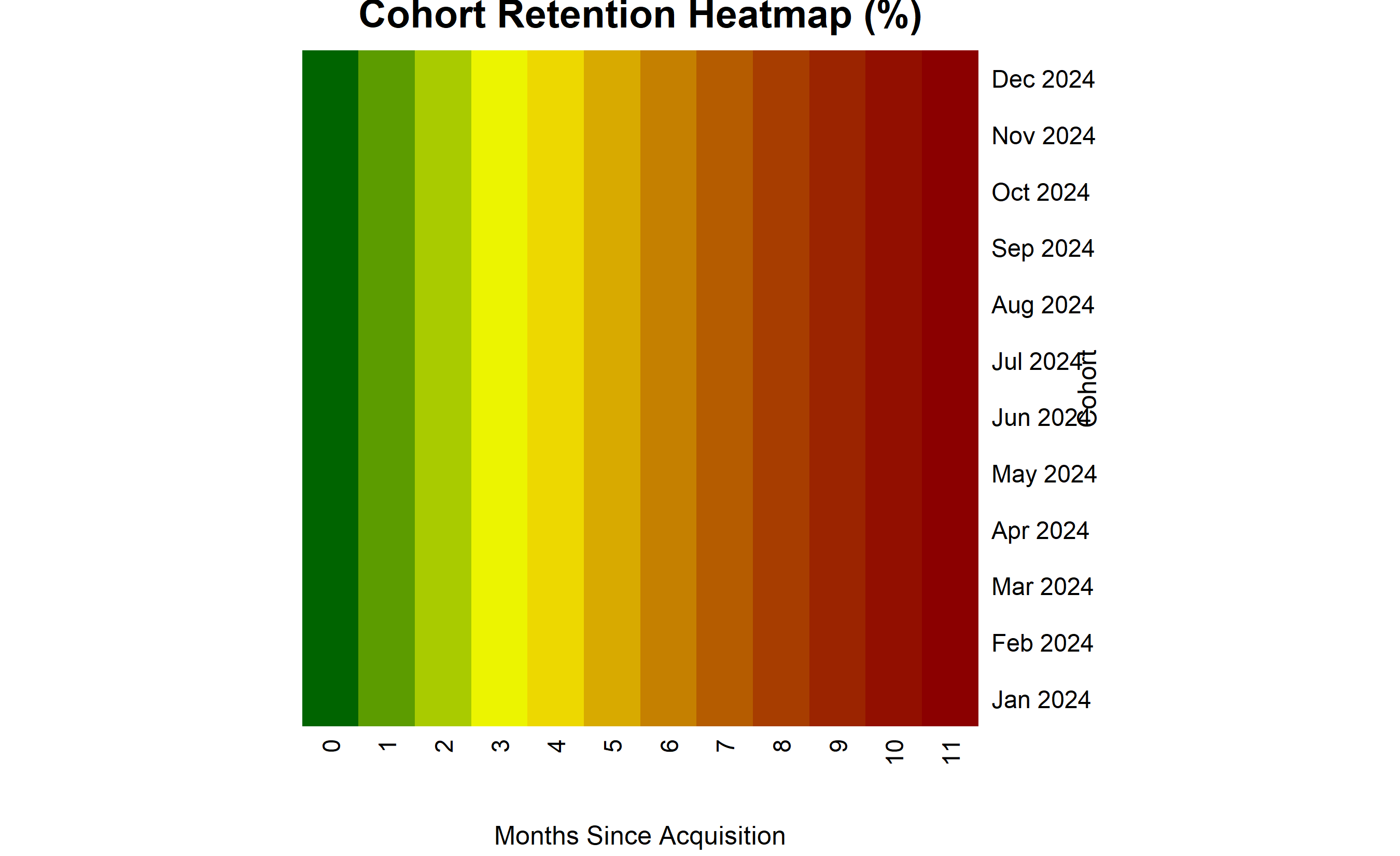
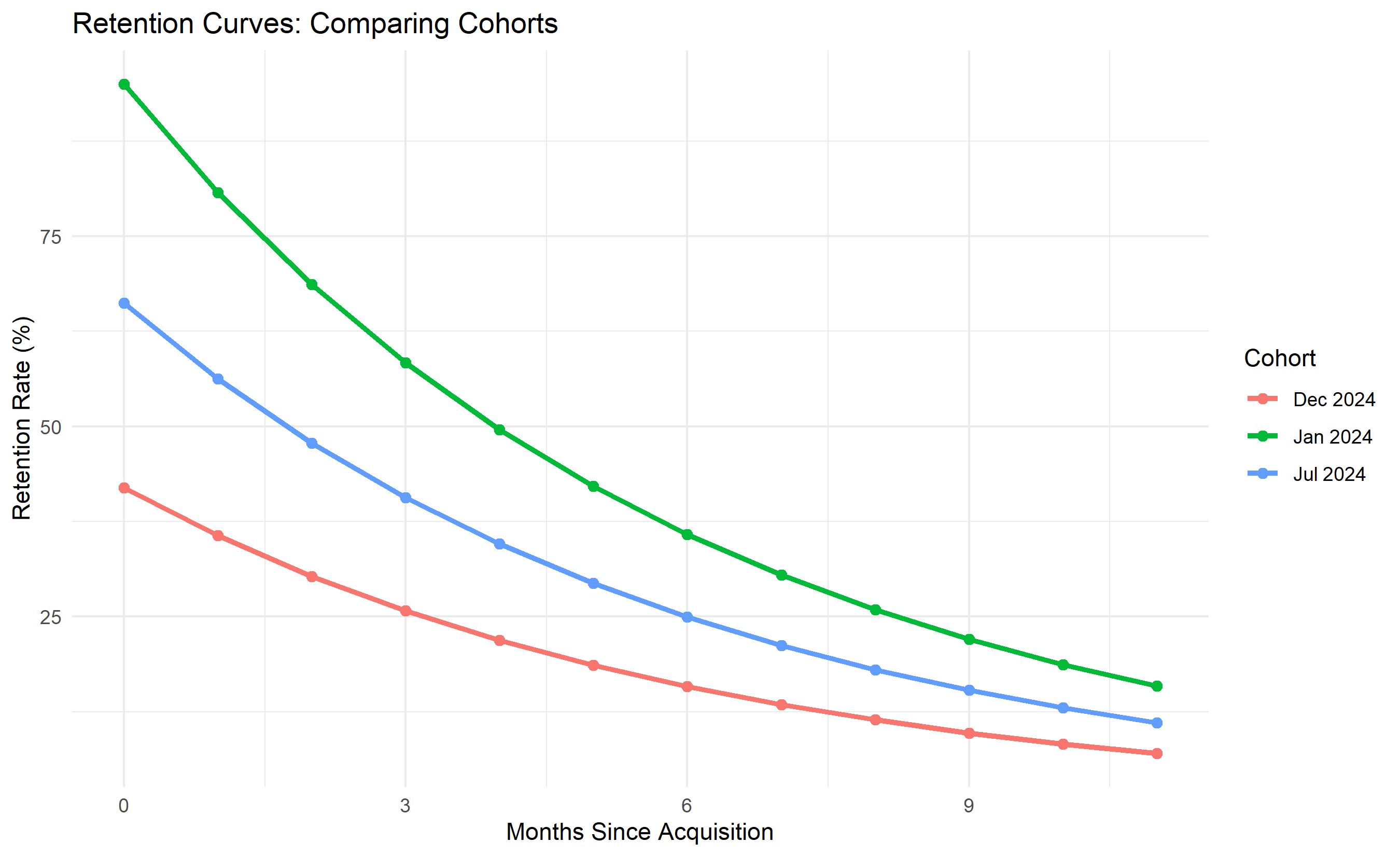
3. **Cohort Health**: Recent cohorts show slightly better retention (trend is positive), suggesting product improvements are working.
4. **A/B Test**: New checkout design increases conversion from 1.8% to 2.2% with 95%+ confidence. Expected revenue lift: +22%.
::: {.exercises}
#### Chapter 43 Exercises
1. **Recall**: Define sessions vs users. Can one user have multiple sessions?
2. **Recall**: In a funnel with Landing (1000), Category (750), Product (500), Cart (300), Checkout (200), Confirmation (150), where is the largest drop-off?
3. **Comprehension**: Explain why last-touch attribution often favors email and display more than they deserve.
4. **Comprehension**: A cohort acquired in January has 60% retention at month 6; February cohort has 65%. What might this pattern indicate?
5. **Application**: Design a cohort analysis for a Nigerian SaaS (Fintech). What metric would you track beyond retention %?
6. **Application**: You run an A/B test on landing page copy with 50,000 users per variant. Control: 800 conversions, Treatment: 850. Should you adopt the new copy?
7. **Analysis**: Compare first-touch, last-touch, and data-driven attribution. When is each most appropriate?
8. **Analysis**: A website has high traffic (100K monthly sessions) but low conversion (1%). Propose three hypotheses and how to test each.
9. **Synthesis**: Design a comprehensive CX dashboard for a Nigerian e-commerce site. Include metrics, targets, and refresh frequencies.
10. **Synthesis**: You discover that mobile users convert at half the rate of desktop users. Propose root causes and diagnostic steps.
:::
## Further Reading
- Kaplan, A. M., & Haenlein, M. (2010). Users of the world, unite! The challenges and opportunities of social media. *Business Horizons*, 53(1), 59–68.
- Aribarg, A., Schwepker Jr, C. H., & Pilling, B. K. (2020). Understanding the antecedents of the use of social media in customer-facing roles. *Journal of Personal Selling & Sales Management*, 40(2), 131–146.
---
## Chapter 43 Appendix: Attribution Modelling Formulas and Cohort Analysis Statistics
### Shapley-Value Attribution for Marketing Channels
Data-driven attribution uses Shapley values (from coalitional game theory) to assign credit to channels. The Shapley value for channel $i$ is:
$$\phi_i = \frac{1}{n!} \sum_{\text{all permutations } \pi} [v(\pi^{i+}) - v(\pi^{i-})]$$
where:
- $\pi$ is an ordering of channels
- $v(\pi^{i+})$ is the revenue from a conversion path including channel $i$
- $v(\pi^{i-})$ is the revenue excluding channel $i$
- The average is over all $n!$ permutations
In practice, compute Shapley values via SHAP libraries (Python: shap, R: fastshap) using a trained model (gradient boosting) that predicts conversion probability given touchpoint sequences.
### Markov Chain Attribution
Alternative to Shapley: model touchpoints as a Markov chain. State space is {channels, converted, not_converted}. Transition probabilities are estimated from historical paths. The removal effect (credit for channel $i$) is:
$$\text{Credit}_i = \text{Revenue} \times \frac{P(\text{Convert} | \text{with channel } i) - P(\text{Convert} | \text{without channel } i)}{P(\text{Convert})}$$
Markov attribution is simpler computationally but less robust to channel ordering than Shapley.
### Cohort Retention: Statistical Testing
To test whether retention is improving across cohorts, fit a logistic regression:
$$\log \left( \frac{P(\text{active at } t)}{1 - P(\text{active at } t)} \right) = \alpha + \beta_1 \times \text{cohort\_month} + \beta_2 \times t + \varepsilon$$
A significant positive $\beta_1$ coefficient indicates recent cohorts have better retention, controlling for time since acquisition $t$.
### Cohort Revenue Analysis: Lifetime Value Estimation
Instead of retention %, track cumulative revenue per cohort. If January cohort has mean revenue ₦50,000 by month 6, February cohort has ₦55,000, this suggests improving customer quality or spending increases. Fit exponential or logarithmic curve to monthly data to project long-term LTV.
48.4 Social Media Analytics: Engagement and Sentiment
Core Social Media Metrics: - Reach: Unique users who saw your content - Impressions: Total times your content was displayed (one user can generate multiple) - Engagement: Likes, comments, shares, retweets - Engagement Rate: (Engagement / Impressions) × 100% - Follower Growth: Net change in followers (sign-up minus churn) - Share of Voice: Your brand mentions / (Your mentions + Competitor mentions)
Nigerian Social Media Context: The platform landscape differs from global norms: - Twitter/X: Used heavily for real-time discussion, news, customer service complaints - Instagram: FMCG brands and e-commerce thrive; visual products - TikTok: Growing rapidly; short-form entertainment and product reviews - Facebook: Still large but aging demographic; good for community building - WhatsApp: Not publicly postable but critical for customer communication
Sentiment Analysis: Classify social mentions as positive, negative, or neutral. Tools like TextBlob (Python) or VADER (R) provide sentiment scores; more sophisticated fine-tuned BERT models improve accuracy.
Example Dashboard: - Twitter Mentions: 1,500 last month, 62% positive, trending topics: #BankAppDown (80 mentions, 10% positive) - Instagram Posts: 8,000 impressions per post, 4.2% engagement rate (good for FMCG) - TikTok Videos: 250K views, 15K likes, 500 comments (viral for that brand)