---
title: "Statistical Process Control and Quality Analytics"
---
```{python}
#| label: python-setup-51-quality-analytics-spc
#| include: false
import numpy as np
import pandas as pd
import matplotlib.pyplot as plt
import seaborn as sns
from scipy.stats import norm
```
::: {.callout-note icon="false"}
## 📋 Learning Objectives
By the end of this chapter, you will:
- Understand the business case for quality investment using the cost-of-quality framework
- Distinguish between common cause and special cause variation using Shewhart's principles
- Construct and interpret X-bar and R control charts for continuous data
- Analyze attribute data using p-charts, c-charts, and u-charts
- Apply CUSUM and EWMA charts to detect small, sustained process shifts
- Perform capability analysis using Cp and Cpk indices and benchmark against industry standards
- Conduct root cause analysis using Pareto charts and regression trees
- Implement a complete quality analytics system for NAFDAC-compliant pharmaceutical manufacturing
:::
## Quality as a Business Issue
Quality failures impose enormous costs on businesses. A pharmaceutical company in Lagos discovers that 2% of capsule packs contain the wrong active ingredient due to a filling machine calibration error. For a production run of 500,000 packs per month, this means 10,000 defective units. If the company catches these internally before shipment (internal failure cost), it pays for scrap and rework: ₦500 per defective unit = ₦5 million. But if the error reaches customers (external failure cost), it faces: customer returns processed at ₦1,500 per unit = ₦15 million; regulatory fines from NAFDAC (National Agency for Food and Drug Administration and Control) = ₦50 million; reputational damage and lost sales = ₦200 million. Total external failure cost: ₦265 million. The same defect, caught at different stages, has a 53x cost difference.
Juran's quality cost model classifies costs into four categories. *Prevention costs* are investments made upfront to prevent defects: quality planning, process design, operator training, equipment maintenance, inspections before production starts. *Appraisal costs* are the cost of measuring and inspecting to detect defects: incoming material inspection, in-process checking, final product testing, process audits. *Internal failure costs* are incurred when defects are caught before shipping: scrap, rework, troubleshooting, retesting. *External failure costs* are incurred after a defective product reaches a customer: warranty claims, recall campaigns, legal liability, loss of customer trust. The inverse relationship is critical: investing ₦1 in prevention often saves ₦10–₦100 in failure costs.
For Nigerian manufacturers seeking certification under ISO 9001, SON (Standards Organisation of Nigeria) product standards, or export requirements to EU markets, quality management is not optional—it is a regulatory requirement and a competitive necessity. Export-oriented companies like those in Lagos's pharmaceutical cluster, or food processors targeting ECOWAS trade, must demonstrate statistical evidence of process control. Six Sigma, a management philosophy originating from Motorola, targets a process capability of Cpk ≈ 1.67, meaning only 3.4 defects per million opportunities. This is aspirational for most Nigerian manufacturers but achievable through systematic quality improvement using analytics.
::: {.callout-note icon="false"}
## 📘 Theory: The Cost-of-Quality Framework
Juran identified that optimal quality is achieved not at zero defects (which is infinitely expensive), but at the point where the total cost of quality (prevention + appraisal + failure costs) is minimized. As prevention and appraisal spending increases, failure costs decrease more rapidly, yielding a U-shaped total cost curve. The optimal operating point is where the derivative of total cost equals zero. In most organizations, shifting spending from failure and appraisal toward prevention yields the best ROI.
:::
::: {.callout-tip icon="false"}
## 🔑 Key Formula
**Total Cost of Quality:**
$$C_{\text{total}} = C_{\text{prevention}} + C_{\text{appraisal}} + C_{\text{failure internal}} + C_{\text{failure external}}$$
**Juran's Principle:** Investing in prevention reduces total cost because failure costs decrease faster than prevention costs increase. For well-controlled processes, $C_{\text{failure}} << C_{\text{prevention}}$.
**Six Sigma Target:**
$$\text{Cpk} \geq 1.67 \implies \text{DPMO} \approx 3.4 \text{ (defects per million opportunities)}$$
:::
## Common Cause vs Special Cause Variation
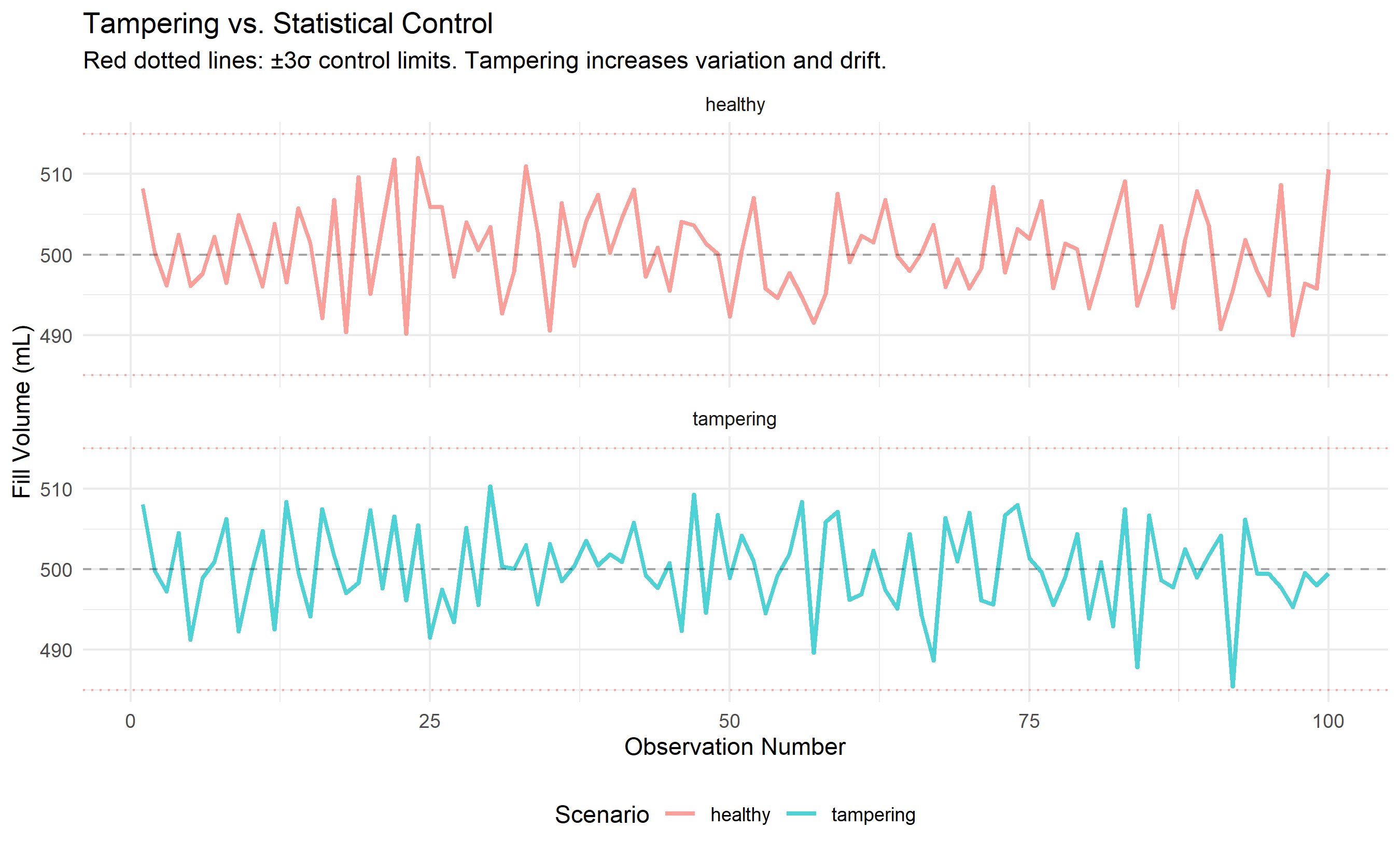
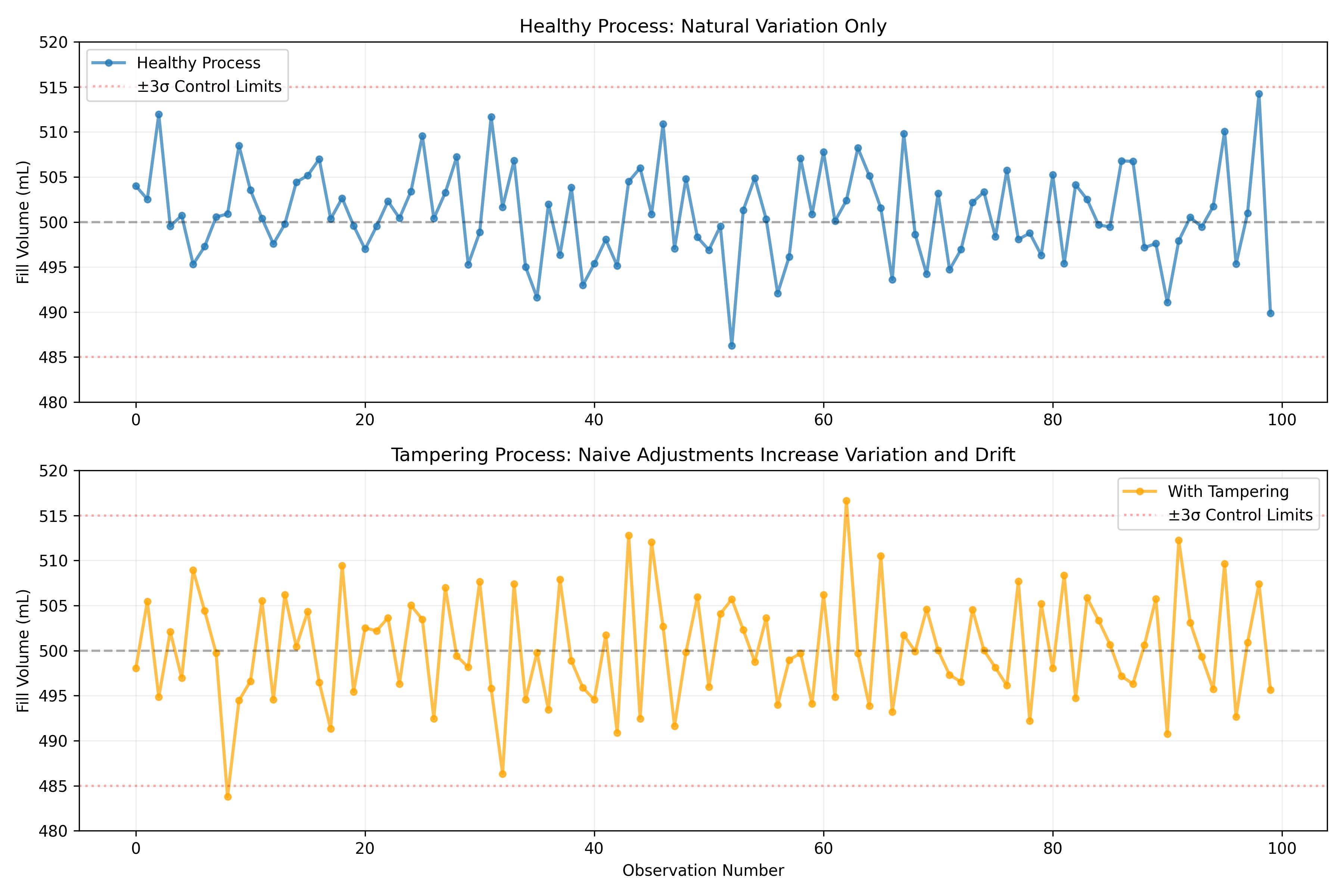
In 1924, Walter Shewhart at Bell Laboratories made a fundamental discovery that revolutionized manufacturing: *every process has natural variation*. When a bottling machine fills bottles, some are 499 mL, some 501 mL, some 500 mL exactly—this natural spread (common cause variation) is normal and expected. If you adjust the machine every time the fill is slightly off (999 mL, then 1001 mL), you will paradoxically make the process *worse*, not better. This is called tampering. However, when something unusual happens—a valve gets stuck, a sensor dies, a shipment of defective bottles arrives—the variation pattern changes. This is special cause variation, a signal that something has gone wrong and investigation is needed.
The distinction is like detective work. A detective knows that in a city of 10 million people, today's murder count (perhaps 5–10) is normal variation around a mean. If tomorrow's count is 7 and yesterday's was 6, the detective doesn't investigate a "murder surge." But if a serial killer commits 50 murders in a week, this is a signal—special cause variation. The detective springs into action. In manufacturing, the same principle applies: ignore noise (common cause), investigate signals (special cause).
Shewhart formalized this with control limits. For a process with natural variation (mean μ, standard deviation σ), we expect 99.7% of observations to fall within μ ± 3σ (the three-sigma rule, derived from the normal distribution). If an observation falls outside these limits, it is a signal of special cause variation and the process should be stopped for investigation. If all observations fall inside, the process is "in control"—stable and predictable—even if the product quality varies slightly. The control chart is the graphical tool for tracking this.
To illustrate the danger of tampering, consider a simple simulation. Suppose a process has a target of 500 mL and natural standard deviation of 5 mL. We observe fills: 500, 501, 499, 502, 498 mL. A naive operator might think: "The last fill was 498, below the target. Let me adjust the machine up by 2 mL." The next fill is 502 (because of the adjustment, not because the adjustment helped—the natural variation is still ±5 mL). The operator thinks the adjustment worked and leaves it. The next natural variation pushes the fill to 507 mL, and now the operator adjusts down by 7 mL. This "chasing the process" causes the fills to wildly oscillate—the process mean drifts, the range increases, and process performance deteriorates. The solution: *accept common cause variation* and adjust only when special cause variation is detected.
::: {.callout-note icon="false"}
## 📘 Theory: Shewhart Control Charts
A Shewhart control chart plots a process statistic (e.g., subgroup mean, range) over time with three horizontal lines: a center line (μ), an upper control limit (UCL = μ + 3σ_stat), and a lower control limit (LCL = μ − 3σ_stat). If a point falls outside the UCL or LCL, it signals special cause variation. The formula for control limits ensures that, under normality and independence, approximately 1 in 370 points will be a false alarm (Type I error).
:::
::: {.panel-tabset}
## R
```{r}
#| label: ch51-tampering-demo
#| fig-cap: "Impact of tampering: chasing process variation increases instability"
library(tidyverse)
library(ggplot2)
set.seed(4628)
# Scenario 1: Healthy process (no tampering)
n_obs <- 100
target <- 500
sigma <- 5
# No tampering: just common cause variation
healthy_fills <- target + rnorm(n_obs, 0, sigma)
# Scenario 2: Tampering process (naive adjustment)
tampering_fills <- numeric(n_obs)
tampering_adjustments <- numeric(n_obs)
adjustment <- 0
for (i in 1:n_obs) {
# Add adjustment from previous observation
observed <- target + adjustment + rnorm(1, 0, sigma)
tampering_fills[i] <- observed
# Naive rule: if last fill was below target, adjust up; if above, adjust down
if (i < n_obs) {
adjustment <- -0.3 * (observed - target) # Adjust 30% of the deviation
tampering_adjustments[i] <- adjustment
}
}
# Compile data
comparison_df <- tibble(
observation = 1:n_obs,
healthy = healthy_fills,
tampering = tampering_fills
) |>
pivot_longer(cols = c(healthy, tampering), names_to = "scenario", values_to = "fill_volume")
# Compute rolling statistics
comparison_stats <- comparison_df |>
group_by(scenario) |>
summarise(
mean_fill = mean(fill_volume),
sd_fill = sd(fill_volume),
range_fill = max(fill_volume) - min(fill_volume),
cpk = min(
(510 - mean(fill_volume)) / (3 * sd(fill_volume)),
(mean(fill_volume) - 490) / (3 * sd(fill_volume))
)
)
cat("\n=== Process Comparison: Healthy vs. Tampering ===\n")
print(comparison_stats)
# Plot time series
ggplot(comparison_df, aes(x = observation, y = fill_volume, color = scenario)) +
geom_line(alpha = 0.7, linewidth = 1) +
geom_hline(yintercept = 500, linetype = "dashed", color = "black", alpha = 0.3) +
geom_hline(yintercept = 500 + 3*sigma, linetype = "dotted", color = "red", alpha = 0.3) +
geom_hline(yintercept = 500 - 3*sigma, linetype = "dotted", color = "red", alpha = 0.3) +
facet_wrap(~ scenario, nrow = 2) +
labs(
title = "Tampering vs. Statistical Control",
subtitle = "Red dotted lines: ±3σ control limits. Tampering increases variation and drift.",
x = "Observation Number",
y = "Fill Volume (mL)",
color = "Scenario"
) +
theme_minimal() +
theme(legend.position = "bottom")
```
## Python
```{python}
#| label: py-ch51-tampering-demo
import numpy as np
import pandas as pd
import matplotlib.pyplot as plt
np.random.seed(4628)
# Parameters
n_obs = 100
target = 500
sigma = 5
# Scenario 1: Healthy (no tampering)
healthy_fills = target + np.random.normal(0, sigma, n_obs)
# Scenario 2: Tampering
tampering_fills = np.zeros(n_obs)
adjustment = 0
for i in range(n_obs):
observed = target + adjustment + np.random.normal(0, sigma)
tampering_fills[i] = observed
if i < n_obs - 1:
adjustment = -0.3 * (observed - target)
# Comparison stats
stats_data = {
'Scenario': ['Healthy', 'Tampering'],
'Mean Fill': [healthy_fills.mean(), tampering_fills.mean()],
'Std Dev': [healthy_fills.std(), tampering_fills.std()],
'Range': [healthy_fills.max() - healthy_fills.min(),
tampering_fills.max() - tampering_fills.min()]
}
stats_df = pd.DataFrame(stats_data)
print("\n=== Process Comparison: Healthy vs. Tampering ===")
print(stats_df.round(2))
# Plot
fig, (ax1, ax2) = plt.subplots(2, 1, figsize=(12, 8))
# Healthy process
ax1.plot(healthy_fills, 'o-', alpha=0.7, linewidth=2, markersize=4, label='Healthy Process')
ax1.axhline(y=500, color='black', linestyle='--', alpha=0.3)
ax1.axhline(y=500 + 3*sigma, color='red', linestyle=':', alpha=0.3, label='±3σ Control Limits')
ax1.axhline(y=500 - 3*sigma, color='red', linestyle=':', alpha=0.3)
ax1.set_ylabel('Fill Volume (mL)')
ax1.set_title('Healthy Process: Natural Variation Only')
ax1.legend()
ax1.grid(True, alpha=0.2)
ax1.set_ylim(480, 520)
# Tampering process
ax2.plot(tampering_fills, 'o-', alpha=0.7, color='orange', linewidth=2, markersize=4, label='With Tampering')
ax2.axhline(y=500, color='black', linestyle='--', alpha=0.3)
ax2.axhline(y=500 + 3*sigma, color='red', linestyle=':', alpha=0.3, label='±3σ Control Limits')
ax2.axhline(y=500 - 3*sigma, color='red', linestyle=':', alpha=0.3)
ax2.set_xlabel('Observation Number')
ax2.set_ylabel('Fill Volume (mL)')
ax2.set_title('Tampering Process: Naive Adjustments Increase Variation and Drift')
ax2.legend()
ax2.grid(True, alpha=0.2)
ax2.set_ylim(480, 520)
plt.tight_layout()
plt.show()
```
:::
::: {.callout-caution icon="false"}
## 📝 Section 51.2 Review Questions
1. Define common cause variation and special cause variation. Give two manufacturing examples of each from a Nigerian context (e.g., cement production, bottling, food processing).
2. A bottling plant observes fills of 499, 501, 500, 502, 498, 503, 497 mL. Are these signals of special cause variation or common cause variation? Justify your answer using the three-sigma rule.
3. Why does tampering (adjusting a process in response to common cause variation) make process performance worse? Describe the mechanism.
4. In Shewhart's framework, what is the false alarm rate for a three-sigma control chart? (Hint: how often will a point fall outside the control limits purely by chance under normality?)
5. A shift supervisor is instructed: "If two consecutive fills are below 500 mL, adjust the machine upward by 1 mL." Is this a good decision rule? Why or why not?
:::
## The X-bar and R Control Chart
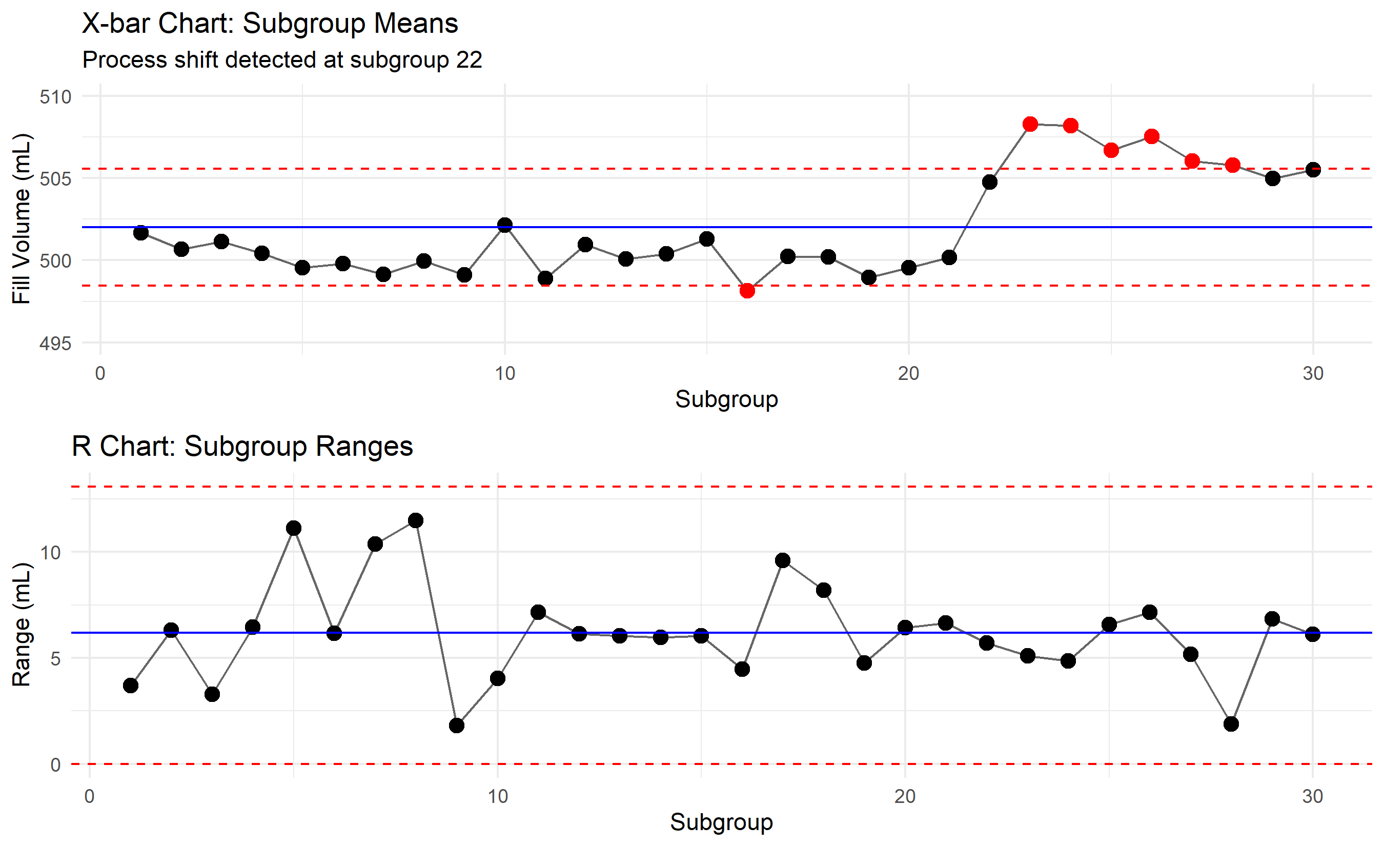
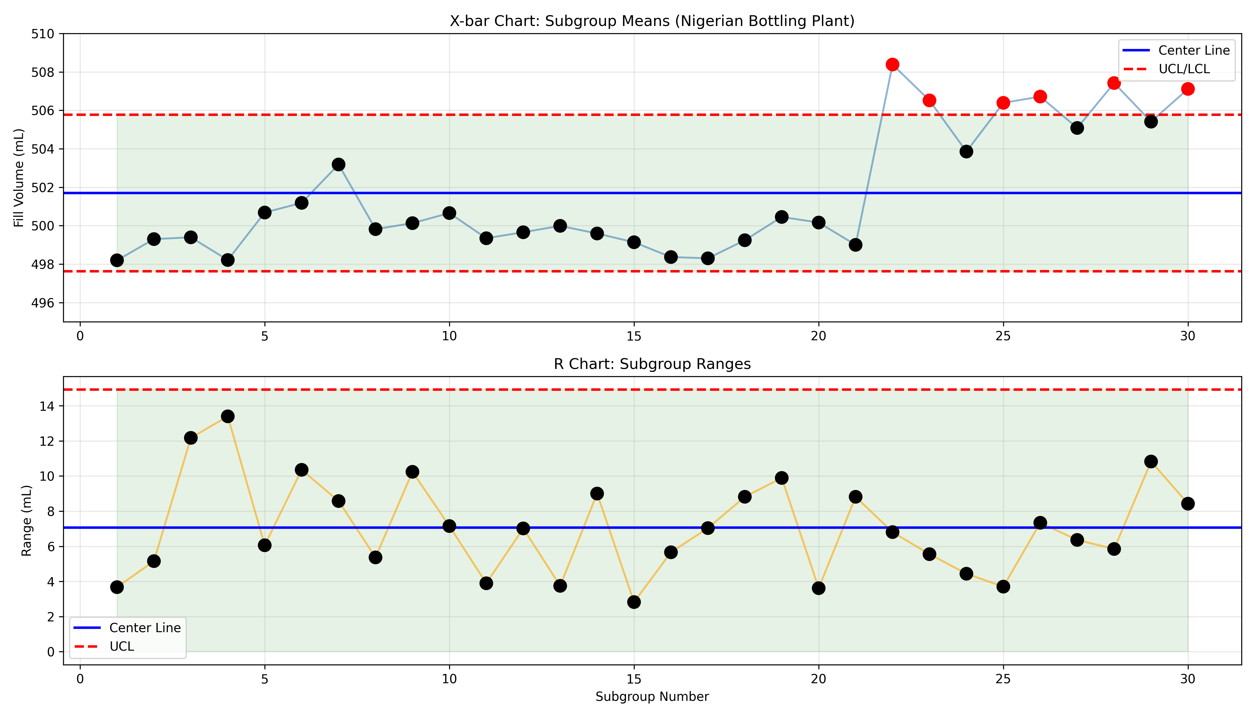
The X-bar and R control chart is the workhorse of quality control for continuous data. Instead of plotting individual measurements, we collect rational subgroups: at each time point (e.g., every hour), we measure n units (e.g., n = 5 bottle fills). We plot the subgroup mean (X-bar) and subgroup range (R). The rationale is that the mean of n measurements has lower variance than individual measurements, making shifts easier to detect. The range R captures process spread without assuming normality.
For a process with true mean μ and standard deviation σ, the standard error of the mean is σ/√n. The control limits for the X-bar chart are:
- Center line: $\bar{\bar{X}}$ (grand mean of all subgroup means)
- UCL: $\bar{\bar{X}} + 3 \cdot \frac{S}{\sqrt{n}}$ or $\bar{\bar{X}} + A_2 \cdot \bar{R}$
- LCL: $\bar{\bar{X}} - A_2 \cdot \bar{R}$
The R-chart tracks whether process spread is stable. High variability in R suggests assignable cause (e.g., one machine is looser than others). The control limits for R are based on the distribution of the range:
- UCL: $D_4 \cdot \bar{R}$
- LCL: $D_3 \cdot \bar{R}$
The constants A₂, D₃, D₄ depend on subgroup size n and are derived from statistical tables (see Appendix). For example, with n = 5: A₂ = 0.577, D₃ = 0, D₄ = 2.114.
The Western Electric (Nelson) rules provide additional sensitivity to detect special cause variation:
1. One point beyond 3σ (classical rule)
2. Two of three consecutive points beyond 2σ on same side
3. Four of five consecutive points beyond 1σ on same side
4. Eight consecutive points on the same side of the center line
Together, these rules catch sustained shifts, trends, and cycles faster than the classical three-sigma rule alone.
::: {.callout-note icon="false"}
## 📘 Theory: Sampling Distribution of the Range
For a sample of n measurements from a Normal(μ, σ) distribution, the expected value of the range R is $E[R] = d_2 \cdot \sigma$, where d₂ is a constant depending on n. For n = 5, d₂ ≈ 2.326. The standard deviation of R is $\sigma_R = d_3 \cdot \sigma$, where d₃ ≈ 0.864 for n = 5. Control limits for the R-chart are $\bar{R} \pm 3 \sigma_R$, which simplifies to $\bar{R} \cdot (1 \pm 3 d_3/d_2)$, yielding the D₃ and D₄ constants.
:::
::: {.callout-tip icon="false"}
## 🔑 Key Formula
**X-bar Chart Control Limits:**
$$\text{UCL}_{\bar{X}} = \bar{\bar{X}} + A_2 \bar{R}, \quad \text{LCL}_{\bar{X}} = \bar{\bar{X}} - A_2 \bar{R}$$
**R-chart Control Limits:**
$$\text{UCL}_R = D_4 \bar{R}, \quad \text{LCL}_R = D_3 \bar{R}$$
**Where:** $\bar{\bar{X}}$ = grand mean of subgroup means, $\bar{R}$ = average subgroup range, and A₂, D₃, D₄ are constants tabulated by subgroup size n.
**Control Limit Calculation:** For subgroup mean, the margin of error is $3 \cdot \frac{\bar{R}}{d_2 \sqrt{n}}$, giving $A_2 = \frac{3}{d_2 \sqrt{n}}$.
:::
::: {.panel-tabset}
## R
```{r}
#| label: ch51-xbar-r-chart
#| fig-cap: "X-bar and R control chart: Nigerian bottling plant fill volume, 30 subgroups of n=5"
library(tidyverse)
library(gridExtra)
set.seed(7215)
# Parameters
n_subgroups <- 30
n_per_subgroup <- 5
target_fill <- 500
process_sd <- 3
# Control chart constants for n=5 (from statistical tables)
A2 <- 0.577
D3 <- 0.0
D4 <- 2.114
d2 <- 2.326
# Generate data: first 21 subgroups in-control, subgroups 22-30 shifted to 506 mL
subgroup_data <- list()
for (sg in 1:n_subgroups) {
# Shift process mean at subgroup 22
mean_shift <- ifelse(sg >= 22, 6, 0)
# Generate 5 fills for this subgroup
fills <- target_fill + mean_shift + rnorm(n_per_subgroup, 0, process_sd)
subgroup_data[[sg]] <- data.frame(
subgroup = sg,
sample_num = 1:n_per_subgroup,
fill = fills
)
}
subgroup_df <- bind_rows(subgroup_data)
# Compute subgroup statistics
subgroup_stats <- subgroup_df |>
group_by(subgroup) |>
summarise(
xbar = mean(fill),
R = max(fill) - min(fill),
.groups = 'drop'
)
# Compute control limits
grand_mean <- mean(subgroup_stats$xbar)
avg_range <- mean(subgroup_stats$R)
ucl_xbar <- grand_mean + A2 * avg_range
lcl_xbar <- grand_mean - A2 * avg_range
ucl_r <- D4 * avg_range
lcl_r <- D3 * avg_range
# Identify out-of-control points
subgroup_stats <- subgroup_stats |>
mutate(
ooc_xbar = xbar > ucl_xbar | xbar < lcl_xbar,
ooc_r = R > ucl_r | R < lcl_r
)
cat("\n=== Control Chart Statistics ===\n")
cat("Grand Mean (X-double-bar):", round(grand_mean, 2), "\n")
cat("Average Range (R-bar):", round(avg_range, 2), "\n")
cat("UCL_X-bar:", round(ucl_xbar, 2), "\n")
cat("LCL_X-bar:", round(lcl_xbar, 2), "\n")
cat("UCL_R:", round(ucl_r, 2), "\n")
cat("LCL_R:", round(lcl_r, 2), "\n\n")
cat("Out-of-Control Points (X-bar chart):\n")
ooc_points <- subgroup_stats |> filter(ooc_xbar)
if (nrow(ooc_points) > 0) {
print(ooc_points)
} else {
cat("None detected by 3-sigma rule\n")
}
# Plot X-bar chart
p1 <- ggplot(subgroup_stats, aes(x = subgroup, y = xbar)) +
geom_line(alpha = 0.6) +
geom_point(aes(color = ooc_xbar), size = 3) +
geom_hline(yintercept = grand_mean, color = "blue", linetype = "solid") +
geom_hline(yintercept = ucl_xbar, color = "red", linetype = "dashed") +
geom_hline(yintercept = lcl_xbar, color = "red", linetype = "dashed") +
scale_color_manual(values = c("FALSE" = "black", "TRUE" = "red"), guide = "none") +
labs(
title = "X-bar Chart: Subgroup Means",
x = "Subgroup", y = "Fill Volume (mL)",
subtitle = "Process shift detected at subgroup 22"
) +
theme_minimal() +
ylim(495, 510)
# Plot R chart
p2 <- ggplot(subgroup_stats, aes(x = subgroup, y = R)) +
geom_line(alpha = 0.6) +
geom_point(aes(color = ooc_r), size = 3) +
geom_hline(yintercept = avg_range, color = "blue", linetype = "solid") +
geom_hline(yintercept = ucl_r, color = "red", linetype = "dashed") +
geom_hline(yintercept = lcl_r, color = "red", linetype = "dashed") +
scale_color_manual(values = c("FALSE" = "black", "TRUE" = "red"), guide = "none") +
labs(
title = "R Chart: Subgroup Ranges",
x = "Subgroup", y = "Range (mL)"
) +
theme_minimal()
grid.arrange(p1, p2, nrow = 2)
```
## Python
```{python}
#| label: py-ch51-xbar-r-chart
import numpy as np
import pandas as pd
import matplotlib.pyplot as plt
np.random.seed(7215)
# Parameters
n_subgroups = 30
n_per_subgroup = 5
target_fill = 500
process_sd = 3
# Control chart constants
A2 = 0.577
D3 = 0.0
D4 = 2.114
# Generate data
subgroup_list = []
for sg in range(1, n_subgroups + 1):
# Process shift at subgroup 22
mean_shift = 6 if sg >= 22 else 0
# Generate n=5 fills
fills = target_fill + mean_shift + np.random.normal(0, process_sd, n_per_subgroup)
for sample_num, fill in enumerate(fills, 1):
subgroup_list.append({
'subgroup': sg,
'sample_num': sample_num,
'fill': fill
})
subgroup_df = pd.DataFrame(subgroup_list)
# Compute subgroup statistics
subgroup_stats = subgroup_df.groupby('subgroup').agg({
'fill': ['mean', lambda x: x.max() - x.min()]
}).reset_index()
subgroup_stats.columns = ['subgroup', 'xbar', 'R']
# Control limits
grand_mean = subgroup_stats['xbar'].mean()
avg_range = subgroup_stats['R'].mean()
ucl_xbar = grand_mean + A2 * avg_range
lcl_xbar = grand_mean - A2 * avg_range
ucl_r = D4 * avg_range
lcl_r = D3 * avg_range
# Identify out-of-control points
subgroup_stats['ooc_xbar'] = (subgroup_stats['xbar'] > ucl_xbar) | (subgroup_stats['xbar'] < lcl_xbar)
subgroup_stats['ooc_r'] = (subgroup_stats['R'] > ucl_r) | (subgroup_stats['R'] < lcl_r)
print("\n=== Control Chart Statistics ===")
print(f"Grand Mean (X-double-bar): {grand_mean:.2f}")
print(f"Average Range (R-bar): {avg_range:.2f}")
print(f"UCL_X-bar: {ucl_xbar:.2f}")
print(f"LCL_X-bar: {lcl_xbar:.2f}")
print(f"UCL_R: {ucl_r:.2f}")
print(f"LCL_R: {lcl_r:.2f}\n")
ooc_xbar_points = subgroup_stats[subgroup_stats['ooc_xbar']]
print(f"Out-of-Control Points (X-bar): {len(ooc_xbar_points)}")
if len(ooc_xbar_points) > 0:
print(ooc_xbar_points)
# Plot
fig, (ax1, ax2) = plt.subplots(2, 1, figsize=(14, 8))
# X-bar chart
colors_xbar = ['red' if x else 'black' for x in subgroup_stats['ooc_xbar']]
ax1.plot(subgroup_stats['subgroup'], subgroup_stats['xbar'], 'o-', alpha=0.6, color='steelblue', markersize=6)
ax1.scatter(subgroup_stats['subgroup'], subgroup_stats['xbar'], c=colors_xbar, s=100, zorder=3)
ax1.axhline(y=grand_mean, color='blue', linestyle='-', linewidth=2, label='Center Line')
ax1.axhline(y=ucl_xbar, color='red', linestyle='--', linewidth=2, label='UCL/LCL')
ax1.axhline(y=lcl_xbar, color='red', linestyle='--', linewidth=2)
ax1.fill_between(subgroup_stats['subgroup'], lcl_xbar, ucl_xbar, alpha=0.1, color='green')
ax1.set_ylabel('Fill Volume (mL)')
ax1.set_title('X-bar Chart: Subgroup Means (Nigerian Bottling Plant)')
ax1.set_ylim(495, 510)
ax1.grid(True, alpha=0.3)
ax1.legend()
# R chart
colors_r = ['red' if x else 'black' for x in subgroup_stats['ooc_r']]
ax2.plot(subgroup_stats['subgroup'], subgroup_stats['R'], 'o-', alpha=0.6, color='orange', markersize=6)
ax2.scatter(subgroup_stats['subgroup'], subgroup_stats['R'], c=colors_r, s=100, zorder=3)
ax2.axhline(y=avg_range, color='blue', linestyle='-', linewidth=2, label='Center Line')
ax2.axhline(y=ucl_r, color='red', linestyle='--', linewidth=2, label='UCL')
ax2.fill_between(subgroup_stats['subgroup'], 0, ucl_r, alpha=0.1, color='green')
ax2.set_xlabel('Subgroup Number')
ax2.set_ylabel('Range (mL)')
ax2.set_title('R Chart: Subgroup Ranges')
ax2.grid(True, alpha=0.3)
ax2.legend()
plt.tight_layout()
plt.show()
```
:::
::: {.callout-caution icon="false"}
## 📝 Section 51.3 Review Questions
1. A bottling plant collects 30 subgroups of n=5 fill measurements. The grand mean is 500.1 mL and the average range is 8.2 mL. Compute the X-bar control limits using A₂ = 0.577. What is the interpretation if a subgroup mean of 508 mL is observed?
2. Why do we use both the X-bar chart and the R chart together, rather than just the X-bar chart?
3. In the code above, the process shift is detected at subgroup 22. At what subgroup would you expect to detect it using the Western Electric rule "4 of 5 consecutive points beyond 1σ"? (The three-sigma rule may not catch it immediately.)
4. If the process standard deviation is unknown, how can you estimate it from the subgroup ranges?
5. A cement kiln's control chart shows two consecutive out-of-control points on the R chart but all points on the X-bar chart are in control. What does this suggest?
:::
## Control Charts for Attribute Data
Not all quality metrics are continuous measurements. A food manufacturer inspects packaging: each pack is either defective (wrong label, damaged seal) or acceptable. A pharmaceutical facility counts the number of capsules with color variation per batch. An insurance company tracks the number of errors per claim form. These are attribute data: counts or proportions of defectives. Standard continuous data control charts (X-bar/R) don't apply. Instead, we use attribute control charts: p-charts, np-charts, c-charts, and u-charts.
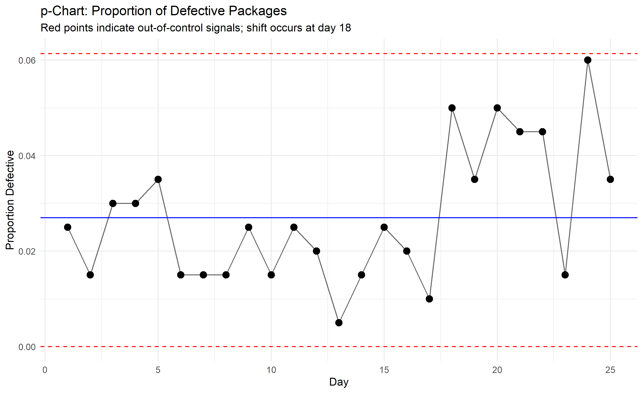
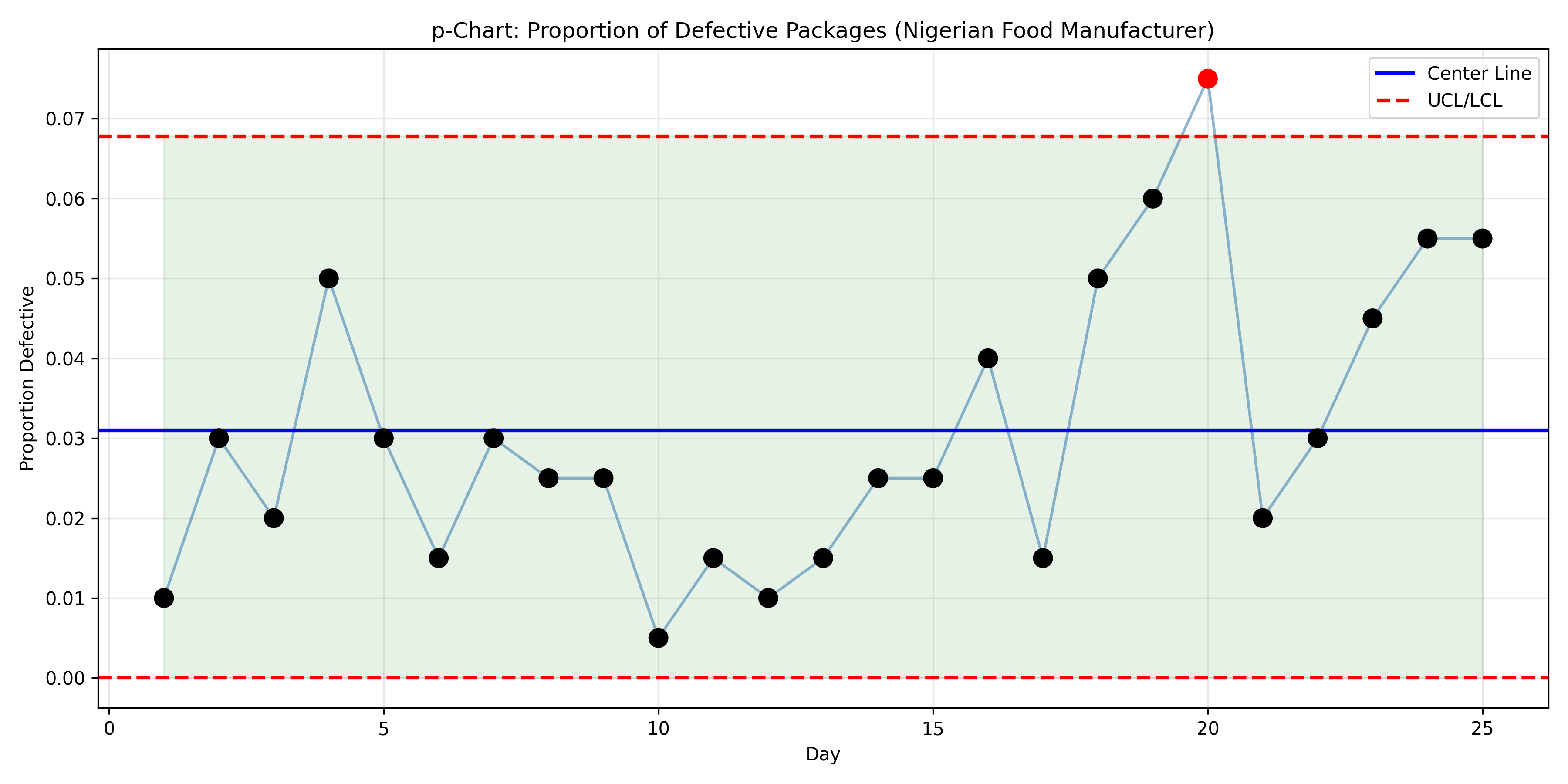
The *p-chart* tracks the proportion of defective units. If each day, a packaging line inspects n = 200 packs and finds d defective, the proportion is p = d/n. Over 25 days of inspection, we compute the average proportion p-bar = (total defective)/(total inspected). The control limits are based on the binomial distribution: when n is large, $p \approx \text{Normal}(p\text{-bar}, \sqrt{p\text{-bar}(1-p\text{-bar})/n})$. So:
- UCL: $\bar{p} + 3\sqrt{\bar{p}(1-\bar{p})/n}$
- LCL: $\bar{p} - 3\sqrt{\bar{p}(1-\bar{p})/n}$ (or 0 if negative)
The *np-chart* is used when the sample size n is constant (same number of units inspected each day). It plots the number of defectives rather than the proportion, with control limits: $\bar{np} \pm 3\sqrt{\bar{np}(1-\bar{p})}$.
The *c-chart* counts the number of defects per unit. For example, a textile mill counts the number of flaws per 100 meters of fabric. If defects follow a Poisson distribution with rate λ, then control limits are $\bar{c} \pm 3\sqrt{\bar{c}}$.
The *u-chart* is the rate-standardized version: defects per unit when the unit size varies. For example, textile samples might be 100 meters on one day, 150 meters on another. The rate u = c/unit_size is plotted, with control limits: $\bar{u} \pm 3\sqrt{\bar{u}/n_i}$ where $n_i$ is the number of units inspected on day i.
::: {.callout-note icon="false"}
## 📘 Theory: Attribute Control Chart Distributions
The p-chart is based on the binomial distribution: if a process produces defectives at rate p, and we sample n units, the number of defectives X ~ Binomial(n, p). For large n, X is approximately normal with mean np and variance np(1-p). The proportion p-hat = X/n has mean p and variance p(1-p)/n. The c-chart assumes defects follow a Poisson distribution: if defects occur at a constant rate λ, the number of defects in a unit is c ~ Poisson(λ), with mean λ and variance λ.
:::
::: {.callout-tip icon="false"}
## 🔑 Key Formula
**p-Chart Control Limits (proportion defective):**
$$\text{UCL}_p = \bar{p} + 3\sqrt{\frac{\bar{p}(1-\bar{p})}{n}}, \quad \text{LCL}_p = \bar{p} - 3\sqrt{\frac{\bar{p}(1-\bar{p})}{n}}$$
**c-Chart Control Limits (count of defects per unit):**
$$\text{UCL}_c = \bar{c} + 3\sqrt{\bar{c}}, \quad \text{LCL}_c = \bar{c} - 3\sqrt{\bar{c}}$$
**u-Chart Control Limits (defects per unit with variable unit size):**
$$\text{UCL}_u = \bar{u} + 3\sqrt{\frac{\bar{u}}{n_i}}, \quad \text{LCL}_u = \bar{u} - 3\sqrt{\frac{\bar{u}}{n_i}}$$
Where $n_i$ is the number of units (or size of unit) on observation i.
:::
::: {.panel-tabset}
## R
```{r}
#| label: ch51-p-chart
#| fig-cap: "p-chart: Packaging line defect rate, Nigerian food manufacturer"
library(tidyverse)
set.seed(2849)
# Simulate daily inspection data: 25 days, n=200 packs inspected per day
n_days <- 25
packs_per_day <- 200
# Baseline defect rate p = 0.02 (2%), increase to 0.05 (5%) on day 18 onward
defect_rate_baseline <- 0.02
defect_rate_shift <- 0.05
p_chart_data <- tibble(
day = 1:n_days,
defect_rate = ifelse(day < 18, defect_rate_baseline, defect_rate_shift),
n_inspected = packs_per_day,
n_defective = rbinom(n_days, packs_per_day, defect_rate),
p_defective = n_defective / n_inspected
)
# Compute control limits
avg_defect_rate <- sum(p_chart_data$n_defective) / sum(p_chart_data$n_inspected)
se_p <- sqrt(avg_defect_rate * (1 - avg_defect_rate) / packs_per_day)
ucl_p <- avg_defect_rate + 3 * se_p
lcl_p <- max(0, avg_defect_rate - 3 * se_p)
p_chart_data <- p_chart_data |>
mutate(ooc = p_defective > ucl_p | p_defective < lcl_p)
cat("\n=== p-Chart Statistics ===\n")
cat("Average Defect Rate:", round(avg_defect_rate, 4), "\n")
cat("UCL:", round(ucl_p, 4), "\n")
cat("LCL:", round(lcl_p, 4), "\n")
cat("Out-of-control days:", sum(p_chart_data$ooc), "\n\n")
print(filter(p_chart_data, ooc))
# Plot
ggplot(p_chart_data, aes(x = day, y = p_defective)) +
geom_line(alpha = 0.6) +
geom_point(aes(color = ooc), size = 3) +
geom_hline(yintercept = avg_defect_rate, color = "blue", linetype = "solid") +
geom_hline(yintercept = ucl_p, color = "red", linetype = "dashed") +
geom_hline(yintercept = lcl_p, color = "red", linetype = "dashed") +
scale_color_manual(values = c("FALSE" = "black", "TRUE" = "red"), guide = "none") +
labs(
title = "p-Chart: Proportion of Defective Packages",
x = "Day",
y = "Proportion Defective",
subtitle = "Red points indicate out-of-control signals; shift occurs at day 18"
) +
theme_minimal()
```
## Python
```{python}
#| label: py-ch51-p-chart
import numpy as np
import pandas as pd
import matplotlib.pyplot as plt
np.random.seed(2849)
# Simulation parameters
n_days = 25
packs_per_day = 200
defect_rate_baseline = 0.02
defect_rate_shift = 0.05
# Generate data
data_list = []
for day in range(1, n_days + 1):
defect_rate = defect_rate_shift if day >= 18 else defect_rate_baseline
n_defective = np.random.binomial(packs_per_day, defect_rate)
p_defective = n_defective / packs_per_day
data_list.append({
'day': day,
'n_inspected': packs_per_day,
'n_defective': n_defective,
'p_defective': p_defective
})
p_chart_df = pd.DataFrame(data_list)
# Control limits
avg_defect_rate = p_chart_df['n_defective'].sum() / p_chart_df['n_inspected'].sum()
se_p = np.sqrt(avg_defect_rate * (1 - avg_defect_rate) / packs_per_day)
ucl_p = avg_defect_rate + 3 * se_p
lcl_p = max(0, avg_defect_rate - 3 * se_p)
p_chart_df['ooc'] = (p_chart_df['p_defective'] > ucl_p) | (p_chart_df['p_defective'] < lcl_p)
print("\n=== p-Chart Statistics ===")
print(f"Average Defect Rate: {avg_defect_rate:.4f}")
print(f"UCL: {ucl_p:.4f}")
print(f"LCL: {lcl_p:.4f}")
print(f"Out-of-control days: {p_chart_df['ooc'].sum()}\n")
print("Out-of-control days:")
print(p_chart_df[p_chart_df['ooc']])
# Plot
fig, ax = plt.subplots(figsize=(12, 6))
colors = ['red' if x else 'black' for x in p_chart_df['ooc']]
ax.plot(p_chart_df['day'], p_chart_df['p_defective'], 'o-', alpha=0.6, color='steelblue', markersize=8)
ax.scatter(p_chart_df['day'], p_chart_df['p_defective'], c=colors, s=100, zorder=3)
ax.axhline(y=avg_defect_rate, color='blue', linestyle='-', linewidth=2, label='Center Line')
ax.axhline(y=ucl_p, color='red', linestyle='--', linewidth=2, label='UCL/LCL')
ax.axhline(y=lcl_p, color='red', linestyle='--', linewidth=2)
ax.fill_between(p_chart_df['day'], lcl_p, ucl_p, alpha=0.1, color='green')
ax.set_xlabel('Day')
ax.set_ylabel('Proportion Defective')
ax.set_title('p-Chart: Proportion of Defective Packages (Nigerian Food Manufacturer)')
ax.grid(True, alpha=0.3)
ax.legend()
plt.tight_layout()
plt.show()
```
:::
::: {.callout-caution icon="false"}
## 📝 Section 51.4 Review Questions
1. A pharmaceutical packaging line inspects 500 capsule packs per day. Over 20 days, a total of 48 defective packs are found. Compute the control limits for the p-chart. Are there any days where you would expect an out-of-control signal?
2. Explain the difference between a p-chart and an np-chart. When would you use each?
3. A textile mill counts flaws in bolts of fabric. On a given day, 12 flaws are found in 80 meters of fabric. Compute the defect rate u = 12/80. If the baseline u-bar is 0.1 flaws per meter, is this day's rate in control? (Assume the same sample size each day, so use a c-chart approximation.)
4. Why is the control limit formula for the p-chart based on the binomial distribution rather than the normal distribution?
5. A Nigerian cement company reports that their packaging line has zero defects for the last three weeks. The plant manager is delighted. What might the quality engineer suspect? (Hint: is this realistic? What might be wrong with the inspection process?)
:::
## CUSUM and EWMA Charts
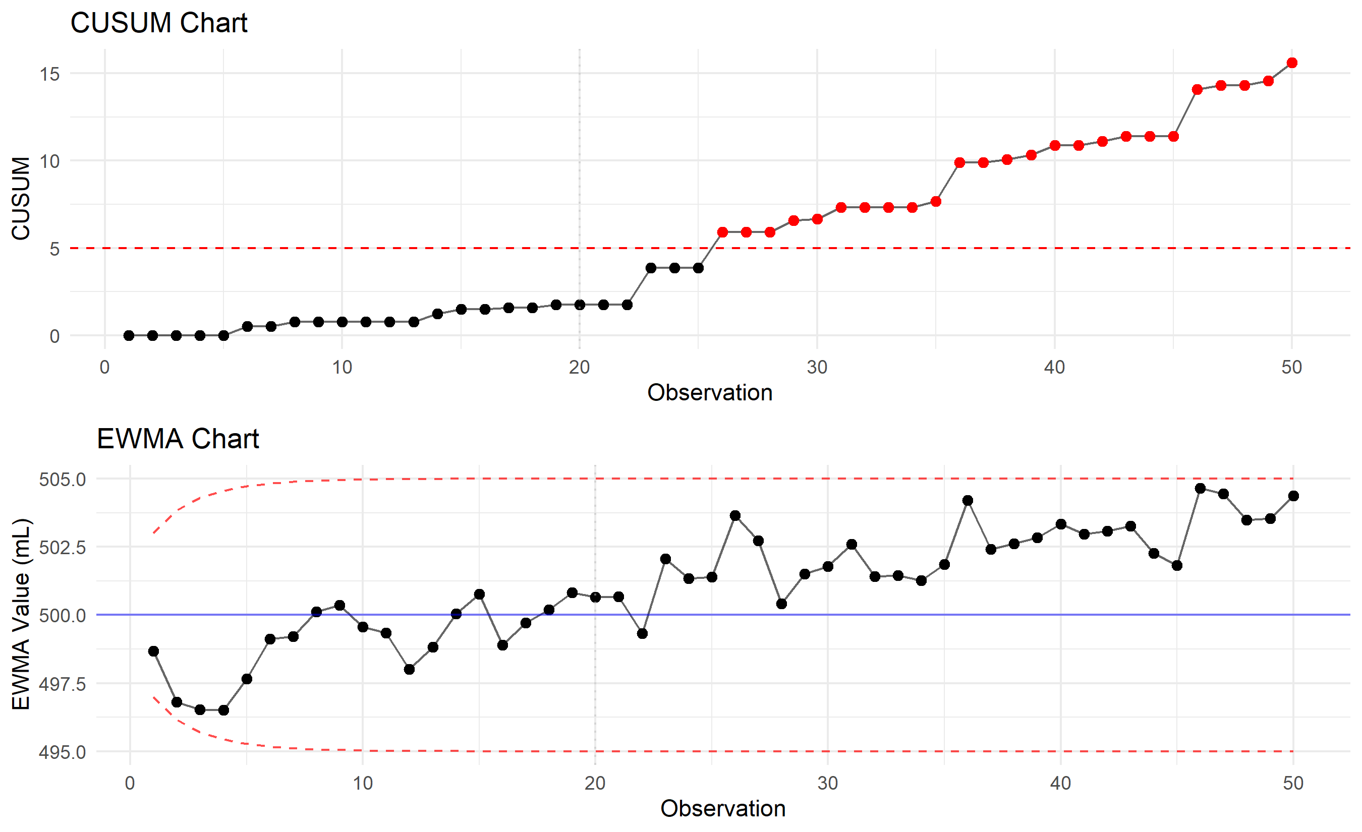
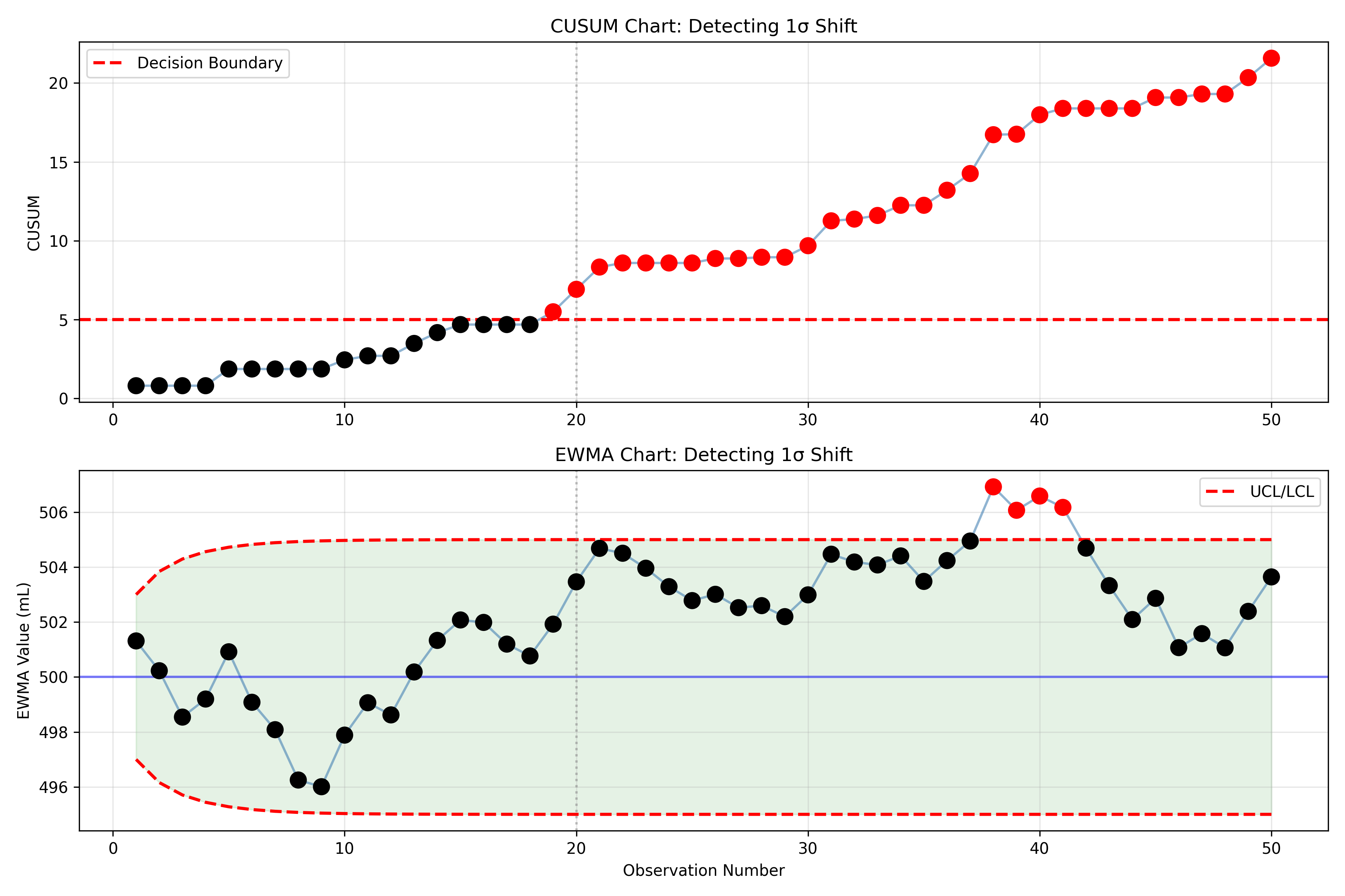
The X-bar chart is excellent at detecting large, sudden shifts in a process (e.g., a machine bearing fails, mean shifts by 2σ). However, it is slow to detect small, sustained shifts (e.g., a gradual recalibration, mean drifts by 0.5σ per day). To address this, two supplementary charts accumulate information over time: the CUSUM (Cumulative Sum) chart and the EWMA (Exponentially Weighted Moving Average) chart.
The CUSUM chart maintains a running sum of deviations from the target. If observations are $x_1, x_2, \ldots, x_n$ with target μ₀ and process standard deviation σ, the CUSUM is:
$$C_i = \max(0, C_{i-1} + (x_i - \mu_0)/\sigma - k)$$
The parameter k (typically 0.5σ) is the "slack" or "reference value" that ignores common cause variation. When the process is on target, the CUSUM stays near zero. A sustained upward shift accumulates positive deviations, and the CUSUM rises. If CUSUM crosses a decision boundary (typically h = 5σ), an out-of-control signal is triggered. The CUSUM chart's advantage: it detects small shifts in 5–10 observations, versus 15–20 for a Shewhart chart.
The EWMA chart weights recent observations more heavily:
$$z_i = \lambda x_i + (1 - \lambda) z_{i-1}$$
where λ (typically 0.1–0.3) is the smoothing constant and z₀ = μ₀. The control limits are based on the variance of z, which depends on λ and time. For early observations, the variance is small (because z is anchored to z₀); as time goes on, variance stabilizes. The EWMA chart is practical and widely used in industry because it is easy to compute and visualize, and it combines good detection of small and moderate shifts.
::: {.callout-note icon="false"}
## 📘 Theory: CUSUM Design
The CUSUM chart is rooted in sequential probability ratio testing (SPRT). We want to detect a shift from μ₀ (in-control) to μ₁ = μ₀ + δσ (out-of-control) as quickly as possible with low false alarm rate. The CUSUM accumulates the log-likelihood ratio of in-control vs out-of-control, and when it crosses a boundary, the process is declared out-of-control. The constants k and h are chosen to achieve desired type I and type II error rates (ARL₀ and ARL₁, respectively).
:::
::: {.callout-tip icon="false"}
## 🔑 Key Formula
**CUSUM (One-sided, detect upward shift):**
$$C_i^+ = \max(0, C_{i-1}^+ + (x_i - \mu_0 - k\sigma)), \quad \text{Signal if } C_i^+ > h\sigma$$
**EWMA:**
$$z_i = \lambda x_i + (1 - \lambda) z_{i-1}, \quad \text{UCL}_i = \mu_0 + 3\sigma\sqrt{\frac{\lambda}{2-\lambda}(1 - (1-\lambda)^{2i})}$$
**Where:** k ≈ 0.5 (slack/reference), h ≈ 5 (decision boundary), λ ≈ 0.2 (smoothing constant).
:::
::: {.panel-tabset}
## R
```{r}
#| label: ch51-cusum-ewma
#| fig-cap: "CUSUM and EWMA charts detecting a 1-sigma shift in Nigerian bottling fill volume"
library(tidyverse)
set.seed(6073)
# Generate data with shift at observation 20
n_obs <- 50
target <- 500
sigma <- 5
data_with_shift <- tibble(
obs = 1:n_obs,
mean_shift = ifelse(obs >= 20, 1 * sigma, 0),
x = target + mean_shift + rnorm(n_obs, 0, sigma)
)
# CUSUM
k <- 0.5 # slack parameter
h <- 5 # decision boundary (in units of sigma)
data_with_shift <- data_with_shift |>
mutate(
deviation = (x - target) / sigma - k,
cusum = cumsum(pmax(0, deviation))
) |>
mutate(
signal_cusum = cusum > h
)
# EWMA
lambda <- 0.2
ewma <- numeric(n_obs)
ewma[1] <- lambda * data_with_shift$x[1] + (1 - lambda) * target
for (i in 2:n_obs) {
ewma[i] <- lambda * data_with_shift$x[i] + (1 - lambda) * ewma[i-1]
}
data_with_shift <- data_with_shift |>
mutate(ewma = ewma)
# EWMA control limits
ewma_var <- numeric(n_obs)
for (i in 1:n_obs) {
ewma_var[i] <- sigma^2 * (lambda / (2 - lambda)) * (1 - (1 - lambda)^(2*i))
}
data_with_shift <- data_with_shift |>
mutate(
ewma_ucl = target + 3 * sqrt(ewma_var),
ewma_lcl = target - 3 * sqrt(ewma_var),
signal_ewma = ewma > ewma_ucl | ewma < ewma_lcl
)
cat("\n=== CUSUM and EWMA Detection ===\n")
cat("Shift occurs at observation 20 (1σ shift, mean → 505 mL)\n\n")
cusum_signal <- min(which(data_with_shift$signal_cusum), n_obs + 1)
ewma_signal <- min(which(data_with_shift$signal_ewma), n_obs + 1)
cat("CUSUM detects shift at observation:", cusum_signal, "\n")
cat("EWMA detects shift at observation:", ewma_signal, "\n")
# Plot
p1 <- ggplot(data_with_shift, aes(x = obs, y = cusum)) +
geom_line(alpha = 0.6) +
geom_point(aes(color = signal_cusum), size = 2) +
geom_hline(yintercept = h, color = "red", linetype = "dashed", label = "Decision Boundary") +
geom_vline(xintercept = 20, color = "gray", linetype = "dotted", alpha = 0.5) +
scale_color_manual(values = c("FALSE" = "black", "TRUE" = "red"), guide = "none") +
labs(title = "CUSUM Chart", x = "Observation", y = "CUSUM") +
theme_minimal()
p2 <- ggplot(data_with_shift, aes(x = obs, y = ewma)) +
geom_line(alpha = 0.6) +
geom_point(aes(color = signal_ewma), size = 2) +
geom_line(aes(y = ewma_ucl), color = "red", linetype = "dashed", alpha = 0.7) +
geom_line(aes(y = ewma_lcl), color = "red", linetype = "dashed", alpha = 0.7) +
geom_hline(yintercept = target, color = "blue", linetype = "solid", alpha = 0.5) +
geom_vline(xintercept = 20, color = "gray", linetype = "dotted", alpha = 0.5) +
scale_color_manual(values = c("FALSE" = "black", "TRUE" = "red"), guide = "none") +
labs(title = "EWMA Chart", x = "Observation", y = "EWMA Value (mL)") +
theme_minimal()
gridExtra::grid.arrange(p1, p2, nrow = 2)
```
## Python
```{python}
#| label: py-ch51-cusum-ewma
import numpy as np
import pandas as pd
import matplotlib.pyplot as plt
np.random.seed(6073)
# Generate data with shift at observation 20
n_obs = 50
target = 500
sigma = 5
data_list = []
for obs in range(1, n_obs + 1):
mean_shift = sigma if obs >= 20 else 0
x = target + mean_shift + np.random.normal(0, sigma)
data_list.append({'obs': obs, 'x': x})
df = pd.DataFrame(data_list)
# CUSUM
k = 0.5
h = 5
df['deviation'] = (df['x'] - target) / sigma - k
df['cusum'] = np.maximum(0, df['deviation']).cumsum()
df['signal_cusum'] = df['cusum'] > h
# EWMA
lambda_ewma = 0.2
ewma = [lambda_ewma * df['x'].iloc[0] + (1 - lambda_ewma) * target]
for i in range(1, n_obs):
ewma.append(lambda_ewma * df['x'].iloc[i] + (1 - lambda_ewma) * ewma[i-1])
df['ewma'] = ewma
# EWMA control limits
ewma_var = []
for i in range(n_obs):
var = sigma**2 * (lambda_ewma / (2 - lambda_ewma)) * (1 - (1 - lambda_ewma)**(2*(i+1)))
ewma_var.append(var)
df['ewma_ucl'] = target + 3 * np.sqrt(ewma_var)
df['ewma_lcl'] = target - 3 * np.sqrt(ewma_var)
df['signal_ewma'] = (df['ewma'] > df['ewma_ucl']) | (df['ewma'] < df['ewma_lcl'])
print("\n=== CUSUM and EWMA Detection ===")
print("Shift occurs at observation 20 (1σ shift, mean → 505 mL)\n")
cusum_signal_obs = df[df['signal_cusum']]['obs'].min() if df['signal_cusum'].any() else n_obs + 1
ewma_signal_obs = df[df['signal_ewma']]['obs'].min() if df['signal_ewma'].any() else n_obs + 1
print(f"CUSUM detects shift at observation: {cusum_signal_obs}")
print(f"EWMA detects shift at observation: {ewma_signal_obs}")
# Plot
fig, (ax1, ax2) = plt.subplots(2, 1, figsize=(12, 8))
# CUSUM
colors_cusum = ['red' if x else 'black' for x in df['signal_cusum']]
ax1.plot(df['obs'], df['cusum'], 'o-', alpha=0.6, color='steelblue', markersize=6)
ax1.scatter(df['obs'], df['cusum'], c=colors_cusum, s=100, zorder=3)
ax1.axhline(y=h, color='red', linestyle='--', linewidth=2, label='Decision Boundary')
ax1.axvline(x=20, color='gray', linestyle=':', alpha=0.5)
ax1.set_ylabel('CUSUM')
ax1.set_title('CUSUM Chart: Detecting 1σ Shift')
ax1.grid(True, alpha=0.3)
ax1.legend()
# EWMA
colors_ewma = ['red' if x else 'black' for x in df['signal_ewma']]
ax2.plot(df['obs'], df['ewma'], 'o-', alpha=0.6, color='steelblue', markersize=6)
ax2.scatter(df['obs'], df['ewma'], c=colors_ewma, s=100, zorder=3)
ax2.plot(df['obs'], df['ewma_ucl'], '--', color='red', linewidth=2, label='UCL/LCL')
ax2.plot(df['obs'], df['ewma_lcl'], '--', color='red', linewidth=2)
ax2.axhline(y=target, color='blue', linestyle='-', alpha=0.5)
ax2.axvline(x=20, color='gray', linestyle=':', alpha=0.5)
ax2.fill_between(df['obs'], df['ewma_lcl'], df['ewma_ucl'], alpha=0.1, color='green')
ax2.set_xlabel('Observation Number')
ax2.set_ylabel('EWMA Value (mL)')
ax2.set_title('EWMA Chart: Detecting 1σ Shift')
ax2.grid(True, alpha=0.3)
ax2.legend()
plt.tight_layout()
plt.show()
```
:::
::: {.callout-caution icon="false"}
## 📝 Section 51.5 Review Questions
1. What is the key advantage of CUSUM charts over traditional Shewhart X-bar charts?
2. In the code above, the CUSUM and EWMA charts both detect a 1σ shift much faster than a classical X-bar chart would. Which chart signals earlier? Why?
3. Explain the purpose of the slack parameter k in the CUSUM chart. What happens if k = 0?
4. The EWMA chart uses λ = 0.2 in the code. How would increasing λ to 0.5 change the chart's sensitivity to small shifts? (Hint: a higher λ weights recent observations more heavily.)
5. A Nigerian cement plant uses a CUSUM chart to monitor kiln temperature. The CUSUM value slowly increases over two weeks, crossing the decision boundary. What does this pattern suggest about the process? Is this the same as a sudden out-of-control signal?
:::
## Process Capability Analysis
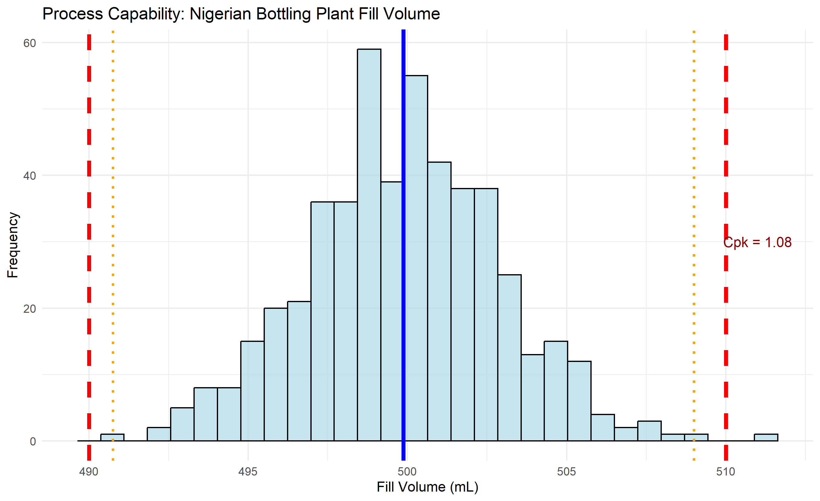
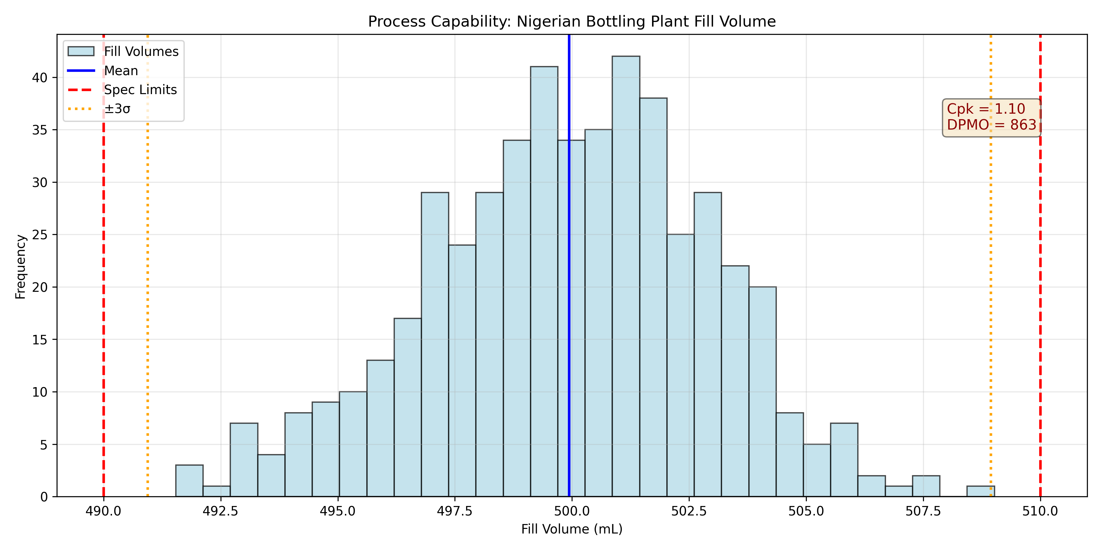
Once a process is in statistical control (no special cause variation detected by control charts), the next question is: *Is the process capable of meeting the specification limits?* A bottling plant's target is 500 mL, with specification limits of 490 mL (LSL, Lower Spec Limit) and 510 mL (USL, Upper Spec Limit). The tolerance is 20 mL. If the process standard deviation is 3 mL, the natural spread (6σ) is 18 mL. The tolerance is only slightly wider than the natural spread, so occasionally bottles will be outside spec—the process is barely capable.
The capability index *Cp* measures how well the process spread fits within the tolerance:
$$C_p = \frac{\text{USL} - \text{LSL}}{6\sigma}$$
A Cp = 1.0 means the process spread equals the tolerance; Cp < 1.0 means the process is not capable (some defects unavoidable); Cp > 1.33 is typical for well-controlled processes; Cp > 1.67 is Six Sigma.
But Cp ignores centering. A process could have Cp = 1.5 but be off-center, running mostly above the target. The *Cpk* index measures capability while accounting for centering:
$$C_{pk} = \min\left(\frac{\text{USL} - \mu}{3\sigma}, \frac{\mu - \text{LSL}}{3\sigma}\right)$$
Cpk is the capability in the worst direction. For a centered process, Cpk = Cp. For an off-center process, Cpk < Cp, reflecting that some tolerance is wasted.
Industry benchmarks: Cpk > 1.0 is the minimum acceptable, Cpk > 1.33 is typical, Cpk > 1.67 is excellent (Six Sigma). When reporting capability, always report both Cp and Cpk, and always check that the process is in statistical control first. A process with high Cpk but out-of-control signals is not truly capable.
::: {.callout-note icon="false"}
## 📘 Theory: Process Capability and Defect Rates
Assuming the process is normal with mean μ and std dev σ, the proportion of defects below LSL is $P(X < \text{LSL}) = \Phi\left(\frac{\text{LSL} - \mu}{\sigma}\right)$ and above USL is $P(X > \text{USL}) = 1 - \Phi\left(\frac{\text{USL} - \mu}{\sigma}\right)$, where Φ is the standard normal CDF. For a process with Cpk = 1.67 (Six Sigma), centered at the target, the defect rate is approximately 3.4 defects per million opportunities.
:::
::: {.callout-tip icon="false"}
## 🔑 Key Formula
**Process Capability Indices:**
$$C_p = \frac{\text{USL} - \text{LSL}}{6\sigma}, \quad C_{pk} = \min\left(\frac{\text{USL} - \mu}{3\sigma}, \frac{\mu - \text{LSL}}{3\sigma}\right)$$
**Implied Defect Rate (assuming normality):**
$$\text{Defect Rate} = P(X < \text{LSL}) + P(X > \text{USL}) = \Phi\left(\frac{\text{LSL}-\mu}{\sigma}\right) + \left(1 - \Phi\left(\frac{\text{USL}-\mu}{\sigma}\right)\right)$$
**Six Sigma Standard:** Cpk ≈ 1.67 implies a centered process with defect rate ≈ 3.4 ppm.
:::
::: {.panel-tabset}
## R
```{r}
#| label: ch51-process-capability
#| fig-cap: "Process capability chart: Nigerian bottling plant fill volume"
library(tidyverse)
library(nortest)
set.seed(3516)
# Generate in-control process data
n_samples <- 500
usl <- 510
lsl <- 490
target <- 500
sigma <- 3
# Simulate fill volumes (in-control, centered process)
fills <- target + rnorm(n_samples, 0, sigma)
# Compute capability indices
cp <- (usl - lsl) / (6 * sigma)
cpk_upper <- (usl - mean(fills)) / (3 * sd(fills))
cpk_lower <- (mean(fills) - lsl) / (3 * sd(fills))
cpk <- min(cpk_upper, cpk_lower)
# Compute defect rate
defect_lower <- pnorm(lsl, mean(fills), sd(fills))
defect_upper <- 1 - pnorm(usl, mean(fills), sd(fills))
total_defect_rate <- defect_lower + defect_upper
defect_ppm <- total_defect_rate * 1e6
cat("\n=== Process Capability Analysis ===\n")
cat("Target (μ):", round(mean(fills), 2), "\n")
cat("Std Dev (σ):", round(sd(fills), 2), "\n")
cat("USL:", usl, ", LSL:", lsl, "\n")
cat("Tolerance:", usl - lsl, "\n\n")
cat("Cp:", round(cp, 2), "\n")
cat("Cpk:", round(cpk, 2), "\n")
cat("Cpk Interpretation:", if(cpk > 1.67) "Excellent (Six Sigma)"
else if(cpk > 1.33) "Good"
else if(cpk > 1.0) "Adequate"
else "Not Capable", "\n\n")
cat("Expected Defect Rate:", round(total_defect_rate * 100, 3), "%\n")
cat("Defects Per Million:", round(defect_ppm, 0), "\n")
# Histogram with capability visualization
capability_df <- tibble(fill = fills)
ggplot(capability_df, aes(x = fill)) +
geom_histogram(bins = 30, fill = "lightblue", color = "black", alpha = 0.7) +
geom_vline(xintercept = mean(fills), color = "blue", linetype = "solid", linewidth = 1.5, label = "Mean") +
geom_vline(xintercept = usl, color = "red", linetype = "dashed", linewidth = 1.5, label = "Spec Limits") +
geom_vline(xintercept = lsl, color = "red", linetype = "dashed", linewidth = 1.5) +
geom_vline(xintercept = mean(fills) + 3*sd(fills), color = "orange", linetype = "dotted", linewidth = 1, label = "±3σ") +
geom_vline(xintercept = mean(fills) - 3*sd(fills), color = "orange", linetype = "dotted", linewidth = 1) +
annotate("text", x = usl + 1, y = 30, label = paste("Cpk =", round(cpk, 2)), color = "darkred", size = 4) +
labs(
title = "Process Capability: Nigerian Bottling Plant Fill Volume",
x = "Fill Volume (mL)",
y = "Frequency"
) +
theme_minimal() +
theme(legend.position = "topright")
```
## Python
```{python}
#| label: py-ch51-process-capability
import numpy as np
import pandas as pd
import matplotlib.pyplot as plt
from scipy.stats import norm
np.random.seed(3516)
# Parameters
n_samples = 500
usl = 510
lsl = 490
target = 500
sigma = 3
# Generate data
fills = target + np.random.normal(0, sigma, n_samples)
# Capability indices
cp = (usl - lsl) / (6 * sigma)
mean_fill = fills.mean()
std_fill = fills.std(ddof=1)
cpk_upper = (usl - mean_fill) / (3 * std_fill)
cpk_lower = (mean_fill - lsl) / (3 * std_fill)
cpk = min(cpk_upper, cpk_lower)
# Defect rate
defect_lower = norm.cdf(lsl, mean_fill, std_fill)
defect_upper = 1 - norm.cdf(usl, mean_fill, std_fill)
total_defect_rate = defect_lower + defect_upper
defect_ppm = total_defect_rate * 1e6
print("\n=== Process Capability Analysis ===")
print(f"Target (μ): {mean_fill:.2f}")
print(f"Std Dev (σ): {std_fill:.2f}")
print(f"USL: {usl}, LSL: {lsl}")
print(f"Tolerance: {usl - lsl}\n")
print(f"Cp: {cp:.2f}")
print(f"Cpk: {cpk:.2f}")
if cpk > 1.67:
print("Cpk Interpretation: Excellent (Six Sigma)")
elif cpk > 1.33:
print("Cpk Interpretation: Good")
elif cpk > 1.0:
print("Cpk Interpretation: Adequate")
else:
print("Cpk Interpretation: Not Capable")
print(f"\nExpected Defect Rate: {total_defect_rate*100:.3f}%")
print(f"Defects Per Million: {defect_ppm:.0f}")
# Plot
fig, ax = plt.subplots(figsize=(12, 6))
# Histogram
ax.hist(fills, bins=30, alpha=0.7, color='lightblue', edgecolor='black', label='Fill Volumes')
# Vertical lines
ax.axvline(mean_fill, color='blue', linestyle='-', linewidth=2, label='Mean')
ax.axvline(usl, color='red', linestyle='--', linewidth=2, label='Spec Limits')
ax.axvline(lsl, color='red', linestyle='--', linewidth=2)
ax.axvline(mean_fill + 3*std_fill, color='orange', linestyle=':', linewidth=2, label='±3σ')
ax.axvline(mean_fill - 3*std_fill, color='orange', linestyle=':', linewidth=2)
# Annotation
ax.text(usl - 2, 35, f'Cpk = {cpk:.2f}\nDPMO = {defect_ppm:.0f}',
color='darkred', fontsize=11, bbox=dict(boxstyle='round', facecolor='wheat', alpha=0.5))
ax.set_xlabel('Fill Volume (mL)')
ax.set_ylabel('Frequency')
ax.set_title('Process Capability: Nigerian Bottling Plant Fill Volume')
ax.legend()
ax.grid(True, alpha=0.3)
plt.tight_layout()
plt.show()
```
:::
::: {.callout-caution icon="false"}
## 📝 Section 51.6 Review Questions
1. A pharmaceutical fill line has fills that are normally distributed with μ = 5.02 mL, σ = 0.08 mL. The specification is 5.00 ± 0.15 mL. Compute Cp and Cpk. Is the process capable?
2. Explain why Cpk will always be less than or equal to Cp. Give an example where they differ significantly.
3. A Nigerian cement bag-filling process has a target of 50 kg and spec limits of 49–51 kg. The process standard deviation is 0.6 kg. If the process mean shifts to 50.5 kg, what happens to Cpk? Is the process still capable?
4. A process has Cpk = 0.95. The plant manager says, "Let's improve the process variability to Cpk = 1.33." How much does the standard deviation need to reduce (assuming the mean stays centered)?
5. Why is it critical that a process be in statistical control (per control charts) before computing capability indices? What would high Cpk mean if the process is out of control?
:::
## Root Cause Analysis with Analytics
Detecting that a process is out of control (via control charts) or incapable (via Cpk < 1.0) is only the first step. The next step is root cause analysis: *why* did the process go wrong? Was it a machine failure, poor raw material, operator error, environmental change, or something else? Analytics helps prioritize investigation and identify data-driven causes.
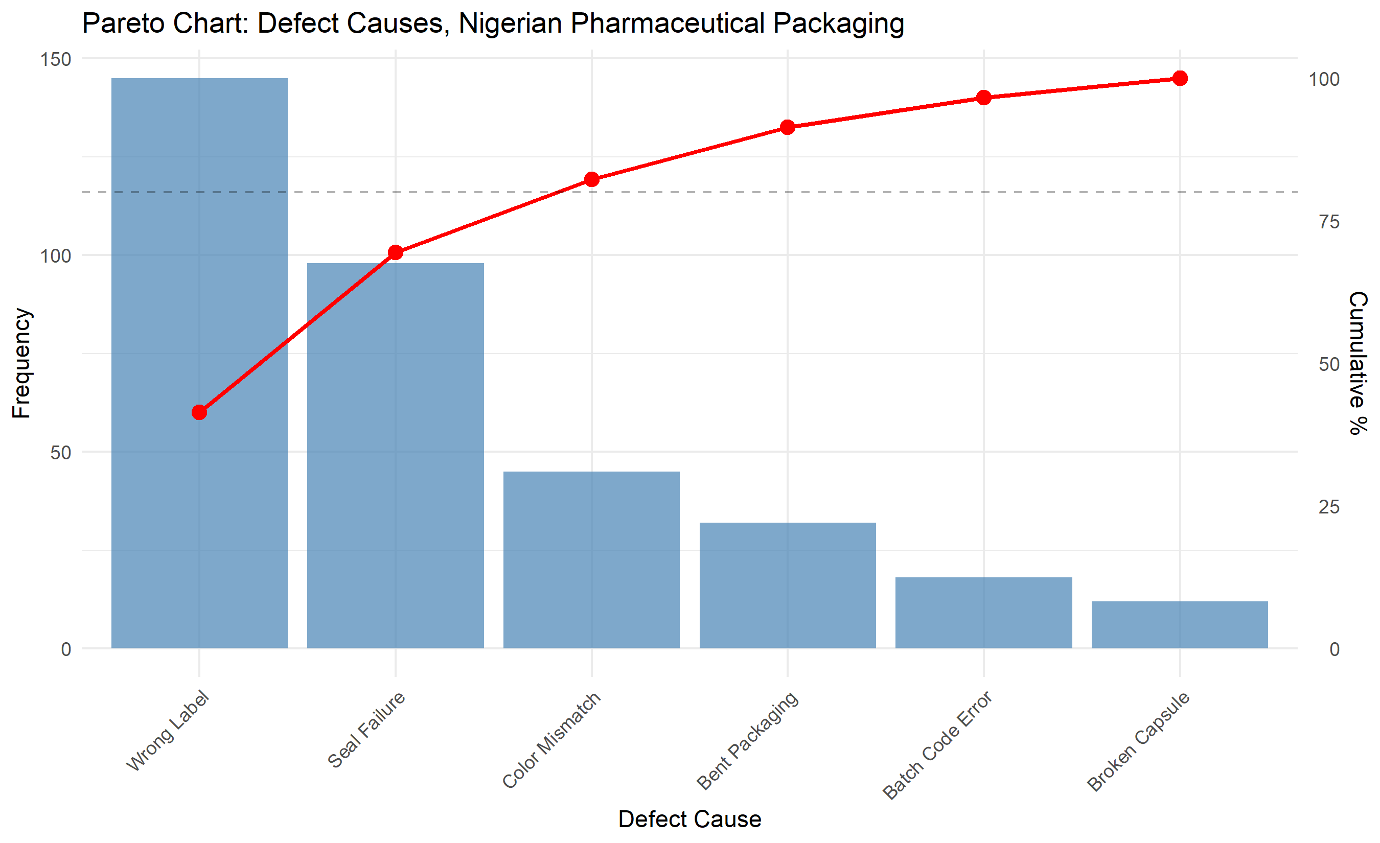
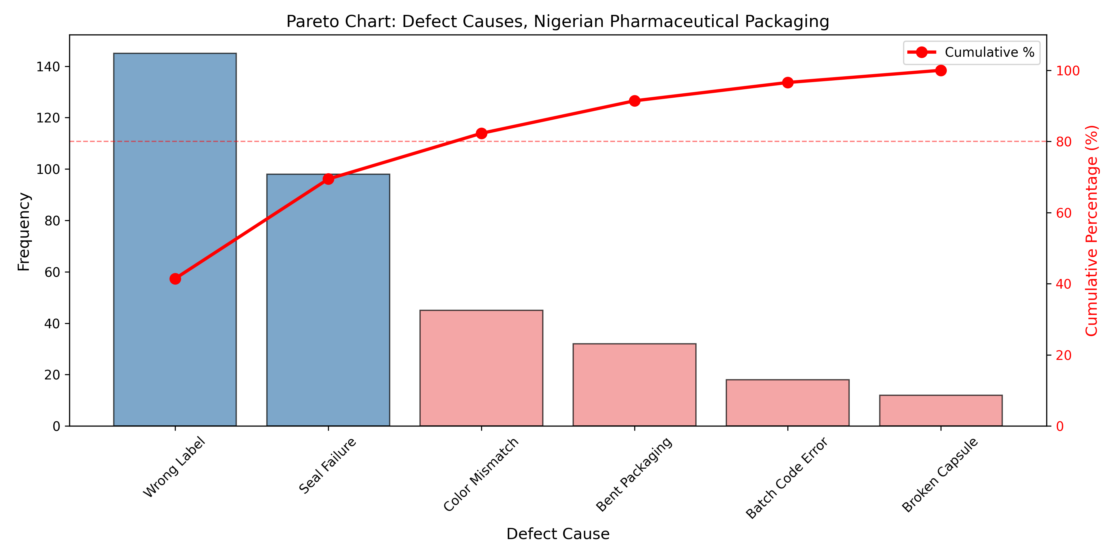
A Pareto chart ranks defect causes by frequency. If a packaging line produces 100 defective packs in a week due to: wrong label (40), seal failure (35), wrong color (15), bent corner (10), the Pareto chart shows that wrong label and seal failure account for 75% of defects. The plant should focus improvement efforts on these two causes first. This is the 80/20 rule applied to quality: 80% of problems are caused by 20% of causes.
An Ishikawa (fishbone) diagram organizes potential causes into six categories: Machine (equipment malfunction), Method (process design), Material (raw material quality), Man (operator training or error), Measurement (inspection/testing errors), and Mother Nature (environmental factors). For each main category, investigators brainstorm subcauses and data is collected to test hypotheses.
Regression trees can identify which process parameters predict defects. For example, if a production line records temperature, humidity, line speed, and raw material batch, a regression tree can reveal: "defects occur when (temperature > 35°C AND humidity > 70%) OR (line speed > 100 units/min AND raw material from Supplier B)." This directs improvement efforts toward process parameters that matter.
Correlation analysis tests whether defect rate correlates with measurable process variables. A beverage bottling plant hypothesizes that seal failures correlate with ambient temperature (sealing wax is temperature-sensitive). By collecting daily defect counts and ambient temperatures for 30 days, a correlation coefficient reveals the strength of this relationship. If r = 0.75 (strong positive correlation), this supports the hypothesis and points to installing temperature control in the sealing room.
::: {.callout-note icon="false"}
## 📘 Theory: Pareto Principle and Optimization
The Pareto principle (80/20 rule) states that a small number of causes account for the bulk of effects. In quality, this means that fixing the top 20% of causes often eliminates 80% of defects. This is an optimization principle: resources are limited, so focus on high-impact improvements first. Data science identifies which causes are high-impact.
:::
::: {.callout-tip icon="false"}
## 🔑 Key Formula
**Pareto Analysis: Cumulative Percentage**
$$\text{Cumulative %} = \frac{\sum_{i=1}^{k} \text{Frequency}_i}{\sum_{i=1}^{n} \text{Frequency}_i} \times 100$$
Sort causes by frequency in descending order and compute cumulative percentage. Causes contributing to first 80% are the "vital few."
**Correlation Test: Defect Rate vs Process Variable**
$$r = \frac{\text{Cov}(X, Y)}{\sigma_X \sigma_Y}$$
If |r| > 0.3, there is a potential relationship worth investigating further.
:::
::: {.panel-tabset}
## R
```{r}
#| label: ch51-root-cause-pareto
#| fig-cap: "Pareto chart: Defect causes at Nigerian pharmaceutical packaging line"
library(tidyverse)
# Synthetic defect data
defect_causes <- tibble(
cause = c("Wrong Label", "Seal Failure", "Color Mismatch", "Bent Packaging",
"Batch Code Error", "Broken Capsule"),
frequency = c(145, 98, 45, 32, 18, 12)
) |>
arrange(desc(frequency)) |>
mutate(
cumulative = cumsum(frequency),
cumulative_pct = cumulative / sum(frequency) * 100,
cause_fct = factor(cause, levels = cause)
)
cat("\n=== Pareto Analysis: Defect Causes ===\n")
print(defect_causes)
# Pareto chart
p1 <- ggplot(defect_causes, aes(x = cause_fct, y = frequency)) +
geom_col(fill = "steelblue", alpha = 0.7) +
geom_line(aes(y = cumulative_pct * (max(frequency)/100)), color = "red", linewidth = 1, group = 1) +
geom_point(aes(y = cumulative_pct * (max(frequency)/100)), color = "red", size = 3) +
scale_y_continuous(
name = "Frequency",
sec.axis = sec_axis(~. * 100 / max(defect_causes$frequency), name = "Cumulative %")
) +
geom_hline(yintercept = 0.8 * (max(defect_causes$frequency)), linetype = "dashed", alpha = 0.3) +
labs(
title = "Pareto Chart: Defect Causes, Nigerian Pharmaceutical Packaging",
x = "Defect Cause"
) +
theme_minimal() +
theme(axis.text.x = element_text(angle = 45, hjust = 1))
print(p1)
# Vital few (80/20)
vital_few <- defect_causes |>
filter(cumulative_pct <= 80)
cat("\n=== Vital Few (80/20 Rule) ===\n")
cat("Causes responsible for ~80% of defects:\n")
print(vital_few |> select(cause, frequency, cumulative_pct))
```
## Python
```{python}
#| label: py-ch51-root-cause-pareto
import pandas as pd
import matplotlib.pyplot as plt
import numpy as np
# Defect data
defect_data = {
'Cause': ['Wrong Label', 'Seal Failure', 'Color Mismatch', 'Bent Packaging',
'Batch Code Error', 'Broken Capsule'],
'Frequency': [145, 98, 45, 32, 18, 12]
}
df = pd.DataFrame(defect_data)
df = df.sort_values('Frequency', ascending=False).reset_index(drop=True)
df['Cumulative'] = df['Frequency'].cumsum()
df['Cumulative_Pct'] = (df['Cumulative'] / df['Frequency'].sum()) * 100
print("\n=== Pareto Analysis: Defect Causes ===")
print(df)
# Vital few (80/20)
vital_few = df[df['Cumulative_Pct'] <= 80]
print("\n=== Vital Few (80/20 Rule) ===")
print("Causes responsible for ~80% of defects:")
print(vital_few[['Cause', 'Frequency', 'Cumulative_Pct']])
# Pareto chart
fig, ax1 = plt.subplots(figsize=(12, 6))
# Bar chart
colors = ['steelblue' if pct <= 80 else 'lightcoral' for pct in df['Cumulative_Pct']]
bars = ax1.bar(df['Cause'], df['Frequency'], color=colors, alpha=0.7, edgecolor='black')
ax1.set_ylabel('Frequency', fontsize=12)
ax1.set_xlabel('Defect Cause', fontsize=12)
ax1.set_title('Pareto Chart: Defect Causes, Nigerian Pharmaceutical Packaging', fontsize=13)
ax1.tick_params(axis='x', rotation=45)
# Line chart (cumulative %)
ax2 = ax1.twinx()
ax2.plot(df['Cause'], df['Cumulative_Pct'], 'o-', color='red', linewidth=2.5, markersize=8, label='Cumulative %')
ax2.set_ylabel('Cumulative Percentage (%)', fontsize=12, color='red')
ax2.tick_params(axis='y', labelcolor='red')
ax2.axhline(y=80, color='red', linestyle='--', alpha=0.5, linewidth=1)
ax2.set_ylim(0, 110)
# Legend
lines1, labels1 = ax1.get_legend_handles_labels()
lines2, labels2 = ax2.get_legend_handles_labels()
ax1.legend(lines2, labels2, loc='upper right')
plt.tight_layout()
plt.show()
```
:::
::: {.callout-caution icon="false"}
## 📝 Section 51.7 Review Questions
1. In the Pareto chart above, the first two causes (Wrong Label and Seal Failure) account for what percentage of defects? Based on the 80/20 rule, where should the plant focus improvement efforts?
2. Design an Ishikawa (fishbone) diagram for seal failures in a bottling plant. For each of the six M categories (Machine, Method, Material, Man, Measurement, Mother Nature), suggest two potential sub-causes.
3. A plant records the following data over 20 days:
- Day 1: 28°C, 3 defects
- Day 2: 32°C, 5 defects
- Day 3: 25°C, 1 defect
- ...
Compute the correlation between temperature and daily defect count. If r = 0.72, what conclusion would you draw?
4. A regression tree identifies the rule: "Defects occur when (Raw Material Supplier = A AND Line Speed > 150) OR (Temperature > 35°C)." What improvement experiments would you recommend?
5. Why is root cause analysis more important than simply lowering the upper or lower specification limits to match current process performance?
:::
## Case Study: Quality Analytics for a Nigerian Bottling Plant Under NAFDAC Compliance
A 30-year-old beverage bottling plant in Lagos has applied for NAFDAC re-certification. The agency requires evidence of statistical process control and minimum capability (Cpk > 1.0) for fill volume. The plant has installed IoT sensors on the main filling machine and collected 30 subgroups of n = 5 fill measurements over two weeks, plus 25 daily packaging inspections (n = 200 packs per day) and 200 temperature readings from the sealing chamber.
**Data Overview:**
- X-bar/R chart data: 30 subgroups, 5 fills per subgroup, target = 500 mL, spec = 490–510 mL
- p-chart data: 25 days, 200 packs inspected per day, defect types tracked
- Ambient temperature readings: 200 observations, potential correlation with seal failures
**Step 1: X-bar/R Chart Analysis**
The plant computes subgroup means and ranges. The first 21 subgroups are stable (all within control limits). At subgroup 22, the mean rises to 505.8 mL, just above the UCL (504.2 mL). Subgroups 22–30 remain elevated. The R chart stays in control, suggesting the machine's spread is stable but the mean has shifted upward.
```r
# Abbreviated code: X-bar/R construction
subgroup_stats |>
  filter(subgroup >= 20 & subgroup <= 30) |>
  select(subgroup, xbar, R, ooc_xbar)
# Output:
# subgroup    xbar        R  ooc_xbar
#        20  500.2      7.2     FALSE
#        21  500.5      8.1     FALSE
#        22  505.8      7.8      TRUE
#        23  505.1      8.3      TRUE
#        ...
```
**Step 2: Correlation Analysis—Temperature and Seal Failures**
The plant collects daily temperatures (°C) and daily defect counts. Correlation analysis reveals r = 0.68, a strong positive relationship. Higher temperature → more seal failures.
```r
# Simplified correlation test
cor.test(~temperature + seal_failures, data = qc_data)
# r = 0.68, p-value < 0.05
```
This prompts investigation: the sealing wax becomes too soft above 32°C, compromising seal integrity. Recommendation: install air conditioning in the sealing chamber and maintain temperature ≤ 30°C.
**Step 3: p-Chart and Pareto Analysis**
Daily packaging defects: 3–6% over 25 days, average 4.2%. Defect causes breakdown:
- Seal failures: 58 defects (54%)
- Label misalignment: 31 defects (29%)
- Color variation: 16 defects (15%)
- Other: 3 defects (2%)
Pareto analysis: seal failures and label misalignment account for 83% of defects. The plant focuses on these two.
**Step 4: Process Capability**
Subgroup data (excluding out-of-control subgroups 22–30) yields:
- Mean (subgroups 1–21): 500.2 mL
- Std dev: 2.8 mL
- Cpk = min((510 − 500.2)/(3×2.8), (500.2 − 490)/(3×2.8)) = min(1.19, 1.21) = 1.19
Cpk = 1.19 is barely acceptable. To reach Cpk = 1.33, the plant must reduce variability to σ ≤ 2.5 mL.
**Step 5: Root Cause and Action Plan**
The elevated mean (subgroups 22–30) is traced to a recalibration that was performed on day 11 of the study. Investigation reveals:
1. Calibration procedure was not well-documented; the technician used approximate settings
2. The machine has a history of drifting 5–10 mL per week
3. Preventive maintenance schedule had been stretched from every 2 weeks to every 4 weeks
**Actions Recommended:**
1. Tighten preventive maintenance to every 10 business days (reduce drift)
2. Implement standardized calibration SOP with written checklist
3. Install temperature control in sealing chamber (≤ 30°C) to address seal failures
4. Increase label system maintenance to reduce misalignment
5. Retrain operators on proper machine adjustment
6. Implement real-time monitoring dashboard: alert operators when X-bar approaches control limits
**NAFDAC Submission:**
The plant submits control charts for subgroups 1–21 (in-control period), demonstrating Cpk = 1.19 over one week. It also submits the root cause analysis, showing that the shift at subgroup 22 was due to calibration drift (special cause, now addressed). With corrective actions in place (preventive maintenance, temperature control), the plant projects Cpk > 1.33 within one month. NAFDAC grants provisional certification pending re-audit.
::: {.exercises}
#### Chapter 51 Exercises
1. **(Recall)** Distinguish between Type I error (false alarm) and Type II error (missed signal) in the context of control charts. For a three-sigma Shewhart chart, what is the approximate false alarm rate?
2. **(Recall)** Define the four categories in Juran's cost-of-quality framework and give an example of each from a Nigerian manufacturing context.
3. **(Comprehension)** Explain why the range (R) in an X-bar/R chart must be in control before interpreting the X-bar chart. What would high, out-of-control R values suggest?
4. **(Application)** A pharmaceutical capsule-filling machine has fills with mean 0.55 g and std dev 0.03 g. Spec limits are 0.50–0.60 g. Compute Cp and Cpk. Is the process capable?
5. **(Application)** A p-chart for daily defect rates over 30 days shows an average proportion of 0.035 (3.5%). Five consecutive days have proportions of 0.042, 0.048, 0.051, 0.045, 0.043. Do these points trigger the Western Electric rule "4 of 5 beyond 1σ"? (Assume n = 200 per day.)
6. **(Application)** A CUSUM chart with k = 0.5σ and h = 5σ detects a 0.5σ process shift. Approximately how many observations will the CUSUM chart require to signal? (Hint: the CUSUM must accumulate roughly h × (1/(detection threshold)) observations.)
7. **(Analysis)** A cement plant's bottling line has a Cpk = 0.95. The quality engineer proposes two solutions: (A) reduce process std dev by 10%, or (B) center the process better by adjusting the mean. Which approach would you recommend and why?
8. **(Analysis)** Pareto analysis of a food packaging line shows: wrong weight (45%), seal failure (35%), label missing (15%), other (5%). A cost analysis reveals: wrong weight cost to fix = ₦500 per unit, seal failure = ₦800, label = ₦200. Which defect type should the plant prioritize for reduction and why?
9. **(Synthesis)** You are hired to implement a quality system for a Nigerian pharmaceutical manufacturer seeking ISO 9001 certification. Outline a six-month quality improvement roadmap, including control chart types, capability targets, and key milestones.
10. **(Synthesis)** A bottling plant experiences a sudden increase in seal failures (from 2% to 8% of units). Design an analytics-driven root cause investigation plan using Pareto, correlation, regression trees, and control charts. Describe the sequence of analyses and the decision rules for next steps.
:::
## Further Reading
- Shewhart, W. A. (1931). Economic control of quality of manufactured product. D. Van Nostrand Company.
- Juran, J. M. (1988). Juran on planning for quality. The Free Press.
- Montgomery, D. C. (2020). Introduction to statistical quality control (8th ed.). Wiley.
- NAFDAC Standards Compendium: https://nafdac.gov.ng/ (access official Nigerian pharmaceutical quality standards).
## Chapter 51 Appendix: Mathematical Derivations
### A51.1 Derivation of X-bar Control Limits from Sampling Distribution
For a process with true mean μ and standard deviation σ, the sampling distribution of the mean from samples of size n is:
$$\bar{X} \sim \text{Normal}\left(\mu, \frac{\sigma}{\sqrt{n}}\right)$$
Under the 99.7% confidence rule (three-sigma), approximately 99.7% of sample means fall within:
$$\mu \pm 3 \cdot \frac{\sigma}{\sqrt{n}}$$
In practice, σ is unknown, so we estimate it from subgroup ranges using the unbiased estimator $\hat{\sigma} = \bar{R}/d_2$, where d₂ depends on subgroup size n:
| n | d₂ | A₂ | D₃ | D₄ |
|---|----|----|----|----|
| 2 | 1.128 | 1.880 | 0 | 3.267 |
| 3 | 1.693 | 1.023 | 0 | 2.575 |
| 4 | 2.059 | 0.729 | 0 | 2.282 |
| 5 | 2.326 | 0.577 | 0 | 2.114 |
| 6 | 2.534 | 0.483 | 0 | 2.004 |
Thus: $A_2 = \frac{3}{d_2 \sqrt{n}}$, and the control limits become:
$$\text{UCL}_{\bar{X}} = \bar{\bar{X}} + A_2 \bar{R}, \quad \text{LCL}_{\bar{X}} = \bar{\bar{X}} - A_2 \bar{R}$$
### A51.2 Derivation of R-Chart Control Limits
The range R of a sample of size n from a Normal(μ, σ) distribution has expected value $E[R] = d_2 \sigma$ and standard deviation $\sigma_R = d_3 \sigma$. The three-sigma control limits for the range are:
$$\bar{R} \pm 3 d_3 \sigma = \bar{R} \pm 3 d_3 \cdot \frac{\bar{R}}{d_2}$$
Simplifying:
$$\text{UCL}_R = \bar{R} \left(1 + \frac{3 d_3}{d_2}\right) = D_4 \bar{R}, \quad \text{LCL}_R = \bar{R} \left(1 - \frac{3 d_3}{d_2}\right) = D_3 \bar{R}$$
Where:
- $D_4 = 1 + \frac{3 d_3}{d_2}$
- $D_3 = 1 - \frac{3 d_3}{d_2}$ (equals 0 for n ≤ 6 because negative LCL is meaningless)
### A51.3 CUSUM Sequential Probability Ratio Test (SPRT)
The CUSUM chart is derived from the sequential probability ratio test. We wish to distinguish between two hypotheses:
- H₀: Process is in-control (mean = μ₀)
- H₁: Process is out-of-control (mean = μ₁ = μ₀ + δσ)
The log-likelihood ratio after observing $x_1, \ldots, x_n$ is:
$$\text{LLR} = \sum_{i=1}^{n} \log \frac{f(x_i | H_1)}{f(x_i | H_0)} = \sum_{i=1}^{n} \left( \frac{\delta(2x_i - \mu_0 - \mu_1)}{2\sigma^2} \right)$$
Simplifying (and setting μ₀ = 0, δ = 1 for clarity):
$$C_n = \sum_{i=1}^{n} \left( x_i - \frac{\sigma}{2} \right) = \sum_{i=1}^{n} (x_i - k\sigma)$$
where k = 0.5. The CUSUM continues as long as $0 < C_n < h$; it signals if $C_n \geq h$ or $C_n \leq 0$ (for two-sided test, use absolute value). The parameters h and k are chosen to control Type I and Type II error rates (ARL₀ and ARL₁).
### A51.4 EWMA Optimal Smoothing Constant
The EWMA filter $z_i = \lambda x_i + (1-\lambda) z_{i-1}$ is optimal (in the mean-square sense) for detecting shifts in an ARIMA(0,1,1) process. The optimal λ depends on the shift magnitude and allowable false alarm rate. Generally:
- λ ≈ 0.05–0.2 for small shift detection (0.5σ to 1σ)
- λ ≈ 0.2–0.5 for moderate shift detection (1σ to 2σ)
For most manufacturing applications, λ = 0.2 is a good default.
### A51.5 Cpk and Defect Rate Relationship
For a normal process with mean μ and std dev σ:
$$\text{Proportion Defective} = \Phi\left( \frac{\text{LSL} - \mu}{\sigma} \right) + \left( 1 - \Phi\left( \frac{\text{USL} - \mu}{\sigma} \right) \right)$$
For a centered process (μ = (LSL + USL)/2):
$$C_p = \frac{\text{USL} - \text{LSL}}{6\sigma}, \quad C_{pk} = C_p$$
And:
$$\text{Cpk} = \frac{\text{USL} - \mu}{3\sigma} = \frac{1}{3} \cdot \frac{\text{USL} - \mu}{\sigma}$$
So:
$$\text{Defect Rate} = 2 \left( 1 - \Phi(3 C_{pk}) \right)$$
For Cpk = 1.67:
$$\text{Defect Rate} = 2 (1 - \Phi(5)) \approx 2 \times 2.87 \times 10^{-7} = 3.4 \times 10^{-6} \approx 3.4 \text{ ppm}$$
This is the Six Sigma standard.
### A51.6 Six Sigma DPMO Calculation
Six Sigma means that the process mean is 6σ away from the nearest specification limit. In a centered process with symmetric tolerances:
$$\text{DPMO} = 2 \times 10^6 \times \Phi(-\text{Cpk} \times 3)$$
For Cpk = 1.67 (6σ), the DPMO is approximately 3.4 million⁻¹ = 3.4 ppm.
Motorola's original Six Sigma initiative used a more conservative assumption of a 1.5σ shift in the long term, leading to the DPMO target of 3.4 at Cpk ≈ 1.67 as an aspirational standard.