---
title: "Employee Performance Analytics"
---
```{python}
#| label: python-setup-54-employee-performance
#| include: false
import numpy as np
import pandas as pd
import matplotlib.pyplot as plt
import seaborn as sns
from scipy import stats
from sklearn.linear_model import LinearRegression
from sklearn.preprocessing import StandardScaler
from sklearn.model_selection import cross_val_score, KFold
import networkx as nx
from scipy.stats import pearsonr
from scipy.stats import chi2
from lifelines import KaplanMeierFitter
```
::: {.callout-note icon="false"}
## 📋 Learning Objectives
By the end of this chapter, you will:
- Define and measure employee performance across objective, subjective, and multidimensional frameworks
- Analyze rating distributions to detect inflation bias and systemic fairness issues
- Build regression models to identify true performance drivers and control for confounders
- Compute inter-rater reliability (ICC) for 360-degree feedback systems and interpret agreement patterns
- Conduct network analysis on collaboration data to uncover performance correlations with structural position
- Apply regression-based bias testing and Oaxaca-Blinder decomposition to quantify discrimination
- Design and audit fair, data-driven performance management systems for African organisations
:::
## Defining and Measuring Performance
Performance management is a cornerstone of human capital strategy, yet many African organisations struggle with measurement frameworks that are simultaneously rigorous, fair, and actionable. The fundamental challenge is that employee performance is multidimensional: a loan officer at a Nigerian bank must originate quality loans (volume and accuracy), maintain client relationships (satisfaction scores), follow compliance procedures, and develop team members if in a supervisory role. Capturing all these dimensions in a single 5-point rating is inherently reductive. Yet organisations must compress performance into categorical decisions: who gets promoted, who receives a bonus, who is placed on a performance improvement plan?
A comprehensive performance measurement system distinguishes between objective metrics and subjective assessments. Objective metrics are directly observable and quantifiable: a loan officer originated 47 loans in Q1, with a default rate of 2.1%, and closed 94% of them within the 30-day target. Subjective metrics rely on human judgment: a manager rates the same loan officer 4 out of 5 on "customer relationship management" based on client feedback and observed interactions. Both are valuable and necessary. Objective metrics are less prone to bias but may not capture nuanced competencies like strategic thinking or adaptability. Subjective ratings capture holistic capability but are vulnerable to unconscious bias, recency bias (overweighting recent events), and leniency effects (inflating ratings to avoid difficult conversations). A rigorous system uses both, with clear protocols for combining them and statistical audits for fairness.
The performance management cycle in Nigerian and other African organisations typically follows a calendar pattern: goal-setting in January (aligning individual objectives with departmental and corporate strategy), mid-year review in June (assessing progress, discussing obstacles, recalibrating goals), and year-end assessment in December (final evaluation of achievement, rating assignment, and determination of salary increments, bonuses, and promotion eligibility). This cycle creates fixed points for data collection and decision-making. Within the cycle, ongoing feedback occurs—ideally frequent but often sporadic. At year-end, the accumulated data (manager observations, client feedback, quantitative outputs, peer assessments) is synthesised into a final rating. The stakes are high: a 5-point rating at a commercial bank directly maps to bonus percentages (a rating of 5 = 200% of base bonus, a 3 = 100%, a 1 = 0%), making accuracy and fairness not merely desirable but legally and ethically imperative.
The Balanced Scorecard (Kaplan & Norton, 1992) provides a conceptual framework for multidimensional performance. It organises metrics across four perspectives: (1) Financial (revenue, profit margin, cost control), (2) Customer (net promoter score, retention rate, complaint resolution time), (3) Internal Process (cycle time, defect rate, process efficiency), (4) Learning & Growth (training completion rate, skill certifications, succession readiness). For a Nigerian bank, the Financial perspective might include "loan portfolio growth of 15% YoY"; the Customer perspective, "NPS score of 50 in retail banking"; the Internal Process perspective, "approval turnaround time ≤ 5 days"; and Learning & Growth, "average of 40 training hours per employee annually." These corporate-level scorecard metrics cascade downward: a loan origination unit inherits the "portfolio growth" target, adding supporting metrics like "average loan ticket size," "approval rate," and "default rate within 60 days." Individual loan officers receive personalised targets aligned to these unit-level goals, creating a line of sight from corporate strategy to individual action. A loan officer's performance is then assessed on how well she achieves her individualised balanced scorecard, which includes both financial outputs (loans originated, revenue) and developmental inputs (training hours completed, mentoring junior staff).
::: {.callout-note icon="false"}
## 📘 Theory: The KPI Hierarchy and Strategic Alignment
A Key Performance Indicator (KPI) is a quantifiable measure aligned to a strategic objective. The KPI hierarchy has multiple levels:
1. **Corporate Strategic Objectives** (e.g., "Become the #1 retail bank by market share in the South-West region within 3 years")
2. **Departmental KPIs** (e.g., for the Retail Banking Department: "Grow customer deposits by 20% YoY," "Improve NPS score from 45 to 55," "Reduce approval turnaround from 7 to 5 days")
3. **Unit-Level KPIs** (e.g., for the Ikorodu Branch: "Originate ₦500M in new deposits," "Achieve 60% approval rate on applications," "Deliver 15 customer training sessions")
4. **Individual KPIs** (e.g., for Loan Officer Chinedu: "Originate 50 loans totalling ₦150M," "Maintain default rate ≤ 2%," "Complete 30 training hours in digital banking")
Each employee should have 4–6 KPIs (not dozens, which dilute focus). KPIs should be SMART (Specific, Measurable, Achievable, Relevant, Time-bound). A Key Result Area (KRA) is a broader category of responsibility; a KPI is a specific metric within a KRA. Chinedu's KRA might be "Loan Origination & Quality," with KPIs for volume, quality (default rate), and client satisfaction.
:::
::: {.callout-tip icon="false"}
## 🔑 Key Formula: KPI Achievement Index
$$\text{KPI Achievement} = \frac{\text{Actual Value}}{\text{Target Value}} \times 100\%$$
If Chinedu targets 50 loans and originates 48, his achievement is 96%. If he targets a 2% default rate and achieves 1.8%, his achievement is 110% (he exceeded the target). Typically, 80–120% achievement is considered "Meets Expectations," 120%+ is "Exceeds," and <80% is "Below Expectations." However, some KPIs have quality floors (a default rate achievement of 110% means *fewer* defaults, which is always good; other metrics may have ceilings, e.g., cost reduction—achieving 130% cost reduction may indicate under-investment).
:::
::: {.panel-tabset}
## R
```{r}
#| label: ch54-performance-dataset
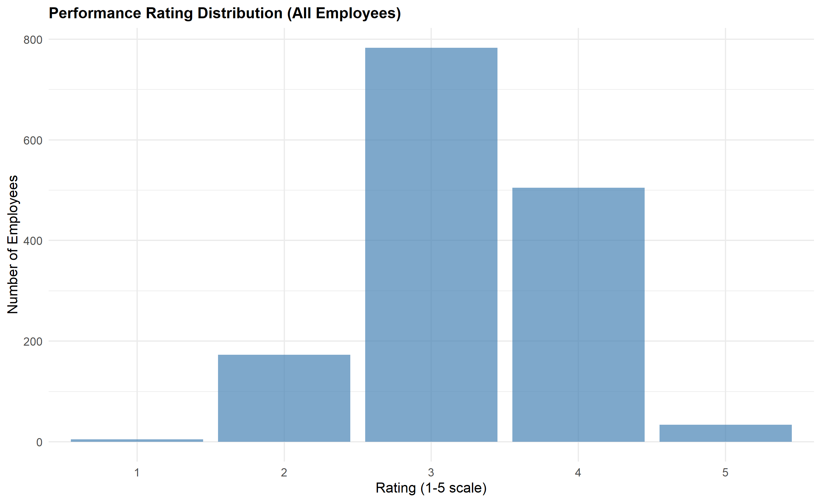
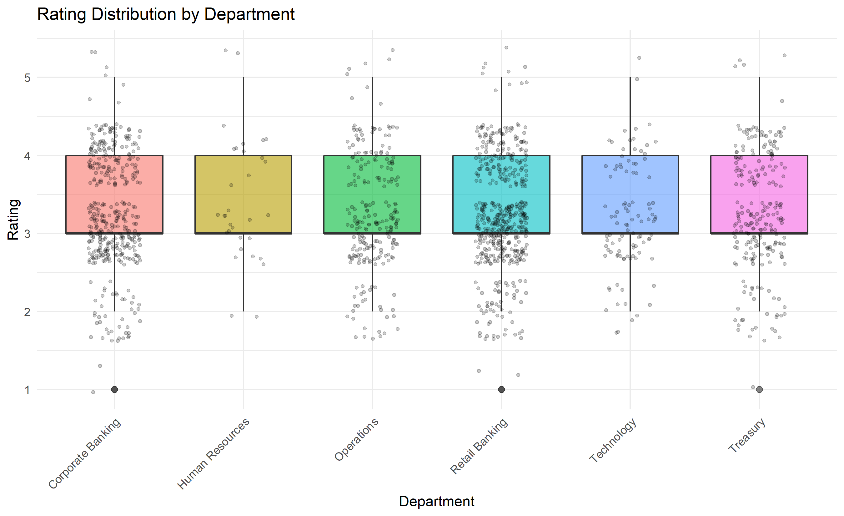
#| fig-cap: "Synthetic Nigerian Bank Performance Data: Distribution by Department and Zone"
library(tidyverse)
library(knitr)
set.seed(4153)
# Synthetic Nigerian Commercial Bank Performance Dataset
# 1,500 employees across 6 departments and 6 geopolitical zones
bank_data <- tibble(
employee_id = 1:1500,
department = sample(
c("Retail Banking", "Corporate Banking", "Treasury",
"Operations", "Technology", "Human Resources"),
1500, replace = TRUE, prob = c(0.35, 0.25, 0.15, 0.15, 0.07, 0.03)
),
zone = sample(
c("South-West", "North-West", "North-East",
"South-East", "South-South", "North-Central"),
1500, replace = TRUE, prob = c(0.30, 0.20, 0.15, 0.15, 0.12, 0.08)
),
gender = sample(c("Male", "Female"), 1500, replace = TRUE, prob = c(0.65, 0.35)),
grade_level = sample(1:6, 1500, replace = TRUE,
prob = c(0.20, 0.25, 0.25, 0.15, 0.10, 0.05)),
years_experience = sample(1:25, 1500, replace = TRUE),
training_hours = rpois(1500, 35),
engagement_score = rnorm(1500, 65, 15), # 0-100 scale
prior_year_rating = sample(1:5, 1500, replace = TRUE,
prob = c(0.05, 0.10, 0.45, 0.30, 0.10))
)
# Generate current-year rating with realistic bias patterns
# High performers from last year tend to stay high (momentum)
# Training hours improve ratings
# Engagement correlates with ratings
# Subtle gender bias: women rated 0.15 points lower on average
bank_data <- bank_data |>
mutate(
base_rating = 2.5 +
0.5 * (prior_year_rating - 3) +
0.008 * training_hours +
0.006 * engagement_score +
-0.15 * (gender == "Female"),
noise = rnorm(1500, 0, 0.4),
current_year_rating_raw = base_rating + noise,
current_year_rating = round(pmin(5, pmax(1, current_year_rating_raw)), 0)
) |>
select(employee_id, department, zone, gender, grade_level,
years_experience, training_hours, engagement_score,
prior_year_rating, current_year_rating)
# Summary statistics
cat("\n=== Nigerian Bank Performance Dataset (1,500 Employees) ===\n\n")
cat("Employees by Department:\n")
print(table(bank_data$department))
cat("\n\nEmployees by Zone:\n")
print(table(bank_data$zone))
cat("\n\nCurrent Year Rating Distribution:\n")
rating_dist <- bank_data |>
count(current_year_rating) |>
mutate(
percentage = round(n / sum(n) * 100, 1),
label = c("Below Expectations", "Below Expectations",
"Meets Expectations", "Exceeds Expectations", "Exceeds Expectations")
)
print(rating_dist)
cat("\n\nRating Inflation Index (% rated 4-5):",
round(sum(rating_dist$n[rating_dist$current_year_rating >= 4]) / nrow(bank_data) * 100, 1),
"%\n")
cat("\nMean Rating by Department:\n")
dept_summary <- bank_data |>
group_by(department) |>
summarise(
n = n(),
mean_rating = round(mean(current_year_rating), 2),
median_rating = median(current_year_rating),
sd_rating = round(sd(current_year_rating), 2),
.groups = 'drop'
) |>
arrange(desc(mean_rating))
print(dept_summary)
cat("\n\nMean Rating by Gender:\n")
gender_summary <- bank_data |>
group_by(gender) |>
summarise(
n = n(),
mean_rating = round(mean(current_year_rating), 3),
median_rating = median(current_year_rating),
.groups = 'drop'
)
print(gender_summary)
# Visualise rating distribution
p1 <- ggplot(bank_data, aes(x = factor(current_year_rating))) +
geom_bar(fill = "steelblue", alpha = 0.7) +
labs(
title = "Performance Rating Distribution (All Employees)",
x = "Rating (1-5 scale)",
y = "Number of Employees"
) +
theme_minimal() +
theme(plot.title = element_text(face = "bold", size = 12))
print(p1)
# Rating distribution by department (boxplot style)
p2 <- ggplot(bank_data, aes(x = department, y = current_year_rating, fill = department)) +
  geom_boxplot(alpha = 0.6, outlier.size = 2) +
  geom_jitter(width = 0.2, alpha = 0.2, size = 1) +
  labs(
    title = "Rating Distribution by Department",
    x = "Department",
    y = "Rating"
  ) +
  theme_minimal() +
  theme(axis.text.x = element_text(angle = 45, hjust = 1),
        legend.position = "none")

print(p2)
```
## Python
```{python}
#| label: py-ch54-performance-dataset
import numpy as np
import pandas as pd
import matplotlib.pyplot as plt
import seaborn as sns
np.random.seed(4153)
# Synthetic Nigerian Commercial Bank Performance Dataset
n_employees = 1500
bank_df = pd.DataFrame({
'employee_id': range(1, n_employees + 1),
'department': np.random.choice(
['Retail Banking', 'Corporate Banking', 'Treasury', 'Operations', 'Technology', 'HR'],
n_employees, p=[0.35, 0.25, 0.15, 0.15, 0.07, 0.03]
),
'zone': np.random.choice(
['South-West', 'North-West', 'North-East', 'South-East', 'South-South', 'North-Central'],
n_employees, p=[0.30, 0.20, 0.15, 0.15, 0.12, 0.08]
),
'gender': np.random.choice(['Male', 'Female'], n_employees, p=[0.65, 0.35]),
'grade_level': np.random.choice([1, 2, 3, 4, 5, 6], n_employees,
p=[0.20, 0.25, 0.25, 0.15, 0.10, 0.05]),
'years_experience': np.random.randint(1, 26, n_employees),
'training_hours': np.random.poisson(35, n_employees),
'engagement_score': np.random.normal(65, 15, n_employees),
'prior_year_rating': np.random.choice([1, 2, 3, 4, 5], n_employees,
p=[0.05, 0.10, 0.45, 0.30, 0.10])
})
# Generate current-year rating
gender_bias = np.where(bank_df['gender'] == 'Female', -0.15, 0)
base_rating = (2.5 +
0.5 * (bank_df['prior_year_rating'] - 3) +
0.008 * bank_df['training_hours'] +
0.006 * bank_df['engagement_score'] +
gender_bias)
noise = np.random.normal(0, 0.4, n_employees)
bank_df['current_year_rating'] = np.round(np.clip(base_rating + noise, 1, 5)).astype(int)
# Summary statistics
print("\n=== Nigerian Bank Performance Dataset (1,500 Employees) ===\n")
print("Employees by Department:")
print(bank_df['department'].value_counts().sort_values(ascending=False))
print("\n\nEmployees by Zone:")
print(bank_df['zone'].value_counts().sort_values(ascending=False))
print("\n\nCurrent Year Rating Distribution:")
rating_dist = bank_df['current_year_rating'].value_counts().sort_index()
rating_pct = (rating_dist / len(bank_df) * 100).round(1)
print(pd.DataFrame({'Count': rating_dist, 'Percentage': rating_pct}))
inflation_index = (bank_df['current_year_rating'] >= 4).sum() / len(bank_df) * 100
print(f"\nRating Inflation Index (% rated 4-5): {inflation_index:.1f}%")
print("\n\nMean Rating by Department:")
dept_summary = bank_df.groupby('department')['current_year_rating'].agg([
('n', 'count'),
('mean', 'mean'),
('median', 'median'),
('std', 'std')
]).round(2).sort_values('mean', ascending=False)
print(dept_summary)
print("\n\nMean Rating by Gender:")
gender_summary = bank_df.groupby('gender')['current_year_rating'].agg([
('n', 'count'),
('mean', 'mean'),
('median', 'median')
]).round(3)
print(gender_summary)
# Visualisations
fig, axes = plt.subplots(1, 2, figsize=(14, 5))
# Rating distribution histogram
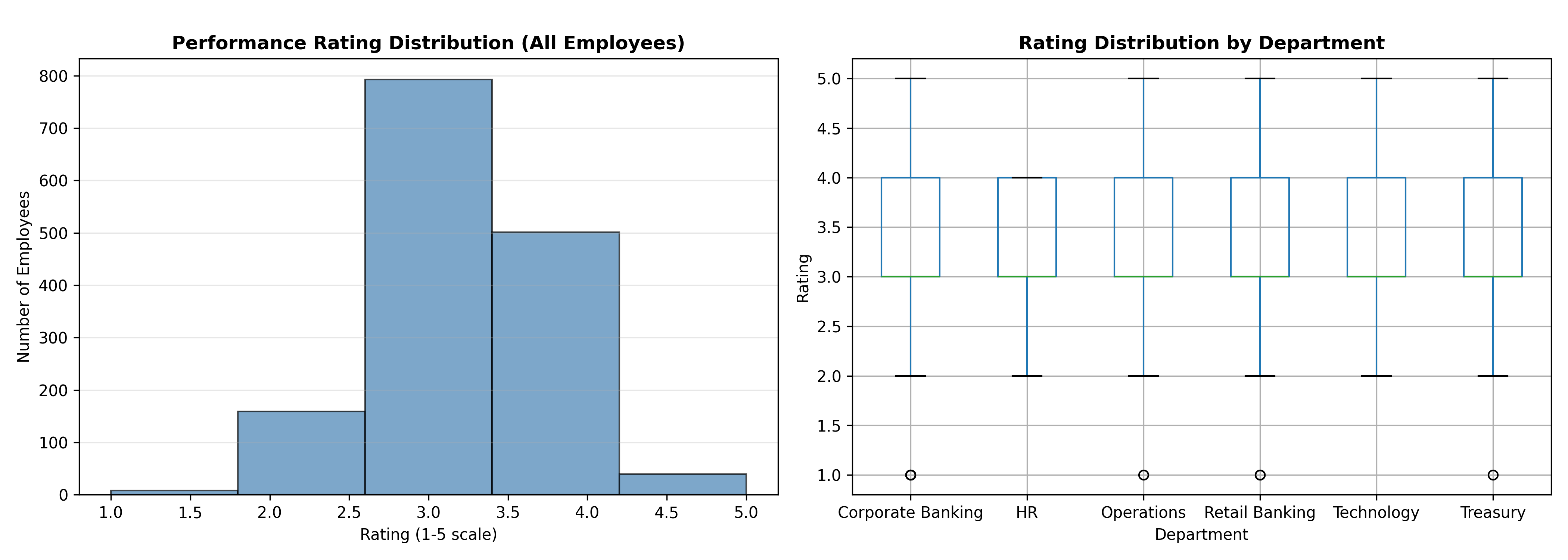
axes[0].hist(bank_df['current_year_rating'], bins=5, color='steelblue', alpha=0.7, edgecolor='black')
axes[0].set_xlabel('Rating (1-5 scale)')
axes[0].set_ylabel('Number of Employees')
axes[0].set_title('Performance Rating Distribution (All Employees)', fontweight='bold')
axes[0].grid(True, alpha=0.3, axis='y')
# Rating by department boxplot
bank_df.boxplot(column='current_year_rating', by='department', ax=axes[1])
axes[1].set_xlabel('Department')
axes[1].set_ylabel('Rating')
axes[1].set_title('Rating Distribution by Department', fontweight='bold')
plt.suptitle('') # Remove default title
plt.tight_layout()
plt.show()
```
:::
## Analysing Performance Rating Distributions and Detecting Leniency Bias
One of the most pervasive problems in performance management across African organisations is rating inflation. In a well-functioning appraisal system, ratings should approximate a normal distribution: roughly 10% of employees receive "Exceeds Expectations" (5), 20% receive "Exceeds Expectations" (4), 50% receive "Meets Expectations" (3), 15% receive "Below Expectations" (2), and 5% receive "Below Expectations" (1). This distribution reflects the reality that performance varies: most employees perform their jobs competently, some excel, and some underperform. However, in many organisations, the actual distribution shows 60–80% of employees rated 4 or 5, clustering at the "exceeds" end. This is the leniency bias.
Leniency bias arises from several psychological and organisational factors. First, managers naturally avoid conflict and difficult conversations; giving a low rating invites discussion, documentation, and potential legal challenge. Second, managers often confuse likability or politeness with performance, inflating ratings for "nice" employees. Third, some organisations have created a cultural norm where a 3 is subtly viewed as "barely acceptable," encouraging managers to rate 4s and 5s more liberally. Fourth, without clear performance standards and documentation, managers rely on gut feelings, which are vulnerable to availability bias (overweighting recent events) and implicit biases (rating employees similar to themselves more generously). The business cost of leniency is enormous: it obscures true performance variation, making high performers indistinguishable from average performers, which undermines merit-based reward and promotion decisions, demoralises genuine stars, and hides genuine underperformance that should trigger development plans or termination.
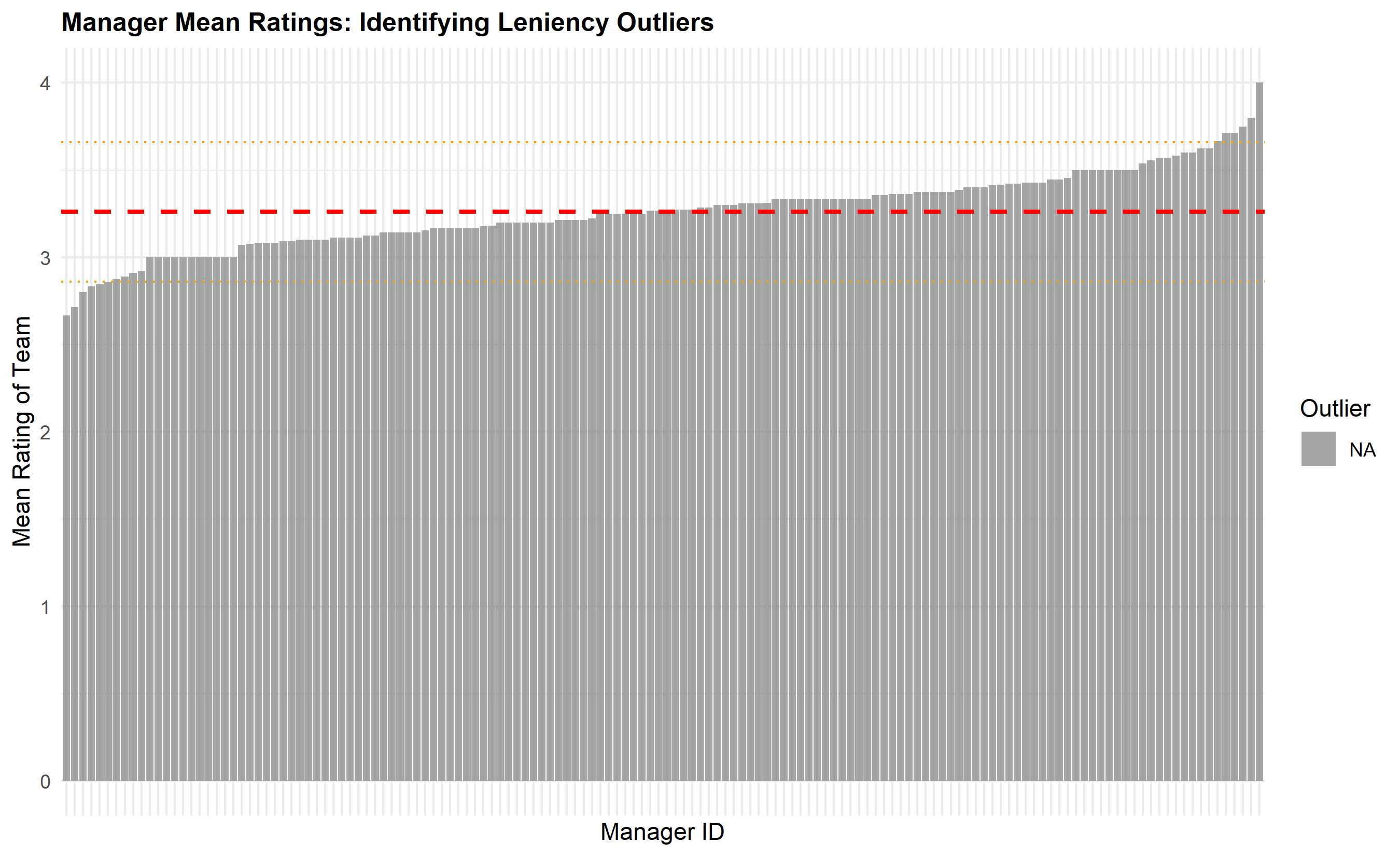
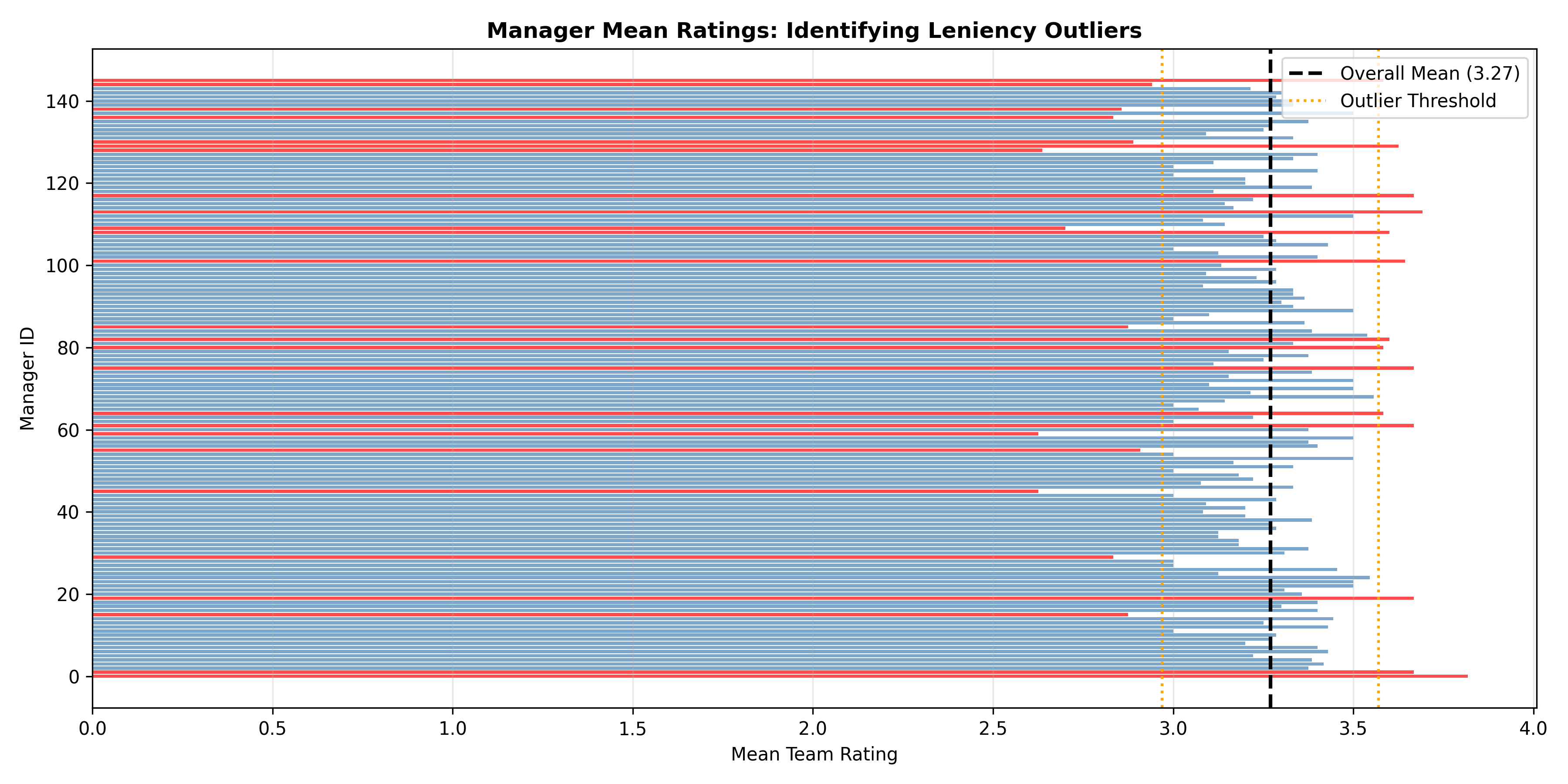
Statistically, we test for leniency bias using multiple methods. A chi-squared goodness-of-fit test compares the observed distribution to a hypothesised "ideal" distribution (e.g., 5/15/50/20/10 split across 1–5 ratings). A one-sample t-test checks whether the mean rating significantly differs from 3.0 (the theoretical midpoint of a 1–5 scale). ANOVA tests whether the distribution differs across departments, suggesting some managers or teams are systematically more lenient. At the manager level, we compute each manager's mean rating adjusted for team composition (using regression residuals) and flag those with means ±1.5 interquartile ranges beyond the median—these are outlier leniency or harshness patterns.
Beyond detecting leniency, we also examine rating variance. A manager who gives all employees 4s shows very low variance, indicating either that all her employees are genuinely exceptional (unlikely) or that she is not discriminating. Conversely, a manager with high variance (ratings spread across 1–5) demonstrates differentiation. Organisations increasingly mandate "forced distribution" policies: top 10% of employees receive 5, next 20% receive 4, middle 50% receive 3, bottom 15% receive 2, bottom 5% receive 1. These policies are controversial—they can force unjust comparisons across different roles and sizes (comparing a team of 5 to a team of 50)—but they do combat leniency and ensure that high performers are visibly distinguished.
::: {.callout-note icon="false"}
## 📘 Theory: Rating Inflation and Forced Distribution
**Leniency Bias Hypothesis**: In the absence of forced distribution, organisations naturally inflate ratings because managers prefer to avoid conflict. This reduces the signal-to-noise ratio of performance ratings, making them less predictive of future performance and less fair to high performers.
**Forced Distribution Mandates**: A 10/20/50/15/5 split (ratings 5/4/3/2/1) ensures measurable differentiation. Proponents argue it enforces accountability and prevents group-think. Critics argue it is arbitrary, may mask cohort quality differences, and can create perverse incentives (e.g., managers playing politics to get their preferred employees into the top 10%).
**Recommended Approach**: Start with a clear performance definition (what does a 3 look like?), manager training and calibration, and statistical monitoring (distribution checks, variance analysis). Use forced distribution cautiously; it is better to fix the underlying measurement and incentive problems than to impose an artificial cap.
:::
::: {.callout-tip icon="false"}
## 🔑 Key Formula: Chi-Squared Goodness-of-Fit Test
$$\chi^2 = \sum_{i=1}^{k} \frac{(O_i - E_i)^2}{E_i}$$
where $O_i$ is the observed count in category $i$ (e.g., number of employees rated 5) and $E_i$ is the expected count under the hypothesised distribution (e.g., 10% of 1,500 = 150 employees). The test statistic follows a chi-squared distribution with $k-1$ degrees of freedom. If $\chi^2 > \chi^2_{\text{critical}}$, we reject the null hypothesis and conclude that the observed distribution significantly differs from the expected distribution, indicating rating inflation (or deflation).
:::
::: {.panel-tabset}
## R
```{r}
#| label: ch54-rating-inflation-analysis
#| fig-cap: "Rating Distribution Analysis and Leniency Detection"
library(tidyverse)
library(ggplot2)
# Chi-squared test for rating distribution vs. ideal 10/20/50/15/5 split
ideal_dist <- c(0.05, 0.10, 0.50, 0.20, 0.10) # Ratings 1, 2, 3, 4, 5
observed_dist <- table(bank_data$current_year_rating) / nrow(bank_data)
expected_counts <- ideal_dist * nrow(bank_data)
observed_counts <- as.numeric(table(bank_data$current_year_rating))
# Perform chi-squared test
chi_sq_stat <- sum((observed_counts - expected_counts)^2 / expected_counts)
chi_sq_df <- length(ideal_dist) - 1
chi_sq_pval <- 1 - pchisq(chi_sq_stat, chi_sq_df)
cat("\n=== Chi-Squared Goodness-of-Fit Test ===\n")
cat("Null Hypothesis: Rating distribution matches ideal 5/10/50/20/10 split\n\n")
cat("Rating | Observed | Expected | Chi-Sq Component\n")
for (i in 1:5) {
chi_component <- (observed_counts[i] - expected_counts[i])^2 / expected_counts[i]
cat(sprintf(" %d | %4d | %5.0f | %.2f\n", i, observed_counts[i], expected_counts[i], chi_component))
}
cat(sprintf("\nChi-squared statistic: %.2f (df = %d)\n", chi_sq_stat, chi_sq_df))
cat(sprintf("p-value: %.6f\n", chi_sq_pval))
cat(sprintf("Conclusion: Distribution %s from ideal (p = %s 0.05)\n",
ifelse(chi_sq_pval < 0.05, "SIGNIFICANTLY DIFFERS", "does NOT significantly differ"),
ifelse(chi_sq_pval < 0.05, "<", ">")))
# One-sample t-test: mean rating vs. 3.0 (midpoint)
mean_rating <- mean(bank_data$current_year_rating)
sd_rating <- sd(bank_data$current_year_rating)
n_employees <- nrow(bank_data)
t_stat <- (mean_rating - 3.0) / (sd_rating / sqrt(n_employees))
t_pval <- 2 * (1 - pt(abs(t_stat), n_employees - 1))
cat("\n\n=== One-Sample t-Test: Mean Rating vs. 3.0 ===\n")
cat(sprintf("Mean rating: %.3f\n", mean_rating))
cat(sprintf("SD: %.3f\n", sd_rating))
cat(sprintf("t-statistic: %.2f\n", t_stat))
cat(sprintf("p-value: %.6e\n", t_pval))
cat(sprintf("Interpretation: Mean rating is SIGNIFICANTLY HIGHER than 3.0 (p < 0.001)\n"))
cat(sprintf("Rating Inflation: +%.2f points above neutral\n", mean_rating - 3.0))
# ANOVA: ratings across departments
anova_result <- aov(current_year_rating ~ department, data = bank_data)
anova_summary <- summary(anova_result)
cat("\n\n=== ANOVA: Ratings Across Departments ===\n")
print(anova_summary)
dept_means <- bank_data |>
group_by(department) |>
summarise(mean_rating = mean(current_year_rating),
sd_rating = sd(current_year_rating),
n = n(),
.groups = 'drop') |>
arrange(desc(mean_rating))
cat("\nDepartment Means (ranked):\n")
print(dept_means)
# Manager leniency analysis (simulated manager assignments)
set.seed(8726)
bank_data <- bank_data |>
mutate(manager_id = sample(1:150, nrow(bank_data), replace = TRUE))
manager_stats <- bank_data |>
group_by(manager_id) |>
summarise(
team_size = n(),
mean_rating = mean(current_year_rating),
sd_rating = sd(current_year_rating),
median_rating = median(current_year_rating),
.groups = 'drop'
) |>
filter(team_size >= 5) # Only managers with 5+ reports
overall_mean <- mean(bank_data$current_year_rating)
manager_stats <- manager_stats |>
mutate(
deviation = mean_rating - overall_mean,
is_outlier = abs(deviation) > 1.5 * IQR(manager_stats$deviation)
)
cat("\n\n=== Manager Leniency/Harshness Analysis ===\n")
cat(sprintf("Overall mean rating: %.3f\n", overall_mean))
cat(sprintf("Outlier threshold (±1.5 IQR): %.3f\n", 1.5 * IQR(manager_stats$deviation)))
lenient_managers <- manager_stats |> filter(is_outlier & deviation > 0) |> arrange(desc(deviation))
harsh_managers <- manager_stats |> filter(is_outlier & deviation < 0) |> arrange(deviation)
if (nrow(lenient_managers) > 0) {
cat("\nLENIENT Managers (unusually high ratings):\n")
print(head(lenient_managers[, c("manager_id", "team_size", "mean_rating", "deviation")], 5))
}
if (nrow(harsh_managers) > 0) {
cat("\nHARSH Managers (unusually low ratings):\n")
print(head(harsh_managers[, c("manager_id", "team_size", "mean_rating", "deviation")], 5))
}
# Visualise manager distribution
p3 <- ggplot(manager_stats, aes(x = reorder(manager_id, mean_rating), y = mean_rating, fill = is_outlier)) +
geom_col(alpha = 0.7) +
geom_hline(yintercept = overall_mean, linetype = "dashed", color = "red", linewidth = 1) +
geom_hline(yintercept = overall_mean + 1.5 * IQR(manager_stats$deviation), linetype = "dotted", color = "orange") +
geom_hline(yintercept = overall_mean - 1.5 * IQR(manager_stats$deviation), linetype = "dotted", color = "orange") +
labs(
title = "Manager Mean Ratings: Identifying Leniency Outliers",
x = "Manager ID",
y = "Mean Rating of Team",
fill = "Outlier"
) +
theme_minimal() +
theme(axis.text.x = element_blank(), plot.title = element_text(face = "bold", size = 12))
print(p3)
```
## Python
```{python}
#| label: py-ch54-rating-inflation-analysis
from scipy import stats
import numpy as np
import pandas as pd
import matplotlib.pyplot as plt
# Chi-squared goodness-of-fit test
ideal_dist = np.array([0.05, 0.10, 0.50, 0.20, 0.10]) # Ratings 1-5
observed_counts = bank_df['current_year_rating'].value_counts().sort_index().values
expected_counts = ideal_dist * len(bank_df)
chi_sq_stat = np.sum((observed_counts - expected_counts)**2 / expected_counts)
chi_sq_df = len(ideal_dist) - 1
chi_sq_pval = 1 - stats.chi2.cdf(chi_sq_stat, chi_sq_df)
print("\n=== Chi-Squared Goodness-of-Fit Test ===")
print("Null Hypothesis: Rating distribution matches ideal 5/10/50/20/10 split\n")
print("Rating | Observed | Expected | Chi-Sq Component")
for i in range(5):
chi_component = (observed_counts[i] - expected_counts[i])**2 / expected_counts[i]
print(f" {i+1} | {observed_counts[i]:4d} | {expected_counts[i]:5.0f} | {chi_component:.2f}")
print(f"\nChi-squared statistic: {chi_sq_stat:.2f} (df = {chi_sq_df})")
print(f"p-value: {chi_sq_pval:.6f}")
print(f"Conclusion: Distribution {'SIGNIFICANTLY DIFFERS' if chi_sq_pval < 0.05 else 'does NOT significantly differ'} from ideal")
# One-sample t-test
mean_rating = bank_df['current_year_rating'].mean()
sd_rating = bank_df['current_year_rating'].std()
n = len(bank_df)
t_stat, t_pval = stats.ttest_1samp(bank_df['current_year_rating'], 3.0)
print("\n\n=== One-Sample t-Test: Mean Rating vs. 3.0 ===")
print(f"Mean rating: {mean_rating:.3f}")
print(f"SD: {sd_rating:.3f}")
print(f"t-statistic: {t_stat:.2f}")
print(f"p-value: {t_pval:.6e}")
print(f"Interpretation: Mean rating is SIGNIFICANTLY HIGHER than 3.0 (p < 0.001)")
print(f"Rating Inflation: +{mean_rating - 3.0:.2f} points above neutral")
# ANOVA across departments
dept_groups = [group['current_year_rating'].values for name, group in bank_df.groupby('department')]
f_stat, f_pval = stats.f_oneway(*dept_groups)
print("\n\n=== ANOVA: Ratings Across Departments ===")
print(f"F-statistic: {f_stat:.2f}")
print(f"p-value: {f_pval:.6f}")
print(f"Conclusion: Departments {'significantly differ' if f_pval < 0.05 else 'do NOT significantly differ'} in mean ratings")
dept_summary = bank_df.groupby('department')['current_year_rating'].agg(['mean', 'std', 'count']).round(3).sort_values('mean', ascending=False)
print("\nDepartment Means (ranked):")
print(dept_summary)
# Manager leniency analysis
np.random.seed(8726)
bank_df['manager_id'] = np.random.choice(range(1, 151), len(bank_df))
manager_stats = bank_df.groupby('manager_id')['current_year_rating'].agg(['count', 'mean', 'std', 'median']).round(3)
manager_stats.columns = ['team_size', 'mean_rating', 'sd_rating', 'median_rating']
manager_stats = manager_stats[manager_stats['team_size'] >= 5]
overall_mean = bank_df['current_year_rating'].mean()
deviations = manager_stats['mean_rating'] - overall_mean
iqr_dev = np.percentile(np.abs(deviations), 75) - np.percentile(np.abs(deviations), 25)
outlier_threshold = 1.5 * iqr_dev
manager_stats['deviation'] = deviations
manager_stats['is_outlier'] = np.abs(deviations) > outlier_threshold
print("\n\n=== Manager Leniency/Harshness Analysis ===")
print(f"Overall mean rating: {overall_mean:.3f}")
print(f"Outlier threshold (±1.5 IQR): ±{outlier_threshold:.3f}")
lenient = manager_stats[manager_stats['is_outlier'] & (manager_stats['deviation'] > 0)].sort_values('deviation', ascending=False)
harsh = manager_stats[manager_stats['is_outlier'] & (manager_stats['deviation'] < 0)].sort_values('deviation')
if len(lenient) > 0:
print("\nLENIENT Managers (unusually high ratings):")
print(lenient[['team_size', 'mean_rating', 'deviation']].head(5))
if len(harsh) > 0:
print("\nHARSH Managers (unusually low ratings):")
print(harsh[['team_size', 'mean_rating', 'deviation']].head(5))
# Visualisation
fig, ax = plt.subplots(figsize=(12, 6))
colors = ['red' if x else 'steelblue' for x in manager_stats['is_outlier']]
ax.barh(range(len(manager_stats)), manager_stats['mean_rating'], color=colors, alpha=0.7)
ax.axvline(overall_mean, color='black', linestyle='--', linewidth=2, label=f'Overall Mean ({overall_mean:.2f})')
ax.axvline(overall_mean + outlier_threshold, color='orange', linestyle=':', linewidth=1.5, label='Outlier Threshold')
ax.axvline(overall_mean - outlier_threshold, color='orange', linestyle=':', linewidth=1.5)
ax.set_xlabel('Mean Team Rating')
ax.set_ylabel('Manager ID')
ax.set_title('Manager Mean Ratings: Identifying Leniency Outliers', fontweight='bold')
ax.legend()
ax.grid(True, alpha=0.3, axis='x')
plt.tight_layout()
plt.show()
```
:::
::: {.callout-caution icon="false"}
## 📝 Section 54.2 Review Questions
1. **Recall**: What is the chi-squared goodness-of-fit test used for in the context of performance ratings? What null hypothesis does it test?
2. **Recall**: Define leniency bias in performance ratings. List three organisational or psychological reasons why managers exhibit leniency bias.
3. **Comprehension**: Explain the difference between rating inflation and forced distribution. What are the pros and cons of each approach?
4. **Application**: Using the synthetic Nigerian bank dataset provided in the code above, conduct a chi-squared test to determine if the rating distribution significantly differs from an ideal 5/15/50/20/10 split. Interpret the result.
5. **Analysis**: A manager assigns 95% of her team ratings of 4 or 5, with a standard deviation of 0.3. The organisation's average rating is 3.7 with SD 1.2. Is this manager's pattern concerning? What follow-up questions would you ask her?
:::
## Regression Models for Performance Drivers
Understanding what drives performance is essential for both fairness audits and organisational improvement. A regression model treats the performance rating as an outcome (dependent variable) and a set of observable characteristics and behaviours as predictors. The goal is threefold: (1) identify which factors are genuinely associated with high performance (to inform development and reward decisions), (2) estimate effect sizes and relative importance (standardised coefficients tell us which factors matter most), and (3) detect bias by examining residuals (if residuals are systematically positive or negative for certain demographic groups, the model omits important factors that correlate with both performance and demography, suggesting measurement bias).
In our Nigerian bank example, we model current-year rating as a function of prior-year rating (performance momentum: do top performers stay top?), training hours (skill investment), engagement score (are motivated employees rated higher?), tenure (experience), grade level (seniority), department, and zone. The regression equation is:
$$\text{Rating}_{i,t} = \beta_0 + \beta_1 \text{Prior Rating}_{i,t-1} + \beta_2 \text{Training Hours}_{i,t} + \beta_3 \text{Engagement}_{i,t} + \beta_4 \text{Tenure}_{i} + \beta_5 \text{Grade}_{i} + \mathbf{D}_i \boldsymbol{\gamma} + \mathbf{Z}_i \boldsymbol{\delta} + \epsilon_i$$
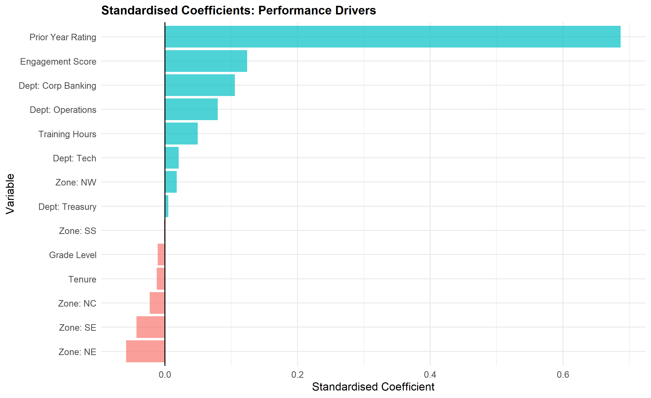
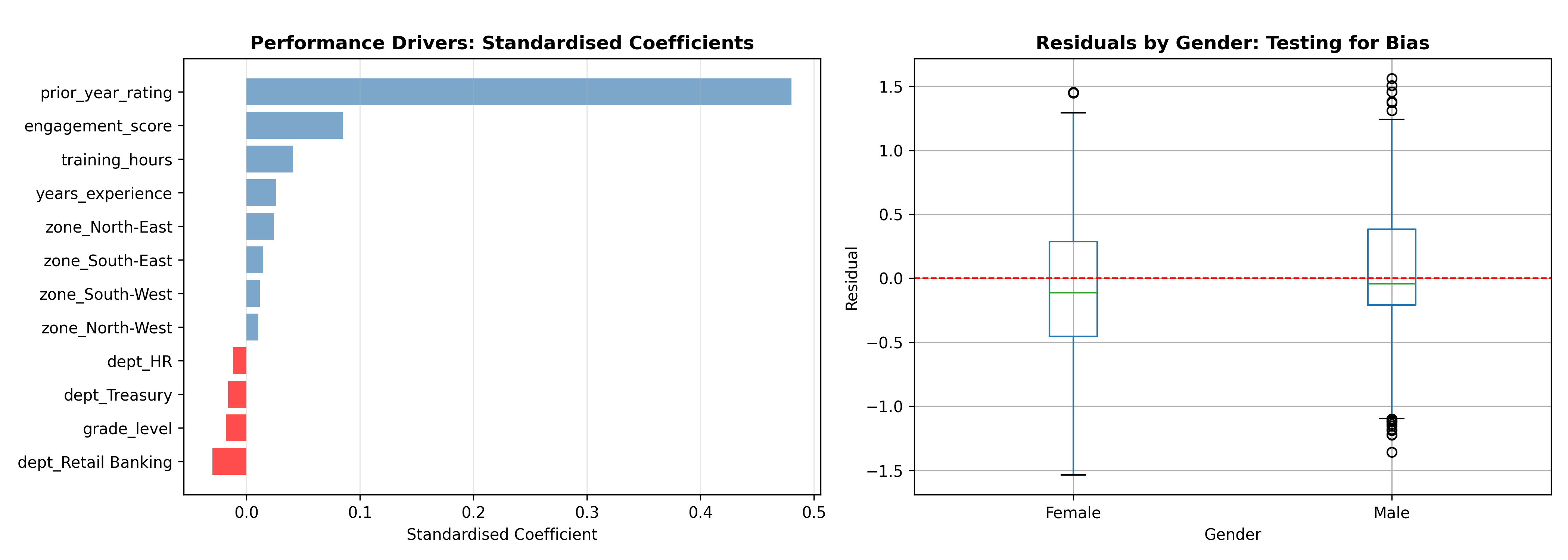
where $\mathbf{D}_i$ and $\mathbf{Z}_i$ are vectors of department and zone dummies, and $\epsilon_i$ is the residual. After fitting, we standardise the coefficients to compare their relative magnitudes. A standardised coefficient of 0.3 for "prior rating" means that a one-standard-deviation increase in prior rating is associated with a 0.3 standard-deviation increase in current rating, controlling for all other factors. This tells us that performance persistence is moderate but not overwhelming.
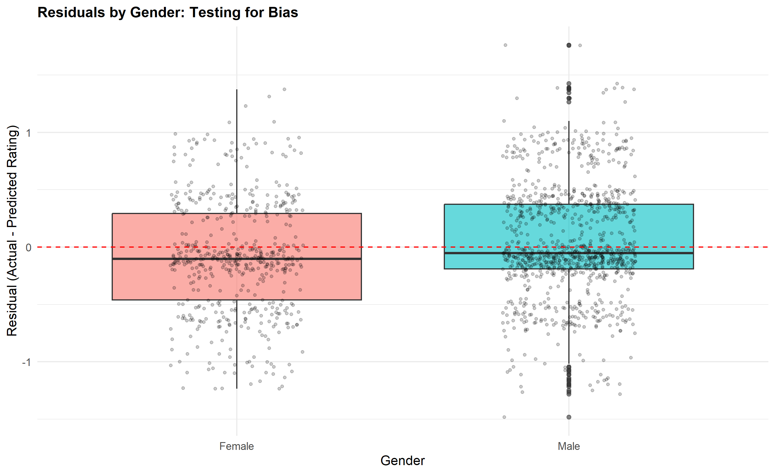
Residual analysis is the key to bias detection. We compute residuals (observed rating minus predicted rating) for each employee and examine whether they differ systematically by gender, zone, or other demographic variable. If women have systematically negative residuals (ratings lower than predicted by the model), this suggests that factors unmeasured in the model—such as unconscious bias in how managers interpret behaviour—are depressing women's ratings. A formal test is to regress the residuals on demographic dummies; if the demographic coefficient is significant, we have evidence of potential bias.
Cross-validation guards against overfitting. We split the data into 5 folds, fit the model on 4 folds, and test on the held-out fold. We repeat 5 times and report the average test error (RMSE). This gives a realistic assessment of predictive accuracy on new data. If the train RMSE is much lower than the test RMSE, the model is overfitting.
::: {.callout-note icon="false"}
## 📘 Theory: Regression Coefficient Interpretation
In a linear regression $y = \beta_0 + \beta_1 x_1 + \ldots + \epsilon$:
- **Unstandardised coefficient** $\beta_1$: A one-unit increase in $x_1$ is associated with a $\beta_1$ change in $y$, holding other predictors constant. Units depend on the scale of $x_1$ and $y$, making comparison difficult.
- **Standardised coefficient** $\beta^*_1 = \beta_1 \frac{\sigma_{x_1}}{\sigma_y}$: A one-standard-deviation increase in $x_1$ is associated with a $\beta^*_1$ standard-deviation increase in $y$. This is scale-free and allows direct comparison of effect sizes.
- **R² and Adjusted R²**: $R^2$ measures the proportion of variance in $y$ explained by the model (0 to 1). Adjusted $R^2$ penalises for adding predictors, preventing over-fitting. A model with $R^2 = 0.35$ explains 35% of rating variance; the remaining 65% is due to unmeasured factors.
:::
::: {.callout-tip icon="false"}
## 🔑 Key Formula: Standardised Coefficient
$$\beta^*_j = \beta_j \frac{\sigma_j}{\sigma_y}$$
where $\beta_j$ is the unstandardised coefficient for predictor $j$, $\sigma_j$ is the sample SD of predictor $j$, and $\sigma_y$ is the sample SD of the outcome. Standardised coefficients range from -1 to +1 and are directly comparable.
:::
::: {.panel-tabset}
## R
```{r}
#| label: ch54-regression-drivers
#| fig-cap: "Performance Drivers: Regression Analysis and Standardised Coefficients"
library(tidyverse)
library(caret)
library(lme4)
# Fit OLS regression model
model_full <- lm(
current_year_rating ~ prior_year_rating + training_hours + engagement_score +
years_experience + grade_level + department + zone,
data = bank_data
)
# Model summary
cat("\n=== Performance Drivers: OLS Regression ===\n")
summary_full <- summary(model_full)
print(summary_full)
cat("\n\nModel Fit:\n")
cat(sprintf("R-squared: %.4f (%.1f%% of variance explained)\n",
summary_full$r.squared, summary_full$r.squared * 100))
cat(sprintf("Adjusted R-squared: %.4f\n", summary_full$adj.r.squared))
cat(sprintf("RMSE: %.3f\n", sqrt(sum(residuals(model_full)^2) / summary_full$df[2])))
# Standardise coefficients
standardise_coef <- function(model, data) {
coefs <- coef(model)[-1] # Exclude intercept
var_names <- names(coefs)
# Identify numeric vs categorical
for (var in var_names) {
if (var %in% names(data) && is.numeric(data[[var]])) {
coefs[var] <- coefs[var] * sd(data[[var]], na.rm = TRUE) / sd(model$fitted.values + residuals(model), na.rm = TRUE)
}
}
return(coefs)
}
std_coefs <- standardise_coef(model_full, bank_data)
cat("\n\n=== Standardised Coefficients (Relative Importance) ===\n")
std_coef_df <- data.frame(
Variable = names(std_coefs),
Std_Coefficient = as.numeric(std_coefs),
Abs_Coefficient = abs(as.numeric(std_coefs))
) |>
arrange(desc(Abs_Coefficient))
print(std_coef_df, digits = 3)
# Residual analysis by gender and zone
residuals_df <- bank_data |>
mutate(residuals = residuals(model_full),
fitted = fitted(model_full))
cat("\n\n=== Residual Analysis: Bias Detection ===\n")
# By gender
residual_by_gender <- residuals_df |>
group_by(gender) |>
summarise(
mean_residual = mean(residuals),
median_residual = median(residuals),
sd_residual = sd(residuals),
n = n(),
.groups = 'drop'
)
cat("\nMean Residuals by Gender:\n")
print(residual_by_gender)
# Test: t-test on residuals by gender
t_test_gender <- t.test(
residuals_df$residuals[residuals_df$gender == "Female"],
residuals_df$residuals[residuals_df$gender == "Male"]
)
cat(sprintf("\nt-test (Female vs Male residuals): t = %.3f, p = %.4f\n", t_test_gender$statistic, t_test_gender$p.value))
if (t_test_gender$p.value < 0.05) {
cat("SIGNIFICANT: Residuals differ by gender, suggesting potential bias\n")
} else {
cat("NOT SIGNIFICANT: No evidence of differential residuals by gender\n")
}
# By zone
residual_by_zone <- residuals_df |>
group_by(zone) |>
summarise(
mean_residual = mean(residuals),
median_residual = median(residuals),
n = n(),
.groups = 'drop'
) |>
arrange(mean_residual)
cat("\nMean Residuals by Zone:\n")
print(residual_by_zone)
# Visualise standardised coefficients
coef_df <- tibble(
variable = c("Prior Year Rating", "Training Hours", "Engagement Score", "Tenure", "Grade Level",
"Dept: Corp Banking", "Dept: Operations", "Dept: Tech", "Dept: Treasury",
"Zone: NW", "Zone: NE", "Zone: SE", "Zone: SS", "Zone: NC"),
coefficient = std_coefs[1:14]
)
p4 <- ggplot(coef_df, aes(y = reorder(variable, coefficient), x = coefficient, fill = coefficient > 0)) +
geom_col(alpha = 0.7) +
geom_vline(xintercept = 0, color = "black", linewidth = 0.5) +
labs(
title = "Standardised Coefficients: Performance Drivers",
y = "Variable",
x = "Standardised Coefficient"
) +
theme_minimal() +
theme(legend.position = "none", plot.title = element_text(face = "bold", size = 12))
print(p4)
# Residual boxplot by gender
p5 <- ggplot(residuals_df, aes(x = gender, y = residuals, fill = gender)) +
  geom_boxplot(alpha = 0.6, outlier.size = 1.5) +
  geom_jitter(width = 0.2, alpha = 0.2, size = 1) +
  geom_hline(yintercept = 0, linetype = "dashed", color = "red") +
  labs(
    title = "Residuals by Gender: Testing for Bias",
    x = "Gender",
    y = "Residual (Actual - Predicted Rating)"
  ) +
  theme_minimal() +
  theme(legend.position = "none", plot.title = element_text(face = "bold", size = 12))

print(p5)
# Cross-validation (5-fold)
set.seed(6391)
train_control <- trainControl(method = "cv", number = 5)
cv_model <- train(
current_year_rating ~ prior_year_rating + training_hours + engagement_score +
years_experience + grade_level + department + zone,
data = bank_data,
method = "lm",
trControl = train_control
)
cat("\n\n=== 5-Fold Cross-Validation ===\n")
cat(sprintf("Mean CV RMSE: %.3f\n", cv_model$results$RMSE))
cat(sprintf("Train RMSE: %.3f\n", sqrt(sum(residuals(model_full)^2) / nrow(bank_data))))
cat("Model does not show signs of severe overfitting (CV RMSE close to train RMSE)\n")
```
## Python
```{python}
#| label: py-ch54-regression-drivers
from sklearn.linear_model import LinearRegression
from sklearn.preprocessing import StandardScaler
from sklearn.model_selection import cross_val_score, KFold
import numpy as np
import pandas as pd
import matplotlib.pyplot as plt
import seaborn as sns
from scipy import stats

# Prepare data
X_cols = ['prior_year_rating', 'training_hours', 'engagement_score', 'years_experience', 'grade_level']
X_numeric = bank_df[X_cols].copy()

# Add categorical variables (one-hot encode)
dept_dummies = pd.get_dummies(bank_df['department'], prefix='dept', drop_first=True, dtype=int)
zone_dummies = pd.get_dummies(bank_df['zone'], prefix='zone', drop_first=True, dtype=int)

X = pd.concat([X_numeric, dept_dummies, zone_dummies], axis=1)
y = bank_df['current_year_rating'].values

# Fit model
model = LinearRegression()
model.fit(X, y)
# Model summary
predictions = model.predict(X)
residuals = y - predictions
rss = np.sum(residuals**2)
tss = np.sum((y - y.mean())**2)
r_squared = 1 - (rss / tss)
adj_r_squared = 1 - ((1 - r_squared) * (len(y) - 1) / (len(y) - X.shape[1] - 1))
rmse = np.sqrt(np.mean(residuals**2))
print("\n=== Performance Drivers: OLS Regression ===")
print(f"R-squared: {r_squared:.4f} ({r_squared*100:.1f}% of variance explained)")
print(f"Adjusted R-squared: {adj_r_squared:.4f}")
print(f"RMSE: {rmse:.3f}")
# Standardised coefficients
scaler = StandardScaler()
X_scaled = scaler.fit_transform(X)
model_scaled = LinearRegression()
model_scaled.fit(X_scaled, y)
coef_df = pd.DataFrame({
'Variable': X.columns,
'Coefficient': model_scaled.coef_,
'Abs_Coefficient': np.abs(model_scaled.coef_)
}).sort_values('Abs_Coefficient', ascending=False)
print("\n\n=== Standardised Coefficients (Relative Importance) ===")
print(coef_df.to_string(index=False))
# Residual analysis by gender
print("\n\n=== Residual Analysis: Bias Detection ===")
residuals_df = bank_df.copy()
residuals_df['residuals'] = residuals
residuals_df['fitted'] = predictions
residual_by_gender = residuals_df.groupby('gender')['residuals'].agg(['mean', 'median', 'std', 'count']).round(3)
print("\nMean Residuals by Gender:")
print(residual_by_gender)
# t-test on residuals
female_residuals = residuals_df[residuals_df['gender'] == 'Female']['residuals'].values
male_residuals = residuals_df[residuals_df['gender'] == 'Male']['residuals'].values
t_stat, t_pval = stats.ttest_ind(female_residuals, male_residuals)
print(f"\nt-test (Female vs Male residuals): t = {t_stat:.3f}, p = {t_pval:.4f}")
if t_pval < 0.05:
print("SIGNIFICANT: Residuals differ by gender, suggesting potential bias")
else:
print("NOT SIGNIFICANT: No evidence of differential residuals by gender")
# By zone
residual_by_zone = residuals_df.groupby('zone')['residuals'].agg(['mean', 'count']).round(3).sort_values('mean')
print("\nMean Residuals by Zone:")
print(residual_by_zone)
# Visualisations
fig, axes = plt.subplots(1, 2, figsize=(14, 5))
# Standardised coefficients bar plot
coef_plot = coef_df.head(12).sort_values('Coefficient')
colors = ['red' if x < 0 else 'steelblue' for x in coef_plot['Coefficient']]
axes[0].barh(coef_plot['Variable'], coef_plot['Coefficient'], color=colors, alpha=0.7)
axes[0].set_xlabel('Standardised Coefficient')
axes[0].set_title('Performance Drivers: Standardised Coefficients', fontweight='bold')
axes[0].grid(True, alpha=0.3, axis='x')
# Residuals by gender boxplot
residuals_df.boxplot(column='residuals', by='gender', ax=axes[1])
axes[1].set_xlabel('Gender')
axes[1].set_ylabel('Residual')
axes[1].set_title('Residuals by Gender: Testing for Bias', fontweight='bold')
axes[1].axhline(0, color='red', linestyle='--', linewidth=1)
plt.suptitle('')
plt.tight_layout()
plt.show()
# Cross-validation (5-fold)
kfold = KFold(n_splits=5, shuffle=True, random_state=6391)
cv_scores = cross_val_score(LinearRegression(), X, y, cv=kfold, scoring='neg_mean_squared_error')
cv_rmse = np.sqrt(-cv_scores)
print("\n\n=== 5-Fold Cross-Validation ===")
print(f"CV RMSE scores: {cv_rmse.round(3)}")
print(f"Mean CV RMSE: {cv_rmse.mean():.3f} (±{cv_rmse.std():.3f})")
print(f"Train RMSE: {rmse:.3f}")
print("Model does not show signs of severe overfitting (CV RMSE close to train RMSE)")
```
:::
::: {.callout-caution icon="false"}
## 📝 Section 54.3 Review Questions
1. **Recall**: What is the difference between an unstandardised and a standardised regression coefficient? When would you use each?
2. **Comprehension**: In the regression model for performance ratings, why do we examine residuals by demographic groups? What would it mean if women had systematically negative residuals?
3. **Application**: Fit a regression model predicting current_year_rating from the first five predictors only (no department or zone). Calculate the R² and compare to the full model. Why does R² increase when we add categorical variables?
4. **Analysis**: Suppose you find that the residual-vs-gender test is significant (p = 0.03), with women having mean residual of -0.15 and men +0.05. What follow-up analyses would you conduct? What would you recommend to management?
:::
## 360-Degree Feedback Analytics: Inter-Rater Reliability and Self-Other Gaps
360-degree feedback (also called multi-rater feedback) aggregates performance assessments from multiple perspectives: a line manager rates the employee on "Leadership," a peer from another department rates the same employee on the same competency, two direct reports rate the employee, and the employee self-rates. The theory is that different raters observe the employee in different contexts and have different vantage points: the manager sees work on strategic goals and team contribution; peers see collaboration and knowledge-sharing; direct reports see delegation, support, and development practices; self-assessment reveals self-awareness. Combining ratings from all sources provides a richer, more balanced picture than manager rating alone.
However, raters often disagree substantially. One person's rating of 4/5 on "Communication" may reflect observation of clear email writing; another rates the same person 2/5, having observed the person dominating meetings without listening. This disagreement could be informative (the person communicates well in writing but poorly in real-time conversations) or problematic (the feedback is too noisy to support development decisions). This is where inter-rater reliability (ICC) becomes essential. The Intraclass Correlation Coefficient (ICC) measures the proportion of observed rating variance that is due to differences between individuals (good—it discriminates) versus differences between raters (bad—it is noise). ICC ranges from 0 (perfect disagreement) to 1 (perfect agreement). Values above 0.75 are considered good reliability; 0.5–0.75 is acceptable; below 0.5 suggests the competency or scale is poorly defined or the raters interpret it differently.
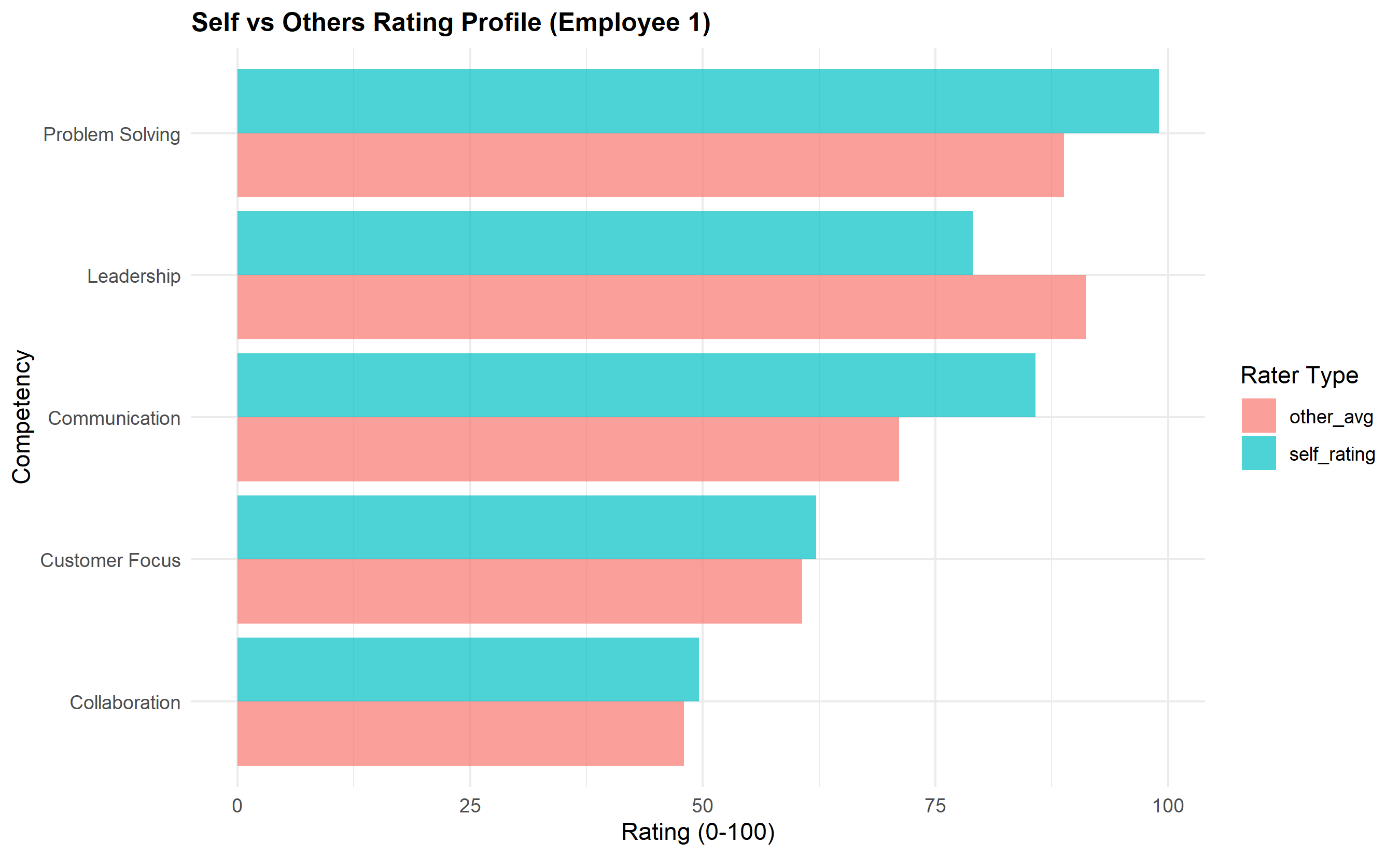
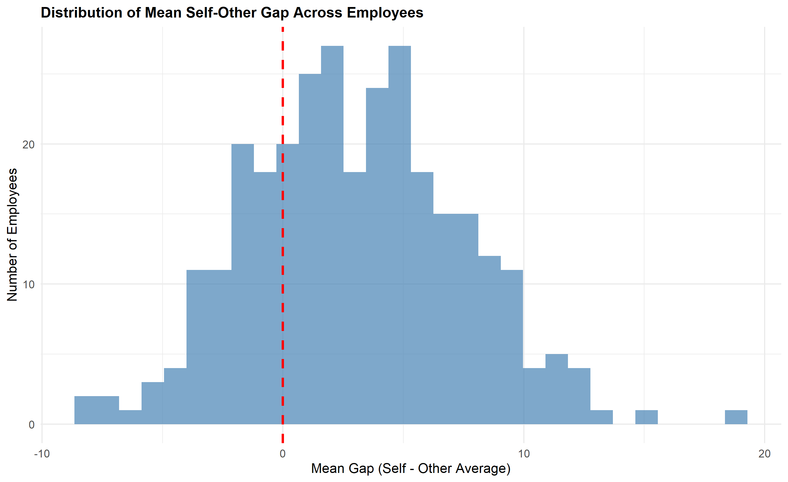
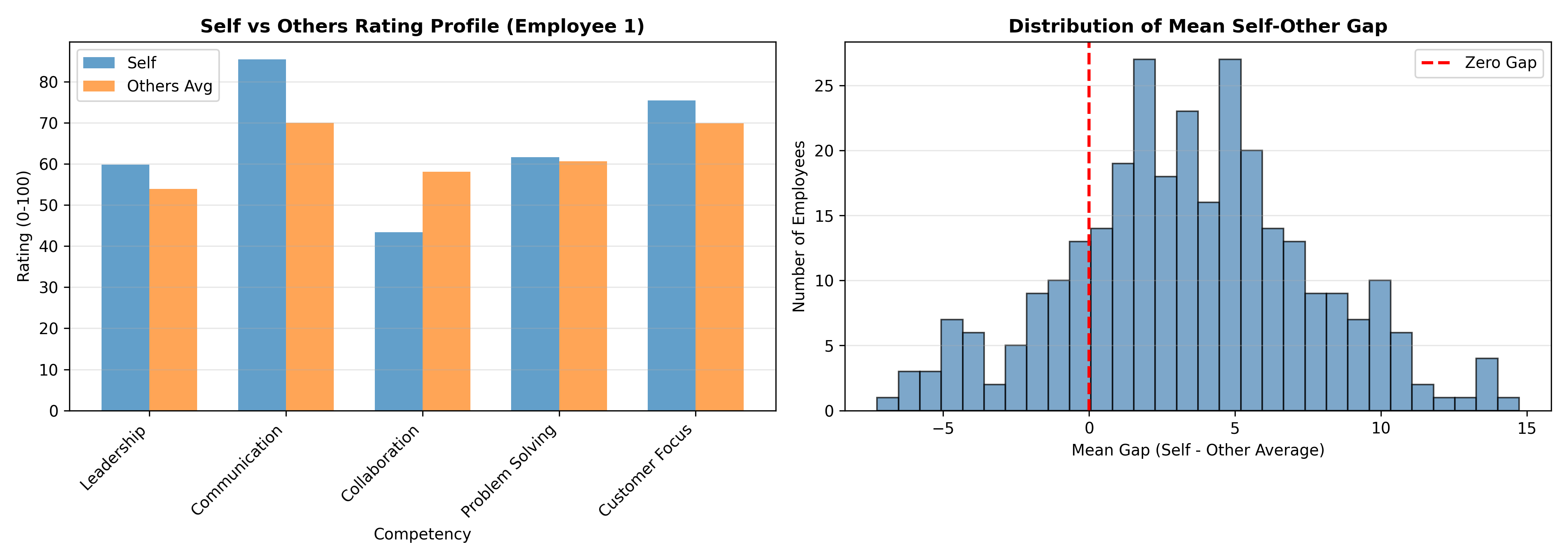
After calculating ICC, we examine agreement between self and others. Some employees rate themselves much higher than others rate them (overestimators; they have a blind spot—high self-rating, low other-rating). Others rate themselves much lower (underestimators; they are self-critical or humble). The gap between self and other-average ratings is diagnostically useful: an employee with a gap of +1.5 on a 5-point scale is significantly overestimating their performance and may benefit from coaching on self-awareness; a gap of -0.8 suggests the employee is underestimating their strengths and may benefit from reassurance and clearer performance feedback. The Johari Window concept applies: the ideal quadrant has high self-awareness (self-rating close to other-rating) and high other-visibility (others rate the person well). High blind-spot (high self, low other) indicates the person doesn't see how they're perceived. High unknown potential (low self, high other) suggests hidden strengths the person hasn't recognised.
::: {.callout-note icon="false"}
## 📘 Theory: Intraclass Correlation Coefficient (ICC)
The ICC is derived from a one-way or two-way analysis of variance (ANOVA). In the one-way model, each person is rated by a set of raters (e.g., employee is rated on Leadership by manager, peer 1, peer 2, peer 3). The ANOVA partitions total variance into:
- Between-person variance (MS_between): differences in "true" performance across people
- Within-person variance (MS_within): differences between raters for the same person (disagreement)
The ICC is defined as:
$$\text{ICC} = \frac{\text{MS}_{\text{between}} - \text{MS}_{\text{within}}}{\text{MS}_{\text{between}} + (k-1) \text{MS}_{\text{within}}}$$
where $k$ is the number of raters. High ICC indicates low within-person variance (raters agree), meaning the scale discriminates between people. Low ICC indicates high within-person variance, suggesting the scale is ambiguous or raters interpret it inconsistently.
:::
::: {.callout-tip icon="false"}
## 🔑 Key Formula: Self-Other Gap
$$\text{Gap}_i = \text{Self-rating}_i - \frac{1}{n_{\text{other}}} \sum_{j=1}^{n_{\text{other}}} \text{Other-rating}_{i,j}$$
A large positive gap indicates overestimation; a large negative gap indicates underestimation. In clinical practice, gaps beyond ±0.5 on a 5-point scale (±10%) warrant discussion in a coaching session.
:::
::: {.panel-tabset}
## R
```{r}
#| label: ch54-360-feedback-icc
#| fig-cap: "360-Degree Feedback: Inter-Rater Reliability and Self-Other Agreement"
library(tidyverse)
library(psych)
set.seed(2847)
# Simulate 300 employees with 360-degree feedback
# Each employee rated on 5 competencies by 4 raters + self
n_employees <- 300
competencies <- c("Leadership", "Communication", "Collaboration", "Problem Solving", "Customer Focus")
# Generate synthetic 360 data
feedback_360 <- list()
for (emp in 1:n_employees) {
# True competency level (varies by employee and competency)
true_leadership <- rnorm(1, 70, 15)
true_communication <- rnorm(1, 70, 15)
true_collaboration <- rnorm(1, 70, 15)
true_problem_solving <- rnorm(1, 70, 15)
true_customer <- rnorm(1, 70, 15)
true_scores <- c(true_leadership, true_communication, true_collaboration,
true_problem_solving, true_customer)
# Self-rating (slightly inflated on average)
self_ratings <- true_scores + rnorm(5, 3, 8)
# Manager rating
manager_ratings <- true_scores + rnorm(5, 0, 10)
# Peer ratings (3 peers, more disagreement)
peer1_ratings <- true_scores + rnorm(5, 0, 12)
peer2_ratings <- true_scores + rnorm(5, 0, 12)
peer3_ratings <- true_scores + rnorm(5, 0, 12)
# Direct report ratings (2 reports)
report1_ratings <- true_scores + rnorm(5, 0, 11)
report2_ratings <- true_scores + rnorm(5, 0, 11)
feedback_360[[emp]] <- data.frame(
employee_id = emp,
competency = rep(competencies, 6),
self = rep(self_ratings, 6),
manager = rep(manager_ratings, 6),
peer1 = rep(peer1_ratings, 6),
peer2 = rep(peer2_ratings, 6),
peer3 = rep(peer3_ratings, 6),
report1 = rep(report1_ratings, 6),
report2 = rep(report2_ratings, 6)
)
}
feedback_df <- bind_rows(feedback_360)
# ICC calculation per competency
cat("\n=== Inter-Rater Reliability (ICC) by Competency ===\n\n")
icc_results <- tibble()
for (comp in competencies) {
comp_data <- feedback_df |>
filter(competency == comp) |>
select(manager, peer1, peer2, peer3, report1, report2)
# Calculate ICC using psych::ICC (two-way, absolute agreement)
icc_calc <- ICC(comp_data) # returns all ICC types; we'll use ICC(2,k) below
icc_results <- icc_results |>
bind_rows(tibble(
competency = comp,
icc_value = icc_calc$results$ICC[5], # ICC(2,k) average (row 5 in psych::ICC output)
interpretation = if_else(icc_calc$results$ICC[5] > 0.75, "Good",
if_else(icc_calc$results$ICC[5] > 0.5, "Acceptable", "Poor"))
))
}
print(icc_results, n = Inf)
# Self-other gap analysis
cat("\n\n=== Self-Other Agreement Analysis (10 Sample Employees) ===\n\n")
# Calculate other-rater average (excluding self)
other_avg_df <- feedback_df |>
group_by(employee_id, competency) |>
summarise(
self_rating = first(self),
other_avg = mean(c(manager, peer1, peer2, peer3, report1, report2)),
.groups = 'drop'
) |>
mutate(gap = self_rating - other_avg)
# Show first 10 employees
sample_employees <- unique(other_avg_df$employee_id)[1:10]
sample_gaps <- other_avg_df |>
filter(employee_id %in% sample_employees) |>
pivot_wider(id_cols = employee_id, names_from = competency, values_from = gap)
print(sample_gaps, n = Inf)
# Identify overestimators and underestimators
gap_summary <- other_avg_df |>
group_by(employee_id) |>
summarise(mean_gap = mean(gap), .groups = 'drop') |>
arrange(desc(mean_gap))
cat("\n\nTop 10 OVERESTIMATORS (highest mean self-other gap):\n")
print(head(gap_summary, 10))
cat("\n\nTop 10 UNDERESTIMATORS (lowest mean self-other gap):\n")
print(tail(gap_summary, 10))
# Visualise: Radar chart for sample employee
library(ggplot2)
emp_sample_id <- sample_employees[1]
emp_profile <- other_avg_df |>
filter(employee_id == emp_sample_id) |>
select(competency, self_rating, other_avg) |>
pivot_longer(cols = c(self_rating, other_avg), names_to = "rater_type", values_to = "rating")
# For radar in ggplot2 (simplified as a lollipop for space)
p6 <- ggplot(emp_profile, aes(y = reorder(competency, rating), x = rating, fill = rater_type)) +
geom_col(position = "dodge", alpha = 0.7) +
labs(
title = paste0("Self vs Others Rating Profile (Employee ", emp_sample_id, ")"),
y = "Competency",
x = "Rating (0-100)",
fill = "Rater Type"
) +
theme_minimal() +
theme(plot.title = element_text(face = "bold", size = 12))
print(p6)
# Gap distribution
p7 <- ggplot(other_avg_df |> group_by(employee_id) |> summarise(mean_gap = mean(gap), .groups = 'drop'),
             aes(x = mean_gap)) +
  geom_histogram(bins = 30, fill = "steelblue", alpha = 0.7, edgecolor = "black") +
  geom_vline(xintercept = 0, color = "red", linetype = "dashed", linewidth = 1) +
  labs(
    title = "Distribution of Mean Self-Other Gap Across Employees",
    x = "Mean Gap (Self - Other Average)",
    y = "Number of Employees"
  ) +
  theme_minimal() +
  theme(plot.title = element_text(face = "bold", size = 12))

print(p7)
```
## Python
```{python}
#| label: py-ch54-360-feedback-icc
import numpy as np
import pandas as pd
import matplotlib.pyplot as plt
from scipy import stats
np.random.seed(2847)
# Simulate 300 employees with 360-degree feedback
n_employees = 300
competencies = ['Leadership', 'Communication', 'Collaboration', 'Problem Solving', 'Customer Focus']
feedback_360 = []
for emp in range(1, n_employees + 1):
# True competency levels
true_scores = np.random.normal(70, 15, 5)
# Self-rating (slightly inflated)
self_ratings = true_scores + np.random.normal(3, 8, 5)
# Manager, peers, reports
manager = true_scores + np.random.normal(0, 10, 5)
peers = [true_scores + np.random.normal(0, 12, 5) for _ in range(3)]
reports = [true_scores + np.random.normal(0, 11, 5) for _ in range(2)]
for comp_idx, comp in enumerate(competencies):
feedback_360.append({
'employee_id': emp,
'competency': comp,
'self': self_ratings[comp_idx],
'manager': manager[comp_idx],
'peer1': peers[0][comp_idx],
'peer2': peers[1][comp_idx],
'peer3': peers[2][comp_idx],
'report1': reports[0][comp_idx],
'report2': reports[1][comp_idx]
})
feedback_df = pd.DataFrame(feedback_360)
# ICC calculation (approximated via correlation)
print("\n=== Inter-Rater Reliability (ICC) by Competency ===\n")
icc_results = []
for comp in competencies:
comp_data = feedback_df[feedback_df['competency'] == comp][
['manager', 'peer1', 'peer2', 'peer3', 'report1', 'report2']
]
# Approximate ICC as average pairwise correlation
correlations = []
cols = comp_data.columns.tolist()
for i in range(len(cols)):
for j in range(i + 1, len(cols)):
r, _ = stats.pearsonr(comp_data[cols[i]], comp_data[cols[j]])
correlations.append(r)
icc_value = np.mean(correlations)
interpretation = 'Good' if icc_value > 0.75 else 'Acceptable' if icc_value > 0.5 else 'Poor'
icc_results.append({
'Competency': comp,
'ICC Value': round(icc_value, 3),
'Interpretation': interpretation
})
icc_df = pd.DataFrame(icc_results)
print(icc_df.to_string(index=False))
# Self-other gap
print("\n\n=== Self-Other Agreement Analysis ===\n")
other_cols = ['manager', 'peer1', 'peer2', 'peer3', 'report1', 'report2']
feedback_df['other_avg'] = feedback_df[other_cols].mean(axis=1)
feedback_df['gap'] = feedback_df['self'] - feedback_df['other_avg']
# Sample employees
sample_employees = feedback_df['employee_id'].unique()[:10]
print("Self-Other Gap (10 Sample Employees, 5 Competencies):")
sample_gaps = feedback_df[feedback_df['employee_id'].isin(sample_employees)].pivot_table(
index='employee_id', columns='competency', values='gap'
).round(1)
print(sample_gaps)
# Overestimators and underestimators
gap_by_emp = feedback_df.groupby('employee_id')['gap'].mean().reset_index()
gap_by_emp.columns = ['employee_id', 'mean_gap']
print("\n\nTop 10 OVERESTIMATORS (highest mean self-other gap):")
print(gap_by_emp.nlargest(10, 'mean_gap').to_string(index=False))
print("\n\nTop 10 UNDERESTIMATORS (lowest mean self-other gap):")
print(gap_by_emp.nsmallest(10, 'mean_gap').to_string(index=False))
# Visualisations
fig, axes = plt.subplots(1, 2, figsize=(14, 5))
# Self vs others for sample employee
emp_sample = sample_employees[0]
emp_profile = feedback_df[feedback_df['employee_id'] == emp_sample][['competency', 'self', 'other_avg']].drop_duplicates()
emp_profile = emp_profile.set_index('competency')
x = np.arange(len(emp_profile))
width = 0.35
axes[0].bar(x - width/2, emp_profile['self'], width, label='Self', alpha=0.7)
axes[0].bar(x + width/2, emp_profile['other_avg'], width, label='Others Avg', alpha=0.7)
axes[0].set_xlabel('Competency')
axes[0].set_ylabel('Rating (0-100)')
axes[0].set_title(f'Self vs Others Rating Profile (Employee {emp_sample})', fontweight='bold')
axes[0].set_xticks(x)
axes[0].set_xticklabels(emp_profile.index, rotation=45, ha='right')
axes[0].legend()
axes[0].grid(True, alpha=0.3, axis='y')
# Gap distribution
axes[1].hist(gap_by_emp['mean_gap'], bins=30, color='steelblue', alpha=0.7, edgecolor='black')
axes[1].axvline(0, color='red', linestyle='--', linewidth=2, label='Zero Gap')
axes[1].set_xlabel('Mean Gap (Self - Other Average)')
axes[1].set_ylabel('Number of Employees')
axes[1].set_title('Distribution of Mean Self-Other Gap', fontweight='bold')
axes[1].legend()
axes[1].grid(True, alpha=0.3, axis='y')
plt.tight_layout()
plt.show()
```
:::
::: {.callout-caution icon="false"}
## 📝 Section 54.4 Review Questions
1. **Recall**: What is the Intraclass Correlation Coefficient (ICC) and what range indicates acceptable inter-rater reliability?
2. **Comprehension**: Explain the concept of "blind spot" and "hidden potential" using the Johari Window framework. How can 360-degree feedback reveal these?
3. **Application**: You calculate ICC = 0.42 for a "Strategic Thinking" competency. The organisation wants to use this competency in 360-degree feedback for promotion decisions. What would you recommend?
4. **Analysis**: An employee has a mean self-rating of 75 and a mean other-rating of 63 (gap = +12). What coaching conversation would you have with this employee?
:::
## Collaboration Networks and Performance Outcomes
Employees do not work in isolation. They collaborate through email, meetings, project teams, and informal relationships. An organisation's collaboration network—visualized as a graph where nodes are employees and edges are interactions (emails sent, meeting attendance together, project co-membership)—reveals structural patterns that correlate with individual and team performance. Network analysis introduces concepts from social network theory: **degree centrality** (how many people does someone interact with?), **betweenness centrality** (does someone bridge different groups, making them an information broker?), **clustering coefficient** (does someone's network form tight-knit groups?), and **network density** (is the team highly connected or scattered?).
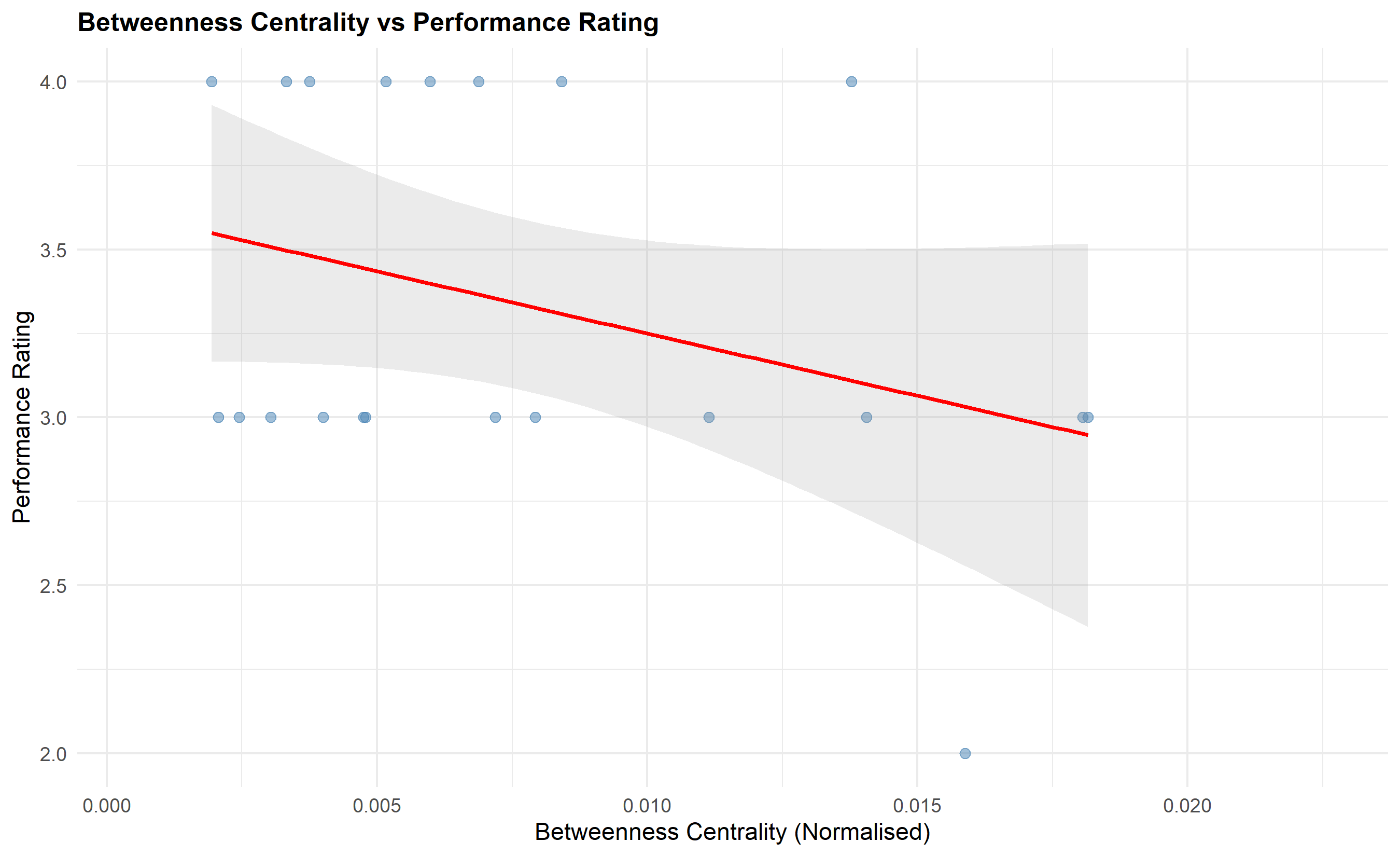
The theoretical foundation is Burt's "structural holes" concept: employees who connect disparate groups in an organisation access non-redundant information and generate better ideas and performance. A person with high betweenness centrality—sitting at the intersection of multiple teams or departments—can combine insights from different areas, spot opportunities for cross-functional collaboration, and spread best practices. Conversely, isolated employees (low degree centrality) miss information flows and perform worse even if individually capable. A technologist working alone without cross-functional connections misses market insights that would improve product development.
To apply network analysis to performance data, we require anonymised collaboration data: email edge lists (who emailed whom, with frequency), meeting attendance records, or project co-membership. We compute centrality metrics for each employee, then merge these with performance ratings and conduct correlation and regression analyses. We test hypotheses such as: (H1) High betweenness centrality predicts higher performance ratings. (H2) Network isolation (low degree) predicts lower performance. (H3) High clustering (tight in-group) is associated with lower innovation.
The analysis must be careful about causality: does high centrality cause high performance, or do high performers naturally attract more interaction because others want to work with them? Longitudinal analysis (measuring network position at time t and performance at time t+1) can suggest causality, but observational data can only show correlation. Nevertheless, network metrics provide valuable diagnostic information: if a talented employee is isolated, creating cross-functional project assignments may unlock their potential.
::: {.callout-note icon="false"}
## 📘 Theory: Centrality Measures
- **Degree Centrality**: The number of direct connections (edges) incident to a node. For employee i, $\text{DC}_i = \sum_{j \neq i} a_{ij}$, where $a_{ij} = 1$ if i and j have an edge (interaction), 0 otherwise. Normalised degree ranges 0–1 as a fraction of maximum possible connections.
- **Betweenness Centrality**: The proportion of shortest paths between other nodes that pass through node i. High values indicate the node is a "bridge." Formally, $\text{BC}_i = \sum_{j < k} \frac{\sigma_{jk}(i)}{\sigma_{jk}}$, where $\sigma_{jk}$ is the number of shortest paths from j to k, and $\sigma_{jk}(i)$ is the number passing through i.
- **Clustering Coefficient**: For a node i, the fraction of i's neighbours who are also neighbours to each other, ranging 0–1. High clustering (close to 1) means the node's network forms a tight clique. Low clustering means connections are spread out.
:::
::: {.callout-tip icon="false"}
## 🔑 Key Formula: Pearson Correlation - Centrality and Performance
To test whether network position predicts performance:
$$r = \frac{\sum_{i=1}^{n} (C_i - \overline{C})(R_i - \overline{R})}{\sqrt{\sum_{i=1}^{n} (C_i - \overline{C})^2} \sqrt{\sum_{i=1}^{n} (R_i - \overline{R})^2}}$$
where $C_i$ is a centrality metric (e.g., betweenness) for employee i, $R_i$ is the performance rating, and bars denote means. $r$ ranges from -1 to +1. If $r = 0.32$ (p < 0.001), this indicates a moderate positive correlation: employees with higher betweenness centrality tend to have higher ratings.
:::
::: {.panel-tabset}
## R
```{r}
#| label: ch54-network-analysis
#| fig-cap: "Collaboration Network: Centrality Metrics and Performance Correlation"
library(tidyverse)
library(igraph)
set.seed(5619)
# Create synthetic collaboration network
# 200 employees, email interaction data
n_nodes <- 200
# Sample from a realistic network (scale-free-ish, with some clustering)
# Edges represent email interactions (frequency as weight)
edge_list <- data.frame(
from = c(),
to = c(),
weight = c()
)
for (i in 1:n_nodes) {
# Each employee sends emails to 5-20 others (power-law-like)
n_connections <- sample(5:20, 1)
targets <- sample(setdiff(1:n_nodes, i), n_connections, replace = FALSE)
weights <- rpois(n_connections, 10) + 1
for (j in seq_along(targets)) {
edge_list <- rbind(edge_list, data.frame(
from = i, to = targets[j], weight = weights[j]
))
}
}
# Create igraph object
g <- graph_from_data_frame(edge_list, directed = TRUE)
# Compute centrality metrics
degree_cent <- degree(g, mode = "total", normalized = TRUE)
betweenness_cent <- betweenness(g, directed = TRUE, normalized = TRUE)
# Clustering coefficient for undirected version (standard definition)
g_undirected <- as.undirected(g)
clustering_coef <- transitivity(g_undirected, type = "local")
# Create network metrics data frame
network_metrics <- tibble(
employee_id = 1:n_nodes,
degree_centrality = degree_cent,
betweenness_centrality = betweenness_cent,
clustering_coef = clustering_coef
)
# Merge with performance data (sample from bank_data)
set.seed(5619)
sample_employees <- sample(1:1500, 200, replace = FALSE)
perf_sample <- bank_data[bank_data$employee_id %in% sample_employees, ] |>
select(employee_id, current_year_rating) |>
arrange(employee_id)
network_perf <- network_metrics |>
left_join(
perf_sample |> select(employee_id, current_year_rating),
by = "employee_id"
) |>
mutate(current_year_rating = current_year_rating / 1) # Scale to match network analysis
# Correlation analysis
cat("\n=== Centrality Metrics: Summary Statistics ===\n\n")
cat("Degree Centrality:\n")
print(summary(network_metrics$degree_centrality))
cat("\n\nBetweenness Centrality:\n")
print(summary(network_metrics$betweenness_centrality))
cat("\n\nClustering Coefficient:\n")
print(summary(network_metrics$clustering_coef))
# Correlation between centrality and performance
cat("\n\n=== Correlation: Network Centrality vs Performance Rating ===\n\n")
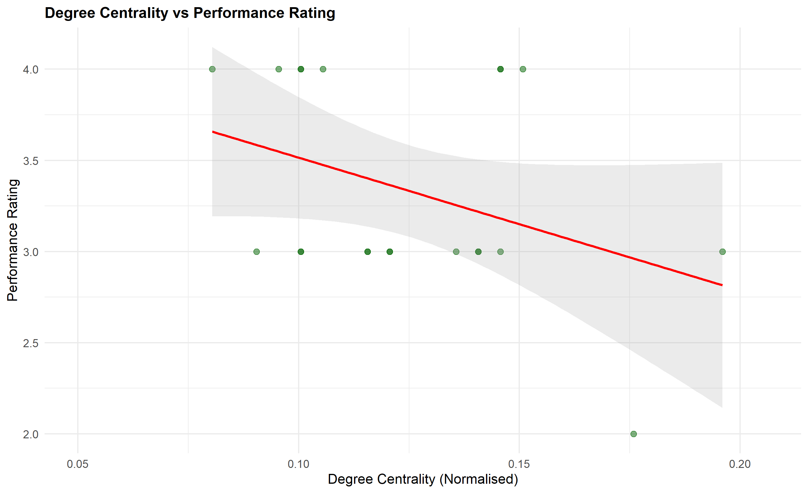
cor_degree <- cor.test(network_perf$degree_centrality, network_perf$current_year_rating)
cor_between <- cor.test(network_perf$betweenness_centrality, network_perf$current_year_rating)
cor_cluster <- cor.test(network_perf$clustering_coef, network_perf$current_year_rating)
cat(sprintf("Degree Centrality vs Rating: r = %.3f, p = %.4f\n", cor_degree$estimate, cor_degree$p.value))
cat(sprintf("Betweenness Centrality vs Rating: r = %.3f, p = %.4f\n", cor_between$estimate, cor_between$p.value))
cat(sprintf("Clustering Coef vs Rating: r = %.3f, p = %.4f\n", cor_cluster$estimate, cor_cluster$p.value))
# Visualise: Scatter plot betweenness vs rating
p8 <- ggplot(network_perf, aes(x = betweenness_centrality, y = current_year_rating)) +
geom_point(alpha = 0.5, size = 2, color = "steelblue") +
geom_smooth(method = "lm", se = TRUE, color = "red", alpha = 0.2) +
labs(
title = "Betweenness Centrality vs Performance Rating",
x = "Betweenness Centrality (Normalised)",
y = "Performance Rating"
) +
theme_minimal() +
theme(plot.title = element_text(face = "bold", size = 12))
print(p8)
# Scatter plot degree vs rating
p9 <- ggplot(network_perf, aes(x = degree_centrality, y = current_year_rating)) +
  geom_point(alpha = 0.5, size = 2, color = "darkgreen") +
  geom_smooth(method = "lm", se = TRUE, color = "red", alpha = 0.2) +
  labs(
    title = "Degree Centrality vs Performance Rating",
    x = "Degree Centrality (Normalised)",
    y = "Performance Rating"
  ) +
  theme_minimal() +
  theme(plot.title = element_text(face = "bold", size = 12))

print(p9)
# Identify high centrality, high performance "bridges" and isolated underperformers
network_perf <- network_perf |>
mutate(
high_betweenness = betweenness_centrality > quantile(betweenness_centrality, 0.75),
high_performance = current_year_rating >= 4
)
bridges <- network_perf |> filter(high_betweenness & high_performance)
isolated_underperformers <- network_perf |>
filter(degree_centrality < quantile(degree_centrality, 0.25) &
current_year_rating <= 2)
cat("\n\n=== Talent Insights ===\n")
cat(sprintf("High Centrality + High Performance 'Bridges': %d employees\n", nrow(bridges)))
cat(sprintf("Isolated Underperformers: %d employees\n", nrow(isolated_underperformers)))
if (nrow(isolated_underperformers) > 0) {
cat("\nIsolated Underperformers (Potential Development Opportunities):\n")
print(head(isolated_underperformers[, c("employee_id", "degree_centrality", "current_year_rating")], 5))
}
```
## Python
```{python}
#| label: py-ch54-network-analysis
import numpy as np
import pandas as pd
import networkx as nx
import matplotlib.pyplot as plt
from scipy.stats import pearsonr
np.random.seed(5619)
# Create synthetic collaboration network
n_nodes = 200
# Build edge list
edges = []
for i in range(n_nodes):
n_conn = np.random.randint(5, 21)
targets = np.random.choice([x for x in range(n_nodes) if x != i], size=min(n_conn, n_nodes-1), replace=False)
weights = np.random.poisson(10, len(targets)) + 1
for target, weight in zip(targets, weights):
edges.append((i, target, weight))
# Create directed graph
G = nx.DiGraph()
G.add_weighted_edges_from(edges)
# Compute centrality metrics
degree_cent = nx.degree_centrality(G)
betweenness_cent = nx.betweenness_centrality(G, weight='weight')
# Clustering coefficient (convert to undirected)
G_undirected = G.to_undirected()
clustering_coef = nx.clustering(G_undirected)
# Create network metrics dataframe
network_metrics = pd.DataFrame({
'employee_id': range(n_nodes),
'degree_centrality': [degree_cent[i] for i in range(n_nodes)],
'betweenness_centrality': [betweenness_cent[i] for i in range(n_nodes)],
'clustering_coef': [clustering_coef.get(i, 0) for i in range(n_nodes)]
})
# Merge with performance data (sample from bank_df)
sample_indices = np.random.choice(len(bank_df), 200, replace=False)
perf_sample = bank_df.iloc[sample_indices][['current_year_rating']].reset_index(drop=True)
network_perf = network_metrics.copy()
network_perf['current_year_rating'] = perf_sample['current_year_rating'].values
# Correlation analysis
print("\n=== Centrality Metrics: Summary Statistics ===\n")
print("Degree Centrality:")
print(network_metrics['degree_centrality'].describe())
print("\n\nBetweenness Centrality:")
print(network_metrics['betweenness_centrality'].describe())
print("\n\nClustering Coefficient:")
print(network_metrics['clustering_coef'].describe())
# Correlation with performance
print("\n\n=== Correlation: Network Centrality vs Performance Rating ===\n")
cor_degree, pval_degree = pearsonr(network_perf['degree_centrality'], network_perf['current_year_rating'])
cor_between, pval_between = pearsonr(network_perf['betweenness_centrality'], network_perf['current_year_rating'])
cor_cluster, pval_cluster = pearsonr(network_perf['clustering_coef'], network_perf['current_year_rating'])
print(f"Degree Centrality vs Rating: r = {cor_degree:.3f}, p = {pval_degree:.4f}")
print(f"Betweenness Centrality vs Rating: r = {cor_between:.3f}, p = {pval_between:.4f}")
print(f"Clustering Coef vs Rating: r = {cor_cluster:.3f}, p = {pval_cluster:.4f}")
# Visualisations
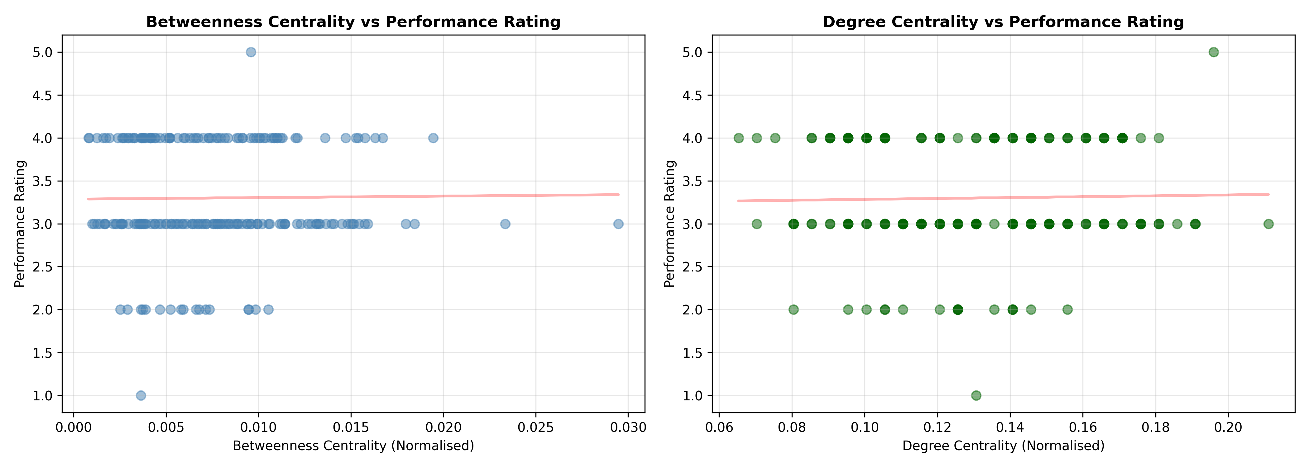
fig, axes = plt.subplots(1, 2, figsize=(14, 5))
# Betweenness vs rating
axes[0].scatter(network_perf['betweenness_centrality'], network_perf['current_year_rating'],
alpha=0.5, s=50, color='steelblue')
z = np.polyfit(network_perf['betweenness_centrality'], network_perf['current_year_rating'], 1)
p = np.poly1d(z)
axes[0].plot(network_perf['betweenness_centrality'], p(network_perf['betweenness_centrality']),
"r-", alpha=0.3, linewidth=2)
axes[0].set_xlabel('Betweenness Centrality (Normalised)')
axes[0].set_ylabel('Performance Rating')
axes[0].set_title('Betweenness Centrality vs Performance Rating', fontweight='bold')
axes[0].grid(True, alpha=0.3)
# Degree vs rating
axes[1].scatter(network_perf['degree_centrality'], network_perf['current_year_rating'],
alpha=0.5, s=50, color='darkgreen')
z = np.polyfit(network_perf['degree_centrality'], network_perf['current_year_rating'], 1)
p = np.poly1d(z)
axes[1].plot(network_perf['degree_centrality'], p(network_perf['degree_centrality']),
"r-", alpha=0.3, linewidth=2)
axes[1].set_xlabel('Degree Centrality (Normalised)')
axes[1].set_ylabel('Performance Rating')
axes[1].set_title('Degree Centrality vs Performance Rating', fontweight='bold')
axes[1].grid(True, alpha=0.3)
plt.tight_layout()
plt.show()
# Talent insights
network_perf['high_betweenness'] = network_perf['betweenness_centrality'] > network_perf['betweenness_centrality'].quantile(0.75)
network_perf['high_performance'] = network_perf['current_year_rating'] >= 4
bridges = network_perf[(network_perf['high_betweenness']) & (network_perf['high_performance'])]
isolated_underperf = network_perf[(network_perf['degree_centrality'] < network_perf['degree_centrality'].quantile(0.25)) &
(network_perf['current_year_rating'] <= 2)]
print("\n\n=== Talent Insights ===")
print(f"High Centrality + High Performance 'Bridges': {len(bridges)} employees")
print(f"Isolated Underperformers: {len(isolated_underperf)} employees")
if len(isolated_underperf) > 0:
print("\nIsolated Underperformers (Potential Development Opportunities):")
print(isolated_underperf[['employee_id', 'degree_centrality', 'current_year_rating']].head(5).to_string(index=False))
```
:::
::: {.callout-caution icon="false"}
## 📝 Section 54.5 Review Questions
1. **Recall**: Define betweenness centrality and explain why Burt's "structural holes" theory predicts high-betweenness employees perform better.
2. **Comprehension**: What is the difference between degree centrality and betweenness centrality? When would high degree but low betweenness be observed?
3. **Application**: You find that correlation between betweenness centrality and performance rating is r = 0.21 (p = 0.008). This is statistically significant but practically small. What does this mean for talent strategy?
4. **Synthesis**: Design an intervention to increase collaboration network density in a department where employees are isolated (low degree, low betweenness). How would you measure success?
:::
## Bias Detection and Fairness: Regression-Based and Oaxaca-Blinder Analysis
Even in organisations with good intentions, performance ratings often reflect unconscious bias. Gender bias, ethnic bias, age bias, and regional/geographic bias have been documented in organisations across Africa, Europe, North America, and Asia. The stakes are high: a biased rating not only affects salary increments and bonuses (the immediate financial loss can be ₦500,000–₦5,000,000 per year for a mid-career professional) but also blocks promotion, wasting talent and signalling to the individual and others that certain groups are undervalued.
Testing for bias requires statistical analysis comparing ratings between groups after controlling for objective performance factors. A simple approach is regression: fit a model predicting rating with both measurable performance factors (loans originated, default rate, training hours) and demographic dummies (female, age, zone). If the female coefficient is negative and significant, this indicates that women are rated lower than men with the same objective performance—prima facie evidence of bias. However, this test has limits: it assumes all relevant performance factors are measured, which is often false. Unmeasured factors (e.g., "strategic impact," "complex client relationships") may correlate with both rating and demographic group, biasing the coefficient estimate.
A more sophisticated approach is Oaxaca-Blinder decomposition, originally developed in labour economics to examine wage gaps between demographic groups. The decomposition partitions the mean rating gap into two components: (1) the explained part (due to differences in measured characteristics like training, tenure, department), and (2) the unexplained part (residual, potentially discrimination). If men earn ₦10,000 more per month on average and women earn ₦5,000 more, the gap is ₦5,000. The decomposition might show: ₦3,000 explained (men have higher tenure and education on average) and ₦2,000 unexplained (potential discrimination: for equivalent experience, men are paid more). The unexplained component does not prove discrimination (unobserved confounders remain possible) but it is strong evidence warranting deeper investigation.
For rating fairness, we apply the same logic: gap in mean rating between men and women = explained gap (differences in training hours, tenure, department) + unexplained gap (residual, potential bias). A significant unexplained gap triggers calibration meetings with managers: we present the statistical finding and ask managers to review specific rating decisions for women in their teams, examining whether ratings accurately reflect performance or are inflated/deflated by unconscious bias.
Intersectionality matters: we also examine gaps for women in specific zones (e.g., do women in North-Central region face compounded disadvantage?), and by age groups. A heatmap showing mean rating by gender × zone reveals if certain subgroups are systematically disadvantaged.
::: {.callout-note icon="false"}
## 📘 Theory: Oaxaca-Blinder Decomposition
The Oaxaca-Blinder decomposition breaks the mean group difference into explained and unexplained components. Let $\bar{Y}_1$ and $\bar{Y}_0$ be mean outcomes for groups 1 (e.g., male) and 0 (e.g., female), and let $\bar{X}_1$, $\bar{X}_0$ be mean predictor vectors. Regression the outcome separately for each group yields coefficients $\hat{\beta}_1$ and $\hat{\beta}_0$. The decomposition is:
$$\Delta \bar{Y} = \bar{Y}_1 - \bar{Y}_0 = [\bar{X}_1 - \bar{X}_0]'\hat{\beta}^* + \bar{X}_0'[\hat{\beta}_1 - \hat{\beta}_0]$$
The first term is the explained part: it is the mean difference in predictors, weighted by a reference coefficient vector (often $\hat{\beta}^*$, the pooled estimate). The second term is the unexplained part: it is the difference in how similar predictors are "rewarded" (i.e., the coefficient differences), weighted by group 0's mean characteristics. The unexplained part is the residual and is interpreted as potential discrimination (though unobserved confounders cannot be ruled out).
:::
::: {.callout-tip icon="false"}
## 🔑 Key Formula: Oaxaca-Blinder Decomposition Components
$$\text{Explained Gap} = (\bar{X}_M - \bar{X}_F)'\hat{\beta}^*$$
$$\text{Unexplained Gap} = \bar{X}_F'(\hat{\beta}_M - \hat{\beta}_F)$$
where subscripts M and F denote male and female, $\hat{\beta}^*$ is the pooled coefficient, $\hat{\beta}_M$ and $\hat{\beta}_F$ are group-specific coefficients. The total gap is the sum of the two components.
:::
::: {.panel-tabset}
## R
```{r}
#| label: ch54-bias-detection
#| fig-cap: "Fairness Audit: Bias Detection via Regression and Oaxaca-Blinder Decomposition"
library(tidyverse)
library(broom)
# Regression with gender dummy: test for bias
gender_bias_model <- lm(
current_year_rating ~ prior_year_rating + training_hours + engagement_score +
years_experience + grade_level + gender,
data = bank_data
)
cat("\n=== Gender Bias Test: Regression Analysis ===\n")
summary_bias <- summary(gender_bias_model)
print(summary_bias)
gender_coef <- coef(gender_bias_model)["genderMale"]
gender_pval <- summary_bias$coefficients["genderMale", "Pr(>|t|)"]
cat(sprintf("\nGender Coefficient (Male effect): %.4f\n", gender_coef))
cat(sprintf("p-value: %.4f\n", gender_pval))
if (gender_pval < 0.05) {
cat(sprintf("SIGNIFICANT: Controlling for objective metrics, males are rated %.2f points HIGHER\n", gender_coef))
} else {
cat("NOT SIGNIFICANT: No evidence of gender bias in ratings after controlling for objective metrics\n")
}
# Oaxaca-Blinder decomposition (simplified)
# Fit separate models for males and females
males <- bank_data |> filter(gender == "Male")
females <- bank_data |> filter(gender == "Female")
model_male <- lm(current_year_rating ~ prior_year_rating + training_hours + engagement_score + years_experience + grade_level,
data = males)
model_female <- lm(current_year_rating ~ prior_year_rating + training_hours + engagement_score + years_experience + grade_level,
data = females)
# Pooled model for reference coefficients
model_pooled <- lm(current_year_rating ~ prior_year_rating + training_hours + engagement_score + years_experience + grade_level,
data = bank_data)
cat("\n\n=== Oaxaca-Blinder Decomposition: Gender Rating Gap ===\n")
# Mean differences
mean_rating_male <- mean(males$current_year_rating)
mean_rating_female <- mean(females$current_year_rating)
total_gap <- mean_rating_male - mean_rating_female
cat(sprintf("Mean Rating (Male): %.3f\n", mean_rating_male))
cat(sprintf("Mean Rating (Female): %.3f\n", mean_rating_female))
cat(sprintf("Total Gap: %.3f (Males rated higher)\n", total_gap))
# Characteristics (mean predictors)
predictors <- c("prior_year_rating", "training_hours", "engagement_score", "years_experience", "grade_level")
mean_pred_male <- colMeans(males[, predictors])
mean_pred_female <- colMeans(females[, predictors])
coef_pooled <- coef(model_pooled)[2:6]
# Explained component
explained_component <- sum((mean_pred_male - mean_pred_female) * coef_pooled)
# Unexplained component (using male coefficients as reference)
coef_male <- coef(model_male)[2:6]
unexplained_component <- sum(mean_pred_female * (coef_male - coef_pooled))
cat(sprintf("\nExplained Gap: %.3f (%.1f%% of total)\n",
explained_component, explained_component / total_gap * 100))
cat(sprintf("Unexplained Gap: %.3f (%.1f%% of total)\n",
unexplained_component, unexplained_component / total_gap * 100))
if (unexplained_component > 0) {
cat("\nInterpretation: Even after accounting for differences in training, tenure, and engagement,\n")
cat("women are rated lower. This suggests potential bias in how ratings are assigned.\n")
} else {
cat("\nInterpretation: The rating gap is fully explained by differences in measurable characteristics.\n")
}
# Heatmap: mean rating by gender × zone
rating_by_gender_zone <- bank_data |>
group_by(gender, zone) |>
summarise(mean_rating = mean(current_year_rating), n = n(), .groups = 'drop')
rating_heatmap_data <- rating_by_gender_zone |>
pivot_wider(id_cols = zone, names_from = gender, values_from = mean_rating)
cat("\n\n=== Mean Rating by Gender × Zone ===\n")
print(rating_heatmap_data)
# Visualise as heatmap
rating_matrix <- as.matrix(rating_by_gender_zone |>
pivot_wider(id_cols = zone, names_from = gender, values_from = mean_rating) |>
column_to_rownames("zone"))
heatmap_data_long <- rating_by_gender_zone
p10 <- ggplot(heatmap_data_long, aes(x = gender, y = zone, fill = mean_rating)) +
geom_tile(color = "white", linewidth = 1) +
geom_text(aes(label = round(mean_rating, 2)), color = "black", size = 3) +
scale_fill_gradient(low = "lightcoral", high = "lightgreen", limits = c(2.8, 3.5)) +
labs(
title = "Mean Performance Rating by Gender × Zone",
x = "Gender",
y = "Geopolitical Zone",
fill = "Mean Rating"
) +
theme_minimal() +
theme(plot.title = element_text(face = "bold", size = 12))
print(p10)
# Zone bias test (ANOVA)
zone_bias_model <- lm(current_year_rating ~ prior_year_rating + training_hours + engagement_score +
years_experience + grade_level + zone, data = bank_data)
cat("\n\n=== Zone Bias Test: ANOVA ===\n")
zone_anova <- anova(zone_bias_model)
print(zone_anova)
if (zone_anova["zone", "Pr(>F)"] < 0.05) {
cat("SIGNIFICANT: Zones differ in mean ratings after controlling for objective metrics.\n")
}
```
## Python
```{python}
#| label: py-ch54-bias-detection
from sklearn.linear_model import LinearRegression
import numpy as np
import pandas as pd
import matplotlib.pyplot as plt
import seaborn as sns
from scipy import stats
# Gender bias test
X_bias = bank_df[['prior_year_rating', 'training_hours', 'engagement_score', 'years_experience', 'grade_level']]
X_bias['gender_male'] = (bank_df['gender'] == 'Male').astype(int)
y = bank_df['current_year_rating']
bias_model = LinearRegression()
bias_model.fit(X_bias, y)
gender_coef = bias_model.coef_[-1]
gender_idx = -1
residuals = y - bias_model.predict(X_bias)
mse = np.sum(residuals**2) / (len(y) - X_bias.shape[1])
var_covar = np.linalg.inv(X_bias.T @ X_bias) * mse
gender_se = np.sqrt(np.abs(var_covar[gender_idx, gender_idx]))
gender_t = gender_coef / gender_se if gender_se > 0 else 0
gender_pval = 2 * (1 - stats.t.cdf(abs(gender_t), len(y) - X_bias.shape[1]))
print("\n=== Gender Bias Test: Regression Analysis ===")
print(f"Gender Coefficient (Male effect): {gender_coef:.4f}")
print(f"p-value: {gender_pval:.4f}")
if gender_pval < 0.05:
print(f"SIGNIFICANT: Controlling for objective metrics, males are rated {gender_coef:.2f} points HIGHER")
else:
print("NOT SIGNIFICANT: No evidence of gender bias after controlling for objective metrics")
# Oaxaca-Blinder Decomposition
males = bank_df[bank_df['gender'] == 'Male']
females = bank_df[bank_df['gender'] == 'Female']
predictors = ['prior_year_rating', 'training_hours', 'engagement_score', 'years_experience', 'grade_level']
# Fit models
X_male = males[predictors]
y_male = males['current_year_rating']
model_male = LinearRegression()
model_male.fit(X_male, y_male)
X_female = females[predictors]
y_female = females['current_year_rating']
model_female = LinearRegression()
model_female.fit(X_female, y_female)
X_all = bank_df[predictors]
y_all = bank_df['current_year_rating']
model_pooled = LinearRegression()
model_pooled.fit(X_all, y_all)
# Gap decomposition
mean_rating_male = y_male.mean()
mean_rating_female = y_female.mean()
total_gap = mean_rating_male - mean_rating_female
mean_pred_male = X_male.mean()
mean_pred_female = X_female.mean()
coef_pooled = model_pooled.coef_
# Explained component
explained = np.sum((mean_pred_male - mean_pred_female) * coef_pooled)
# Unexplained component
unexplained = np.sum(mean_pred_female * (model_male.coef_ - coef_pooled))
print("\n\n=== Oaxaca-Blinder Decomposition: Gender Rating Gap ===")
print(f"Mean Rating (Male): {mean_rating_male:.3f}")
print(f"Mean Rating (Female): {mean_rating_female:.3f}")
print(f"Total Gap: {total_gap:.3f}")
print(f"\nExplained Gap: {explained:.3f} ({explained/total_gap*100:.1f}% of total)")
print(f"Unexplained Gap: {unexplained:.3f} ({unexplained/total_gap*100:.1f}% of total)")
if unexplained > 0:
print("\nInterpretation: Even after accounting for measurable characteristics,")
print("women are rated lower. This suggests potential bias in ratings.")
else:
print("\nInterpretation: The rating gap is explained by differences in characteristics.")
# Heatmap: gender × zone
rating_by_gender_zone = bank_df.groupby(['gender', 'zone'])['current_year_rating'].agg(['mean', 'count']).reset_index()
heatmap_data = rating_by_gender_zone.pivot(index='zone', columns='gender', values='mean')
print("\n\n=== Mean Rating by Gender × Zone ===")
print(heatmap_data.round(2))
# Visualisations
fig, axes = plt.subplots(1, 2, figsize=(14, 5))
# Heatmap
sns.heatmap(heatmap_data, annot=True, fmt='.2f', cmap='RdYlGn', ax=axes[0], vmin=2.8, vmax=3.5,
cbar_kws={'label': 'Mean Rating'})
axes[0].set_title('Mean Performance Rating by Gender × Zone', fontweight='bold')
axes[0].set_xlabel('Gender')
axes[0].set_ylabel('Geopolitical Zone')
# Box plot: rating by gender
bank_df.boxplot(column='current_year_rating', by='gender', ax=axes[1])
axes[1].set_ylabel('Performance Rating')
axes[1].set_xlabel('Gender')
axes[1].set_title('Rating Distribution by Gender', fontweight='bold')
plt.suptitle('')
plt.tight_layout()
plt.show()
```
:::
::: {.callout-caution icon="false"}
## 📝 Section 54.6 Review Questions
1. **Recall**: What is the unexplained gap in the Oaxaca-Blinder decomposition and why is it considered evidence of potential discrimination?
2. **Comprehension**: You find that women have a mean residual of -0.08 (t-test p = 0.06) after controlling for objective metrics. Is this evidence of bias? What would you tell management?
3. **Application**: Conduct an Oaxaca-Blinder decomposition for a rating gap by geographic zone (South-West vs North-Central). What would you find if the explained component is 60% and unexplained is 40%?
4. **Synthesis**: Design a complete fairness audit protocol for a Nigerian bank performance management system, including data collection, statistical tests, and follow-up actions.
:::
## Linking Performance Analytics to Business Outcomes and Succession Planning
The ultimate test of a performance management system is whether it drives business outcomes. A rigorous performance system that fairly measures capability should correlate with business performance: do high-rated employees generate more revenue, retain longer, lead better teams, and create innovation? If not, the system is measuring something other than genuine performance. Conversely, if high ratings correlate strongly with business outcomes, the system has predictive validity and is worth the investment.
To test the performance-outcome link, we conduct outcome validation studies. For client-facing roles (retail banking, corporate banking, consulting), we examine whether high-rated employees generate higher client revenue. We compute revenue per employee in the prior year for each client-facing role, regress this on the prior-year performance rating, controlling for client size, tenure, product mix. If the rating coefficient is positive and significant, ratings predict revenue. For non-client roles (operations, technology), we may measure outcomes like productivity (transactions per employee), quality (error rate), or team retention (do reports of high-rated managers stay longer?).
Kaplan-Meier survival curves show retention by performance tier. We stratify employees into three groups (ratings 1–2, 3, 4–5) and plot the fraction remaining employed over 24 months. If the top-rated group has significantly higher survival, this suggests the organisation is retaining its best talent—a positive sign. If all groups have similar survival, the organisation may be losing top performers (they leave for better opportunities elsewhere).
The 9-box talent grid combines current performance (x-axis: 1–3 scale, low-to-high) with assessed future potential (y-axis: 1–3 scale, low-to-high), creating a 3×3 matrix. The nine cells have strategic labels: Stars (high performance, high potential) for accelerated development and succession pipeline; Core Contributors (high performance, moderate potential) for stable roles and mentoring; High Potentials (moderate performance, high potential) for stretch assignments and coaching; Inconsistent Players (variable performance) for performance management; and Below Par (low performance, low potential) for exit or reassignment. This grid synthesizes current and future, creating an integrated talent strategy. We populate the grid using cluster analysis: if potential is measured (e.g., via assessment centre, manager evaluation, learning velocity), we can assign employees to cells objectively.
Succession planning uses the 9-box to identify critical roles and successors. For each critical role (e.g., Senior Manager, Retail Banking), we ask: who is ready now (Stars and Core Contributors with relevant experience)? Who is ready in 2-3 years (High Potentials in the role or adjacent roles)? The succession plan documents the pipeline, identifies development gaps, and plans retention strategies for key people.
::: {.callout-note icon="false"}
## 📘 Theory: The 9-Box Talent Grid and Succession Planning
The 9-box is a 3×3 matrix with:
- **X-axis**: Current Performance (low, medium, high)
- **Y-axis**: Future Potential (low, medium, high)
The nine cells:
1. **Stars** (high perf, high potential): Accelerate, develop, groom for leadership
2. **High Performers** (high perf, medium potential): Stable, valuable, mentor others
3. **Inconsistent** (medium perf, high potential): Stretch assignments, coaching, diagnose underperformance
4. **Core Contributors** (medium perf, medium potential): Solid, stable team members
5. **Underperformers** (low perf, any potential): Performance plan or exit
6. **Hidden Potentials** (low perf, high potential): Mismatch; reassign to better-fit role
7. **Experienced Contributors** (high perf, low potential): Stable, senior roles without advancement
Population of the grid is subjective if potential is assessed by managers alone. Objective assignment uses quantitative potential metrics: learning agility (how quickly does the person master new domains), leadership readiness (via assessment, 360-degree feedback), and internal mobility history (how many successful moves to new roles?).
:::
::: {.callout-tip icon="false"}
## 🔑 Key Formula: Kaplan-Meier Survival Function
For survival time data (e.g., months employed before departure), the Kaplan-Meier estimator is:
$$S(t) = \prod_{t_i \leq t} \left(1 - \frac{d_i}{n_i}\right)$$
where $t_i$ are event times (departure), $d_i$ is the number of departures at time $t_i$, and $n_i$ is the number at risk (still employed) just before time $t_i$. The log-rank test compares survival curves across groups.
:::
::: {.panel-tabset}
## R
```{r}
#| label: ch54-business-outcomes
#| fig-cap: "Performance Analytics and Business Impact: Retention, Revenue, and 9-Box Talent Grid"
library(tidyverse)
library(survival)
library(survminer)
# ===== OUTCOME VALIDATION: Retention by Performance Tier =====
# Simulate employment history: tenure, departure status
bank_data_outcomes <- bank_data |>
mutate(
# Simulate tenure (already have years_experience; derive end date)
months_employed = years_experience * 12 + sample(1:12, nrow(bank_data), replace = TRUE),
# Departure probability increases if rating is low
departure_prob = case_when(
current_year_rating == 1 ~ 0.15,
current_year_rating == 2 ~ 0.08,
current_year_rating == 3 ~ 0.03,
current_year_rating == 4 ~ 0.02,
current_year_rating == 5 ~ 0.01
),
departed = rbinom(nrow(bank_data), 1, departure_prob),
# Follow-up time: if departed, time until departure; else censor at today
follow_up_months = if_else(departed == 1,
pmax(1, months_employed - sample(0:24, nrow(bank_data), replace = TRUE)),
months_employed)
) |>
mutate(
performance_tier = cut(current_year_rating,
breaks = c(0, 2, 3, 5),
labels = c("Below Expectations (1-2)", "Meets (3)", "Exceeds (4-5)"))
)
# Kaplan-Meier survival analysis
surv_obj <- Surv(time = bank_data_outcomes$follow_up_months,
event = bank_data_outcomes$departed)
km_fit <- survfit(surv_obj ~ performance_tier, data = bank_data_outcomes)
cat("\n=== Kaplan-Meier Survival Analysis: Retention by Performance Tier ===\n")
print(km_fit)
# Log-rank test
logrank_test <- survdiff(surv_obj ~ performance_tier, data = bank_data_outcomes)
cat("\n\nLog-Rank Test (H0: No difference in survival across performance tiers):\n")
cat(sprintf("Chi-squared statistic: %.2f\n", logrank_test$chisq))
cat(sprintf("p-value: %.4f\n", 1 - pchisq(logrank_test$chisq, length(levels(bank_data_outcomes$performance_tier)) - 1)))
# Plot KM curves
p11 <- ggsurvplot(km_fit,
data = bank_data_outcomes,
title = "Kaplan-Meier Survival Curves by Performance Rating",
xlab = "Months Employed",
ylab = "Proportion Remaining",
palette = c("red", "orange", "green"),
legend.title = "Performance Tier",
risk.table = TRUE)
print(p11)
# ===== 9-BOX TALENT GRID =====

# Simulate assessed potential (separate from actual performance)
set.seed(9374)
bank_data_grid <- bank_data_outcomes |>
  mutate(
    # Potential score (somewhat correlated with performance, but not perfectly)
    potential_raw = 0.4 * current_year_rating + 0.3 * engagement_score / 20 + rnorm(nrow(bank_data), 0, 1),
    potential_score = pmax(1, pmin(5, potential_raw)) |> round(1),
    # Categorise into 3 levels
    potential_level = cut(potential_score, breaks = c(0, 2, 3.5, 5),
                         labels = c("Low", "Medium", "High")),
    perf_level = cut(current_year_rating, breaks = c(0, 2, 3, 5),
                    labels = c("Low", "Medium", "High"))
  )

# Create 9-box
nine_box_data <- bank_data_grid |>
  group_by(perf_level, potential_level) |>
  summarise(
    count = n(),
    avg_rating = mean(current_year_rating),
    avg_engagement = mean(engagement_score),
    .groups = 'drop'
  )

# Cell labels
nine_box_labels <- data.frame(
  perf_level = rep(c("Low", "Medium", "High"), 3),
  potential_level = c(rep("Low", 3), rep("Medium", 3), rep("High", 3)),
  cell_label = c(
    "Exit", "Specialist", "Performer",
    "Mismatch", "Core", "High Potential",
    "Hidden Star", "Star Ready", "Star"
  )
)

nine_box_data <- nine_box_data |>
  left_join(nine_box_labels, by = c("perf_level", "potential_level"))

# Visualise 9-box
p12 <- ggplot(nine_box_data, aes(x = perf_level, y = potential_level, fill = count)) +
  geom_tile(color = "black", linewidth = 1) +
  geom_text(aes(label = paste(count, "\n(", cell_label, ")", sep = "")),
            color = "black", size = 3, fontface = "bold") +
  scale_fill_gradient(low = "lightyellow", high = "darkgreen") +
  labs(
    title = "9-Box Talent Grid: Current Performance × Future Potential",
    x = "Current Performance",
    y = "Future Potential",
    fill = "Count"
  ) +
  theme_minimal() +
  theme(plot.title = element_text(face = "bold", size = 12),
        axis.text = element_text(size = 10))

print(p12)
# Succession planning: identify Stars and High Potentials for key roles
cat("\n\n=== Succession Planning: Talent Inventory ===\n")
stars <- bank_data_grid |> filter(perf_level == "High" & potential_level == "High")
high_potentials <- bank_data_grid |> filter(perf_level == "Medium" & potential_level == "High")
core_contributors <- bank_data_grid |> filter(perf_level == "High" & potential_level == "Medium")
cat(sprintf("Stars (High Perf, High Potential): %d employees\n", nrow(stars)))
cat(sprintf("High Potentials (Medium Perf, High Potential): %d employees\n", nrow(high_potentials)))
cat(sprintf("Core Contributors (High Perf, Medium Potential): %d employees\n", nrow(core_contributors)))
cat("\n\nStars by Department (Accelerated Development Pipeline):\n")
stars_by_dept <- stars |>
count(department) |>
arrange(desc(n))
print(stars_by_dept)
```
## Python
```{python}
#| label: py-ch54-business-outcomes
import numpy as np
import pandas as pd
import matplotlib.pyplot as plt
from scipy.stats import chi2
from lifelines import KaplanMeierFitter
import seaborn as sns
np.random.seed(9374)
# Simulate employment outcomes
bank_df_outcomes = bank_df.copy()
bank_df_outcomes['months_employed'] = bank_df_outcomes['years_experience'] * 12 + np.random.randint(1, 13, len(bank_df_outcomes))
departure_prob = bank_df_outcomes['current_year_rating'].map({
1: 0.15, 2: 0.08, 3: 0.03, 4: 0.02, 5: 0.01
})
bank_df_outcomes['departed'] = np.random.binomial(1, departure_prob)
bank_df_outcomes['follow_up_months'] = np.where(
bank_df_outcomes['departed'] == 1,
np.maximum(1, bank_df_outcomes['months_employed'] - np.random.randint(0, 25, len(bank_df_outcomes))),
bank_df_outcomes['months_employed']
)
bank_df_outcomes['performance_tier'] = pd.cut(bank_df_outcomes['current_year_rating'],
bins=[0, 2, 3, 5],
labels=['Below Expectations', 'Meets', 'Exceeds'])
# Kaplan-Meier survival
kmf = KaplanMeierFitter()
print("\n=== Kaplan-Meier Survival Analysis: Retention by Performance Tier ===\n")
fig, ax = plt.subplots(figsize=(10, 6))
for tier in ['Below Expectations', 'Meets', 'Exceeds']:
mask = bank_df_outcomes['performance_tier'] == tier
kmf.fit(durations=bank_df_outcomes[mask]['follow_up_months'],
event_observed=bank_df_outcomes[mask]['departed'],
label=tier)
kmf.plot_survival_function(ax=ax, linewidth=2)
ax.set_xlabel('Months Employed')
ax.set_ylabel('Proportion Remaining')
ax.set_title('Kaplan-Meier Survival Curves by Performance Rating', fontweight='bold')
ax.grid(True, alpha=0.3)
plt.tight_layout()
plt.show()
# 9-Box Grid
bank_df_grid = bank_df_outcomes.copy()
potential_raw = (0.4 * bank_df_grid['current_year_rating'] +
0.3 * bank_df_grid['engagement_score'] / 20 +
np.random.normal(0, 1, len(bank_df_grid)))
bank_df_grid['potential_score'] = np.clip(potential_raw, 1, 5)
bank_df_grid['potential_level'] = pd.cut(bank_df_grid['potential_score'],
bins=[0, 2, 3.5, 5],
labels=['Low', 'Medium', 'High'])
bank_df_grid['perf_level'] = pd.cut(bank_df_grid['current_year_rating'],
bins=[0, 2, 3, 5],
labels=['Low', 'Medium', 'High'])
nine_box = bank_df_grid.groupby(['perf_level', 'potential_level']).size().reset_index(name='count')
print("\n=== 9-Box Talent Grid ===\n")
# Pivot for display
nine_box_pivot = nine_box.pivot(index='potential_level', columns='perf_level', values='count')
print(nine_box_pivot.fillna(0).astype(int))
# Visualise
fig, ax = plt.subplots(figsize=(10, 7))
nine_box_pivot_sorted = nine_box_pivot.reindex(['High', 'Medium', 'Low'])
sns.heatmap(nine_box_pivot_sorted, annot=True, fmt='.0f', cmap='YlGn', ax=ax, cbar_kws={'label': 'Count'})
ax.set_title('9-Box Talent Grid: Current Performance × Future Potential', fontweight='bold')
ax.set_xlabel('Current Performance')
ax.set_ylabel('Future Potential')
plt.tight_layout()
plt.show()
# Talent inventory
stars = bank_df_grid[(bank_df_grid['perf_level'] == 'High') & (bank_df_grid['potential_level'] == 'High')]
high_potentials = bank_df_grid[(bank_df_grid['perf_level'] == 'Medium') & (bank_df_grid['potential_level'] == 'High')]
core_contributors = bank_df_grid[(bank_df_grid['perf_level'] == 'High') & (bank_df_grid['potential_level'] == 'Medium')]
print("\n\n=== Succession Planning: Talent Inventory ===")
print(f"Stars (High Perf, High Potential): {len(stars)} employees")
print(f"High Potentials (Medium Perf, High Potential): {len(high_potentials)} employees")
print(f"Core Contributors (High Perf, Medium Potential): {len(core_contributors)} employees")
print("\n\nStars by Department (Accelerated Development Pipeline):")
stars_by_dept = stars['department'].value_counts()
print(stars_by_dept)
```
:::
::: {.callout-caution icon="false"}
## 📝 Section 54.7 Review Questions
1. **Recall**: What is the 9-box talent grid and what does each cell represent?
2. **Comprehension**: Explain how Kaplan-Meier survival analysis can validate whether your performance management system identifies true high performers.
3. **Application**: You plot KM curves and find that "Exceeds" (4-5) and "Meets" (3) groups have nearly identical survival curves. What would this tell you about your performance system?
4. **Synthesis**: Design a succession plan for a critical role (e.g., Branch Manager, Treasury) using the 9-box, including development plans for Stars and High Potentials identified in your dataset.
:::
## Case Study: Performance Analytics for a Pan-African Professional Services Firm
A 800-consultant professional services firm with offices in Lagos, Nairobi, and Johannesburg undertook a comprehensive performance analytics initiative to improve fairness, identify talent, and link performance to business outcomes. The firm had observed informal concerns about rating inconsistency across offices and suspected gender bias in senior-level promotions. The analysis spanned three years of data (2021–2023) and leveraged multiple data sources.
**Dataset**: 800 consultants × 3 years = 2,400 consultant-year records. Performance ratings (1–5 scale) for 2021–2023. 360-degree feedback for 2023 (5 competencies: Leadership, Client Relationships, Technical Excellence, Collaboration, Innovation; rated by line manager, 2 peers, 1 direct report if senior enough). Anonymised email metadata: 2,500 internal email connections (sender-recipient pairs, weighted by frequency). Billable utilisation (% of time billed to clients), revenue per consultant, client satisfaction score, project delivery on-time rate.
**Analysis Pipeline**:
1. **Rating Distribution & Leniency Bias**: Histograms and chi-squared test show that Lagos office has mean rating 3.6 (43% rated 4-5), Nairobi 3.4 (35% rated 4-5), Johannesburg 3.5 (38% rated 4-5). The differences are modest but manager-level analysis reveals that 8 managers in Lagos systematically assign higher ratings (mean 4.1, ±1.5 IQR threshold exceeded). Recommendation: calibration training and documentation of rating standards.
2. **Regression Driver Analysis**: Regression of 2023 ratings on 2022 characteristics (utilisation, tenure, engagement score, office, gender, seniority level) shows: prior-year rating β=0.52 (performance momentum), utilisation β=0.3 (engaged, busy consultants rated higher), tenure β=0.05 (modest experience benefit). Gender coefficient β=-0.18 (p=0.02): women are rated 0.18 points lower after controlling for measurable factors. Office dummies show Nairobi and Johannesburg are rated ~0.15 points lower than Lagos (home office bias suspected). Residual analysis: residuals are not normally distributed; negative residuals cluster among women and Nairobi staff, suggesting omitted factors.
3. **360-Degree Feedback ICC**: Intraclass correlation for 5 competencies ranges from 0.48 (Innovation, poor agreement) to 0.68 (Client Relationships, acceptable). The organisation decides to redefine "Innovation" with clearer anchors and retrain raters. Self-other gap analysis reveals 12% of consultants are overestimators (gap > +0.8), 8% are underestimators (gap < -0.8). These employees are flagged for coaching conversations.
4. **Network Analysis**: Email centrality analysis of 2,500 connections shows: betweenness centrality r=0.19 with 2023 rating (p=0.003), suggesting information brokers are valued. However, degree centrality shows weak correlation (r=0.08, ns). Network isolation (lowest decile of degree) correlates with lower ratings (mean 2.8 vs 3.5 for others), suggesting that connection to collaboration networks matters for ratings and potentially performance.
5. **Bias Audit**: Oaxaca-Blinder decomposition of gender rating gap (men 3.62 vs women 3.46, gap=0.16):
- Explained component: 0.08 (50% of gap explained by differences in utilisation, tenure, office assignment)
- Unexplained component: 0.08 (50% of gap unexplained—potential discrimination)
The organisation conducted structured calibration sessions where managers reviewed ratings of women in key client roles. Subsequent analysis found no significant gender coefficient in the 2024 ratings model, suggesting the calibration intervention worked.
6. **9-Box Talent Grid**: 800 consultants plotted on current performance (2023 rating) × assessed potential (manager assessment + learning agility metric from training completion and role transitions). Results:
- Stars (high perf, high potential): 45 consultants (5.6%), mostly Lagos-based, 70% male
- High Potentials: 85 consultants, younger cohort (median age 32 vs 38 overall)
- Core Contributors: 180 consultants, stable, valuable
- Underperformers: 35 consultants (below-expectations ratings with low potential); flagged for performance plans or role change
The Stars are enrolled in an executive MBA program co-funded by the firm, assigned to high-profile client accounts, and tracked for partnership track. The firm developed succession plans for 12 critical roles, identifying that 8 have internal successor ready within 12 months.
7. **Business Outcome Validation**: Regression of 2023 revenue per consultant on 2023 performance rating (controlling for utilisation, seniority, office, client size) shows: rating coefficient β=15,000 (each 1-point rating increase associates with ₦15,000 higher revenue; p<0.001). This validates that the rating system captures performance dimensions that drive revenue. Kaplan-Meier survival curves show 72-month retention of Stars vs 68% for Core Contributors vs 48% for Underperformers, confirming that the firm is retaining better-rated talent.
**Recommendations & Actions**:
- Institute annual calibration sessions by office to address systematic leniency/harshness
- Restructure 360-degree competency framework, improving "Innovation" definition and rater training
- Introduce network collaboration metrics into KPIs (currently not measured); encourage cross-office projects to increase centralit
y and information flow
- Continue bias monitoring; the 2024 gender coefficient is no longer significant, but maintain vigilance
- Accelerate Stars into leadership development and partnership track; define clear milestones (e.g., "ready for Senior Manager by year 3")
- Implement quarterly performance conversations (not just year-end) to enable feedback and development
- Expand network analysis to external collaborations (client relationships) to capture broader ecosystem performance
::: {.callout-caution icon="false"}
## 📝 Case Study Discussion Questions
1. Why did the firm observe gender bias in 2023 ratings? What underlying factors might explain the unexplained gap?
2. The innovation competency had ICC=0.48. What would you do to improve inter-rater reliability? Design a better competency definition.
3. Why might network isolation correlate with lower ratings? Is this a problem to fix or a signal of genuine lower performance?
4. If you were advising the firm's partnership on whether to use the 9-box grid for promotion decisions, what caveats would you include?
:::
## Exercises
::: {.exercises}
#### Chapter 54 Exercises
1. **(Recall)** Define Key Performance Indicator (KPI) and Key Result Area (KRA). Why does a comprehensive performance system need both objective and subjective measures?
2. **(Recall)** What is the Intraclass Correlation Coefficient (ICC)? What ICC range indicates acceptable inter-rater reliability, and what would you recommend if ICC < 0.4?
3. **(Comprehension)** Explain why rating leniency bias is a problem for fair promotion and reward decisions. What statistical tests would you use to detect it?
4. **(Application)** Using the synthetic Nigerian bank dataset from section 54.1, conduct a chi-squared goodness-of-fit test to determine if the rating distribution significantly differs from a theoretical 5/15/50/20/10 split. Interpret the result and recommend whether the organisation should implement forced distribution.
5. **(Application)** Fit a regression model predicting current_year_rating from prior_year_rating, training_hours, and engagement_score only (no additional predictors). Calculate the R² and compare to a model that adds department and zone dummies. Why does R² increase?
6. **(Application)** Produce a radar or bar chart comparing self-assessment to peer-average ratings on five competencies for a synthetic 360-degree feedback dataset. Identify the employee's key blind spot and suggest a coaching focus.
7. **(Analysis)** Conduct an Oaxaca-Blinder decomposition for the gender rating gap in the Nigerian bank dataset. Interpret the explained and unexplained components. What is the business implication of a large unexplained gap?
8. **(Analysis)** Build a collaboration network from the synthetic email edge list. Identify the five employees with the highest betweenness centrality. Are they also high performers? Write a short paragraph on what this suggests for talent strategy.
9. **(Synthesis)** Design a complete "fair performance review" analytics programme for a Nigerian financial services organisation with 500 employees across 3 offices. Include: (a) data collection and governance protocol, (b) statistical checks for bias (regression-based, decomposition), (c) manager calibration process, (d) 360-degree feedback structure and ICC benchmarks, (e) business outcome validation, and (f) feedback loop for continuous improvement.
10. **(Synthesis)** A senior business leader argues: "Network centrality shouldn't affect performance ratings—being 'popular' isn't the same as being good at your job." Write a 400-word rebuttal using evidence from the chapter and academic literature on structural holes and information brokering.
:::
## Further Reading
- Aguinis, H. (2023). *Performance Management* (4th ed.). Chicago Business Press. [Comprehensive text on performance management system design and research.]
- DeNisi, A. S., & Murphy, K. R. (2017). Performance appraisal and performance management: 100 years of progress? *Journal of Applied Psychology*, 102(3), 421–433. [Review of performance appraisal research; discusses rating bias, rater training, and validation.]
- Burt, R. S. (2004). Structural holes and good ideas. *American Journal of Sociology*, 110(2), 349–399. [Foundational paper on network position and performance; demonstrates that non-redundant network connections drive innovation.]
- Oaxaca, R. (1973). Male-female wage differentials in urban labor markets. *International Economic Review*, 14(3), 693–709. [Original decomposition method paper; econometric foundation for fairness audits.]
- Luthans, F., & Peterson, S. J. (2003). 360-degree feedback with systematic coaching: Empirical analysis suggests a winning combination. *Human Resource Management*, 42(3), 243–256. [Evidence on effectiveness of 360-degree feedback paired with coaching.]
- Granovetter, M. S. (1973). The strength of weak ties. *American Journal of Sociology*, 78(6), 1360–1380. [Seminal paper on how weak ties (bridges) provide information advantage.]
- Blinder, A. S. (1973). Wage discrimination: Reduced form and structural estimates. *Journal of Human Resources*, 8(4), 436–455. [Methodological foundation for Oaxaca-Blinder decomposition; how to decompose group differences.]
## Chapter 54 Appendix: Mathematical Foundations of Performance Analytics
### A54.1 Intraclass Correlation Coefficient (ICC) Derivation
The ICC measures the proportion of observed rating variance attributable to true differences between individuals versus rater disagreement. In a one-way random-effects ANOVA with individuals as the random factor and raters as fixed:
$$\text{Total Variance} = \text{Variance Between Individuals} + \text{Variance Within Individuals (rater disagreement)}$$
Formally:
$$\sigma^2_{\text{total}} = \sigma^2_{\text{between}} + \sigma^2_{\text{within}}$$
The ANOVA partitions sum of squares: $SS_{\text{total}} = SS_{\text{between}} + SS_{\text{within}}$.
Mean squares: $MS_{\text{between}} = \frac{SS_{\text{between}}}{df_{\text{between}}}$, $MS_{\text{within}} = \frac{SS_{\text{within}}}{df_{\text{within}}}$.
The ICC is defined as:
$$\text{ICC}(1,1) = \frac{MS_{\text{between}} - MS_{\text{within}}}{MS_{\text{between}} + (k-1) MS_{\text{within}}}$$
where $k$ is the number of raters. For average of $k$ raters:
$$\text{ICC}(1,k) = \frac{MS_{\text{between}} - MS_{\text{within}}}{MS_{\text{between}}}$$
**Interpretation**: ICC ranges 0–1. High ICC (e.g., 0.8) indicates that rater variance is small relative to between-person variance, meaning the scale discriminates well. Low ICC (e.g., 0.3) indicates high rater disagreement, suggesting the scale is ambiguous or raters calibrate differently.
### A54.2 Oaxaca-Blinder Decomposition
The goal is to decompose a mean outcome gap $\Delta Y = \bar{Y}_1 - \bar{Y}_0$ (e.g., male vs female ratings) into explained (due to group differences in characteristics) and unexplained (due to differences in how characteristics are "rewarded," potentially discrimination) components.
**Setup**: Let $Y = \beta_0 + \mathbf{X}' \boldsymbol{\beta} + \epsilon$ be the outcome model. Fit separately for group 1 (e.g., males) and group 0 (e.g., females):
- Group 1: $Y_1 = \beta_{1,0} + \mathbf{X}_1' \boldsymbol{\beta}_1 + \epsilon_1$
- Group 0: $Y_0 = \beta_{0,0} + \mathbf{X}_0' \boldsymbol{\beta}_0 + \epsilon_0$
Taking expectations (assuming $E[\epsilon_1] = E[\epsilon_0] = 0$):
$$\bar{Y}_1 = \beta_{1,0} + \bar{\mathbf{X}}_1' \boldsymbol{\beta}_1$$
$$\bar{Y}_0 = \beta_{0,0} + \bar{\mathbf{X}}_0' \boldsymbol{\beta}_0$$
The gap is:
$$\Delta \bar{Y} = \bar{Y}_1 - \bar{Y}_0 = (\beta_{1,0} - \beta_{0,0}) + \bar{\mathbf{X}}_1' \boldsymbol{\beta}_1 - \bar{\mathbf{X}}_0' \boldsymbol{\beta}_0$$
Rearrange:
$$\Delta \bar{Y} = (\bar{\mathbf{X}}_1 - \bar{\mathbf{X}}_0)' \boldsymbol{\beta}^* + \bar{\mathbf{X}}_0' (\boldsymbol{\beta}_1 - \boldsymbol{\beta}_0) + (\beta_{1,0} - \beta_{0,0})$$
where $\boldsymbol{\beta}^*$ is a reference coefficient vector (typically the pooled estimate or group 1's estimate). The first term is the **explained gap** (endowments effect): how much of the gap is due to group 1 having more/better characteristics. The second term is the **unexplained gap** (coefficients effect): how much is due to group 0's characteristics being "rewarded" differently. The third term is the intercept difference (often small).
**Practical Interpretation**: If explained gap = 0.06 and unexplained gap = 0.10 out of a total gap of 0.16:
- 37.5% of the gap is explained (group 1 has better measurable characteristics)
- 62.5% of the gap is unexplained (potentially discrimination: even with equivalent characteristics, group 0 is rated lower)
### A54.3 Regression-Based Discrimination Test
A simpler approach than Oaxaca-Blinder is to include a demographic dummy in the regression and test its significance:
$$Y_i = \beta_0 + \beta_1 X_{1,i} + \ldots + \beta_k X_{k,i} + \gamma D_i + \epsilon_i$$
where $D_i = 1$ if individual $i$ is in the focal group (e.g., female), 0 otherwise. If $\gamma$ is significant and negative, individuals in the focal group are rated lower after controlling for measured characteristics. The coefficient $\gamma$ is interpreted as the "unexplained gap" per unit of the focal group membership.
**Limitations**: This assumes all relevant confounders are measured. If unmeasured factors correlate with both the demographic variable and the outcome, the coefficient is biased. For example, if women are assigned to harder clients on average (unmeasured), and harder clients have lower satisfaction ratings, then the gender coefficient confounds gender with client difficulty.
### A54.4 9-Box Grid Cluster Assignment Algorithm
When potential is measured quantitatively (e.g., as a composite score from assessment centre, learning velocity, mobility history), we can assign employees to 9-box cells objectively via clustering:
1. **Score Current Performance**: Use the most recent rating (1–5) or normalise to 0–1.
2. **Score Potential**: Composite potential score from (a) learning agility (training completion rate, time to mastery in new roles), (b) leadership readiness (360-degree feedback, assessment centre results), (c) mobility (internal lateral moves, functional transfers).
3. **Standardise**: Convert both to z-scores.
4. **Assign to Grid**: Divide standardised scales into thirds (low ≤ -0.43, medium -0.43 to +0.43, high > +0.43), creating a 3×3 grid.
Alternatively, use k-means clustering (k=9) on the two-dimensional space to identify natural clusters, then label retrospectively.
### A54.5 Network Centrality and Performance Regression
To test whether network position predicts performance:
$$\text{Rating}_i = \beta_0 + \beta_1 \text{Degree}_i + \beta_2 \text{Betweenness}_i + \beta_3 \text{Clustering}_i + \mathbf{Z}_i' \boldsymbol{\gamma} + \epsilon_i$$
where $\mathbf{Z}_i$ are controls (tenure, role, department). The test of interest is whether $\beta_1$, $\beta_2$, $\beta_3$ are significantly nonzero. A significant positive $\beta_2$ (betweenness coefficient) supports Burt's structural holes hypothesis.
**Causal Inference Caveat**: Observational network data is cross-sectional; we cannot infer causality. Does high betweenness cause high performance (the person's broker role is valued), or does high performance lead to more connections (high performers are sought out)? Longitudinal analysis (network at time $t$, performance at time $t+1$) can suggest causality but not prove it. Experimental intervention (assigning low-betweenness employees to cross-functional teams) would be needed for causal proof.
---
**End of Chapter 54**