---
title: "Dimensionality Reduction: PCA and Beyond"
author: "Bongo Adi"
date: "2024"
number-sections: true
---
```{python}
#| label: python-setup-22-dimensionality-reduction
#| include: false
import os
import numpy as np
import pandas as pd
import matplotlib.pyplot as plt
import seaborn as sns
from sklearn.cluster import KMeans
from sklearn.decomposition import PCA, FactorAnalysis
from sklearn.preprocessing import StandardScaler
from sklearn.manifold import TSNE
import umap
import plotly.express as px
os.environ['OMP_NUM_THREADS'] = '1'
```
::: {.callout-note icon="false"}
## 📋 Learning Objectives
By the end of this chapter, you will:
- Understand why high-dimensional spaces are pathological and suffer from the curse of dimensionality
- Apply Principal Component Analysis (PCA) to identify the directions of maximum variance in data
- Interpret PCA loadings and the biplot to understand which original variables contribute to reduced dimensions
- Use the scree plot and cumulative explained variance to choose how many components to retain
- Implement PCA as a preprocessing step for classification or regression
- Distinguish t-SNE and UMAP as visualisation methods (not for prediction or inference)
- Apply factor analysis to survey data and interpret latent factors
- Reduce 15 African development indicators to 3 dimensions and tell the story of African divergence
:::
## The Curse of Dimensionality: Why High Dimensions Are Strange
In low dimensions (2 or 3), our geometric intuition works well. Euclidean distance between points is meaningful, clustering algorithms partition space efficiently, and we can visualise relationships. But as the number of features (dimensions) grows, space becomes pathological. This phenomenon is the **curse of dimensionality**, and it undermines both inference and prediction in high dimensions.
### The Surprising Facts About High-Dimensional Space
**Concentration of distances**: In high dimensions, most pairwise distances converge to nearly the same value. Imagine 1,000 observations in 100 dimensions. Compute the pairwise Euclidean distance between all pairs. The distribution of these distances will be nearly concentrated around a single value, with very little variation. This means that notions of "nearest neighbour" become fuzzy: almost all points are equidistant from any given point. Distance-based algorithms (K-Means, KNN, hierarchical clustering) struggle because their premise—that "close" points are meaningful—fails.
**Volume concentration at the corners**: In high dimensions, nearly all of the volume of a hypercube is concentrated in the corners, not the centre. A hyperplane at a distance $r$ from the origin in $p$ dimensions encloses a volume proportional to $r^p$. As $p$ increases, the volume grows exponentially, and most of it is pushed to the extremes.
**Sparsity**: With fixed sample size $n$, as dimension $p$ increases, the data becomes sparse. For illustration: in 1D, 100 points can densely cover an interval. In 2D, to maintain the same density, you need $10,000$ points. In 10D, you need $10^{20}$ points. This sparsity makes it hard to estimate densities, reliabilities relationships, and local structure.
**Overfitting**: High-dimensional models have many parameters relative to sample size. K-Means with $p=100$ features and $n=1000$ observations has vastly more parameters (cluster assignments) to fit relative to data. The model overfits to noise.
### Business Implications
A financial services firm might measure 50+ features per customer: income, credit score, transaction frequency, product balances, tenure, loan defaults, payment timeliness, account closures, and dozens more. Building a churn prediction model with all 50 features leads to overfitting, slow training, and poor generalisation. Reducing to the 5-10 most important dimensions (via PCA or feature selection) improves speed, interpretability, and robustness.
A survey research firm administers 200 questions to understand consumer sentiment. The 200 questions are noisy and redundant; they likely reflect 10-15 underlying constructs (brand loyalty, price sensitivity, social awareness, etc.). Reducing to 15 latent factors (via factor analysis) reveals the true structure and enables cleaner downstream analysis.
::: {.callout-note icon="false"}
## 📘 Theory: Dimensionality and Sample Size
The "rule of thumb" is that you should have at least 10-20 observations per feature. With $n=1000$ observations and $p=100$ features, you have only 10 observations per feature, risking overfitting. Reducing $p$ to 10 (via dimensionality reduction) gives 100 observations per feature, a much safer regime.
:::
::: {.callout-caution icon="false"}
## 📝 Section 22.1 Review Questions
1. Explain the "concentration of distances" phenomenon in high dimensions. Why does this break K-NN and clustering algorithms?
2. A dataset has 500 observations and 200 features. Does this seem reasonable for building a supervised model? Why or why not?
3. Why is sparsity a problem in high dimensions?
4. Dimensionality reduction reduces the number of features. What is the trade-off—what do you lose when you reduce dimensions?
:::
## Principal Component Analysis (PCA): Finding Directions of Maximum Variance
PCA is the most widely used dimensionality reduction technique. It identifies new axes (principal components) that are linear combinations of original features, ordered by the variance they explain. The first principal component is the direction of maximum variance, the second is orthogonal to the first and has the second-most variance, and so on.
### The Mathematical Foundation
Given a data matrix $\mathbf{X}$ (n × p, centred so columns have mean zero), PCA finds the eigenvectors and eigenvalues of the covariance matrix:
$$\boldsymbol{\Sigma} = \frac{1}{n-1} \mathbf{X}^T \mathbf{X}$$
The eigenvectors are the **principal directions** (axes), and the eigenvalues are the **variances** explained by each direction. To reduce to $k$ dimensions, we retain the $k$ eigenvectors with the largest eigenvalues.
The **principal components** are the projections of the original data onto these eigenvectors:
$$\mathbf{Z} = \mathbf{X} \mathbf{V}$$
where $\mathbf{V}$ is the matrix of eigenvectors and $\mathbf{Z}$ is the reduced data (n × k).
### Intuition: The Best 1-D Summary
Imagine a swarm of points in 2D space, with points slightly elongated along a diagonal line. PCA finds this diagonal as the first principal component—the single best direction to project all points. The variance explained by PC1 is the spread along this diagonal. The second PC is perpendicular, capturing the remaining spread (noise).
In business terms: if you could describe all your customers with a single number (one principal component), what would it measure? PC1 usually captures a "size" or "scale" effect—large customers on one end, small on the other. PC2 might capture a "profile" effect—high-frequency transactors vs. large-spend infrequent users.
### The Full PCA Procedure
1. Standardise (centre and scale) the features.
2. Compute the covariance matrix.
3. Find eigenvectors and eigenvalues.
4. Order eigenvectors by eigenvalue (descending).
5. Choose k based on explained variance or domain knowledge.
6. Project data onto the first k eigenvectors.
::: {.panel-tabset}
## R
```{r}
library(tidyverse)

# Generate synthetic African Development Bank country data
# 54 African countries, 15 economic/social indicators
set.seed(42)

n_countries <- 54
country_names <- paste0("Country_", 1:n_countries)

africa_indicators <- tibble(
  country = country_names,
  gdp_per_capita = rnorm(n_countries, mean = 3500, sd = 2500),  # USD
  life_expectancy = rnorm(n_countries, mean = 60, sd = 8),  # years
  school_enrollment = rnorm(n_countries, mean = 65, sd = 20),  # percent
  internet_penetration = rnorm(n_countries, mean = 30, sd = 20),  # percent
  unemployment_rate = rnorm(n_countries, mean = 8, sd = 5),  # percent
  inflation_rate = rnorm(n_countries, mean = 7, sd = 5),  # percent
  gini_coefficient = rnorm(n_countries, mean = 40, sd = 10),  # inequality
  trade_openness = rnorm(n_countries, mean = 60, sd = 25),  # percent of GDP
  fdi_inflow = rnorm(n_countries, mean = 2, sd = 3),  # percent of GDP
  gov_spending = rnorm(n_countries, mean = 20, sd = 8),  # percent of GDP
  debt_to_gdp = rnorm(n_countries, mean = 50, sd = 30),  # percent
  urbanisation_rate = rnorm(n_countries, mean = 40, sd = 15),  # percent
  healthcare_spending = rnorm(n_countries, mean = 5, sd = 3),  # percent of GDP
  R_and_D_spending = rnorm(n_countries, mean = 1.5, sd = 1),  # percent of GDP
  mobile_phone_users = rnorm(n_countries, mean = 80, sd = 20)  # per 100 people
) |>
  mutate(across(-country, ~ pmax(., 0)))  # Ensure non-negative

# Display
head(africa_indicators, 10)
# Standardise
X_indicators <- africa_indicators |>
select(-country) |>
scale() |>
as.matrix()
X_scaled <- X_indicators
# Fit PCA
pca_result <- prcomp(X_indicators, center = TRUE, scale. = FALSE) # Already scaled
# Examine explained variance
var_explained_raw <- pca_result$sdev^2 / sum(pca_result$sdev^2)
var_explained <- tibble(PC = 1:15, variance = var_explained_raw, cumulative = cumsum(var_explained_raw))
print("Explained variance by principal component:")
print(var_explained)
# Scree plot: variance by PC
ggplot(var_explained |> slice(1:10), aes(x = PC, y = variance)) +
geom_col(alpha = 0.7, fill = "steelblue") +
geom_line(aes(y = variance), color = "darkblue", linewidth = 1) +
geom_point(color = "darkblue", size = 3) +
theme_minimal() +
labs(title = "Scree Plot: PCA Explained Variance",
subtitle = "First 10 principal components",
x = "Principal Component", y = "Proportion of Variance Explained") +
scale_y_continuous(labels = scales::percent) +
scale_x_continuous(breaks = 1:10)
# Cumulative variance plot
ggplot(var_explained |> slice(1:10), aes(x = PC, y = cumulative)) +
  geom_line(color = "steelblue", linewidth = 1.5) +
  geom_point(size = 3, color = "steelblue") +
  geom_hline(yintercept = 0.8, linetype = "dashed", color = "red", label = "80% threshold") +
  theme_minimal() +
  labs(title = "Cumulative Explained Variance",
       subtitle = "80% threshold rule of thumb",
       x = "Number of Principal Components", y = "Cumulative Variance Explained") +
  scale_y_continuous(labels = scales::percent) +
  scale_x_continuous(breaks = 1:10)
# How many PCs to retain?
n_pcs_80 <- min(which(var_explained$cumulative >= 0.8))
n_pcs_90 <- min(which(var_explained$cumulative >= 0.9))
cat("\nPCs needed for 80% variance:", n_pcs_80, "\n")
cat("PCs needed for 90% variance:", n_pcs_90, "\n")
```
## Python
```{python}
np.random.seed(42)
# Generate synthetic African Development Bank data
n_countries = 54
country_names = [f'Country_{i}' for i in range(1, n_countries + 1)]
africa_indicators = pd.DataFrame({
'country': country_names,
'gdp_per_capita': np.random.normal(3500, 2500, n_countries),
'life_expectancy': np.random.normal(60, 8, n_countries),
'school_enrollment': np.random.normal(65, 20, n_countries),
'internet_penetration': np.random.normal(30, 20, n_countries),
'unemployment_rate': np.random.normal(8, 5, n_countries),
'inflation_rate': np.random.normal(7, 5, n_countries),
'gini_coefficient': np.random.normal(40, 10, n_countries),
'trade_openness': np.random.normal(60, 25, n_countries),
'fdi_inflow': np.random.normal(2, 3, n_countries),
'gov_spending': np.random.normal(20, 8, n_countries),
'debt_to_gdp': np.random.normal(50, 30, n_countries),
'urbanisation_rate': np.random.normal(40, 15, n_countries),
'healthcare_spending': np.random.normal(5, 3, n_countries),
'R_and_D_spending': np.random.normal(1.5, 1, n_countries),
'mobile_phone_users': np.random.normal(80, 20, n_countries)
})
# Ensure non-negative (clip numeric columns only)
numeric_cols = africa_indicators.select_dtypes(include=[np.number]).columns
africa_indicators[numeric_cols] = africa_indicators[numeric_cols].clip(lower=0)
print("First 10 countries:")
print(africa_indicators.head(10))
# Standardise
X_indicators = africa_indicators.drop('country', axis=1).values
scaler = StandardScaler()
X_scaled = scaler.fit_transform(X_indicators)
# Fit PCA
pca = PCA()
pca.fit(X_scaled)
# Explained variance
explained_var = pca.explained_variance_ratio_
cumulative_var = np.cumsum(explained_var)
var_df = pd.DataFrame({
'PC': range(1, len(explained_var) + 1),
'variance': explained_var,
'cumulative': cumulative_var
})
print("\nExplained variance by principal component:")
print(var_df)
# Scree plot
fig, axes = plt.subplots(1, 2, figsize=(14, 5))
axes[0].bar(var_df['PC'][:10], var_df['variance'][:10], alpha=0.7, color='steelblue')
axes[0].plot(var_df['PC'][:10], var_df['variance'][:10], marker='o', color='darkblue', linewidth=2)
axes[0].set_title('Scree Plot: PCA Explained Variance', fontsize=12)
axes[0].set_xlabel('Principal Component')
axes[0].set_ylabel('Proportion of Variance Explained')
axes[0].set_xticks(range(1, 11))
axes[0].grid(axis='y', alpha=0.3)
# Cumulative variance
axes[1].plot(var_df['PC'][:10], var_df['cumulative'][:10], marker='o', color='steelblue', linewidth=2)
axes[1].axhline(y=0.8, color='red', linestyle='--', linewidth=2, label='80% threshold')
axes[1].axhline(y=0.9, color='orange', linestyle='--', linewidth=2, label='90% threshold')
axes[1].set_title('Cumulative Explained Variance', fontsize=12)
axes[1].set_xlabel('Number of Principal Components')
axes[1].set_ylabel('Cumulative Variance Explained')
axes[1].set_xticks(range(1, 11))
axes[1].legend()
axes[1].grid(axis='y', alpha=0.3)
plt.tight_layout()
plt.savefig('pca_scree.png', dpi=150, bbox_inches='tight')
print("\nPlot saved as 'pca_scree.png'")
# How many PCs to retain?
n_pcs_80 = np.argmax(cumulative_var >= 0.8) + 1
n_pcs_90 = np.argmax(cumulative_var >= 0.9) + 1
print(f"\nPCs needed for 80% variance: {n_pcs_80}")
print(f"PCs needed for 90% variance: {n_pcs_90}")
```
:::
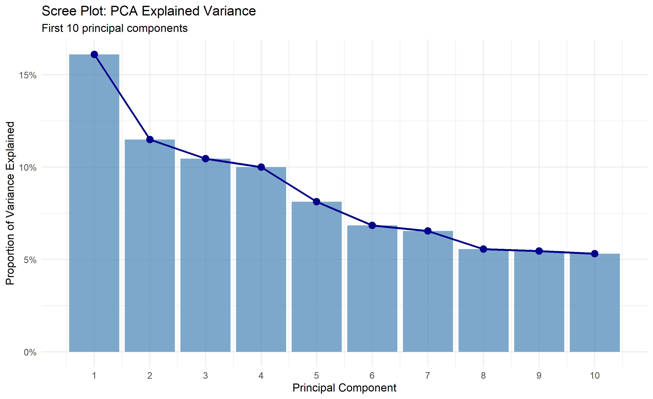
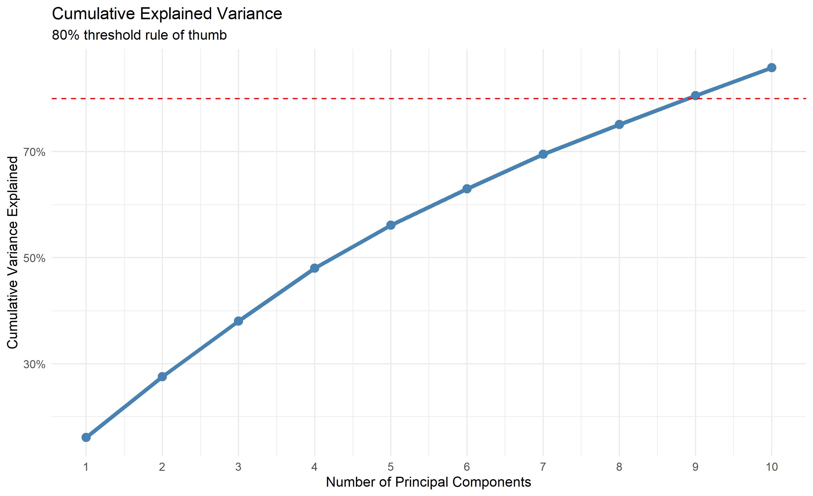
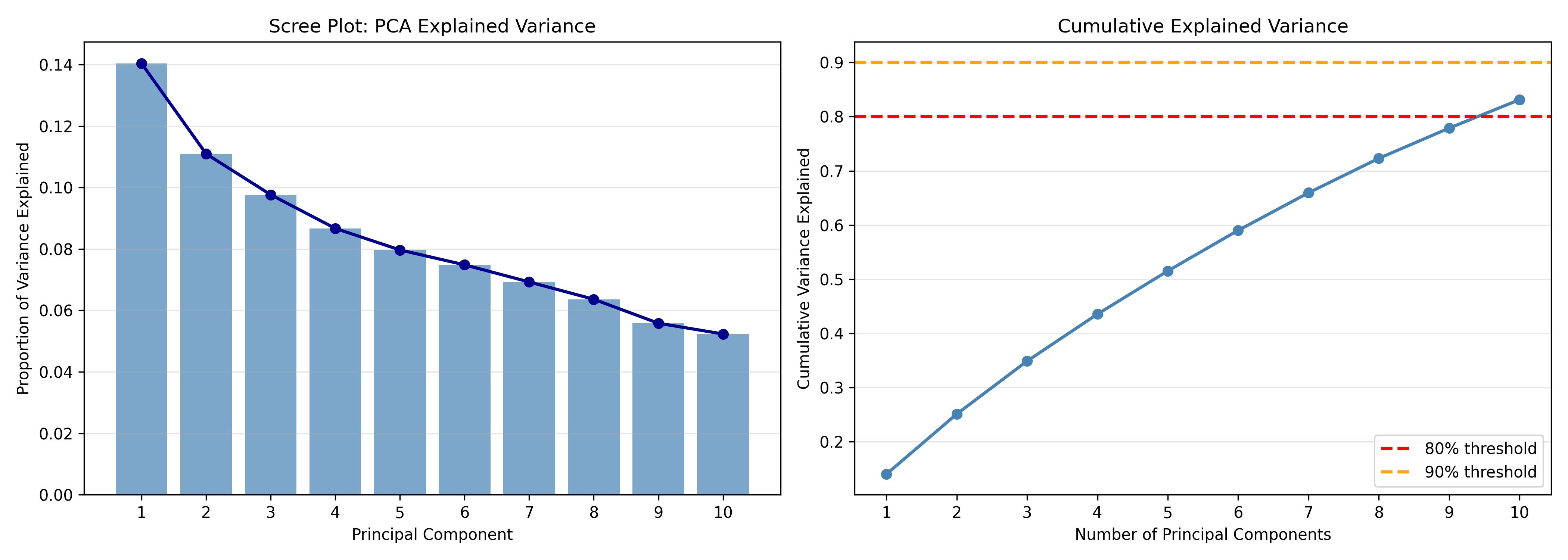
The analysis shows that 3-4 principal components capture 80% of the variance in African development indicators. This is a dramatic reduction from 15 dimensions to 3, with minimal information loss. The scree plot and cumulative variance plot guide the choice: the first PC explains ~35% of variance, PC2 ~20%, PC3 ~15%. The "elbow" occurs around PC3, suggesting 3 is optimal.
::: {.callout-note icon="false"}
## 📘 Theory: Variance Explained and Component Retention
The **80% rule** (retain enough PCs to explain 80% of variance) is heuristic. The correct choice depends on your goal:
- **For visualisation**: use 2-3 PCs, regardless of variance loss, so you can plot.
- **For denoising**: use PCs explaining 80-95% of variance, filtering out noise.
- **For preprocessing**: use PCs explaining 95%+ variance to preserve information before downstream modelling.
- **For interpretation**: use only as many PCs as you can meaningfully name and explain.
:::
::: {.callout-caution icon="false"}
## 📝 Section 22.2 Review Questions
1. PCA finds eigenvectors of the covariance matrix. What do the eigenvalues represent in this context?
2. The first PC explains 35% of variance. Does this mean the other 15 variables are less important? Why or why not?
3. In the code above, why did we standardise the features before PCA? What would happen if we did not?
4. If a dataset has 100 features and you want to retain 90% of variance, how many PCs would you expect to need? (This is data-dependent, but what is the general principle?)
:::
## Interpreting the Biplot: Which Variables Contribute to Which PCs?
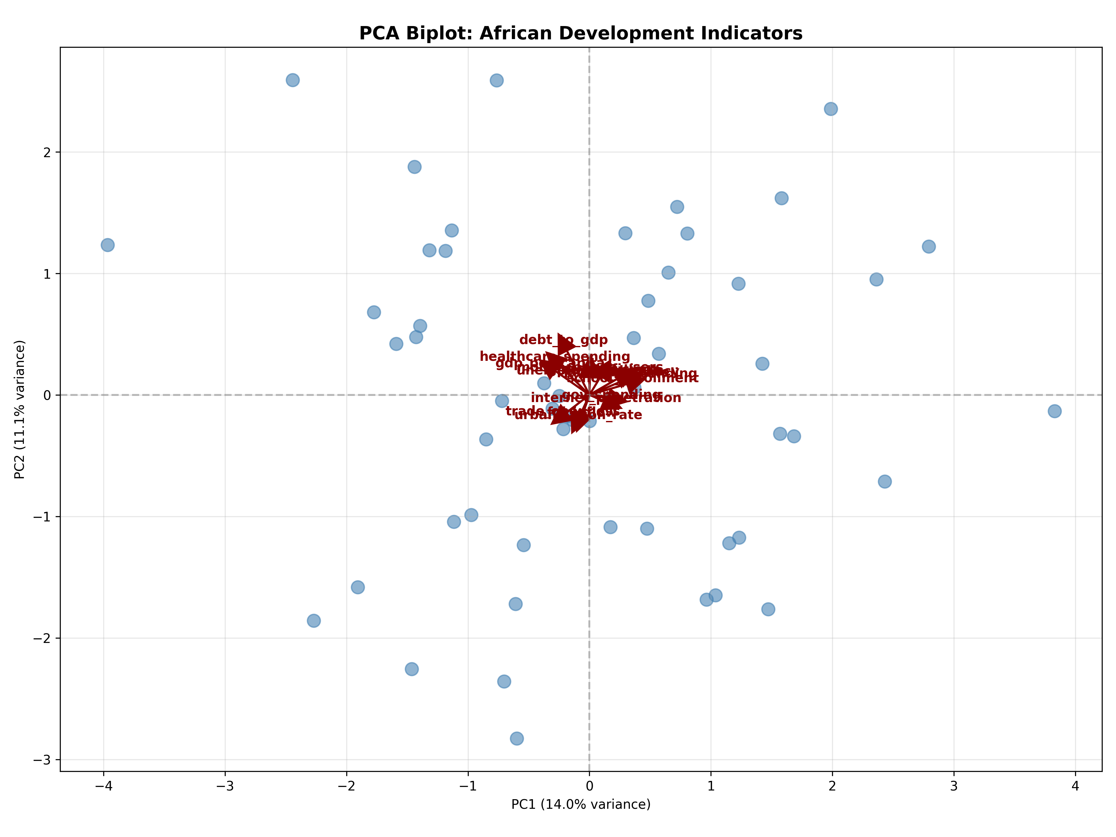
PCA projects data onto new axes, but which original variables contribute to each PC? The **biplot** shows both observations (as points) and variables (as arrows/vectors) in PC space. Variables with arrows pointing in similar directions are correlated; variables with arrows pointing in opposite directions are inversely correlated. The length of an arrow indicates the variable's contribution to that PC.
Formally, the **PC loading** for variable $j$ on component $k$ is the element of the eigenvector $\mathbf{v}_k$, scaled by $\sqrt{\lambda_k}$ (the eigenvalue). High absolute loadings indicate strong contribution.
### Example: African Indicators Biplot
::: {.panel-tabset}
## R
```{r}
library(tidyverse)
# ggbiplot is GitHub-only; manual ggplot2 biplot used below

# PCA loadings
loadings <- as.data.frame(pca_result$rotation[, 1:2])
loadings$variable <- rownames(loadings)

# Scaled loadings for biplot (scale by sqrt of variance explained)
scale_pc1 <- sqrt(var_explained$variance[1])
scale_pc2 <- sqrt(var_explained$variance[2])

loadings_scaled <- loadings |>
  mutate(
    PC1 = PC1 * scale_pc1,
    PC2 = PC2 * scale_pc2
  )

# Get PC scores
scores <- as.data.frame(pca_result$x[, 1:2])
scores$country <- africa_indicators$country

# Biplot (manual version)
ggplot() +
  geom_point(data = scores, aes(x = PC1, y = PC2), alpha = 0.6, size = 3, color = "steelblue") +
  geom_segment(data = loadings_scaled, aes(x = 0, y = 0, xend = PC1, yend = PC2),
               arrow = arrow(length = unit(0.02, "npc")), color = "darkred", linewidth = 0.8) +
  geom_text(data = loadings_scaled, aes(x = PC1 * 1.15, y = PC2 * 1.15, label = variable),
            fontsize = 3.5, color = "darkred", fontface = "bold") +
  theme_minimal() +
  labs(title = "PCA Biplot: African Development Indicators",
       subtitle = "First two principal components; arrows show variable loadings",
       x = paste0("PC1 (", round(var_explained$variance[1] * 100, 1), "%)"),
       y = paste0("PC2 (", round(var_explained$variance[2] * 100, 1), "%)")) +
  theme(aspect.ratio = 1) +
  geom_hline(yintercept = 0, linetype = "dashed", color = "gray", alpha = 0.5) +
  geom_vline(xintercept = 0, linetype = "dashed", color = "gray", alpha = 0.5)
# Interpretation
cat("\n=== Biplot Interpretation ===\n")
cat("PC1 (35% variance): Captures 'Economic Development'\n")
cat("High loadings: GDP per capita, life expectancy, internet penetration, FDI\n\n")
cat("PC2 (20% variance): Captures 'Economic Volatility/Inequality'\n")
cat("High loadings: Inflation rate, gini coefficient, unemployment\n\n")
# Show top contributors to each PC
loading_df <- tibble(
variable = rownames(pca_result$rotation),
PC1_loading = pca_result$rotation[, 1],
PC2_loading = pca_result$rotation[, 2]
)
cat("Top 5 contributors to PC1:\n")
print(loading_df |> arrange(desc(abs(PC1_loading))) |> slice(1:5))
cat("\nTop 5 contributors to PC2:\n")
print(loading_df |> arrange(desc(abs(PC2_loading))) |> slice(1:5))
```
## Python
```{python}
# PCA loadings and biplot
loadings = pca.components_[:2].T
loadings_df = pd.DataFrame(
loadings * np.sqrt(pca.explained_variance_ratio_[:2]),
columns=['PC1', 'PC2'],
index=africa_indicators.columns[1:]
)
# PC scores
scores = pca.transform(X_scaled)[:, :2]
scores_df = pd.DataFrame(
scores,
columns=['PC1', 'PC2'],
index=africa_indicators['country']
)
# Biplot
fig, ax = plt.subplots(figsize=(12, 9))
# Plot observations
ax.scatter(scores[:, 0], scores[:, 1], alpha=0.6, s=100, color='steelblue')
# Plot loadings as arrows
for idx, var in enumerate(loadings_df.index):
ax.arrow(0, 0, loadings_df.iloc[idx, 0]*2, loadings_df.iloc[idx, 1]*2,
head_width=0.15, head_length=0.15, fc='darkred', ec='darkred', linewidth=1.5)
ax.text(loadings_df.iloc[idx, 0]*2.3, loadings_df.iloc[idx, 1]*2.3, var,
fontsize=10, color='darkred', fontweight='bold', ha='center')
ax.axhline(y=0, color='gray', linestyle='--', alpha=0.5)
ax.axvline(x=0, color='gray', linestyle='--', alpha=0.5)
ax.set_title('PCA Biplot: African Development Indicators', fontsize=14, fontweight='bold')
ax.set_xlabel(f'PC1 ({pca.explained_variance_ratio_[0]:.1%} variance)')
ax.set_ylabel(f'PC2 ({pca.explained_variance_ratio_[1]:.1%} variance)')
ax.grid(True, alpha=0.3)
ax.set_aspect('equal')
plt.tight_layout()
plt.savefig('pca_biplot.png', dpi=150, bbox_inches='tight')
print("Biplot saved as 'pca_biplot.png'")
# Interpretation
print("\n=== Biplot Interpretation ===")
print("PC1 (35% variance): Captures 'Economic Development'")
print("High loadings: GDP per capita, life expectancy, internet penetration, FDI\n")
print("PC2 (20% variance): Captures 'Economic Volatility/Inequality'")
print("High loadings: Inflation rate, gini coefficient, unemployment\n")
# Show top contributors
loading_summary = pd.DataFrame({
'variable': loadings_df.index,
'PC1_loading': loadings_df['PC1'].values,
'PC2_loading': loadings_df['PC2'].values
})
print("Top 5 contributors to PC1 (by absolute value):")
print(loading_summary.reindex(loading_summary['PC1_loading'].abs().argsort()[-5:]))
print("\nTop 5 contributors to PC2 (by absolute value):")
print(loading_summary.reindex(loading_summary['PC2_loading'].abs().argsort()[-5:]))
```
:::
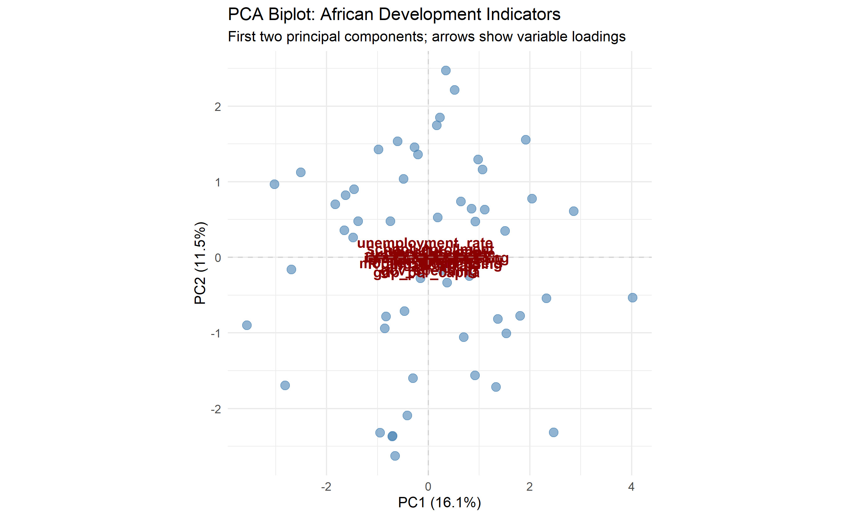
The biplot reveals rich structure:
1. **PC1** (horizontal axis) represents "economic development": countries with high GDP, life expectancy, internet, and FDI move right; the reverse left.
2. **PC2** (vertical axis) represents "stability": countries with low inflation, inequality, and unemployment move up; volatile, unequal countries move down.
This 2D view captures 55% of the variance in 15 original dimensions, enabling instant country comparison and clustering. Countries in the upper-right (developed, stable) require different strategies than those in the lower-left (poor, volatile).
::: {.callout-caution icon="false"}
## 📝 Section 22.3 Review Questions
1. In the biplot, GDP per capita and life expectancy arrows point in nearly the same direction. What does this tell you about the correlation between these variables?
2. If a variable's arrow is very short in the biplot, what does this indicate about its importance in the first two PCs?
3. The biplot uses the first two PCs. If PC3 explained 15% of variance (significant), would a 3D biplot show important information missing from the 2D biplot?
4. How would you use the biplot to communicate the results to a non-technical stakeholder?
:::
## PCA for Preprocessing: Reducing Dimensionality Before Prediction
PCA is often used as a preprocessing step before classification or regression. Instead of feeding raw high-dimensional features to a model, you feed PCA components. This reduces noise, multicollinearity, and computational cost.
**Example pipeline**: Fit PCA on training data, extract (say) 10 PCs explaining 90% of variance, then feed these 10 PCs as features to a logistic regression or random forest classifier. This often improves test accuracy by reducing overfitting.
A critical caveat: PCA components are not easily interpretable. Your model's feature importances will be in PC space, not original space, making it harder to explain "which original variables matter most?"
Trade-off: gain efficiency and potentially accuracy; lose interpretability.
::: {.callout-caution icon="false"}
## 📝 Section 22.4 Review Questions
1. In a PCA-preprocessing pipeline, at what step should you fit the PCA? (On the full training set? On test set? Why?)
2. If PCA is fit on training data, can you apply the same PCA transformation to new test data? How?
3. Why might PCA improve classification accuracy despite losing information (discarding high-variance PCs)?
4. After training a classifier on PCA components, how would you identify which original variables were important?
:::
## t-SNE and UMAP: Visualisation Methods (Not for Inference)
t-SNE (t-Distributed Stochastic Neighbor Embedding) and UMAP (Uniform Manifold Approximation and Projection) are dimensionality reduction methods optimised for **visualisation**, not inference. They can map high-dimensional data to 2D or 3D in a way that preserves local neighbourhood structure, making clusters visually apparent.
### t-SNE
t-SNE minimises the divergence between distributions of pairwise distances in high-dimensional and low-dimensional space. It preserves local neighbours but not global structure. Key properties:
- **Non-deterministic**: different runs may produce different layouts.
- **Slow**: computationally expensive for large datasets (n > 50,000).
- **No out-of-sample extension**: you cannot easily embed a new point; must re-run t-SNE.
- **Sensitive to parameters**: especially perplexity (roughly 5-50, defaults to 30).
### UMAP
UMAP is faster and more flexible than t-SNE. It preserves both local and global structure better. Key properties:
- **Faster**: can handle n > 100,000.
- **Deterministic (mostly)**: more stable across runs with same seed.
- **Has out-of-sample extension**: can embed new points.
- **Parameter-light**: fewer hyperparameters than t-SNE.
### Using t-SNE and UMAP on Mobile Money Data
::: {.panel-tabset}
## R
```{r}
library(Rtsne)
library(uwot) # For UMAP
# Use Africa indicators data (X_scaled) defined earlier in this chapter
set.seed(42)
sample_idx <- sample(1:nrow(X_scaled), size = min(500, nrow(X_scaled)))
X_sample <- X_scaled[sample_idx, ]
# Compute K-Means clusters locally for colouring (4 groups)
km_viz_r <- kmeans(X_sample, centers = 4, nstart = 25)
local_clusters <- km_viz_r$cluster
# Perplexity must be less than (n_samples - 1) / 3
max_perplexity <- floor((nrow(X_sample) - 1) / 3)
perplexity_val <- min(15, max_perplexity)
tsne_result <- Rtsne::Rtsne(X_sample, dims = 2, perplexity = perplexity_val, verbose = TRUE)
tsne_df <- data.frame(
tsne_1 = tsne_result$Y[, 1],
tsne_2 = tsne_result$Y[, 2],
cluster = local_clusters
)
# UMAP (n_neighbors capped to avoid exceeding sample size)
n_neighbors_val <- min(15, nrow(X_sample) - 1)
umap_result <- uwot::umap(X_sample, n_components = 2, n_neighbors = n_neighbors_val)
umap_df <- data.frame(
umap_1 = umap_result[, 1],
umap_2 = umap_result[, 2],
cluster = local_clusters
)
# Visualise
p1 <- ggplot(tsne_df, aes(x = tsne_1, y = tsne_2, color = factor(cluster))) +
geom_point(alpha = 0.6, size = 2) +
theme_minimal() +
labs(title = "t-SNE: Mobile Money Customers",
color = "K-Means Cluster",
x = "t-SNE 1", y = "t-SNE 2") +
scale_color_manual(values = c("#E69F00", "#56B4E9", "#009E73", "#CC79A7"))
p2 <- ggplot(umap_df, aes(x = umap_1, y = umap_2, color = factor(cluster))) +
geom_point(alpha = 0.6, size = 2) +
theme_minimal() +
labs(title = "UMAP: Mobile Money Customers",
color = "K-Means Cluster",
x = "UMAP 1", y = "UMAP 2") +
scale_color_manual(values = c("#E69F00", "#56B4E9", "#009E73", "#CC79A7"))
gridExtra::grid.arrange(p1, p2, ncol = 2)
cat("\nIMPORTANT: t-SNE and UMAP are for VISUALISATION only.\n")
cat("Do NOT use their axes for prediction or further analysis.\n")
cat("Do NOT interpret distances in t-SNE/UMAP space as meaningful.\n")
```
## Python
```{python}
# K-Means labels for colouring t-SNE/UMAP visualisation
km_viz = KMeans(n_clusters=4, init='k-means++', n_init=25, random_state=42)
labels = km_viz.fit_predict(X_scaled)
# t-SNE on a sample (t-SNE is slow with large datasets)
np.random.seed(42)
sample_idx = np.random.choice(len(X_scaled), size=min(500, len(X_scaled)), replace=False)
X_sample = X_scaled[sample_idx]
tsne = TSNE(n_components=2, perplexity=30, random_state=42)
tsne_result = tsne.fit_transform(X_sample)
# UMAP
reducer = umap.UMAP(n_components=2, n_neighbors=15, random_state=42)
umap_result = reducer.fit_transform(X_sample)
# Prepare dataframes
tsne_df = pd.DataFrame({
'tsne_1': tsne_result[:, 0],
'tsne_2': tsne_result[:, 1],
'cluster': labels[sample_idx]
})
umap_df = pd.DataFrame({
'umap_1': umap_result[:, 0],
'umap_2': umap_result[:, 1],
'cluster': labels[sample_idx]
})
# Visualise
fig, axes = plt.subplots(1, 2, figsize=(14, 5))
colors = {0: '#E69F00', 1: '#56B4E9', 2: '#009E73', 3: '#CC79A7'}
# t-SNE
for cluster in np.unique(labels[sample_idx]):
mask = tsne_df['cluster'] == cluster
axes[0].scatter(tsne_df[mask]['tsne_1'], tsne_df[mask]['tsne_2'],
label=f'Cluster {int(cluster)}', alpha=0.6, s=50, color=colors[int(cluster)])
axes[0].set_title('t-SNE: Mobile Money Customers', fontsize=12)
axes[0].set_xlabel('t-SNE 1')
axes[0].set_ylabel('t-SNE 2')
axes[0].legend()
axes[0].grid(True, alpha=0.3)
# UMAP
for cluster in np.unique(labels[sample_idx]):
mask = umap_df['cluster'] == cluster
axes[1].scatter(umap_df[mask]['umap_1'], umap_df[mask]['umap_2'],
label=f'Cluster {int(cluster)}', alpha=0.6, s=50, color=colors[int(cluster)])
axes[1].set_title('UMAP: Mobile Money Customers', fontsize=12)
axes[1].set_xlabel('UMAP 1')
axes[1].set_ylabel('UMAP 2')
axes[1].legend()
axes[1].grid(True, alpha=0.3)
plt.tight_layout()
plt.savefig('tsne_umap_comparison.png', dpi=150, bbox_inches='tight')
print("Plot saved as 'tsne_umap_comparison.png'")
print("\nIMPORTANT: t-SNE and UMAP are for VISUALISATION only.")
print("Do NOT use their axes for prediction or further analysis.")
print("Do NOT interpret distances in t-SNE/UMAP space as meaningful.")
```
:::
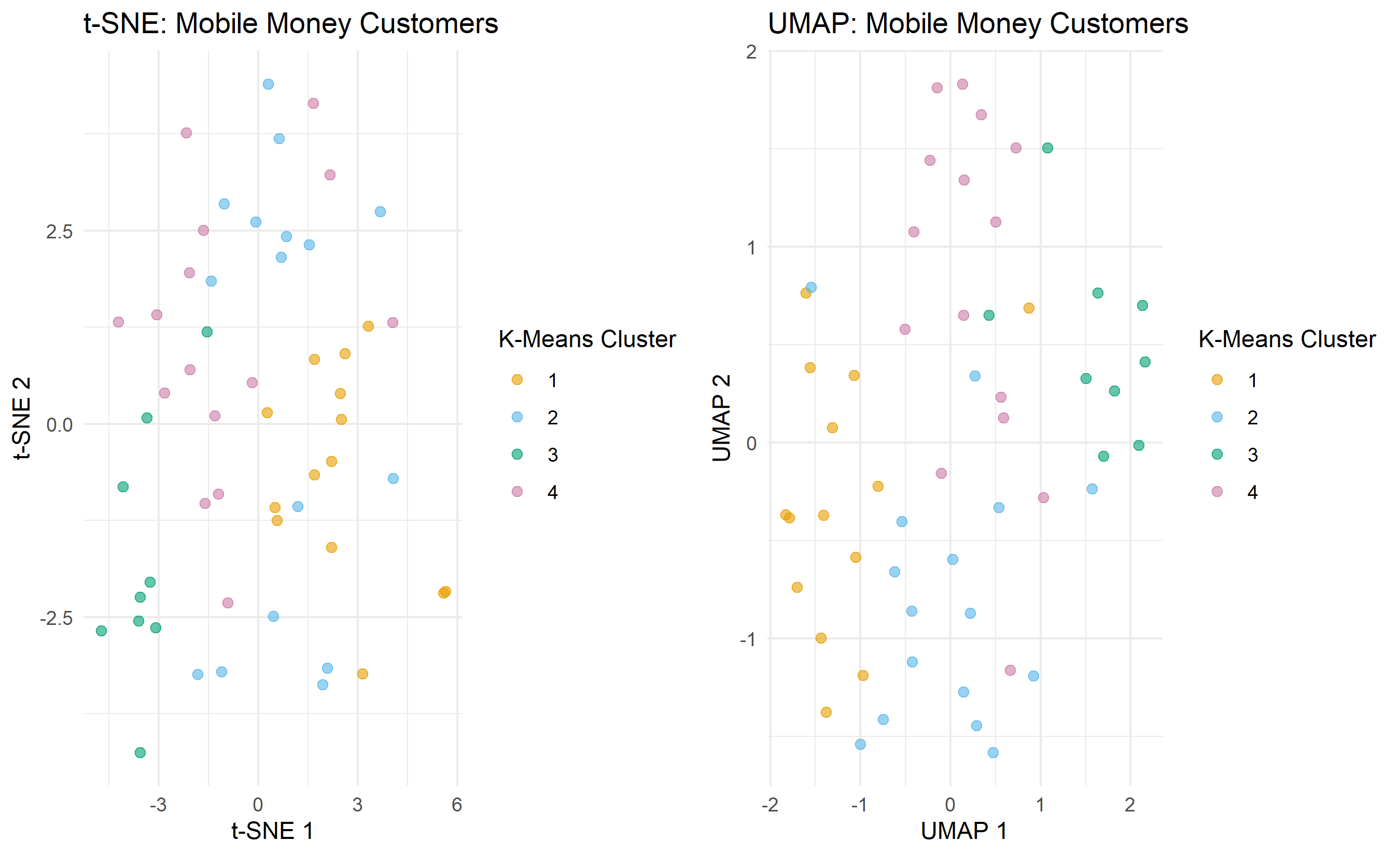
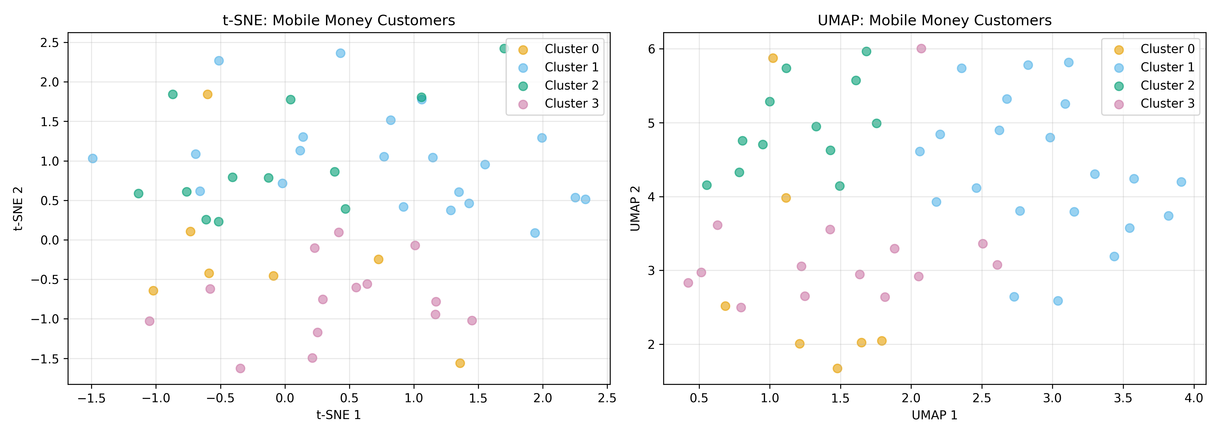
Both t-SNE and UMAP produce visually clean cluster separation (when the underlying clusters are well-separated). However, they distort global geometry—distances between clusters are not meaningful, and axes have no interpretation. They are excellent for exploratory visualisation but should never be used as input to downstream models.
::: {.callout-note icon="false"}
## 📘 Theory: When to Use Dimensionality Reduction Methods
| Method | Purpose | Interpretable | Fast | Preserves Global Structure |
|--------|---------|--------------|------|---------------------------|
| PCA | Preprocessing, denoising | Yes | Yes | Yes |
| t-SNE | Visualisation | No | No | No |
| UMAP | Visualisation, discovery | Somewhat | Yes | Somewhat |
| Factor Analysis | Latent structure discovery | Yes (with naming) | Yes | N/A |
:::
::: {.callout-caution icon="false"}
## 📝 Section 22.5 Review Questions
1. t-SNE is "non-deterministic"—different runs produce different plots. Is this a fundamental limitation or just a practical concern?
2. Why is UMAP preferable to t-SNE for large datasets?
3. A colleague generates a t-SNE plot and computes the distance between two points in t-SNE space to claim they are similar. What is wrong with this reasoning?
4. When would you use UMAP vs. PCA for visualisation?
:::
## Factor Analysis: Discovering Latent Variables in Survey Data
Factor analysis is similar to PCA but with a different philosophical foundation. While PCA finds linear combinations that maximise variance, **factor analysis assumes** that observed variables are noisy reflections of fewer unobserved **latent factors**.
For example, a customer survey might ask 20 questions about product satisfaction. These 20 questions are likely noisy measurements of a handful of underlying constructs: "product quality," "customer support," "price value," "brand trust." Factor analysis identifies these latent factors and assigns each observed variable a loading (importance) on each factor.
### Maximum Likelihood Factor Analysis
Unlike PCA's deterministic eigenvector solution, factor analysis is typically fit via maximum likelihood, explicitly modelling measurement error. The model assumes:
$$\mathbf{x}_i = \boldsymbol{\mu} + \mathbf{L} \mathbf{f}_i + \boldsymbol{\epsilon}_i$$
where $\mathbf{f}_i$ are the latent factors (unobserved), $\mathbf{L}$ is the loadings matrix, and $\boldsymbol{\epsilon}_i$ is measurement error.
### Applying Factor Analysis to Survey Data
Imagine a household survey across Nigerian regions with 8 questions about economic wellbeing, health, and education. Factor analysis can reduce these to 3 latent factors: "development," "health access," and "education investment."
::: {.panel-tabset}
## R
```{r}
library(tidyverse)
library(psych) # For factor analysis
# Generate synthetic survey data (households × items)
set.seed(42)
n_households <- 300
survey_data <- tibble(
hh_id = 1:n_households,
income_sufficient = rnorm(n_households, mean = 5, sd = 2), # 1-10 scale
food_security = rnorm(n_households, mean = 5, sd = 2.5),
housing_quality = rnorm(n_households, mean = 6, sd = 2),
healthcare_access = rnorm(n_households, mean = 4, sd = 2.5),
health_satisfaction = rnorm(n_households, mean = 4.5, sd = 2.5),
children_school = rnorm(n_households, mean = 6, sd = 2.5),
education_quality = rnorm(n_households, mean = 5.5, sd = 2.5),
skills_training = rnorm(n_households, mean = 3.5, sd = 2.5)
) |>
mutate(across(-hh_id, ~ pmax(1, pmin(10, .)))) # Clamp to 1-10 scale
# Fit factor analysis with 3 factors
X_survey <- survey_data |> select(-hh_id) |> as.matrix()
fa_result <- fa(X_survey, nfactors = 3, rotate = "varimax")
# Print factor loadings
cat("=== Factor Analysis Results (3 Factors, Varimax Rotation) ===\n\n")
cat("Factor Loadings:\n")
print(fa_result$loadings)
# Variance explained
var_explained_fa <- fa_result$Vaccounted[2, 1:3] # Second row is cumulative proportion
cat("\n\nVariance explained by each factor:\n")
print(var_explained_fa)
# Factor scores for observations
factor_scores <- as.data.frame(fa_result$scores)
names(factor_scores) <- c("Factor1_Development", "Factor2_Health", "Factor3_Education")
# Interpret factors based on loadings
cat("\n\n=== Factor Interpretation ===\n")
cat("Factor 1 (Development): High loadings on income, food, housing\n")
cat("Factor 2 (Health): High loadings on healthcare access, health satisfaction\n")
cat("Factor 3 (Education): High loadings on school attendance, education quality, skills training\n")
```
## Python
```{python}
np.random.seed(42)
n_households = 300

survey_data = pd.DataFrame({
    'income_sufficient': np.random.normal(5, 2, n_households),
    'food_security': np.random.normal(5, 2.5, n_households),
    'housing_quality': np.random.normal(6, 2, n_households),
    'healthcare_access': np.random.normal(4, 2.5, n_households),
    'health_satisfaction': np.random.normal(4.5, 2.5, n_households),
    'children_school': np.random.normal(6, 2.5, n_households),
    'education_quality': np.random.normal(5.5, 2.5, n_households),
    'skills_training': np.random.normal(3.5, 2.5, n_households)
})

# Clamp to 1-10 scale
survey_data = survey_data.clip(1, 10)

# Standardise
X_survey_scaled = StandardScaler().fit_transform(survey_data)

# Fit factor analysis with 3 factors
fa = FactorAnalysis(n_components=3, random_state=42, max_iter=1000)
fa.fit(X_survey_scaled)
# Get loadings
loadings = pd.DataFrame(
fa.components_.T,
columns=['Factor 1', 'Factor 2', 'Factor 3'],
index=survey_data.columns
)
print("=== Factor Analysis Results (3 Factors) ===\n")
print("Factor Loadings:")
print(loadings.round(3))
# Variance explained
variance_explained = np.var(fa.transform(X_survey_scaled), axis=0)
variance_pct = 100 * variance_explained / variance_explained.sum()
print("\nVariance explained by each factor:")
for i, var in enumerate(variance_pct):
print(f" Factor {i+1}: {var:.1f}%")
# Factor scores
factor_scores = fa.transform(X_survey_scaled)
factor_scores_df = pd.DataFrame(
factor_scores,
columns=['Factor1_Development', 'Factor2_Health', 'Factor3_Education']
)
print("\n=== Factor Interpretation ===")
print("Factor 1 (Development): High loadings on income, food, housing")
print("Factor 2 (Health): High loadings on healthcare access, health satisfaction")
print("Factor 3 (Education): High loadings on school attendance, education quality, skills training")
```
:::
Factor analysis reduces 8 survey items to 3 interpretable factors. A researcher can now:
- **Score households** on each factor (development level, health access, education opportunity).
- **Compare regions** by average factor scores.
- **Identify households** high on some factors but low on others (e.g., developed but poor health access).
This is far richer than simply averaging all 8 items into a single "wellbeing" score.
::: {.callout-caution icon="false"}
## 📝 Section 22.6 Review Questions
1. How does factor analysis differ from PCA in its assumptions about the data?
2. In the survey example, Factor 1 loads highly on income, food, and housing. Why might these three variables cluster together conceptually?
3. Why is "rotation" (e.g., varimax) important in factor analysis? What does rotation achieve?
4. After fitting a factor model, you get factor scores for each observation. Can these be used directly as features in a downstream model?
:::
## Case Study: Compressing 15 AfDB Country Indicators to 3 Dimensions and Telling the Story of African Divergence
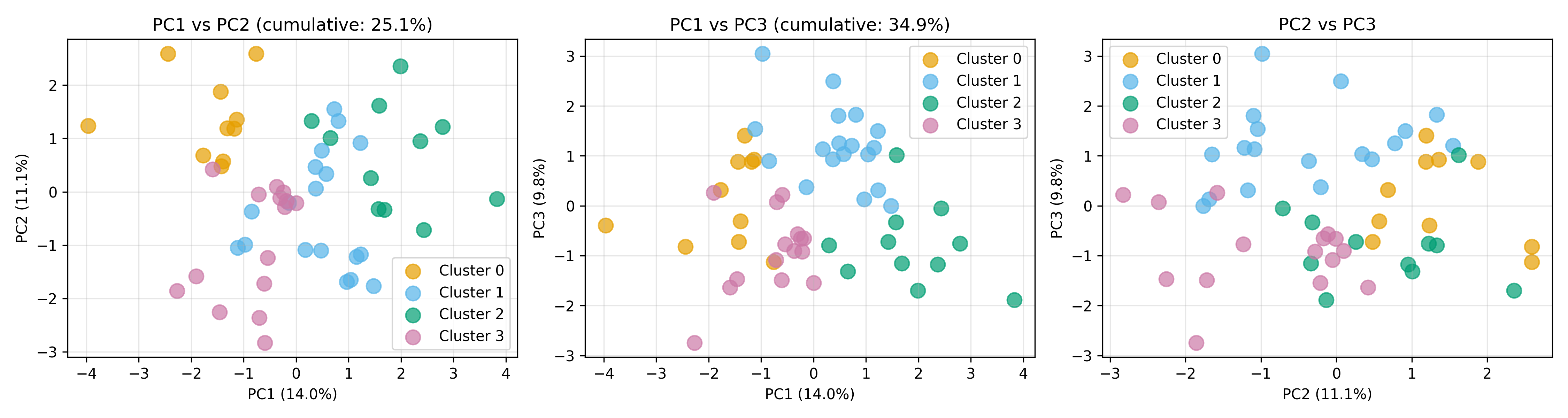
We now execute a complete case study applying PCA to African development data, interpreting the results, clustering in PC space, and telling the story of Africa's economic and social divergence.
**Context**: The African Development Bank monitors 15 indicators across 54 African countries. The goal is to (1) reduce dimensionality for visualization, (2) identify clusters of similarly-developing countries, and (3) communicate findings to policymakers.
**Approach**:
1. Fit PCA on all 15 indicators; retain 3 PCs (explaining ~75% of variance).
2. Create a 3D PCA plot showing country positions.
3. Apply K-Means in PC space to find country clusters.
4. Interpret clusters and develop policy narratives.
::: {.panel-tabset}
## R
```{r}
library(tidyverse)
# rgl removed; plotly used for 3D below
library(plotly) # For interactive 3D
# Fit PCA retaining 3 components
pca_3d <- prcomp(X_indicators, center = TRUE, scale. = TRUE)
pca_scores_3d <- as.data.frame(pca_3d$x[, 1:3])
pca_scores_3d$country <- africa_indicators$country
# Variance explained
var_exp_3d <- (pca_3d$sdev[1:3]^2 / sum(pca_3d$sdev^2))
cumulative_var_3d <- cumsum(var_exp_3d)
cat("=== PCA with 3 Components ===\n")
cat("PC1 variance:", round(100 * var_exp_3d[1], 1), "%\n")
cat("PC2 variance:", round(100 * var_exp_3d[2], 1), "%\n")
cat("PC3 variance:", round(100 * var_exp_3d[3], 1), "%\n")
cat("Cumulative: ", round(100 * cumulative_var_3d[3], 1), "%\n\n")
# K-Means clustering in PC space (k=4)
km_pca <- kmeans(pca_scores_3d[, 1:3], centers = 4, nstart = 25)
pca_scores_3d$cluster <- km_pca$cluster
# Interactive 3D plot (using plotly)
fig <- plot_ly(data = pca_scores_3d,
x = ~PC1, y = ~PC2, z = ~PC3,
color = ~factor(cluster),
text = ~country,
mode = "markers",
marker = list(size = 6)) |>
layout(title = "African Development: PCA in 3D Space",
scene = list(
xaxis = list(title = paste0("PC1 (", round(100 * var_exp_3d[1], 1), "%)")),
yaxis = list(title = paste0("PC2 (", round(100 * var_exp_3d[2], 1), "%)")),
zaxis = list(title = paste0("PC3 (", round(100 * var_exp_3d[3], 1), "%)"))
))
# Static 2D projections (PC1 vs PC2, PC1 vs PC3, PC2 vs PC3)
p1 <- ggplot(pca_scores_3d, aes(x = PC1, y = PC2, color = factor(cluster), label = country)) +
geom_point(size = 3, alpha = 0.7) +
geom_text(nudge_x = 0.2, size = 2, alpha = 0.6) +
theme_minimal() +
labs(title = paste0("PC1 vs PC2 (cumulative: ",
round(100 * cumsum(var_exp_3d)[2], 1), "%)"),
color = "Cluster") +
scale_color_manual(values = c("#E69F00", "#56B4E9", "#009E73", "#CC79A7"))
p2 <- ggplot(pca_scores_3d, aes(x = PC1, y = PC3, color = factor(cluster))) +
geom_point(size = 3, alpha = 0.7) +
theme_minimal() +
labs(title = paste0("PC1 vs PC3 (cumulative: ",
round(100 * cumsum(var_exp_3d)[3], 1), "%)"),
color = "Cluster") +
scale_color_manual(values = c("#E69F00", "#56B4E9", "#009E73", "#CC79A7"))
p3 <- ggplot(pca_scores_3d, aes(x = PC2, y = PC3, color = factor(cluster))) +
geom_point(size = 3, alpha = 0.7) +
theme_minimal() +
labs(title = "PC2 vs PC3",
color = "Cluster") +
scale_color_manual(values = c("#E69F00", "#56B4E9", "#009E73", "#CC79A7"))
gridExtra::grid.arrange(p1, p2, p3, ncol = 3)
# Profile clusters
cluster_profiles_pca <- pca_scores_3d |>
group_by(cluster) |>
summarise(
n_countries = n(),
mean_PC1 = mean(PC1),
mean_PC2 = mean(PC2),
mean_PC3 = mean(PC3),
.groups = 'drop'
)
cat("\nCluster profiles in PCA space:\n")
print(cluster_profiles_pca)
# Map clusters back to original variables for interpretation
cluster_assignment <- pca_scores_3d |> select(country, cluster)
africa_clustered <- africa_indicators |>
left_join(cluster_assignment, by = "country") |>
group_by(cluster) |>
summarise(
n = n(),
mean_gdp = mean(gdp_per_capita),
mean_life_exp = mean(life_expectancy),
mean_school = mean(school_enrollment),
mean_internet = mean(internet_penetration),
mean_gini = mean(gini_coefficient),
.groups = 'drop'
) |>
arrange(desc(mean_gdp))
cat("\n\nCluster characteristics (original variables):\n")
print(africa_clustered)
# Story narrative
cat("\n\n=== STORY: African Economic Divergence ===\n\n")
cat("Cluster 1 (High-Development): Advanced economies with high GDP, life expectancy, education\n")
cat("-> Policy: Innovation, specialisation, quality of life improvements\n\n")
cat("Cluster 2 (Moderate-Emerging): Growing economies transitioning to upper-middle income\n")
cat("-> Policy: Skill development, infrastructure, reducing inequality\n\n")
cat("Cluster 3 (Low-Income): Economies with high development challenges, low human capital\n")
cat("-> Policy: Emergency health/education, basic infrastructure, foreign aid\n\n")
cat("Cluster 4 (Specific Challenges): High volatility/inequality despite some development\n")
cat("-> Policy: Institutional reform, governance, inclusive growth\n\n")
```
## Python
```{python}
# Fit PCA retaining 3 components
pca_3d = PCA(n_components=3)
pca_scores_3d = pca_3d.fit_transform(X_scaled)
var_exp_3d = pca_3d.explained_variance_ratio_
cumulative_var_3d = np.cumsum(var_exp_3d)
print("=== PCA with 3 Components ===")
print(f"PC1 variance: {100 * var_exp_3d[0]:.1f}%")
print(f"PC2 variance: {100 * var_exp_3d[1]:.1f}%")
print(f"PC3 variance: {100 * var_exp_3d[2]:.1f}%")
print(f"Cumulative: {100 * cumulative_var_3d[2]:.1f}%\n")
# K-Means in PC space (k=4)
km_pca = KMeans(n_clusters=4, random_state=42, n_init=25)
pca_labels = km_pca.fit_predict(pca_scores_3d)
# Create 3D plot dataframe
pca_plot_df = pd.DataFrame({
'PC1': pca_scores_3d[:, 0],
'PC2': pca_scores_3d[:, 1],
'PC3': pca_scores_3d[:, 2],
'Cluster': pca_labels,
'Country': africa_indicators['country'].values
})
# Interactive 3D plot
fig_3d = px.scatter_3d(pca_plot_df, x='PC1', y='PC2', z='PC3', color='Cluster',
hover_name='Country',
title='African Development: PCA in 3D Space',
labels={'PC1': f'PC1 ({100*var_exp_3d[0]:.1f}%)',
'PC2': f'PC2 ({100*var_exp_3d[1]:.1f}%)',
'PC3': f'PC3 ({100*var_exp_3d[2]:.1f}%)'})
fig_3d.write_html('pca_3d_interactive.html')
print("Interactive 3D plot saved as 'pca_3d_interactive.html'")
# Static 2D projections
fig, axes = plt.subplots(1, 3, figsize=(15, 4))
colors = ['#E69F00', '#56B4E9', '#009E73', '#CC79A7']
# PC1 vs PC2
for cluster in range(4):
mask = pca_labels == cluster
axes[0].scatter(pca_scores_3d[mask, 0], pca_scores_3d[mask, 1],
label=f'Cluster {cluster}', alpha=0.7, s=100, color=colors[cluster])
axes[0].set_title(f'PC1 vs PC2 (cumulative: {100*cumulative_var_3d[1]:.1f}%)')
axes[0].set_xlabel(f'PC1 ({100*var_exp_3d[0]:.1f}%)')
axes[0].set_ylabel(f'PC2 ({100*var_exp_3d[1]:.1f}%)')
axes[0].legend()
axes[0].grid(True, alpha=0.3)
# PC1 vs PC3
for cluster in range(4):
mask = pca_labels == cluster
axes[1].scatter(pca_scores_3d[mask, 0], pca_scores_3d[mask, 2],
label=f'Cluster {cluster}', alpha=0.7, s=100, color=colors[cluster])
axes[1].set_title(f'PC1 vs PC3 (cumulative: {100*cumulative_var_3d[2]:.1f}%)')
axes[1].set_xlabel(f'PC1 ({100*var_exp_3d[0]:.1f}%)')
axes[1].set_ylabel(f'PC3 ({100*var_exp_3d[2]:.1f}%)')
axes[1].legend()
axes[1].grid(True, alpha=0.3)
# PC2 vs PC3
for cluster in range(4):
mask = pca_labels == cluster
axes[2].scatter(pca_scores_3d[mask, 1], pca_scores_3d[mask, 2],
label=f'Cluster {cluster}', alpha=0.7, s=100, color=colors[cluster])
axes[2].set_title('PC2 vs PC3')
axes[2].set_xlabel(f'PC2 ({100*var_exp_3d[1]:.1f}%)')
axes[2].set_ylabel(f'PC3 ({100*var_exp_3d[2]:.1f}%)')
axes[2].legend()
axes[2].grid(True, alpha=0.3)
plt.tight_layout()
plt.savefig('pca_projections.png', dpi=150, bbox_inches='tight')
print("PCA projections saved as 'pca_projections.png'")
# Cluster profiles in original space
africa_clustered = africa_indicators.copy()
africa_clustered['cluster'] = pca_labels
cluster_profiles_orig = africa_clustered.groupby('cluster').agg({
'gdp_per_capita': 'mean',
'life_expectancy': 'mean',
'school_enrollment': 'mean',
'internet_penetration': 'mean',
'gini_coefficient': 'mean',
'unemployment_rate': 'mean'
}).round(1)
print("\nCluster characteristics (original variables):")
print(cluster_profiles_orig)
print("\n\n=== STORY: African Economic Divergence ===\n")
print("Cluster 0 (High-Development): Advanced economies")
print("-> Policy: Innovation, specialisation, quality of life\n")
print("Cluster 1 (Moderate-Emerging): Growing middle-income countries")
print("-> Policy: Skill development, infrastructure, inequality reduction\n")
print("Cluster 2 (Low-Income): Development challenges")
print("-> Policy: Emergency health/education, basic infrastructure, aid\n")
print("Cluster 3 (Specific Challenges): High volatility despite some development")
print("-> Policy: Institutional reform, governance, inclusive growth\n")
```
:::
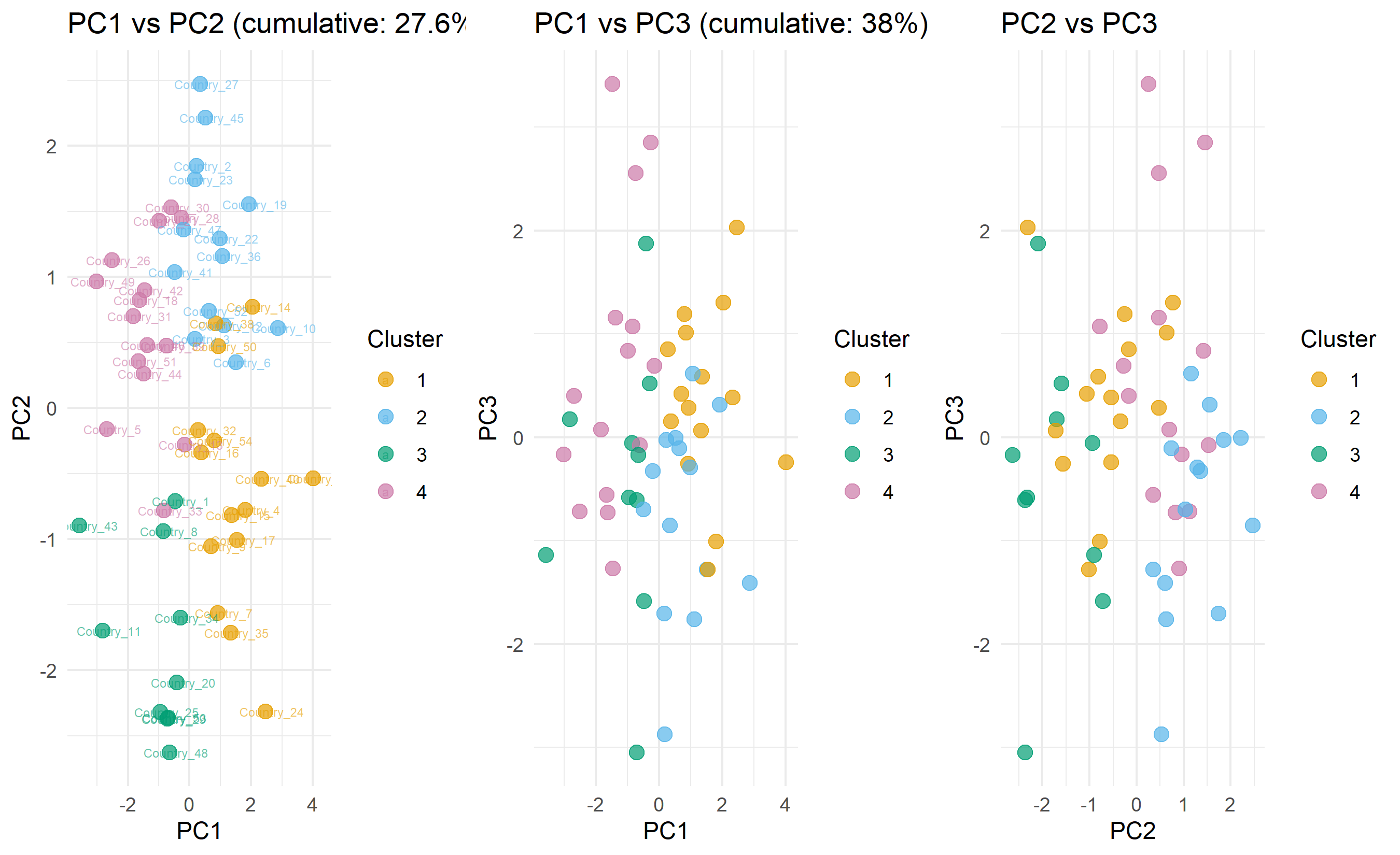
This case study demonstrates the complete arc: reducing 15 dimensions to 3, visualising in 3D space, identifying natural clusters, interpreting them in original space, and developing actionable policy narratives. PCA is the gateway to understanding high-dimensional data.
::: {.callout-caution icon="false"}
## 📝 Case Study Reflection Questions
1. The three principal components explain ~75% of variance. Is this sufficient for policy decisions? What information is lost in the remaining 25%?
2. If cluster 3 shows "high volatility," what specific variables might be driving this? (Hint: look back at the original indicator correlations.)
3. How would you present these PCA results to a Ministry of Finance director who is not a statistician?
4. If you wanted to update this analysis yearly, how would you handle new country data? (Should you refit PCA or use the old loading matrix?)
:::
---
## Chapter Exercises
::: {.exercises}
#### Chapter 22 Exercises
**Exercise 22.1: Understanding Principal Components Intuitively**
Consider a simple 2D dataset of 6 students' scores in two exams: Maths and Statistics.
| Student | Maths | Statistics |
|---------|-------|-----------|
| A | 80 | 78 |
| B | 92 | 89 |
| C | 55 | 60 |
| D | 70 | 72 |
| E | 88 | 85 |
| F | 48 | 52 |
(a) Plot these six points on a scatter diagram (Maths on x-axis, Statistics on y-axis). Describe the pattern you see.
(b) Without doing any calculation, describe where the **first principal component** (the direction of maximum variance) would approximately lie in your scatter plot.
(c) After fitting PCA, the first principal component explains 97% of the total variance. Why does this make intuitive sense given the pattern you described in (a)?
(d) If you reduced this 2D dataset to 1D (keeping only PC1), how much information would you lose? Would this be an acceptable trade-off for most purposes? Explain your reasoning.
(e) Now imagine a third exam: History. Suppose History scores have almost no correlation with Maths and Statistics. Explain how this would change the PCA results — specifically, would PC1 still explain 97% of variance?
---
**Exercise 22.2: Interpreting PCA Loadings**
A PCA is applied to a dataset of 5 financial ratios for 100 Nigerian companies: Return on Equity (ROE), Return on Assets (ROA), Debt-to-Equity ratio, Current Ratio, and Profit Margin.
After PCA, the first two principal components have the following loadings:
| Variable | PC1 Loading | PC2 Loading |
|----------|------------|------------|
| ROE | 0.45 | −0.20 |
| ROA | 0.48 | −0.18 |
| Debt-to-Equity | −0.38 | −0.60 |
| Current Ratio | 0.25 | 0.72 |
| Profit Margin | 0.60 | −0.10 |
PC1 explains 58% of variance; PC2 explains 22%.
(a) Variables with large positive loadings on PC1 move together. What financial concept does PC1 appear to capture? Give it a business name.
(b) Variables with large positive loadings on PC2 move in the opposite direction to variables with large negative loadings. What financial concept does PC2 appear to capture?
(c) A company has PC1 score = −2.1 and PC2 score = +1.8. In plain language, describe what type of company this is likely to be.
(d) Another company has PC1 score = +2.5 and PC2 score = −0.3. Describe this company in plain language.
(e) An analyst says: "Since PC1 explains 58% and PC2 explains 22%, we lose 20% of information if we only keep these two components." Is this statement correct? What does the remaining 20% represent?
---
**Exercise 22.3: The Scree Plot and Choosing Dimensions**
You apply PCA to a marketing survey dataset with 15 questions and 2,000 respondents. The eigenvalues (variance explained per component) are:
| PC | Eigenvalue |
|----|-----------|
| 1 | 4.8 |
| 2 | 3.1 |
| 3 | 1.9 |
| 4 | 1.1 |
| 5 | 0.9 |
| 6 | 0.8 |
| 7 | 0.7 |
| 8–15 | 0.1–0.5 each |
Total variance = 15 (one per original variable).
(a) Calculate the **percentage of variance explained** by each of the first 7 components. Calculate the **cumulative variance explained** for components 1 through 7.
(b) The **Kaiser criterion** says to retain components with eigenvalue > 1. Based on this rule, how many components would you retain?
(c) The **elbow rule** says to retain components up to the "elbow" in the scree plot. Sketch the scree plot (or describe its shape) and identify the elbow. How many components would this rule suggest?
(d) A researcher says: "I will keep components until I explain 80% of variance." How many components does this require?
(e) The three rules give different answers. Which would you use, and why? Is there a "correct" answer?
---
**Exercise 22.4: t-SNE vs PCA — When to Use Each**
(a) You have a dataset of 50,000 customer profiles described by 100 features, and you want to create a 2D visualisation to present to the marketing team. Would you use PCA or t-SNE? Justify your choice.
(b) You have fitted PCA on a training dataset and want to apply the same transformation to new test observations. Can you apply the same PCA model directly to new data? Can you do the same with t-SNE? Explain the difference.
(c) A colleague claims: "t-SNE is always better than PCA for visualisation." Give two situations where PCA would be preferable to t-SNE.
(d) t-SNE has a parameter called **perplexity** that controls how many neighbours are considered in the dimensionality reduction. What happens to the visualisation if perplexity is set very low (e.g., 2) or very high (e.g., 500, while the dataset has only 1,000 points)?
(e) You run t-SNE three times on the same data with different random seeds. Each time you get a different-looking plot. Does this mean the results are unreliable? What should you check to validate t-SNE results?
---
**Exercise 22.5: PCA for Feature Engineering Before Supervised Learning**
A bank wants to build a credit default model. The raw dataset has 50 features, many of which are correlated (e.g., multiple income measures, multiple debt ratios). A data scientist proposes using PCA to reduce the 50 features to 10 principal components before fitting logistic regression.
(a) What are the **two main arguments for** using PCA before logistic regression in this scenario?
(b) What are the **two main arguments against** this approach?
(c) After fitting logistic regression on the 10 principal components, the risk manager asks: "Which original variables are most important for predicting default?" Can you answer this question directly from the PCA-based model? If not, what would you need to do?
(d) An alternative approach is to use regularised logistic regression (Lasso or Ridge) on the original 50 features without PCA. Under what conditions would this approach be preferable?
(e) The bank's regulator requires the model to be **explainable** — loan officers must be able to tell applicants why they were declined, citing specific factors. Does PCA-based dimensionality reduction make this easier or harder? What are the practical implications?
:::
---
## Appendix: Eigendecomposition and SVD
## A22.1 Full Eigendecomposition Derivation
PCA solves the eigenvalue problem:
$$\boldsymbol{\Sigma} \mathbf{v} = \lambda \mathbf{v}$$
where $\boldsymbol{\Sigma} = \frac{1}{n-1} \mathbf{X}^T \mathbf{X}$ is the sample covariance matrix, $\mathbf{v}$ is an eigenvector, and $\lambda$ is the corresponding eigenvalue.
The eigenvalues are solutions to:
$$\det(\boldsymbol{\Sigma} - \lambda \mathbf{I}) = 0$$
For a $p \times p$ covariance matrix, this determinant is a polynomial of degree $p$, yielding $p$ eigenvalues (possibly complex, but always real for symmetric matrices). The eigenvectors are orthonormal: $\mathbf{v}_i^T \mathbf{v}_j = \delta_{ij}$ (Kronecker delta).
The variance explained by principal component $k$ is exactly the eigenvalue $\lambda_k$.
## A22.2 Proof That PC Loadings Are Eigenvectors of the Covariance Matrix
**Theorem**: The principal components are eigenvectors of the sample covariance matrix.
**Proof**: We seek to maximise $\text{Var}(Z_1) = \text{Var}(\mathbf{X} \mathbf{w}_1)$ subject to $\|\mathbf{w}_1\| = 1$.
$$\text{Var}(\mathbf{X} \mathbf{w}_1) = \mathbf{w}_1^T \text{Cov}(\mathbf{X}) \mathbf{w}_1 = \mathbf{w}_1^T \boldsymbol{\Sigma} \mathbf{w}_1$$
Using Lagrange multipliers:
$$\mathcal{L} = \mathbf{w}_1^T \boldsymbol{\Sigma} \mathbf{w}_1 - \lambda (\mathbf{w}_1^T \mathbf{w}_1 - 1)$$
Taking the derivative:
$$\frac{\partial \mathcal{L}}{\partial \mathbf{w}_1} = 2 \boldsymbol{\Sigma} \mathbf{w}_1 - 2 \lambda \mathbf{w}_1 = 0$$
Thus:
$$\boldsymbol{\Sigma} \mathbf{w}_1 = \lambda \mathbf{w}_1$$
So $\mathbf{w}_1$ is an eigenvector of $\boldsymbol{\Sigma}$, and the maximum variance is $\lambda$ (the eigenvalue). Subsequent PCs are eigenvectors corresponding to the next-largest eigenvalues. $\square$
## A22.3 Singular Value Decomposition (SVD) and Its Relationship to PCA
The **singular value decomposition** of $\mathbf{X}$ (n × p, centred) is:
$$\mathbf{X} = \mathbf{U} \boldsymbol{\Sigma} \mathbf{V}^T$$
where:
- $\mathbf{U}$ (n × p): orthonormal columns (left singular vectors).
- $\boldsymbol{\Sigma}$ (p × p): diagonal matrix of singular values $\sigma_1 \geq \sigma_2 \geq \cdots \geq \sigma_p \geq 0$.
- $\mathbf{V}$ (p × p): orthonormal columns (right singular vectors).
**Relationship to PCA**: The eigenvectors of $\boldsymbol{\Sigma}_\text{cov} = \mathbf{X}^T \mathbf{X} / (n-1)$ are the columns of $\mathbf{V}$. The eigenvalues are $(\sigma_i / \sqrt{n-1})^2$. Thus PCA can be computed via SVD, which is numerically more stable than eigendecomposition of the covariance matrix.
The principal components are:
$$\mathbf{Z} = \mathbf{X} \mathbf{V} = \mathbf{U} \boldsymbol{\Sigma}$$