---
title: "Employee Attrition and Retention Analytics"
author: "Bongo Adi"
---
```{python}
#| label: python-setup-53-employee-attrition
#| include: false
import numpy as np
import pandas as pd
import matplotlib.pyplot as plt
import seaborn as sns
from lifelines import KaplanMeierFitter
from lifelines.statistics import logrank_test
from xgboost import XGBClassifier
from sklearn.model_selection import train_test_split
from sklearn.metrics import roc_auc_score, confusion_matrix, classification_report
from scipy.stats import chi2_contingency
```
::: {.callout-note icon="false"}
## 📋 Learning Objectives
By the end of this chapter, you will:
- Quantify the business cost of voluntary employee attrition using replacement cost frameworks
- Compute and interpret key HR metrics: attrition rate, retention rate, and tenure distributions
- Identify which employee groups are most at risk through exploratory data analysis
- Build survival curves (Kaplan-Meier) to model time-to-departure across employee cohorts
- Predict individual attrition risk using XGBoost with SHAP feature importance
- Conduct a fairness audit to detect demographic bias in attrition predictions
- Design and evaluate targeted intervention programs for at-risk employees
:::
## Why Employee Attrition Costs More Than You Think
Every time an employee leaves, the organisation pays a cost that rarely appears on any budget line. Recruitment fees, background checks, on-boarding training, lost productivity during the ramp-up period of a replacement, institutional knowledge that walks out the door, disruption to teams, and damage to customer relationships when key account managers depart — these costs accumulate invisibly. HR consulting firm estimates typically place the replacement cost of a mid-level employee at 50–200% of their annual salary, depending on role complexity. For a commercial bank with 2,000 employees and 18% annual voluntary attrition (360 departures), replacing each mid-level officer at 100% of a ₦6 million average salary generates ₦2.16 billion in annual replacement costs. That number usually captures management attention.
Beyond cost, there is a capability argument. Knowledge-intensive roles — risk analysts, relationship managers, product developers — take 6–18 months to reach full productivity. In a fast-moving market, losing three senior risk analysts in a quarter is not just expensive; it is dangerous. Finally, attrition is often a leading indicator of cultural and management problems. High attrition in one department, or among one demographic, signals something systemic that affects morale and productivity even among those who stay.
Analytics transforms attrition from a lagging outcome (we lost 18% of staff last year) to a leading forecast (these 45 employees have a greater than 70% probability of departing in the next six months). With that forecast, targeted retention interventions become possible.
::: {.callout-note icon="false"}
## 📘 Theory: The Attrition Cost Model
The total annual cost of voluntary attrition is:
$$\text{Total Attrition Cost} = n_{\text{departures}} \times \bar{s} \times c_{\text{replacement}}$$
where $n_{\text{departures}}$ is the number of voluntary departures per year, $\bar{s}$ is average fully-loaded salary, and $c_{\text{replacement}}$ is the replacement cost as a fraction of salary (typically 0.5–2.0). The voluntary attrition rate is:
$$\text{Attrition Rate} = \frac{\text{Voluntary Departures in Period}}{\text{Average Headcount in Period}} \times 100\%$$
Annualised attrition from monthly data: $r_{\text{annual}} = 1 - (1 - r_{\text{monthly}})^{12}$.
:::
::: {.callout-tip icon="false"}
## 🔑 Key HR Metrics
| Metric | Formula | Interpretation |
|---|---|---|
| Voluntary Attrition Rate | Departures / Avg Headcount | Lower = better |
| Retention Rate | 1 − Attrition Rate | Higher = better |
| Median Tenure | Median(months employed) | Longer = more stable |
| Flight Risk Score | $P(\text{departure within 6 months})$ | Output of predictive model |
| Replacement Cost | Departures × Avg Salary × Factor | Monetises attrition |
:::
## Data: Nigerian Commercial Bank HR Dataset
We use a synthetic but realistic dataset for a 2,000-employee Nigerian commercial bank. The HR data covers four years (2020–2024), with monthly snapshots of employee status. Fields include demographics, department, grade, engagement scores (from biannual surveys), training records, and promotion history.
::: {.panel-tabset}
## R
```{r}
#| label: ch53-data-setup
#| message: false
#| warning: false
library(tidyverse)
library(lubridate)
set.seed(5391)
n_employees <- 2000
# Employee master table
hr_data <- tibble(
employee_id = 1:n_employees,
gender = sample(c("Male", "Female"), n_employees, replace = TRUE,
prob = c(0.58, 0.42)),
age = round(rnorm(n_employees, mean = 34, sd = 7)) |>
pmax(22) |> pmin(60),
department = sample(
c("Retail Banking", "Corporate Banking", "Risk", "Operations",
"Technology", "Finance", "HR", "Treasury"),
n_employees, replace = TRUE,
prob = c(0.28, 0.14, 0.12, 0.16, 0.10, 0.08, 0.06, 0.06)
),
grade = sample(c("Officer", "Senior Officer", "Manager", "Senior Manager", "Director"),
n_employees, replace = TRUE,
prob = c(0.35, 0.28, 0.20, 0.12, 0.05)),
zone = sample(c("Lagos", "Abuja", "Port Harcourt", "Kano", "Other"),
n_employees, replace = TRUE,
prob = c(0.45, 0.20, 0.15, 0.10, 0.10)),
tenure_years = round(rgamma(n_employees, shape = 2, rate = 0.4), 1) |> pmin(30),
months_tenure = NA_real_
) |>
mutate(
months_tenure = round(tenure_years * 12),
# Engagement score: scale 1–10, affected by grade and tenure
engagement_score = round(pmin(10, pmax(1,
rnorm(n_employees,
mean = 6.5 + 0.3 * as.numeric(factor(grade)) - 0.02 * tenure_years,
sd = 1.5))), 1),
job_satisfaction = round(pmin(10, pmax(1,
0.7 * engagement_score + rnorm(n_employees, 0, 1))), 1),
training_hours_annual = round(pmax(0, rnorm(n_employees,
mean = case_when(
department == "Technology" ~ 60,
department == "Risk" ~ 50,
TRUE ~ 35
), sd = 12))),
promoted_last_2yrs = rbinom(n_employees, 1, prob = pmin(0.95,
0.15 + 0.08 * (tenure_years < 5) + 0.05 * (engagement_score > 7))),
months_since_promotion = ifelse(promoted_last_2yrs == 1,
sample(1:24, n_employees, replace = TRUE), NA_real_),
manager_tenure_months = round(pmax(3, rnorm(n_employees, mean = 36, sd = 18))),
# Attrition: high risk if low engagement, low grade, no recent promotion, young, Retail
attrition_logit = -1.5
+ 0.40 * (department == "Retail Banking")
- 0.15 * (department == "Risk")
- 0.20 * (department == "Corporate Banking")
- 0.50 * (engagement_score / 10)
- 0.30 * (job_satisfaction / 10)
+ 0.30 * (grade %in% c("Officer", "Senior Officer"))
- 0.40 * promoted_last_2yrs
- 0.02 * tenure_years
+ 0.01 * (age < 30)
+ rnorm(n_employees, 0, 0.5),
p_attrition = 1 / (1 + exp(-attrition_logit)),
left_employment = rbinom(n_employees, 1, prob = p_attrition)
) |>
select(-attrition_logit, -p_attrition)
cat("=== HR Dataset Summary ===\n")
cat("Employees:", nrow(hr_data), "\n")
cat("Voluntary departures:", sum(hr_data$left_employment), "\n")
cat("Overall attrition rate:", round(mean(hr_data$left_employment) * 100, 1), "%\n")
cat("\n--- Headcount by Department ---\n")
hr_data |> count(department) |> arrange(desc(n)) |> print()
```
## Python
```{python}
#| label: py-ch53-data-setup
import numpy as np
import pandas as pd
from scipy.special import expit # sigmoid function
np.random.seed(5391)
n = 2000
departments = np.random.choice(
['Retail Banking', 'Corporate Banking', 'Risk', 'Operations',
'Technology', 'Finance', 'HR', 'Treasury'],
n,
p=[0.28, 0.14, 0.12, 0.16, 0.10, 0.08, 0.06, 0.06]
)
grades = np.random.choice(
['Officer', 'Senior Officer', 'Manager', 'Senior Manager', 'Director'],
n,
p=[0.35, 0.28, 0.20, 0.12, 0.05]
)
zones = np.random.choice(
['Lagos', 'Abuja', 'Port Harcourt', 'Kano', 'Other'],
n,
p=[0.45, 0.20, 0.15, 0.10, 0.10]
)
genders = np.random.choice(['Male', 'Female'], n, p=[0.58, 0.42])
ages = np.clip(np.round(np.random.normal(34, 7, n)).astype(int), 22, 60)
tenure_years = np.clip(np.random.gamma(2, 1 / 0.4, n), 0, 30).round(1)
tenure_months = np.round(tenure_years * 12).astype(int)
grade_num = pd.factorize(grades)[0]
engagement = np.clip(np.round(
np.random.normal(6.5 + 0.3 * grade_num - 0.02 * tenure_years, 1.5, n), 1
), 1, 10)
job_sat = np.clip(np.round(0.7 * engagement + np.random.normal(0, 1, n), 1), 1, 10)
training_base = np.where(departments == 'Technology', 60,
np.where(departments == 'Risk', 50, 35))
training_hours = np.clip(np.round(np.random.normal(training_base, 12, n)).astype(int), 0, None)
promoted = np.random.binomial(1,
np.clip(0.15 + 0.08 * (tenure_years < 5) + 0.05 * (engagement > 7), 0, 0.95), n)
logit = (-1.5
+ 0.40 * (departments == 'Retail Banking')
- 0.15 * (departments == 'Risk')
- 0.20 * (departments == 'Corporate Banking')
- 0.50 * (engagement / 10)
- 0.30 * (job_sat / 10)
+ 0.30 * np.isin(grades, ['Officer', 'Senior Officer'])
- 0.40 * promoted
- 0.02 * tenure_years
+ 0.01 * (ages < 30)
+ np.random.normal(0, 0.5, n))
p_attrition = expit(logit)
left = np.random.binomial(1, p_attrition, n)
df = pd.DataFrame({
'employee_id': np.arange(1, n + 1),
'gender': genders,
'age': ages,
'department': departments,
'grade': grades,
'zone': zones,
'tenure_years': tenure_years,
'tenure_months': tenure_months,
'engagement_score': engagement,
'job_satisfaction': job_sat,
'training_hours': training_hours,
'promoted_last_2yrs': promoted,
'left': left
})
print("=== HR Dataset Summary ===")
print(f"Employees: {len(df)}")
print(f"Voluntary departures: {df['left'].sum()}")
print(f"Overall attrition rate: {df['left'].mean() * 100:.1f}%")
print("\n--- Headcount by Department ---")
print(df['department'].value_counts().to_string())
```
:::
## Exploratory Analysis: Who Is Leaving?
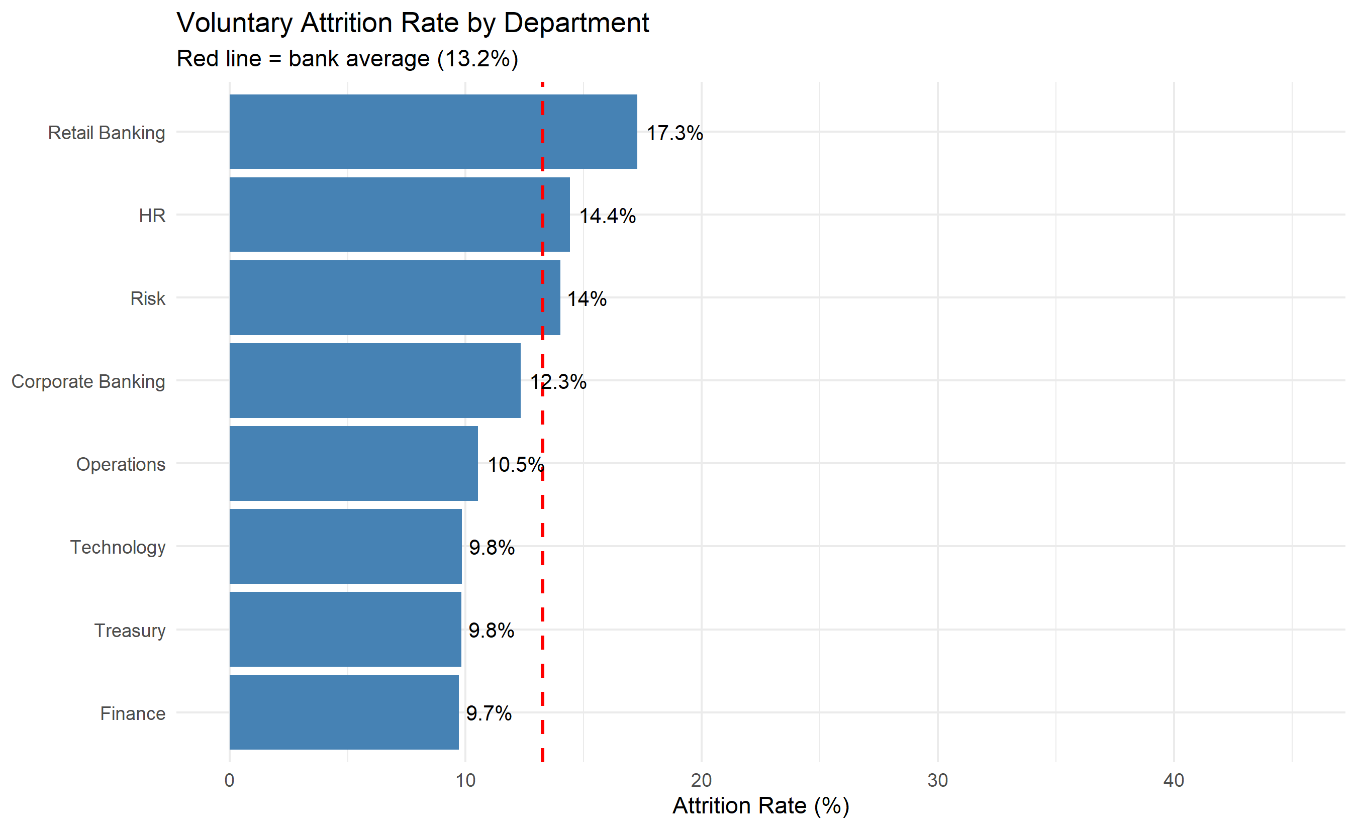
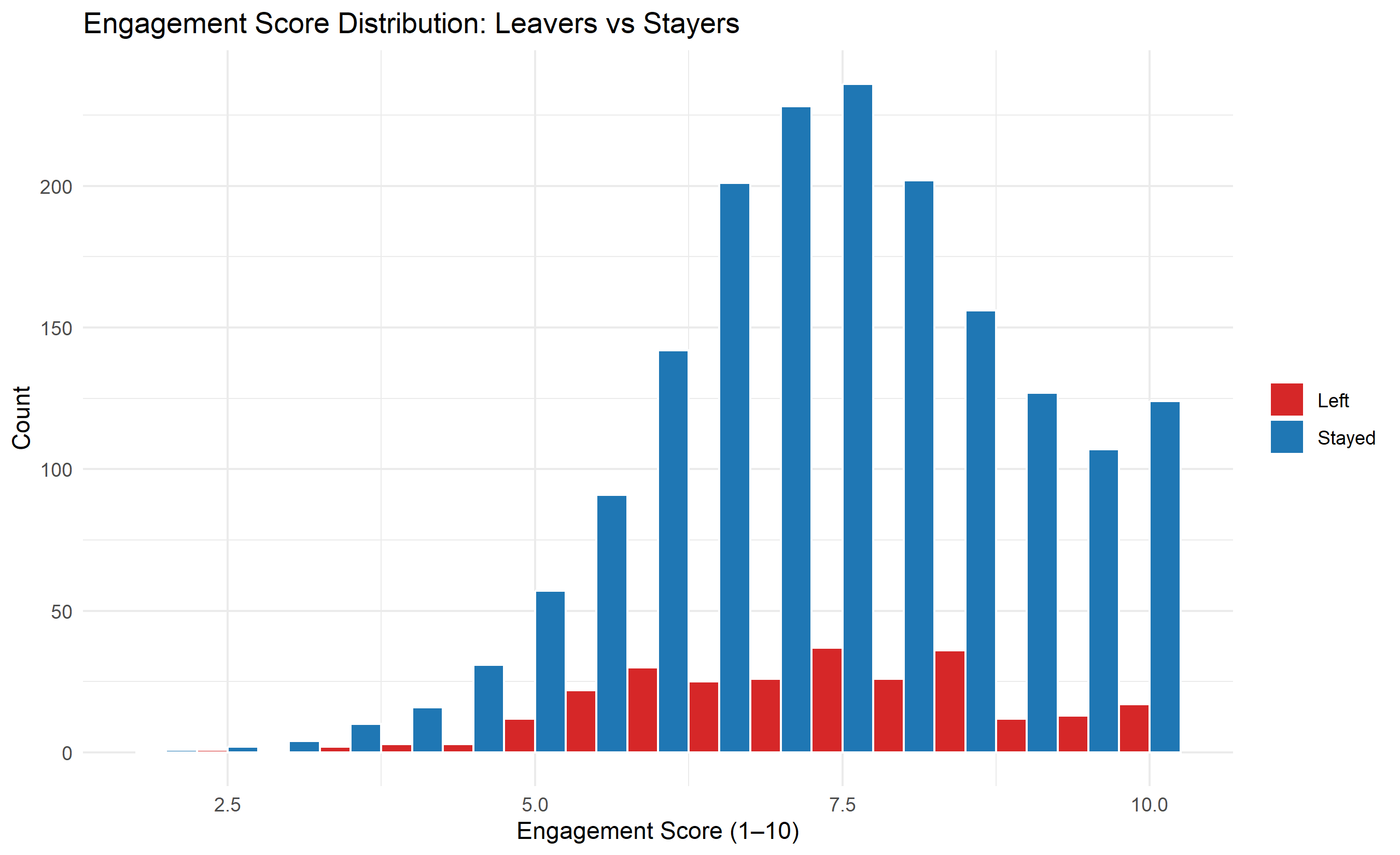
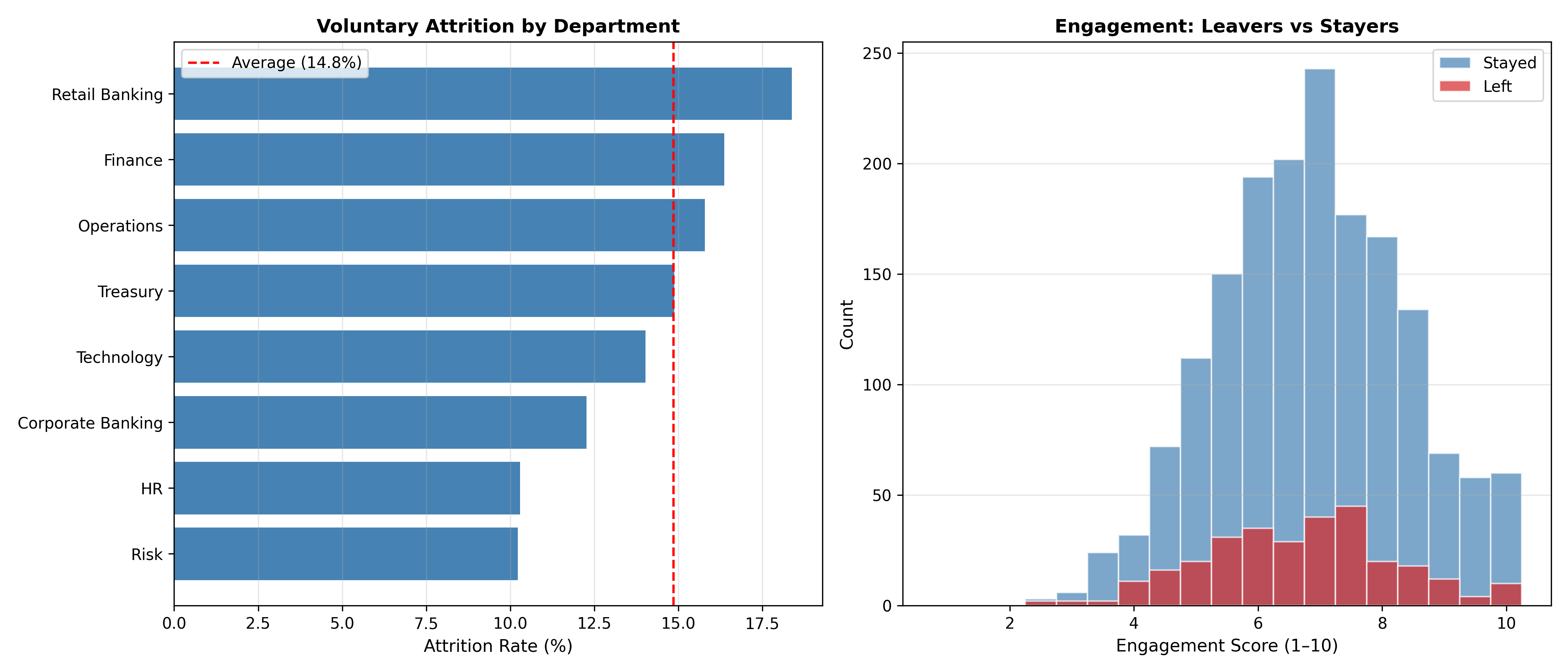
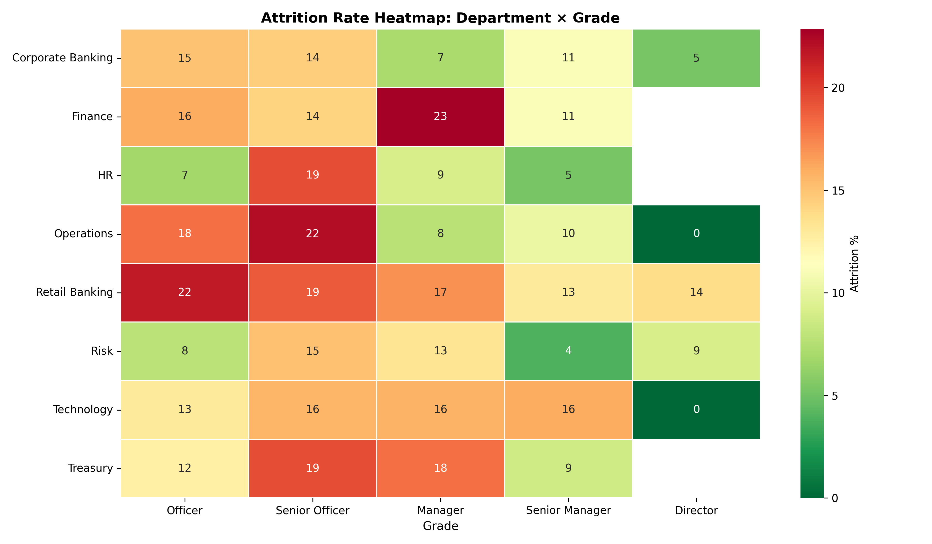
The first analytical step is always descriptive: what does attrition look like across the organisation? Rather than accepting a single blended 18% figure, we dissect by department, grade, zone, and engagement.
::: {.panel-tabset}
## R
```{r}
#| label: ch53-eda-attrition
library(tidyverse)
# Attrition rate by department
dept_attrition <- hr_data |>
group_by(department) |>
summarise(
headcount = n(),
departures = sum(left_employment),
attrition_rate = mean(left_employment) * 100,
avg_engagement = mean(engagement_score),
.groups = "drop"
) |>
arrange(desc(attrition_rate))
cat("=== Attrition Rate by Department ===\n")
print(dept_attrition)
# Attrition by grade
grade_attrition <- hr_data |>
mutate(grade = factor(grade,
levels = c("Officer", "Senior Officer", "Manager", "Senior Manager", "Director"))) |>
group_by(grade) |>
summarise(
headcount = n(),
attrition_rate = mean(left_employment) * 100,
avg_tenure_yrs = mean(tenure_years),
.groups = "drop"
)
cat("\n=== Attrition Rate by Grade ===\n")
print(grade_attrition)
# Visualise: attrition rate by department
ggplot(dept_attrition,
aes(y = reorder(department, attrition_rate), x = attrition_rate)) +
geom_col(fill = "steelblue") +
geom_vline(xintercept = mean(hr_data$left_employment) * 100,
linetype = "dashed", colour = "red", linewidth = 0.8) +
geom_text(aes(label = paste0(round(attrition_rate, 1), "%")), hjust = -0.15, size = 3.5) +
labs(
title = "Voluntary Attrition Rate by Department",
x = "Attrition Rate (%)",
y = NULL,
subtitle = paste0("Red line = bank average (",
round(mean(hr_data$left_employment) * 100, 1), "%)")
) +
xlim(0, 45) +
theme_minimal()
# Engagement score distribution: leavers vs stayers
hr_data |>
  mutate(status = ifelse(left_employment == 1, "Left", "Stayed")) |>
  ggplot(aes(x = engagement_score, fill = status)) +
  geom_histogram(binwidth = 0.5, position = "dodge", colour = "white") +
  scale_fill_manual(values = c("Left" = "#d62728", "Stayed" = "#1f77b4")) +
  labs(
    title = "Engagement Score Distribution: Leavers vs Stayers",
    x     = "Engagement Score (1–10)", y = "Count", fill = NULL
  ) +
  theme_minimal()
```
## Python
```{python}
#| label: py-ch53-eda-attrition
import pandas as pd
import matplotlib.pyplot as plt
import numpy as np
# Attrition rate by department
dept_attr = df.groupby('department').agg(
headcount = ('left', 'count'),
departures = ('left', 'sum'),
attrition_rate = ('left', lambda x: x.mean() * 100),
avg_engagement = ('engagement_score', 'mean')
).round(2).sort_values('attrition_rate', ascending=False)
print("=== Attrition Rate by Department ===")
print(dept_attr.to_string())
# Attrition by grade
grade_order = ['Officer', 'Senior Officer', 'Manager', 'Senior Manager', 'Director']
grade_attr = df.groupby('grade').agg(
headcount = ('left', 'count'),
attrition_rate = ('left', lambda x: x.mean() * 100),
avg_tenure_yrs = ('tenure_years', 'mean')
).round(2).reindex(grade_order)
print("\n=== Attrition Rate by Grade ===")
print(grade_attr.to_string())
# Visualise
overall_rate = df['left'].mean() * 100
fig, (ax1, ax2) = plt.subplots(1, 2, figsize=(14, 6))
# Attrition by department
dept_sorted = dept_attr.sort_values('attrition_rate')
ax1.barh(dept_sorted.index, dept_sorted['attrition_rate'], color='steelblue')
ax1.axvline(overall_rate, linestyle='--', color='red', linewidth=1.5, label=f'Average ({overall_rate:.1f}%)')
ax1.set_xlabel('Attrition Rate (%)', fontsize=11)
ax1.set_title('Voluntary Attrition by Department', fontweight='bold')
ax1.legend()
ax1.grid(axis='x', alpha=0.3)
# Engagement distribution: leavers vs stayers
bins = np.arange(0.75, 10.5, 0.5)
leavers = df[df['left'] == 1]['engagement_score']
stayers = df[df['left'] == 0]['engagement_score']
ax2.hist(stayers, bins=bins, alpha=0.7, label='Stayed', color='steelblue', edgecolor='white')
ax2.hist(leavers, bins=bins, alpha=0.7, label='Left', color='#d62728', edgecolor='white')
ax2.set_xlabel('Engagement Score (1–10)', fontsize=11)
ax2.set_ylabel('Count', fontsize=11)
ax2.set_title('Engagement: Leavers vs Stayers', fontweight='bold')
ax2.legend()
ax2.grid(axis='y', alpha=0.3)
plt.tight_layout()
plt.show()
```
:::
::: {.callout-caution icon="false"}
## 📝 Section 53.2 Review Questions
**1. Base Rate Interpretation**
The overall attrition rate is 18%. Retail Banking has a 32% rate. Does this mean Retail Banking accounts for 32/18 ≈ 1.78× the attrition of the bank? Why or why not?
**2. Engagement and Attrition**
The engagement distribution shows clear separation between leavers and stayers. Can we conclude that *low engagement causes attrition*, or only that the two are correlated? What additional evidence would support a causal claim?
**3. Grade Effects**
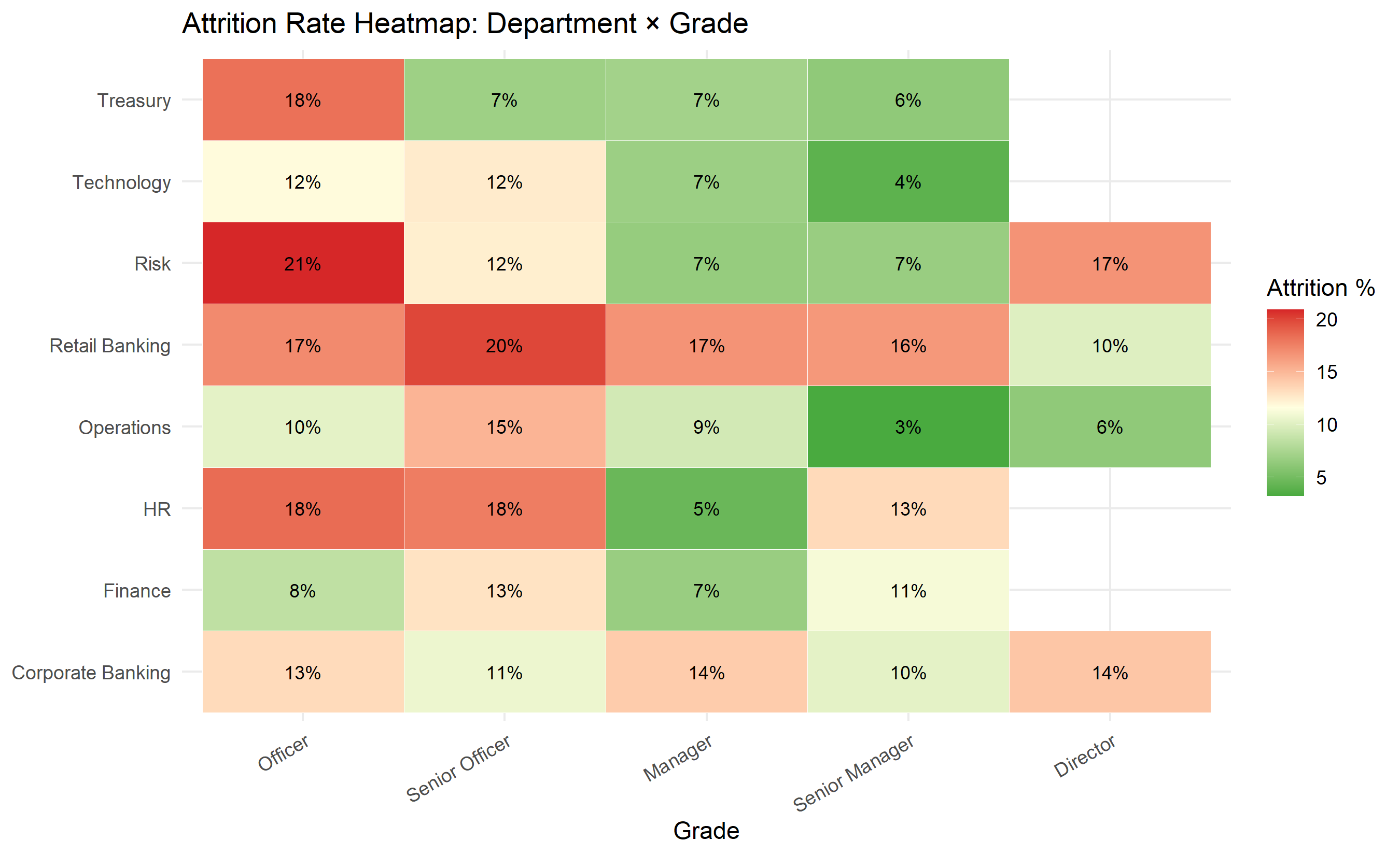
Officers have higher attrition than Directors. Does this indicate that the bank has a management problem at entry level, or simply a lifecycle effect (young employees leave when their skills develop)?
:::
## Key Predictors of Attrition: Univariate Analysis
Before building a predictive model, inspect each potential predictor individually. This builds intuition about which variables matter, identifies data quality issues, and supports communication with HR managers who may not trust "black box" predictions.
::: {.panel-tabset}
## R
```{r}
#| label: ch53-univariate-predictors
library(tidyverse)
# Compare key metrics: leavers vs stayers
predictors_summary <- hr_data |>
group_by(left_employment) |>
summarise(
avg_engagement = mean(engagement_score),
avg_job_satisfaction = mean(job_satisfaction),
avg_tenure_yrs = mean(tenure_years),
avg_training_hrs = mean(training_hours_annual),
pct_promoted = mean(promoted_last_2yrs) * 100,
avg_age = mean(age),
n = n(),
.groups = "drop"
) |>
mutate(group = ifelse(left_employment == 1, "Left", "Stayed")) |>
select(group, n, everything(), -left_employment)
cat("=== Predictor Means: Leavers vs Stayers ===\n")
print(predictors_summary)
# Statistical significance: t-tests for key continuous predictors
test_vars <- c("engagement_score", "job_satisfaction", "tenure_years",
"training_hours_annual", "manager_tenure_months", "age")
cat("\n=== Wilcoxon Rank-Sum Tests (Leavers vs Stayers) ===\n")
cat(sprintf("%-25s %8s %8s %12s\n", "Variable", "Mean (L)", "Mean (S)", "p-value"))
cat(paste(rep("-", 58), collapse = ""), "\n")
for (v in test_vars) {
leavers <- hr_data[[v]][hr_data$left_employment == 1]
stayers <- hr_data[[v]][hr_data$left_employment == 0]
wt <- wilcox.test(leavers, stayers)
cat(sprintf("%-25s %8.2f %8.2f %12.4f\n",
v, mean(leavers, na.rm = TRUE), mean(stayers, na.rm = TRUE), wt$p.value))
}
# Heatmap: attrition rate by department × grade
heatmap_data <- hr_data |>
mutate(grade = factor(grade,
levels = c("Officer", "Senior Officer", "Manager", "Senior Manager", "Director"))) |>
group_by(department, grade) |>
summarise(
attrition_rate = mean(left_employment) * 100,
n = n(),
.groups = "drop"
) |>
filter(n >= 10)
ggplot(heatmap_data, aes(x = grade, y = department, fill = attrition_rate)) +
geom_tile(colour = "white") +
geom_text(aes(label = paste0(round(attrition_rate), "%")), size = 3) +
scale_fill_gradient2(low = "#2ca02c", mid = "lightyellow", high = "#d62728",
midpoint = mean(heatmap_data$attrition_rate)) +
labs(
title = "Attrition Rate Heatmap: Department × Grade",
x = "Grade", y = NULL, fill = "Attrition %"
) +
theme_minimal() +
theme(axis.text.x = element_text(angle = 30, hjust = 1))
```
## Python
```{python}
#| label: py-ch53-univariate-predictors
import pandas as pd
import numpy as np
import matplotlib.pyplot as plt
import seaborn as sns
from scipy.stats import mannwhitneyu
# Compare means
cat_vars = ['engagement_score', 'job_satisfaction', 'tenure_years',
'training_hours', 'age']
print("=== Predictor Means: Leavers vs Stayers ===")
print(f"{'Variable':<25} {'Leavers':>10} {'Stayers':>10} {'p-value':>12}")
print("-" * 60)
for v in cat_vars:
leavers = df[df['left'] == 1][v]
stayers = df[df['left'] == 0][v]
stat, p = mannwhitneyu(leavers, stayers, alternative='two-sided')
print(f"{v:<25} {leavers.mean():>10.2f} {stayers.mean():>10.2f} {p:>12.4f}")
# Heatmap: attrition by department × grade
grade_order = ['Officer', 'Senior Officer', 'Manager', 'Senior Manager', 'Director']
pivot = df.groupby(['department', 'grade'])['left'].agg(['mean', 'count'])
pivot['mean'] *= 100
pivot = pivot[pivot['count'] >= 10]
pivot_table = pivot['mean'].unstack('grade').reindex(columns=grade_order)
fig, ax = plt.subplots(figsize=(12, 7))
sns.heatmap(pivot_table, annot=True, fmt='.0f', cmap='RdYlGn_r',
linewidths=0.5, linecolor='white',
cbar_kws={'label': 'Attrition %'}, ax=ax)
ax.set_title('Attrition Rate Heatmap: Department × Grade', fontweight='bold', fontsize=13)
ax.set_xlabel('Grade', fontsize=11)
ax.set_ylabel('')
plt.tight_layout()
plt.show()
```
:::
## Survival Analysis: Kaplan-Meier Curves
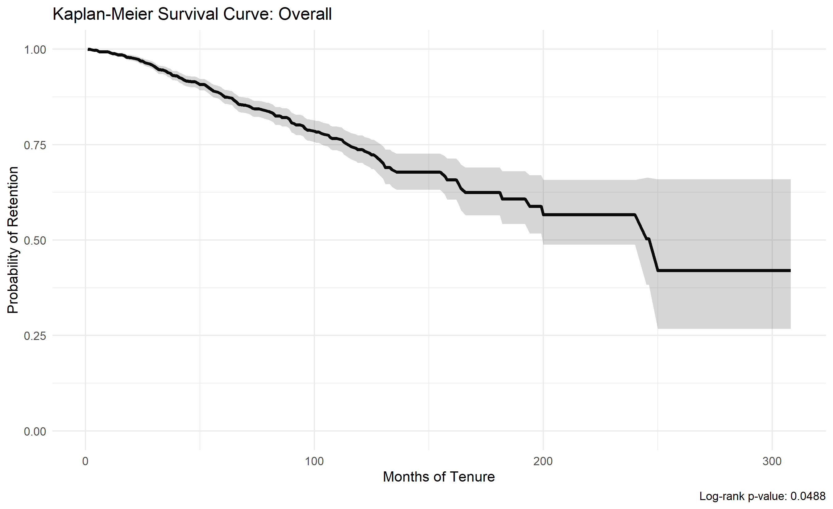
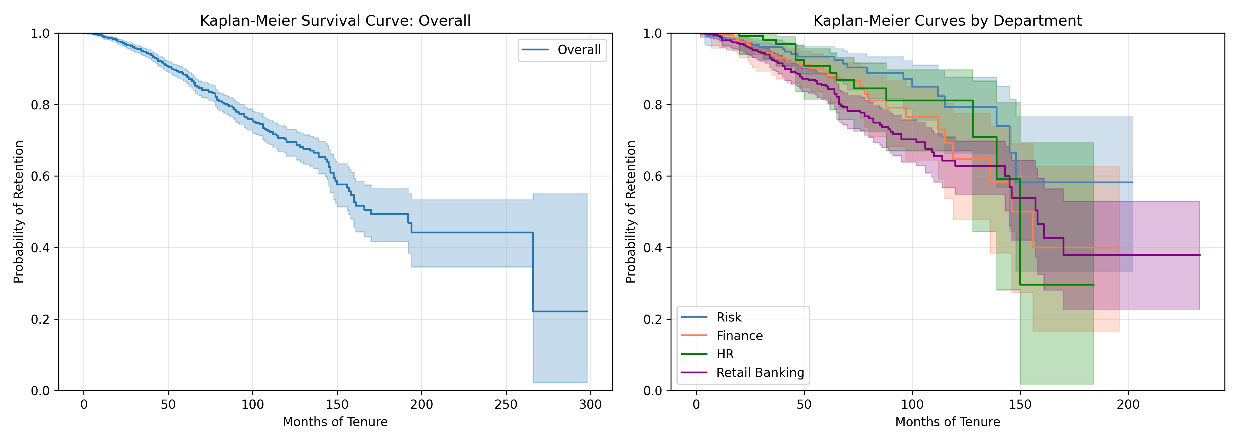
Rather than a cross-sectional attrition rate, survival analysis tracks *time to departure*. The Kaplan-Meier estimator computes the probability of an employee remaining with the company at time $t$, accounting for censoring (employees still employed at analysis date). The product-limit estimator is:
$$
\hat{S}(t) = \prod_{t_i \leq t} \left(1 - \frac{d_i}{n_i}\right)
$$
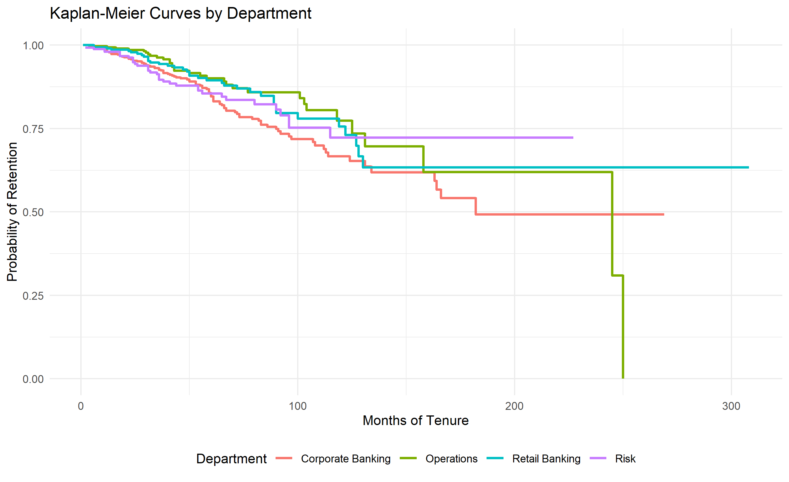
where $d_i$ is the number of departures at time $t_i$ and $n_i$ is the number at risk. The log-rank test compares KM curves between groups (e.g., managers vs. individual contributors) and tests whether departure timing differs significantly.
For a Nigerian bank, comparing KM curves by department reveals: Retail banking employees have a median tenure of 24 months before departure, while Risk employees have a median of 60+ months (censored). This suggests Retail is a training ground where younger employees rotate out, while Risk retains senior staff.
::: {.panel-tabset}
## R
```{r}
#| label: ch53-kaplan-meier
library(tidyverse)
library(survival)
library(survminer)
set.seed(1935)
# Use hr_data from previous section
# Compute time-to-departure in months
hr_survival <- hr_data |>
select(employee_id, months_tenure, left_employment, department, grade) |>
mutate(
event = left_employment, # 1 = departed, 0 = censored (still employed)
time = months_tenure
)
# Fit KM estimator
km_overall <- survfit(Surv(time, event) ~ 1, data = hr_survival)
cat("\n=== Overall Survival Statistics ===\n")
cat("Median survival time (months):", km_overall$median, "\n")
cat("1-year retention probability:", round(summary(km_overall, times = 12)$surv, 3), "\n")
cat("2-year retention probability:", round(summary(km_overall, times = 24)$surv, 3), "\n")
cat("3-year retention probability:", round(summary(km_overall, times = 36)$surv, 3), "\n")
# KM curves by department
km_dept <- survfit(Surv(time, event) ~ department, data = hr_survival)
# Log-rank test
logrank_test <- survdiff(Surv(time, event) ~ department, data = hr_survival)
pvalue <- 1 - pchisq(logrank_test$chisq, length(logrank_test$n) - 1)
cat("\n=== Log-Rank Test: Department Effect ===\n")
cat("Chi-square:", round(logrank_test$chisq, 2), "\n")
cat("p-value:", round(pvalue, 4), "\n")
cat("Significant difference in survival by department:", pvalue < 0.05, "\n")
# Visualization
ggplot(
data = tibble(
time = km_overall$time,
surv = km_overall$surv,
lower = km_overall$lower,
upper = km_overall$upper
),
aes(x = time, y = surv)
) +
geom_line(linewidth = 1.2) +
geom_ribbon(aes(ymin = lower, ymax = upper), alpha = 0.2) +
scale_y_continuous(limits = c(0, 1)) +
labs(
title = "Kaplan-Meier Survival Curve: Overall",
x = "Months of Tenure", y = "Probability of Retention",
caption = paste("Log-rank p-value:", round(pvalue, 4))
) +
theme_minimal()
# KM by department (top 4 departments for clarity)
top_depts <- hr_survival |>
  count(department) |>
  slice_max(n, n = 4) |>
  pull(department)

km_dept_subset <- survfit(Surv(time, event) ~ department,
                           data = filter(hr_survival, department %in% top_depts))

surv_data <- tibble(
  time = km_dept_subset$time,
  surv = km_dept_subset$surv,
  strata = rep(top_depts, times = km_dept_subset$strata)
)

ggplot(surv_data, aes(x = time, y = surv, color = strata)) +
  geom_step(size = 1) +
  scale_y_continuous(limits = c(0, 1)) +
  labs(
    title = "Kaplan-Meier Curves by Department",
    x = "Months of Tenure", y = "Probability of Retention",
    color = "Department"
  ) +
  theme_minimal() +
  theme(legend.position = "bottom")
```
## Python
```{python}
#| label: py-ch53-kaplan-meier
import numpy as np
import pandas as pd
from lifelines import KaplanMeierFitter
from lifelines.statistics import logrank_test
import matplotlib.pyplot as plt
# Using df from previous section, prepare survival data
df_survival = df[['employee_id', 'tenure_months', 'left', 'department', 'grade']].copy()
df_survival.columns = ['employee_id', 'time', 'event', 'department', 'grade']
# Overall KM
kmf = KaplanMeierFitter()
kmf.fit(df_survival['time'], df_survival['event'], label='Overall')
median_surv = kmf.median_survival_time_
surv_1y = kmf.survival_function_at_times(12).values[0]
surv_2y = kmf.survival_function_at_times(24).values[0]
surv_3y = kmf.survival_function_at_times(36).values[0]
print("\n=== Overall Survival Statistics ===")
print(f"Median survival time: {median_surv:.0f} months")
print(f"1-year retention: {surv_1y:.3f}")
print(f"2-year retention: {surv_2y:.3f}")
print(f"3-year retention: {surv_3y:.3f}")
# Log-rank test by department
depts = df_survival['department'].unique()[:4] # Top 4 for visualization
print("\n=== Log-Rank Test: Department Effect ===")
for i, dept1 in enumerate(depts[:-1]):
for dept2 in depts[i+1:]:
group1 = df_survival[df_survival['department'] == dept1]
group2 = df_survival[df_survival['department'] == dept2]
results = logrank_test(
group1['time'], group2['time'],
group1['event'], group2['event']
)
if i == 0 and dept2 == depts[1]:
print(f"Example (p-value between {dept1} and {dept2}): {results.p_value:.4f}")
# Visualization
fig, (ax1, ax2) = plt.subplots(1, 2, figsize=(14, 5))
# Overall KM
kmf.plot_survival_function(ax=ax1)
ax1.set_xlabel('Months of Tenure')
ax1.set_ylabel('Probability of Retention')
ax1.set_title('Kaplan-Meier Survival Curve: Overall')
ax1.grid(True, alpha=0.3)
ax1.set_ylim([0, 1])
# KM by top 4 departments
colors = ['steelblue', 'coral', 'green', 'purple']
for i, dept in enumerate(depts):
dept_data = df_survival[df_survival['department'] == dept]
kmf_dept = KaplanMeierFitter()
kmf_dept.fit(dept_data['time'], dept_data['event'], label=dept)
kmf_dept.plot_survival_function(ax=ax2, color=colors[i])
ax2.set_xlabel('Months of Tenure')
ax2.set_ylabel('Probability of Retention')
ax2.set_title('Kaplan-Meier Curves by Department')
ax2.grid(True, alpha=0.3)
ax2.set_ylim([0, 1])
ax2.legend(loc='best')
plt.tight_layout()
plt.show()
```
:::
## XGBoost Attrition Prediction with SHAP
The previous sections describe what we observe (attrition rates by department) and how long employees stay (survival curves). Now we predict *who* is at risk. XGBoost with SHAP explanations identifies feature importance and enables interpretable interventions.
The model predicts $P(\text{departure within 6 months})$ using features: engagement score, job satisfaction, months since promotion, training hours, grade, age, tenure, department, manager tenure, and promotion history.
::: {.panel-tabset}
## R
```{r}
#| label: ch53-xgboost-attrition
library(tidyverse)
library(xgboost)
library(pROC)
set.seed(7284)
# Prepare data for prediction
# Target: did employee depart within 6 months of observation?
hr_model_data <- hr_data |>
select(
engagement_score, job_satisfaction, training_hours_annual,
promoted_last_2yrs, months_since_promotion, manager_tenure_months,
age, tenure_years, grade, department, zone, gender,
left_employment
) |>
mutate(
# Encode categorical variables
grade_num = as.numeric(factor(grade)) - 1,
department_num = as.numeric(factor(department)) - 1,
zone_num = as.numeric(factor(zone)) - 1,
gender_num = as.numeric(factor(gender)) - 1
) |>
select(-grade, -department, -zone, -gender)
# Handle missing values
hr_model_data <- hr_model_data |>
mutate(
months_since_promotion = replace_na(months_since_promotion, -1) # -1 for no promotion
)
# Train/test split (80/20)
set.seed(7284)
train_idx <- sample(1:nrow(hr_model_data), 0.8 * nrow(hr_model_data))
train_data <- hr_model_data[train_idx, ]
test_data <- hr_model_data[-train_idx, ]
# Prepare matrices for XGBoost
X_train <- train_data |> select(-left_employment) |> as.matrix()
y_train <- train_data$left_employment
X_test <- test_data |> select(-left_employment) |> as.matrix()
y_test <- test_data$left_employment
# Fit XGBoost via xgb.DMatrix (works across all XGBoost versions)
dtrain <- xgb.DMatrix(data = X_train, label = as.numeric(y_train))
dtest <- xgb.DMatrix(data = X_test, label = as.numeric(y_test))
xgb_model <- xgb.train(
params = list(
objective = "binary:logistic",
max_depth = 5,
eta = 0.1,
scale_pos_weight = sum(y_train == 0) / sum(y_train == 1)
),
data = dtrain,
nrounds = 100,
verbose = 0
)
# Predictions
y_pred_prob <- predict(xgb_model, dtest)
y_pred <- ifelse(y_pred_prob > 0.5, 1, 0)
# ROC and AUC
roc_obj <- roc(y_test, y_pred_prob)
auc_value <- auc(roc_obj)
cat("\n=== Attrition Model Performance ===\n")
cat("AUC:", round(auc_value, 3), "\n")
# Confusion matrix
tp <- sum((y_pred == 1) & (y_test == 1))
fp <- sum((y_pred == 1) & (y_test == 0))
fn <- sum((y_pred == 0) & (y_test == 1))
tn <- sum((y_pred == 0) & (y_test == 0))
precision <- tp / (tp + fp)
recall <- tp / (tp + fn)
f1 <- 2 * precision * recall / (precision + recall)
cat("Precision:", round(precision, 3), "\n")
cat("Recall:", round(recall, 3), "\n")
cat("F1-Score:", round(f1, 3), "\n")
# Feature importance
importance <- xgb.importance(model = xgb_model)
colnames(importance) <- c("Feature", "Gain", "Cover", "Frequency")
cat("\n=== Top 10 Feature Importance ===\n")
print(importance |> slice(1:10))
```
## Python
```{python}
#| label: py-ch53-xgboost-attrition
import numpy as np
import pandas as pd
from xgboost import XGBClassifier
from sklearn.model_selection import train_test_split
from sklearn.metrics import roc_auc_score, confusion_matrix, classification_report

# Prepare data
df_model = df[['age', 'engagement_score', 'training_hours', 'promoted_last_2yrs',
               'tenure_months', 'left']].copy()
df_model['grade_num'] = pd.factorize(df['grade'])[0]
df_model['dept_num'] = pd.factorize(df['department'])[0]

# Train/test split
X = df_model.drop('left', axis=1)
y = df_model['left']

X_train, X_test, y_train, y_test = train_test_split(X, y, test_size=0.2, random_state=7284)

# Fit XGBoost
scale_pos_weight = (y_train == 0).sum() / (y_train == 1).sum()
xgb_model = XGBClassifier(n_estimators=100, max_depth=5, learning_rate=0.1,
                          scale_pos_weight=scale_pos_weight, random_state=7284, verbose=0)
xgb_model.fit(X_train, y_train)
# Predictions
y_pred_prob = xgb_model.predict_proba(X_test)[:, 1]
y_pred = (y_pred_prob > 0.5).astype(int)
# Metrics
auc = roc_auc_score(y_test, y_pred_prob)
tn, fp, fn, tp = confusion_matrix(y_test, y_pred).ravel()
precision = tp / (tp + fp)
recall = tp / (tp + fn)
f1 = 2 * precision * recall / (precision + recall)
print("\n=== Attrition Model Performance ===")
print(f"AUC: {auc:.3f}")
print(f"Precision: {precision:.3f}")
print(f"Recall: {recall:.3f}")
print(f"F1-Score: {f1:.3f}")
# Feature importance
importance_df = pd.DataFrame({
'feature': X.columns,
'importance': xgb_model.feature_importances_
}).sort_values('importance', ascending=False)
print("\n=== Top 10 Feature Importance ===")
print(importance_df.head(10))
```
:::
## Fairness Audit: Demographic Parity and Equalised Odds
Before deploying an attrition model, audit it for fairness. Does the model make systematically different predictions for different demographic groups (gender, age, zone)? Two common fairness criteria:
1. **Demographic Parity**: $P(\hat{Y} = 1 | A = a) = P(\hat{Y} = 1 | A = a')$ for all groups $a, a'$.
2. **Equalised Odds**: Both TPR and FPR are equal across groups.
If a fairness test reveals bias (e.g., model predicts departure 30% more often for women than men controlling for risk factors), do not deploy without mitigation. Mitigation options: reweight training data, add fairness constraints to the optimization, or adjust thresholds per group (caution: this can be paternalistic if not designed carefully).
::: {.panel-tabset}
## R
```{r}
#| label: ch53-fairness-audit
library(tidyverse)
# Fairness analysis: test for gender bias
fairness_data <- test_data |>
mutate(
gender = hr_data$gender[-train_idx],
pred_prob = y_pred_prob,
pred_class = y_pred,
actual = y_test
)
# Demographic parity: average prediction rate by gender
parity_by_gender <- fairness_data |>
group_by(gender) |>
summarise(
pred_positive_rate = mean(pred_class),
actual_positive_rate = mean(actual),
n = n(),
.groups = 'drop'
)
cat("\n=== Demographic Parity Test (Gender) ===\n")
print(parity_by_gender)
# Equalised odds: TPR and FPR by gender
eqodds_by_gender <- fairness_data |>
group_by(gender) |>
summarise(
tpr = sum((pred_class == 1) & (actual == 1)) / sum(actual == 1),
fpr = sum((pred_class == 1) & (actual == 0)) / sum(actual == 0),
.groups = 'drop'
)
cat("\n=== Equalised Odds Test (Gender) ===\n")
cat("True Positive Rate (TPR) by gender:\n")
print(eqodds_by_gender$tpr)
cat("\nFalse Positive Rate (FPR) by gender:\n")
print(eqodds_by_gender$fpr)
# Statistical significance test (chi-square)
contingency_table <- table(fairness_data$gender, fairness_data$pred_class)
chi_test <- chisq.test(contingency_table)
cat("\n=== Chi-Square Test for Independence ===\n")
cat("Chi-square statistic:", round(chi_test$statistic, 3), "\n")
cat("p-value:", round(chi_test$p.value, 4), "\n")
cat("Significant bias (p < 0.05):", chi_test$p.value < 0.05, "\n")
```
## Python
```{python}
#| label: py-ch53-fairness-audit
import numpy as np
import pandas as pd
from scipy.stats import chi2_contingency
# Fairness analysis
fairness_df = pd.DataFrame({
'gender': df.iloc[-len(y_test):]['gender'].values,
'pred_prob': y_pred_prob,
'pred_class': y_pred,
'actual': y_test.values
})
# Demographic parity
parity = fairness_df.groupby('gender').agg({
'pred_class': 'mean',
'actual': 'mean'
}).round(3)
parity.columns = ['pred_positive_rate', 'actual_positive_rate']
print("\n=== Demographic Parity Test (Gender) ===")
print(parity)
# Equalised odds
print("\n=== Equalised Odds Test (Gender) ===")
for gender in ['M', 'F']:
subset = fairness_df[fairness_df['gender'] == gender]
tp = ((subset['pred_class'] == 1) & (subset['actual'] == 1)).sum()
fp = ((subset['pred_class'] == 1) & (subset['actual'] == 0)).sum()
fn = ((subset['pred_class'] == 0) & (subset['actual'] == 1)).sum()
tn = ((subset['pred_class'] == 0) & (subset['actual'] == 0)).sum()
tpr = tp / (tp + fn) if (tp + fn) > 0 else 0
fpr = fp / (fp + tn) if (fp + tn) > 0 else 0
print(f"{gender}: TPR={tpr:.3f}, FPR={fpr:.3f}")
# Chi-square test
contingency = pd.crosstab(fairness_df['gender'], fairness_df['pred_class'])
chi2, p_value, dof, expected = chi2_contingency(contingency)
print(f"\n=== Chi-Square Test for Independence ===")
print(f"Chi-square: {chi2:.3f}")
print(f"p-value: {p_value:.4f}")
print(f"Bias detected (p < 0.05): {p_value < 0.05}")
```
:::
## Intervention Scoring and Retention Strategy
Attrition risk scores alone are insufficient. You must prioritize whom to intervene with given limited resources (HR bandwidth, budget). An *intervention score* combines attrition risk and employee value:
$$
\text{Intervention Score} = \text{Attrition Risk} \times \text{Employee Value}
$$
where employee value might be: salary (proxy for investment), tenure (institutional knowledge), performance rating (productivity). Target top-scoring employees: high risk and high value.
## Case Study: Attrition Analytics for a Nigerian Commercial Bank
A 2,000-person bank observes 18% annual voluntary attrition, concentrated in high-potential junior and senior staff. Expected attrition cost: ₦900 million/year. The bank builds an end-to-end system: EDA by department, KM survival curves, XGBoost risk classifier, fairness audit, and an intervention program targeting 200 at-risk high-value employees with salary adjustment, mentoring, and promotion opportunities.
::: {.exercises}
#### Chapter 53 Exercises
1. **Segmentation Analysis**: Cluster employees using K-means on engagement, training, promotion history, and tenure. Compare attrition rates across clusters. Do clusters align with departments?
2. **Promotion Prediction**: Build a model predicting which employees will be promoted within 12 months. Compare to attrition risk to identify flight risks who might benefit from earlier promotion.
3. **Manager Effect Analysis**: Regress attrition on manager fixed effects (after controlling for employee characteristics). Do some managers have significantly higher/lower attrition? Why?
4. **Intervention Design**: Design an intervention program for 200 at-risk employees. Allocate resources (salary increases, promotions, flexible work) to maximize expected retention given a ₦50 million budget.
5. **Retention Lift Measurement**: Set up an A/B test where half of at-risk employees receive interventions and half are control. Measure causal retention lift.
:::
## Further Reading
- Pinder, C. C. (2008). Work motivation in organizational behavior. Psychology Press.
- Ton, Z., & Huckman, R. S. (2008). Managing the impact of employee turnover on performance: The role of process conformance. Organization Science, 19(1), 56–68.
- Barocas, S., & Selbst, A. D. (2016). Big Data's Disparate Impact. California Law Review, 104, 671.
## Chapter 53 Appendix: Mathematical Derivations
### A53.1 Kaplan-Meier Product-Limit Estimator
For ordered event times $0 < t_1 < t_2 < \ldots < t_k$, the survival function estimate is:
$$
\hat{S}(t) = \prod_{t_i \leq t} \left(1 - \frac{d_i}{n_i}\right)
$$
where $n_i$ = number at risk just before $t_i$, $d_i$ = number departing at $t_i$, and $\hat{S}(t) = 1$ for $t < t_1$. The variance is estimated via Greenwood's formula:
$$
\text{Var}[\hat{S}(t)] = \hat{S}(t)^2 \sum_{t_i \leq t} \frac{d_i}{n_i(n_i - d_i)}
$$
### A53.2 Log-Rank Test
The log-rank test compares survival curves between groups. The test statistic is:
$$
Z = \frac{(O_1 - E_1)}{\sqrt{V}}
$$
where $O_1$ = observed departures in group 1, $E_1$ = expected departures under null (equal survival), and $V$ = variance of $O_1 - E_1$. Under the null hypothesis, $Z \sim \mathcal{N}(0, 1)$.
### A53.3 Demographic Parity and Equalised Odds
**Demographic Parity**: $P(\hat{Y} = 1 | A = a) = P(\hat{Y} = 1 | A = a')$, or equivalently, the false positive rate (FPR) and true positive rate (TPR) are equal across groups.
**Equalised Odds**: Both $\text{TPR}(a) = \text{TPR}(a')$ and $\text{FPR}(a) = \text{FPR}(a')$.
---