---
title: "Data Visualisation for Business"
---
```{python}
#| label: python-setup-05
#| include: false
import pandas as pd
import numpy as np
import matplotlib.pyplot as plt
import seaborn as sns
import plotly.express as px
import plotly.graph_objects as go
from plotly.subplots import make_subplots
# ── households (same seeds as Chapter 4) ─────────────────────────────────────
np.random.seed(42)
zones_list = ["North-West", "North-Central", "North-East",
"South-West", "South-South", "South-East"]
states = ["Kano", "Katsina", "Kogi", "Kwara", "Adamawa", "Taraba",
"Lagos", "Ogun", "Osun", "Oyo",
"Cross River", "Akwa Ibom", "Rivers", "Bayelsa",
"Anambra", "Enugu", "Imo"]
households = pd.DataFrame({
"household_id": range(1, 501),
"state": np.random.choice(states, 500),
"zone": np.tile(zones_list, 500 // 6 + 1)[:500],
"household_size": np.random.randint(2, 13, 500),
"monthly_income": np.maximum(np.random.normal(150000, 80000, 500), 20000),
})
np.random.seed(43)
households["food_spend"] = (households["monthly_income"] * np.random.uniform(0.35, 0.55, 500)
+ np.random.normal(0, 5000, 500))
households["education_spend"] = (households["monthly_income"] * np.random.uniform(0.08, 0.18, 500)
+ np.random.normal(0, 3000, 500))
households["healthcare_spend"] = (households["monthly_income"] * np.random.uniform(0.04, 0.12, 500)
+ np.random.normal(0, 2000, 500))
spend_cols = ["food_spend", "education_spend", "healthcare_spend"]
households[spend_cols] = households[spend_cols].clip(lower=0)
households["has_electricity"] = np.random.choice([True, False], 500, p=[0.65, 0.35])
households["has_internet"] = np.random.choice([True, False], 500, p=[0.45, 0.55])
households.loc[np.random.choice(500, 35, replace=False), "education_spend"] = np.nan
households.loc[np.random.choice(500, 20, replace=False), "healthcare_spend"] = np.nan
households.loc[np.random.choice(500, 15, replace=False), "monthly_income"] = np.nan
households.loc[np.random.choice(500, 1), "food_spend"] = 800000
# ── revenue_data ──────────────────────────────────────────────────────────────
np.random.seed(7)
zones = zones_list
quarters = ["Q1", "Q2", "Q3", "Q4"]
revenue_data = pd.DataFrame({
"zone": np.repeat(zones, 4),
"quarter": quarters * 6,
"revenue": np.clip(np.random.normal(50, 15, 24), 5, None),
})
pivot_data = revenue_data.pivot(index="zone", columns="quarter", values="revenue")
# ── inflation series ──────────────────────────────────────────────────────────
years = np.arange(2014, 2024)
inflation = np.array([8.5, 9.0, 15.3, 11.4, 11.1, 13.7, 15.1, 18.2, 20.5, 21.3])
# ── correlation matrix ────────────────────────────────────────────────────────
corr_matrix = households[["monthly_income", "food_spend", "education_spend",
"healthcare_spend", "household_size"]].corr()
```
```{r}
#| label: r-setup-05
#| include: false
library(tidyverse)
library(ggplot2)
# ── households (same seeds as Chapter 4) ─────────────────────────────────────
set.seed(42)
zones <- c("North-West", "North-Central", "North-East",
"South-West", "South-South", "South-East")
households <- tibble(
household_id = 1:500,
state = sample(c("Kano", "Katsina", "Kogi", "Kwara", "Adamawa",
"Taraba", "Lagos", "Ogun", "Osun", "Oyo",
"Cross River", "Akwa Ibom", "Rivers", "Bayelsa",
"Anambra", "Enugu", "Imo"), 500, replace = TRUE),
zone = rep_len(zones, 500),
household_size = sample(2:12, 500, replace = TRUE),
monthly_income = pmax(rnorm(500, mean = 150000, sd = 80000), 20000),
food_spend = NA_real_,
education_spend = NA_real_,
healthcare_spend = NA_real_,
has_electricity = sample(c(TRUE, FALSE), 500, replace = TRUE, prob = c(0.65, 0.35)),
has_internet = sample(c(TRUE, FALSE), 500, replace = TRUE, prob = c(0.45, 0.55))
) |>
mutate(
food_spend = pmax(monthly_income * runif(500, 0.35, 0.55) + rnorm(500, 0, 5000), 0),
education_spend = pmax(monthly_income * runif(500, 0.08, 0.18) + rnorm(500, 0, 3000), 0),
healthcare_spend = pmax(monthly_income * runif(500, 0.04, 0.12) + rnorm(500, 0, 2000), 0)
)
set.seed(43)
households$education_spend[sample(1:500, 35)] <- NA
households$healthcare_spend[sample(1:500, 20)] <- NA
households$monthly_income[sample(1:500, 15)] <- NA
households$food_spend[sample(1:500, 1)] <- 800000
# ── revenue_data and inflation_data ──────────────────────────────────────────
set.seed(7)
revenue_data <- tibble(
zone = rep(zones, each = 4),
quarter = rep(c("Q1", "Q2", "Q3", "Q4"), times = 6),
revenue = pmax(rnorm(24, mean = 50, sd = 15), 5)
)
inflation_data <- tibble(
year = 2014:2023,
inflation = c(8.5, 9.0, 15.3, 11.4, 11.1, 13.7, 15.1, 18.2, 20.5, 21.3)
)
```
::: {.callout-note icon="false"}
## 📋 Learning Objectives
By the end of this chapter, you will be able to:
- Understand the layered grammar of graphics and why it matters for reproducible, principled visualization
- Choose the appropriate chart type for your data and analytical question
- Build publication-quality static charts using ggplot2 (R) and matplotlib/seaborn (Python)
- Create interactive visualizations with Plotly for exploration and presentation
- Apply accessibility principles to colour, typography, and design for inclusive communication
- Tell a data story that moves from context through complication to resolution
- Design dashboards that communicate business insights to diverse audiences
- Critique visualizations for clarity, honesty, and visual efficiency
:::
## The Grammar of Graphics
When Leland Wilkinson published *The Grammar of Graphics* in 1999, he fundamentally changed how we think about visualization. Before his work, charting felt ad hoc—you knew a bar chart was good for comparison and a line chart for trends, but there was no unified framework explaining *why* or how to build them systematically. Wilkinson's insight was that all statistical graphics, from the simplest scatter plot to the most complex multi-layered chart, can be decomposed into a series of layers: data, aesthetic mappings, geometries, scales, coordinates, and facets.
::: {.callout-note icon="false"}
## 📘 Theory: The Layered Grammar of Graphics
Hadley Wickham built on Wilkinson's work to create ggplot2, which implements the grammar explicitly. Understanding this grammar helps you think clearly about visualization and build charts methodically.
1. **Data**: The raw observations and variables you're visualizing. Always start here. Ask: what variables matter? Are they numeric or categorical?
2. **Aesthetics** (aes): The mapping from data variables to visual properties—position on axes, colour, size, shape, fill, transparency. If you want to show income by geopolitical zone, you might map income to the y-axis and zone to the x-axis, or zone to colour.
3. **Geometries** (geom): The visual marks themselves—points (geom_point), bars (geom_col), lines (geom_line), smooth curves (geom_smooth). A scatterplot uses geom_point; a bar chart uses geom_col.
4. **Scales**: How the mapping from data values to visual values is encoded. For a numeric y-axis spanning 0 to 1 million naira, you're applying a scale. Colour scales map data values to colours (e.g., viridis for continuous data). Legends are visual representations of scales.
5. **Coordinates**: The coordinate system. Cartesian (x, y) is default. Polar coordinates (useful for circular data) rotate the plane. Flipped coordinates swap x and y (useful for long category names).
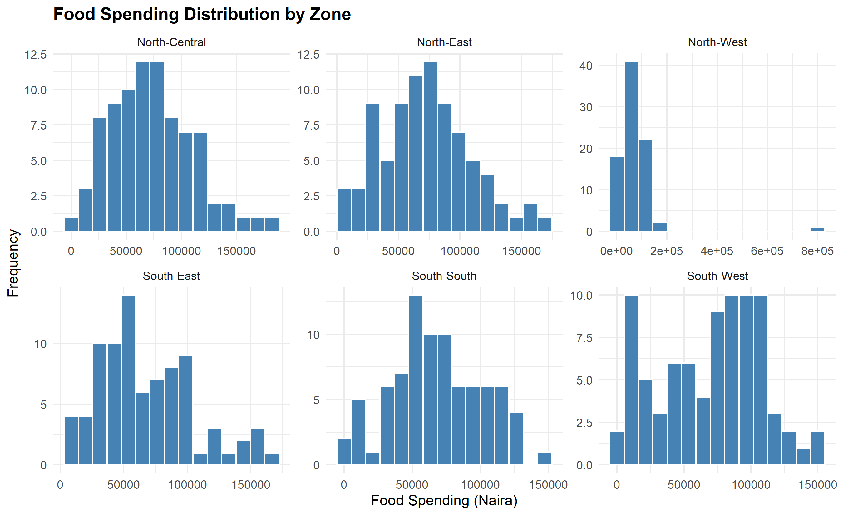
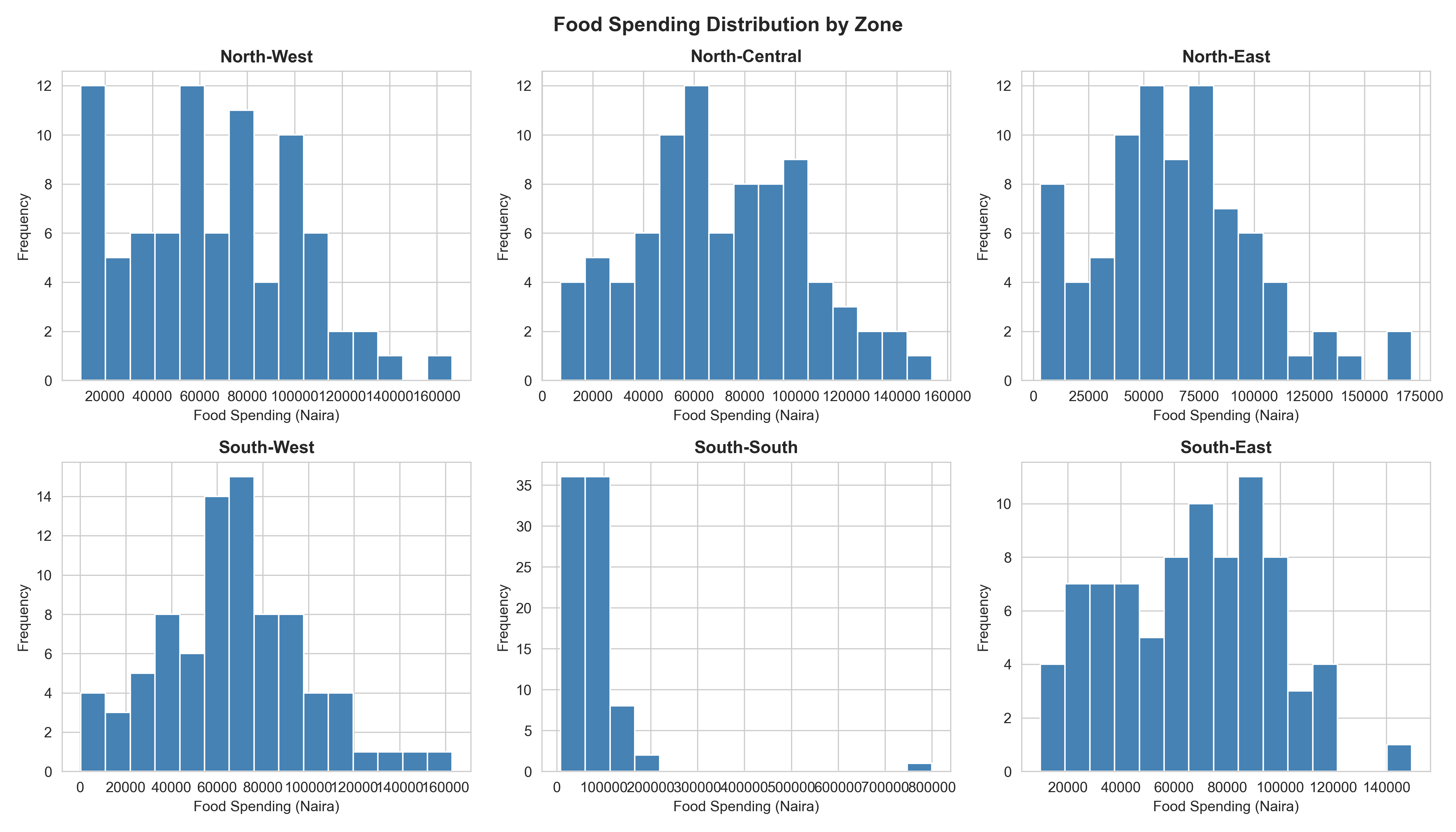
6. **Facets**: Small multiples—separate panels, one per category. If you want to compare income distributions across six zones, facet by zone and you get six side-by-side histograms.
7. **Themes**: Visual styling—fonts, backgrounds, gridlines, legend position. Themes don't change the data or the mapping; they're aesthetic decoration.
This layered approach is powerful because it makes visualization modular and reproducible. In ggplot2, you literally build charts layer by layer: start with `ggplot(data, aes(x, y))`, add a geom (e.g., `+ geom_point()`), adjust scales and labels, then style with a theme. Each layer is independent and composable.
:::
::: {.callout-caution icon="false"}
## 📝 Section 5.1 Review Questions
1. What are the seven core layers of the grammar of graphics, and what role does each play?
2. Why is the mapping from data to aesthetics (aes) the most important decision you make in building a visualization?
3. How does faceting help you compare across groups? Give an example with Nigerian household data.
4. Explain the difference between a geometry and a statistic. (Hint: geom_smooth is a geom that fits a smooth curve; under the hood, it computes statistics.)
5. Why do you think the grammar of graphics has become so influential for building reproducible visualizations?
:::
## Choosing the Right Chart
The first step in any visualization is asking: *What story am I telling?* Once you know the story, the chart type follows. There is no universally "best" chart; the best chart is the one that makes your message clear, honest, and memorable.
::: {.callout-note icon="false"}
## 📘 Theory: The Decision Framework
**Comparison**: You want to show how values differ across categories or time. Use bar charts (for categorical comparison) or column charts (bars vertical). Grouped bar charts compare multiple series side-by-side. Stacked bar charts show composition *and* total, but stacking makes it hard to compare middle categories, so use with caution.
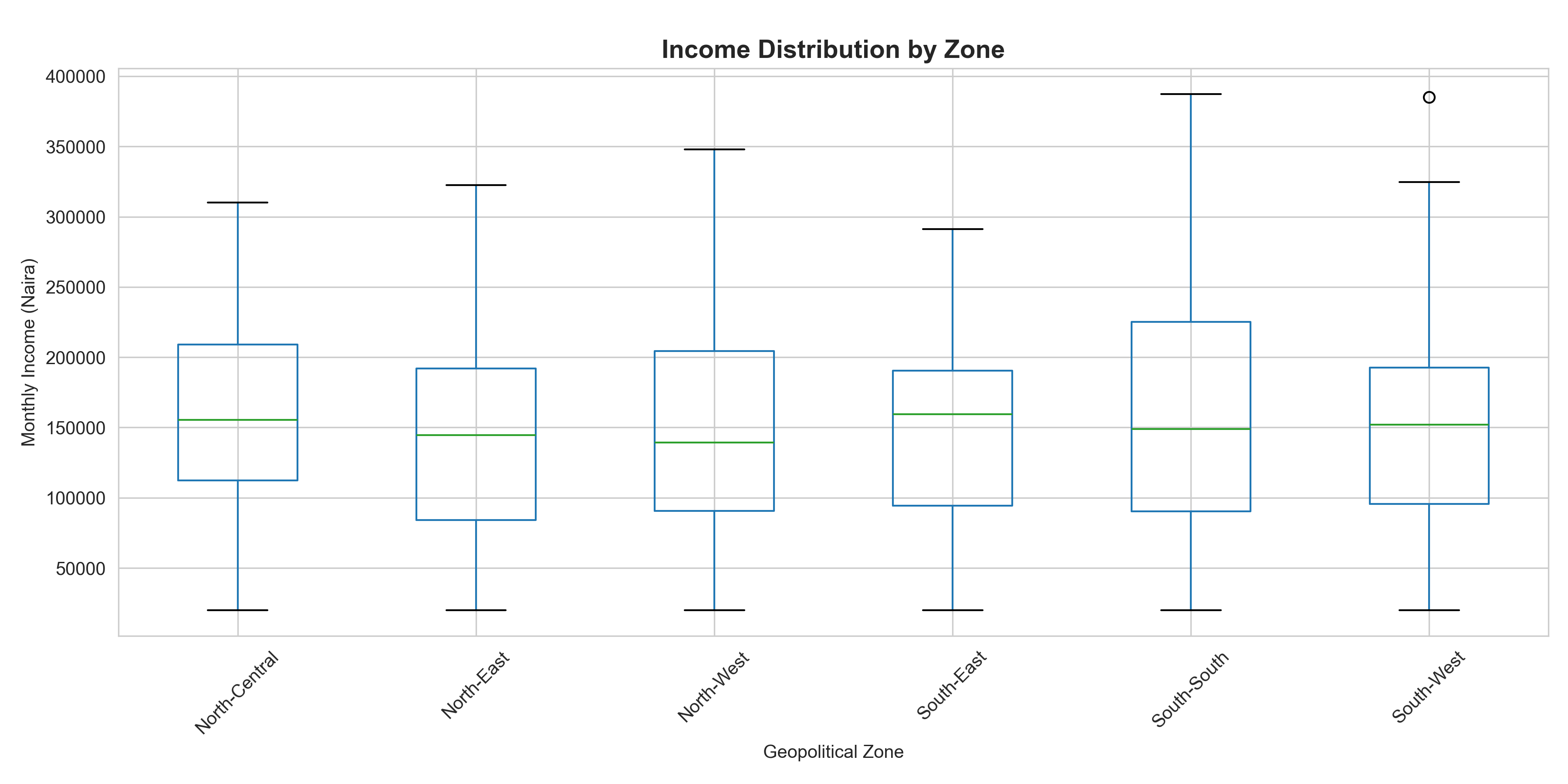
**Distribution**: You want to show the shape, spread, and central tendency of a numeric variable. Histograms show frequency; density plots smooth the distribution; box plots summarize quartiles and outliers; violin plots show the full density by group.
**Trend**: You want to track how a metric changes over time. Line charts are gold standard for time series. Multiple lines allow comparison of trends across groups. Use markers (points) to highlight specific moments.
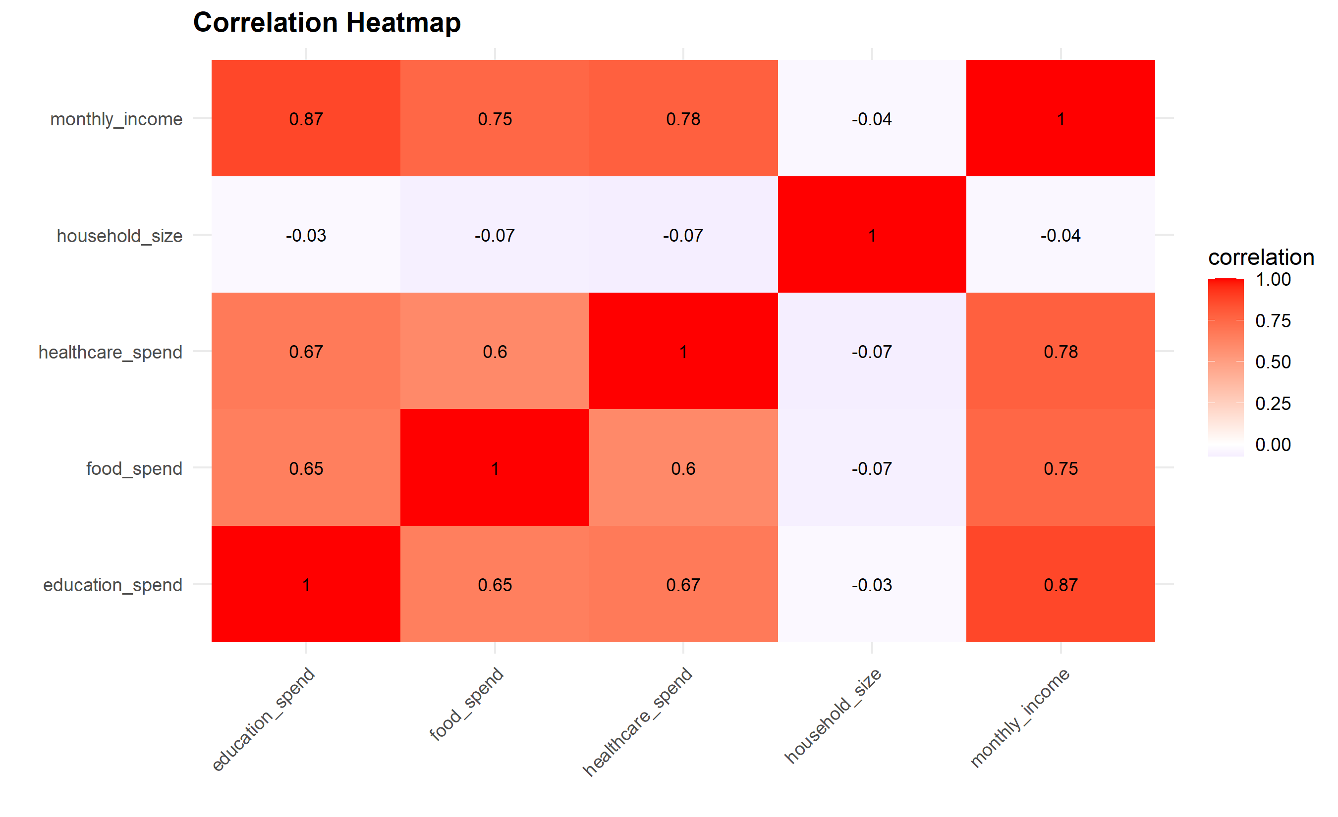
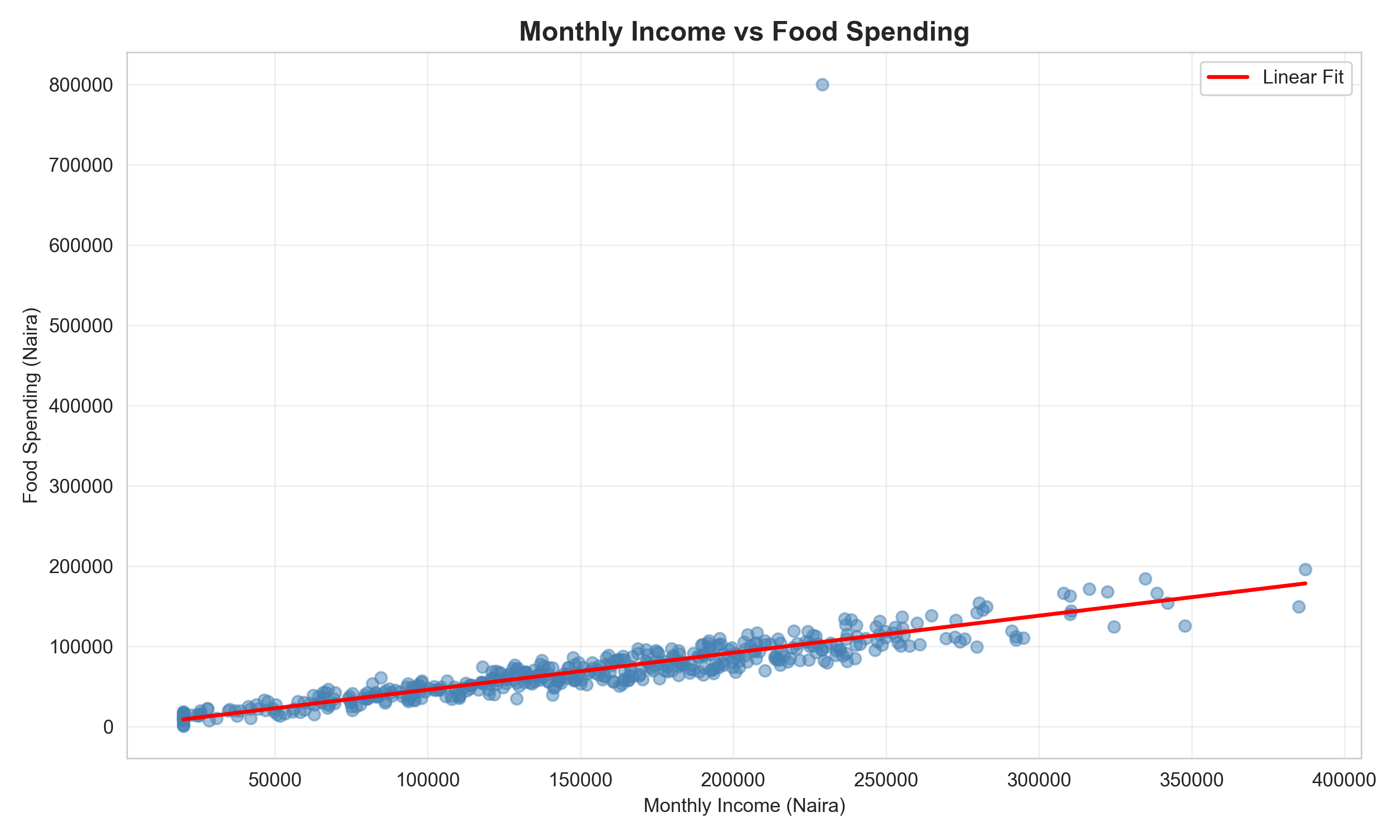
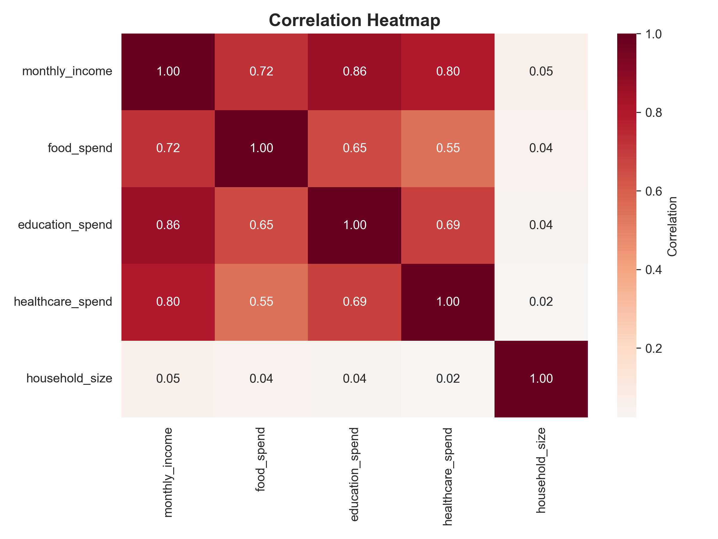
**Relationship**: You want to show how two numeric variables relate. Scatter plots are the workhorse. Overlay a smooth curve to show the trend. Heatmaps show relationship between two categorical variables (or a continuous variable binned into categories).
**Composition**: You want to show how a whole is divided into parts. Stacked bar charts work well. Treemaps (rectangular tiles, sized and coloured by value) are elegant for hierarchical data. Pie charts, despite their ubiquity, are notoriously hard to read—humans judge area and angles poorly. If you must show composition, use a stacked bar chart instead.
**The One Chart to Avoid**: 3D pie charts. They add no information, distort area (making it even harder to compare slices), and look dated. If you're tempted by a 3D pie chart, choose a different chart type.
:::
Let's apply this framework to Nigerian business contexts:
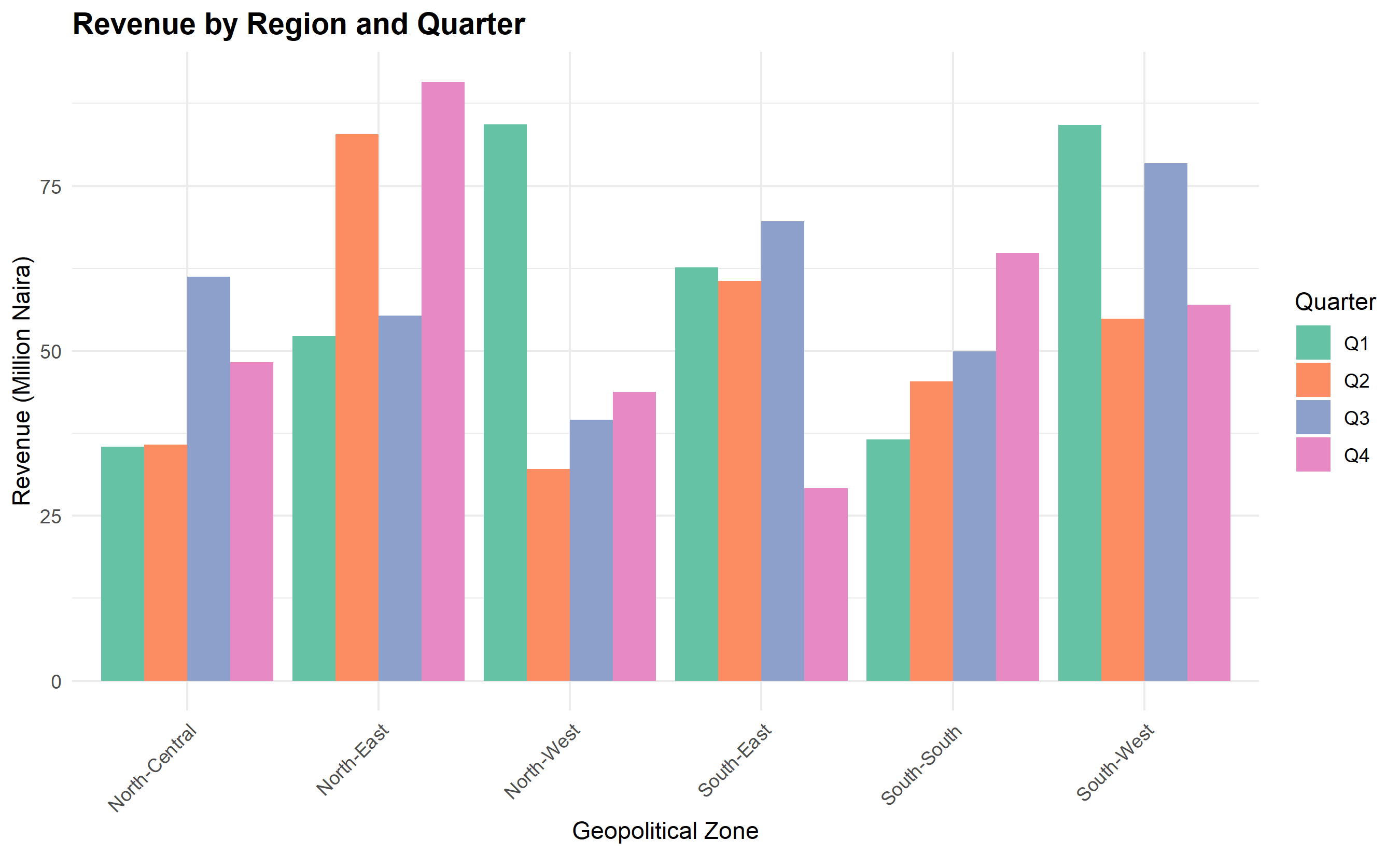
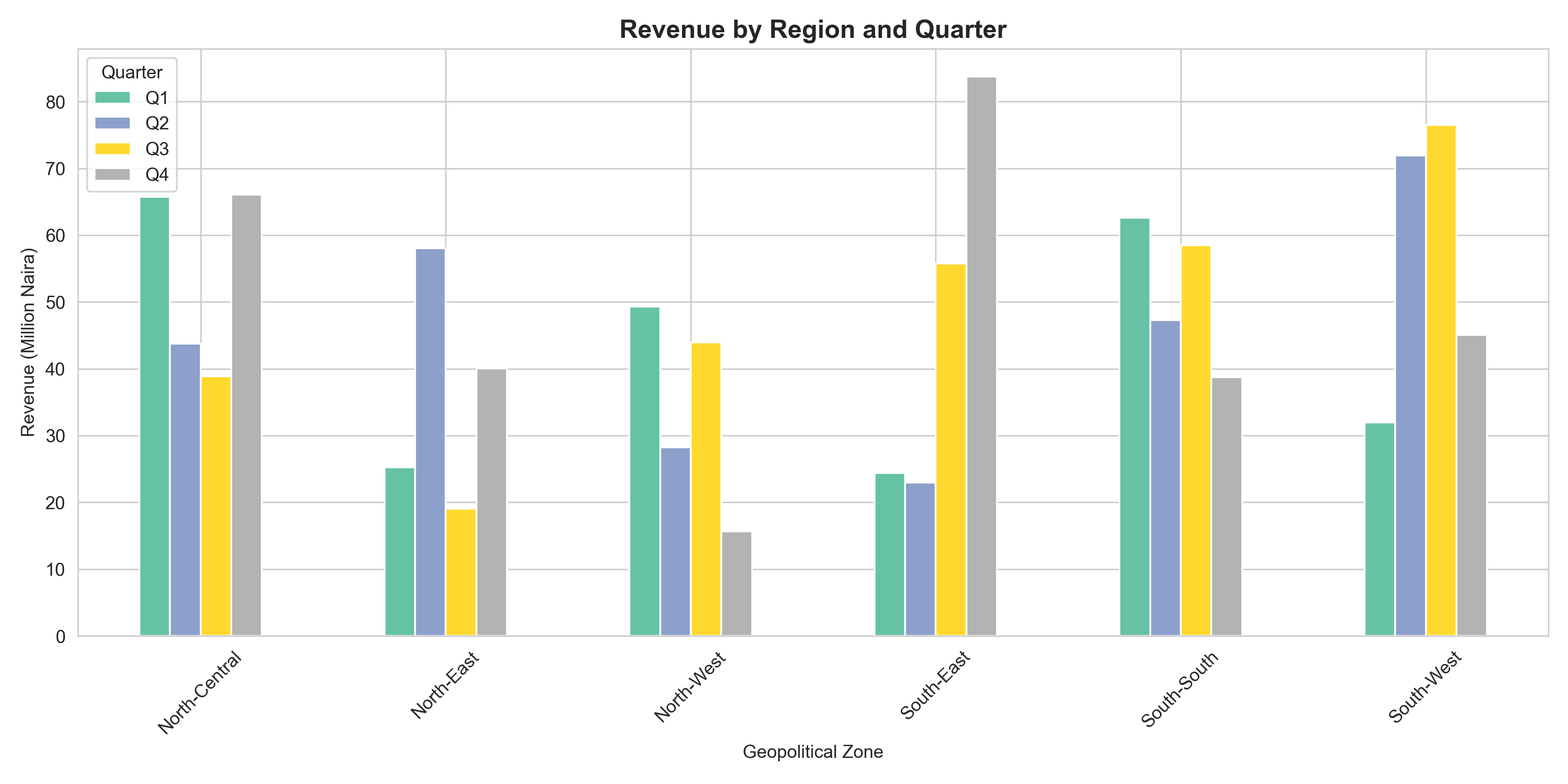
**Example 1: Comparison**. A fintech wants to compare customer acquisition across four regions (Lagos, Abuja, Port Harcourt, Kano) in 2023. A grouped bar chart showing each region with bars for each quarter works well. If regions are ranked, sort the bars by total acquisition to guide the eye.
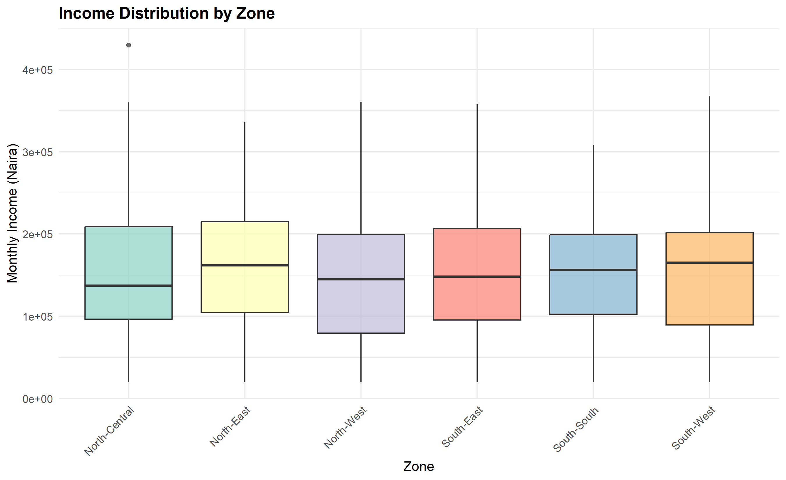
**Example 2: Distribution**. A bank wants to show the distribution of loan amounts to small businesses across Nigeria. A histogram or density plot reveals skewness (most loans are small, few are large). A box plot by sector (agriculture, retail, manufacturing) shows how distributions vary by industry.
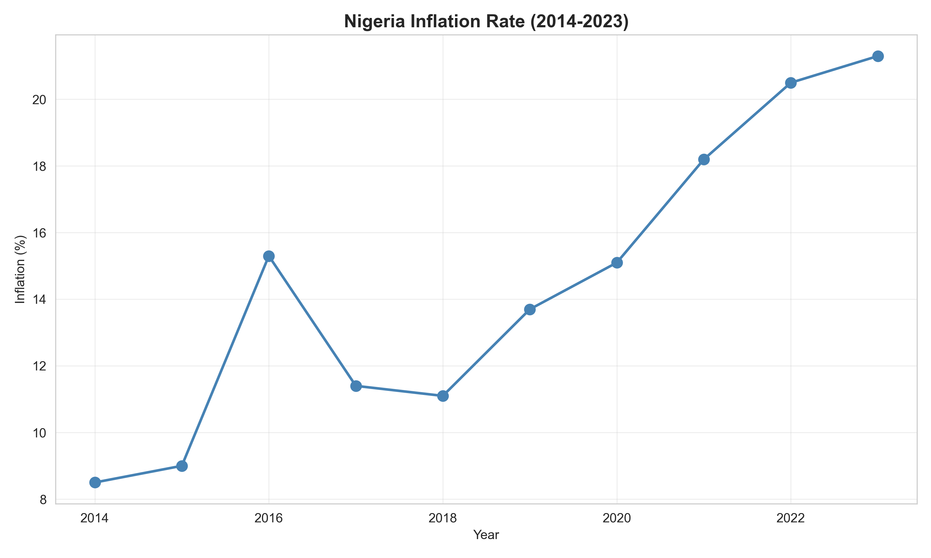
**Example 3: Trend**. A telecom wants to show mobile subscriber growth from 2018 to 2023. A line chart with quarters on the x-axis and millions of subscribers on the y-axis is ideal. If you want to compare growth across provinces, use multiple lines or faceted line charts.
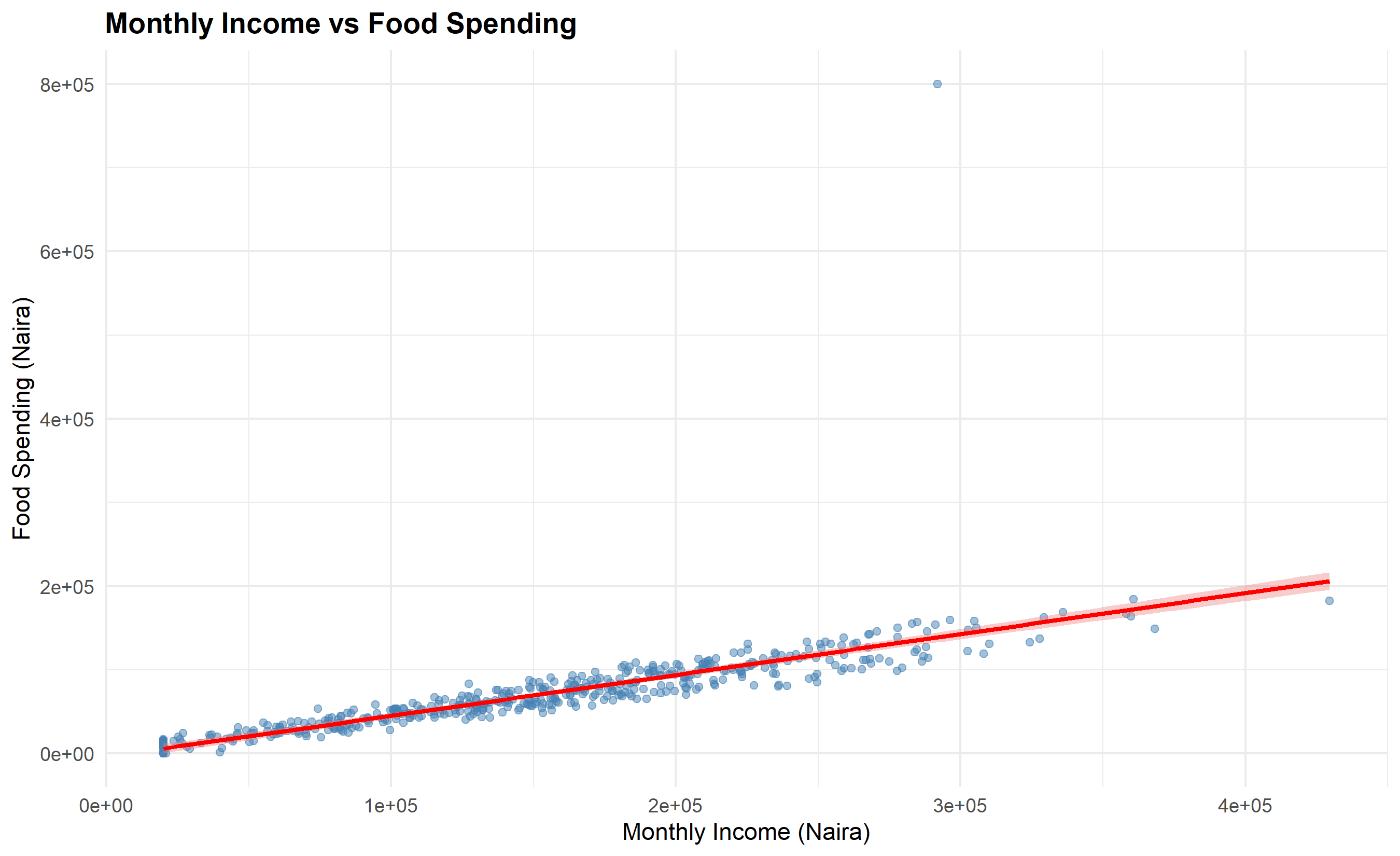
**Example 4: Relationship**. An e-commerce company wants to investigate whether advertising spend predicts sales revenue. A scatter plot (ad spend on x, revenue on y) reveals the association. A regression line overlaid on the scatter makes the trend explicit.
**Example 5: Composition**. A consumer goods company wants to show how revenue breaks down by product category (food, beverages, personal care). A stacked bar chart with categories on the x-axis and revenue on the y-axis is clear. Better yet, use a stacked bar chart with years on the x-axis to show both composition and trend.
::: {.callout-caution icon="false"}
## 📝 Section 5.2 Review Questions
1. For each of the five chart types (comparison, distribution, trend, relationship, composition), name one business question and the chart that answers it.
2. Why is a stacked bar chart useful for showing composition but problematic for comparing values in the middle categories?
3. When would a scatter plot be preferable to a line chart for showing relationship?
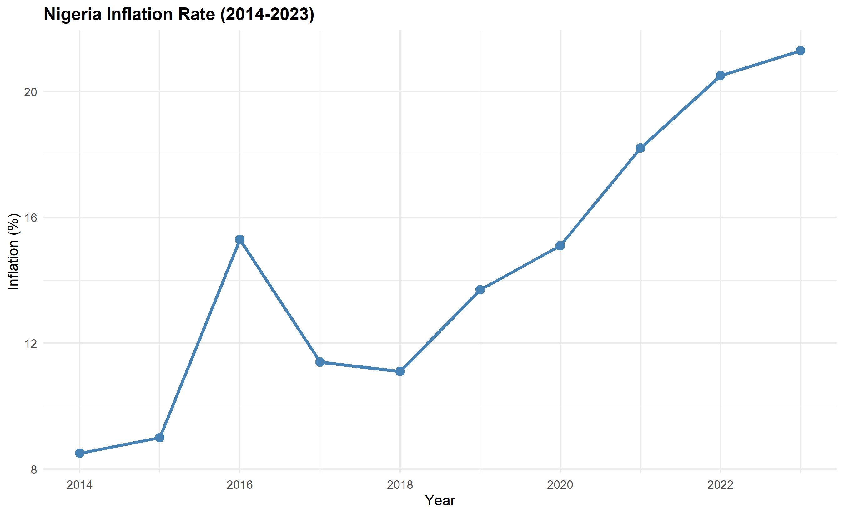
4. Give an example of how you would visualize a trend in inflation across Nigeria over 10 years.
5. Why do 3D pie charts distort the data, and what should you use instead?
:::
## Static Charts with ggplot2 and matplotlib
Now we'll build six chart types side by side in R and Python. We'll use the households dataset from Chapter 4, plus synthetic data for more complex examples.
::: {.panel-tabset}
## R
```{r}
library(tidyverse)
library(ggplot2)

# Prepare enhanced households data for examples
zones <- c("North-West", "North-Central", "North-East",
           "South-West", "South-South", "South-East")

# Chart 1: Grouped Bar Chart (Comparison)
# Revenue by region and quarter (synthetic)
set.seed(7)
revenue_data <- tibble(
  zone = rep(zones, each = 4),
  quarter = rep(c("Q1", "Q2", "Q3", "Q4"), times = 6),
  revenue = rnorm(24, mean = 50, sd = 15)
) |>
  mutate(revenue = pmax(revenue, 5))  # Ensure positive

ggplot(revenue_data, aes(x = zone, y = revenue, fill = quarter)) +
  geom_col(position = "dodge") +
  scale_fill_brewer(palette = "Set2") +
  labs(
    title = "Revenue by Region and Quarter",
    x = "Geopolitical Zone",
    y = "Revenue (Million Naira)",
    fill = "Quarter"
  ) +
  theme_minimal() +
  theme(
    axis.text.x = element_text(angle = 45, hjust = 1),
    plot.title = element_text(face = "bold", size = 14)
  )
# Chart 2: Line Chart (Trend)
# Inflation trend over time
inflation_data <- tibble(
  year = 2014:2023,
  inflation = c(8.5, 9.0, 15.3, 11.4, 11.1, 13.7, 15.1, 18.2, 20.5, 21.3)
)

ggplot(inflation_data, aes(x = year, y = inflation)) +
  geom_line(linewidth = 1.2, color = "steelblue") +
  geom_point(size = 3, color = "steelblue") +
  labs(
    title = "Nigeria Inflation Rate (2014-2023)",
    x = "Year",
    y = "Inflation (%)"
  ) +
  theme_minimal() +
  theme(plot.title = element_text(face = "bold"))
# Chart 3: Scatter Plot (Relationship)
ggplot(households, aes(x = monthly_income, y = food_spend)) +
  geom_point(alpha = 0.5, color = "steelblue") +
  geom_smooth(method = "lm", se = TRUE, color = "red", fill = "lightcoral") +
  labs(
    title = "Monthly Income vs Food Spending",
    x = "Monthly Income (Naira)",
    y = "Food Spending (Naira)"
  ) +
  theme_minimal() +
  theme(plot.title = element_text(face = "bold"))
# Chart 4: Box Plot (Distribution by Group)
ggplot(households, aes(x = zone, y = monthly_income, fill = zone)) +
  geom_boxplot(alpha = 0.7) +
  scale_fill_brewer(palette = "Set3") +
  labs(
    title = "Income Distribution by Zone",
    x = "Zone",
    y = "Monthly Income (Naira)",
    fill = "Zone"
  ) +
  theme_minimal() +
  theme(
    axis.text.x = element_text(angle = 45, hjust = 1),
    legend.position = "none",
    plot.title = element_text(face = "bold")
  )
# Chart 5: Heatmap (Correlation)
corr_matrix <- households |>
  select(monthly_income, food_spend, education_spend,
         healthcare_spend, household_size) |>
  cor(use = "complete.obs")

corr_df <- corr_matrix |>
  as_tibble(rownames = "var1") |>
  pivot_longer(-var1, names_to = "var2", values_to = "correlation")

ggplot(corr_df, aes(x = var1, y = var2, fill = correlation)) +
  geom_tile() +
  geom_text(aes(label = round(correlation, 2)), color = "black", size = 3) +
  scale_fill_gradient2(low = "blue", mid = "white", high = "red", midpoint = 0) +
  labs(
    title = "Correlation Heatmap",
    x = "",
    y = ""
  ) +
  theme_minimal() +
  theme(
    axis.text.x = element_text(angle = 45, hjust = 1),
    plot.title = element_text(face = "bold")
  )
# Chart 6: Faceted Small Multiples (Distribution across groups)
ggplot(households, aes(x = food_spend)) +
  facet_wrap(~zone, scales = "free") +
  geom_histogram(bins = 15, fill = "steelblue", color = "white") +
  labs(
    title = "Food Spending Distribution by Zone",
    x = "Food Spending (Naira)",
    y = "Frequency"
  ) +
  theme_minimal() +
  theme(plot.title = element_text(face = "bold"))
```
## Python
```{python}
import pandas as pd
import numpy as np
import matplotlib.pyplot as plt
import seaborn as sns
# Set seaborn style
sns.set_style("whitegrid")
# Chart 1: Grouped Bar Chart
zones = ["North-West", "North-Central", "North-East",
"South-West", "South-South", "South-East"]
quarters = ["Q1", "Q2", "Q3", "Q4"]
revenue_data = pd.DataFrame({
'zone': np.repeat(zones, 4),
'quarter': quarters * 6,
'revenue': np.clip(np.random.normal(50, 15, 24), 5, None)
})
pivot_data = revenue_data.pivot(index='zone', columns='quarter', values='revenue')
pivot_data.plot(kind='bar', figsize=(12, 6), colormap='Set2')
plt.title("Revenue by Region and Quarter", fontsize=14, fontweight='bold')
plt.xlabel("Geopolitical Zone")
plt.ylabel("Revenue (Million Naira)")
plt.legend(title="Quarter")
plt.xticks(rotation=45)
plt.tight_layout()
plt.show()
# Chart 2: Line Chart
years = np.arange(2014, 2024)
inflation = np.array([8.5, 9.0, 15.3, 11.4, 11.1, 13.7, 15.1, 18.2, 20.5, 21.3])

plt.figure(figsize=(10, 6))
plt.plot(years, inflation, marker='o', linewidth=2, markersize=8, color='steelblue')
plt.title("Nigeria Inflation Rate (2014-2023)", fontsize=14, fontweight='bold')
plt.xlabel("Year")
plt.ylabel("Inflation (%)")
plt.grid(alpha=0.3)
plt.tight_layout()
plt.show()
# Chart 3: Scatter Plot
# Drop rows where either variable is NA before fitting
valid_sc = households[['monthly_income', 'food_spend']].dropna()
plt.figure(figsize=(10, 6))
plt.scatter(valid_sc['monthly_income'], valid_sc['food_spend'],
            alpha=0.5, color='steelblue')
z = np.polyfit(valid_sc['monthly_income'], valid_sc['food_spend'], 1)
p = np.poly1d(z)
x_line = np.linspace(valid_sc['monthly_income'].min(),
                     valid_sc['monthly_income'].max(), 100)
plt.plot(x_line, p(x_line), color='red', linewidth=2, label='Linear Fit')
plt.xlabel('Monthly Income (Naira)')
plt.ylabel('Food Spending (Naira)')
plt.title('Monthly Income vs Food Spending', fontsize=14, fontweight='bold')
plt.legend()
plt.grid(alpha=0.3)
plt.tight_layout()
plt.show()
# Chart 4: Box Plot
households.boxplot(column='monthly_income', by='zone', figsize=(12, 6))
plt.xlabel("Geopolitical Zone")
plt.ylabel("Monthly Income (Naira)")
plt.title("Income Distribution by Zone", fontsize=14, fontweight='bold')
plt.suptitle('') # Remove automatic title
plt.xticks(rotation=45)
plt.tight_layout()
plt.show()
# Chart 5: Heatmap
corr_matrix = households[['monthly_income', 'food_spend', 'education_spend',
                          'healthcare_spend', 'household_size']].corr()
plt.figure(figsize=(8, 6))
sns.heatmap(corr_matrix, annot=True, fmt='.2f', cmap='RdBu_r', center=0,
            cbar_kws={'label': 'Correlation'})
plt.title("Correlation Heatmap", fontsize=14, fontweight='bold')
plt.tight_layout()
plt.show()
# Chart 6: Faceted Histograms
fig, axes = plt.subplots(2, 3, figsize=(14, 8))
axes = axes.flatten()
for i, zone in enumerate(zones):
    zone_data = households[households['zone'] == zone]['food_spend']
    axes[i].hist(zone_data.dropna(), bins=15, color='steelblue', edgecolor='white')
    axes[i].set_title(zone, fontweight='bold')
    axes[i].set_xlabel('Food Spending (Naira)')
    axes[i].set_ylabel('Frequency')
plt.suptitle('Food Spending Distribution by Zone', fontsize=14, fontweight='bold')
plt.tight_layout()
plt.show()
```
:::
::: {.callout-caution icon="false"}
## 📝 Section 5.3 Review Questions
1. For a grouped bar chart, why is it important to sort bars or group them in a meaningful way?
2. When building a line chart with multiple lines, how do you ensure they don't look cluttered?
3. What is the purpose of adding a smooth curve (e.g., a regression line) to a scatter plot?
4. In a faceted chart (small multiples), why is it sometimes important to use free scales vs. fixed scales?
5. How would you visualize the relationship between three numeric variables (e.g., income, spending, household size) in a single chart?
:::
## Interactive Charts with Plotly
Static charts are excellent for reports and papers. Interactive charts shine in dashboards, where users can explore data themselves. Plotly is a JavaScript visualization library with Python and R bindings, enabling hover tooltips, zooming, filtering, and animation.
::: {.panel-tabset}
## R
```{r}
library(plotly)

# Interactive scatter plot
p1 <- ggplot(households, aes(x = monthly_income, y = food_spend,
                             color = zone, size = household_size)) +
  geom_point(alpha = 0.6) +
  scale_color_brewer(palette = "Set2") +
  labs(
    title = "Household Income vs Food Spending (Interactive)",
    x = "Monthly Income (Naira)",
    y = "Food Spending (Naira)",
    color = "Zone",
    size = "Household Size"
  ) +
  theme_minimal()

# Convert to interactive
ggplotly(p1, tooltip = c("x", "y", "color", "size"))
# Interactive bar chart: revenue by zone and quarter
revenue_interactive <- plotly::plot_ly(
  revenue_data,
  x = ~zone,
  y = ~revenue,
  color = ~quarter,
  type = "bar"
) |>
  layout(
    title = "Revenue by Region and Quarter (Interactive)",
    xaxis = list(title = "Zone"),
    yaxis = list(title = "Revenue (Million Naira)"),
    barmode = "group",
    hovermode = "closest"
  )

revenue_interactive
# Interactive line chart with multiple series
inflation_interactive <- plotly::plot_ly(
  inflation_data,
  x = ~year,
  y = ~inflation,
  type = "scatter",
  mode = "lines+markers"
) |>
  add_trace(
    y = ~inflation * 0.95,
    name = "Adjusted",
    mode = "lines"
  ) |>
  layout(
    title = "Nigeria Inflation Rate Comparison",
    xaxis = list(title = "Year"),
    yaxis = list(title = "Inflation (%)"),
    hovermode = "x unified"
  )

inflation_interactive
```
## Python
```{python}
import plotly.express as px
import plotly.graph_objects as go
from plotly.subplots import make_subplots

# Interactive scatter plot
fig = px.scatter(
    households,
    x='monthly_income',
    y='food_spend',
    color='zone',
    size='household_size',
    hover_data=['household_id', 'state'],
    title='Household Income vs Food Spending (Interactive)',
    labels={
        'monthly_income': 'Monthly Income (Naira)',
        'food_spend': 'Food Spending (Naira)',
        'zone': 'Zone',
        'household_size': 'Household Size'
    }
)
fig.show()
# Interactive bar chart
fig = px.bar(
    revenue_data,
    x='zone',
    y='revenue',
    color='quarter',
    barmode='group',
    title='Revenue by Region and Quarter (Interactive)',
    labels={
        'zone': 'Geopolitical Zone',
        'revenue': 'Revenue (Million Naira)',
        'quarter': 'Quarter'
    }
)
fig.show()
# Interactive line chart
inflation_df = pd.DataFrame({
    'year': years,
    'inflation': inflation,
    'adjusted': inflation * 0.95
})

fig = go.Figure()
fig.add_trace(go.Scatter(
    x=inflation_df['year'],
    y=inflation_df['inflation'],
    mode='lines+markers',
    name='Actual',
    line=dict(color='steelblue', width=2),
    marker=dict(size=8)
))
fig.add_trace(go.Scatter(
    x=inflation_df['year'],
    y=inflation_df['adjusted'],
    mode='lines',
    name='Adjusted',
    line=dict(color='red', width=2, dash='dash')
))
fig.update_layout(
    title='Nigeria Inflation Rate Comparison',
    xaxis_title='Year',
    yaxis_title='Inflation (%)',
    hovermode='x unified'
)
fig.show()
# Interactive heatmap
fig = go.Figure(data=go.Heatmap(
    z=corr_matrix.values,
    x=corr_matrix.columns,
    y=corr_matrix.columns,
    colorscale='RdBu',
    zmid=0
))
fig.update_layout(title='Correlation Heatmap (Interactive)')
fig.show()
```
:::
::: {.callout-caution icon="false"}
## 📝 Section 5.4 Review Questions
1. What interactivity features does Plotly add that static matplotlib or ggplot2 cannot provide?
2. When designing an interactive dashboard, why is it important to set sensible defaults?
3. How would you use hover tooltips to provide context without cluttering the chart?
4. What is a limitation of interactive visualizations in PDF or print contexts?
5. How might you combine multiple Plotly charts into a single dashboard using Dash (Python) or Shiny (R)?
:::
## Colour, Typography, and Accessibility
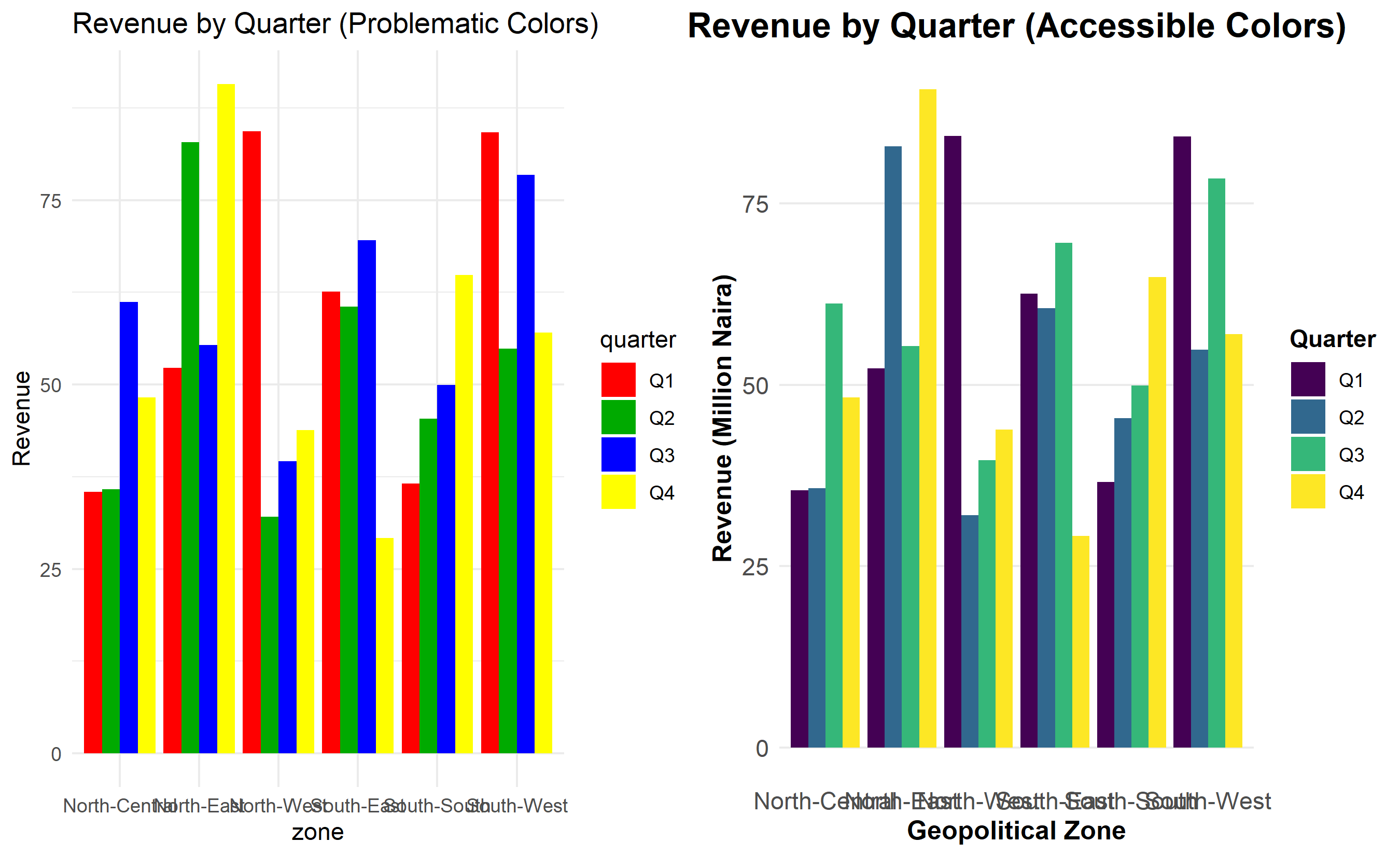
A beautifully designed chart is useless if it excludes readers. Approximately 8% of men and 0.5% of women are colourblind; many readers have low vision; some use screen readers. Designing for accessibility benefits everyone.
::: {.callout-note icon="false"}
## 📘 Theory: Accessible Colour and Design
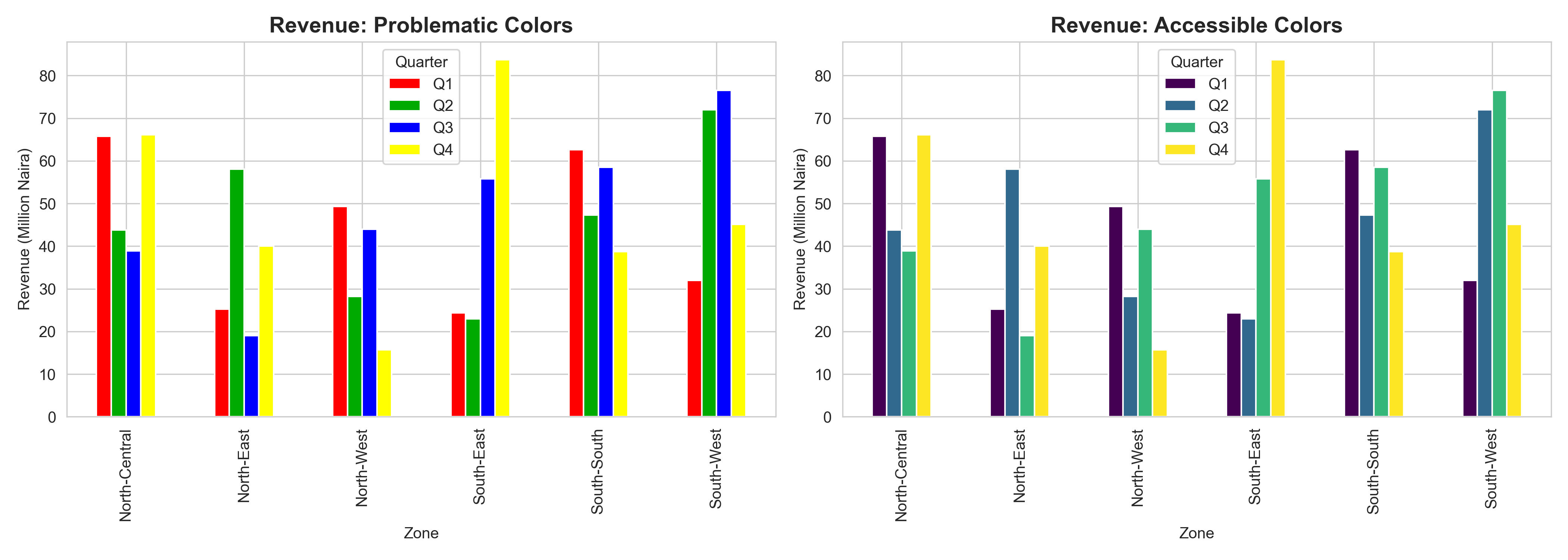
**Colour blindness** comes in forms. Red-green colour blindness (protanopia or deuteranopia) affects 1–2% of the population and makes red and green indistinguishable. The viridis family of colour palettes (viridis, plasma, inferno, cividis) were specifically designed to be distinguishable to colourblind readers and also look good in grayscale. The Okabe-Ito palette is another accessible alternative. Always avoid red-green combinations without additional cues (e.g., also vary size or shape).
**Typography** affects readability. Larger fonts (minimum 12pt for body text) help readers with low vision. Sans-serif fonts (Helvetica, Arial) are more legible than serif fonts on screens. A clear hierarchy—bold, larger font for titles; smaller, gray font for annotations—guides the eye. Avoid all-caps text except for small labels.
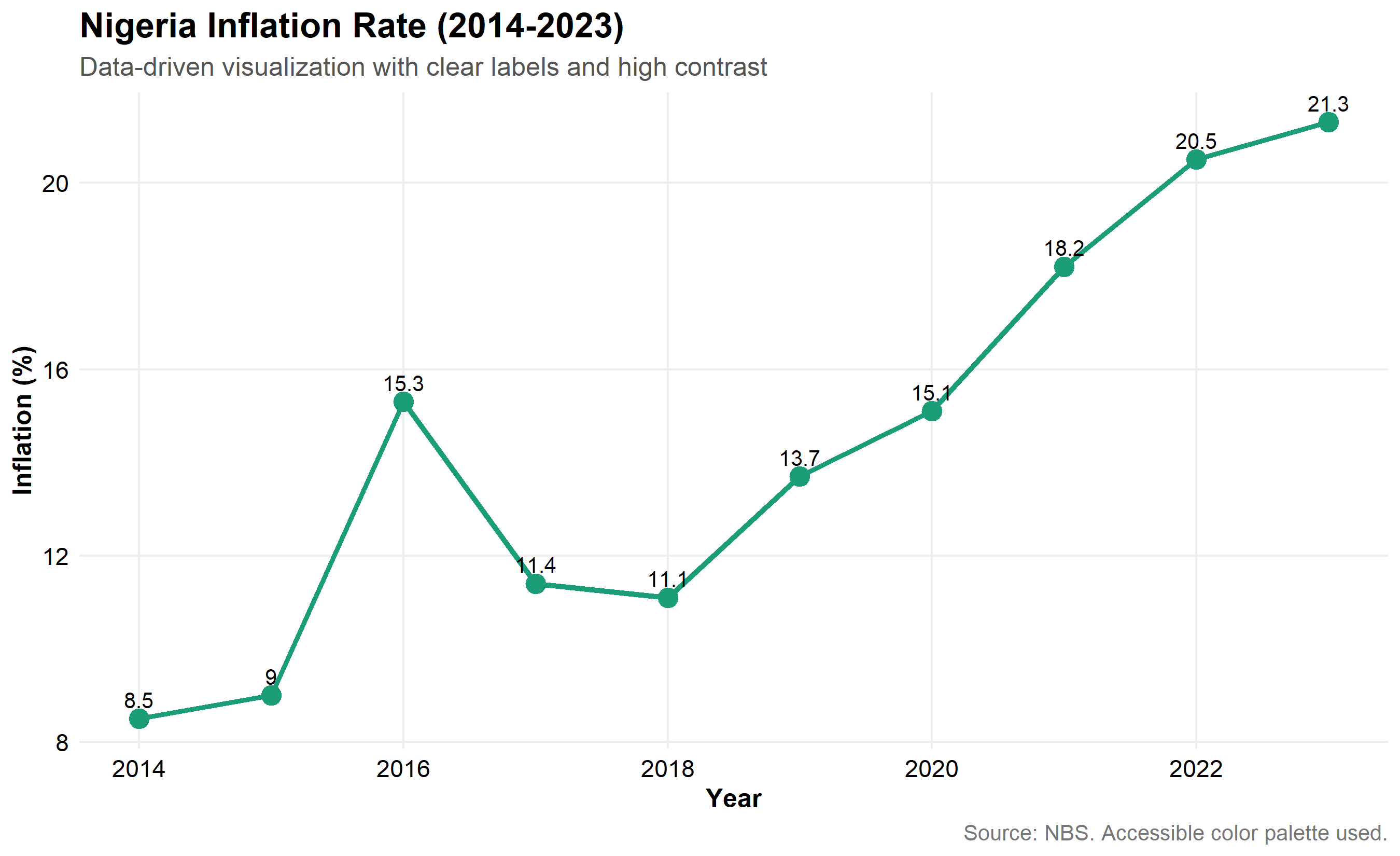
**Contrast ratio** (between text and background) should be at least 4.5:1 for normal text, 3:1 for large text, per WCAG guidelines. Dark text on light background or vice versa. Avoid light gray text on white background—too hard to read.
**Data-to-ink ratio**, a concept from Edward Tufte, measures the fraction of a visualization dedicated to showing data vs. chart ornament (gridlines, axes, labels). Remove unnecessary gridlines, avoid 3D effects, and eliminate decorative elements that don't aid understanding.
:::
::: {.panel-tabset}
## R
```{r}
# Create two versions of the same chart: one with poor color, one with accessible color

# Poor: Red-green color blindness issue
bad_chart <- ggplot(revenue_data, aes(x = zone, y = revenue, fill = quarter)) +
  geom_col(position = "dodge") +
  scale_fill_manual(values = c("Q1" = "#FF0000", "Q2" = "#00AA00",
                               "Q3" = "#0000FF", "Q4" = "#FFFF00")) +
  labs(title = "Revenue by Quarter (Problematic Colors)", y = "Revenue") +
  theme_minimal()

# Good: Using viridis color palette (colorblind-friendly)
good_chart <- ggplot(revenue_data, aes(x = zone, y = revenue, fill = quarter)) +
  geom_col(position = "dodge") +
  scale_fill_viridis_d(option = "viridis") +
  labs(
    title = "Revenue by Quarter (Accessible Colors)",
    x = "Geopolitical Zone",
    y = "Revenue (Million Naira)",
    fill = "Quarter"
  ) +
  theme_minimal() +
  theme(
    plot.title = element_text(
      size = 16,
      face = "bold",
      hjust = 0.5
    ),
    axis.text = element_text(size = 11),
    axis.title = element_text(size = 12, face = "bold"),
    legend.title = element_text(size = 11, face = "bold"),
    panel.grid.minor = element_blank(),
    panel.grid.major.x = element_blank()
  )

# Display side by side
gridExtra::grid.arrange(bad_chart, good_chart, ncol = 2)
# Demonstration: High contrast with clear labels
accessibility_demo <- ggplot(
  inflation_data,
  aes(x = year, y = inflation)
) +
  geom_line(linewidth = 1.2, color = "#1B9E77") +
  geom_point(size = 4, color = "#1B9E77") +
  geom_text(
    aes(label = round(inflation, 1)),
    vjust = -0.7,
    size = 3.5,
    color = "#000000"
  ) +
  labs(
    title = "Nigeria Inflation Rate (2014-2023)",
    subtitle = "Data-driven visualization with clear labels and high contrast",
    x = "Year",
    y = "Inflation (%)",
    caption = "Source: NBS. Accessible color palette used."
  ) +
  theme_minimal() +
  theme(
    plot.title = element_text(size = 16, face = "bold"),
    plot.subtitle = element_text(size = 12, color = "#555555"),
    plot.caption = element_text(size = 10, color = "#777777"),
    axis.text = element_text(size = 11, color = "#000000"),
    axis.title = element_text(size = 12, face = "bold"),
    panel.grid.major = element_line(color = "#EEEEEE"),
    panel.grid.minor = element_blank(),
    panel.background = element_rect(fill = "#FFFFFF", color = NA),
    plot.background = element_rect(fill = "#FFFFFF", color = NA)
  )

accessibility_demo
```
## Python
```{python}
# Demonstrate accessible vs. problematic color choices
fig, axes = plt.subplots(1, 2, figsize=(14, 5))

# Poor color choices
pivot_data.plot(kind='bar', ax=axes[0], color=['#FF0000', '#00AA00', '#0000FF', '#FFFF00'])
axes[0].set_title("Revenue: Problematic Colors", fontsize=14, fontweight='bold')
axes[0].set_ylabel("Revenue (Million Naira)")
axes[0].set_xlabel("Zone")
axes[0].legend(title="Quarter")

# Good color choices (viridis)
pivot_data.plot(kind='bar', ax=axes[1], colormap='viridis')
axes[1].set_title("Revenue: Accessible Colors", fontsize=14, fontweight='bold')
axes[1].set_ylabel("Revenue (Million Naira)")
axes[1].set_xlabel("Zone")
axes[1].legend(title="Quarter")

plt.tight_layout()
plt.show()
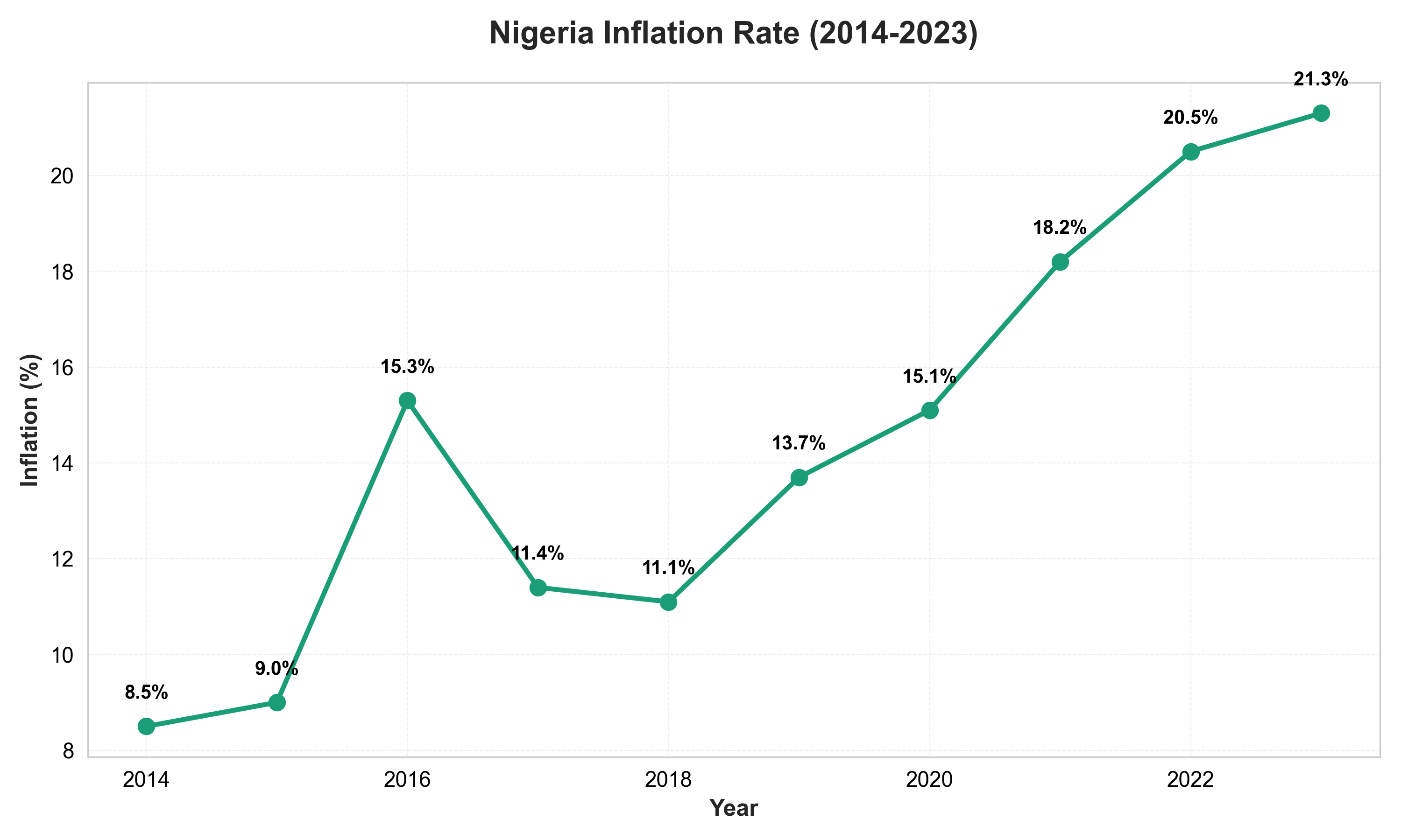
# High contrast, clear labeling demonstration
fig, ax = plt.subplots(figsize=(10, 6))
ax.plot(years, inflation, marker='o', linewidth=2.5, markersize=8,
        color='#1B9E77', label='Inflation Rate')

# Add data labels for clarity
for x, y in zip(years, inflation):
    ax.text(x, y + 0.5, f'{y:.1f}%', ha='center', va='bottom',
            fontsize=10, fontweight='bold', color='#000000')

ax.set_title("Nigeria Inflation Rate (2014-2023)", fontsize=16, fontweight='bold', pad=20)
ax.set_xlabel("Year", fontsize=12, fontweight='bold')
ax.set_ylabel("Inflation (%)", fontsize=12, fontweight='bold')
ax.grid(True, alpha=0.3, linestyle='--', linewidth=0.5)
ax.set_axisbelow(True)

# High contrast background
ax.set_facecolor('#FFFFFF')
fig.patch.set_facecolor('#FFFFFF')

# Improve text readability
ax.tick_params(axis='both', which='major', labelsize=11, colors='#000000')

plt.tight_layout()
plt.show()
```
:::
::: {.callout-caution icon="false"}
## 📝 Section 5.5 Review Questions
1. Why is the viridis colour palette preferable to a red-green palette for visualizations?
2. What is the WCAG contrast ratio requirement, and why does it matter?
3. How does the data-to-ink ratio principle improve chart clarity?
4. Name three accessibility features that benefit not just readers with disabilities but everyone.
5. How would you test whether your visualization is accessible to colourblind readers?
:::
## Storytelling with Data
A chart is not a data dump; it's a communication tool. The best charts tell a story: they set context, highlight a complication or surprise, and resolve it with insight. This is the **Story-Complication-Resolution (SCR) framework**.
::: {.callout-note icon="false"}
## 📘 Theory: The SCR Framework and Audience Design
**Story (Context)**: Start by orienting your audience. Who? What? When? Where? Why do they care? "Nigeria's inflation has been a persistent challenge" sets context. Without context, a chart is just numbers.
**Complication (Tension)**: Present the surprising or concerning finding. "But over the past three years, inflation has accelerated sharply." A static inflation rate is not news; acceleration is. Highlight the relevant part of your chart—use colour, arrows, or annotations to draw attention.
**Resolution (Insight)**: Explain what the audience should do with this knowledge. "This suggests central bank policy intervention may be necessary" or "Consumers should expect price pressures in 2024." A good visualization doesn't end with "here's the data"; it ends with "here's what it means."
Different audiences need different designs. A **technical audience** (data scientists, analysts) wants detail, annotations, and confidence intervals. A **business audience** (executives, board members) wants clarity, simplicity, and actionable insights. A **general audience** (public, media) wants context, intuition, and minimal jargon.
:::
Here's how to apply SCR to a business chart:
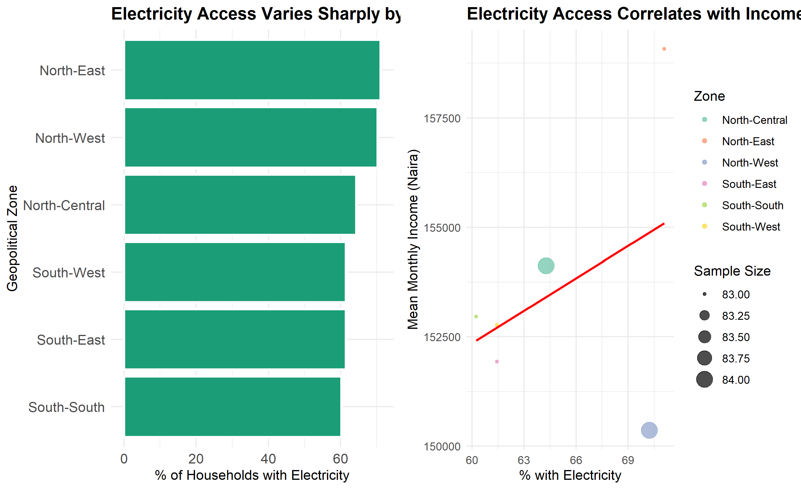
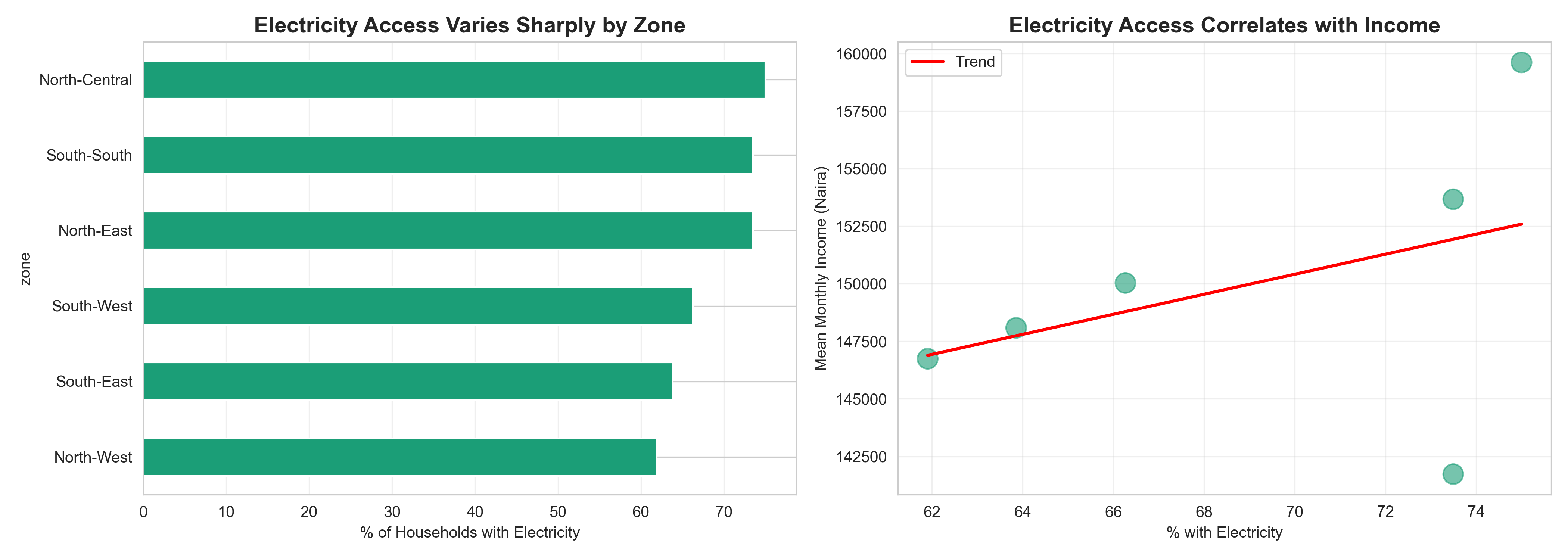
**Example: Electricity Access and Income Inequality**
*Story*: "Access to electricity is a marker of development inequality across Nigeria's geopolitical zones."
*Complication*: "Our analysis of 500 households reveals that electricity access varies from 85% in the South-West to just 40% in the North-East. Moreover, electricity access correlates strongly with income."
*Resolution*: "These disparities suggest targeting rural electrification in the North could reduce inequality and unlock economic opportunity."
To communicate this story visually, you might use:
1. A map (or bar chart) showing electricity access by zone (Story + Complication).
2. A scatter plot of income vs. electricity access with colour by zone (Complication deepened).
3. A summary box highlighting the inequality gap (Resolution).
::: {.panel-tabset}
## R
```{r}
# Story: Electricity Access and Income

# Create a composite visualization telling the story
story_data <- households |>
  group_by(zone) |>
  summarise(
    mean_income = mean(monthly_income, na.rm = TRUE),
    pct_electricity = 100 * mean(has_electricity),
    n = n(),
    .groups = "drop"
  ) |>
  arrange(pct_electricity)

# Chart 1: Story—Electricity access by zone
chart1 <- ggplot(story_data, aes(x = reorder(zone, pct_electricity),
                                  y = pct_electricity)) +
  geom_col(fill = "#1B9E77", color = "white", linewidth = 1) +
  coord_flip() +
  labs(
    title = "Electricity Access Varies Sharply by Zone",
    x = "Geopolitical Zone",
    y = "% of Households with Electricity"
  ) +
  theme_minimal() +
  theme(
    plot.title = element_text(size = 14, face = "bold"),
    axis.text = element_text(size = 11)
  )

# Chart 2: Complication—The income inequality story
chart2 <- ggplot(story_data, aes(x = pct_electricity, y = mean_income,
                                  color = zone, size = n)) +
  geom_point(alpha = 0.7) +
  geom_smooth(inherit.aes = FALSE,
              mapping = aes(x = pct_electricity, y = mean_income),
              method = "lm", se = FALSE, color = "red", linewidth = 1) +
  scale_color_brewer(palette = "Set2") +
  labs(
    title = "Electricity Access Correlates with Income",
    x = "% with Electricity",
    y = "Mean Monthly Income (Naira)",
    color = "Zone",
    size = "Sample Size"
  ) +
  theme_minimal() +
  theme(
    plot.title = element_text(size = 14, face = "bold"),
    legend.position = "right"
  )

# Combine for narrative flow
gridExtra::grid.arrange(chart1, chart2, ncol = 2)
# Add a summary annotation (Resolution)
cat("\n=== KEY INSIGHT (RESOLUTION) ===\n")
cat("Electricity access ranges from",
min(story_data$pct_electricity) |> round(1), "% (North-East) to",
max(story_data$pct_electricity) |> round(1), "% (South-West).\n")
cat("Households with electricity have on average",
format(
(story_data |> filter(pct_electricity > 70) |> pull(mean_income) |> mean()) -
(story_data |> filter(pct_electricity < 70) |> pull(mean_income) |> mean()),
big.mark = ","
),
"naira higher monthly income.\n")
cat("\nRecommendation: Prioritize rural electrification in underserved zones.\n")
```
## Python
```{python}
# Story: Electricity Access and Income

story_data = households.groupby('zone').agg({
    'monthly_income': 'mean',
    'has_electricity': lambda x: 100 * x.mean(),
    'household_id': 'count'
}).rename(columns={'household_id': 'count'})
story_data = story_data.sort_values('has_electricity')

# Chart 1: Story—Electricity access by zone
fig, axes = plt.subplots(1, 2, figsize=(14, 5))

# Left: Bar chart
story_data['has_electricity'].plot(kind='barh', ax=axes[0], color='#1B9E77')
axes[0].set_xlabel('% of Households with Electricity')
axes[0].set_title('Electricity Access Varies Sharply by Zone', fontsize=14, fontweight='bold')
axes[0].grid(axis='x', alpha=0.3)

# Right: Scatter plot
axes[1].scatter(story_data['has_electricity'], story_data['monthly_income'],
                s=story_data['count']*2, alpha=0.6, color='#1B9E77')
# Add regression line
z = np.polyfit(story_data['has_electricity'], story_data['monthly_income'], 1)
p = np.poly1d(z)
x_line = np.linspace(story_data['has_electricity'].min(),
                     story_data['has_electricity'].max(), 100)
axes[1].plot(x_line, p(x_line), color='red', linewidth=2, label='Trend')
axes[1].set_xlabel('% with Electricity')
axes[1].set_ylabel('Mean Monthly Income (Naira)')
axes[1].set_title('Electricity Access Correlates with Income', fontsize=14, fontweight='bold')
axes[1].legend()
axes[1].grid(alpha=0.3)

plt.tight_layout()
plt.show()
# Resolution: Summary insight
print("\n=== KEY INSIGHT (RESOLUTION) ===")
print(f"Electricity access ranges from {story_data['has_electricity'].min():.1f}% "
f"to {story_data['has_electricity'].max():.1f}%.")
high_elec = story_data[story_data['has_electricity'] > 70]['monthly_income'].mean()
low_elec = story_data[story_data['has_electricity'] < 70]['monthly_income'].mean()
print(f"Income difference: {high_elec - low_elec:,.0f} naira on average.")
print("\nRecommendation: Prioritize rural electrification in underserved zones.")
```
:::
::: {.callout-caution icon="false"}
## 📝 Section 5.6 Review Questions
1. Explain the SCR (Story-Complication-Resolution) framework and how it applies to data visualization.
2. How would you adapt a technical visualization (for analysts) into a business-friendly visualization (for executives)?
3. What role do annotations (titles, arrows, text labels) play in guiding a viewer through a data story?
4. Give an example of a "complication" that would justify showing multiple views of the same data.
5. How do you balance detail with simplicity when telling a data story to a mixed audience?
:::
## Case Study: ECOWAS Regional Trade Dashboard
Let's build an interactive dashboard visualizing trade flows across Economic Community of West African States (ECOWAS): Nigeria, Ghana, Côte d'Ivoire, Senegal, and Kenya (added for data richness). The dashboard shows imports, exports, and trade balance from 2015 to 2023, with interactive filters.
::: {.panel-tabset}
## R
```{r}
library(plotly)

# Create synthetic ECOWAS trade data
set.seed(123)
countries <- c("Nigeria", "Ghana", "Côte d'Ivoire", "Senegal", "Kenya")
years <- 2015:2023
commodities <- c("Oil & Gas", "Agriculture", "Textiles", "Manufacturing", "Other")

trade_data <- expand.grid(
  country = countries,
  year = years,
  commodity = commodities
) |>
  as_tibble() |>
  mutate(
    imports = rnorm(n(), mean = 200, sd = 100) |> pmax(10),
    exports = rnorm(n(), mean = 150, sd = 80) |> pmax(10),
    trade_balance = exports - imports
  )

# Chart 1: Total Imports and Exports by Country (2023)
trade_2023 <- trade_data |>
  filter(year == 2023) |>
  group_by(country) |>
  summarise(
    imports = sum(imports),
    exports = sum(exports),
    .groups = "drop"
  )

fig1 <- plot_ly(trade_2023) |>
  add_trace(x = ~country, y = ~imports, type = "bar", name = "Imports",
            marker = list(color = "#E74C3C")) |>
  add_trace(x = ~country, y = ~exports, type = "bar", name = "Exports",
            marker = list(color = "#27AE60")) |>
  layout(
    title = "ECOWAS Imports and Exports by Country (2023)",
    xaxis = list(title = "Country"),
    yaxis = list(title = "Trade Value ($ Billions)"),
    barmode = "group",
    hovermode = "x unified"
  )

fig1
# Chart 2: Trade Trend by Country (2015-2023)
trade_trend <- trade_data |>
  group_by(country, year) |>
  summarise(
    imports = sum(imports),
    exports = sum(exports),
    .groups = "drop"
  )

fig2 <- plot_ly(trade_trend, x = ~year, y = ~exports, color = ~country,
                type = "scatter", mode = "lines+markers") |>
  layout(
    title = "Export Trends by Country (2015-2023)",
    xaxis = list(title = "Year"),
    yaxis = list(title = "Exports ($ Billions)"),
    hovermode = "x unified"
  )

fig2
# Chart 3: Trade Balance by Country and Year (Heatmap)
balance_pivot <- trade_data |>
  group_by(country, year) |>
  summarise(trade_balance = sum(trade_balance), .groups = "drop") |>
  pivot_wider(names_from = year, values_from = trade_balance)

fig3 <- plot_ly(
  z = as.matrix(balance_pivot[, -1]),
  x = colnames(balance_pivot[, -1]),
  y = balance_pivot$country,
  type = "heatmap",
  colorscale = "RdBu",
  colorbar = list(title = "Trade Balance")
) |>
  layout(
    title = "Trade Balance Heatmap (Exports - Imports)",
    xaxis = list(title = "Year"),
    yaxis = list(title = "Country")
  )

fig3
# Chart 4: Top Commodities (Stacked Bar)
top_commodities <- trade_data |>
  filter(year == 2023) |>
  group_by(country, commodity) |>
  summarise(total = sum(exports), .groups = "drop")

fig4 <- plot_ly(top_commodities, x = ~country, y = ~total,
                color = ~commodity, type = "bar") |>
  layout(
    title = "Export Composition by Commodity (2023)",
    xaxis = list(title = "Country"),
    yaxis = list(title = "Export Value ($ Billions)"),
    barmode = "stack",
    hovermode = "x unified"
  )

fig4
```
## Python
```{python}
import plotly.graph_objects as go
from plotly.subplots import make_subplots

# Create ECOWAS trade data
np.random.seed(123)
countries = ["Nigeria", "Ghana", "Côte d'Ivoire", "Senegal", "Kenya"]
years_list = list(range(2015, 2024))
commodities_list = ["Oil & Gas", "Agriculture", "Textiles", "Manufacturing", "Other"]

trade_data_list = []
for country in countries:
    for year in years_list:
        for commodity in commodities_list:
            imports = max(np.random.normal(200, 100), 10)
            exports = max(np.random.normal(150, 80), 10)
            trade_data_list.append({
                'country': country,
                'year': year,
                'commodity': commodity,
                'imports': imports,
                'exports': exports,
                'trade_balance': exports - imports
            })

trade_df = pd.DataFrame(trade_data_list)

# Chart 1: Imports and Exports by Country (2023)
trade_2023 = trade_df[trade_df['year'] == 2023].groupby('country')[['imports', 'exports']].sum()

fig1 = go.Figure()
fig1.add_trace(go.Bar(x=trade_2023.index, y=trade_2023['imports'],
                      name='Imports', marker_color='#E74C3C'))
fig1.add_trace(go.Bar(x=trade_2023.index, y=trade_2023['exports'],
                      name='Exports', marker_color='#27AE60'))
fig1.update_layout(
    title='ECOWAS Imports and Exports by Country (2023)',
    barmode='group',
    xaxis_title='Country',
    yaxis_title='Trade Value ($ Billions)',
    hovermode='x unified'
)
fig1.show()
# Chart 2: Export Trends
trade_trend = trade_df.groupby(['country', 'year'])['exports'].sum().reset_index()
fig2 = px.line(trade_trend, x='year', y='exports', color='country',
              markers=True, title='Export Trends by Country (2015-2023)',
              labels={'exports': 'Exports ($ Billions)'})
fig2.show()
# Chart 3: Trade Balance Heatmap
balance_data = trade_df.groupby(['country', 'year'])['trade_balance'].sum().reset_index()
balance_pivot = balance_data.pivot(index='country', columns='year', values='trade_balance')

fig3 = go.Figure(data=go.Heatmap(
    z=balance_pivot.values,
    x=balance_pivot.columns,
    y=balance_pivot.index,
    colorscale='RdBu',
    zmid=0,
    colorbar=dict(title='Trade Balance')
))
fig3.update_layout(
    title='Trade Balance Heatmap (Exports - Imports)',
    xaxis_title='Year',
    yaxis_title='Country'
)
fig3.show()
# Chart 4: Export Composition by Commodity (2023)
top_commodities = trade_df[trade_df['year'] == 2023].groupby(['country', 'commodity'])['exports'].sum().reset_index()

fig4 = px.bar(top_commodities, x='country', y='exports', color='commodity',
             title='Export Composition by Commodity (2023)',
             labels={'exports': 'Export Value ($ Billions)'},
             barmode='stack')
fig4.show()
# Summary insights
print("\n=== ECOWAS Trade Analysis Summary (2023) ===")
for country in countries:
country_data = trade_2023.loc[country]
balance = country_data['exports'] - country_data['imports']
print(f"\n{country}:")
print(f" Imports: ${country_data['imports']:.1f}B")
print(f" Exports: ${country_data['exports']:.1f}B")
print(f" Trade Balance: ${balance:.1f}B ({'surplus' if balance > 0 else 'deficit'})")
```
:::
**Dashboard Insights:**
1. **Nigeria's Trade Dominance**: Nigeria accounts for the largest trade volumes, driven by oil and gas exports.
2. **Ghana's Agricultural Focus**: Ghana's exports are concentrated in agriculture and cocoa, making them vulnerable to commodity price volatility.
3. **Regional Imbalances**: Senegal and Côte d'Ivoire have smaller trade volumes but diverse export bases.
4. **Trend**: All countries show increasing exports over 2015–2023, reflecting growing intra-regional trade.
5. **Trade Deficits**: Most countries (except Nigeria) run trade deficits with Nigeria, reflecting Nigeria's resource advantage.
**Business Recommendations:**
- Diversify exports beyond primary commodities to reduce price risk.
- Strengthen regional supply chains to capture value in manufacturing.
- Leverage digital trade platforms to reduce transaction costs.
::: {.callout-caution icon="false"}
## 📝 Chapter 5 Exercises
#### Chapter 5 Exercises
1. **Chart Type Selection**: For each scenario, identify the most appropriate chart type (bar, line, scatter, boxplot, heatmap, or faceted) and explain your choice:
(a) Comparing quarterly sales across five product categories.
(b) Tracking daily temperature over a month.
(c) Showing the relationship between advertising spend and sales revenue.
(d) Displaying the distribution of salaries by job level.
(e) Visualizing the correlation matrix of eight economic indicators.
2. **Grammar of Graphics Practice**: Using the households dataset, build a scatter plot step by step using ggplot2 (R) or matplotlib (Python):
- Map monthly_income to the x-axis, food_spend to the y-axis.
- Colour points by zone.
- Size points by household_size.
- Add a regression line with confidence interval.
- Adjust scales (labels, breaks) to improve readability.
- Apply a theme and remove unnecessary gridlines.
3. **Comparison Chart**: Create a grouped bar chart comparing average monthly income across geopolitical zones and electricity access (yes/no). Arrange bars to highlight the income penalty for lack of electricity.
4. **Trend Visualization**: Plot inflation over 2015–2023 using a line chart. Add annotations (text labels) for key events (e.g., "COVID-19 pandemic", "Supply chain disruption"). Use colour to highlight different periods.
5. **Accessibility Audit**: Take a chart you created in a previous exercise and redesign it for accessibility:
- Replace problematic colours with a colourblind-friendly palette (viridis or Okabe-Ito).
- Increase font sizes to 12pt minimum.
- Ensure contrast ratio of at least 4.5:1 between text and background.
- Remove decorative elements (3D effects, excessive gridlines).
- Test readability in grayscale.
6. **Interactive Visualization**: Convert one of your static charts to an interactive Plotly chart. Add:
- Hover tooltips with relevant metadata.
- Click-to-filter functionality (e.g., filter by zone).
- Download as PNG button.
- Zoom and pan capabilities.
7. **Bivariate Heatmap**: Create a correlation heatmap showing relationships between six numeric variables from the households dataset (income, food, education, healthcare, household_size, and a derived variable like spending_ratio). Use an appropriate colour scale and add numeric annotations.
8. **Story-Driven Visualization**: Build a three-part visualization illustrating a data story about electricity access and inequality in Nigeria:
- Part 1 (Story): Bar chart of electricity access by zone.
- Part 2 (Complication): Scatter plot of electricity access vs. mean income by zone.
- Part 3 (Resolution): Summary statistics and a recommended intervention.
9. **Faceted Analysis**: Create a 2×3 faceted histogram showing the distribution of food_spend for each geopolitical zone. Use consistent scales across panels to enable comparison. Add a vertical line for the overall mean across all zones in each panel.
10. **Dashboard Integration**: Combine at least four different visualizations (bar, line, scatter, heatmap) into a coherent interactive dashboard (using Dash in Python or Shiny in R) that tells the story of trade flows or household economics. Include:
- A title and brief description.
- Filters (e.g., by zone, year, or variable).
- Linked brushing (clicking one chart filters others).
- Responsive design suitable for desktop and mobile.
:::
## Further Reading
- Wilkinson, L. (1999). *The Grammar of Graphics*. Springer-Verlag. The foundational theoretical work on visualization grammar.
- Wickham, H. (2016). *ggplot2: Elegant Graphics for Data Analysis* (2nd ed.). Springer. The definitive guide to ggplot2 with deep dives into theory and practice.
- Tufte, E. R. (1983). *The Visual Display of Quantitative Information* (2nd ed.). Graphics Press. A classic on data visualization principles and the data-to-ink ratio.
- Cairo, A. (2019). *How to Visualize the Truth*. W.W. Norton & Company. Modern take on visualization, bias, and responsible charting.
- Okabe-Ito Colorblind-Friendly Colour Palette. URL: https://www.indiehackers.com/@peterbe/okabe-ito-colorblind-accessible-color-palette-1bj6p. Practical guide to accessible colour schemes.
- WCAG 2.1 Accessibility Guidelines. URL: https://www.w3.org/WAI/WCAG21/quickref/. Standards for accessible web content, including colour contrast.
- Plotly Documentation. URL: https://plotly.com. Comprehensive guides to interactive visualizations in Python, R, and JavaScript.
## Chapter Appendix: Colour Theory and Advanced Techniques
### A5.1 The Viridis Colour Palette
The viridis family (viridis, plasma, inferno, cividis, magma) was designed by Stéfan van der Walt and Nathaniel Smith for perceptual uniformity and accessibility. All palette variants are:
- **Perceptually uniform**: Equal steps in data correspond to equal perceptual differences.
- **Colourblind-friendly**: Distinguishable by people with all forms of colour blindness.
- **Grayscale-readable**: Look reasonable when printed in grayscale.
Example codes in R and Python:
- R: `scale_fill_viridis_c()` for continuous, `scale_fill_viridis_d()` for discrete.
- Python: `cmap='viridis'` in matplotlib, or `color_continuous_scale='viridis'` in Plotly.
### A5.2 Tufte's Data-to-Ink Ratio
Edward Tufte proposed the data-to-ink ratio:
$$\text{Data-to-Ink Ratio} = \frac{\text{Ink used to display data}}{\text{Total ink used}}$$
A higher ratio indicates a more efficient visualization. Strategies to increase this ratio:
1. Remove redundant axes labels (if one axis is implied).
2. Eliminate gridlines or make them very light.
3. Remove 3D effects (they don't aid comprehension).
4. Use small multiples (facets) instead of legend-heavy single plots.
5. Eliminate chart borders and backgrounds.
A chart with a ratio of 0.95 wastes only 5% of ink; one with a ratio of 0.5 wastes half. The goal is not to remove all non-data elements—you need axes, labels, and legends for context—but to ruthlessly eliminate ornament that doesn't aid understanding.
### A5.3 The Okabe-Ito Colour Palette
An alternative to viridis, the Okabe-Ito palette was designed by Masataka Okabe and Kei Ito for maximum distinction among people with colour blindness. The palette consists of eight colours:
- Black: #000000
- Orange: #E69F00
- Blue: #56B4E9
- Green: #009E73
- Yellow: #F0E442
- Blue (dark): #0072B2
- Red: #D55E00
- Purple: #CC79A7
These colours are distinguishable for all forms of colour blindness and for grayscale printing. When you have 5–8 categories, this palette is often superior to viridis.
---